Minimalism in UI design: Benefits and examples



Less is more, philosophy has valued the global minimalist design market at 60 billion in 2026. Though this stat is from furniture and physical products. But the same idea works in the digital interface industry.
Minimalism in user experience removes extra elements from the product. Keep only the important things that benefit users and service. With minimalist UI design, you get a screen with fewer buttons, colors, and words. Simply, less distraction.
A research study conducted by Google back in 2012 found that, on average, a user views a webpage for 50 milliseconds. In that blink of a second, pages with low visual complexity and familiar layouts scored the best among a hundred websites.
This Wavespace blog on minimalism explains what minimalism is. Why people love minimalistic designs and what their benefits and risks are, as well as examples that you can learn from.
What is minimalism in UI design?

Minimalism in UI design is a visual and functional philosophy that removes all extra and excessive decorative elements and keeps the core function and elements to provide an easier, simpler, and more pleasant digital experience.
The goal of minimalistic design is not to create an empty design but to deliver a clarity-focused design. For your landing page, branding design, mobile app, or other SaaS, AI, Fintech products.
Minimalist design in digital UI began back in the mid-to-late 1990s. But its simplicity to connect with people made it come back in every design evolution of UI design trends (Immersive & AI UI, Flat & Material Design, Web 2.0 & Skeuomorphism).
A brief history of minimalism
The concept of minimalism came from Japanese design, which focuses on open space and balance. The idea came from a Japanese traditional art philosophy. Ma focuses on negative space, treating the gap between objects as a medium to make main objects matter more.
In the Western part of the world, architect Ludwig Mies van der Rohe popularized the saying “Less is more" for modern buildings. This concept later on took over in other art forms like painting, sculpture, and furniture in the 1960s.
A few decades later industrial designer Dieter Rams coined his approach “as little design as possible.” The UI design industry adopted the philosophy to fight against overcrowded pages with banners and ads.
Today, it shapes everything from phone apps to large display products such as website design and online e-commerce shops.
What minimalism is not
Before going further into minimalism in UI/UX design, let's understand what is not minimalism first. Many aspiring designers get minimalism wrong, and I don’t blame them. It took me a couple of months to fully grasp it.
Here are the three most common mistakes before designing or hiring for minimalist design.
Empty page: Blank pages don’t mean minimalism. A screen with nothing on it is just unfinished. Minimalism means every element has a reason to be there. It is not minimalism if you remove a must-have element.
Removing features: Removing features left and right does not align with minimalism. If your users need a filter, search bar, or buttons, you keep them in the design, but you hide the details and keep it simple.
Light-colored text: Using light colors doesn’t mean you have achieved minimalism. Everything has to have a purpose. Light fonts are harder to read, especially for people with low vision. This is why minimalism uses visible black fonts.
Minimalism vs. simplicity vs. flat design: what is the difference?
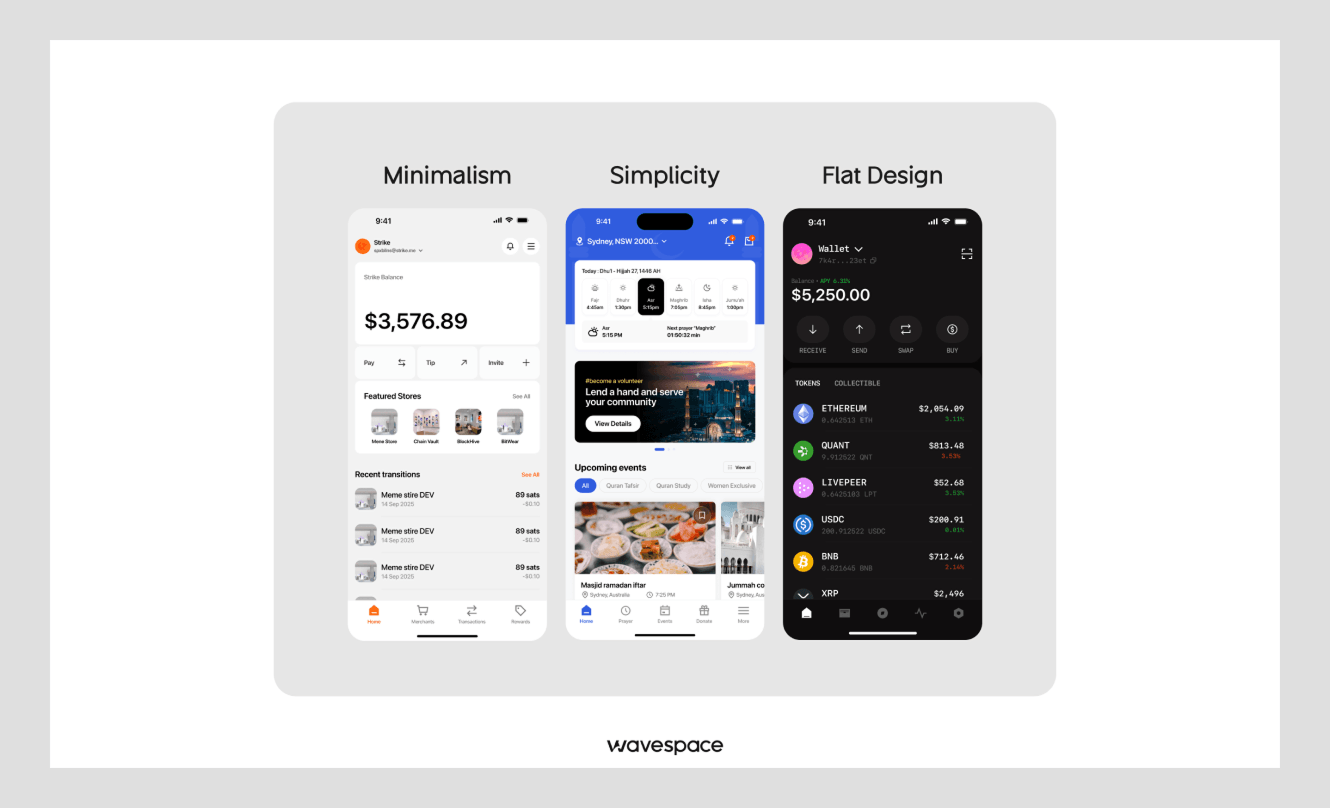
Minimalism is a UI design philosophy that removes unnecessary UI elements so user focus stays only on important things like CTA buttons. Simplicity is another UI design philosophy that makes UI easy to use, navigate, and take action.
Flat design is a visual design style in the UI/UX sector that uses simple shapes, solid colors, and 2D visuals to create user interfaces.
Most people around the world don’t have any idea about UI design. They vaguely say what type of design they want in their product. Here are the three design types many people mix up.
In short, minimalism is removing unnecessary elements, simplicity is making the experience easy to use, and flat design is a visual style without shadows or gradients.
What are the key characteristics of minimalist UI?
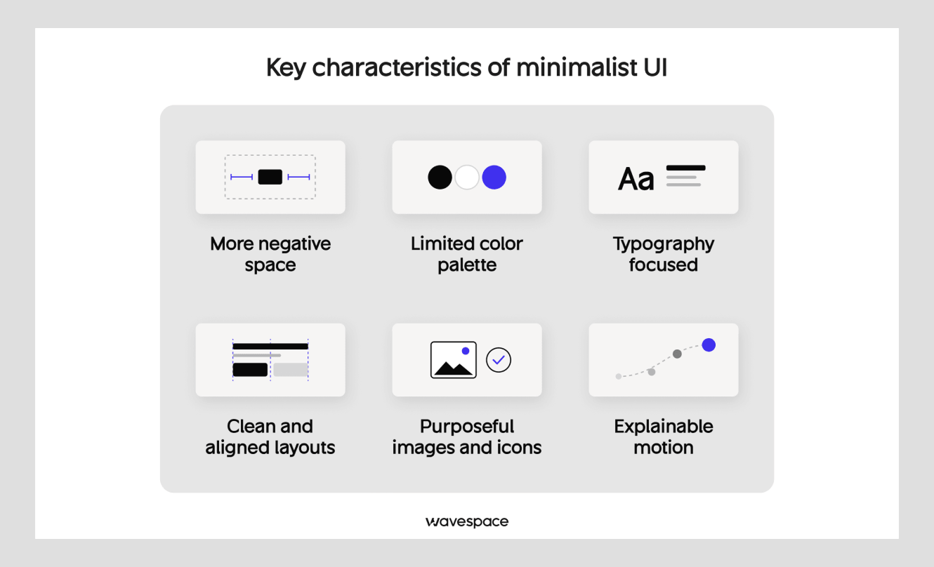
Minimalism is a distinctive art form. By learning its core characteristics, anyone can understand and value it.
More negative space
Negative space is the first signature of minimalistic UI design. It is the empty space around or between elements. More space around the main element means users have less distraction. This empty space influences users' focus on the main action. Empty space doesn’t have to be white. They can be any color background.
Limited color palette
Minimal designs often use neutral colors with one extra accent. The accent is used for important elements/objects such as the main button. Because the palette is limited, each color carries significant meaning. If you get the right UI UX design agency, they can take a minimalist UI to another level by only using a single color.
Typography focused
Type in minimalism UI web design on Google, and you will find one thing in common: font. A minimalistic UI design approach uses fewer colors and images, so most of the design heavily relies on fonts.
In minimalistic design, font size, weight, and spacing show what is important and what users should focus on. When done well, a white background with only black text looks far better than a hero with colorful graphic elements.

Clean and aligned layouts
Clean design is often used as a synonym in UI UX design industry. Because minimalist design uses clarity all over the design layout. Every element aligns on a clear grid. Margins, gaps, and everything follows a pattern. This is achieved so visual hierarchy stays consistent on every screen, and mobile app users or website viewers can easily scan.
Purposeful images and icons
Many believe minimalistic UI means a website header with no image and a mobile app with only one icon, which is wrong. Minimalist design often uses images in headers and UI designs. Modern minimalistic websites are the most effective landing page design. They make the product image the center of attention. Users get it within seconds.
But everything has to be purposeful. Minimalism design philosophy uses images that bring value, because a crowded image with details can take the calmness out of the design layout.
Explainable motion
Many believe minimalism design UI is just static UI UX design, but in reality it is different. Minimalism uses animation to do one job. Our designers believe animation shouldn’t be there just to impress visitors. It should show the product and tell the story of where it came from and where it is going.
7 Principles of minimalism in UI design

Many designers have different views on minimalist design principles. I have curated 7 principles that minimalist UI design rests on. Each of them answers one question: what can I remove without hurting the product and user experience?
1. User first
List why an app user or web visitor will come to your product before starting any design. Every element on the screen should assist them in completing that task or action. If an element doesn’t support that action, it is a liability, not an asset; remove it.
2. Earned place
Every element should earn its place to be on the screen. Our UI UX designers find this with a simple trick. At Wavespace, we ask one question to decide whether to keep an element in minimalist design. “If I remove this, will someone fail to complete the core task?” If the answer is no, remove it. This one question is the fastest way to cut extra items off the screen.
3. Clear focus
The minimalistic UI design principle takes Conversion Rate Optimization (CRO) to another level. Like CRO's minimalistic UX, remove excess elements that don’t help at the end. A screen with 5 loud elements is nothing but a distraction. Minimalistic designers keep one focus element. Choose one thing the user should see first in your product and make it stand out through size, color, and position.
4. Visual hierarchy
Designing decoration is not the first choice in minimalism UI. It focuses on visual hierarchy to tell the story. Make sure your minimalist UI doesn't rely on borders, shadows, or icons to separate elements. You can achieve industry-standard visual hierarchy by only using font, size, weight, and space. This way, you will have top-quality minimalist design, your product will have better usability, and it will perform faster on the web.
5. Consistent design
Consistent design across the product is another important principle of minimalist UI. One screen with one spacious element and another one cramped together breaks the design. Consistent design helps your brand build trust in your target audience.
6. Progressive disclosure
Simply, progressive disclosure. It is a user experience (UX) and interaction design technique. Showing the essential functions first and hiding the details behind buttons. This directly connects to Hick's Law. In 1952, William E. Hick and Ray Hyman found that time and effort to make a decision are logarithmically connected to the number of options.
7. Accessible design
Minimal design does not excuse low or small touchpoints. Every digital design must obey the Web Content Accessibility Guidelines (WCAG). Minimalism has to follow accessibility more strongly.
The WCAG digital product has a contrast ratio of 4.5 to 1 for normal text and 3 to 1 for larger text. Light grey (#999999) on a white background scores 2.84:1 (fails). Check your colors with Color Contrast Checker & Accessibility Checker before you put it on the market.
Benefit of minimalism UI in user experience
Minimalism improves user experience by removing extra options from the product and making it simple enough so that users can make quick decisions. Here are six benefits of minimalism that every designer and founder should know.
Lower cognitive load and faster decisions
Visual complexity and clutter on pages shape how people feel and reduce the time it takes to act. A Google study found that websites with lower complexity and familiar mental models are more appealing to internet users.
This directly ties with Hick's Law discussed earlier. When designing, track how much time a user takes to make a decision and how many people complete the same task.
Faster load times and better Core Web Vitals
Minimalism makes your product faster. Since the design uses fewer numbers of images and animations, you need less JavaScript on your pages. So your website and pages stay light and pass the Core Web Vitals easily. McMaster-Carr, one of the fastest websites in the world, uses minimalism.
The speed they have achieved with minimalist design is what e-commerce sites dream about. This speed matters when you have a digital shop. A study by Deloitte for Google looked at 37 brands. It found that a 0.1 second improvement in mobile speed metrics raised retail conversion by 8.4% and travel conversion by 10.1%.
If you are a business owner, track the largest contentful paint and bounce rate today to make a design decision.
Stronger CTA and conversion focus
When a page has less clutter to get user attention, the strategic CTA (call-to-action) works like a charm. Users don’t have to figure out what to do next. A great example of this is Yeezy by Kanye West. First-time visitors can add items to the cart within 3 seconds.

To understand how it works, track the click-through rate on the main button and the conversion rate.
Better accessibility when paired with good contrast
Large fonts, high contrast, and clear spacing make a simple layout that helps many users. This not only helps people with disabilities but also the general public who struggle with the internet. When you select colors with care, people fall in love with your brand and keep coming back to your service.
Easier responsive and mobile design
Minimalistic designs are easier for users to make responsive. You have a limited number of elements to work with. No matter the device. Phone, tablet, Mac, desktop, or handheld gaming, your website looks great. For this you save money when developing your product.
Easier maintenance and consistent design system
Fewer components and elements are easier to document and maintain. You get a clean design system with design foundations, color palette, typography, spacing system, grid system, layout principles, border system, corner radius, shadows and elevation, iconography, and more. In simple words, everything a new designer will need to learn to keep minimalistic design consistent.
What are the challenges of minimalist UI design (and how do you solve them)?
Minimalism might look easier, and many believe it's cheaper than other UI design styles. But both of them are wrong. Minimalism is one of the hardest to nail. First, you need to understand the design philosophy and art of minimalism.
The reason we always suggest hiring a UI UX design for your design work. A good landing page design agency can redesign your website and increase your conversion, which you will not get from a freelancer.
That said, here are the most common challenges you can face while doing your minimalistic UI design.
The hidden navigation problem
This is the most reported problem in minimalistic UI design. According to a study run by Nielsen Norman Group, a complex menu or hiding the menu can cut the navigation by half. This report also states that hiding the menu increases the time to task completion.
And desktop users get lost more than mobile phone users.
The best way to fix this is to not be too clever in your design. If a user needs a screen, show the link. If you have a menu, then show it as a menu, and add a text label to help users.
Low information density
Less content on the page is another problem minimalism faces. A page with a limited number of elements means you can’t add more content. But the normal user mental model is to explore content. They automatically scroll down if the header feels empty.
The best approach is to fix this by keeping the landing page as minimal as possible and pointing users to rich pages right after they land.
When not to go minimal
Minimalism is an artistic choice that many adapt in products to create calm and clarity. But not every type of product can be minimalistic.
For example, a minimalistic UI is not for an information-heavy SaaS product with a complex dashboard.
- Data-centric product: Project management and stock trading platforms are great examples. You need real-time charts, market data, and trading controls.
- Enterprise software (ERP/CRM): For these products, design needs to be ready for large numbers of menus, reports, forms, permissions, and workflows.
- Healthcare software: These dashboards need to show an extensive data report of the patient records, prescriptions, test results, allergies, and clinical documentation.
I suggest not going for minimal UI UX in these designs, because they would be more harm than good. In this industry, users want to see more data. Showing less data in healthcare software is a risk and can lead to a fatal outcome.
In these cases, your product needs design principles (hierarchy, spacing, consistency) instead of chasing the empty look.
Minimalist UI design examples: what 3 interfaces get right
#1 - Aesop

Aesop is an Australian-based skincare brand owned by L'Oréal. It is a minimalist interface design done right. This online store feels calm and doesn’t scream for attention. It uses large product images and generous space that makes it easier to understand what the product is about.
The nav bar displays product categories, so users don’t have to dig deeper to find what they need. Every detail of the product is skimmable at a glance.
Great combination of calm and premium branding in one product. Photos do the selling, and UX keeps the users coming.
#2 - Apple
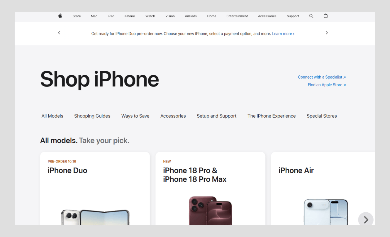
The Apple website is one of the prime examples of a minimalism interface. You see the latest product right away. The clean navigation includes every Apple product category, so consumers don’t have to waste time. They arrive, compare, and get what they need.
#3 - Google Search
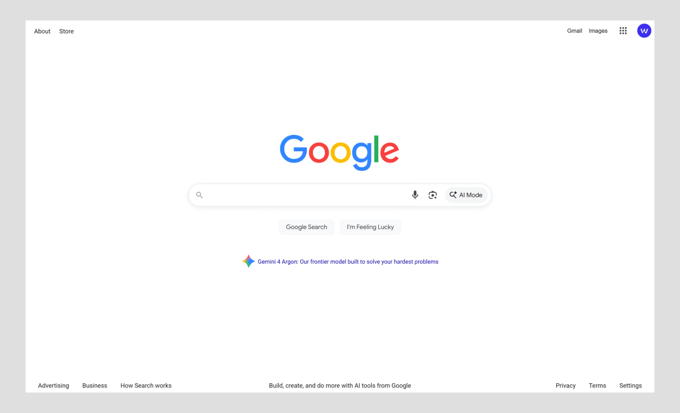
Google search pages are one of the most used minimalistic pages on the internet. Google started as every other search engine, but now it holds 89.9% of the global searches. They achieved it with their design and engineering.
Every other engine filled their engine with ads and a complex interface. Google did the opposite. They succeeded by not making the page cluttered like Yahoo and AltaVista.
Search engine in the middle with a large white space. Every visitor understands in a second how this site works. One search bar with one button.
A minimal conclusion
Minimalism in UI design is a popular design style in brand design. People love it, but it is also one of the hardest to get right. Minimalistic UI simply removes the visual clutter and keeps only the necessary elements that a user needs to perform the core action on a website.
If you are going for a minimalistic look, ensure you start with the user's task as the focal point. Use hierarchy to guide the user. Don’t rely on decoration and test every removed item with real users. Or contact us. We can help you with minimalistic design.
Frequently asked questions for minimalist UI design

Minimalist UI is a user interface and user experience technique. The main purpose of a minimalist UI is to remove extra clutter and present only the useful content or item. In the design world, minimalism is a form that ensures, despite removing elements, the website or app still functions and looks good.
Minimalistic design is popular because of the mental clarity that other designs cannot provide. Minimalism design doesn't scream for attention. If you need a button, you get a functional button. This is what makes minimalistic design one of the most functionable UI/UX designs. It strips away unnecessary things and gives clarity that no other design can give. This is the main reason it has become a timeless design among the general audience.
Minimalist refers to an individual who likes to keep everything simple. Art or design style that uses fewer elements to make a clear and functional product.
Current UI design trends are functional, clarity-focused designs. Balance of intelligence and context-aware design. Liquid glass, skeuomorphism, spatial, and XR interface.
The 30/30 minimalist rule is a simple decision-making trick to avoid unnecessary things. It is a thing before deciding on a technique. Simply put, if you need an unnecessary item that costs $30, you should wait 30 hours before purchasing it. If an item costs more than $100, you should wait 30 days before buying.
Minimalist UI/UX design focuses on user needs. It removes unnecessary elements, creating clear visual hierarchy, maintaining consistency, revealing details when needed, and ensuring accessibility.

More related blog
Design & development in one team. Let’s talk!















.png)



Francisco, CA 94105, United States




































.avif)