Challenges and solutions of multilingual UI/UX design


Focusing only on the local market is a novice founder's mistake, but the challenge for product design starts when you localize it. In 2026, global users want more than translating one language to another. A website or mobile app that looks perfect in English but design can break down in Arabic, Japanese, and German.
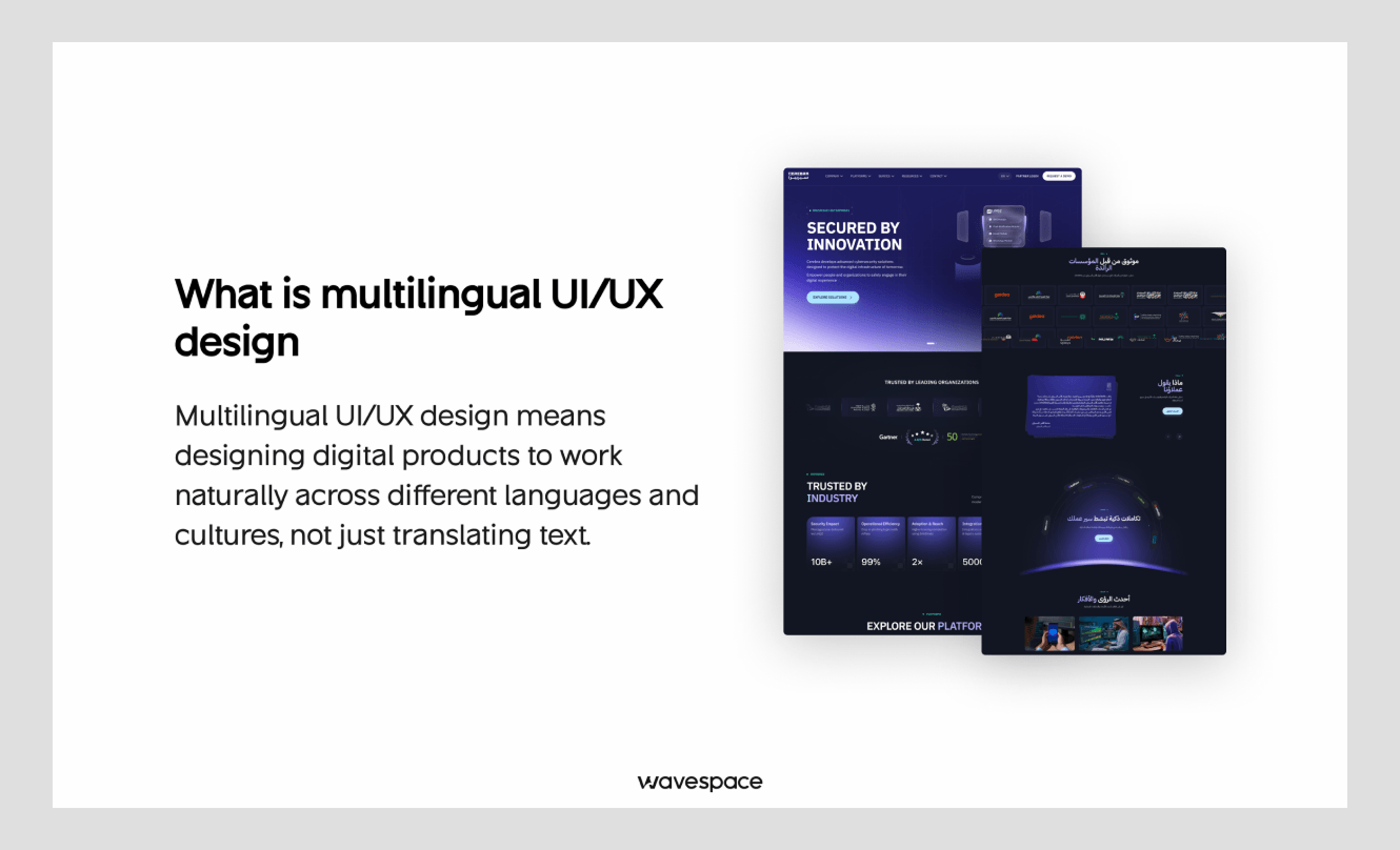
Only multilingual UI/UX design discipline can save you from disaster. Multilingual UI/UX is a strategic approach to create UI and UX for different languages. It ensures the UI UX design seamlessly works on different types of languages, scripts, texts, and fonts.
76% of online shoppers prefer to buy products in their language. So, multilingual UI UX design is not only necessary for mid-stage businesses but also for startups. Because it helps to close the gap in the global market and increases trust and business growth.
Let’s learn what multilingual UI/UX design is, what challenges businesses face, and their solutions.
What is multilingual UI/UX design (and why translation isn't enough)
A CSA research in 2020 found that 40% of online consumers will not make a purchase from a website that is not in their native language. Multilingual UI/UX design principles are a process of planning, structuring, and designing UI to tackle that.
Multilingual UI/UX design’s purpose is to make users feel at home. No matter their background, language, or culture. Most founders and businesses think just translating will do the work for them, but that's a mistake I have seen people make most often.
Suppose you are building a product in English and want to have Arabic and German for your clients. Translating word for word won’t work, and design will break down if you just swap to translation because Arabic is not like English. The direction is different. Arabic reads RTL (right-to-left).
Now, German, the good news is German is not RTL but LTR like English, but the problem still stays. Your design will break when translating English information to German. Because most English words become longer when translated into German. Example: Life insurance in German is “Lebensversicherung,” and “hospital” is Krankenhaus.
This is why just translating digital products results in breaking; buttons get overflowed, and item descriptions cover pricing. Customers have a hard time completing basic actions like managing their cart or making a purchase.
A multilingual experience not only helps prevent your product from breaking but also helps businesses to scale effectively.
- Higher Conversion: People are more likely to stay and buy products from websites or apps that support their native language.
- Stronger Trust: Increases trust and makes users feel safer with their personal information.
- Better Retention: Increases user retention by making users build local habits.
Multilingual UX vs. Localization vs. Internationalization
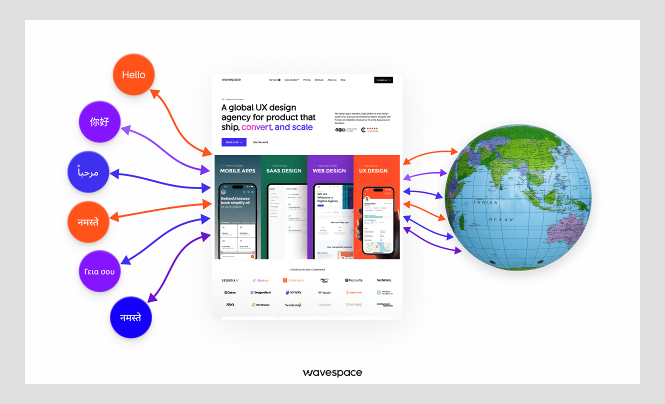
Let’s clear up what most people mix up when discussing internationalization, localization, and multilingual UX. Each of them might sound similar, but they have a very distinct role for global products.
Internationalization (i18n):
A translation module with dynamic JSON storage. I18n allows apps to support multiple languages without breaking the product UI design. For example, an i18n-ready app should be designed to handle:
- Multiple languages
- LTR and RTL layouts
- Different text lengths
- Different number formats
- Different date/time formats
- Different currencies
- Different character sets and fonts
- Localized input fields
- Region-specific content
- UI expansion/contraction caused by translation
Localization (l10n):
l10n is a process of adapting the translation of digital products to different languages, regions, cultures, and locales. For example, a product localized for Arabic might adapt:
- Language: English → Arabic
- Currency: USD → SAR (﷼)
- Date format: 09/22/2026 → 22/09/2026
- Number formatting: 1,000,000 → ١٬٠٠٠٬٠٠٠
- Time/date conventions
- UI text and terminology
- Images and cultural references
- Address and phone-number format
- Layout direction: Left-to-right (LTR) → Right-to-left (RTL)
Multilingual UX:
A digital design discipline that ensures layout, navigation, and visual systems work seamlessly across all supported languages.
Core challenges of multilingual UI/UX design (and how to fix them)
Text expansion and contraction
UI design is a form of art to make web or mobile app design presentable, exciting, and lovable by the works. Most screens are filled with objects and visual elements. Text rarely filled the space on a screen.
English is a compact language, and it takes less horizontal space than Finnish or German, which take about 30% more space. On the other hand, CJK (Chinese, Japanese, and Korean) takes less horizontal space than English.
Fix:
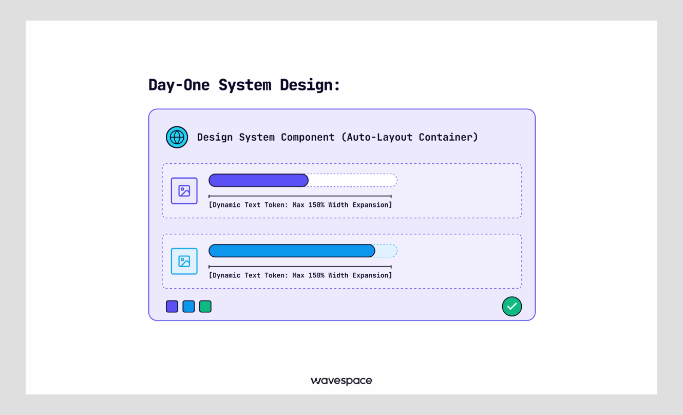
- Leave extra space in buttons, input fields, and card design. A practical rule of thumb that we use at Wavespace is to design for 150% baseline width on short labels (under 10 characters).
- Design with a flexible layout, like Figma (Auto Layout), to expand containers with the text automatically when needed.
- Avoid declaring fixed values like fixed height or fixed width in text boxes.
Understanding negative space in UI design can also help create layouts that remain readable when translated text expands.
Writing systems and script support
In UI/UX design, elements and design can be the same regardless of the region, but language, writing, CTAs, and copy cannot be the same. Different languages use distinct alphabets and writing marks. For example, Latin letters are in a perfect straight line, but Devanagari (used for Hindi) hangs from the top.
On the other hand, CJK characters are square, while Arabic letters are connected to each other with complex curves.
Fix:
- Use extra vertical space for tall characters and scripts. This will save the letters' front from getting cropped top to bottom.
- Use variable fonts in the design to keep text smooth across different styles, weights, and formats.
- Use custom line height in the design system for writing script fonts.
RTL (right-to-left) languages
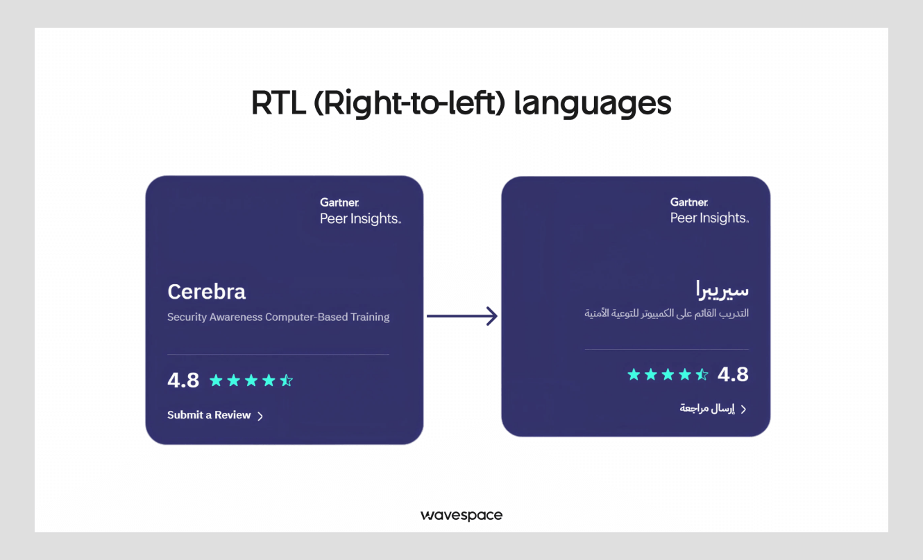
Over 500 million people worldwide natively use RTL languages. Arabic, Hebrew, Urdu, and Persian are to name a few. Designing for RTL is not just alignment to the right; there are more things to it. It requires meticulous monitoring of the layout.
- Left-to-Right (LTR): [Icon] [Label Text] -> [Button]
- Right-to-Left (RTL): [Button] <- [Label Text] [Icon]
Fix:
- Mirror the entire design layout (navigation, elements, back button, form fields, and progress bar.)
- Do not mirror the media player controls (play/pause), clock faces, numbers, or graphs where time is moving.
- Use CSS Logical Properties in code. For example, margin-inline-start instead of margin-left. This will help the browser understand to automatically place margins in the correct order and side based on reading direction.
Date, time, number, currency, and unit formats
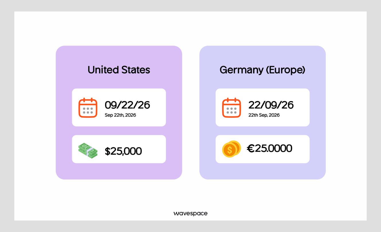
Formatting for time, date, metrics, and currency works differently on each continent of the world. What works in the United States of America doesn’t work in the Middle East or Asia.
07/04/2026 means July 4th in the United States, but it’s 7th April in Europe. Writing $1,000.00 in English becomes 1.000,00 € in Germany.
Fix:
- Avoid hardcoding dates, currency, and number format in your UI UX design.
- Use native system (JavaScript's Intl API) tools to format dates, times, and currencies automatically based on the user's region.
- Ensure numbers inside RTL layouts follow local conventions.
Typography and font compatibility
Many browser versions do not support all types of fonts and texts. When a browser encounters a font type of text that is not in its system, it shows a blank box ▯ (“tofu”).
Fix:
- Define fallback for these encounters; use font lists in CSS. A fallback option will tell the browser to use another font when the primary font fails to load on the user's device.
- Use a universal font family for the default font face. Google Noto Sans is a good choice. It supports thousands of global font scripts.
- Use variable fonts to reduce the font file size. It will make the site lighter and load faster.
Navigation, layout, and component flexibility
Navigation is the most affected element when making a website multilingual. It often breaks and becomes an eyesore. It is because words change their length after being translated. A 5-item menu in English quickly becomes a mess due to overflowing into a second line in French or Spanish.
English: [Home] [About] [Services] [Pricing] [Contact] = Max characters in one is 8.
French: [Accueil] [À propos] [Services] [Tarification] [Contactez-nous] = Max characters in one is 12.
Fix:
- Run pseudolocalization tests early in the design phase. Pseudolocalization replaces the text with accented and extended characters. For example, [Śēāŕčħ !!!] It helps by simulating the text extending before translating starts.
- Develop navigation components for desktop and mobile screens that collapse gracefully. Ensure the dropdown or hamburger menu doesn’t run out of space.
Images, icons, colors, and cultural symbolism
Though most visual elements stay the same after making a website or app multilingual. But they carry different meanings in different countries and cultures.
For example, a “thumbs-up” means a way of approval in most Western countries, but it is considered offensive in some parts of the world, like Bangladesh, West Africa, and the Middle East. The meaning of the color also can be different based on the nation.
Red: Means danger or financial loss in the West side of the world. On the other hand, it represents good fortune & prosperity in China.
White: Represents purity in Western culture but is associated with funerals & mourning in parts of East Asia.
Fix:
- Include extensive UX research before starting to design anything.
- Audit icons to ensure gestures, hands, and cultural symbols are translated respectfully.
- Choose neutral accent colors for the international page or change the color based on the market.
- Use diverse and relevant local images & photography in marketing materials.
This research should be part of a structured UX design process, from understanding users and defining problems to testing and iteration.
Accessibility across languages
Screen readers depend on parsing the code underneath websites, documents, and applications to read them out loud for the visually impaired product users.
If context and language details get missed, the screen reader will automatically use English TTS rules to pronounce foreign words. This will throw off native users, and the product will seem untrustworthy.
Fix:
- Assign clear language indicators on HTML tags. For example, <html lang="es">
- Wrap specific sections of a single page when you are changing language. For example, <span lang="ar">
- Ensure contrast levels for text-to-background are compliant with accessibility standards when fonts shrink and wrap.
Multilingual SEO
Search engines often struggle to understand which version of the page to display to users in different regions. This leads to engines marking your translated pages as duplicate content and their multilingual links and ends up giving plenty of it.
Fix:
- Include `hreflang` tags in the website header section of the HTML code to declare different language versions.
- Translate page title, H1, meta title, meta description, and web addresses (URLs).
- Avoid relying on automatic translation pop-up tools for primary search indexing.
Performance and technical implementation
Loading fonts and localization assets for 6–7 languages will slow down website speed and affect performance. Slow pages will hurt user retention and lower the SEO rankings.
Fix:
- Implement font subsetting, breaking down font files into smaller packages. This will let the user side download part by part only the sections needed when translating.
- Don’t write the translation language into the design files or code.
- Store all the front-end interface text in external resource files (string externalization).
- Use ICU MessageFormat for plural rules for other languages. English has two plural forms (1 item, 2 items), but other languages, such as Arabic, can use up to six plural rules.
Testing and quality assurance
Finding broken layouts after the website or mobile app launch is costly, and it takes a good amount of time to fix.
The step-by-step QA workflow:
- Pseudolocalization: Run the pseudo-localization software testing method during development to ensure internationalization aspects.
- Automated Visual Tests: Run automated screen captures/recordings on different types of devices to ensure there is no overlapping text.
- Native Speaker Review: Hire a native person to review the product screen to ensure there is no awkward phrasing and the core intent stays intact.
Alongside automated visual checks and native-speaker reviews, usability testing can help identify navigation, comprehension, and interaction problems before launch.
Maintaining multiple languages at scale
Designing the product UI/UX and developing it is the first stage. Many businesses struggle to update text manually, and it becomes harder when your product has multiple pages across the board.
Fix:
- Use a Translation Management System (TMS) such as Phrase, Crowdin, or Lokalise.
- Connect TMS directly to Figma and store the development code in repositories like GitHub.
- Set maximum character lengths using design tokens for screen elementsLeave extra space in buttons.
Designing for multilingual from day one
Founders and businesses make their website, AI product, or mobile app without thinking about the localization, thinking they can retrofit it after it gains some traction. Startup founders make this mistake most; they wait for the product to succeed.
UI/UX design agencies like Wavespace have localization bundled together in their design retainer packages. Because we know the pain of founders. Founders don’t understand how much credibility they can build with language support from the start.
Fix:
- Use design tokens: Avoid setting fixed pixel declarations. Predefine the spacing, font, and text call them from the central tokens.
- Build flexible design systems: Create flexible component layout rules to automatically adjust with long strings.
- Test pseudo-locales early: Enable pseudo-locales early in the development sprint to highlight the issues from translation.
A flexible design system makes multilingual products easier to maintain because typography, spacing, components, and layout rules can be adapted centrally.
Multilingual UI/UX design checklist
Use Wavespace’s curated checklist to find issues and solutions for multilingual UI/UX design.
Layout & component flexibility
- Check if the buttons have extra padding for 35% text expansion.
- Use auto-height and flexible width in text boxes.
- Make the navigation menu collapse into a popup menu when labels become longer.
Typography & script support
- Check whether fallback fonts are defined correctly for every supported script.
- Make the line heights adjustable for taller scripts
- Use universal fonts as default characters.
RTL support
- Ensure the page layouts, form fields, and navigation menus are mirrored properly.
- Ensure media player controls remain as they are.
- Replace the CSS directional properties (margin-left) with Logical Properties (margin-inline-start).
Content & formatting
- Use system-level formatting APIs (Intl) for dates, times, and numbers.
- Adjust the comma and decimal of currency markers per region.
- Review icons, images, and colors by local experts.
Code & SEO
- Use the Lang attribute in all HTML elements.
- Use hreflang tag to tell search engines about the language alternatives.
- Store strings and translations into external files.
Tools and workflows for managing multilingual UX
Translation at scale moves from the front-end page and requires management tools to keep everything in order. These tools connect design software with developer code.
Translation Management Systems (TMS): Use TMS like Phrase, Crowdin, and Lokalise to store all translated copy on the cloud. TMS sync translated text with design and code files. When a translator updates a line, it gets automatically updated in Figma and the development stack.
Figma Plugins: Use Figma plugins according to your TMS tools. It allows designers to toggle screens on and off when designing for multiple regions.
Pseudolocalization Tools: Use Lokalise, Smartling, LocaleProof, Tolgee, or any other pseudolocalization tools. Pseudolocalization tools help to find visual bugs or overflows using generated fake/pseudo translations inside Figma.
Conclusion
Multilingual UI/UX design is not just translating interface text. It goes beyond that. It provides a satisfying user experience by making a website or product adapt to users’ region and standards. It uses different languages, scripts, reading directions, cultures, and user expectations to achieve that.
Thinking RTL from the beginning helps prevent issues that come after release: Broken layouts, usability issues, accessibility problems, and redesign costs. If you are looking for RTL design, Wavespace can help you. Wavespace treats multilingual design as a core product strategy to create a trustworthy product for users worldwide.
Frequently asked questions

Multilingual UI UX design makes websites, apps, or digital products user-friendly for other regions. It does that by designing products in different languages, scripts, cultures, layouts, and regional conventions instead of translating just interfaces.
No, localization and translation are not the same. Translation only translates a certain part of the product, but localization transforms the product for a country. Localization does that by changing the format of currency, dates, numbers, imagery, terminology, cultural references, and layouts.
You design RTL languages like Arabic by keeping them in discussion from the beginning. Whether you design in-house or hire a design agency, keep the RTL on the table. Do culture research and UX research, and design them alongside the main page.
Managing the text expansion is the hardest in multilingual web design, websites, or landing pages. Most of the times headings become larger in letter count and break the design, which makes adapting to a right-to-left design harder.
Testing or auditing a multilingual website requires constant checking of text accuracy, letter count, layout design, and technical SEO for the local area. A great way to do that is to get a native expert or hire an experienced agency.
Definitely, multilingual and localized pages are the #1 way to penetrate a foreign market. Not only does it help with SEO by providing a better rank in that said area, but it also increases trust and boosts business.

More related blog

Have a Project? Let’s talk!







.png)



Francisco, CA 94105, United States



































.avif)