Dark mode vs. Light mode: choose one for better UX?
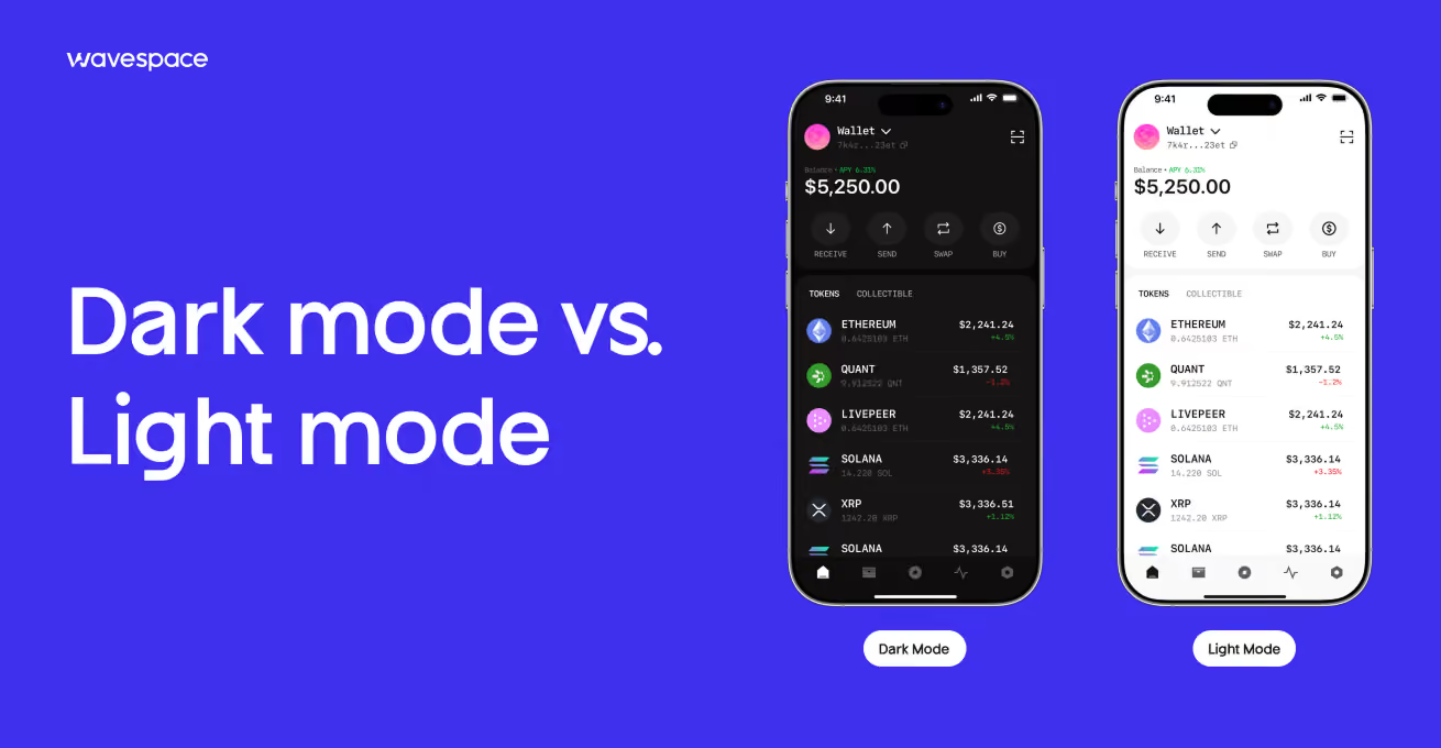


There isn't a single answer to the question of dark mode vs light mode, and if a design blog tells you differently, it's oversimplifying. This will depend on your product's users, their time of use, and the standards of access you need to meet.
The common misconception is to see this as a binary issue: "Either this or that". Let's think about it right and how to make decisions for our own product.
What is light mode?
Light mode is the classic interface mode: dark text on light backgrounds or white. It's been the default for decades, since the advent of "dark mode" as a toggle, and it remains the default in most productivity apps, news sites, and e-commerce stores.
Examples of light mode
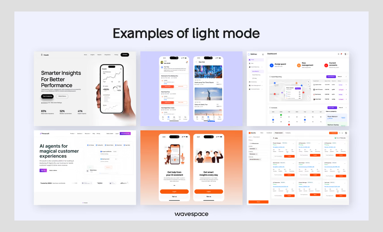
Most products that contain more reading in them and more tasks default to light mode: Google Docs, Gmail, most banking apps (Chase, Wells Fargo), and most of the e-commerce and content sites.
So do news platforms and documentation sites, which are light by default, as most people find it easier to read long content on a light background.
When you don't know your user's environment in advance, it's the safer and more conservative default; that's why most design systems still ship with light mode as the baseline theme.
Light Mode Pros and Cons
Pros:
- No loss of legibility in bright environments or direct sunlight
- Presents the reading experience most like print, reducing mental workload for text-rich content.
- Easier to achieve strong contrast ratios, making it easier to achieve accessibility compliance; and
- Familiar and “safe”, doesn't need additional design QA to prevent a broken look
Cons:
- May cause glare and eye strain in low light and night conditions
- More battery consumption on OLED displays, because white pixels need to be fully backlit
- Can be "loud" in apps designed to be calm, focused, or premium (a reason why many creative and entertainment apps avoid it).
When to use light mode
Light mode is a good default for products that focus mostly on content, like news, documentation, e-commerce, and most B2B SaaS products that are used throughout the normal course of a day's work.
It also works better in a professional or enterprise environment where users will expect a clean, print-like reading experience and where they will be using the device during the day when the lighting is good.
It is also the safer option if the user's environment is not known, if the field sales tools are used outdoors, if there is a kiosk or public-facing display, or if there is a wide spread of devices or lighting.
When these occur, the benefit of dark mode in low-light scenarios is negated by the benefits of light mode for its tolerance of glare and bright ambient light, as the extremes of light and dark cannot be controlled and predicted by the user.
What is dark mode?
Dark mode is the opposite of light mode; it is light text and UI elements on a dark or near-black background. It's not new; it was popular before GUIs, decades ago, but it's now popular again because iOS and Android finally provided system-wide support for dark mode, and then people began expecting it as a feature, and not some novelty.
Examples of dark mode
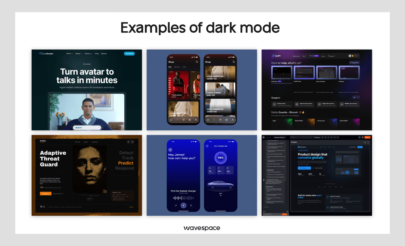
Most of the developer tools (VS Code, most modern IDEs) are dark by default, as are most of the consumer apps meant for extended or nighttime use, such as Discord, the core app UI of Spotify, and most streaming and entertainment platforms (including Prime).
Social sites have done the same, mostly because they are used more in the evening and late-night hours, when a dark user experience is more pleasant to use for longer periods of time.
Dark mode pros and cons
Pros:
- Reduces glare and can ease eye strain in low-light or nighttime environments.
- Power-saving on OLED and AMOLED displays; black pixels can be turned off or partially off.
- Signals a modern, focused, technical aesthetic, a real factor for developer tools, creative software, and premium-feeling products.
Cons:
- Fine text may glow or 'halate' in the background, making it difficult for some to read.
- Tuning of contrast is more difficult; most dark themes use dark gray rather than pure black backgrounds, which can be harsh.
- Not a universal accessibility win (more on this below), some users with specific vision conditions actually read worse in dark mode.
When to use dark mode
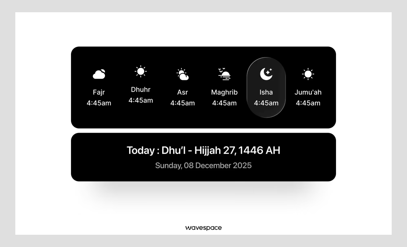
Dark mode earns its place in low-light and evening-use contexts, and in products where users spend long, focused sessions, creative tools, code editors, and entertainment apps.
It's also a reasonable default for products where "modern and technical" is part of the brand's positioning, provided the accessibility trade-offs are actually accounted for rather than assumed away.
It's a particularly strong fit for products used primarily on mobile OLED devices during evening hours, social apps, streaming apps, and anything designed for a "wind-down" part of the day.
The combination of genuine battery savings and reduced glare makes a real, measurable difference for that specific usage pattern, which is exactly why it's less compelling for a daytime, desktop-first, LCD-heavy product.
How does your environment affect your visualization?
The mode discussion isn't so much about looks, it's about the response of your eyes and your screen to various conditions. There are two more important things than personal preference: eye sensitivity and the display technology itself.
It's important to know both to make a defensible design decision, rather than a guess that's masquerading as a design decision.
Eye sensitivity
This is where most comparison articles fall short and it's important to reiterate: Dark mode is not equally accessible for everyone.
Light mode is better for people with normal or corrected-to-normal vision, while some people with vision problems linked to cataracts may do better in dark mode, according to Nielsen Norman Group.
Long-term reading in light mode has also been associated with myopia in some research, so neither mode is a clean, universal "win" for eye health.
The practical takeaway: For users who have low vision, photophobia or certain light sensitivity, dark mode can really benefit them if a significant portion of your users fall into these categories. However, if you are promoting dark mode as an accessibility option for your general user base, then that is not true; it is a comfort for most users, not an accessibility requirement.
If accessibility compliance is a real requirement for your product (and for most B2B and public-sector products, it increasingly is), the right move is to treat both modes as needing their own contrast and readability validation, rather than assuming dark mode automatically checks that box.
The screens
Battery savings from dark mode are true but limited: They only work on OLED and AMOLED screens, in which every pixel is lit independently, and in which black pixels consume very little or no power.
Dark mode's battery-saving pitch doesn't really hold up on LCD-backlit screens, which are still widely used in many mid-range computers and laptops, as well as monitors. Dark mode saves battery isn't a good enough reason to default to dark mode if your users are mainly on older laptops or LCD monitors.
This is a small but important detail that gets flattened into a blanket "dark mode saves battery" claim across most comparison content, when in reality it's a device-specific benefit, not a universal one, worth checking against your actual user base's device mix before you build a business case around it.
So which is preferable: Dark mode or light mode?
It's neither a winner nor a loser; it depends on your audience, their environment, and what you ask them to do in your product. The next two sections provide you with the direct answer and the structure to use it for your product.
Which mode is better for UX?
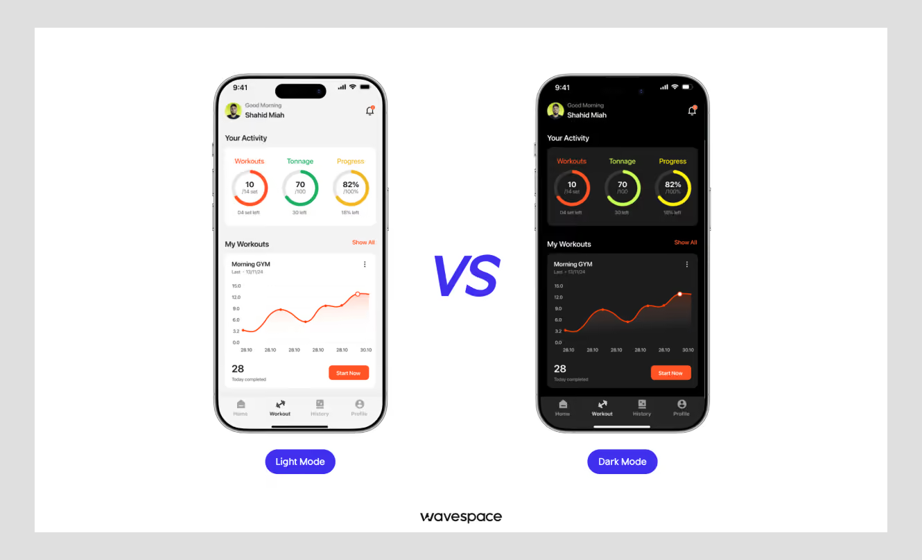
If you have a choice, the truth is to support both and to default to the more popular one when necessary, depending on context. Dark mode is a true benefit for low-light conditions, long viewing time, and OLED battery life. There are real benefits for using light mode for print-like content consumption, consistency of accessibility compliance, and readability in bright environments.
There is no "more modern" or "more correct" in a vacuum, as the mode that enhances UX is the one that aligns with your users' behavior, where and when they use your product.
No matter which one you choose, the real UX error is to make a style decision rather than a context decision.
How to choose the right mode for your product
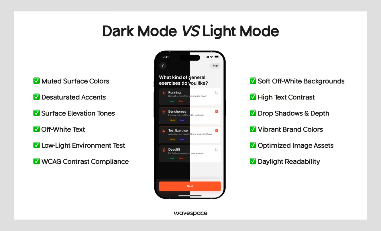
This is the part most comparison articles skip. Knowing the pros and cons of each mode doesn't tell you what actually to ship. This is the structure we apply to clients when the decision must pass a founder, board, or stakeholder review.
1. Audience and use case
Developer tools, creative software, and entertainment products skew toward dark-mode-friendly audiences. These users often already prefer dark interfaces elsewhere and associate it with focus and craft.
Light mode is better for reading-heavy, transactional, or professional documents (finance dashboards, documentation, e-commerce).
2. Session context
A short, glanceable session (checking a balance, confirming a delivery) tolerates either mode fine; the mode choice barely registers if someone's in and out in under a minute. A long, focused session (writing, coding, editing, analyzing a dashboard) is where mode choice actually affects fatigue and comfort over time.
This is more important than brand aesthetics if your primary use case is a 20+ minute session in your product.
3. Brand positioning
Dark interfaces tend to signal modern, technical, or premium positioning. Light colors are generally indicative of openness, trust, and simplicity. Neither is better than the other, it just depends on which one is more aligned with your product message.
A trustworthy and transparent fintech app could be light; an analytics tool for developers could be dark.
The most common error that we see is that a team chooses dark mode because it "looks more premium" in a pitch deck, without verifying if it will function as a product user would do it day to day.
4. Accessibility requirements
Dark mode is not an exception to WCAG contrast standards, simply because it is more comfortable to look at.
When your product is in need of accessibility compliance (and more and more products in B2B and public sector are), both light and dark themes must be checked independently, not by the other.
This is typically when a research-informed design process of an interface is rewarded; it's much more expensive to correct accessibility problems after a product launches than it was during design.
5. The real cost of "just offer both"
The best answer from a pure UX perspective is to support both modes, but it isn't free, and most articles simply sweep over this.
It roughly doubles your design QA surface: every screen, every component state, every edge case (empty states, error states, charts, data visualizations) needs to be checked and tuned in both themes, not just designed once and mechanically inverted.
Light mode colors may need to be adjusted in different ways for dark mode to prevent them from appearing muddy or over-saturated, and the same applies in reverse. That's a real trade-off that is worth saying, not "just add a toggle", if you're in the early days of a product with limited design and dev resources.
When you have a small team, it's better to ship one well-designed default that's aligned to your main use case, test it with real users, and implement the second mode when you have real data indicating when and how people are using your product.
This is the kind of decision that is best made through an outside-in design process and not by flipping a coin between two Figma files.
Conclusion
Dark mode vs. light mode was never really a preference question; it's a product-context question. The pros and cons of each mode are well understood at this point; what actually separates a good decision from a lazy one is whether you've mapped those trade-offs against your real audience, their real usage context, and your real accessibility obligations, instead of defaulting to whichever mode looks better in a pitch deck screenshot.
For most products, the safest and most defensible answer is to support both and default based on context, not because it's trendy, but because it's the only answer that actually holds up under real usage once your product has enough users to see the full range of how, when, and where they engage with it.
Until you have that data, picking a single well-reasoned default and validating it with real users is a perfectly defensible starting point, as long as the reasoning behind it is context, not convention.
If you're weighing this decision for your own product right now, that's exactly how we approach interface decisions like this with clients, starting from who's using the product and how, then letting the visual direction follow from that, rather than the other way around.

More related blog



Have a Project? Let’s talk!



















.png)



Francisco, CA 94105, United States





































.avif)