Negative space in UI design: tips and solutions
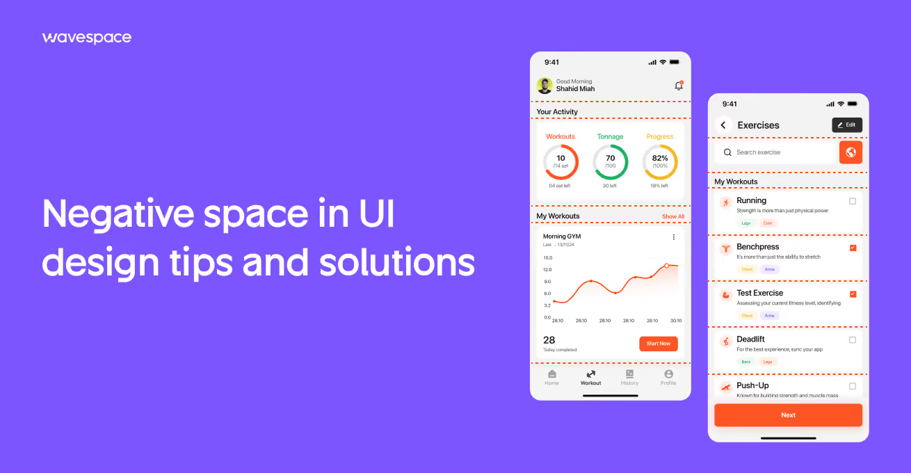



After nearly seven years in UI/UX design, I’ve learned that users don’t notice the most important part of design. They never appreciate or talk about the gap between a headline and a paragraph, or any space put in intentionally to improve their user experience.
Designers put their maximum effort into every space around the button and make breathing room inside a card design. These things make empty areas look empty to non-designers, but they subconsciously shape how people feel about a digital product.
That’s the power of negative space. It controls how users read, navigate, and interact with a product. Too little makes the product cramped, confusing, and overwhelming. Too much breaks the bond between elements.
In this guide, I’ll break down what negative space is in UI UX design, understand the fundamentals, and provide a proven practical spacing system to audit and take products to their full potential.
What is negative space in UI design?
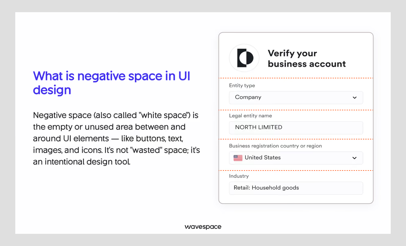
Negative space is the empty area of a layout. It's the margin around the button. The gap between two paragraphs. The room left inside the card before and after text. Negative space is also known as white space but they are not quite the same.
The name itself originated in the age of the print press. Paper space where no ink touched. Nowadays, negative space or white space means empty space. On a dark-mode mobile app or web design, the “white space” is black.
In other words, negative space means the area that is unused on purpose.
In a design sense, a blank space left is not automatically considered a negative space. It only counts once a design willingly decides to leave a space.
It does a job to establish visual hierarchy, separates the headline from the paragraph, keeps the button from touching the edge of a card. Lastly, creates a visually appealing design by giving room to breathe.
UI designers split negative space into two sizes.
Macro space: The large spaces in a design. For example, page margins, gaps between sections, padding around the layout.
Micro space: The smaller spaces in a design that are easy to miss. For example, line height in a paragraph, tracking between letters, pixels between an icon and label.
Both of them matter. A page can have macro space and still feel cramped if line height inside paragraphs is too tight.

What is the difference between white space and negative space?
White space and negative space are closely related in UI UX design services. Both refer to empty space in a design field.
White space is mainly used to make things easy to read from paper to screen. On the other hand, Negative space is the space between design elements that helps make a design more focused, balanced, and visually interesting.
Why is negative space important for UX and conversions?
In short, negative space is important for conversion because it gives room to breathe and users easily understand what you are saying, and results increase in brand trust.
Negative space creates a sense of peace in the user's mind. Whereas cramped interfaces put pressure on the user's brain, even in a product card on a website or in a mobile app. A user sees every element on the screen at a quick glance.
A user has to process every extra element on a screen by an amateur designer. Bad decisions while designing make a user leave your product and in the end, lose you revenue.
Our designer at Wavespace believes that less visual noise around important sections means users find it fast and act quickly. Negative space can also be used for separating things without needing an extra line, box, or color change.
Two elements close together can be interpreted as the same line, putting space between two things and people read them as separate lines. That’s how negative space helps people with their perception.
A button surrounded by open space is more important than the same button crammed between three other elements.
What are the types of negative space?
Negative space comes in six types: Active and passive. The concept of negative space is self-explanatory. Understanding these six types is good for both business founders looking to hire a design agency and designers learning about white space.
1. Active negative space:
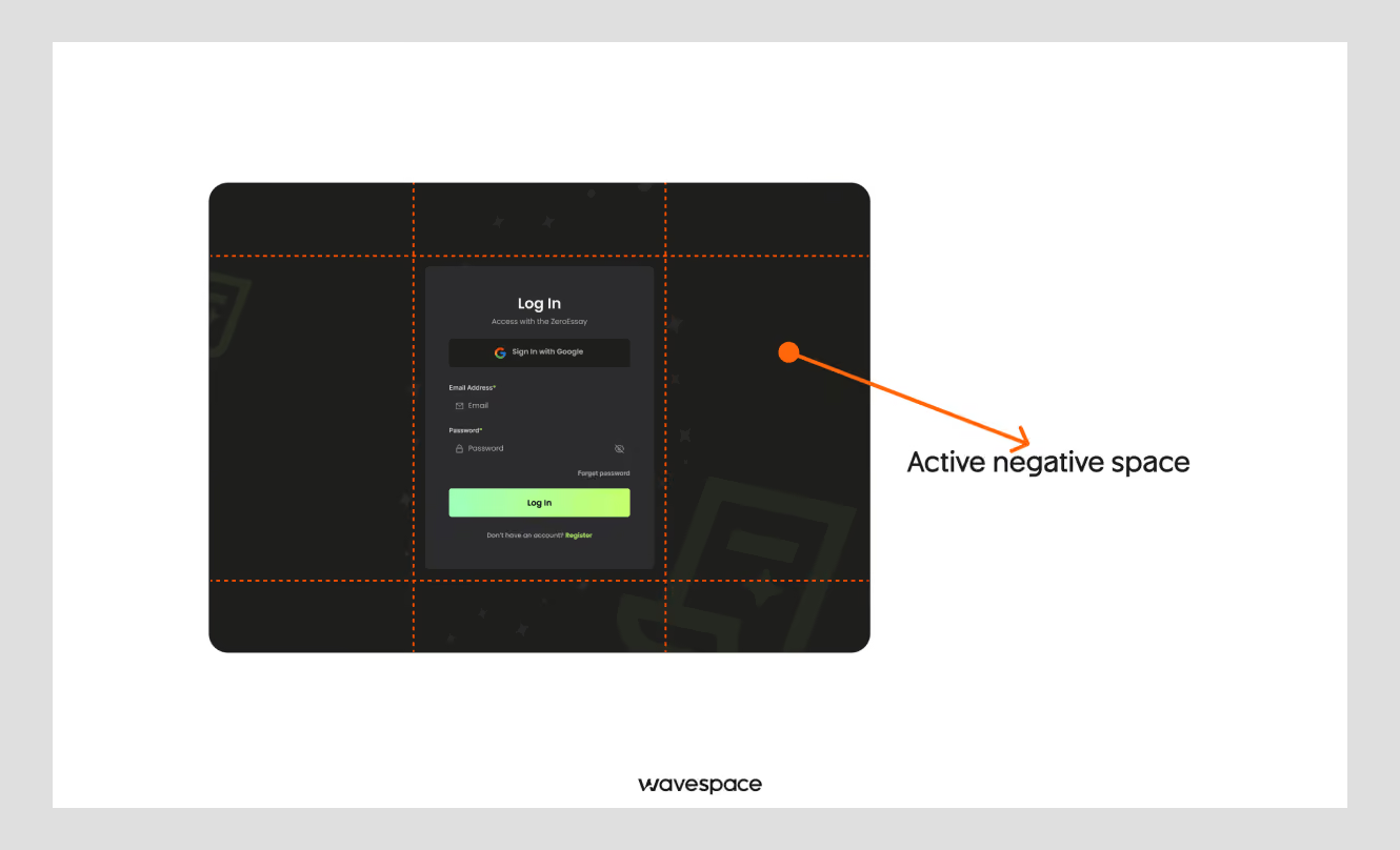
Active negative space is the space that someone puts in a design. A space deliberately placed in the design so users can focus on the core content.
Example: Google Search homepage
2. Passive negative space:
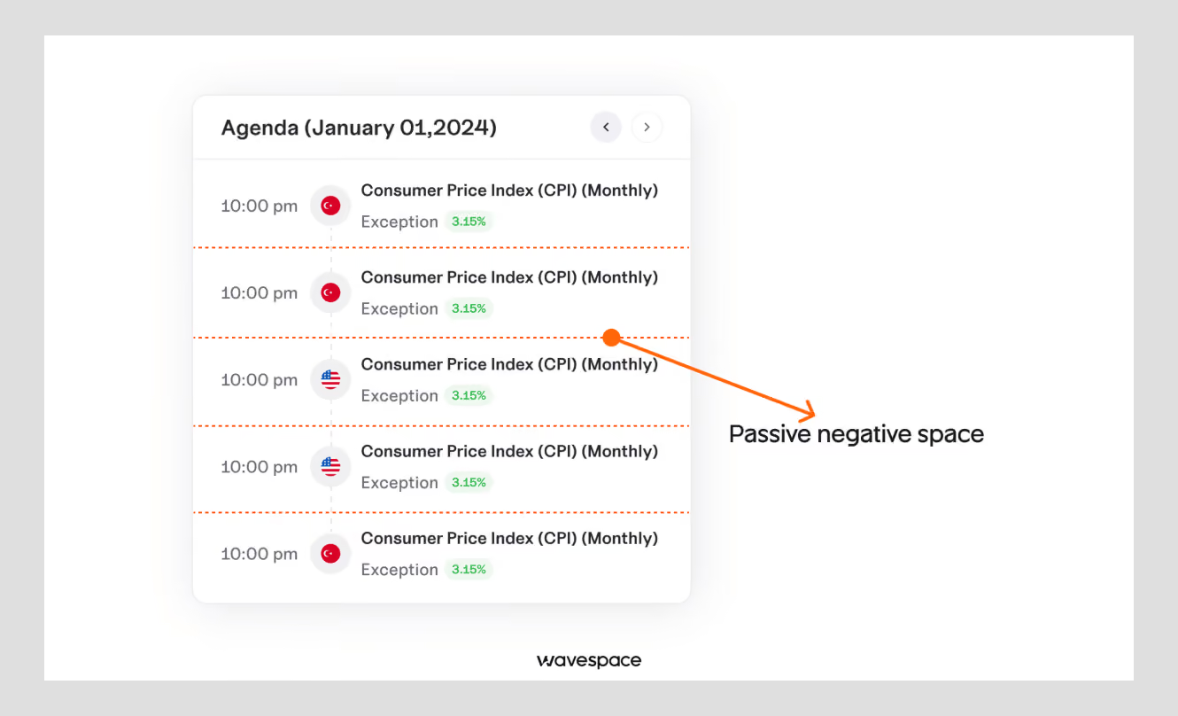
Passive space is the natural space or gaps between text or boxes that a user needs to understand content from their design. Passive space creates a sense of peace. Without it, everything will be cluttered.
Example: Email inbox
3. Open negative space
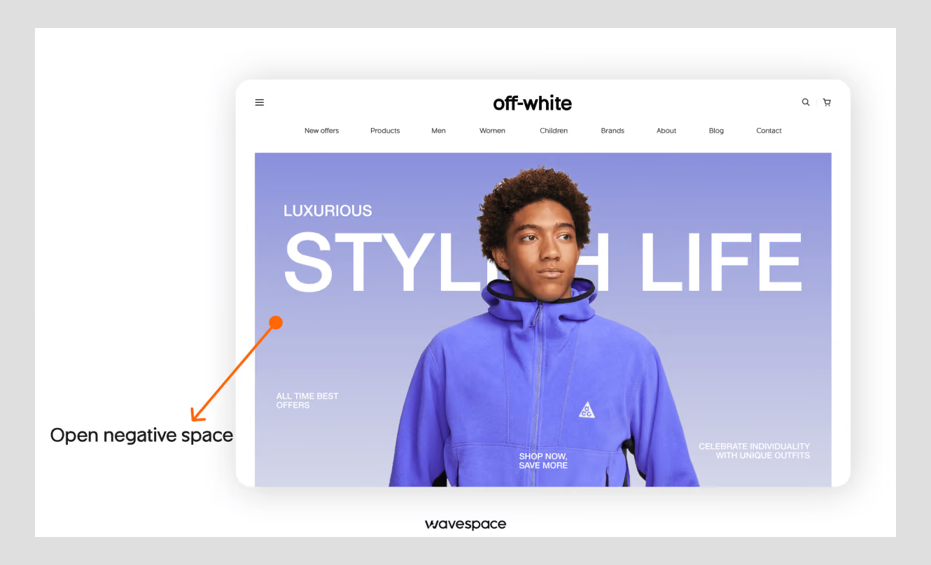
Open negative space is the large space surrounding an object to make a product or subject more visually important and make it look premium. Open negative space might sound similar to active negative space but its visual story is different.
Example: Apple product pages
4. Closed negative space
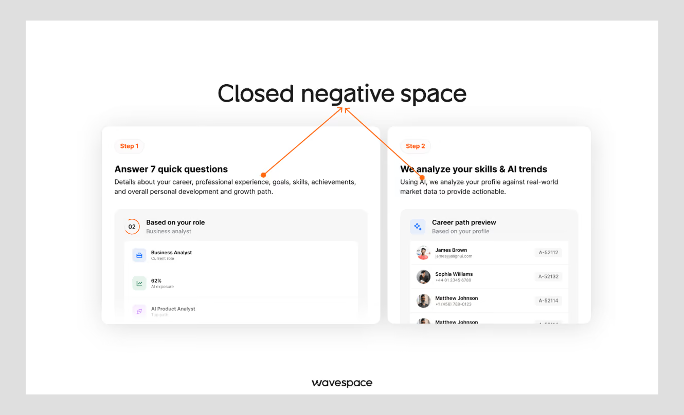
Closed negative space is used in text areas; it is the space inside a card or UI element that creates a gap or separates the main content from touching the main interface. It’s the 10px or 20px space padding of the card design.
Example: UI cards
5. Internal negative space
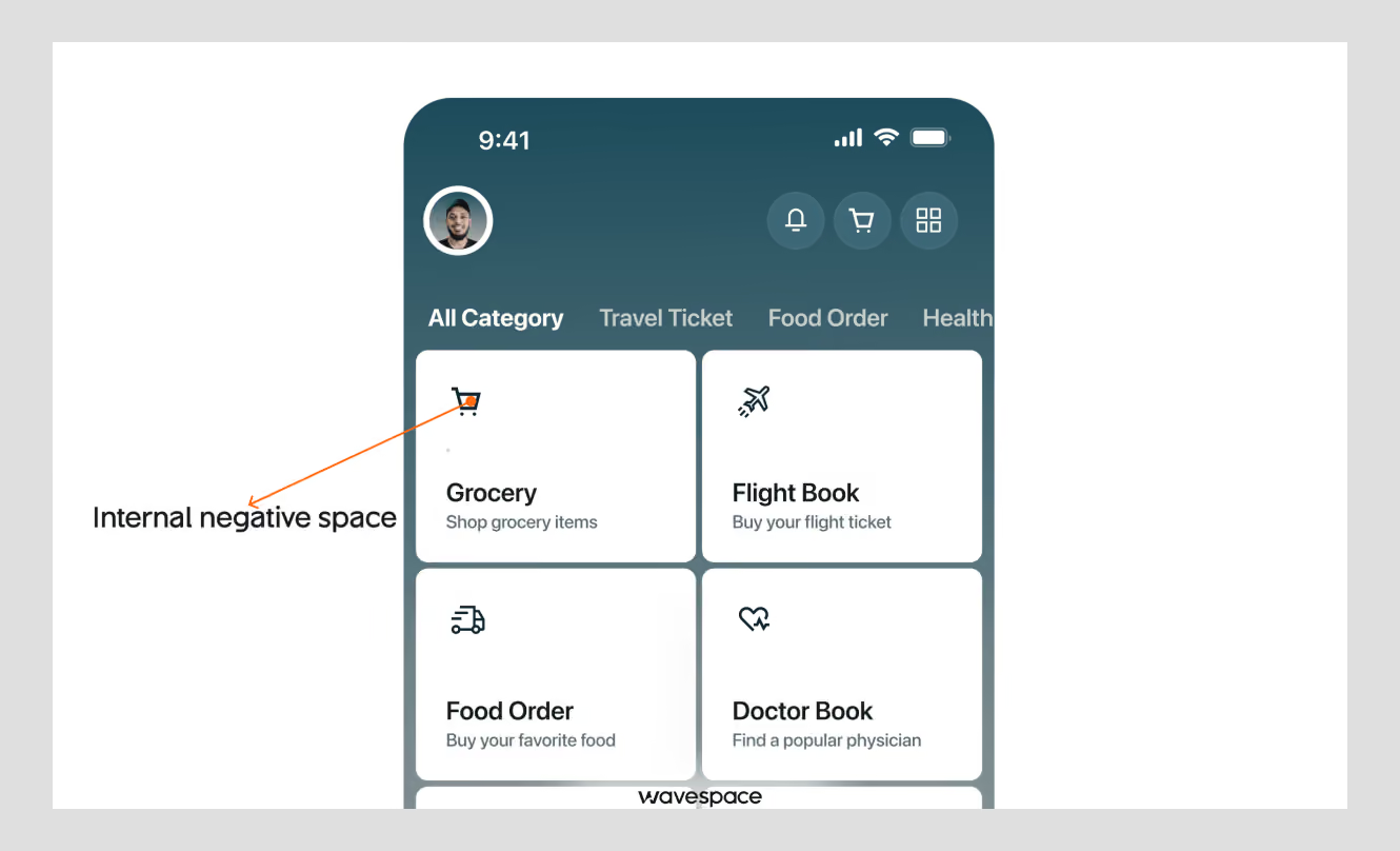
Internal negative space is the space inside an icon design. This space is used to turn a shape into an understandable object. It is the empty space that gives life to an icon, such as 2- 3 spaces in a hamburger menu icon.
Example: Icons
6. External negative space
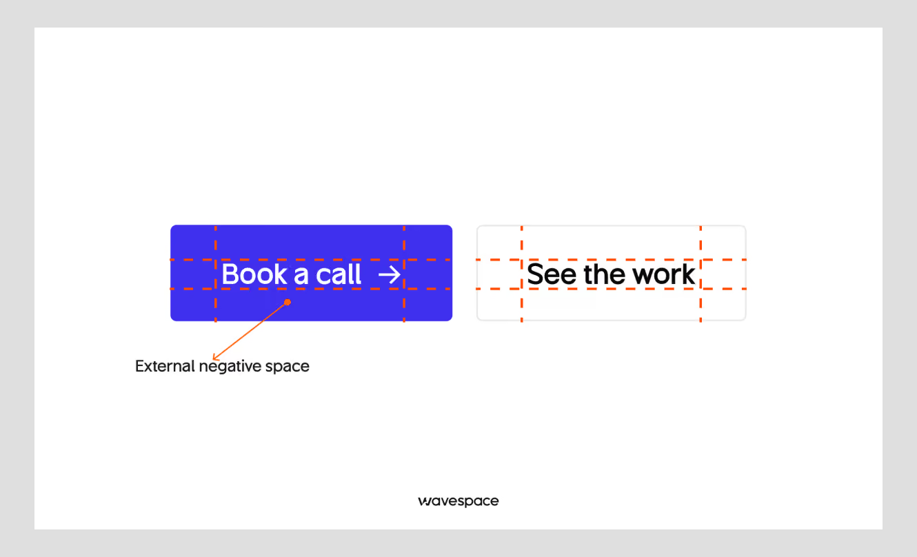
External negative space is the empty space surrounding a button that separates it from other controls and makes it easier to identify/tap.
Example: Spacing around buttons
How do you build a systematic spacing scale?
Spacing in digital or traditional media is a form of art. It helps to bring out unseen meaning. Though most advice from UI designers stops after saying “Use more white space”. In reality, that advice won’t get you any further.
What I have learned after almost 7 years in the UI design industry is that designers need to understand scale. A fixed set of values to call, so that space feels consistent.
The most used version of this is the 8-point grid. It is a digital design framework that uses multiples of 8 to scale design properly and ensure spacing doesn’t feel out of place. Every spacing value in a design comes from multiples of 8 (with 4 used for the tighter, smaller gaps).
A typical scale looks like this:
Industry giants follow these values to establish systematic spacing in digital products. Google's Material Design guidelines recommend a minimum of 8dp for margins. It keeps the whole product consistent instead of guessing what looks right.
This scaling method has been widely adopted by UI UX design agencies to design websites, apps and AI products.
Padding vs. margin: what's the difference?
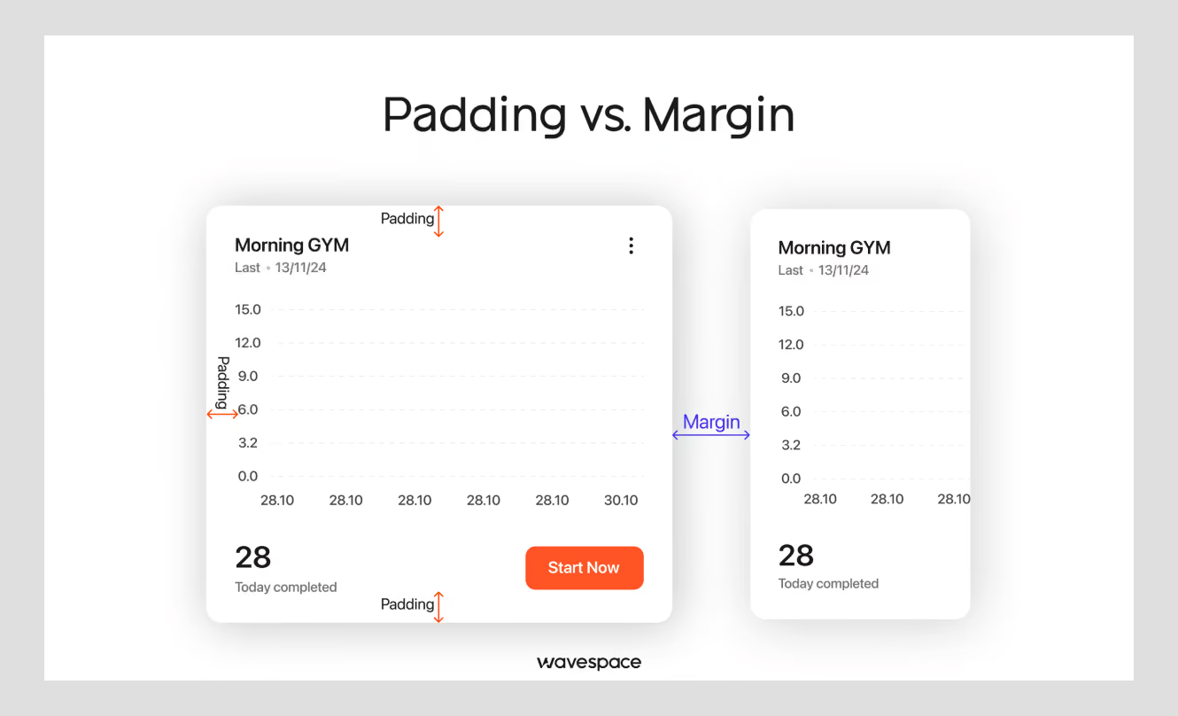
Margin and padding gets mixed up every day, especially people outside of the design work. Simply put, margin is the space outside the design element. Padding is the space inside the design element.
Example:
- A button with padding has more room for a label before the button's edge.
- A button with margin has more room between the button and the next element on the page.
Both use the same 8-point scale. Just applied in opposite directions. Only one place grid should not be considered, typography.
Line height, letter spacing, and other micro-space adjustments for increasing readability. The grid is a tool for consistency, not a rule that deforms what reads naturally.
How to apply negative space across common UI patterns
Spacing theory is not as complex as many people think. It's applying it inside forms and dashboards where most designers find it difficult.
Forms and input fields
Spacing between a label and input fields doesn’t need to be generous. A good design practice is to make the space between label and field tighter and use generous space between two fields.
Tighter space between label and input feels like it ties the label to its respective field. Design mistakes happen when negative space is thought of afterward. Furthermore, using the same spacing can also backfire.
Fields come off as related, and it increases cognitive load; users have to work harder to find where one question ends and the next begins.
Cards, grids, and dashboards
Card grids need to have consistent spacing between cards. Use the systematic scaling (16px or 24px are common defaults) values to make them consistent. The padding inside the card should not be forgotten. Less internal padding will make the content feel pressed against the card's edges.
Dashboards are the hardest case. Because dashboards have dozens of metrics that need to be surfaced without scrolling. In dashboards, negative space works less as "add more of it everywhere" and more as "use it to separate metric groups."
Mobile and responsive spacing
UI design for mobile devices is different from designing web products. Mobile design doesn’t mean shrinking size and spacing to fit the smaller screen. A great way to do that is by prioritizing spacing.
Some spaces need to be smaller, but touch targets need room around them no matter the size of that section on the screen.
The macro spacing between clickable elements sometimes can't be shrunk enough to keep the elements on the same page. In these cases, shrink macro spacing between page sections.

How white space affects user behavior
Spacing isn't just a visual preference. It serves a real purpose, especially for those who need to use accessibility options.
Touch targets and Fitts's law
According to WCAG, the minimum touch target size is 44 by 44 pixels. Google's Material guidelines set it slightly higher, at 48 by 48.
Anything below that makes tapping the right button or touching harder. Especially for users who have limited mobility control.
This perfectly aligns with Fitts's law.
“Distance matters: Longer distances increase movement time because the hand or cursor must travel farther.
Size matters: Smaller targets increase movement time and error rates due to the required aiming accuracy.
Speed-accuracy trade-off: Trying to move too quickly toward a small target results in more mistakes.”
Spacing also affects readability. WCAG's text spacing rule suggests a height of at least 1.5 times the font size and paragraph spacing of at least 2 times the font size. Tighter spacing makes text harder to track for people with low vision or reading disorders.
Most common negative space mistakes?
Pressure to fit more: Stakeholders often put designers under pressure to add more content above the fold, and spacing gets sacrificed to make room. One of our surveys in the design industry found that 84.6% of designers say visual clutter is the top usability problem they face.
Passive space that reads as bug: A gap nobody intended doesn’t come as a deliberate choice. It comes off as broken.
No fixed scale: Not using a shared design system or guessing the distance just with the eyes is a major mistake. Doing this results in a product where nothing lines up and every screen feels wrong.
Too much space: Excessive space between related elements breaks visual hierarchy and breaks the relationship of the contents. Every item of the group becomes unreadable, and it can increase the time to fill a simple form.
How do you audit and test negative space in UI?
Finding issues with negative space is easy, but hard to fix without a process. At Wavespace, our senior designer handles this with our solid process.
Here's a 5-point negative space audit checklist for reviewing spacing in an existing design:
Grid consistency: Check if the design has consistency in space. Ask if the spacing values come from the defined scale, or were some picked by eye?
Grouping and proximity: Can you tell which elements belong together and which are separate?
CTA breathing room: Does the primary action have enough space to make it pop, or is it competing with other elements?
Touch target sizing: Check if the interactive elements are at least 44x44px, with enough margin between them to avoid mis-taps?
Passive space: Check if every gap in the layout is intentional, or are some the result of a responsive breakpoint?
Spacing goes beyond making this look good; you should also take results into consideration. Pick a metric that matters to your business. It can be a CTA, task completion time on a form, or conversion. Change the spacing in your design and run it as an A/B test rather than relying on opinion.
Use Figma's Auto layout and spacing to enforce scaling automatically. This will save you from relying on designers. Nowadays, browser dev tools also make it easy to check the actual displayed spacing on a live page rather than from the design file.

Final thoughts
Negative space in UI design is not about intentionally leaving empty space to make a design less cluttered. It is a functional method that makes users appreciate your product through better content structure, navigation, important elements, and interactions.
It is the art of balancing design elements. Too little space creates clutter and increases cognitive load. On the other hand, too much makes everything feel disconnected + weakens the visual hierarchy.
Ultimately, good negative space should not be based on guessing, personal preference, or how it looks in Figma. Designers should use spacing according to data. Run A/B tests with real users, audit spacing, and follow visual hierarchy according to business goals.
Designers should ensure every gap has a purpose. When every gap has a purpose, negative space stops being “empty” and becomes one of the most powerful tools.
Frequently asked questions

Negative space is the empty space around a design and its outline. Some of the great examples of Negative space are the FedEx logo, which uses negative space between the letters E and X to create an arrow sign. Another one is Rubin's Vase, which uses the space between two human faces to portray a vase.
Positive space in design is the opposite of negative space. In UX design, negative space is the empty space surrounding the design and positive space is the main focus element. Example: If the space between E and X creates an arrow through negative space then E and X are the positive space.
Negative space is good when it is used intentionally in design. Negative space creates an immaculate visual hierarchy that guides users toward conversion. However, too little negative space is bad because it makes the design feel cramped and makes design difficult to read and understand.
The purpose of negative space is to give a design room to breathe. Negative space helps businesses to make their product more appealing to their potential customers. Without negative space everything will become illegible in the design world.
Negative space separates two or more subjects or objects from each other. Negative space is the empty space between two lines in a card design and surrounding the main focus that helps to display a product to users.

More related blog

Design & development in one team. Let’s talk!
















.png)



Francisco, CA 94105, United States





































.avif)