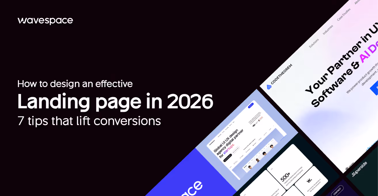
How to design an effective landing page in 2026: 7 tips that lift conversions


Imagine a time when your product is released. Advertisements are on, the announcement email has been sent, and traffic is churning. Then you check the numbers. Visitors arrive, scroll a little, and leave. The page was good in Figma. Nevertheless, it is not converting.
The ugly truth is, the majority of landing pages do not fail due to their appearance. They fail since they produce friction just when a visitor is making a decision whether to trust you or not. With a refined visual design, you can deceive the actual issues until your budget for ads is drained.
In 2026, when the median landing page conversion rate is only 6.6 percent across all industries, startups and SaaS companies cannot afford to spend paid, product launch, or outbound traffic on pages that are just feel-good, but do not convert. The difference between the top-quartile pages (over 11.45% to the rest) is not a design talent gap. It's a decision gap.
This guide covers seven design decisions that close that gap. Not aesthetic trends. Not vague principles. The seven choices concerning clarity, hierarchy, trust, speed, and action that result in a visitor becoming a lead.
What makes a landing page effective in 2026?
Before optimizing, it is good to establish what you are actually optimizing. A good landing page is not the one that has been awarded in design. It aligns with the source of traffic, and the next step is obvious in a few seconds, and it has sufficient trust to generate a visitor to take some action.
The 5-second rule: When the visitor is unable to answer what this is, who is it, and what do I do next in less than five seconds after landing on the page, then it is a clarity problem, not a design problem.
In 2026, conversion quality is a measure of effectiveness, rather than bounce rate or time on page. A right ICP demo booking will be worth a hundred plus bounces of wrongly matched traffic.
The top-converting pages have four common factors:
- Message match: The page is what the ad, email, or search result claimed.
- Single dominant action: It is not a menu of options that compete with each other, but one main CTA.
- Earned trust: Evidence items where a hesitation occurs.
- Speed and stability: The page loads quickly and does not move around as it renders.
All the tips in this guide are related to one of these four properties. If your page is weak on any of them, that's where conversions are leaking.
If you want to know which agencies are best for landing page design, read this blog: 15 Best landing page design agencies in 2026
Tip 1: Lead with a value proposition that passes the 5-second test
Your headline is overworking any other page element. It must provide three answers in one: what is this, who is it to, and why should I care? When it requires knowing wordplay or a rereading to get, you have already lost a portion of your audience.
This is where most startup landing pages break down. Founders are too attached to the product, which makes the headlines abstract (The future of team collaboration) or feature-based (AI-powered project management) rather than result-based and specific.
Here's what that looks like in practice:
The subheadline is your second shot. To refine the promised result, deal with the most glaring objection, or provide a signal of credibility, use it. Better than powerful, flexible, and easy to use is used by 2,000 SaaS teams.
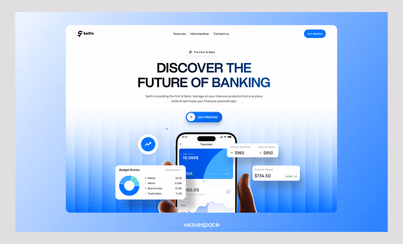
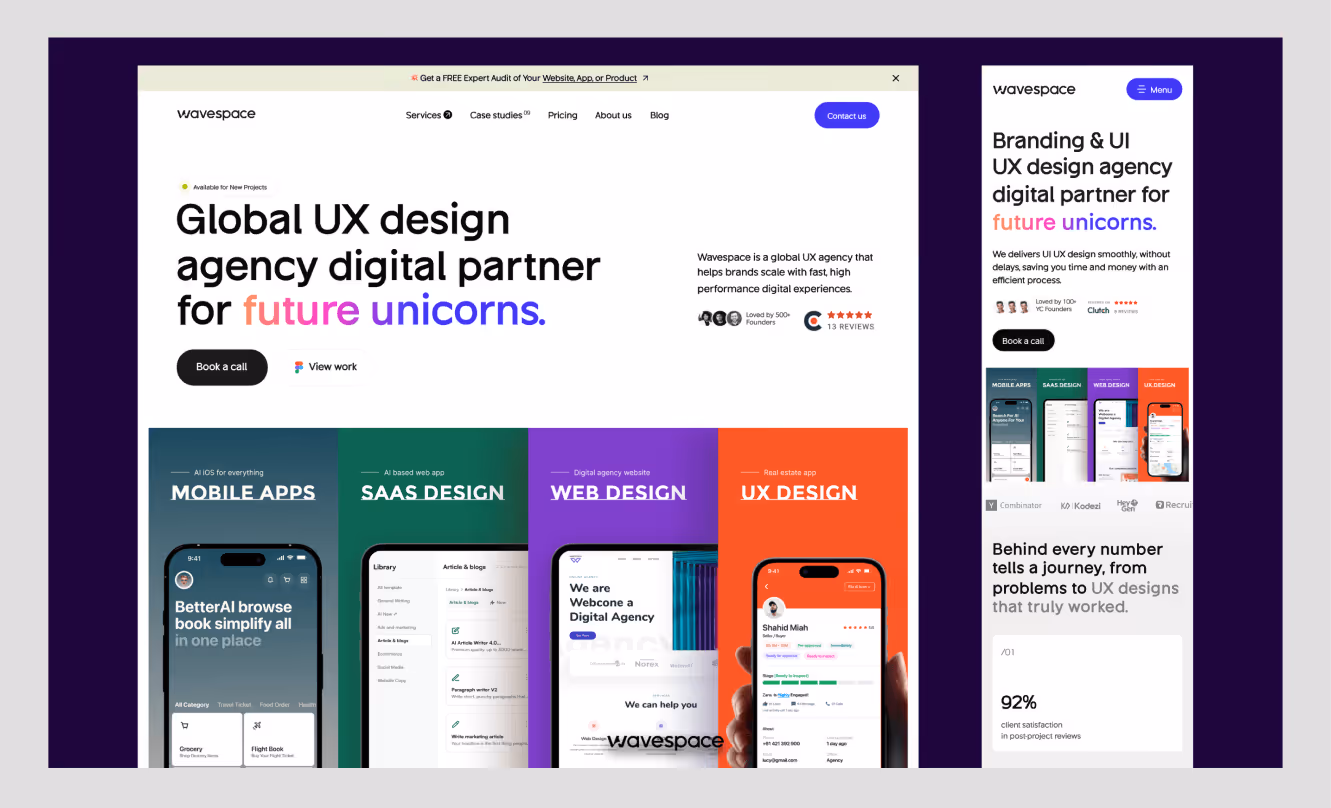
The landing page template of Notion is a helpful reference in this case. The headline is straightforward and result-focused, the navigation is low, and the single CTA takes over the hero without conflicting with the secondary actions.
Quick audit: Read your current headline out loud. If someone who's never heard of your product couldn't describe what it does in one sentence, rewrite it before touching anything else on the page.
Tip 2: Design for ONE dominant action, not multiple competing paths
Every additional option you give a visitor is a small tax on their decision-making. Navigation menus, secondary CTAs, social links, "learn more" buttons scattered across sections: each one pulls attention away from the one thing you actually want them to do.
The data on this is stark. Single CTA pages perform 1.6 times better than pages that contain more than one competing action. With each extra navigation link on a landing page, conversion decreases by approximately 11%. That's not a rounding error. That is what having your top nav on a paid traffic page costs.
What "one dominant action" actually means
It does not mean you have a single button on your page. It implies that all the details on the page lead to one result. Secondary CTAs are possible, but they should not be in competition with the primary action. See how it works, then go back to Book a demo, which is a funnel. Book a demo and View Pricing, read our blog, and follow us on LinkedIn are noise.
Do this:
- Either delete or fold down the top navigation on specific campaign landing pages.
- Make the main CTA button stand out in size, color, and position.
- Repeat the CTA at logical scroll points, but maintain the copy the same.
- Match CTA copy and visitor intent: Get my free audit is better than Submit.
Avoid this:
- CTAs having similar visual weight compete for the same click.
- Exit links send visitors away before they can do anything.
- Hero section with a Start free trial and Book a demo button of equal size.
Tip 3: Build mobile-first hierarchy because that's where most visits happen
When you are working on your landing page on the desktop, and you are making a check on the mobile as an afterthought, then you are designing for the minority. Mobile devices make 83% of all landing page visits now, but most pages are still built desktop-first and squeezed down. The result is layouts that technically "work" on mobile but create just enough friction to kill the conversion.
Mobile-first design isn't just about screen size. It's about rethinking the information hierarchy for a context where users are scrolling fast, attention is short, and tapping a small button is genuinely harder than clicking one.
The most common mobile friction points
- Oversized hero sections that push the CTA below the fold on a 6-inch screen
- Forms with too many fields that feel overwhelming when you're filling them out with your thumbs
- Sticky headers that eat 15% of the viewport, leaving almost no room for the actual content
- Text blocks that don't reflow, requiring horizontal scrolling on smaller devices
- CTA buttons that are too small or too close to other tappable elements
Mobile-first design checklist
- Design the single-column layout first, then adapt for desktop
- Keep the hero headline to two lines maximum on a 375px viewport
- Place the primary CTA above the fold, or within one short scroll
- Use a sticky bottom CTA bar for long-form pages
- Test tap targets: minimum 44x44px for all interactive elements
- Compress and lazy-load images so the page renders fast on 4G connections
- Validate on a real device, not just a browser emulator
Tip 4: Place trust signals where hesitation actually happens
The majority of landing pages use trust signals as decoration: a strip of logos in the top section, a section dedicated to testimonials somewhere in the bottom section, and a section in the bottom dedicated to testimonials. That's the wrong approach. Trust signals are effective because they are inserted at the very point when a visitor is about to make a decision whether to continue or not.
Think about where hesitation happens on your page. It normally comes immediately before the form. Right next to the CTA. Immediately following the pricing announcement. That is when a testimonial in the right place, a client logo, or a particular outcome stat can sway the judgment.
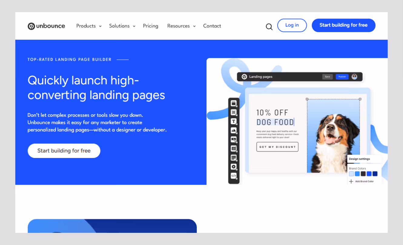
"Visitors must pass the 5-second test, understanding your value proposition immediately, or bounce rates climb,", Unbounce's 2026 Conversion Benchmark Report
What actually moves the needle
For startup pages, there is a temptation to use vague types of social proof (Loved by teams worldwide) since you do not have a long list of clients yet. Resist it. A particular result of an actual customer is better than ten generic five-star quotes. It is more trustworthy than a game-changing product, because the essence of the first topic is to reduce the time spent onboarding by half within the first month.
Proof checklist:
- Concrete figures instead of adjectives (3x faster) beats (significantly faster).
- Known customers or familiar logos to anonymous praise.
- Testimonials based on the outcome rather than on the feature.
Tip 5: Reduce form friction and cognitive load
The form is where intent meets commitment. It is also where most of the landing pages silently forego the conversion they toiled so hard to win. Nameless fields, rough validation, no progress indicator, too many fields, unclear labels, aggressive validation: all this adds a small moment of friction, which multiplies into abandonment.
The difference between a working and a non-working campaign is “The form friction audit.”
Ask these questions about your current form:
- Is every field necessary for the next step? If sales doesn't need company size until after the demo call, don't ask for it on the page.
- Are labels inside the fields? Placeholder text disappears when users start typing, which confuses. Use persistent labels above each field.
- Does the error handling help or blame? "Invalid email" is unhelpful. "Please enter a valid email address like name@company.com" is not.
- Does the button copy state the result? Get my free audit is less ambiguous than Submit.
- Is the form requesting commitment premature? With high-consideration offers such as demos or audits, a two-step form (email first, details second) can often work better than a full form up front.
For SaaS and demo pages specifically, progressive profiling works. Capture name and email first. Qualify further via a confirmation email or a brief onboarding flow. Don't front-load your sales process onto a conversion form.
The cognitive load principle: every field you add is a question the visitor has to answer. Every question is a reason to pause. Pause long enough, and they leave.
Tip 6: Treat page speed as part of the design system
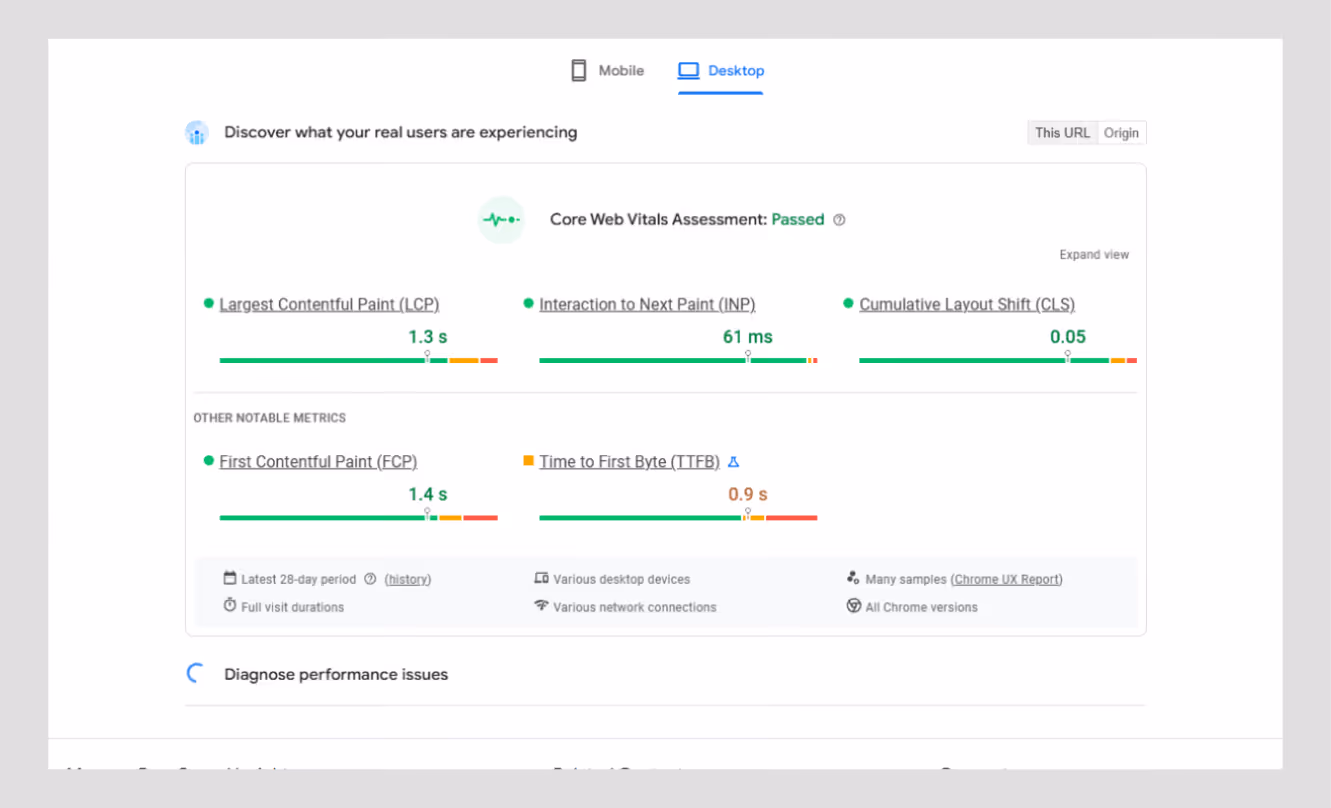
Speed isn't a developer problem. It's a design decision. All the oversized images, background video, and heavy web font are decisions made during the design stage, which manifests itself as a conversion penalty at run time.
This one-second difference in page load time reduces conversions by 7%. Pages that load within less than 2.4 seconds are twice as likely to convert as slower pages. It is even more pronounced on mobile, where connections are not as reliable.
Performance checklist (design-phase decisions)
Test your page with Google PageSpeed Insights before launch. Having a low score does not simply make conversions hurtful right away. It also harms your Quality Score in paid search, increasing your cost per click. Slow pages are not only costly to consumers in many aspects, but they also cost the company in terms of time and money.

Tip 7: Personalize and test after launch
Your first landing page is a hypothesis. The teams that continually perform better than their standards are not the teams that got the design right the first time. They are the ones who consider the page a living system and go through evidence.
Top performing teams complete 2.7 times more A/B tests per quarter compared to the average performers. It is no coincidence. It is no coincidence. It's a compounding advantage.
Where to start testing
You do not have to have a complete experimentation platform to begin with. Prioritize by impact:
- Headline copy - greatest leverage, simplest to test, brightest signal.
- CTA button copy and placement - here, small changes will move the needle at a fast rate.
- Hero image or video vs. static - particularly interesting to test on mobile.
- Form length - test three fields vs. five and measure completion rate
- Traffic source personalization - display various headlines to paid and organic visitors.
When you’re advertising to multiple groups, a single landing page with mediocre copy is a huge waste of conversion opportunities.
The rule: don't redesign the whole page when it underperforms. Identify the one element creating the most friction, change it, measure it, then move to the next. Systematic iteration beats periodic redesigns every time.
Conclusion
The biggest landing page wins are hardly achieved through a complete redesign. They have originated from identifying the specific points of friction that are costing you conversions and repairing them one at a time.
An obvious value proposition. One dominant action. Mobile-first hierarchy. Indications of trust are installed in areas where doubt occurs. A shape that requests less. A webpage that loads quickly. A habit that builds over time and involves testing. These 7 decisions can be used by any team, irrespective of budget or number of heads.
The converted teams of 11%+ are not engaged in something unique. They are doing the basics on a regular basis, quantifying what is important and repeating without arrogance.
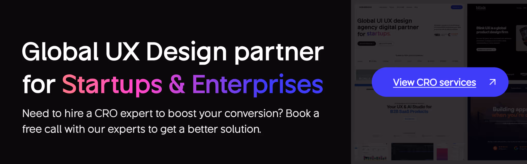
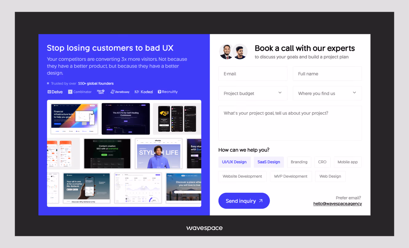
When you are not certain where on your page you are losing conversions, then that is precisely where you need to begin. At Wavespace, we collaborate with startup and SaaS teams to audit landing pages, identify friction points, and redesign with conversion evidence baked into it, rather than being added after the fact.

More related blog
Have a Project? Let’s talk!


.avif)

