What Are Muted Colors? A Guide to Using Them Effectively in Design


TL;DR Low-saturation colors are actually muted colors employed to generate the feeling of balance and calmness with a refined visual experience. They are designed by designers who seek to enhance readability, minimize cognitive load, establish trust, and develop a more human-centered interface in all types of branding, user interface/user experience, web applications, SaaS dashboards, packaging, and marketing imagery. Muted colors, when applied strategically, bring clarity and emotional appeal, elevating a product to feel high quality, trustworthy, and carefully designed.
What Are Muted Colors?
Muted colors refer to colors that are dulled to seem softer, relaxing, and more natural. We mean muted colors in design, which are colors that sound like they are easy to look at and not the colors that scream at you.
We, as designers at Wavespace, have observed a trend throughout the years. When a founder approaches us with the problem of user engagement or high bounce rates, we often consider the visual tension that the color palette of the founder generates first. Light colors may be easily overloaded, particularly in SaaS dashboards, AI applications, and mobile apps, where individuals have spent hours and hours in long sessions.
The dulled colors resolve that tension. They bring clarity. They support minimalism. They did not allow graphics and content to interfere with each other.
The use of muted colors is not boring, but rather purposeful. They are mature, trusting, and emotionally stable. Muted color palettes allow users to feel focused in a world where attention spans are becoming shorter. And to the founders who attempt to convey sophistication and reliability, this visual tone can be one of the most effective instruments in contemporary design.
Difference Between Muted and Vibrant Colors
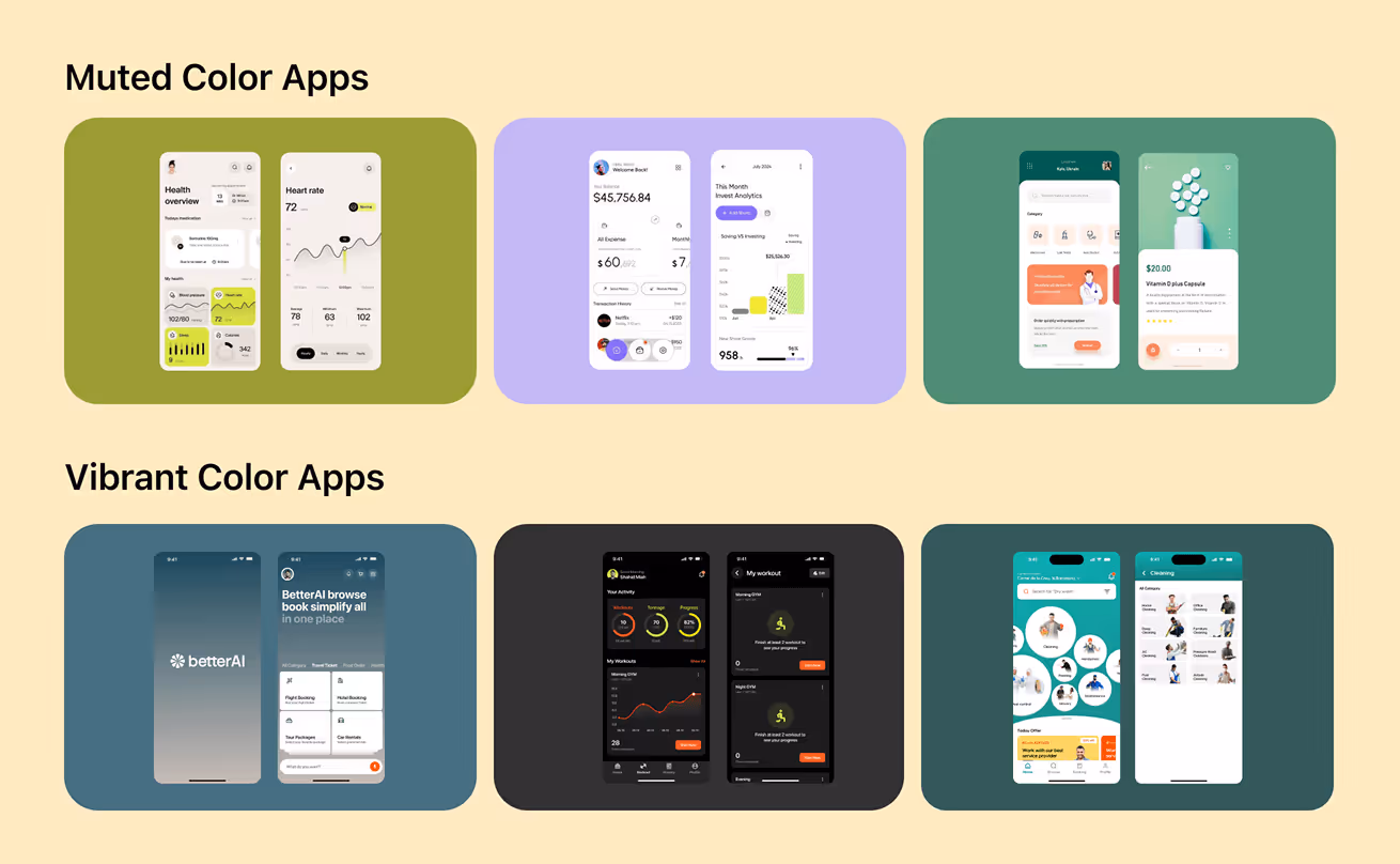
The perception of muted colors starts with the perception of what they are not. Bright colors are rich, highly saturated colors that cannot be ignored. Consider neon green, bright red, or electric blue. They are strong, but at the same time loud, and not all brands would like to be loud. Muted colors, on the contrary, are given the role of the quiet friend in the crowded room. They do not have to shout their presence. However, what is even more important is that they make designers create hierarchy without overloading the user.
Vibrant colors tend to be the most appropriate in terms of micro-interactions, CTAs, or component highlighting in the context of UI/UX. When all things are alive, there is nothing remarkable. This is where low-key sounds play a critical role. They create balance.
This contrast has been observed in numerous of our redesign projects. Startups with over-saturated palettes are immediately discredited since their interface looks too messy or too playful. Once putting on muted base layers and saving the strong colors as accents, the product will feel more on purpose, higher quality. It is the power of understanding the difference.
Vibrant Colors:
• High saturation
• Attention-grabbing
• Perfect for CTAs, buttons, highlights
• Can feel playful, energetic, or overwhelming
• Easy to misuse in data-heavy or long-session interfaces
Muted Colors:
• Low saturation
• Calming and balanced
• Ideal for backgrounds and large UI foundations
• Help create hierarchy and reduce cognitive load
• Feel modern, premium, and trustworthy
When to Use Each:
• Use vibrant colors for: CTAs, alerts, icons, active states
• Use muted colors for: backgrounds, layouts, cards, sections, illustrations, dashboards
Why It Matters:
• Muted = clarity, trust, comfort
• Vibrant = attention, action, energy
• Together = balanced, intentional, premium design
How Are Muted Colors Created?
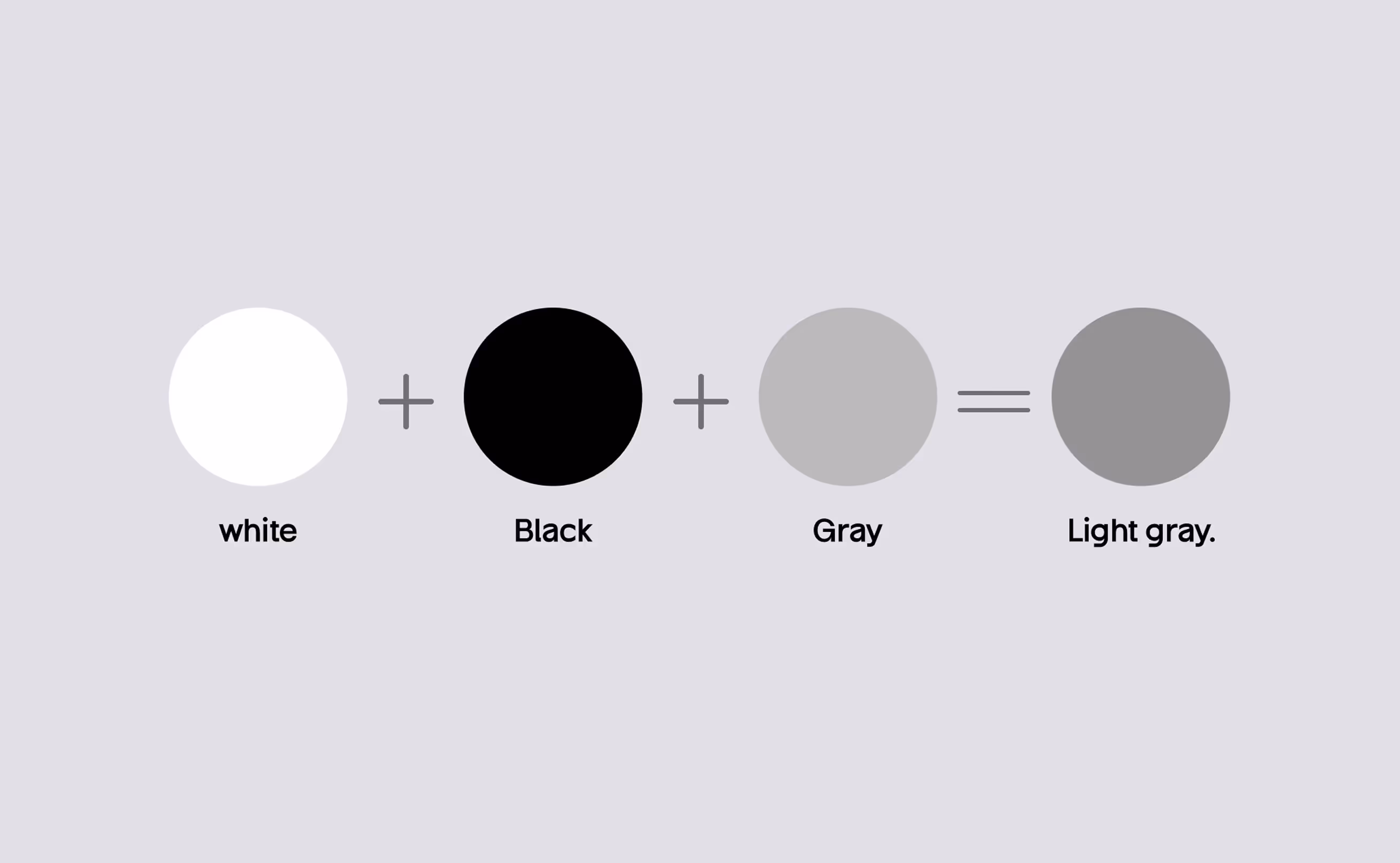
Saturation is lowered to create muted colors. This is simply done in four ways:
- Adding white – softens the shade (pastel effect).
- Adding black – deepens the tone, making rich, muted hues.
- Adding gray – neutralizes vibrancy without changing brightness.
- Mixing complementary colors – creates earthy, organic, muted tones.
The majority of designers prefer to combine these techniques based on the emotional direction that a brand may desire. We commonly use a color desaturator at Wavespace to bring about harmony of palette between UI elements, background, empty states, and illustrations. Muted colors are matched with simple designs, the use of modern typography, and light shadows.
We suggest a 20-60% saturation reduction of muted palettes when developing systems in building designs. This scale preserves personality and removes visual severity. The result is a palette that feels premium, balanced, and ready for professional digital environments.
Psychological Impact of Muted Colors
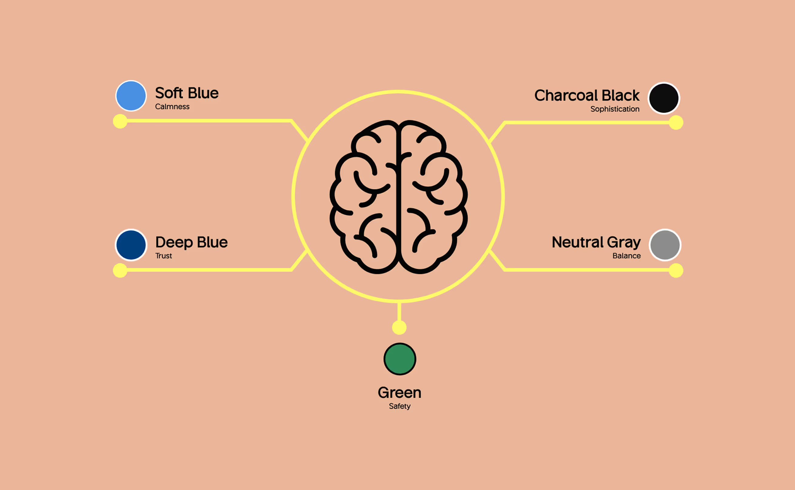
Muted colors have an impact on users' feelings, and the feeling influences behavior. When designing startups and enterprises, we pay a lot of attention to emotional appeal since, in most cases, users do not remember the specifics of UI, but we always keep in mind how a product made them feel. Muted colors are psychologically associated with:
• Calmness
• Trust
• Safety
• Clarity
• Balance
• Sophistication
Since muted colors decrease visual tension, they enhance attention. In high-information environments, SaaS dashboards, AI tools, and e-commerce analytics, this clarity is priceless. Users commit fewer errors, get less tired, and become more involved.
Muted colors give maturity and confidence towards branding. They provide founders with a voice that is stable, empathetic, and long-term. Naturally, users will have faith in brands that do not scream.
This is the kind of emotional stability that contemporary brands, whether fintech or wellness, are employing muted palettes to create credibility. A good design is not just the appearance, but it is something that you feel, and soothing colors define that experience wonderfully.
Why Designers Love Muted Colors
Benefits for Branding
Mute palette is one of the most powerful strategic decisions when founders address us with the rebranding issue. Why? Due to the presence of muted tones being purposeful. Their restraint, maturity, and grounded clarity are displayed. A quiet brand is easier to remember in a market full of noisy brands that are competing for attention.
The presence of muted colors is an indication of confidence. They explain to the users that they do not have to be flashy to show their worth. This tone is easier to gain trust, particularly in cases of SaaS, AI, health, wellness, fintech, sustainability, and education brands. These industries are dependent on calmness and sanity. Pastel colors are also timeless. Popular colors get old, whereas dull colors remain fashionable over time. Longevity is important to founders who develop long-term brands.
Muted colors are popular among designers as they simplify everything: typography is cleaner, spacing is balanced, illustrations are high-end, and photography combines well with brand identity. The use of muted colors creates a narrative of the brand that expands with it rather than opposing it.
Short keypoints:
• Timeless identity
• Remium perception
• Stronger trust
• Visual balance
• Memorable brand voice
Benefits for UX & Accessibility
Muted colors not only look better in designs, but they also make it easier to use. Cognitive overload reduction is one of the largest UX issues. Users become lost when all the elements are competing with each other. This is corrected by muted colors, which make the visual base soft. The palettes are also muted and therefore enhance access when applied appropriately.
They reduce glare, help users scan content faster, and support visual hierarchy. Combined with high contrast text and accent colors, low-profile backgrounds are the ideal canvas for a frictionless experience.
In our own projects, AI dashboards, healthcare apps, and financial platforms, we’ve seen muted foundations reduce user errors, increase task completion rates, and improve overall usability scores. When muted and vibrant interfaces were used by UX researchers, the former provided more comfort and satisfaction ratings.
Muted colors aren’t just aesthetics; they’re usability tools. They make their products more relaxed, clear, and human.
Key takeaway:
• Reduces visual noise
• Improves readability
• Enhances hierarchy
• Supports accessibility
• Lowers cognitive load

How to Use Muted Colors Effectively
Branding & Identity

In creating a brand identity, neutral colors can assist the founders in conveying depth, sincerity, and credibility. They are best suited to brands that desire to express emotional intelligence rather than hype. Muted palette is a frequent tool in the design of SaaS, AI tools, fintech solutions, wellness brands, and B2B companies desiring a professional but warm appearance at Wavespace.
The use of muted colors renders logos more sophisticated and enables brands to change over time. They are also perfectly matched with the modern typography, Serif typeface that is delicate, Sans-serif, which is minimalistic, and Variable fonts that are adaptable to digital applications. As the low-key tones are the base, strategic use of color accents as CTAs and micro-interactions can be boosted.
A well-designed muted branding system communicates:
• Professionalism
• Calm confidence
• Sophistication
• Emotional stability
• Long-term vision
Muted brands don’t chase trends; they build a foundation.
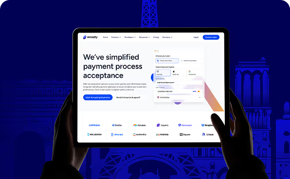
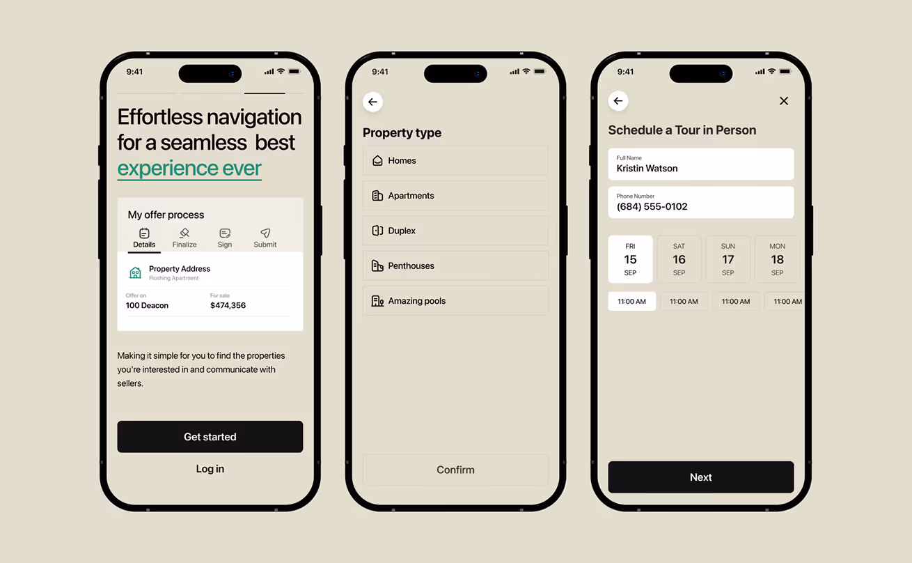
UI/UX Design (Web, App, Dashboard)
.avif)
Dull colors are the brightest in UI/UX. They provide a clear layer of visual information that does not overload the user with content, structure, and interaction. In applications with cognitive load, such as dashboards or AI, muted palettes are required to provide the user with comfort.
We have neutral backgrounds, muted blue, warm grays, and soft purples that are used as background layers by our team since they allow users to focus on data points, charts, and action items. The interface is functional and modern when combined with the bold color of accents on CTAs.
Muted palettes play well in:
• SaaS dashboards
• AI workflow apps
• Health platforms
• Finance and analytics tools
• Mobile apps with long usage sessions
It is not meant to eliminate personality but to focus attention. Muted UI is high quality, predictable, and psychologically secure.

Typography & Contrast
The use of muted colors is important in typography. They help text stand out without relying on harsh contrast. A muted background combined with rich typography improves readability, especially for long-form content or detailed dashboards.
White space, text hierarchy, and color are some of the elements that designers find difficult to balance. Muted palettes give the typography the perfect working atmosphere. Fonts are more classy, readable, and deliberate when the backgrounds are serene.
We recommend:
• Using deep charcoal instead of pure black
• Using warm muted grays instead of flat white
• Pairing muted backgrounds with strong semantic accents
• Ensuring WCAG AA or AAA contrast levels
Muted palettes make typography feel like part of the story, not an afterthought.
Product, Packaging & Print
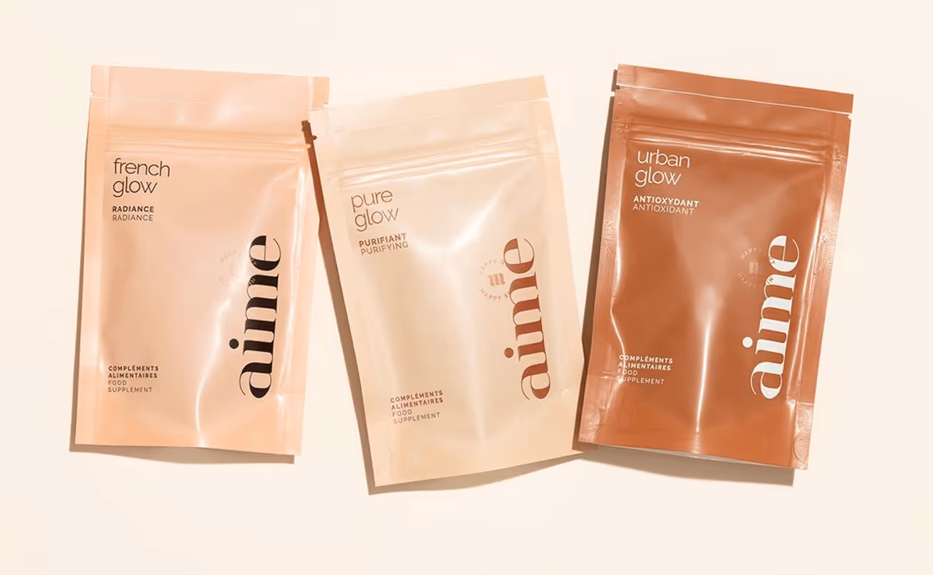
The print and packaging world is being dominated by muted colors, which create the sense of a premium. The brands such as Aesop, Apple, and Everlane employ natural colors to express quality and genuineness. In the case of package design, muted tones contribute to the products being visible in a crowded shopping space by providing a more advanced visual perspective. They are also good at photography and thus are ideal for e-commerce.
Muted colors provide a tactile feeling to printed cards such as brochures, business cards, posters, and editorial layouts. They are artistic, luxurious, and unforgettable. And since the muted tones harmonize with metallic foils, embossing, textured papers, and less-than-minimal layouts, they have become a popular choice amongst the modern product designers.
Muted Color Palettes & Inspiration
Popular Muted Color Examples
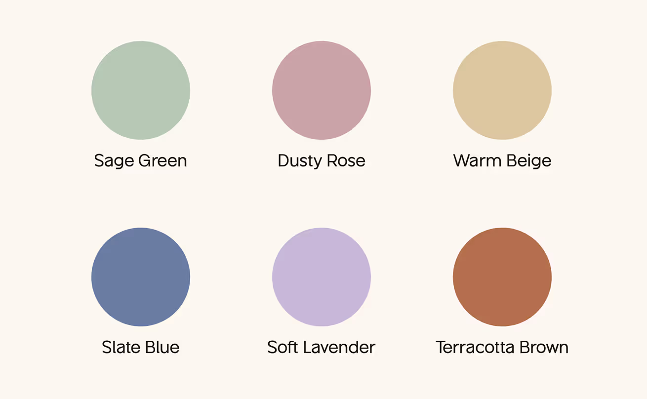
Sometimes the muted colors are inspired by nature, earth, stone, sand, fog, clay, ocean, and forest colors. They are natural and classical. Examples include:
• Muted sage green
• Dusty rose
• Warm beige
• Slate blue
• Soft lavender
• Terracotta brown
• Misty gray
These are soothing, common, and emotionally rooted tones. They are both digital and print-friendly.
These shades are so popular with designers as they are versatile. They may be minimal, luxurious, modern, or soft according to the context. And when combined with a solid and single color, it will form a harmonious and attractive look.
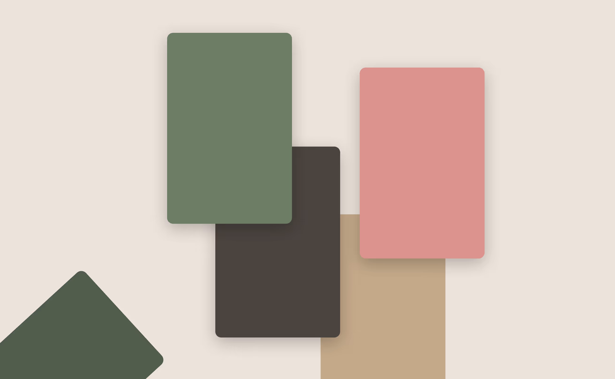
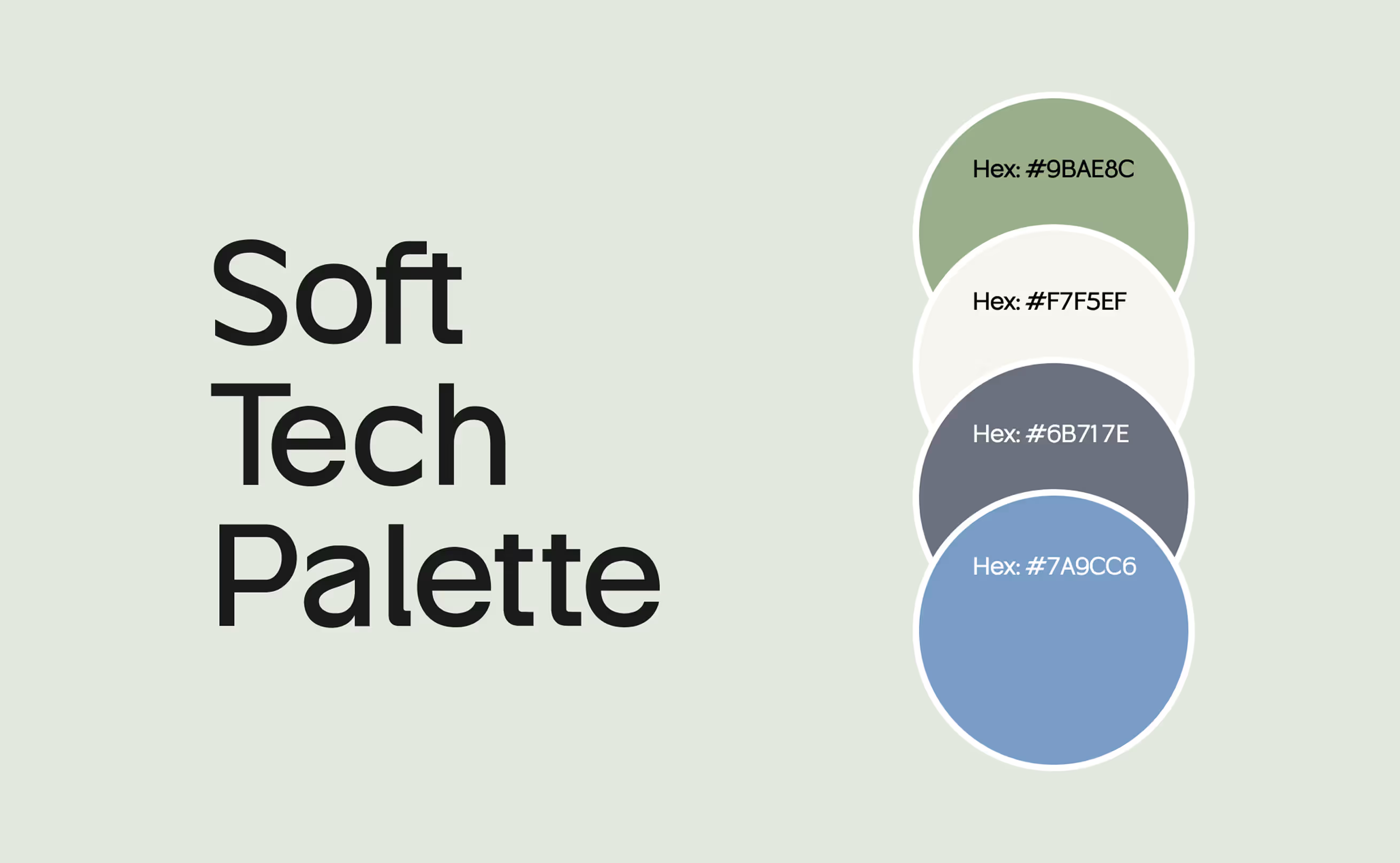
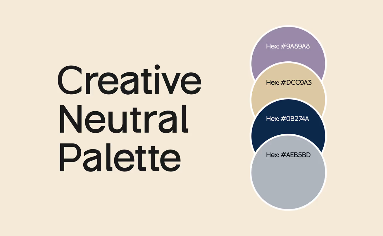
Modern Muted Color Palettes for Designers
The following are the combinations of modern palettes currently commonly used in UI/UX:
1. Soft Tech Palette
2. Minimal Premium Palette
.avif)
3. Creative Neutral Palette
4. Wellness & Calm Palette

5. AI Product Palette

These palettes are well saturated to bring emotional composure without visual distortion.
Practical Applications of Muted Colors
Websites & Landing Pages

A dull palette of colors creates a sense of cleanliness and conversion on websites. They assist founders in communicating reliability and professionalism immediately. A dull hero section establishes a peaceful atmosphere, whereas a bright accent CTA is expected to capture attention.
Successful landing pages usually have subdued colors on backgrounds, section separators, iconography, and drawings. They lower the friction and help the users concentrate on the message.
Muted palettes also perform excellently in many industries, including SaaS, artificial intelligence, financial technology, residential, and education, as they generate emotional credibility. We have observed dull landing pages perform as many as 40 times better than vivid and bright ones.

Web Apps & SaaS Dashboards

Soft colors play a crucial role in the designs of dashboards. Visual fatigue is a significant problem when users spend a long time analysing data. Muted colors provide relief.
Colorful data points are more visible in dashboards that have muted backgrounds. Their use also enables users to distinguish between overlays, tooltips, charts, and tables easily.
We use muted colors extensively in:
• Analytics dashboards
• AI workflow systems
• CRM tools
• E-commerce operations panels
• Fintech reporting platforms
The complex information is simplified with muted colors. And simplicity earns the trust of the user.

Mobile App UI
The mobile apps require visual comfort due to constant interaction. The dull colors allow the users to move without affecting their brains.
Muted tones create:
• Clearer navigation
• Easier reachable touch points.
• Better hierarchy
• Calm onboarding
• Cleaner UI patterns
We’ve used muted palettes for mental health apps, wellness apps, AI assistants, productivity tools, and learning platforms. Muted UI feels safe. Safe UI improves retention.

Social Media & Marketing Creatives

Muted tones have become a branding trend because they stand out on social feeds crowded with bright visuals. They feel premium, artistic, and more design-forward.
Brands use muted colors in:
• Ads
• Instagram carousels
• LinkedIn visuals
• Brand storytelling posts
• Email marketing templates
Muted tones create a level of seriousness and sophistication that founders appreciate for their brand-building.
Big Brands Using Muted Colors
Apple

Apple is fond of neutral gray, gentle metals, and low-profile colors in product images, wrappings, and backgrounds of user interfaces. These colours are more focused on clarity and make the product stand central.
Airbnb
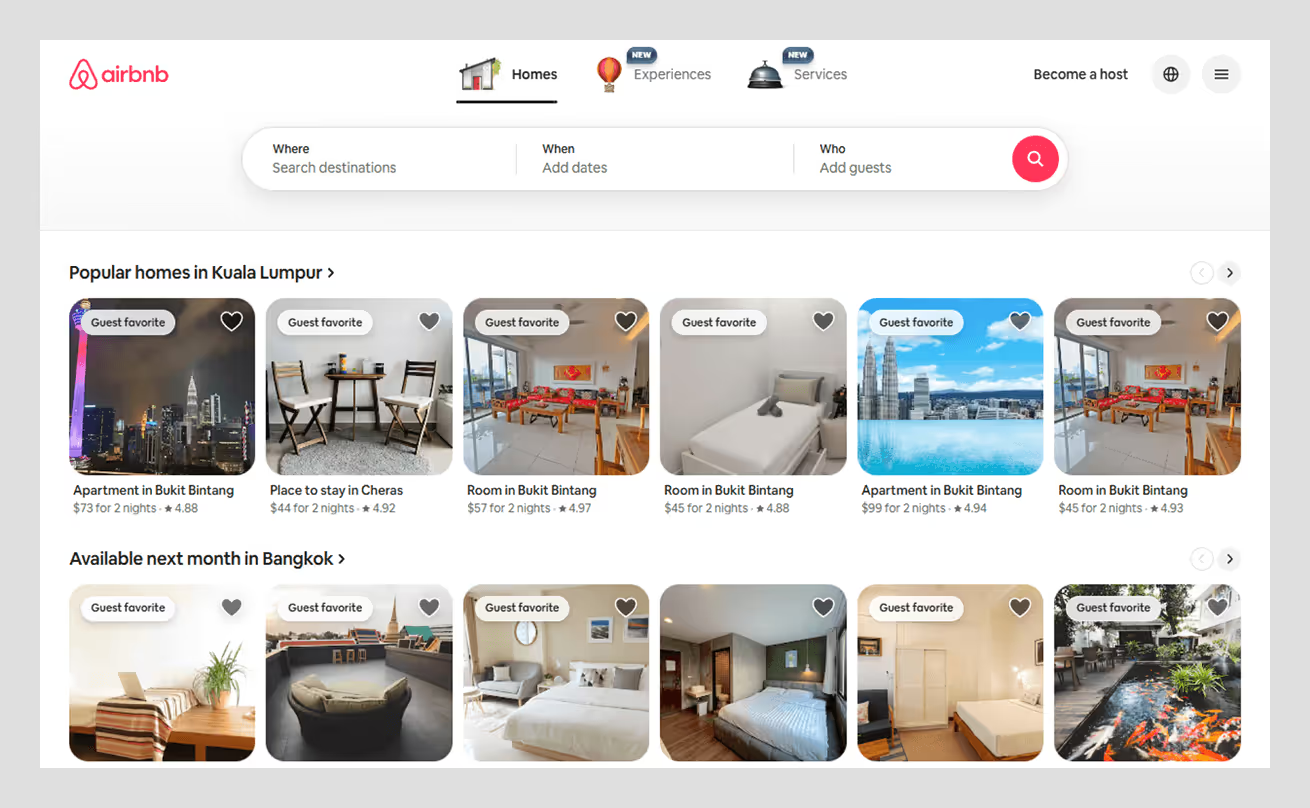
Airbnb has a calm colour palette, warm palette and soft illustrations to introduce a comfortable human-focused visual world. This color scheme creates emotional security, one of the main components of a traveling experience.
Notion
.avif)
The warm off-whites, blacks, and neutrals in Notion make it a sophisticated productivity system. Their color system shows that having a relaxed visual can make people think more.
Enhancing User Experience with Muted Palettes
Muted colors can influence user experience, which is the actual strength of muted colors. Subdued color schemes, intelligent visuals enable users to process information, reduce cognitive load, and help them stick to digital product use in the long term.
Muted colors work beautifully with:
• Whitespace-driven layouts
• Minimal iconography
• Modern typography
• Soft shadow systems
• Micro-interaction accents
Properly implemented muted palettes bring the UX to a higher level because of the emotional calmness they produce. And when users feel relaxed, they commit fewer errors, discover more features, and have more faith in the product. Muted palettes do not take away the personality; they perfect it.
Are Muted Colors the Future of UI/UX?
Absolutely. As AI products, SaaS platforms, and digital experiences become more complex, users crave clarity and emotional comfort. Muted colors are the ideal base of clean, considerate, and humanistic online design.
We think that dull colors are not a trend in Wavespace. They are an expression of the idea of intentionality, design that does not overwhelm users but takes them into account. Soft colors provide interfaces that are reliable. They assist brands in sounding assured. And they make products to feel high-end and emotionally connected. The subtle colors are the silent winner of the contemporary design.

FAQs about muted colors
Muted colors are desaturated, soft tones that feel calm and balanced. They improve readability and user comfort.
Because they reduce visual noise, improve clarity, and support long-term usability.
Not better, just different. Muted colors work as foundational layers. Vibrant colors should be used as accents.
Reduce saturation, add gray, mix complementary colors, or soften with white or black.
SaaS, AI, fintech, health, education, wellness, and productivity tools.
Yes. They evoke calmness, security, trust, and focus.
Muted colors are low-saturation and soft, while saturated colors are intense, bright, and visually loud.
Pastels are soft but bright, while muted colors are soft and toned down with gray or low saturation.
Yes. Muted colors exist in both warm and cool tones depending on their base hue and desaturation level.
They’re ideal for brands that want a premium, calm, trustworthy presence without overwhelming users.

More related blog


Have a Project? Let’s talk!


.png)


.avif)

