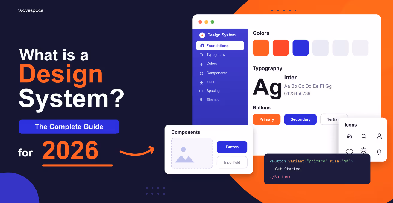
Design system 101(2026 guide): What is a design system?


Have you experienced that smooth experience between Gmail and Google Docs? Everything just clicks. Buttons work the same. Colors make sense. Nothing feels off.
That's a design system at work.
Now imagine the contrary, a site where each page seems to have been created by a different person. Three shades of blue. Buttons all around in any style. Inconsistent spacing. It's chaos.
And you are here because you have probably bumped into that wall. Perhaps you have several types of buttons. Perhaps, your devs continue to ask, " What component do I use? and nobody knows. Perhaps your designer is simply stuck with the same shape this fifth time this month.
The fact is as follows: a design system is not a pretty library of components. It is not a 50UI pack at Creative Market. It is a lot more than that, and knowing what it is will save you months of headaches.
You know what design systems are and when you may need one (probably not yet), and how to create one without over-engineering it.
What exactly is a design system?
A design system is a comprehensive ecosystem of reusable components, design standards, guidelines, and documentation that enables teams to build consistent, scalable digital products efficiently. It is your only truth that connects design and development.
In plain English? It is the DNA of the UI of your product, everything about your color palette, the behavior of your buttons, and when developers should use Component A or Component B.
The key difference: design system vs UI kit
This is where people get confused:
- A UI Kit = A UI Kit is a collection of prepared visual elements, such as buttons, icons, and forms. Design-only. Not a code.
- A Design System = The UI kit, production code, usage rules, design principles, documentation, governance, and how everything works together create a design system.
To put it plainly, if a UI kit is made up of LEGO bricks, then a design system consists of the bricks, instruction manuals, building principles, quality standards, and governance over their consistent use.
Components of a design system
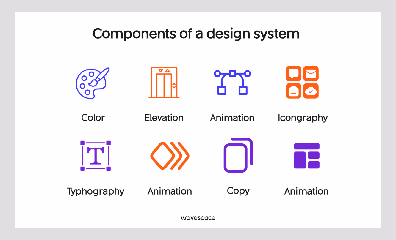
A robust design system consists of several interconnected layers:
1. Foundation layer: design tokens
Design tokens are the basic elements or components of your design language. In the words of the W3C Design Tokens Community Group, through `design tokens` we can express design decisions in a shared, platform-independent way between disciplines, tools, and technologies.
Some examples are:
Typical design tokens may include:
- Color palettes: primary, secondary, semantic (success, error, warning)
- Typography: font families, sizes, weights, line heights
- Spacing scale: consistent units of spacing (4px, 8px, 16px, etc.)
- Border radius: rounding corners
- Shadows and elevation: shadow values for depth
- Motion: animation durations and easing
Design tokens are usually stored as variables that can be updated globally, so that when one token changes, it changes throughout the entire system. Some companies build their own internal tools to manage tokens, while others use existing tools, such as Amazon's Style Dictionary. You define styles once and use them anywhere with the tool.
2. Component library
The components section of your design system refers to reusable UI elements that can be utilized in any layout or design.
The essential elements of UI components comprise basic and navigation as well as display, feedback, and form, commonly referred to as buttons, inputs, headers, tables, alerts, and modals.
Every element has various states (default, hover, active, disabled, loader) and variants (size, color, style).
3. Patterns and templates
Components are used as basic building blocks, whereas the pattern shows how to put these to use for a common problem solution.
- Authentication flows: Login, sign up, and password recovery.
- E-commerce Patterns: Product Listings, Shopping Cart, Checkout.
- Dashboard layouts: Admin panels and analytics views.
- Onboarding sequences: Welcome flows, tutorials
- Search and filtering: Search bars, filter panels, sort options
4. Design principles
The philosophical basis upon which all design decisions are made.
Examples:
- Google Material Design: Material metaphor, bold intentional design, motion provides meaning
- Apple HIG: Clarity, deference, depth.
- Atlassian: Daring, hopeful, realistic.
5. Documentation
Comprehensive guides that explain:
- When and how to use each component
- Code examples and implementation guidelines
- Accessibility requirements (WCAG 2.1 compliance)
- Do's and don'ts with visual examples
- Guidelines on how to contribute to the expansion of the system.
6. Governance structure
System maintenance rules and procedures:
- Who can contribute and how.
- Approval workflows for new components
- Versioning and deprecation policies
- Communication channels for updates
A Brief history of design systems
Design systems are not a recent development; they have developed with digital design itself.
1970s-1980s: The early days
The roots of design systems trace back to print and brand identity work. Corporations such as NASA had developed large graphic standards manuals that defined early principles of systematic design. The 1975 NASA Graphics Standards Manual is regarded as one of the earliest overall design systems.
1990s: Web standards emerge
With the development of the web, the necessity of uniformity was felt. Early web style guides focused on HTML standards and basic visual consistency. One of the earliest sources of web design consistency was The Yale Web Style Guide, which was first published in 1997.
2000s: Component libraries
The idea of reusable UI components became popular with the use of such frameworks as Bootstrap (2011) and Foundation. These were not complete design systems but provided a good foundation. Bootstrap, created by Twitter developers Mark Otto and Jacob Thornton, revolutionized how designers and developers approached UI consistency.
2010s: The design system era
Large technology firms started spending big on design systems:
- 2014: Google launches Material Design
- 2015: Salesforce releases Lightning Design System
- 2016: Airbnb releases its Design Language System
- 2017: IBM launches Carbon Design System
- 2018: Design systems become mainstream across industries
A 2019 survey by Figma found that more than 60% of companies had some kind of design system.
2020s: Maturity and evolution
The new design systems include:
- Design tokens for cross-platform consistency
- Automated design-to-code workflows
- AI-powered component generation
- Advanced accessibility features
- Dark mode and theming capabilities
Why use a design system?
Design systems have become relied upon in modern product development. Here's why:
1. Consistency at scale
Ensure a coherent experience on the web, mobile, desktop, and new platforms. You cannot afford to make users learn your interface on other devices.
2. Faster development cycles
According to InVision's 2020 Product Design Hiring Report, teams can build features 40-50% faster by leveraging pre-built, tested components instead of starting from scratch each time.
3. Improved collaboration
Design systems create a shared language between the designers, developers, product managers, and other stakeholders. Everyone talks about the same aspects, and there is no confusion.
4. Reduced design debt
Lack of system will cause the existence of inconsistency, such as different styles of buttons, clash of color values, and redundancy of elements. Design systems prevent this technical debt.
5. Better accessibility
Once the accessibility is incorporated into system components, all products on the system will automatically obtain those standards. According to the WebAIM Million report, there are 35 fewer accessibility errors in sites that have design systems.
6. Easier onboarding
A lot of documentation and patterns can assist in getting new team members up to speed.
7. Brand consistency
Make sure that you use the same brand identity in all customer touchpoints.
8. Cost efficiency
Although it has an initial investment, design systems can save lots of time and money in the long-term due to reusability and efficiency. According to Nielsen Norman Group studies, ROI is usually realized in 6-12 months.
The reason behind the use of a design system
The reason behind the use of a design system
Signs you need a design system:
- Multiple products or platforms: supporting web, iOS, Android, and other platforms that lack consistent experiences.
- Growing design/dev team: More than 5-10 people working on product design and development
- Scaling pains: Problems in keeping consistency with growth.
- Repetitive work: The teams are always reassembling similar parts.
- Irrational UI: Dissimilar designs, colors, or designs among your products.
- Slow handoffs: Wasting of time during design-to-development transitions.
- Accessibility issues: Problems with accessibility standards.
- Brand inconsistency: Visual and interaction differences between touchpoints exist.
When you may not need one, but:
- Very small team (1-3 persons) on a product.
- MVP or prototype phase with the fast-changing requirements.
- Lack of resources to invest and maintain.
- Simple product and minimal complexity UI.
Pro tip: Basic component libraries and style guides are helpful even in small teams. You do not need a more elaborate system, but laying the groundwork at first will save trouble hereafter.
Difficulties in adopting a design system
Although benefits are considerable, the implementation is accompanied by actual challenges:
1. Initial investment
Designing a full design system needs a lot of initial time and resources. Sparkbox Design System Survey estimates that initial development will take 3-6 months with a dedicated team.
2. Adoption resistance
The teams might be reluctant to adopt the system when:
- It feels restrictive or limiting
- They are content with the current workflows.
- Poor documentation or partial documentation.
- Components fail to satisfy their needs.
Solution: Engage the stakeholders early, show tangible value, and make the system user-friendly.
3. Maintenance burden
- Design systems need to be maintained:
- Making updates to accommodate new needs.
- Deprecating old patterns
- Keeping documentation current
- Breaking change and version management.
Solution: Establish a dedicated team or rotating ownership model with clear governance.
4. Over-engineering
Teams frequently attempt to do all the possible use cases initially, which makes the system too complex to operate and maintain.
Solution: Record the reasons and occasions to violate the rules. Construct according to real requirements and not the imaginary ones.
5. Balancing flexibility and consistency
Systems must be structured and creative to meet unique use cases.
Solution: Document when and how to break the rules. Provide escape hatches for edge cases.
6. Cross-team coordination
It may be difficult to get buy-in between two or more teams that have varying priorities.
Solution: Establish a cross-functional working team consisting of design, engineering, and product representatives.
7. Keeping pace with design trends
Design systems may be old-fashioned with the change in design trends.
Solution: Develop flexibility into your system. Schedule regular reviews and updates.
8. Measuring success
It may be challenging to show the ROI of design systems without explicit measures.
Solution: Track adoption rates, time-to-ship, consistency scores, and team satisfaction.
Pros and cons of using design systems
We can examine the pros and cons and be honest:
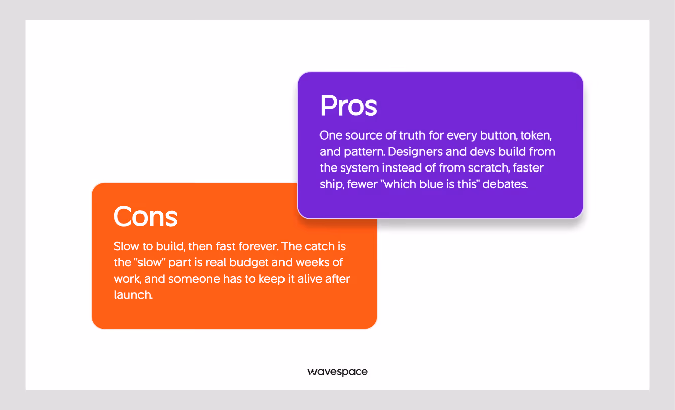
Pros:
- Accelerated Development: Reduce development time by 30-50% by reusing tested components instead of building from scratch.
- Enhanced Consistency: Customers will have a consistent interface no matter who on the team has developed what feature.
- Improved Quality: Components are built and tested, allowing fewer bugs and increased accessibility.
- Scalability: Grow your product and team with ease, and not quality or consistency.
- Better Collaboration: Shared language and components align design, development, and product teams.
- Simplified Maintenance: Modify a part in one place, and it spreads out everywhere it has been used.
- Reduced Decision Fatigue: Designers and developers have less time to contemplate trivial decisions, such as the type of button.
- Accessible by Default: Design accessibility into parts instead of adding it back in.
- Easier Onboarding: New team members can reference comprehensive documentation and get productive faster.
Cons:
- High Initial Investment: It needs a lot of time, money, and resources to set up (3-6 months to start up).
- Constant Maintenance: Design systems do not fit in the set-it-and-forget-it category; they need to be updated and governed continuously.
- Potential Rigidity: Overly strict systems can stifle creativity and make unique solutions difficult.
- Learning Curve: Teams need time to learn the system, tools, and processes.
- Risk of Over-Engineering: It is not difficult to construct complex systems that address hypothetical, but not real, problems.
- Adoption Challenges: Change management is always needed to get the teams to actually use the system on a regular basis.
- Version Management Complexity: Managing updates, deprecations, and breaking changes across multiple products is complex.
- Not Suitable for All Projects: Small teams or early-stage startups may not benefit from the overhead.
Examples of design systems
The most referenced design systems are Google Material Design, Apple Human Interface Guidelines, IBM Carbon, Atlassian, Salesforce Lightning, Shopify Polaris, Microsoft Fluent, Airbnb DLS, Uber Base, and Mailchimp.
Most of them are open source and publicly documented, so they are the quickest means of finding out what a mature system looks like.
1. Google Material Design
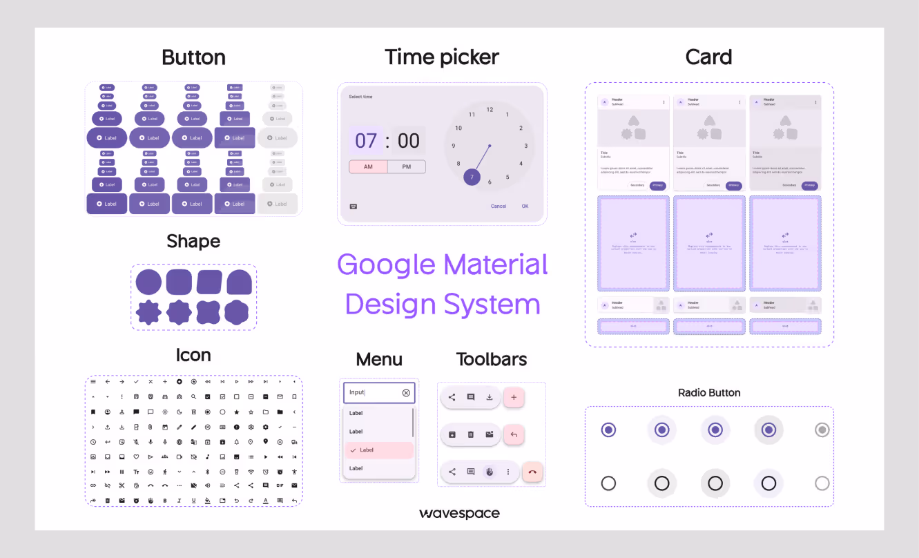
Google's design language for Android, web, and cross-platform products. Deep component library, motion and interaction guidelines, and an official Figma kit. Open-source.
Best for: Android apps, rich interactions, cross-platform consistency.
Site: material.io
2. Apple Human Interface Guidelines (HIG)
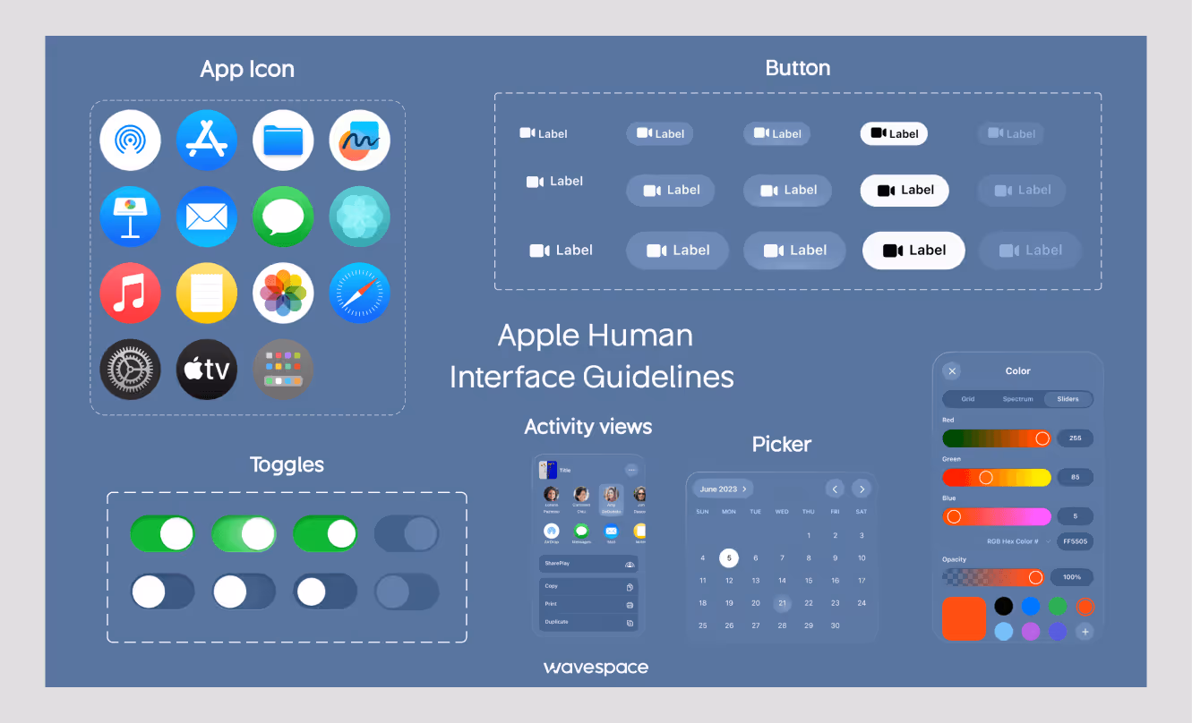
Clarity, deference and depth are the core principles of Apple's guidelines for iOS, iPadOS, macOS, watchOS and tvOS. Strong on typography, iconography, and accessibility.
Best for: iOS and Mac apps, premium product experiences.
Site: developer.apple.com/design
3. IBM Carbon
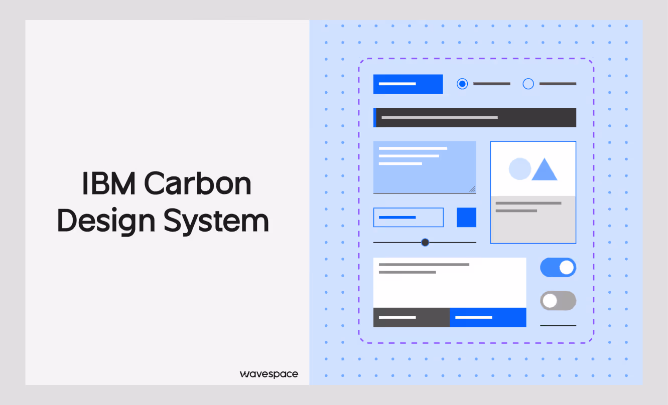
Open-source enterprise products with strong data-visualization patterns and components for React, Angular, Vue, and vanilla JS. Documentation is one of the highest in the industry.
Best for: Enterprise and data-driven B2B websites.
Site: carbondesignsystem.com
4. Atlassian Design System
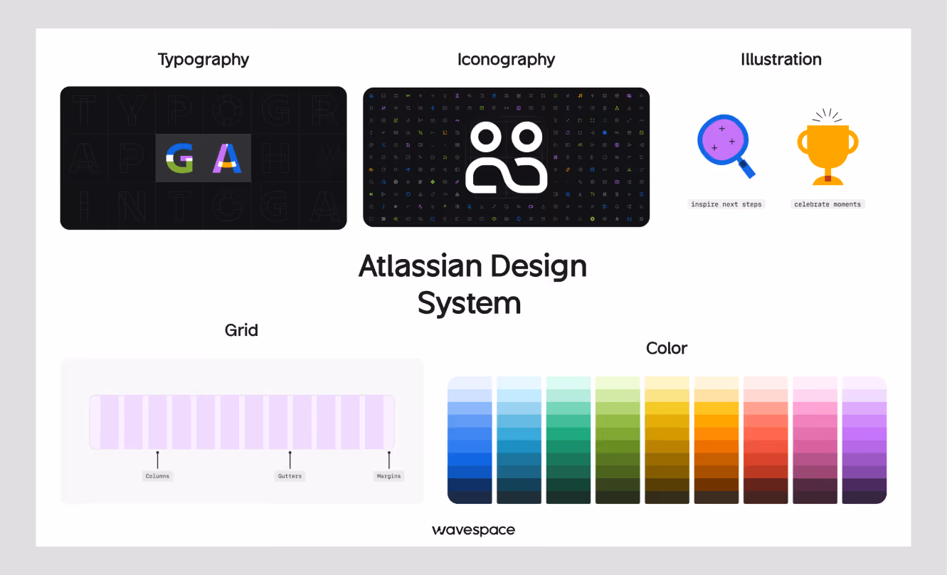
Powers Jira, Confluence, and Trello. Detailed component docs, design tokens for theming, and clear contribution guidelines.
Best for: Tools for collaboration and productivity that rely on access.
Site: atlassian.design
5. Salesforce Lightning
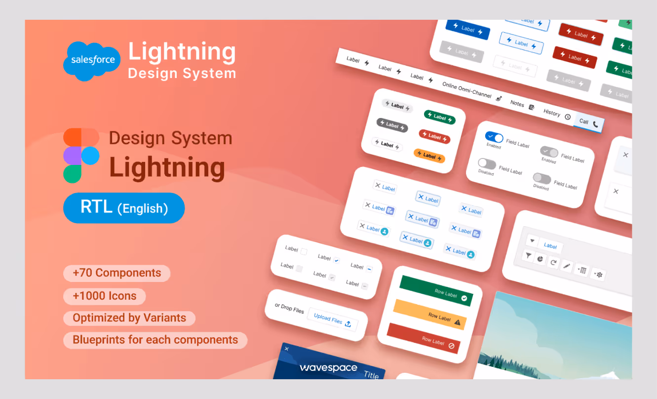
Enterprise system for the Salesforce platform. CRM-specific patterns, accessibility-first components, desktop and mobile coverage.
Best for: CRM interfaces and business software.
Site: lightningdesignsystem.com
6. Shopify Polaris
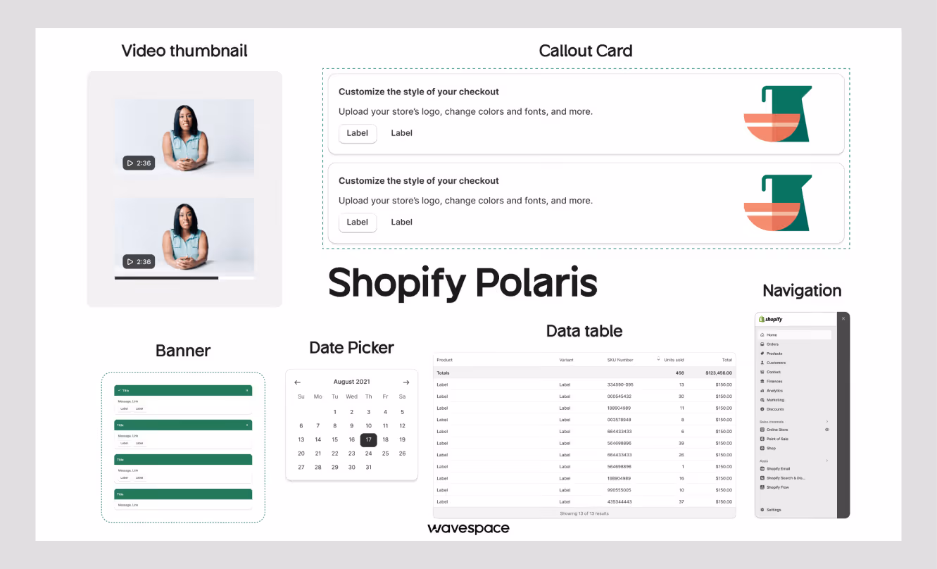
The system behind Shopify's merchant admin and third-party apps. E-commerce patterns, a React component library, and detailed merchant-experience guidelines.
Best for: E-commerce platforms and merchant tools.
Site: polaris.shopify.com
7. Microsoft Fluent
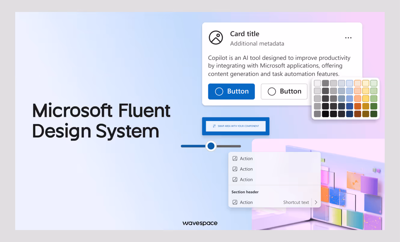
Microsoft's design language across Windows and Office: cross-platform components, depth-and-motion principles, and deep Windows integration.
Best for: Windows apps and the Microsoft product family.
Site: fluent2.microsoft.design
8. Airbnb Design Language System (DLS)
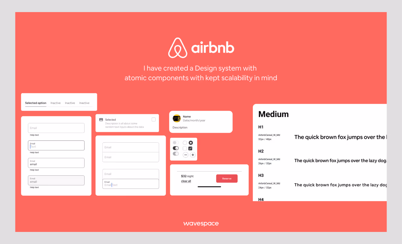
Not public, but one of the most-referenced case studies in the field. Airbnb's team has written openly about unifying web and mobile and cutting design debt.
Best for: A reference on consolidating a fragmented product into one system.
9. Uber Base
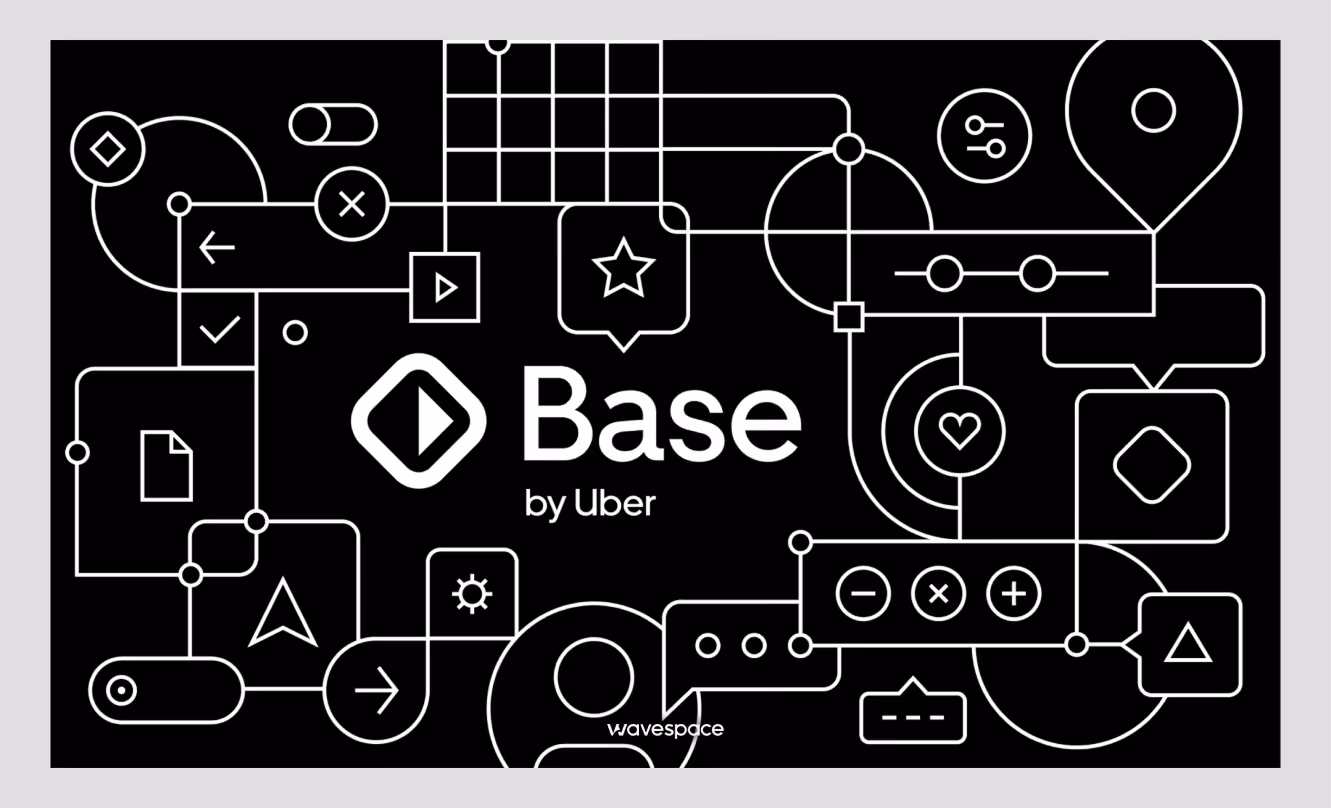
Powers Uber's rider and driver apps across markets. Multi-brand support, localization, and patterns built for two-sided products.
Best for: Marketplaces, multi-app platforms worldwide.
10. Mailchimp Pattern Library
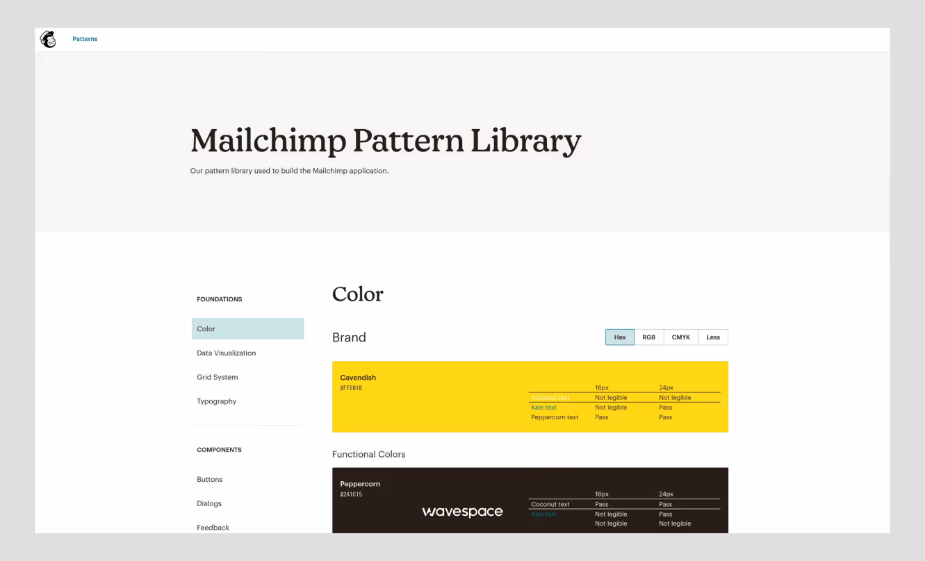
A content-first system focused on marketing and automation. Strong voice-and-tone guidance alongside the UI patterns.
Best for: Marketing platforms and content-heavy products.
Site: ux.mailchimp.com/patterns
When to use a design system
Build a design system when consistency and speed start breaking down at scale, usually when you run multiple products or platforms, your team grows past 10 people, or a UI audit turns up the same component built five different ways. Below that threshold, a style guide or UI kit is enough.
Build one when
- You need to ship on web, iOS, and Android and want the same experience.
- You have a family of products, such as Google Workspace or Adobe Creative Cloud.
- Your team is growing fast, and quality is slipping.
- You're rebranding or running a major redesign, the cleanest moment to set the foundation.
- A UI audit shows real inconsistency: mismatched buttons, clashing color values, duplicated components.
- The product has a long lifecycle and needs to stay maintainable.
- You support white-label or multi-tenant brands, where design tokens do the heavy lifting.
Wait when
- You're pre-product-market fit, iterate first, systematize later.
- The project wraps in three to six months. The setup won't pay back.
- The work is art-directed or experimental, where a system would constrain it.
- The team is one to three people, and the overhead outweighs the gain.
- You can't commit to maintenance. A half-built system creates more problems than no system.
- The middle ground: Start with a shared UI kit and a token sheet. Let it grow into a full system
The middle ground: Start with a shared UI kit and a token sheet. Let it grow into a full system when the pain is real, not before.
How to create a design system
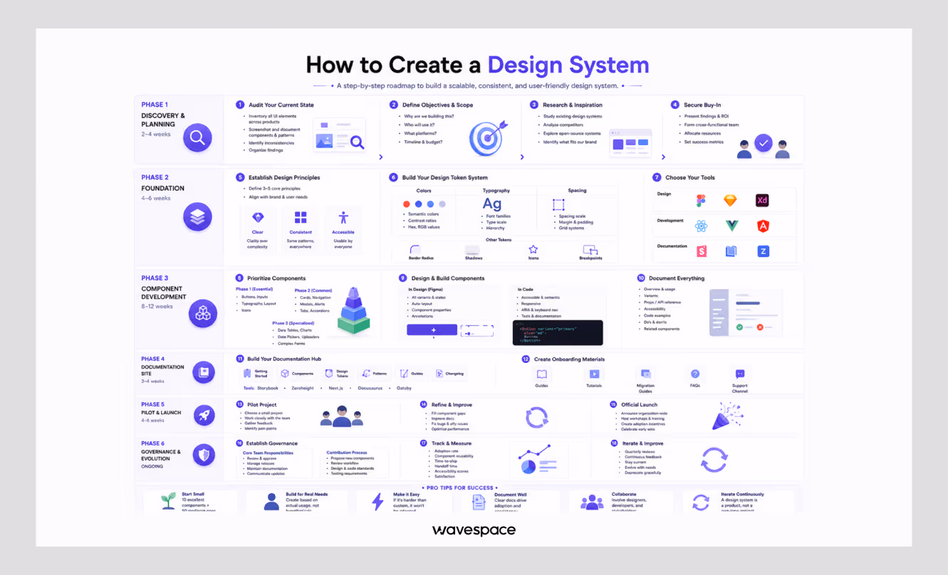
Building a design system runs in six phases — discovery, foundation, components, documentation, pilot, and governance. A focused team can ship a usable v1 in roughly three to six months, then maintain and extend it over time. Start small and grow from real usage.
Phase 1 — Discovery and planning (about 2–4 weeks)
- Check the current condition. Screenshot every unique component and screen. Log the inconsistencies — button styles, color values, spacing.
- Set objectives and scope. Decide why you're building it, who uses it, which platforms it covers, and the budget.
- Research. Read reference materials from your industry and open sources such as Material and Carbon.
- Secure buy-in. Present the audit, form a cross-functional group, and set success metrics.
Phase 2 — Foundation (about 4–6 weeks)
- Write 3–5 design principles. Short, memorable, actionable — "clear over clever," "accessible to all."
- Build the token system. Color (including semantic states and WCAG contrast), typography (families, scale, hierarchy), spacing (a 4px or 8px scale), plus radius, shadows, icon sizes, and breakpoints.
- Choose your tools. Figma for design, Style Dictionary for tokens, Storybook or Zeroheight for documentation.
Phase 3 — Component development (about 8–12 weeks)
- Prioritize. Start with the essentials: buttons, inputs, typography, layout, icons. Then cards, navigation, modals, alerts. Specialized components (tables, charts, date pickers) come last.
- Design and build each one. In Figma: every variant and state, with auto-layout. In code: semantic HTML, ARIA labels, keyboard support, and tests.
- Document as you go. For each component: what it is, when to use it, variants, props, accessibility notes, code examples, and do's and don'ts.
Phase 4 — Documentation site (about 3–4 weeks)
- Build the hub. Getting-started guides, the component library with live examples, token reference, patterns, contribution rules, and a changelog. Storybook, Zeroheight, or a custom site all work.
- Add onboarding material. Quick start guides, migration notes and a question channel.

Phase 5 — Pilot and launch (about 4–6 weeks)
- Run a pilot. Test it out on a low-risk project and get feedback.
- Refine. Close component gaps, fix accessibility issues, sharpen the docs.
- Launch. Announce it, run a training session, and mark the first wins.
Phase 6 — Governance (ongoing)
- Set governance. Establish who approves, how releases and versioning are done, and how updates are communicated.
- Track adoption. Measure reuse, time-to-ship, handoff time, and accessibility scores.
- Iterate. Review and remove old patterns, and stay current with platform changes, quarterly.
Rule of thumb: Ten components people actually use beat fifty nobody touches. Build from real needs, not hypothetical ones.
What is a UI kit?
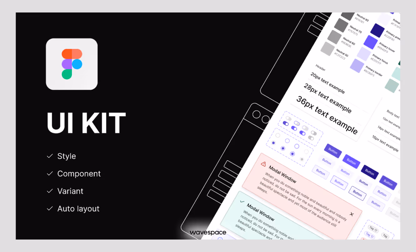
A UI kit is a set of pre-done UI components, buttons, forms, icons, typography, color styles, etc., that will be packaged for easy use in design files. It increases mockups and maintains consistency of visuals. A UI kit is design assets only and does not include production code, documentation, or governance.
What a UI kit includes
Buttons and form elements, navigation, icons, typography samples, color palettes, cards, and layout templates.
Types of UI kits
- Platform-specific: iOS (Apple HIG), Android (Material), responsive web.
- Style-specific: minimalist, glassmorphism, dark mode.
- Industry-specific: e-commerce dashboards, SaaS dashboards, finance applications.
Where to find them
Free: Material and Apple kits, Ant Design. Premium: UI8, Creative Market. Bootstrap, Tailwind UI, Chakra UI are framework-based.
UI kit vs design system: What's the difference?
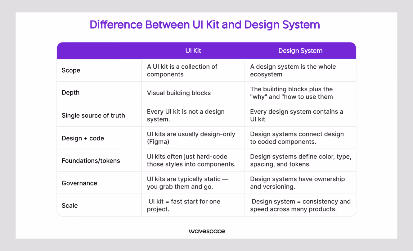
A UI kit is the visual layer - pre-made parts for designers. The operating model is the entire design system, which includes the UI kit, the production code, design tokens, usage guidelines, accessibility standards, documentation, and governance. In other words, a UI kit accelerates design files, and a design system brings design and engineering together throughout the product.
When to use each
If you're creating mockups, prototypes, small projects, or a group of individuals that require rapid visual uniformity, use a UI kit. Use a design system when you're building multiple products, growing the team, or treating consistency as business-critical.
Can they work together?
Yes. The visual layer of a design system is typically a UI kit. The kit gives you the components; the system adds the code, guidelines, accessibility standards, and governance that keep them consistent in production. Most teams start with a kit and grow into a system as the product matures.
Is a design system right for you?
Design systems provide consistency, speed, and a common language between design and engineering. They are not free; they require time to create and work to maintain. It's a size thing.
Build one if you run multiple products or platforms, your team is past 10 people, consistency is critical to the brand, or you're building for the long run.
Wait if you are pre-product-market fit, the project is a short-term one, resources are limited, or the project requires creativity that a system will not allow.
If you're already losing time due to this inconsistency, it's not the only way to go. Engineers use design systems as a production spec at Wavespace.
We're not just talking about this one screen here, but before we rebuilt a single screen on a recent SaaS redesign, we reduced 83 ad-hoc color values down to 22 semantic tokens. Schedule a 30-minute consultation, and we'll draw out a plan for your system.
If you aren’t sure about which agency is best for a design system, read our latest blog about Top design system agencies for enterprise-level UX
FAQ about design system guideline
Usually not. A shared UI kit and a token sheet will provide the bulk of the value without the maintenance cost for 1-3 people. Scale up to a full system when scaling the team or product.
A focused team normally delivers a usable first version in 3-6 months, which is then expanded over time. That can be shortened from an existing system such as Material or Carbon.
It depends on scope and team size, so treat any single figure with caution. The real cost is dedicated design and engineering time during the build, plus ongoing maintenance. Reusing an open-source system lowers the upfront cost.
No. A style guide documents visual rules. A design system adds coded components, tokens, documentation, and governance that both designers and developers use.
Tokens are the smallest decisions, such as colour, spacing value, font size – these are stored as variables. These tokens are used to create reusable UI elements (buttons, inputs, cards) called components.
Material Design and IBM Carbon are the most thoroughly documented and open-source, which makes them the easiest to study end to end.

More related blog


Have a Project? Let’s talk!


.png)


.avif)

