91%
$3.2M
82%
Quicky is a finance app where people send money, link banks, create cards, and track spending in one place. It's made for users who want fast, safe money control without confusing screens. Most finance apps are hard to use with messy layouts and hidden info. This frustrates users and breaks trust.
Many switch to Revolut, Wise, or PayPal instead. Quicky asked us to fix this. We redesigned their look, made the app simple to use, and built clear designs that users trust from day one.
The problems we had to solve
Quicky had a great product idea, but the early design lacked direction. We found the interface hard to use, and the speed and security I need from a financial app weren’t there. The design was basic, and it couldn’t perform real-world jobs. Existing finance apps create frustration through poor design and unclear processes. Users struggle to feel confident and in control of their money.
- Confusing layouts: Users couldn't find send/request features quickly, making simple transfers feel hard
- Unclear design: Outdated interfaces looked untrustworthy and unprofessional
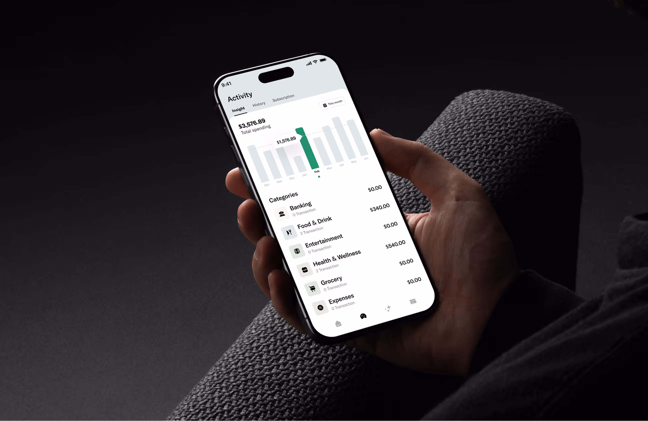
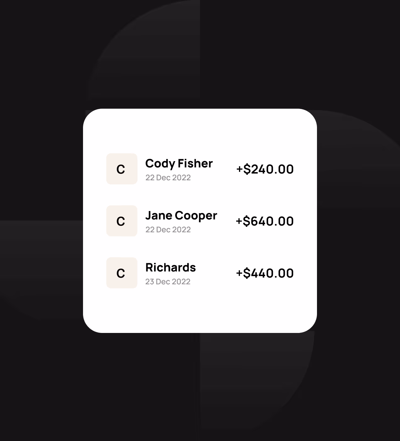
- Complex money tracking: Hard to see transaction history and follow where the money went.
- Low confidence: Many users tried the app once but never came back, hurting long-term growth.
- Messy information: Balance, cards, and activity are scattered across screens broke the flow.

The solution we built
We redesigned Quicky from the ground up with a focus on clarity, speed, and trust. Every design choice aimed to fix the core problems users faced.
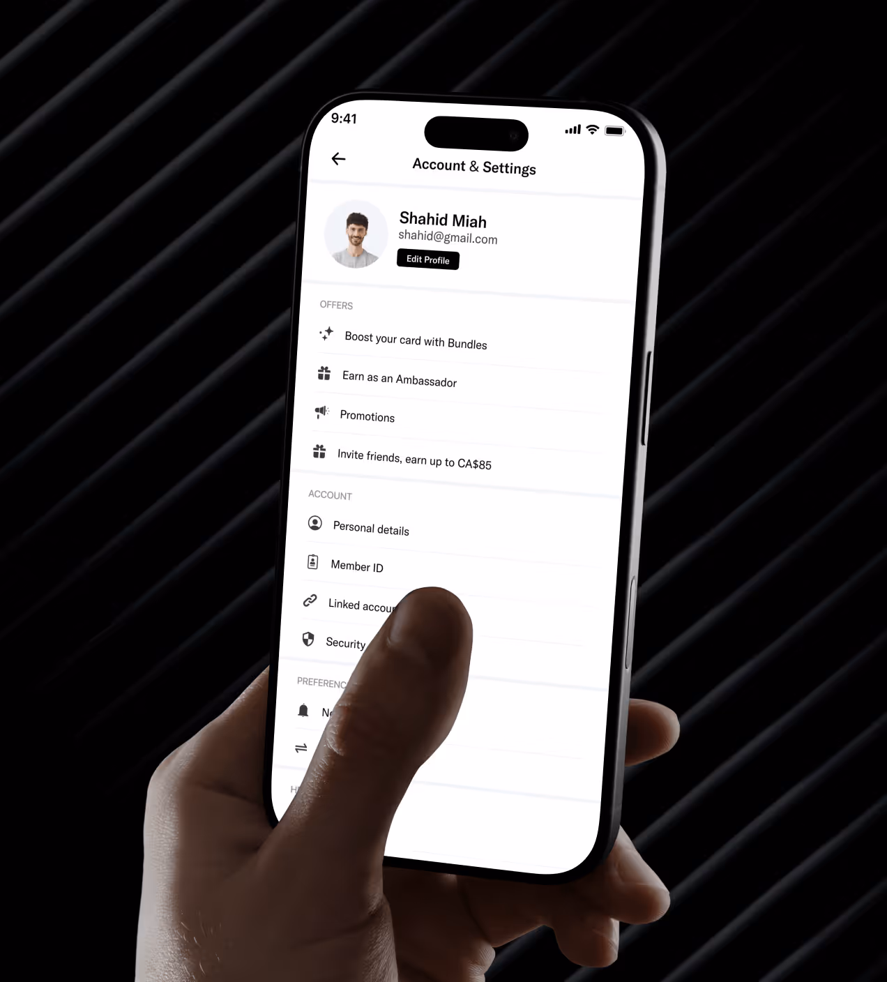
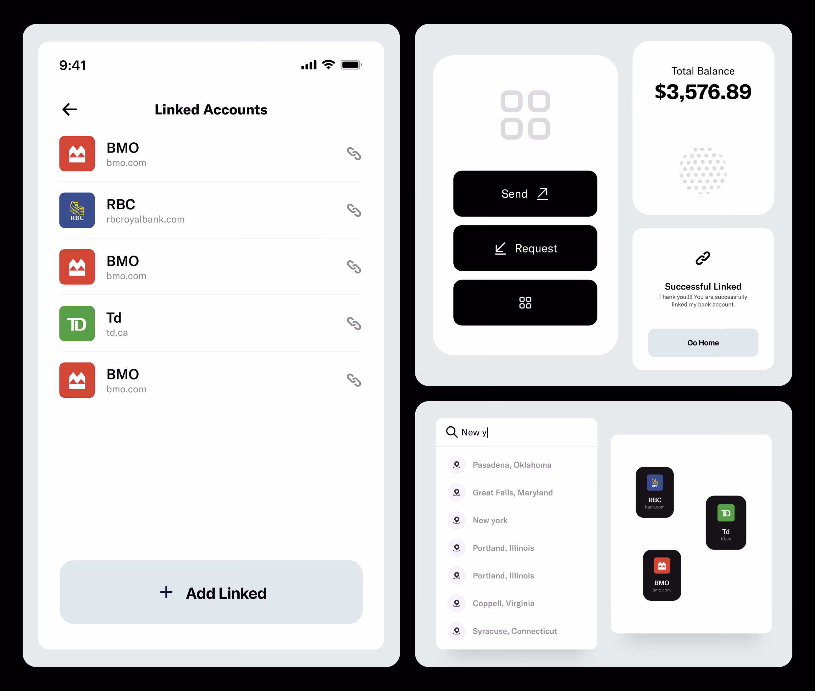
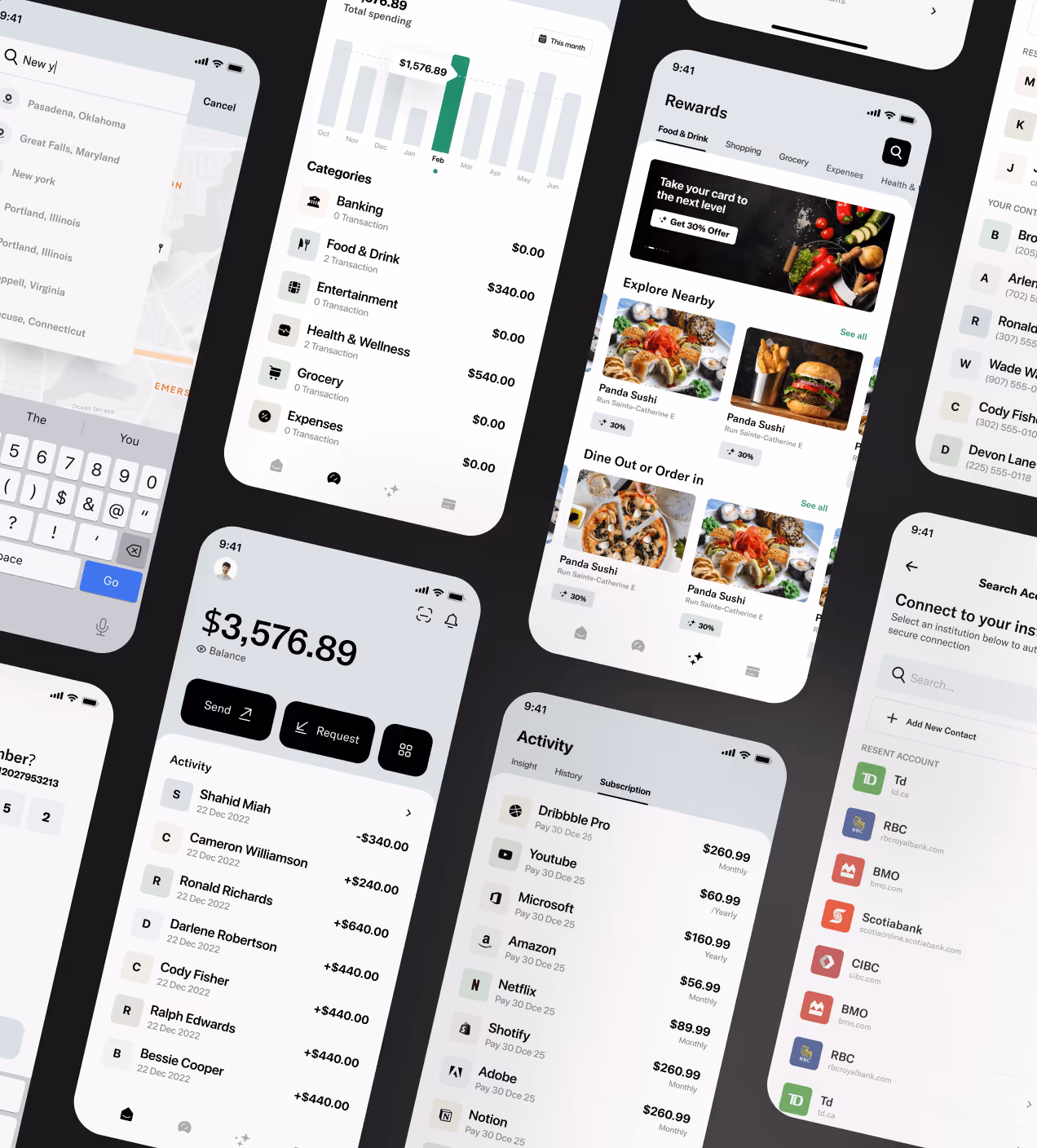
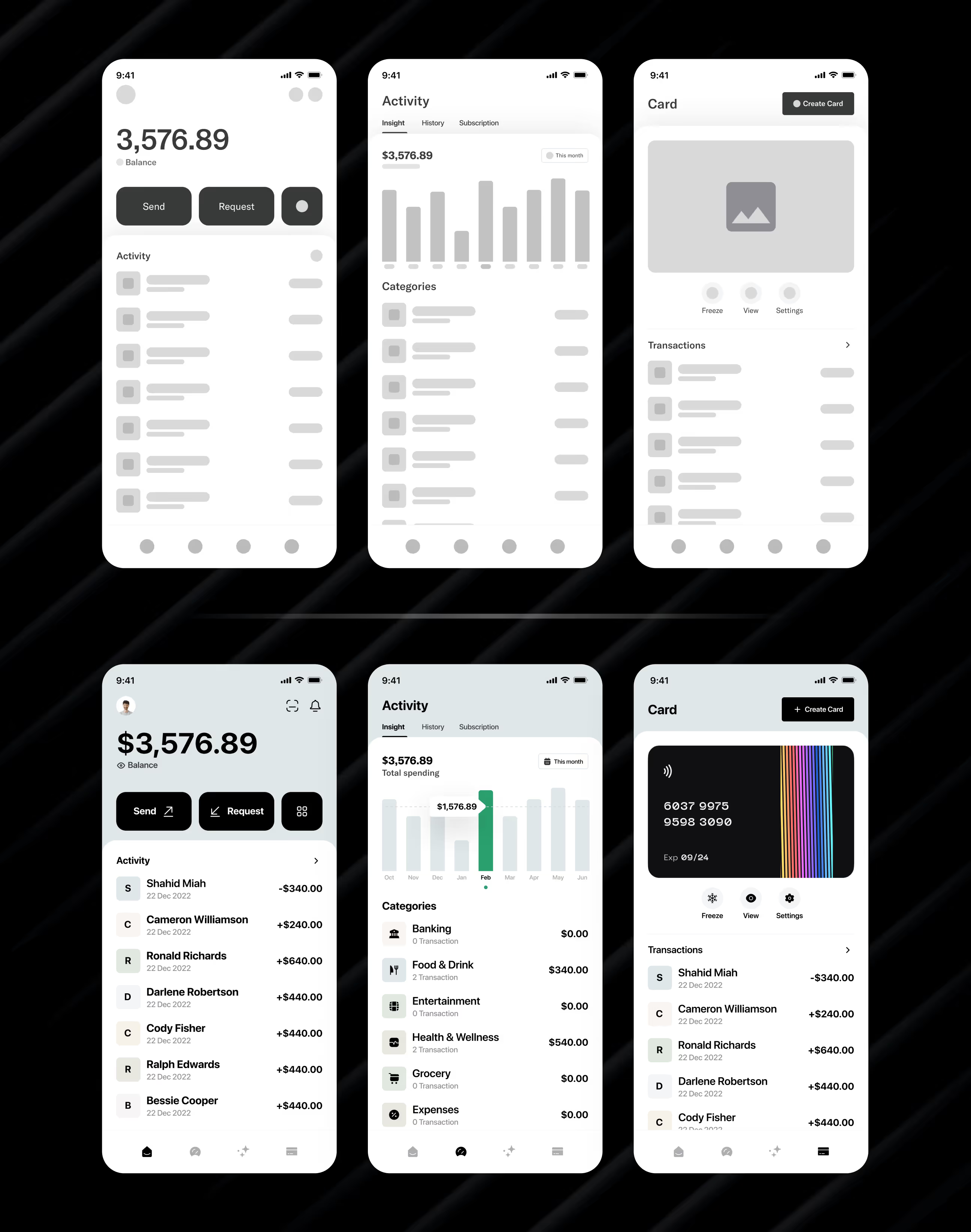
- Clear visual hierarchy: Reorganized screens so send/request buttons and key actions are easy to find and tap
- Modern, trustworthy design: Used dark black and light cyan colors to create a premium, secure feel that builds confidence
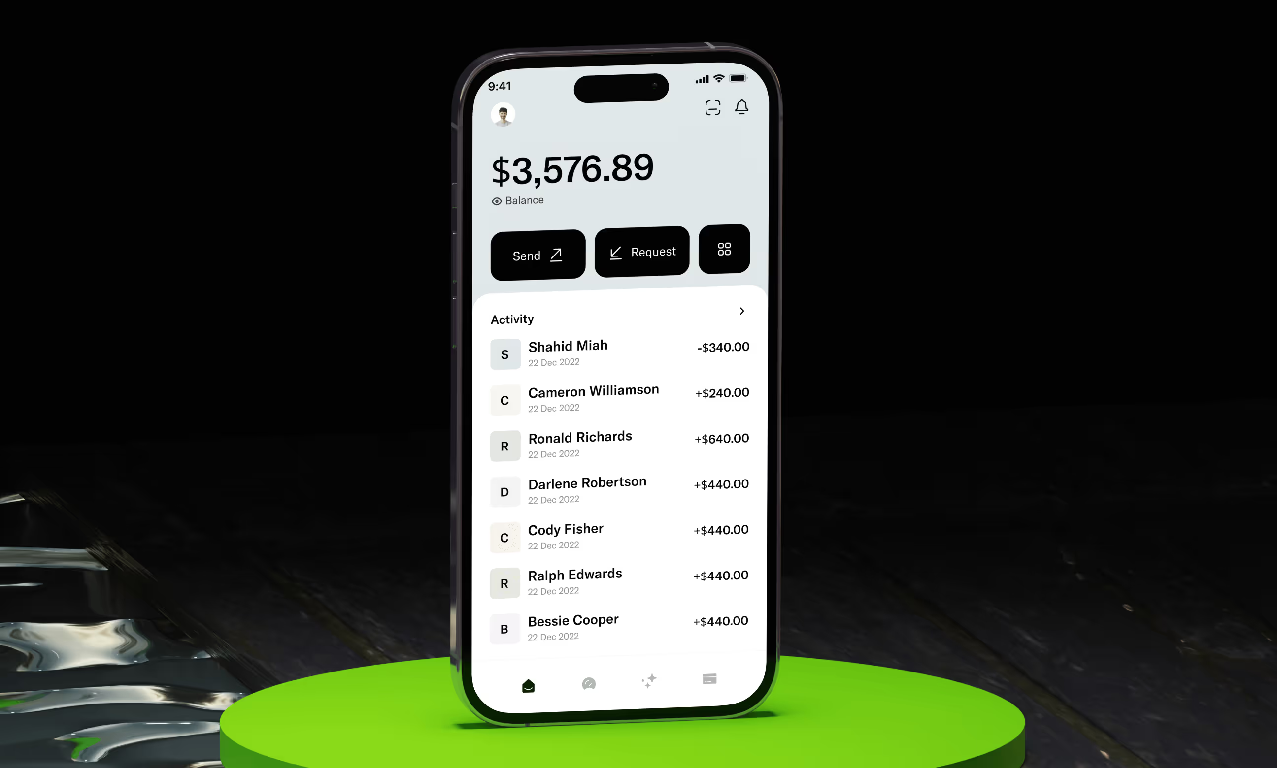
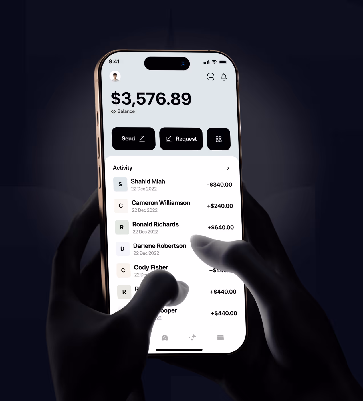
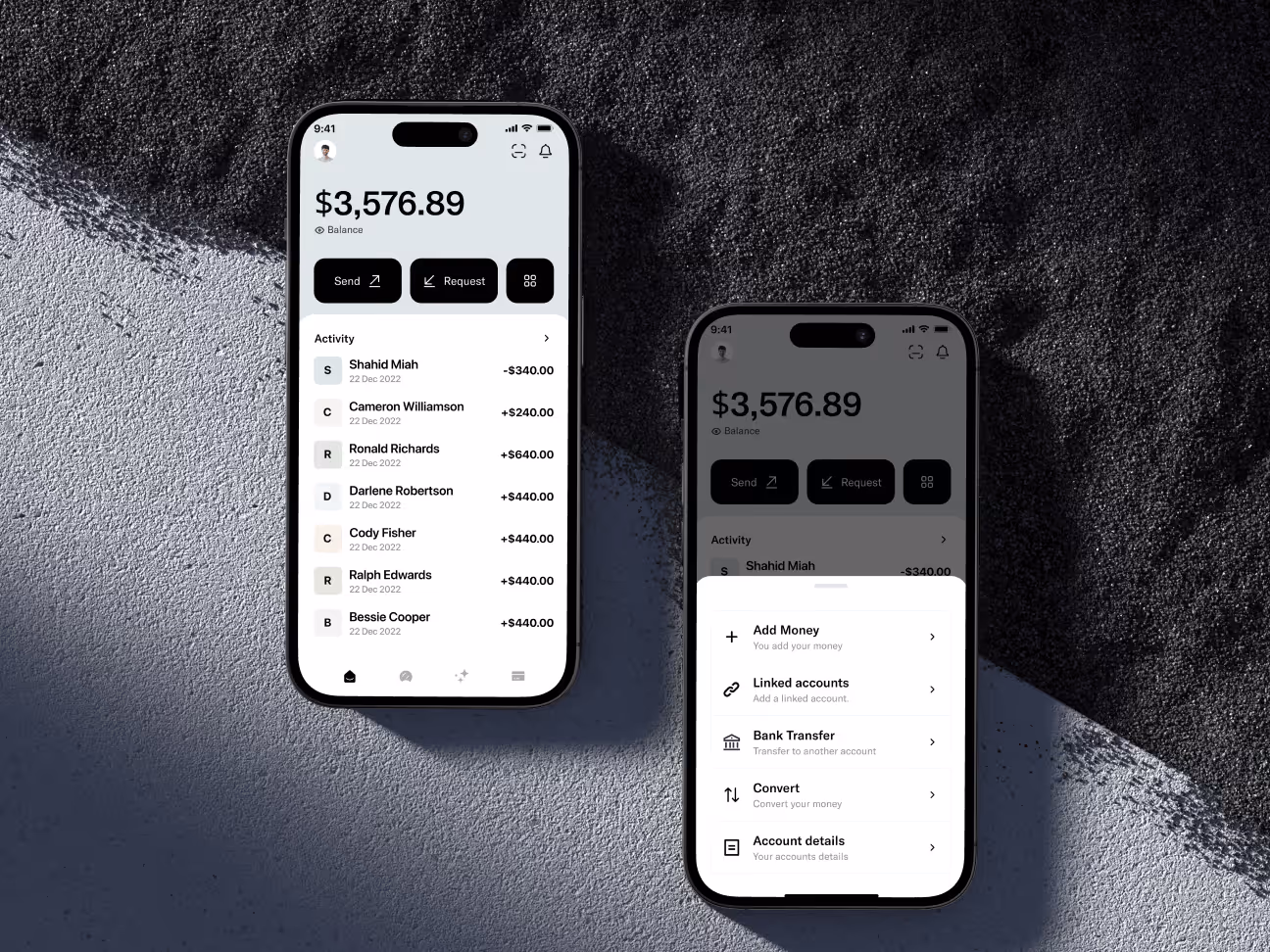
- Simple money tracking: Made transaction history visible on the home screen with clear amounts and dates
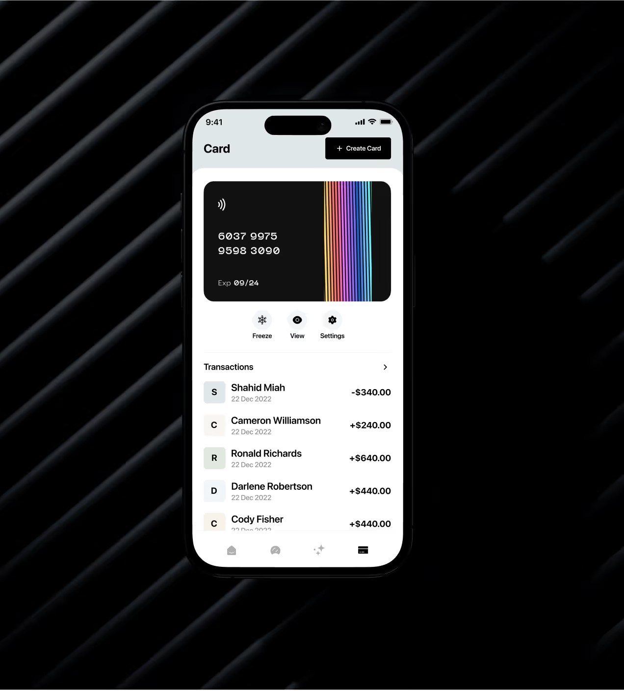
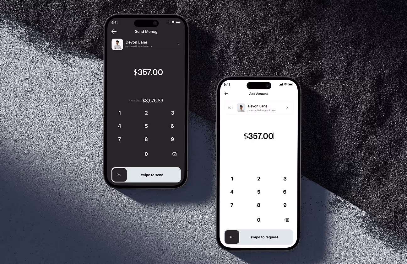
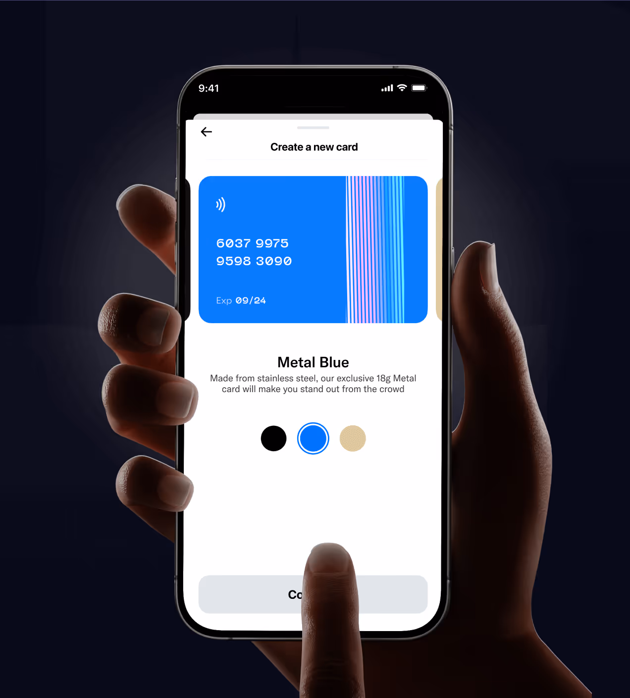
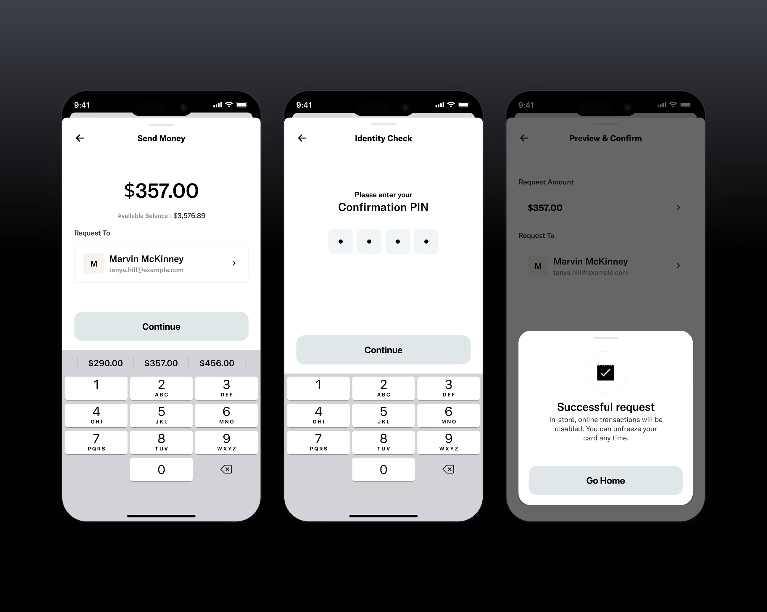
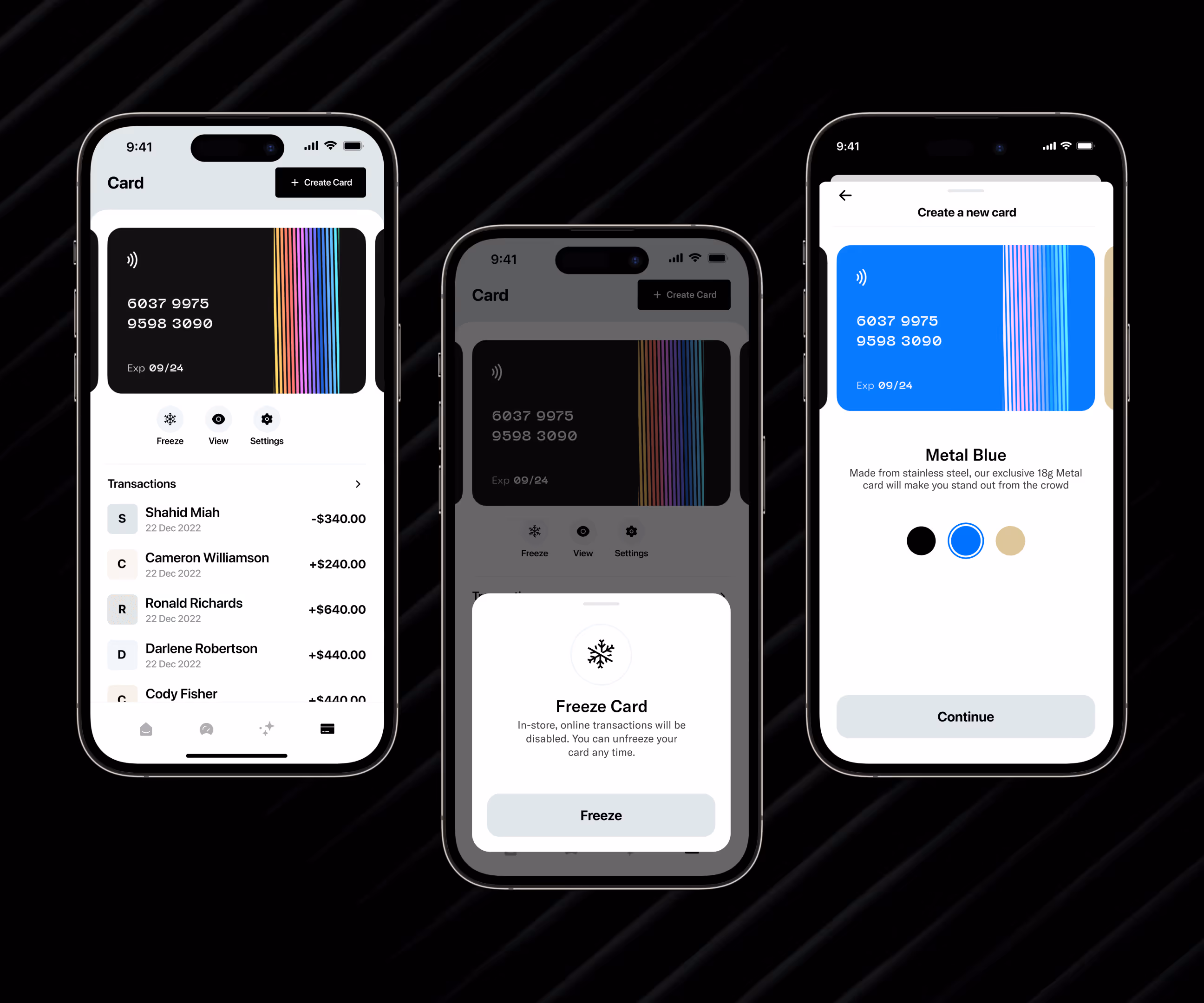
- One-tap actions: Designed send money and card creation features to work with single taps and instant confirmations
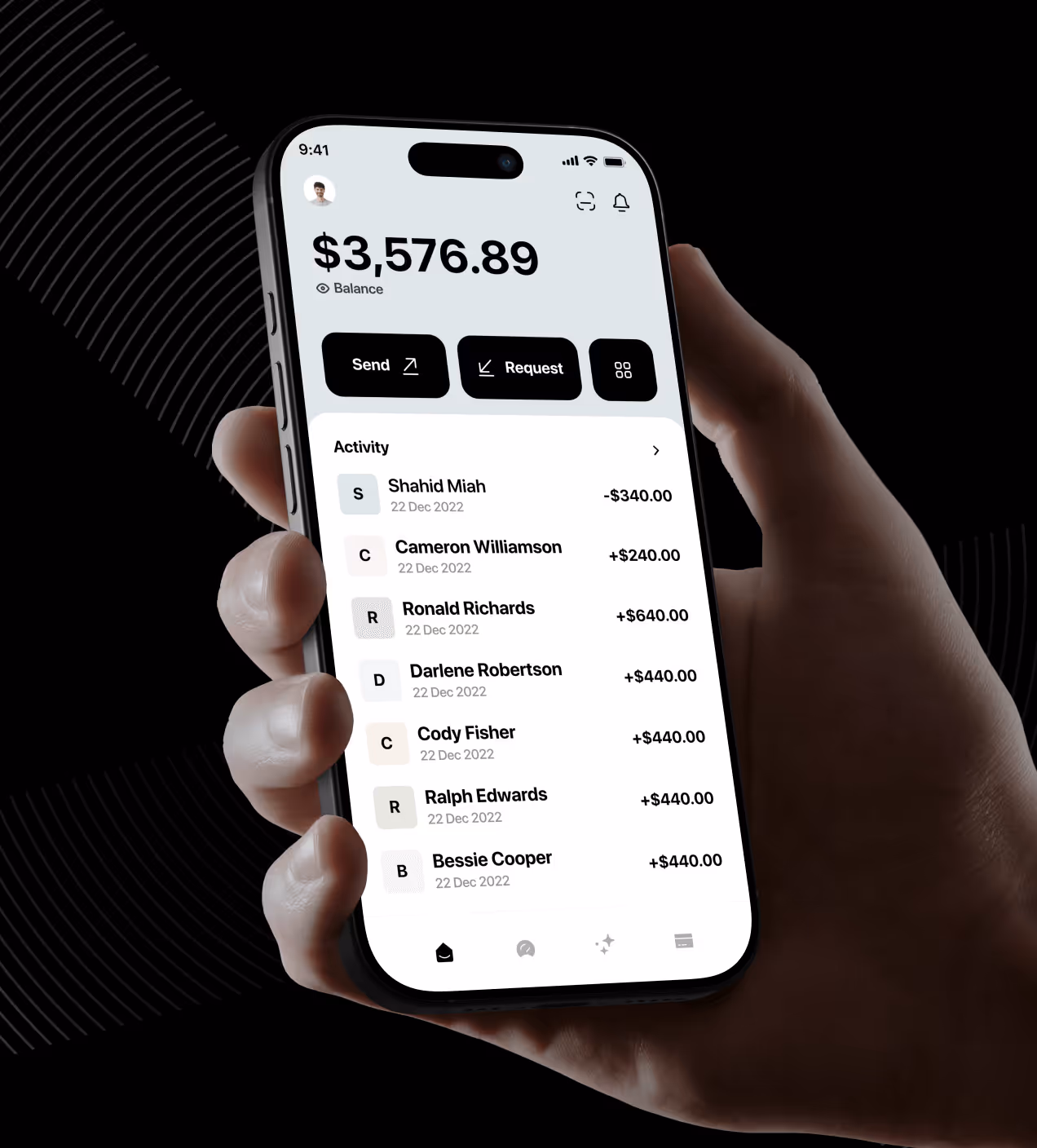
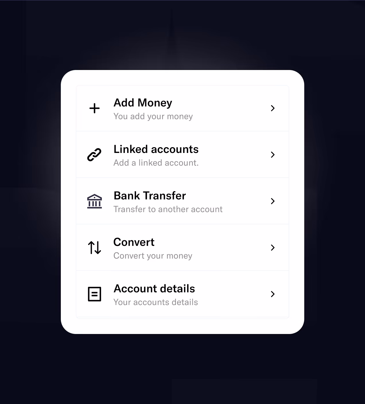
- Unified workspace: Put balance, cards, and activity in one clean interface so users don't switch between screens
How we approached the UX design
Our Quicky design process follows a user-centered approach focused on solving real finance app problems. We worked through research, design, testing, and delivery to create a trusted, easy-to-use experience.
We studied how users interact with finance apps and identified pain points in existing solutions.
We defined user needs and created a clear direction for the redesign based on research.
We built wireframes and visual designs focused on clarity, trust, and ease of use.
We tested designs with real users and improved based on feedback before final delivery.
UX Research & Design Artifacts
We studied how people use finance apps to find pain points and design solutions that actually work. Our research focused on real user behavior and frustrations.
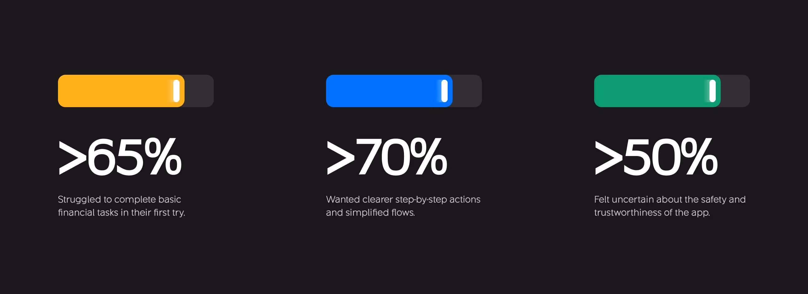
- User surveys: Talked to 40+ finance app users. Found 65% struggled to complete basic tasks on their first try, showing poor onboarding design.
- User interviews: Interviewed 15 people about their money management habits. 70% wanted clearer step-by-step actions instead of confusing navigation.
- Usability testing: Tested early designs with 20 users. Found 50% felt uncertain about app safety and trustworthiness due to outdated interfaces.
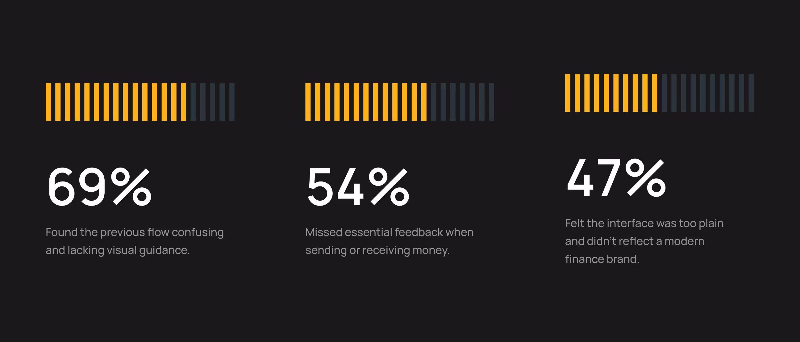
- Pain point mapping: Discovered 69% found previous flows confusing, 54% missed transaction feedback, and 47% felt the interface looked unprofessional.
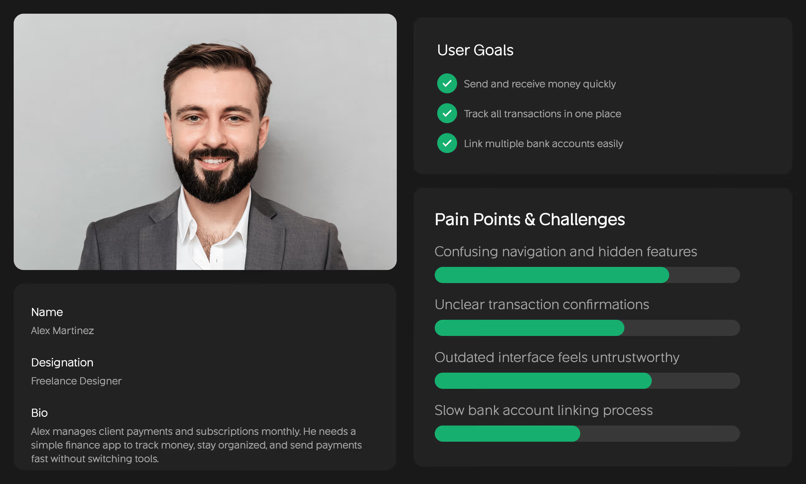
- Design artifacts: Created user personas (Alex), wireframes, high-fidelity mockups, and interactive prototypes based on research findings.
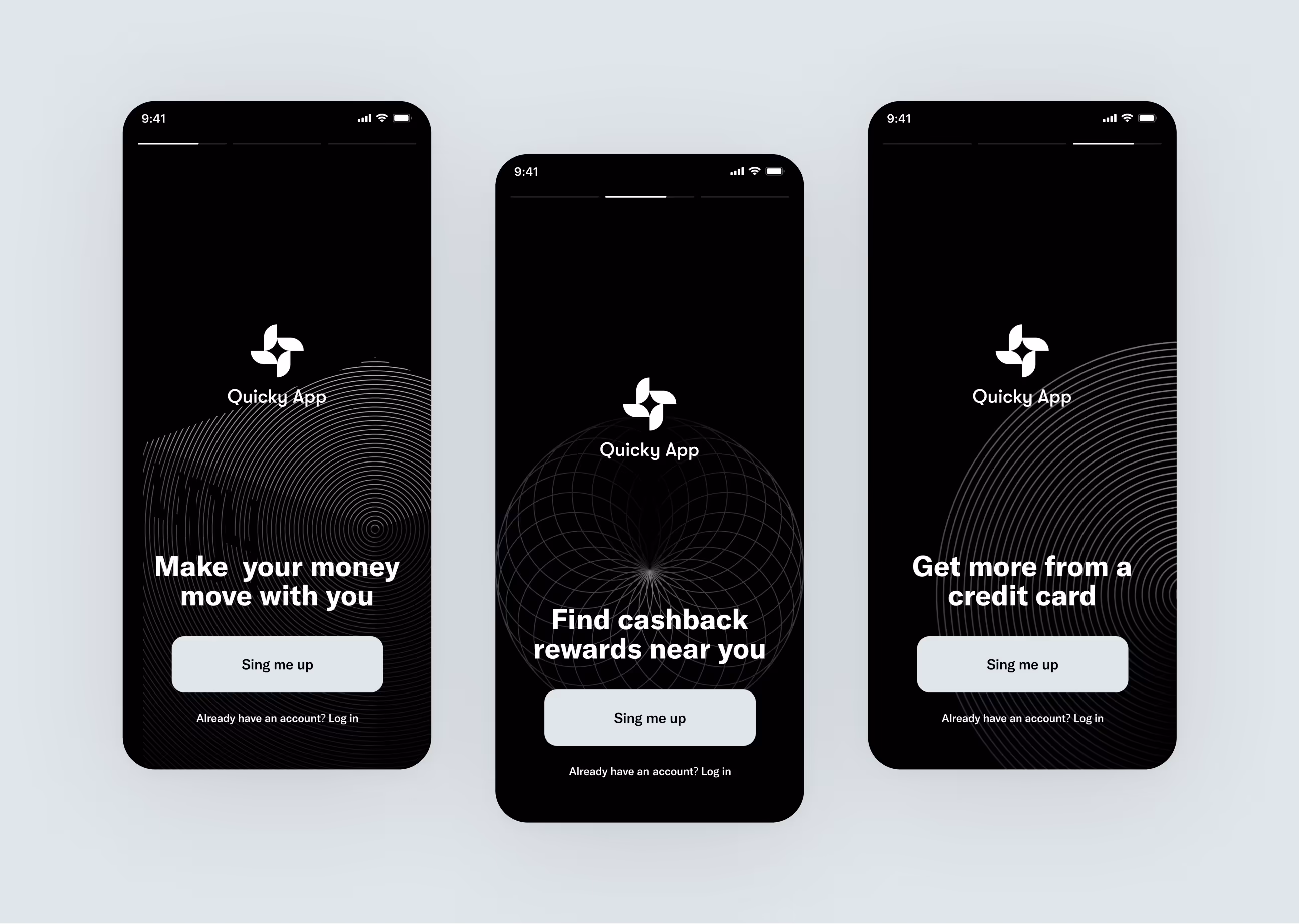
Visual identity and brand story
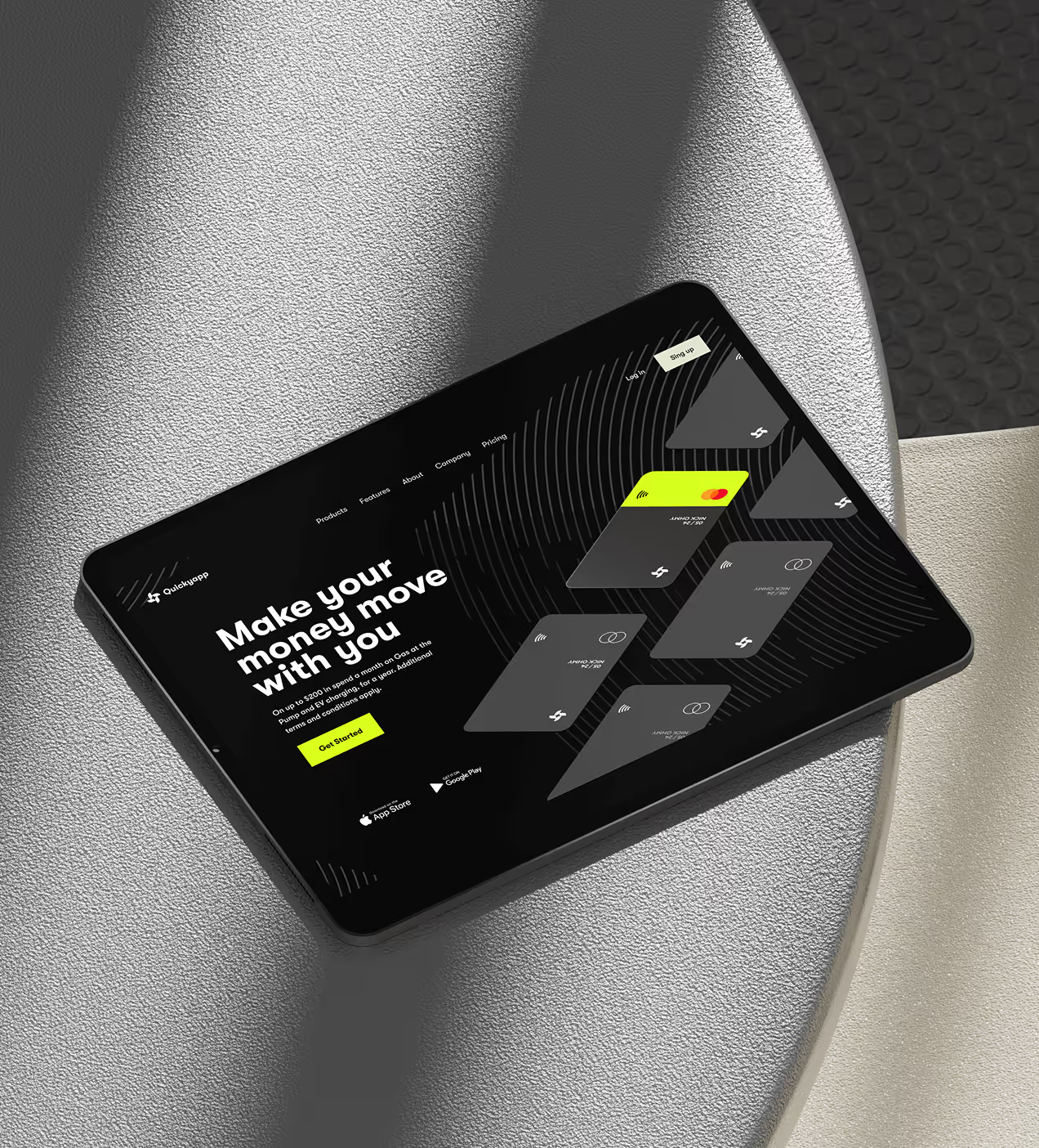
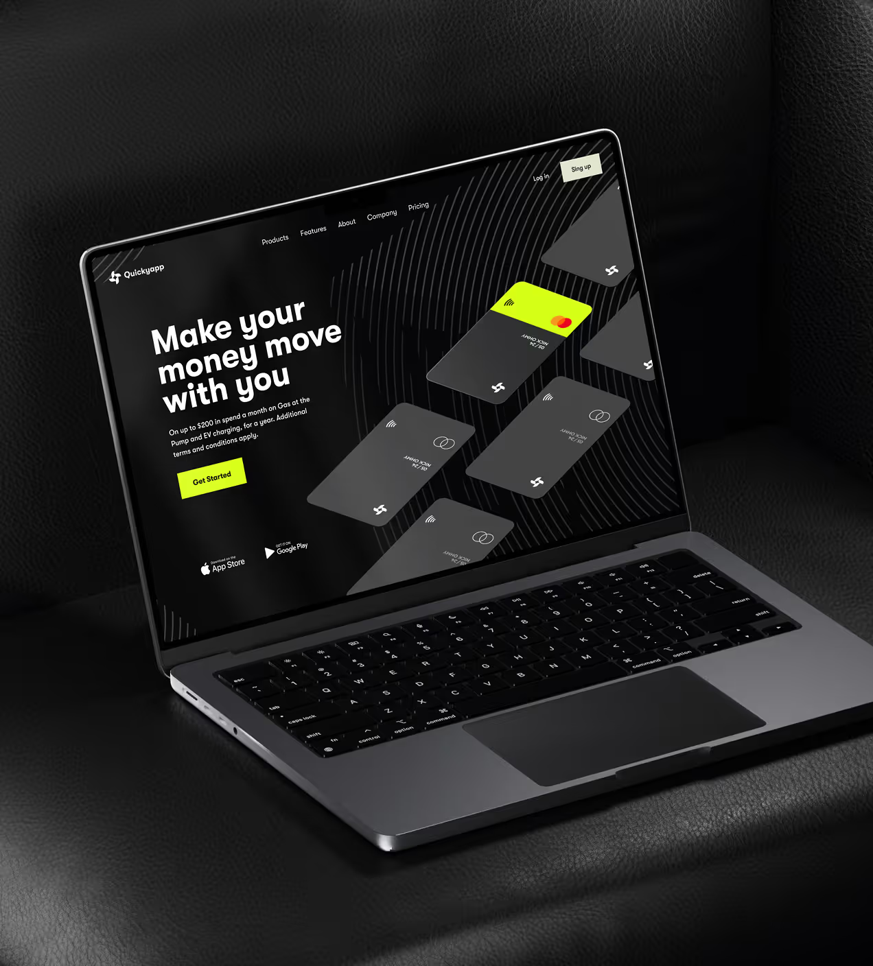
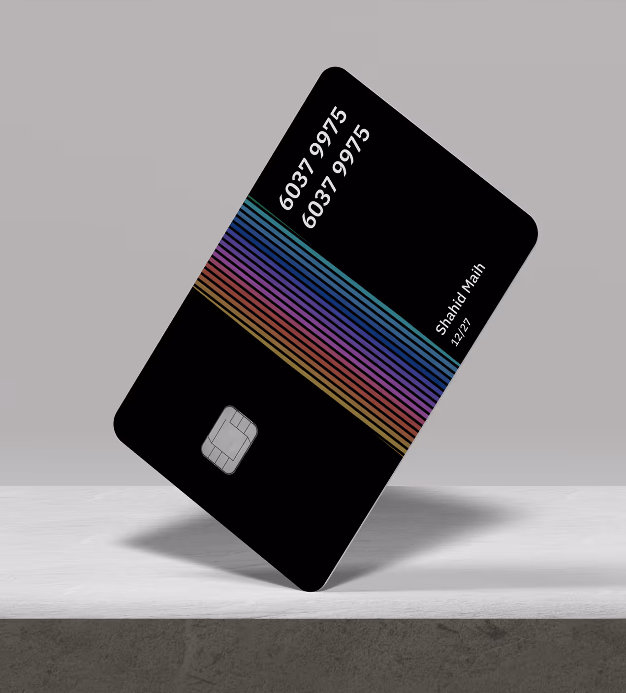
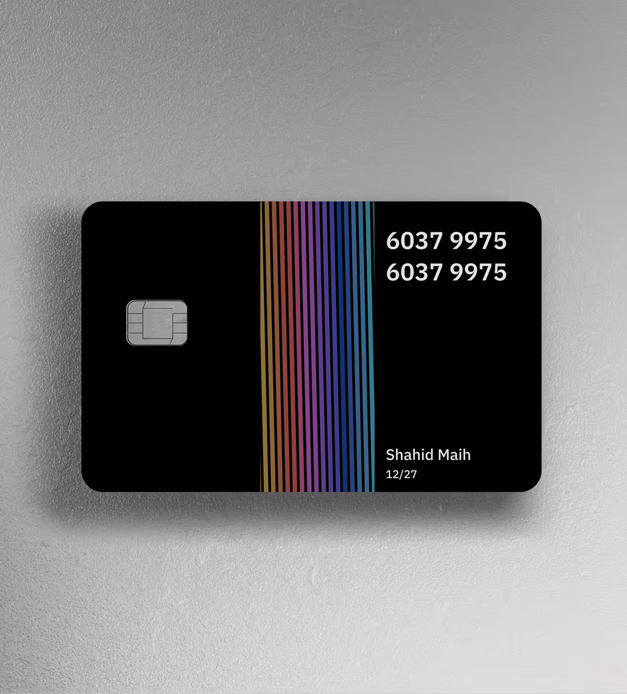
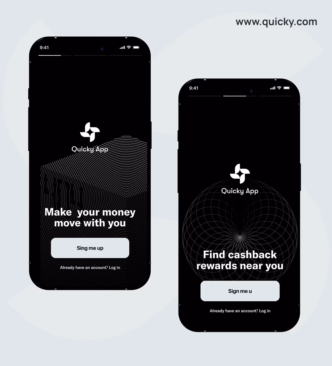
Quicky's visual identity feels fast, secure, and trustworthy. Every design choice reflects confident, modern money management. The logo is clean and fluid, representing smooth money flow. It works on cards, app icons, and anywhere users see the brand.
The color palette uses dark black (#201F1F) for security and professionalism, light cyan (#201F1F) for modern energy and trust, and neutral tones like gray, pearl, and buff for clean balance. Black suggests strength and safety, while cyan adds a modern feel that sets Quicky apart from traditional banks.
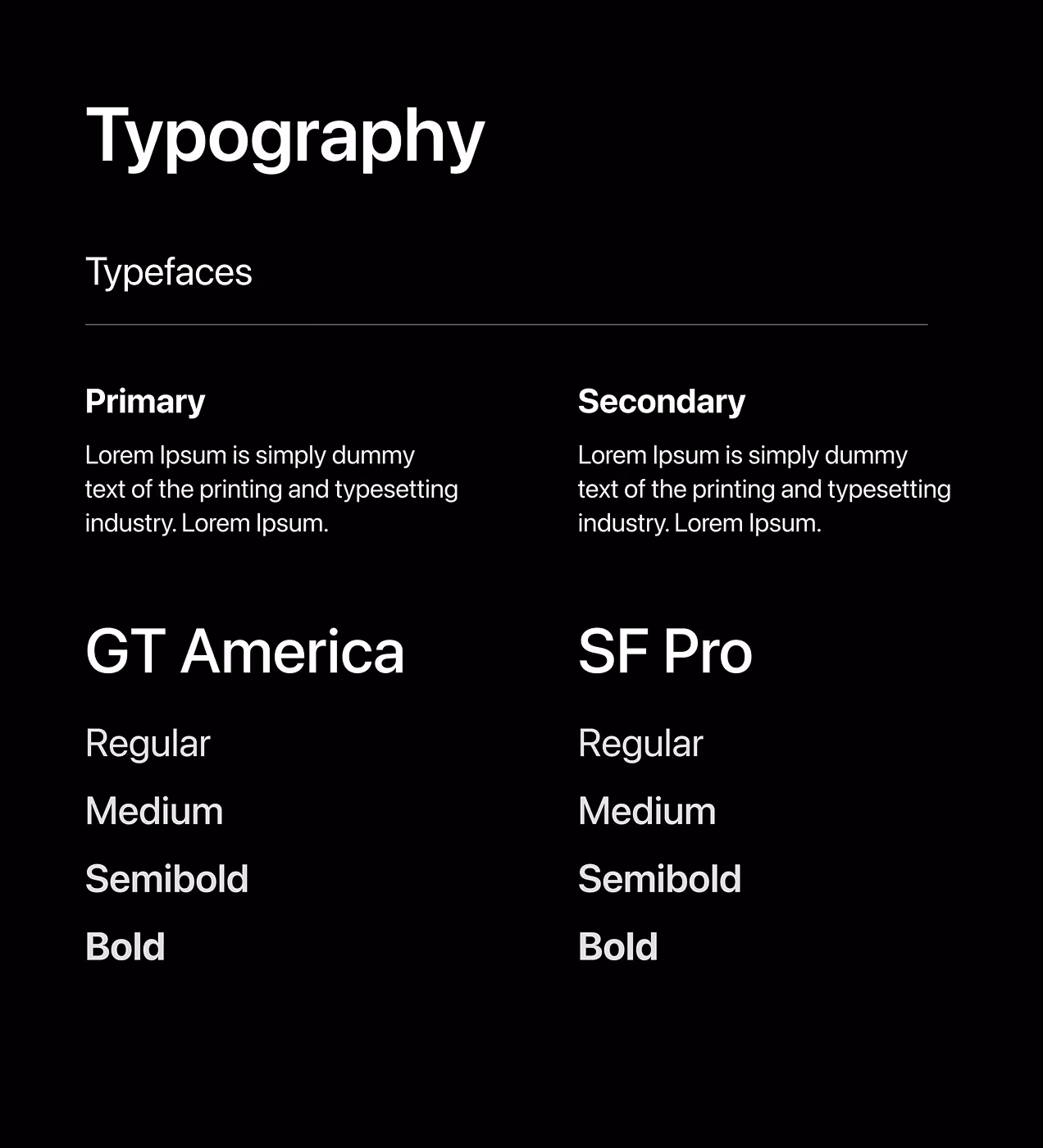
Typography uses SF Pro Display Bold at 22px for clear, confident communication that reinforces trust. The brand story is simple: Quicky gives people fast, safe money control without confusion. The visual identity reflects this through a clean design that just works.

The system behind the design
We built a design system with reusable components like buttons, cards, and input fields. Everything follows the same rules: dark backgrounds, light cyan accents, and clear spacing. Typography uses SF Pro Display Bold so users can scan fast and know where to tap.
Icons share the same style, making patterns easy to recognize. Colors are strict. Dark black creates focus, light cyan highlights actions, neutral grays guide users. Consistent spacing keeps layouts balanced. The system saves time; we reuse components for new features instead of starting fresh. This keeps Quicky unified as it grows.

Designing Quicky's UX experience
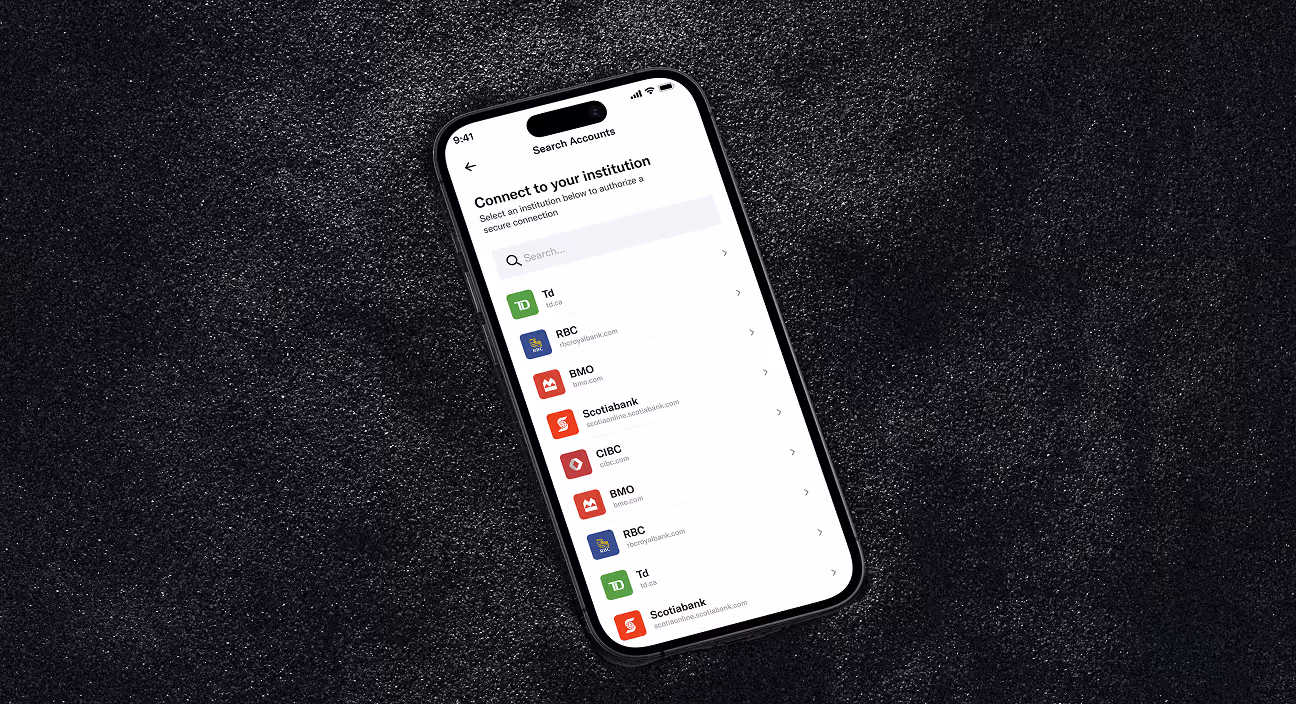
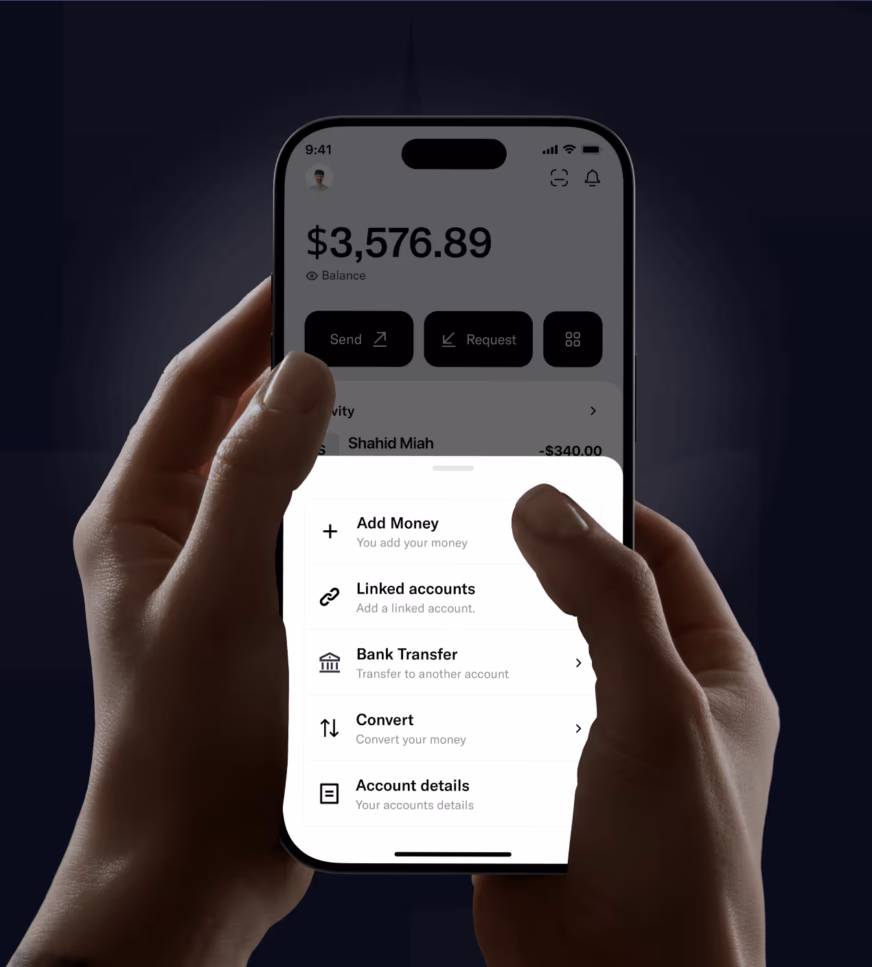
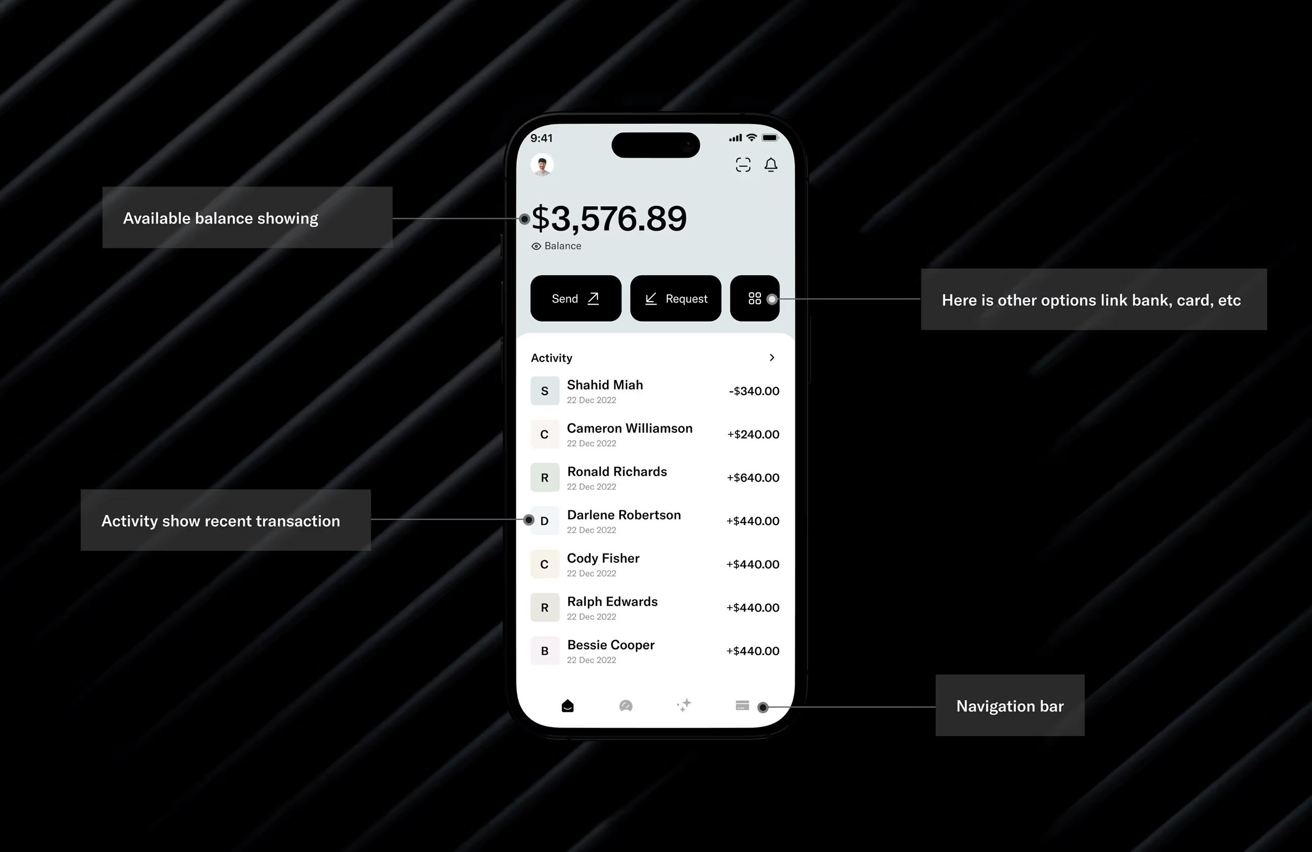
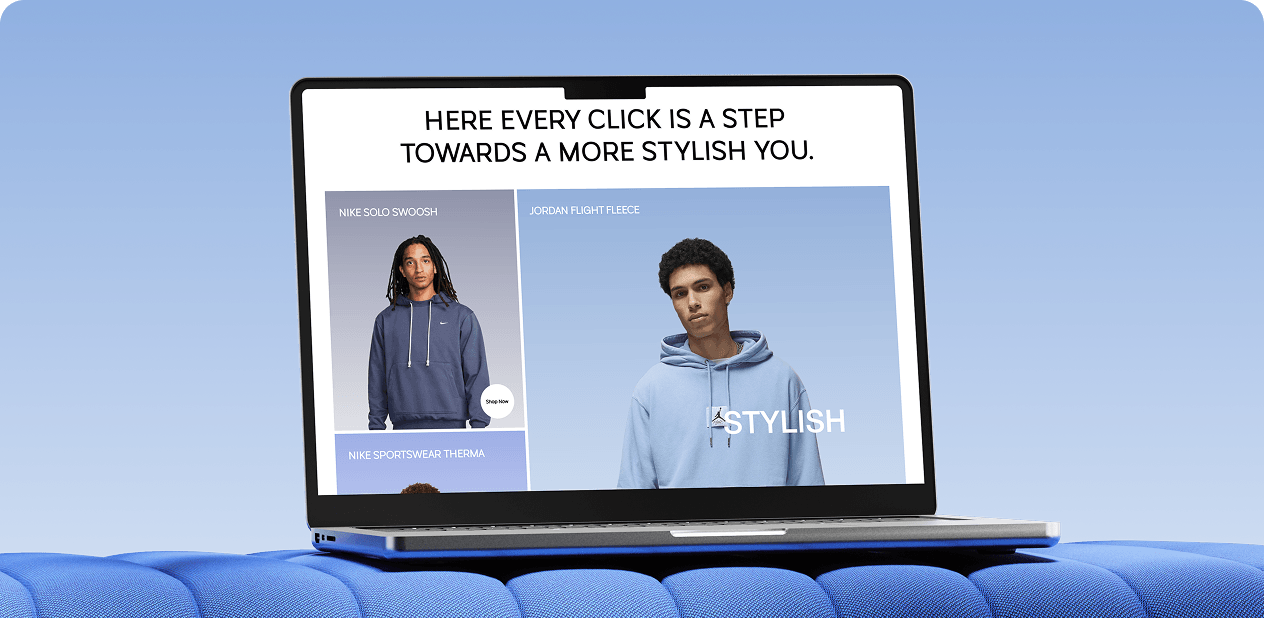
We designed Quicky to solve confusing navigation and slow workflows. The home screen shows balance, transactions, and quick actions at a glance. Users send money in two taps. Bank linking uses clear steps with simple language. Card creation is instant, tap, choose, done.
Navigation stays consistent with a fixed bottom bar. Dark backgrounds focus attention, light cyan highlights key actions. We tested flows with real users and fixed problems before launch. The result feels intuitive from the first tap, fast, confident money management.

The Impact of our redesign on Quicky
The redesigned Quicky app solved key user problems and built real trust with its audience.
Key Results:
- User confidence grew: 82% of users said they felt more confident using Quicky after the redesign. Clear navigation and instant confirmations made users trust their actions.
- Money transfers got easier: 68% found it easier to send, request, and track money through the new interface. Two-tap transactions and visible history removed friction.
- The app looked trustworthy: 91% felt the app now looks clearer, more modern, and trustworthy. Dark black and light cyan colors created a premium, secure feeling.

Have a Project? Let’s talk!


Your competitors are converting 3x more visitors. Not because they have a better product, but because they have a better design.


.avif)