93%
+58%
47%
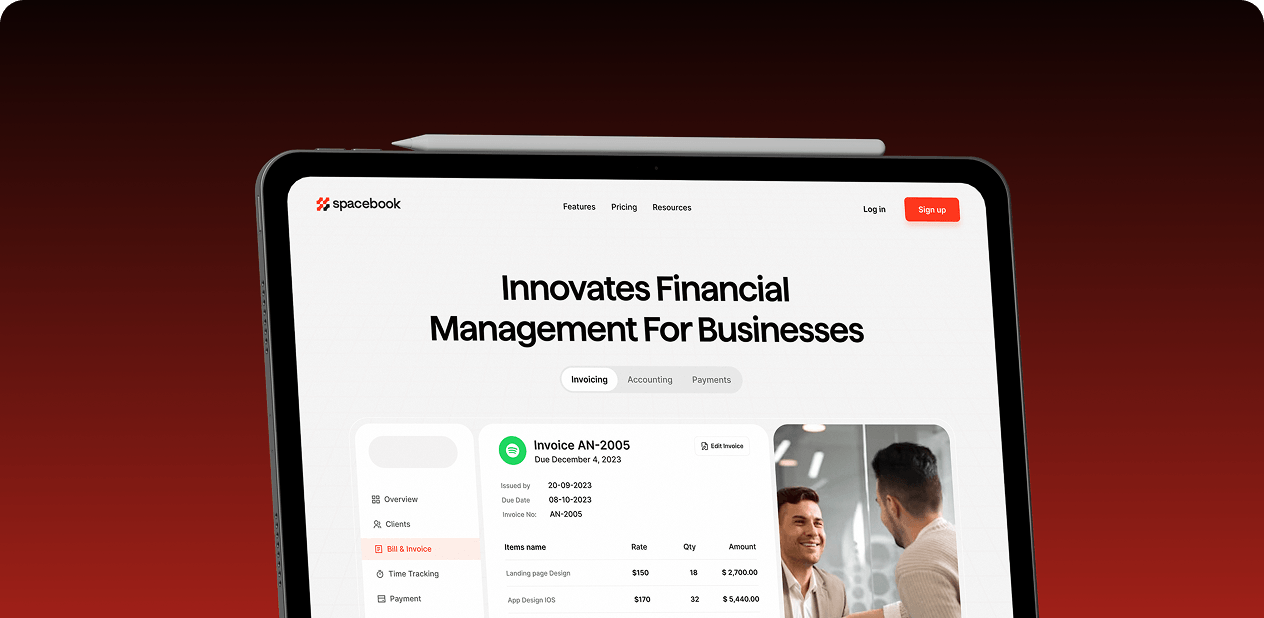
Solon is a Boston-based Web3 platform that lets users swap crypto, create NFT pools, and participate in governance all in one place. They needed to design their product in a way that made complex blockchain tasks feel easy for anyone new to Web3.
We designed their entire platform, making wallet connections clear, transactions simple, and navigation trustworthy so users actually want to explore Web3 features.

Problems that blocked adoption
Solon had powerful Web3 technology, but users couldn't figure out how to use it. People got lost, confused, and left without trying key features.
- Confusing navigation: 81% of users didn't understand how to find features like Swap, NFTs, and Governance, causing them to abandon the platform.
- Unclear wallet actions: 67% found wallet connection and transaction steps confusing on both desktop and mobile, breaking trust before they even started.
- No guidance: 92% wanted step-by-step help but got none, leaving new users overwhelmed and unsure what to do next.
- Hidden features: Important tools stayed buried, so users never discovered what the platform could actually do for them.
- No trust signals : The interface didn't feel safe or modern enough for users to trust it with their crypto assets.

What we built from scratch
We designed Solon from the ground up to make Web3 feel simple, clear, and safe. Every screen was built to guide users through blockchain actions without confusion.
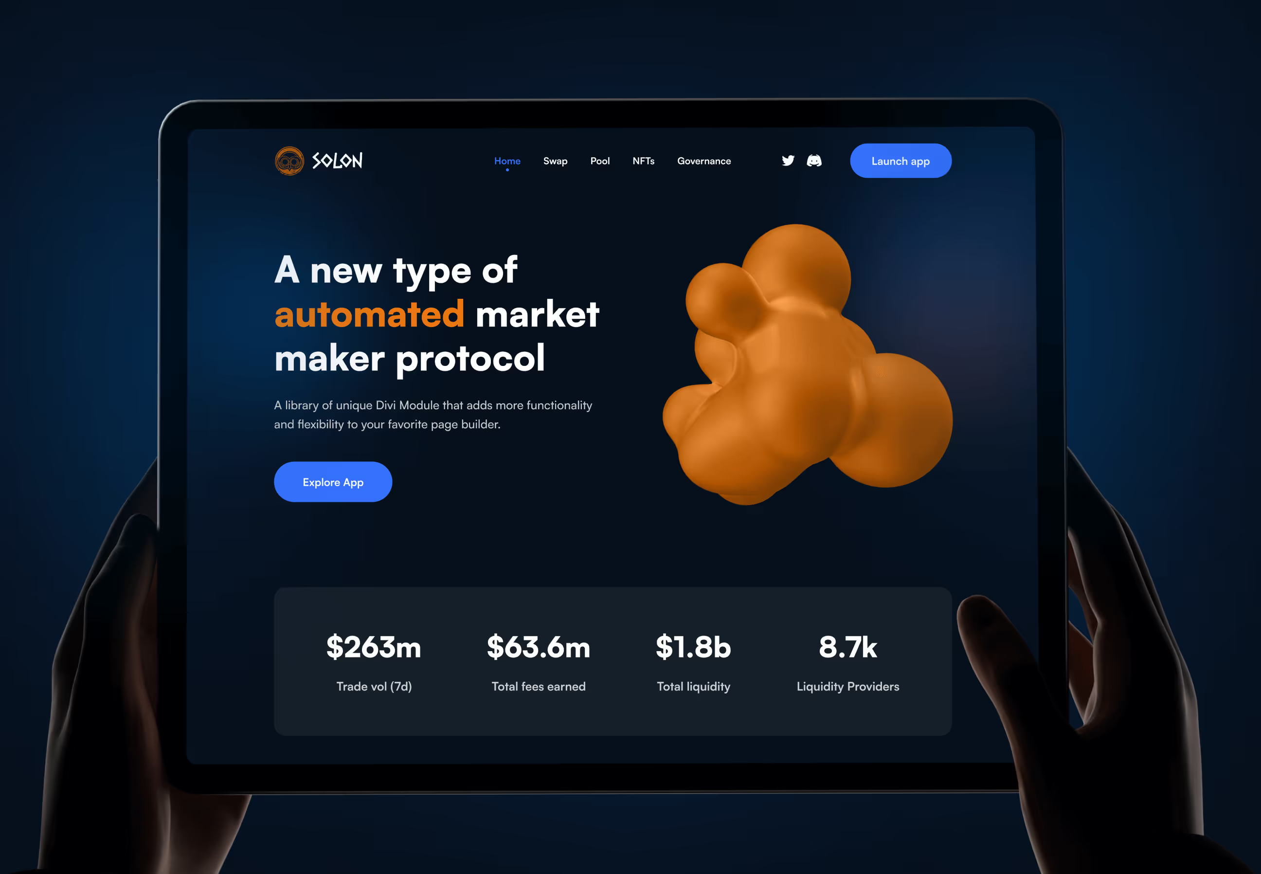
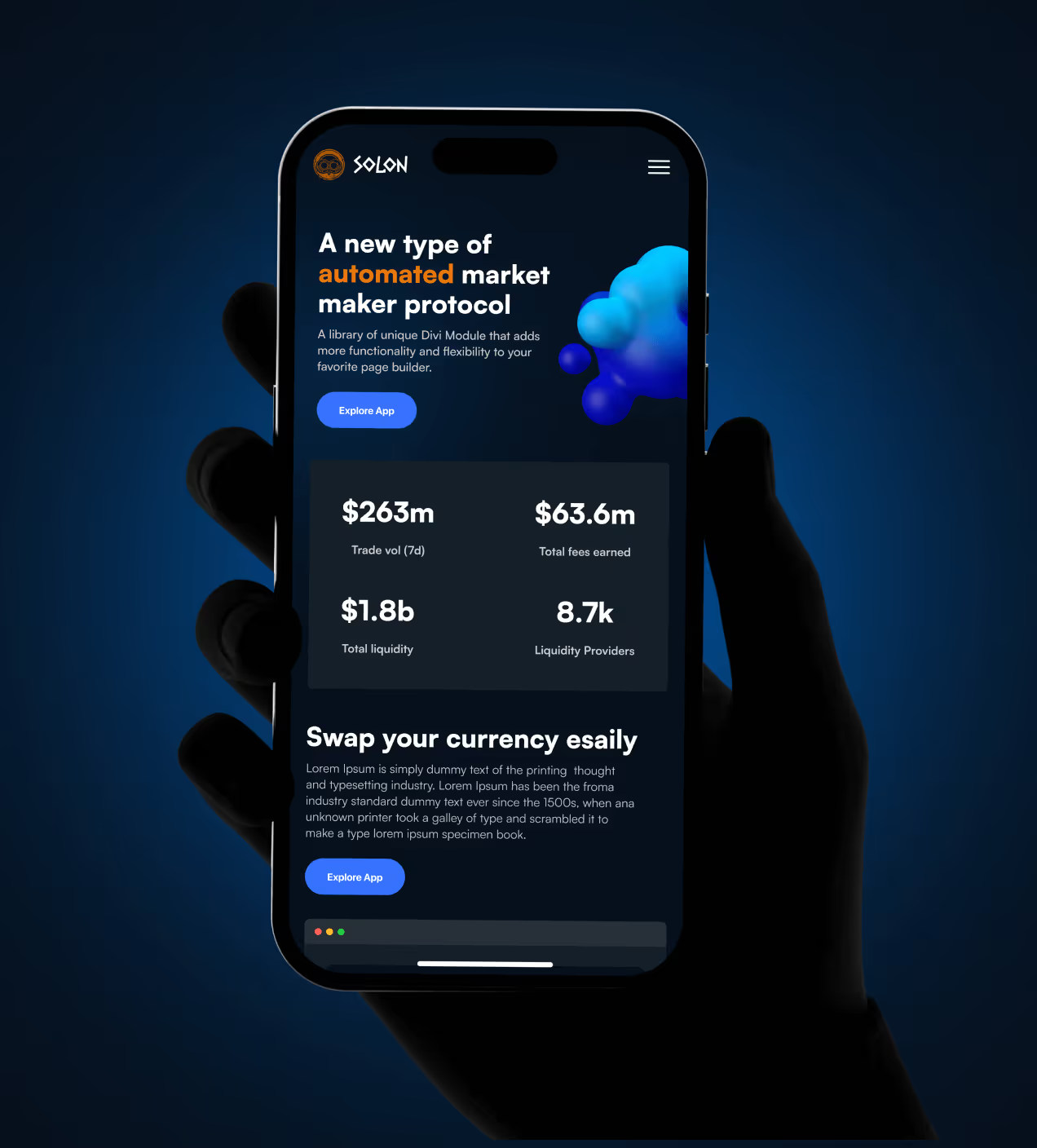
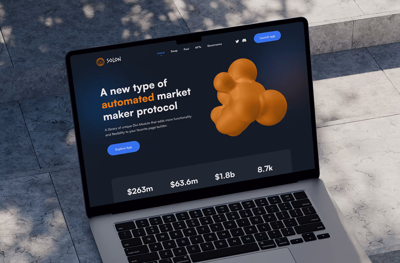
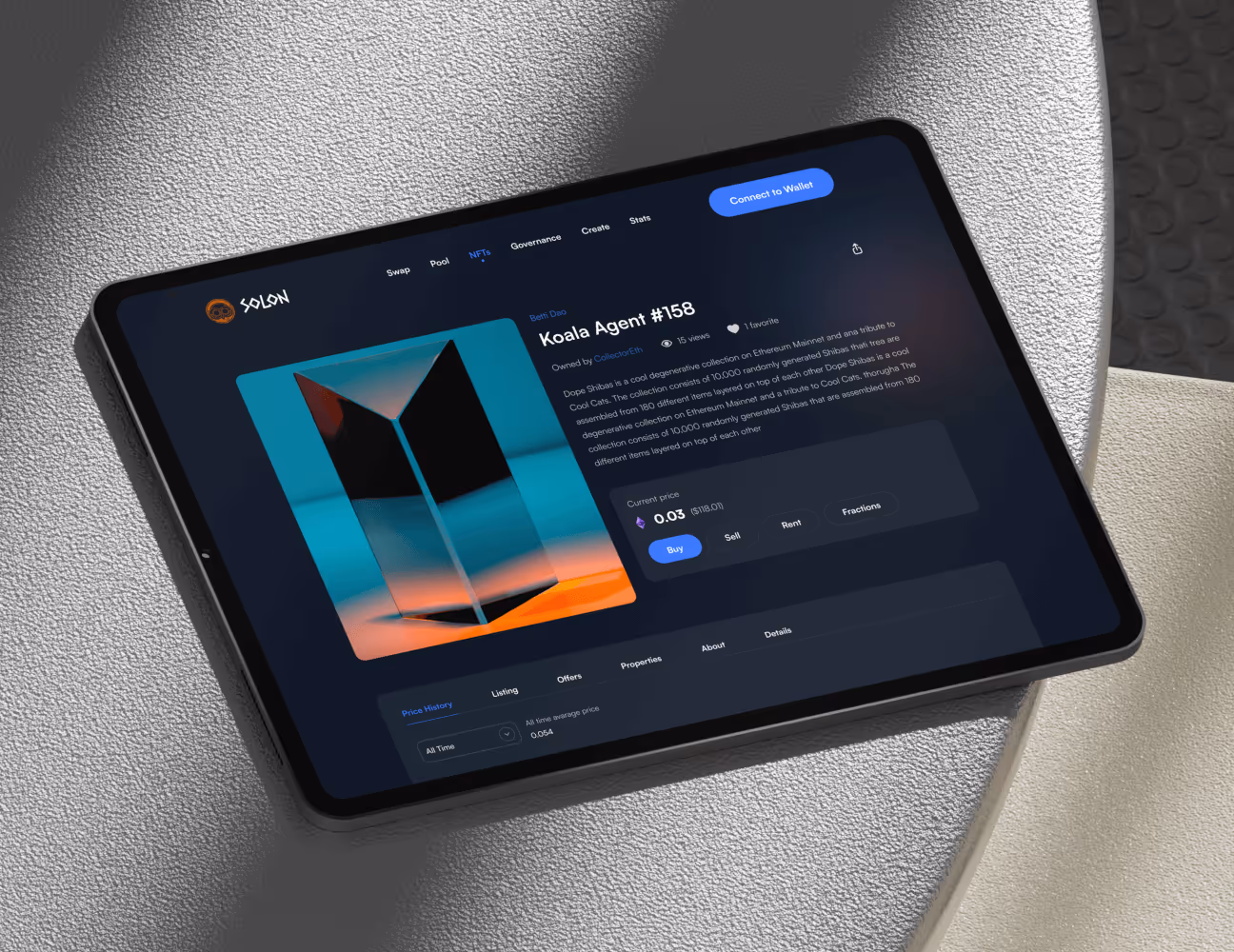
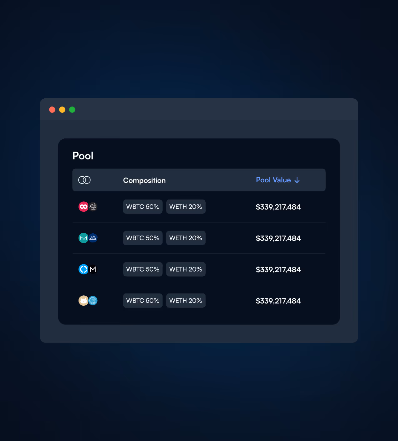
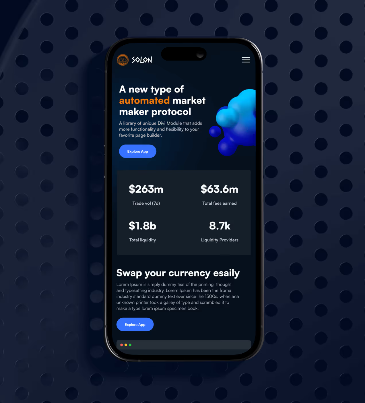
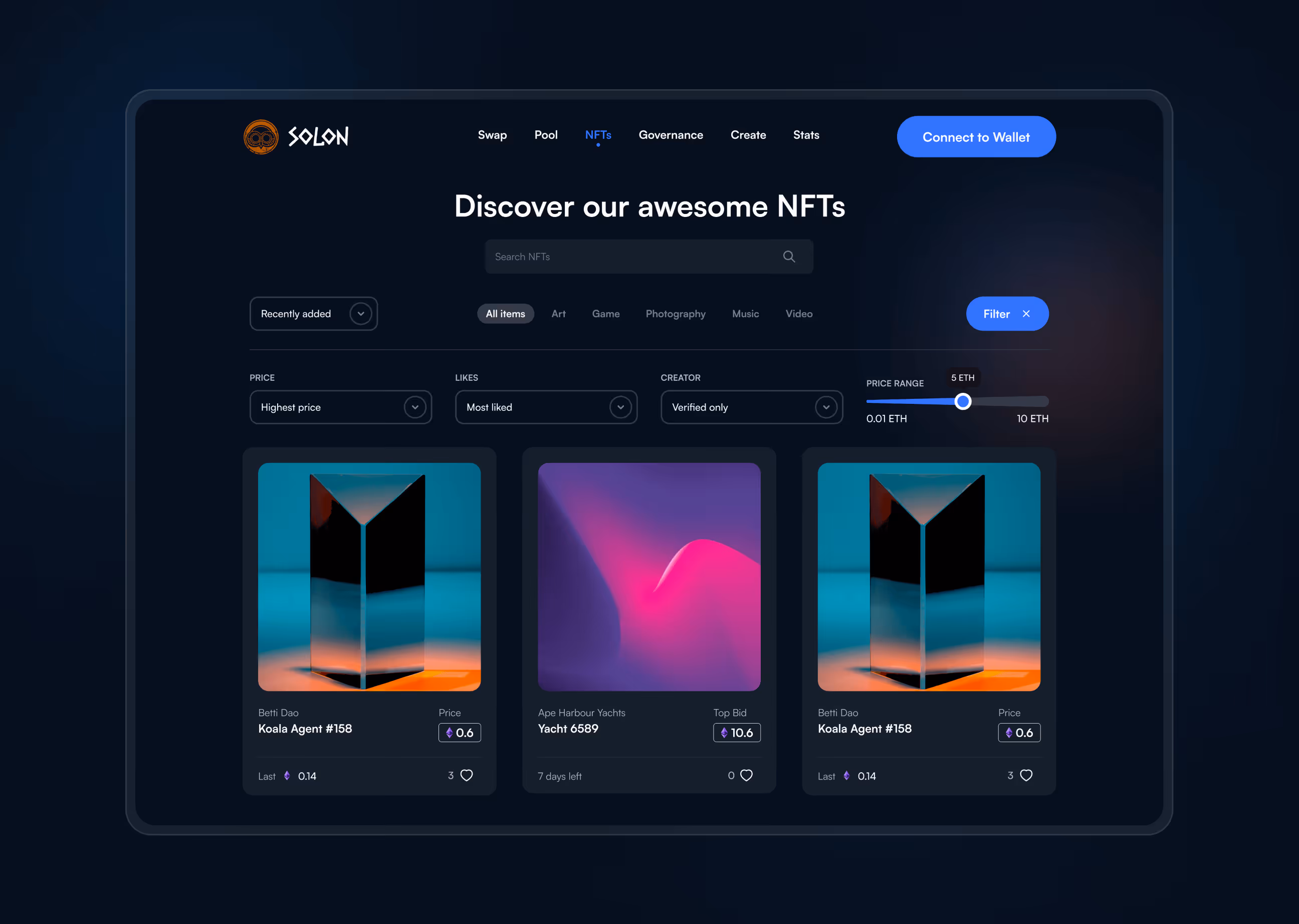
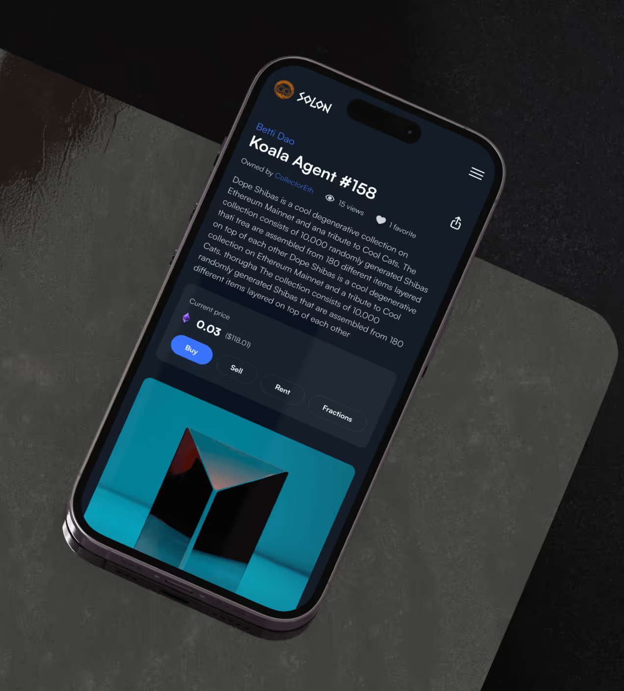
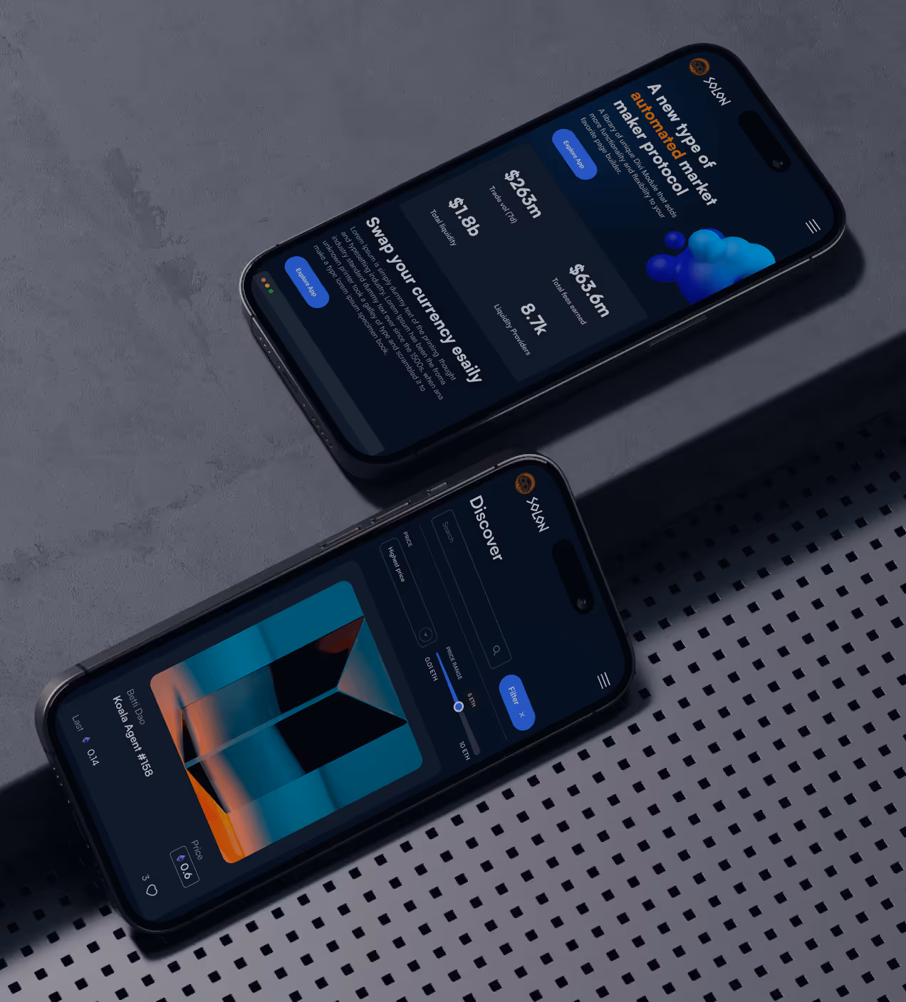
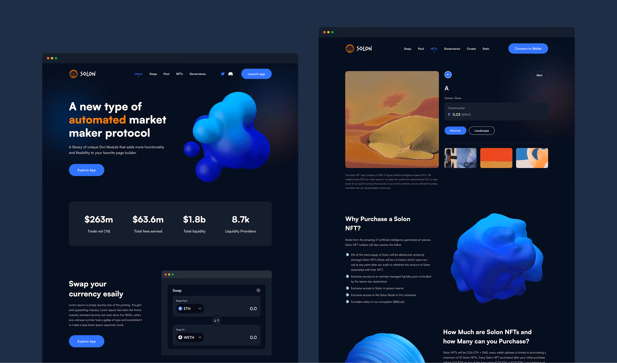
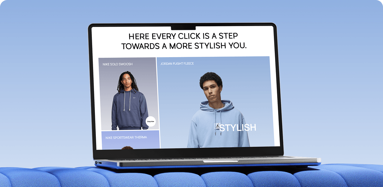
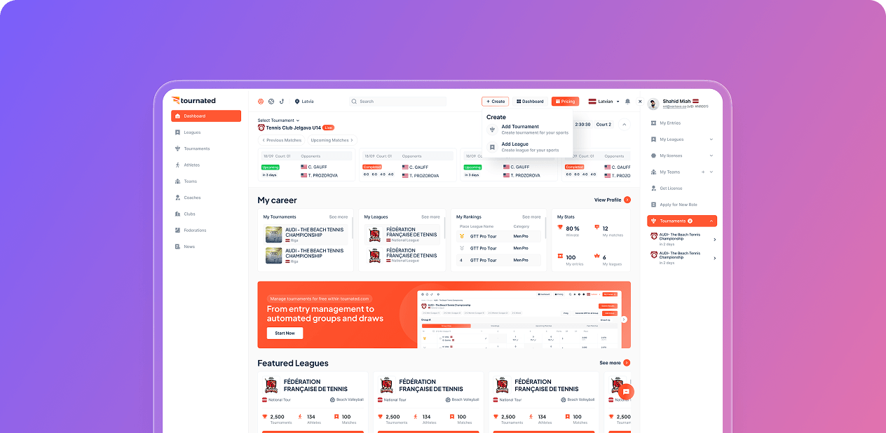
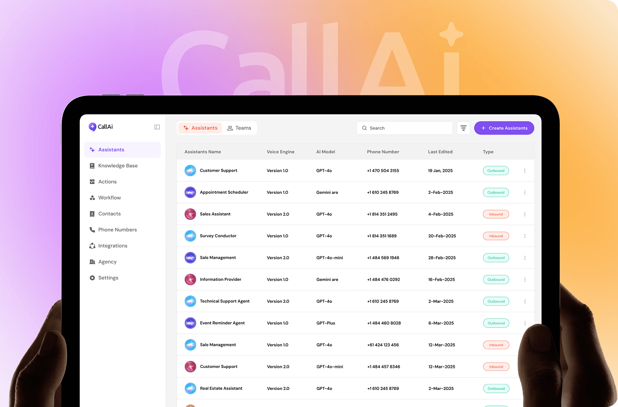
- Clear navigation structure: Organized Swap, Pool, NFTs, and Governance into an easy-to-understand menu so users always know where to go.
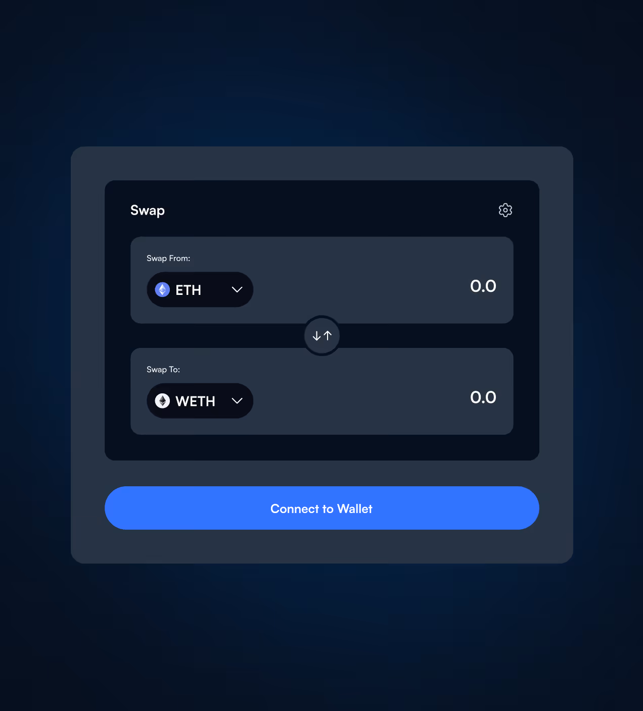
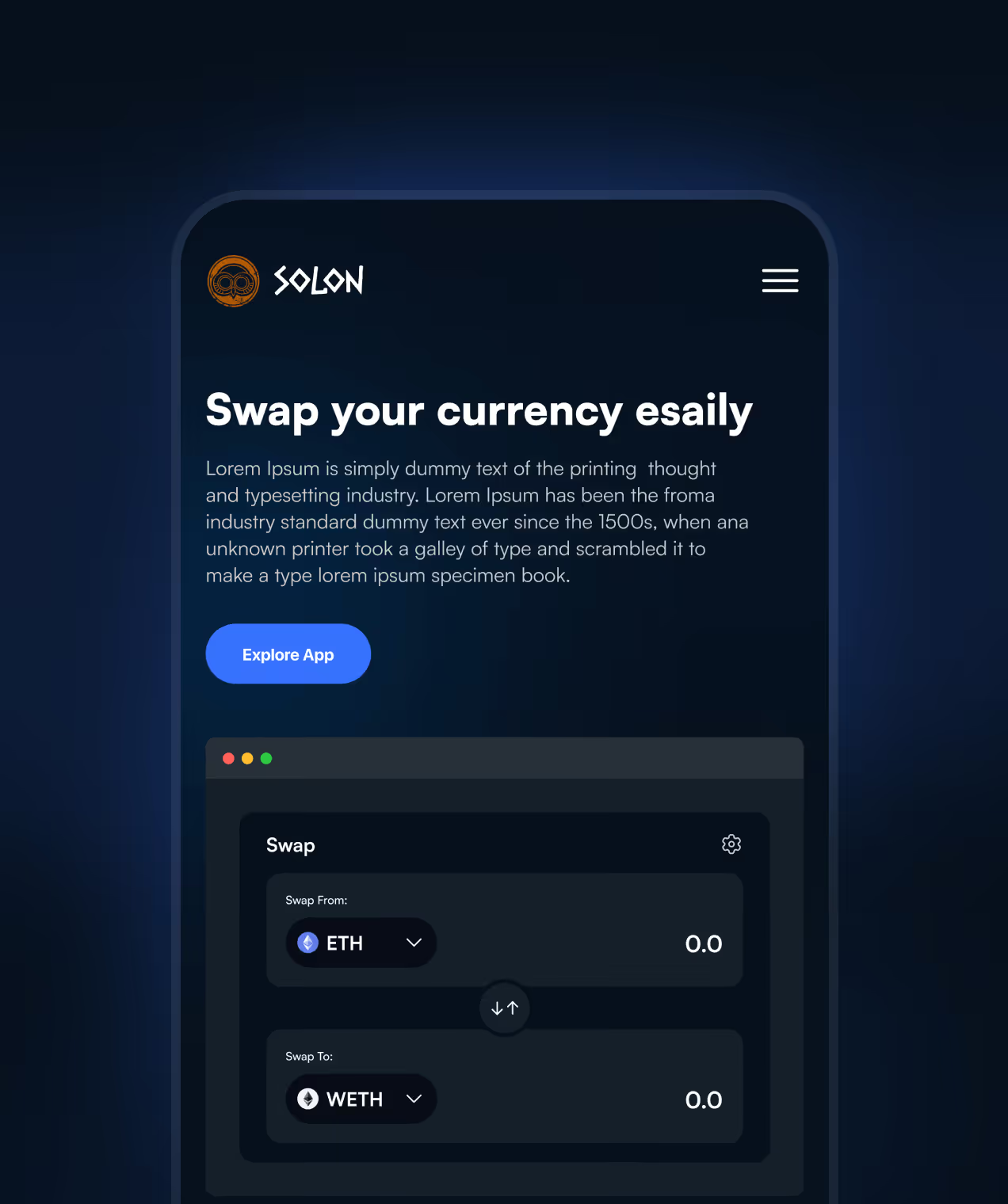
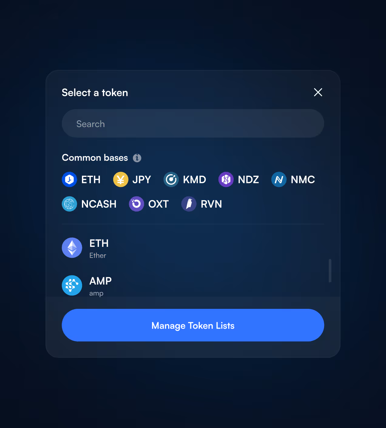
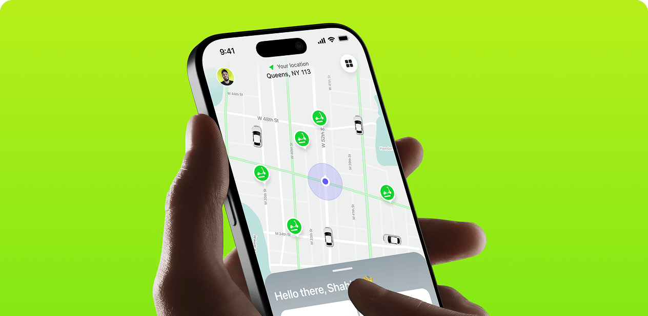
- Guided wallet connection: Designed step-by-step flows for connecting wallets and making transactions that feel safe and trustworthy from the first click.
- Simple interface with fewer clicks: Built screens that show only what users need, reducing 92% of users'desire for extra guidance by making everything obvious.
- Visual trust signals: Used modern UI, dark theme with blue accents, and clear typography to make the platform feel professional and secure for crypto transactions.
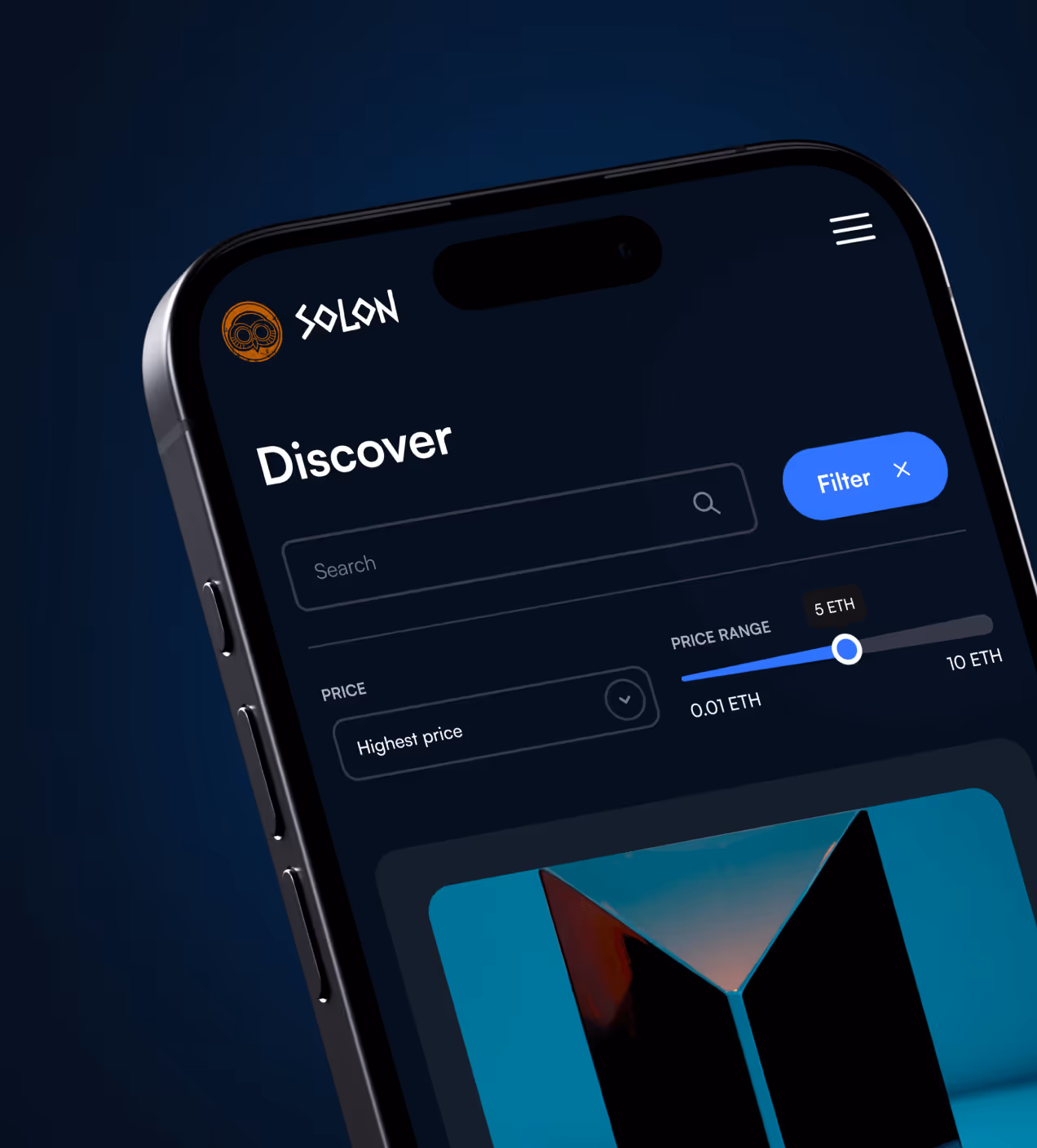
- Highlighted key features: Made Swap, Pool, and NFT actions visible on the homepage so users discover what they can do without hunting through menus.


How we built solon using a proven UX process
We worked with Solon's team to understand Web3 users, from crypto beginners to experienced traders, and designed a platform that makes blockchain simple for everyone.
We explored Web3 user behavior and identified what made blockchain platforms hard to use.
We organized how features connect so users find Swap, Pool, NFTs, and Governance without confusion.
We built and tested low-fidelity screens with real users to validate our design direction.
We created a trustworthy visual system with a dark theme, blue accents, and clear components.
UX Research & Design Artifacts
We studied how people use Web3 platforms to find what stopped them from completing blockchain actions. The findings shaped every design decision we made.
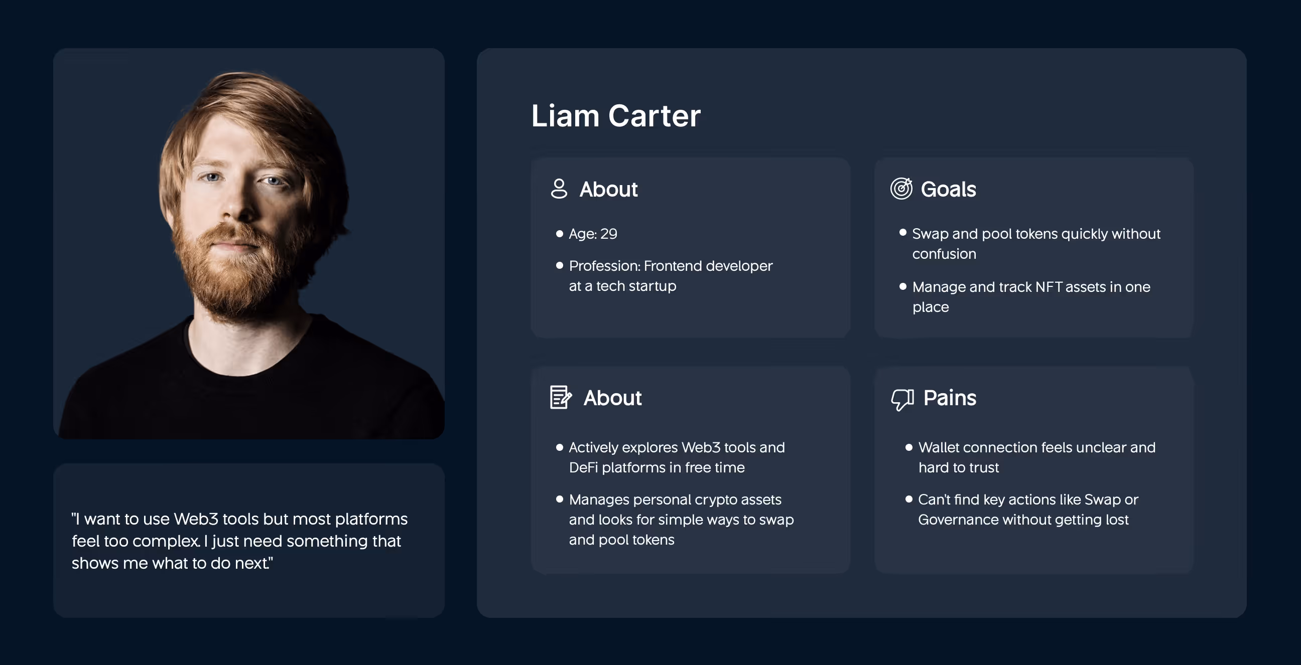
- User interviews with crypto users: Talked to 20+ Web3 beginners and experienced traders. Found 81% couldn't navigate between Swap, NFTs, and Governance without getting confused.
- Wallet connection testing: Tested wallet flows with 15 users. Discovered 67% found the connection and transaction steps unclear on both desktop and mobile, breaking trust immediately.
- Usability testing on competitors: Analyzed top Web3 platforms like Uniswap and OpenSea. Found 92% of users wanted guided steps instead of figuring everything out alone.
- Design deliverables created: Built user personas (Liam Carter), user journey maps, wireframes for Swap/Pool/NFT screens, and high-fidelity prototypes based on real frustrations.

Visual Identity and Brand Story
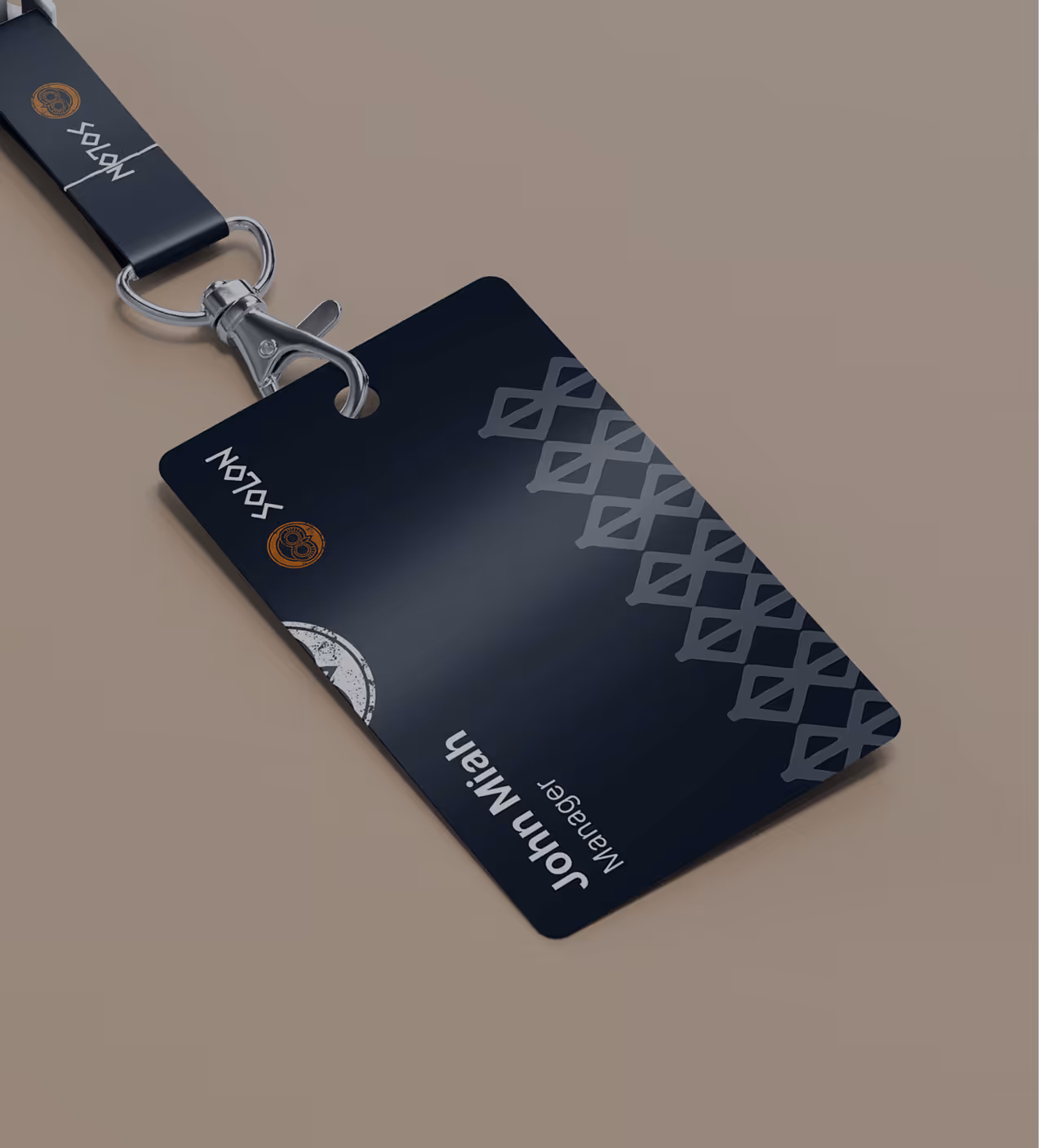
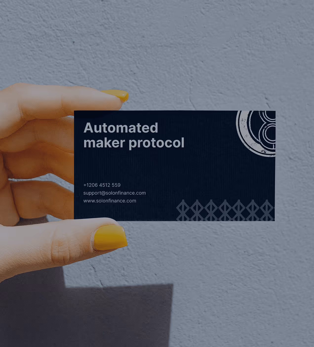
Solon's brand combines creativity with strong ties to the Web3 world. The abstract owl in the logo stands for wisdom, security, and growth made possible by the Kemet community. We chose a dark background and added orange and blue to encourage curiosity and action.
The fonts are clean and modern with rounded corners that make the app feel accessible. Every design element, from the logo to token cards, was made to look safe, modern, and vibrant. The brand helps turn Solon into something bigger and more trustworthy in the blockchain space.


System that keeps Solon consistent
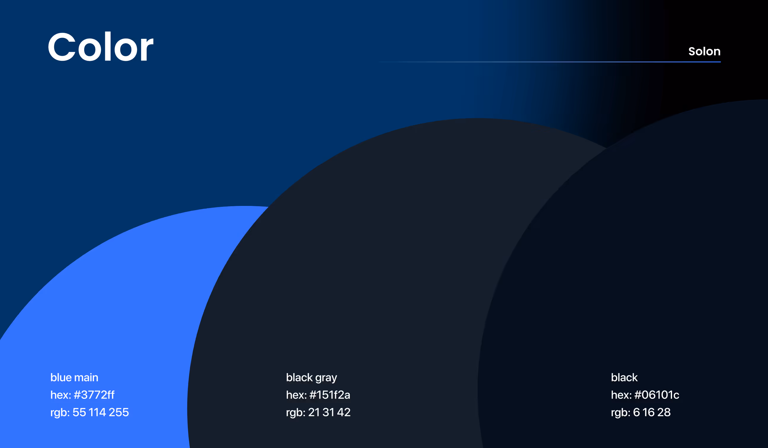
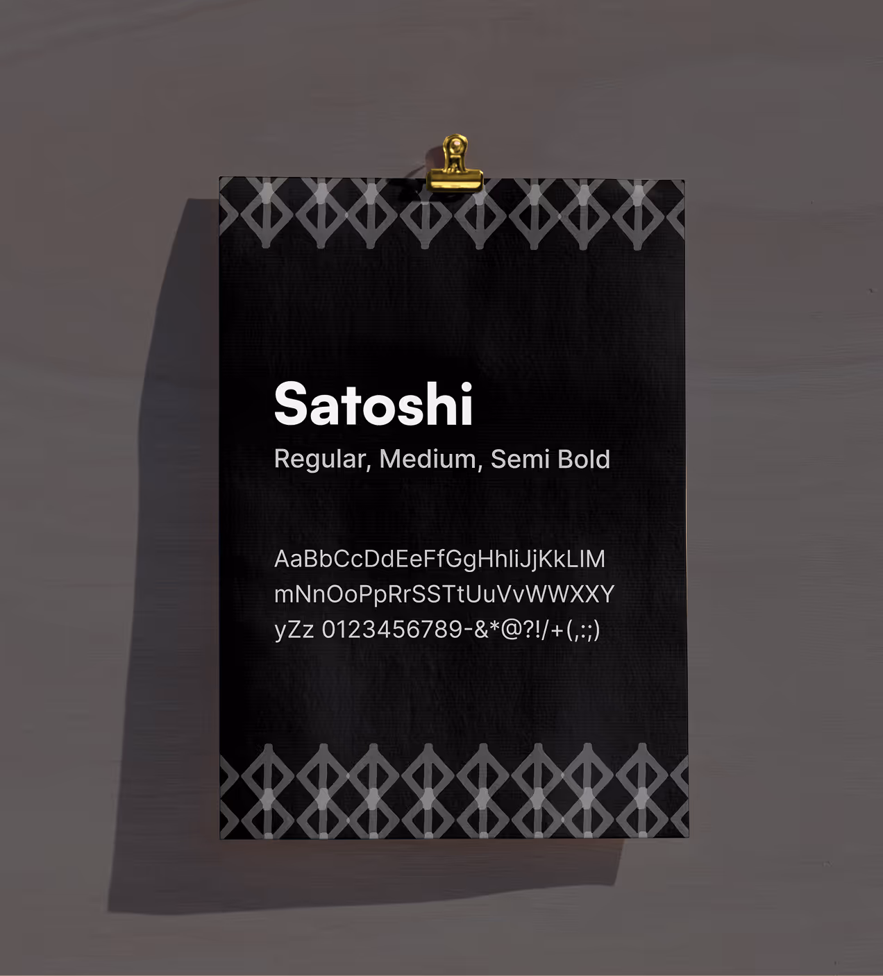
We built a design system to keep Solon consistent across desktop and mobile. The system uses a dark theme with blue main (#3772ff) for key actions, black gray (#151f2a) for backgrounds, and black (#06101c) for depth. The Satoshi font in Regular, Medium, and Semi Bold weights keeps text clean and easy to read during crypto transactions.
Components like cards, buttons, and wallet connection flows follow the same spacing and style rules. Everything scales across devices using a grid system, making it easy for developers to build new features without starting from scratch. This keeps Solon looking trustworthy and professional as the platform grows.

How we made blockchain feel simple
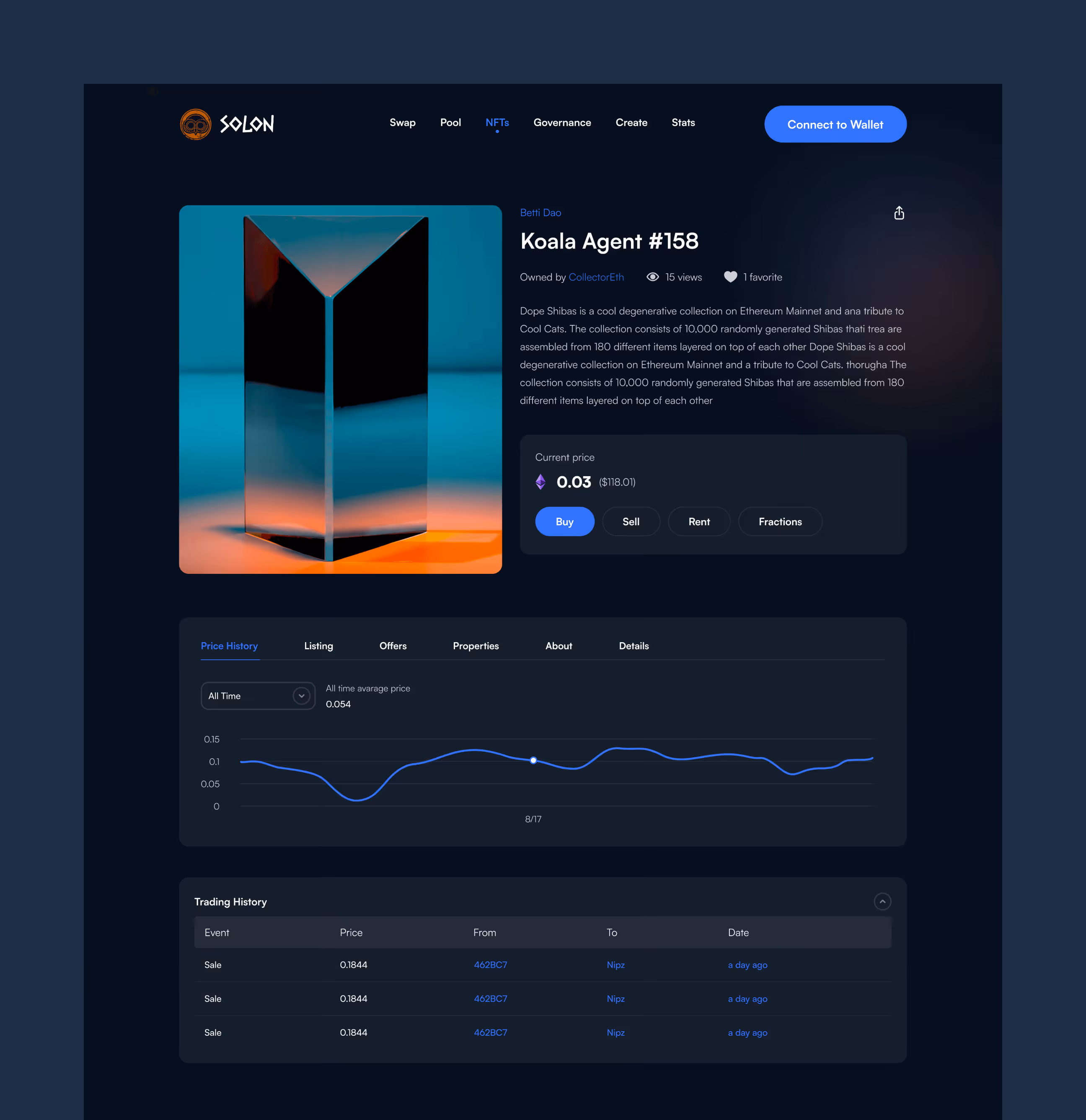
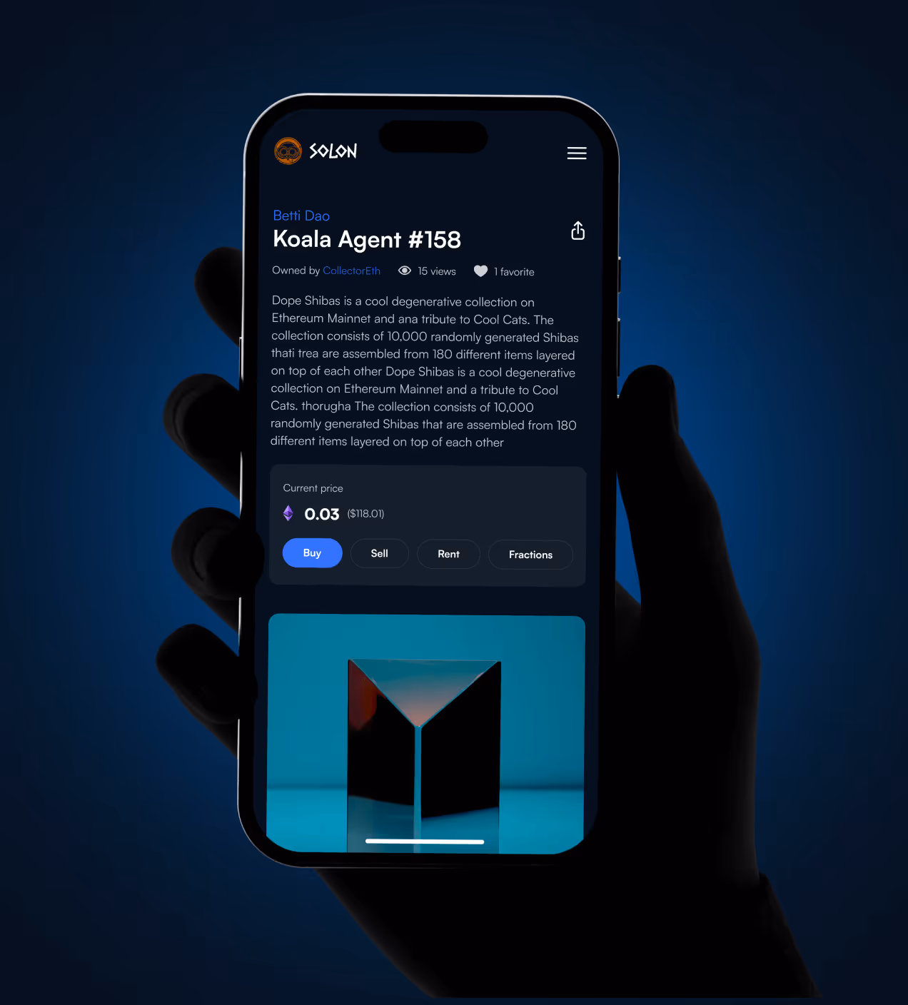
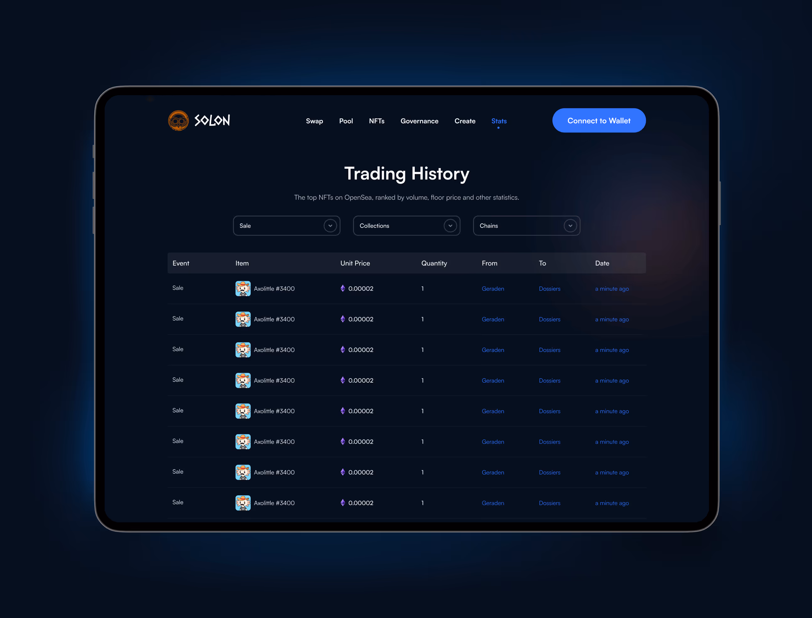
We designed Solon so that Web3 users, from beginners to traders, can swap tokens, pool assets, and manage NFTs without confusion. The dashboard shows key actions like Swap and Pool right at the top. Wallet connection uses clear step-by-step flows so users feel safe connecting and making transactions. Each feature is just one or two clicks away with buttons that show exactly what happens next.
Navigation stays simple with consistent menus across desktop and mobile. Dark backgrounds focus attention on transaction details while blue buttons highlight key actions. We tested every flow with real crypto users and fixed problems before launch. The result feels intuitive from the first use, no training needed, just fast blockchain actions.

What happened after Solon's launch
The Solon platform launched successfully, with users completing blockchain actions confidently. Clear design drove adoption, trust, and daily engagement.
Key Results:
- User confidence boost: 84% of users felt confident navigating Web3 features because guided actions made every step clear from the start.
- Actions became easier: 71% found token swaps, pooling, and NFT transactions simple with clear flows that removed confusion.
- Daily active users increased : Easy navigation and trustworthy design encouraged 47% more users to return and transact more often on the platform.
- Trusted interface: 93% said the platform feels modern, clear, and safe for crypto transactions, building confidence in blockchain actions.
- Faster onboarding: 58% of new users connected wallets and completed first transactions without confusion, thanks to step-by-step flows.


Have a Project? Let’s talk!


Your competitors are converting 3x more visitors. Not because they have a better product, but because they have a better design.


.avif)