Medical device UI/UX design: The complete guide for 2027



Assume that a nurse is at the end of a 12-hour night shift. There are three alarms going off at the same time. A patient needs a new drip rate, and the pump screen shows a small number she has to read twice. She taps, checks, and taps again.
Nothing goes wrong this time. But that small moment of doubt is exactly where medical errors begin.
This is why medical device UI/UX design is important. It is the silent work that enables a person to make the right decision in a few seconds when they are tired. When it fails, the cost isn't a lost sale. It is a patient. My name is Shahid, and I'm the founder of Wavespace.
Our team creates digital products for healthcare companies, such as a diagnostics website and dashboard, and an AI learning tool for medical students and residents. We have learned that people under pressure do not read screens, it's a lesson we've learned in every healthcare project. They scan them.
In this guide, you'll discover what medical device UI/UX design is, the rules that guide it, the practices that make screens safer, and what to look for in a design partner you can trust. All of the facts presented here are from public sources such as the FDA, ECRI, and The Joint Commission and can be verified by you.
What is Medical device UI/UX design?

Medical device UI/UX design refers to the process of designing the user interface and user experience of medical devices to ensure they are intuitive, efficient, and safe for use. Users see and touch the UI.
The UX is the entire process, from installation to the final action of a task.
A medical device user interface is much more than a screen. The IEC 62366-1 standard considers all points of contact as part of the interface, such as buttons, sounds, labels, and even the printed instructions (MedDeviceGuide). Each one can cause an error, and each one should be designed.
How is it different from Healthcare UX?
Healthcare UX is the bigger field. It contains patient portals, hospital software, and telehealth applications. Medical device UX is a more limited and rigorous aspect of it. Because a device can directly affect a patient's body, its design must follow medical device rules and pass formal usability testing before it reaches the market.
What are the main types of Medical device user interfaces?
There are four main types of medical device user interfaces. Each one is designed for a different group of people, at a different location, so each one should be designed differently.
SaMD is an acronym for Software as a Medical Device. It is software that performs medical tasks independently of hardware.
But the lines between these types are fading fast. A wearable sends data to a phone app. That app sends alerts to a clinician dashboard. And all three must speak the same visual language. When a patient sees one color on their watch and a nurse sees a different color for the same reading, trust breaks.
So the first design question is never "What should the screen look like?" It is "Who is using this, where, and under how much pressure?"
Why does Medical user interface design matter so much?
Medical user interface design matters because a confusing screen can lead to a wrong dose, a missed alarm, or a product recall. Good design protects patients, supports clinicians, and keeps products on the market.
Recent numbers show the problem is still very real:
- In 2024, the U.S. medical device industry had 1,059 recalls, the highest number it has had in four years. The most serious type of recall, a Class I, hit a 15-year high (Sedgwick, via AdvaMed).
- Software and device failure were leading causes of recalls across all regions (AdvaMed).
- In its 2026 hazard report, ECRI lists "technology designs or configurations that prompt unsafe clinical workflows" as hazard number nine (ECRI).
That last point deserves attention. ECRI is one of the most trusted patient safety groups in the world. And it is saying, in plain terms, that design itself can push careful people into unsafe steps.
Who gains from better design?
- Patients receive better and safer care and fewer mistakes.
- Clinicians are not as busy with the machine and more with the person in the bed.
- The complaints against device manufacturers are minimal, reviews are smoother, and hospitals have more trust in the devices.
Because in medicine, trust is the real product. A device that feels clear earns daily use. A device that feels risky gets worked around, or quietly ignored.
How is Medical device UX different from consumer app UX?
Medical device UX is different because a mistake can hurt a person, the rules are strict, and changes take months instead of days. Consumer apps aim for delight. Medical devices aim for safety first.
But here is the part many teams miss. Medical users are still people. They use smooth, simple apps all day on their phones. Then they walk into work and face screens that feel decades behind. That gap creates frustration, and frustration leads to shortcuts.
So the goal is not to copy consumer design. The goal is to borrow its clarity while keeping medical discipline. Clean layouts, clear words, and quick feedback are helpful to everyone. A device used to guide a dose shouldn't feature trendy effects, hidden menus, or small gray text.
The best medical products feel simple. And that simplicity is always the result of very careful work.
Which rules and standards shape Medical device UI design?
In the U.S., there are five primary rules that influence medical device UI design: IEC 62366-1, ISO 14971, FDA human factors guidance, IEC 60601-1-8 for alarms, and FDA cybersecurity rules. In Europe, the EU MDR adds its own usability duties.
The FDA treats IEC 62366-1 as a recognized consensus standard. That means following it helps support an FDA submission (Greenlight Guru).
The latest piece is Cybersecurity. Section 524B came into effect on March 29, 2023 (Censinet), and FDA finalized cybersecurity guidance for premarket submissions in June 2025 (Morgan Lewis). This makes designers' real screens change
Because these rules can feel heavy, some teams treat them as paperwork at the end. That is a costly mistake. When the rules guide design from the first sketch, testing runs smoother, and surprises shrink.
What are the best practices for medical device user interface design?
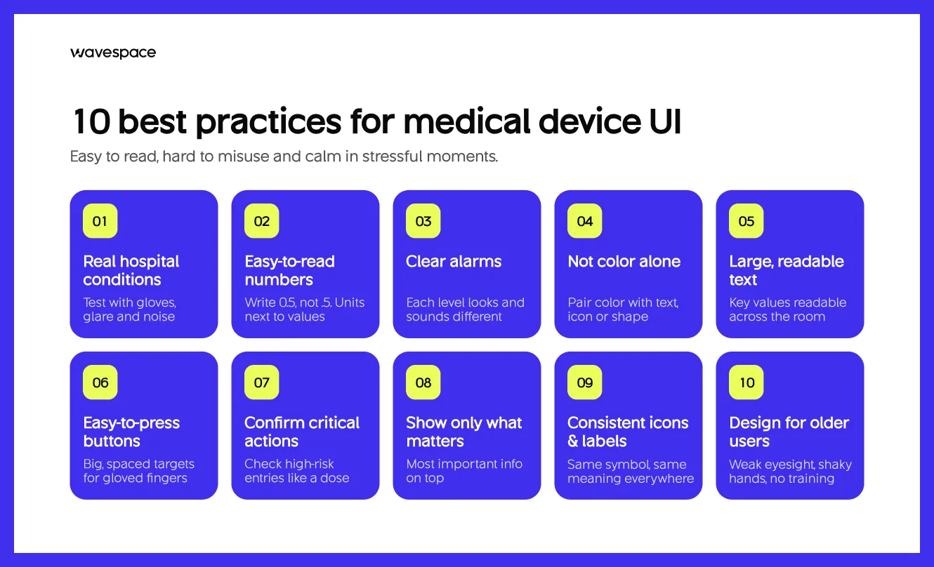
The ideal medical device user interface design is simple to read, difficult to abuse, and soothing in stressful situations. Each of these ten is of utmost importance.
Design for real hospital conditions. Test with gloves, bright lights, noise, and distance. A screen that works at a desk can fail at a bedside.
Make numbers easy to read. Write 0.5, not .5, and write 5, not 5.0. A missing or extra zero can turn into a tenfold dose error. Always show units next to values.
Design clear alarms. Use different sounds, colors, and locations for high, medium, and low alarms to ensure that users can distinguish them in a second.
Avoid using color as the only method of identification. Use color in combination with text, icons, or shape, since many users are color blind.
Use large, easy-to-read text. Key values should be readable from across the room, not only up close.
Make buttons easy to press. Make sure touch targets are large and spaced apart so that a gloved finger will not touch the wrong target.
Confirm critical actions. Request user confirmation of high-risk entries (such as a dose) before the device takes action.
Show only what matters. Place the most crucial information at the top and then go one step deeper.
Keep icons and labels consistent. The same symbol should represent the same thing in a product family across all screens and devices.
Design for older and non-clinical users. Home users might not have good eyesight, shaky hands, and no medical training.
From the design floor Shahid Miah, Founder: "Medical Student AI gets used on phones between patients, often one-handed and in a hurry. That shaped the whole dashboard: short answers first, large tap targets, and the next action always in reach. Hospital equipment is a harder version of the same problem. Gloves, glare, and alarms replace a busy hallway, but the principle is the same."
What does the medical device UX design process look like?
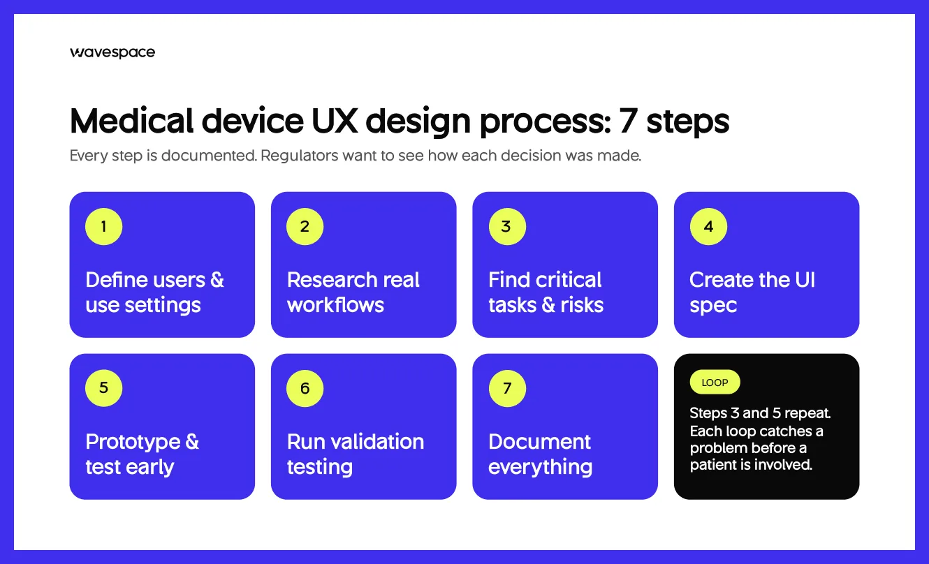
The medical device UX design process has 7 clear steps to follow, from understanding users to proving the design is safe. Every step is documented, regulators want to see how each decision was made.
- Identify user and use situations. Define all user types, their skills, and the environment where they will use the device.
- Research real workflows. Watch people work in real clinics or homes. What people do often differs from what they say.
- Find critical tasks and risks. Identify the tasks where a mistake could cause harm. These tasks become the focus of testing.
- Create the UI specification. Record the desired response of all screens, alarms, and controls.
- Test and prototype early! Make basic prototypes and test them with actual users. The first rounds are known as formative evaluations. They are not here to judge or to pass or fail.
- Run validation testing. Test the final design with representative users on all important tasks. This is known as summative evaluation, and it contributes to the regulatory submission.
- Document everything. Collect information on research, risks, test results, and design decisions into a usability engineering file.
But the process is never a perfectly straight line. Steps 3 and 5 are repeated many times with teams. That's a positive thing. Each loop will capture a problem at an early stage, before it is costly to resolve and before a real patient is involved.
What challenges do Medical device designers face?
Alarm fatigue, a lot of users on one device, limited hardware, security vs. speed, older devices, and slow change after approval are six common challenges for medical device designers. Knowing them early helps teams plan around them.
Alarm fatigue deserves extra attention. According to The Joint Commission, 85% to 99% of alarm signals do not require clinical action. If nearly all the alarms are false, then people cease to listen.
From the design floor Shahid Miah, Founder "Across the mdxhealth website and dashboard, every test had two audiences: urologists who needed the evidence, and patients who needed to understand what a result meant for them. We gave each audience its own path instead of forcing one page to serve both. A medical device has the same problem on a single screen. The first design decision is always who this screen is for."
What can real Medical device failures teach us?
Real failures teach one clear lesson: most "user errors" begin as design problems. Two well-documented cases show how this happens.
Infusion pump errors design
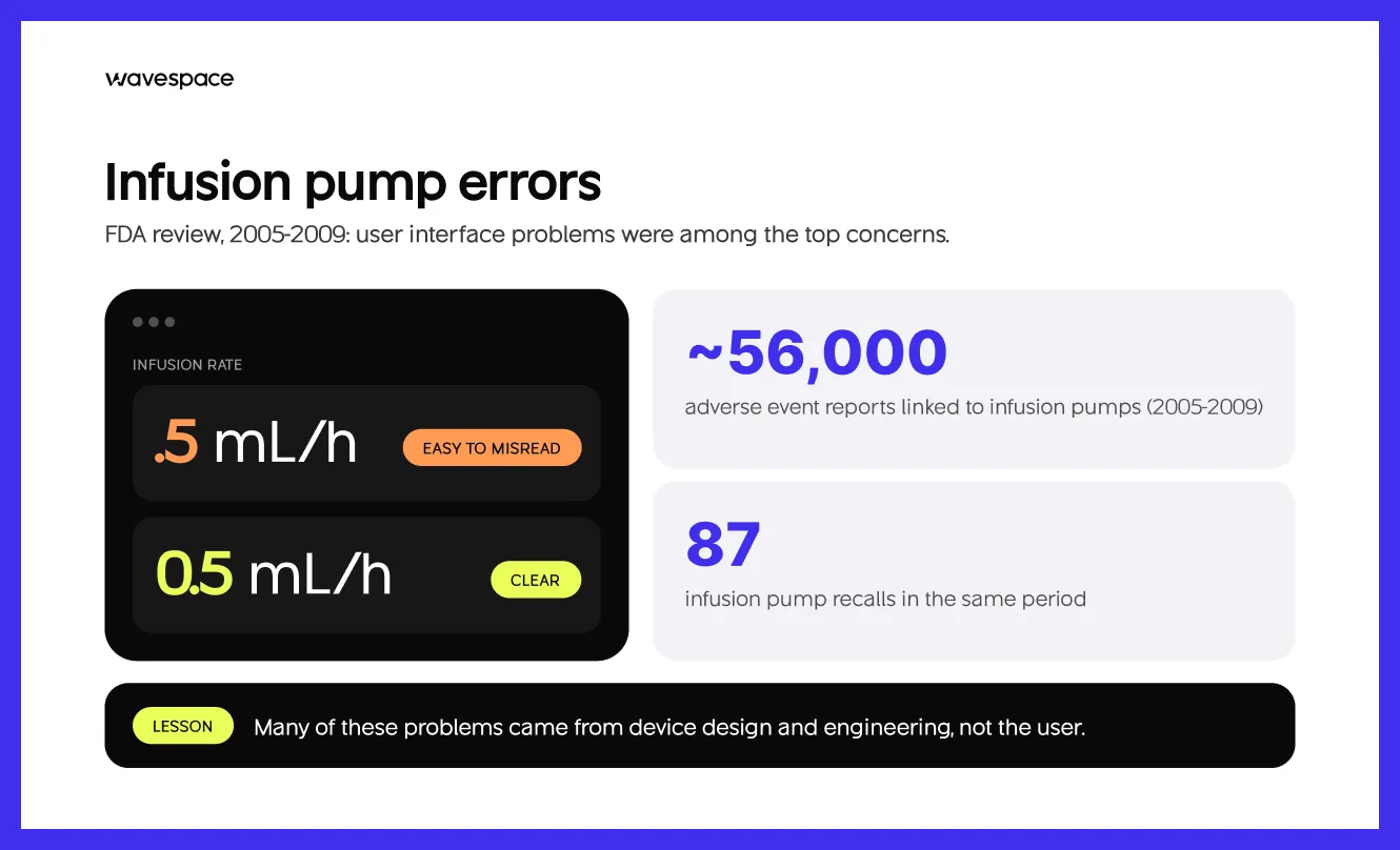
Infusion pumps are mechanical or electronic devices that deliver controlled amounts of fluid, medicine, or nutrients into the bloodstream. They are responsible for high-alert medications (insulin, opioids, chemotherapy, etc.), and any deviations can be life-threatening.
Between 2005 and 2009, the FDA received approximately 56,000 adverse event reports associated with infusion pumps, and there were 87 pump recalls (FDA). User interface problems were among the top concerns (FDA).
It also reported that some on-screen instructions were confusing, which might result in incorrect doses or infusion rates. It concluded that many of these problems had been caused by design and engineering failures in the devices.
Alarm-related deaths design

An alarm-related death occurs when an alarm operates normally or sounds a warning and the clinical environment does not respond, or when an alarm fails to sound during a critical event. This is primarily a human factors and interface failure.
The Joint Commission's alarm safety alert reported that the FDA's MAUDE database recorded 566 alarm-related patient deaths between January 2005 and June 2010 (The Joint Commission). It named alarm fatigue as the most common contributing factor.
What these cases teach us
These are over 10 years old. But they still influence the rules designers use today and still appear in ECRI's current hazard lists. The lessons are simple:
- Assume the user is tired, rushed, and interrupted.
- Make the correct move the easiest.
- Test with real users before real patients are at risk.
Behind every one of those numbers was a family. That is the weight this work carries.
Which Medical device UI trends matter in 2027?
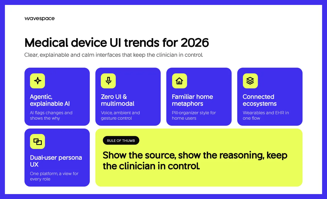
The 5 trends transforming medical device UI design in 2027 are: AI in devices, care at home, security as part of design, and touchless control.
Outcome-driven design, cognitive reduction, and strict safety validation are the core elements shaping the medical device UI space right now. When developing digital products in the healthcare sector, the emphasis is now firmly on human factors engineering (such as IEC 62366 and FDA regulations) to manage information and data without overwhelming the operator.
Here are the key shifts to keep on your radar:
Agentic AI & Explainable Proactive UIs: AI has grown from a passive tool to an active agent that alerts to physiological changes and amplifies abnormal data. The big UX hurdle is building explainable interfaces that clearly surface the "why" behind an AI suggestion, ensuring the clinician stays safely in the loop.
Zero UI & Multimodal Inputs: To combat charting burnout and maintain sterile workflows, systems are leaning into voice-first scribing, ambient intelligence, and gesture controls. Screens are getting secondary, and they are adapting dynamically according to real-time context.
Skeuomorphic Metaphors for Home Care: As devices move into the hands of patients and elderly users at home, we are seeing a return to familiar physical metaphors. Emulating real-world items like pill organizers or traditional file folders reduces cognitive stress when navigating digital interfaces in high-pressure moments.
ECRI listed unmet technology support needs for home care patients as its number two hazard for 2025 (LAMMICO).
Ecosystem Integration & Cross-Brand Cohesion: Fragmented apps are out. Patient-facing UIs are becoming a single "health passport" that integrates a variety of hardware sensors, wearables, and hospital EHR systems into a seamless visual stream, necessitating cross-brand component design.
Dual-User Persona UX: All systems should be designed for multiple users. One platform must be able to seamlessly switch between a high-density display for a surgeon on a clock, a simplified display for an anxious patient, and a technical display for an IT administrator while maintaining compliance in check.
From the design floor Shahid Miah, Founder "When we designed the AI chat for Medical Student AI, the biggest design question wasn't the answer. It was the source. Medical users don't trust an AI because it sounds confident. They trust it when they can see where the answer came from. Any AI feature inside a medical device needs the same rule: show the source, show the reasoning, and keep the clinician in control."
What affects the cost of Medical device UI/UX design?
In short, Several key technical factors, the complexity of clinical data, regulatory factors, and usability validation studies drive the cost of medical device UI/UX design.
The price of medical device UI/UX design varies depending on the type of device, the number of user groups, the number of screens and Workflows, and the amount of research, testing, and documentation required for the project. Unfortunately, there is no real one-size-fits-all price, so when you get a quote that doesn't include discovery, be wary.
Timelines follow the same pattern. A focused app may move from research to a tested design in a few months. A multi-device platform with formal validation testing can take much longer.
Because of this, the smartest first step is a short discovery phase. It defines users, risks, and scope before anyone commits to a full budget. At Wavespace, we recommend that every healthcare project start this way.
After that, teams can work with us on a design subscription, beginning at $2200 per month for 55 hours of design. It provides you with consistent design support without having to sign a big lump-sum contract. And it guards the folks who will ultimately depend on what you construct.
How do you choose the right Medical device design partner?
Choose a medical device design partner who understands healthcare users, designs with risk in mind, tests with real people, and documents every decision. A beautiful portfolio alone is not enough.
Ask these five questions before you sign:
- Have you designed for healthcare users before? Ask to see live work, not concept shots.
- How do you research users? Look for interviews and observation, not guesses.
- What is your approach to risk? A good partner talks about critical tasks and use errors without being asked.
- How do you test? Expect early testing with real users, then more rounds as the design improves.
- What do you write down? You will need design reasons and test records for regulatory purposes for your team.
How Wavespace helps Healthcare product design

We support healthcare start-ups and founders to transform complex medical concepts into simple, viable products. Our healthcare work includes the website and dashboard for mdxhealth, a precision diagnostics company, and the full product for Medical Student AI, including its website, dashboard, and AI chat interface.
Every one of these projects taught us to design for the person under pressure first. We collaborate with your clinical, engineering, and regulatory teams to ensure that each design decision is appropriate to your process. And we will always tell you the truth about your project, even if it is less than you thought.
Medical device UI design checklist
Use this medical device UI design checklist to review any screen before testing or launch.
- Every user type and use environment is listed
- Critical tasks are identified and ranked by risk
- Numbers use leading zeros and no trailing zeros
- Units appear next to every value
- Alarm levels look and sound different
- No information depends on color alone
- Key values are readable from a distance
- Touch targets work with gloved hands
- High-risk actions ask for confirmation
- Each screen shows only what the task needs
- Icons and labels stay the same across screens
- Error messages explain what to do next
- Home-use screens work for older adults and first-time users
- Login and timeout steps never block emergency use
- AI outputs show their source
- Formative testing ran with real users
- Summative testing covers every critical task
- Design decisions and test results are documented
Print it, share it with your team, and use it at every design review. Small checks like these catch big problems early, while they are still easy to fix.
Conclusion
Medical device UI/UX design is low noise, high impact. If it's done right, nobody will notice. The nurse reads the number on the first try. The patient at home trusts the reading. The surgeon's eyes are on the patient, not the screen!
However, when it is not done well, people pay for it, sometimes in their health. This is why this work must be cared for, have clear rules, and be tested from the beginning.
When developing a medical product, begin with the people who will use it. Find out where they are, what they are concerned about, and what they need in their worst hour. Then design for that moment.
At Wavespace, we believe good healthcare design is an act of care. Whether you're developing a medical device, health app, or a clinical dashboard, we'd love to hear your story and help you create something that people can trust.
Sources
- Sedgwick State of the Nation 2025, Medical Device Edition (AdvaMed)
- AdvaMed: State of the Nation 2025 Recall Index summary
- ECRI: Examining the Greatest Health Technology Threats of 2026
- LAMMICO: ECRI Top 10 Health Technology Hazards for 2025
- FDA: Applying Human Factors and Usability Engineering to Medical Devices
- FDA: Infusion Pump Improvement Initiative white paper
- FDA: Infusion Pumps
- The Joint Commission: Sentinel Event Alert on medical device alarm safety
- The Imaging Wire: FDA AI device numbers through 2025
- Greenlight Guru: IEC 62366 explained
- MedDeviceGuide: IEC 62366 usability engineering guide
- Censinet: FDA cybersecurity rules for medical devices
- Morgan Lewis: FDA cybersecurity requirements for medical devices
Frequently asked questions about medical interface

The visible and touchable parts of a device, such as screens, icons, controls, etc., are considered UI. Ux embraces the entire experience, from setup, workflow, error recovery, and training. In medical devices, both need to collaborate to avoid use errors.
Formative testing happens during design. It identifies problems early and does not have a pass or fail outcome. Summative testing happens at the end. It proves that representative users can complete critical tasks safely, and its results support the regulatory submission.
A critical task is a task in which a user error may lead to serious harm to a patient or user. This can range from setting a dose to reacting to a high-priority alarm. Design and testing are focused on critical tasks.
It depends on whether the app is a medical device or not. If it does, FDA expects human factors work for tasks where use errors can cause harm. Not all wellness or education apps are medical devices, consult a regulatory expert early.
It depends on scope. A targeted application that has one user group can take a couple of months from research to tested design. If there are several user groups and many screens and formal validation testing, it will take much longer.

More related blog

Design & development in one team. Let’s talk!



















Francisco, CA 94105, United States