

+120%
3x
60%
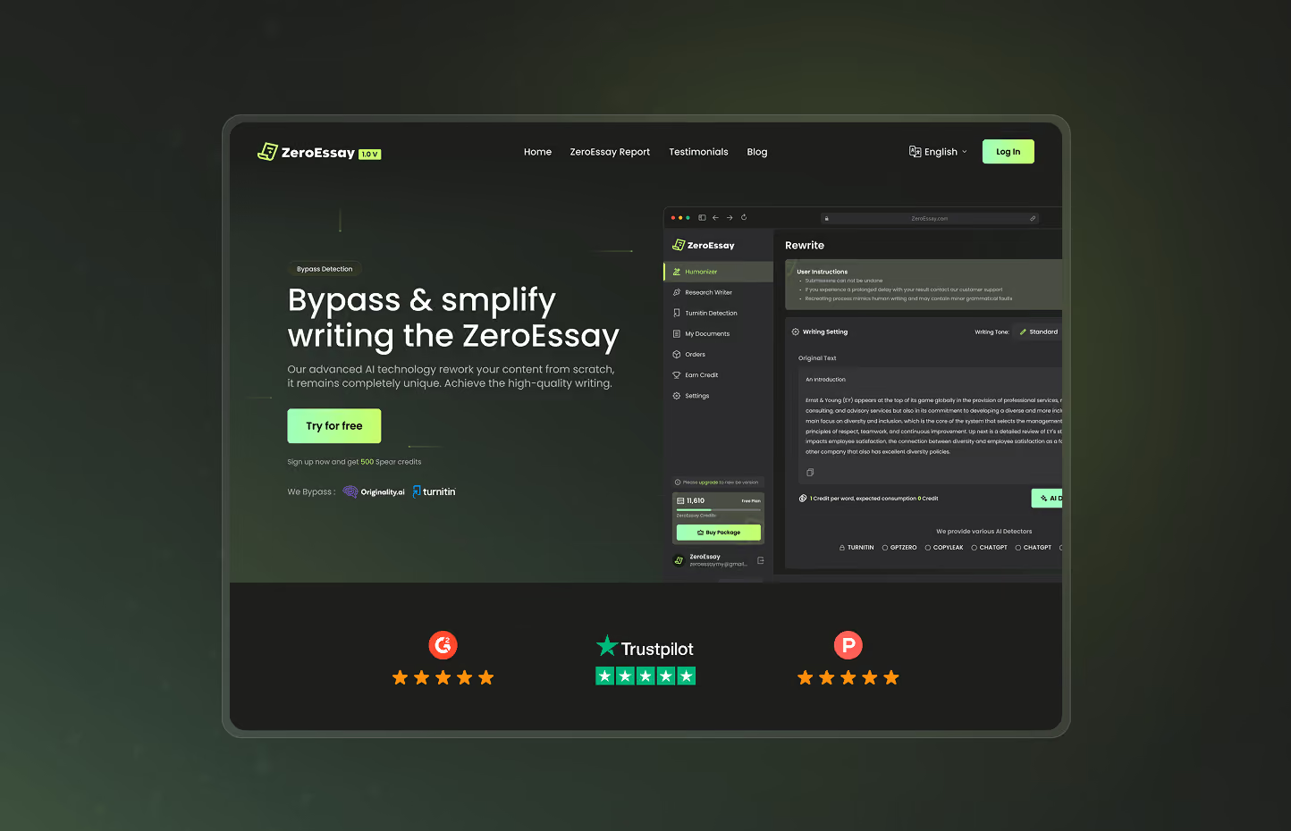
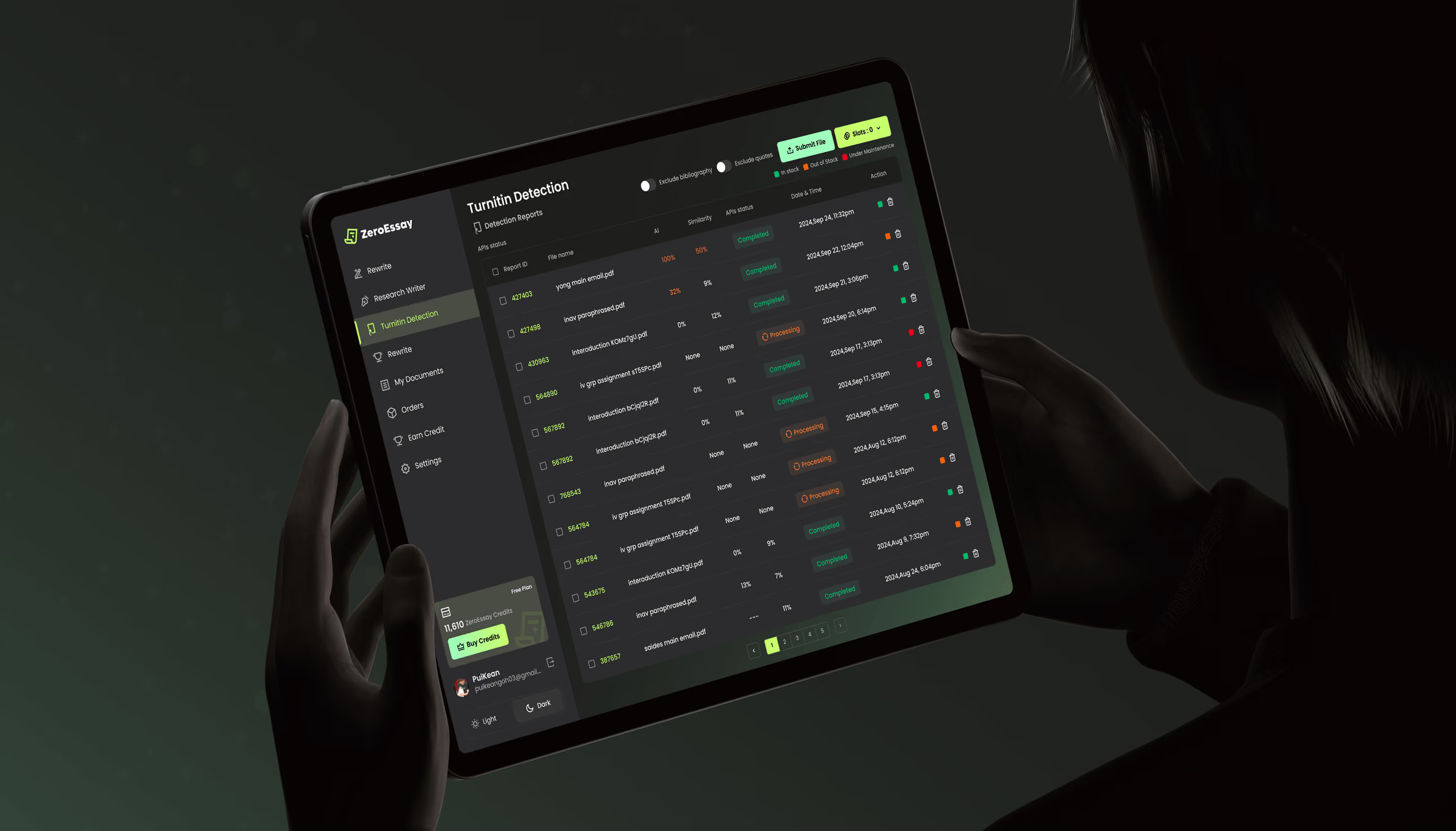

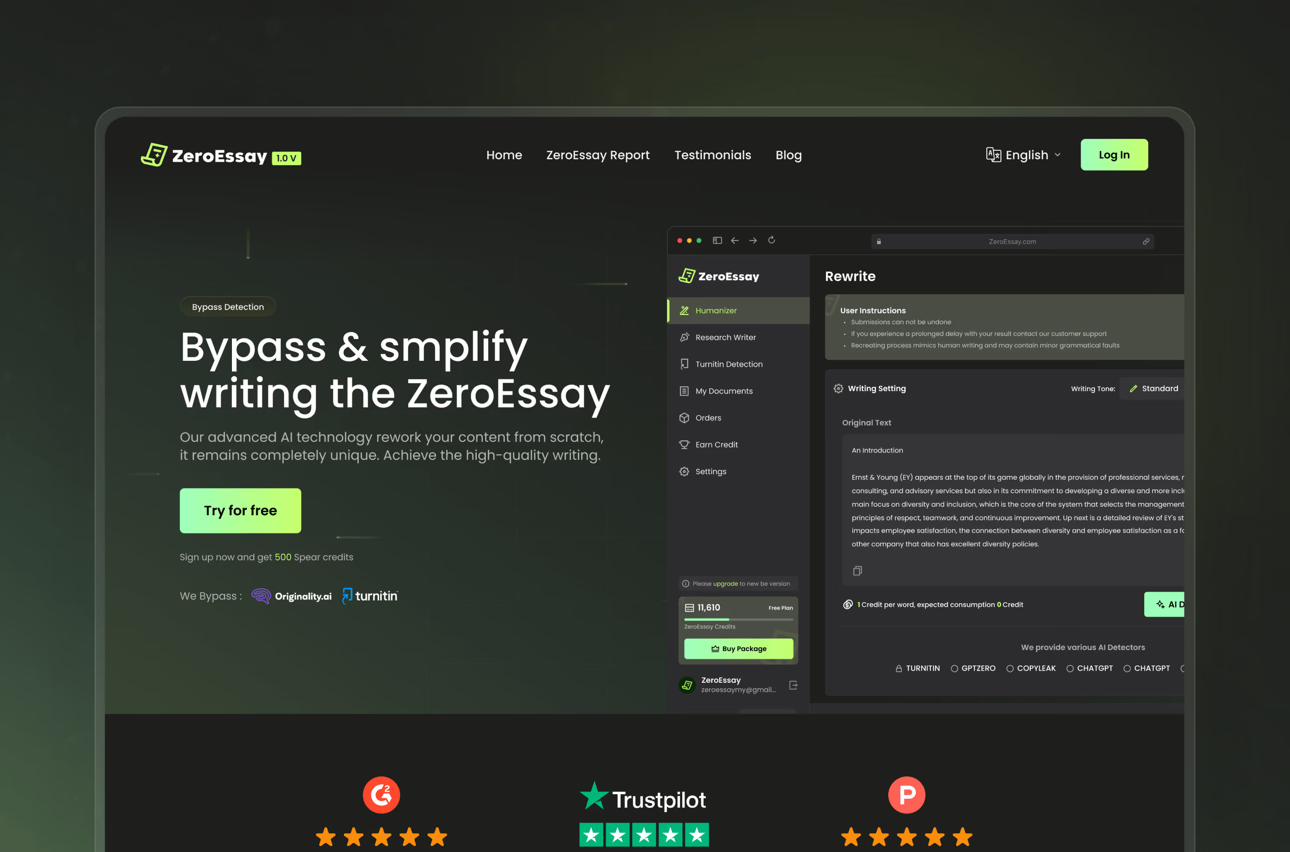
ZeroEssay is an AI writing platform that helps people rewrite, humanize, and verify AI-generated content. With a humanizer, a multi-detector originality checker, and a research writer in one place, it turns a technical, opaque AI process into something anyone can use with confidence.
ZeroEssay approached us to design the full product and brand from the ground up, the marketing site, the core app across web, tablet, and mobile, and a complete visual identity. The goal was to make a complex set of AI tools feel like one clear, trustworthy product for students, writers, and professionals.
Three AI tools that didn't feel like one
ZeroEssay had real power inside: a humanizer, a multi-detector originality checker, and a research writer. But those powers were spread across disparate tools with no clear path to access.
Users would enter the site without knowing what to do first, which tool would solve their problem, or whether to trust an AI result they couldn’t see the logic behind. The very power of the product worked against its own usability.
- Three tools, no through-line the humanizer, detector, and research writer worked in isolation instead of as one connected product.
- Trust with nothing to hold onto users had to accept AI output with no visible scores or signals to justify it.
- Friction before the first result reaching a real output meant moving through setup and navigation that slowed the first win.
- A landing page that under-sold the product the marketing experience didn't make ZeroEssay's value or audience clear at a glance.

One clear system, built for trust
We designed ZeroEssay as a single connected product instead of a set of separate tools. Every decision worked toward two goals: make the AI process visible enough to trust, and make the path to a result short enough that users reach value fast.
That meant a unified product structure, a trust-first interface, and a brand and landing experience that finally said what ZeroEssay was and who it was for.
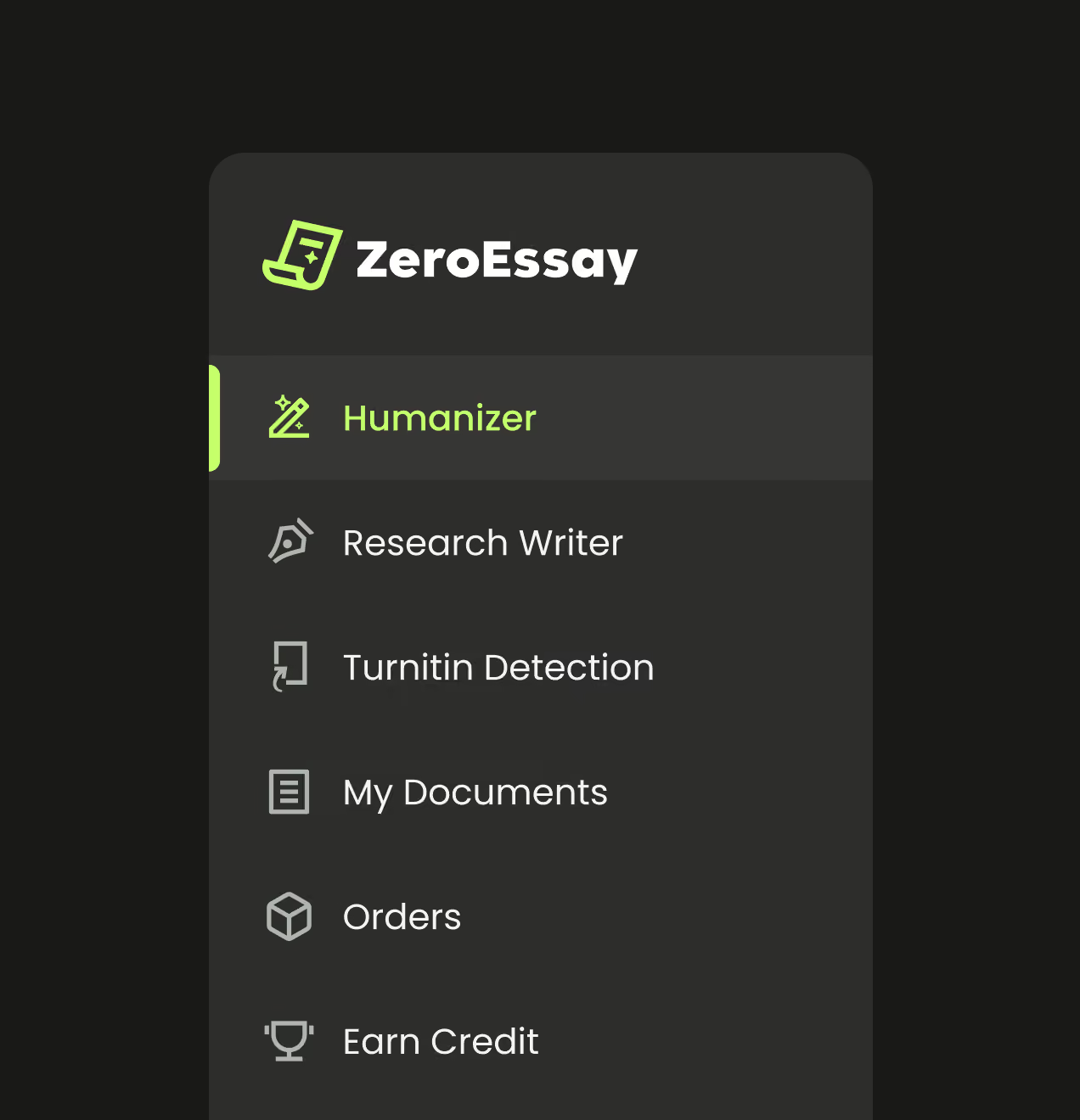
- Unified the tools into one experience: Humanizer, detection, and research writer became connected parts of a single flow with a clear starting point.
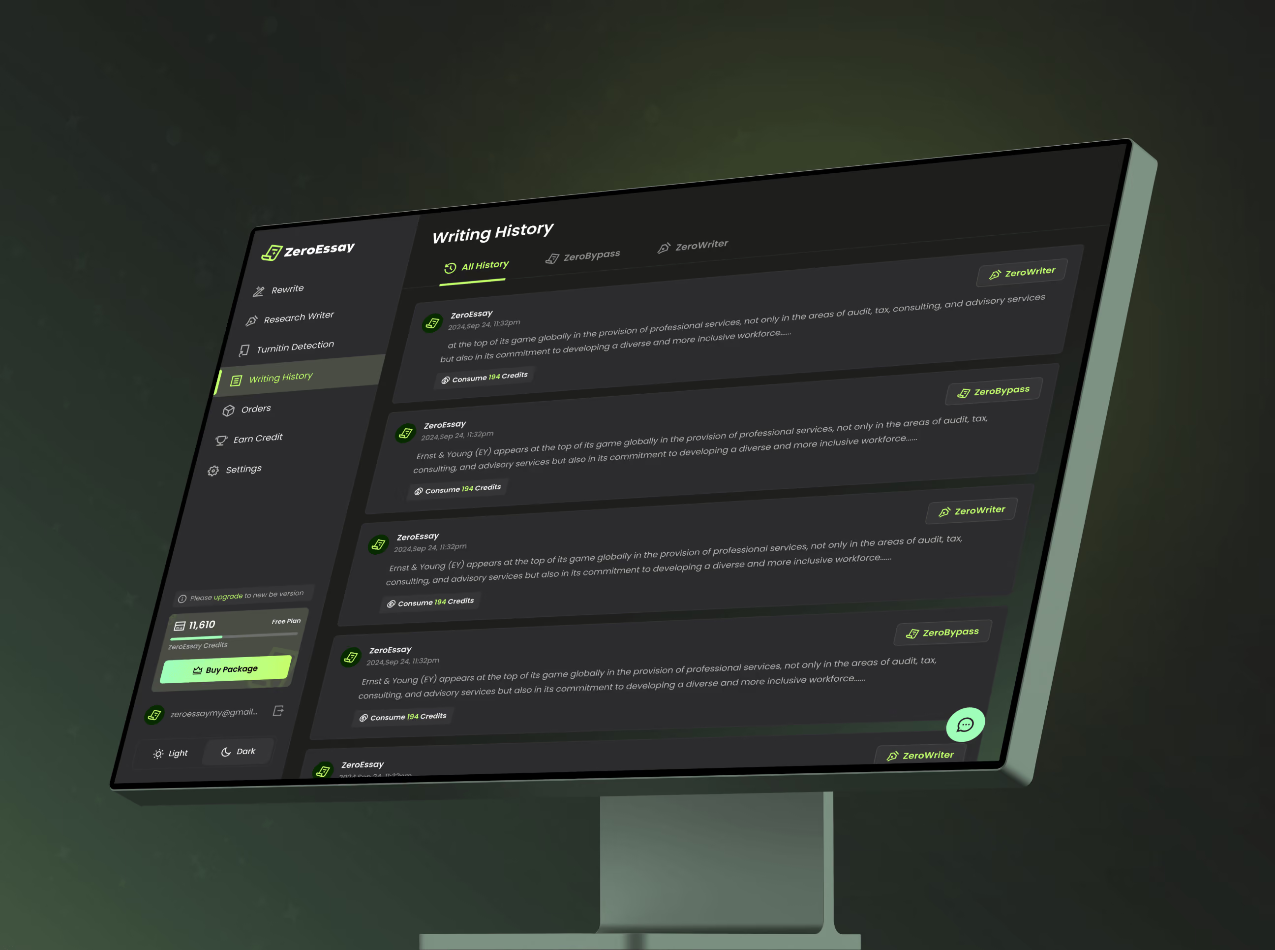
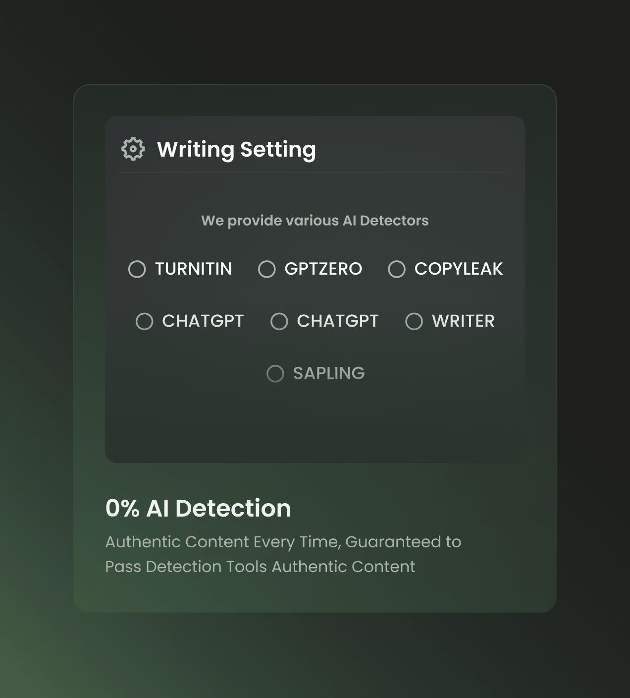
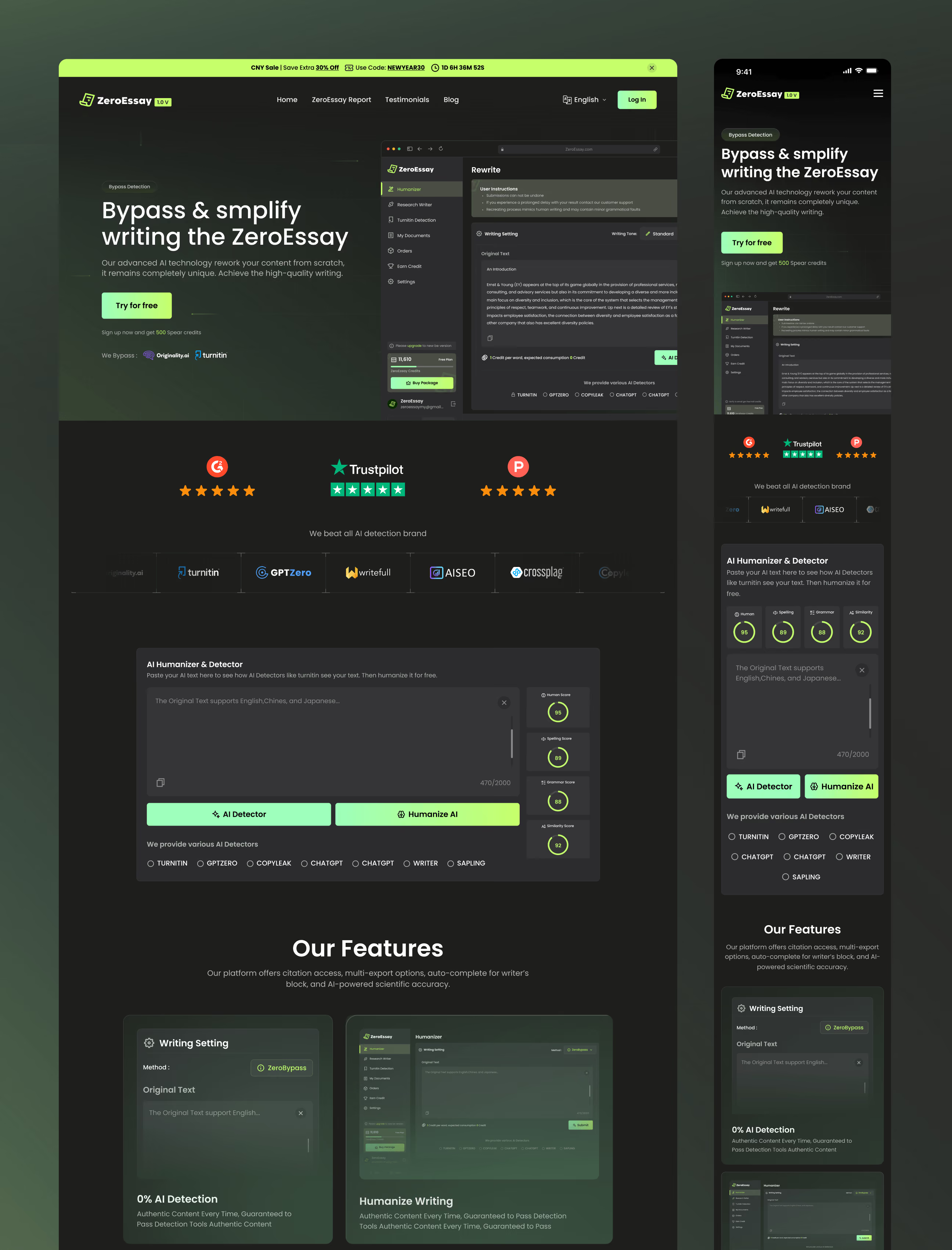
- Made the AI visible and trustworthy: live Human, Spelling, Grammar, and Similarity scores turned an invisible process into something users could see and believe.
- Cut the path to the first result: we stripped setup and navigation friction so users reach a real output in fewer steps, on their first session.
- Rebuilt the brand and landing experience: a from-scratch identity and restructured landing page communicate the product's value and audience at a glance.
How we designed ZeroEssay, phase by phase
ZeroEssay had real AI power but no clear product around it. We built one from scratch, tool by tool, screen by screen.
We studied the product and its users before drawing a single screen.
We mapped how three separate tools could work as one connected product.
We built the mark and visual language from scratch, dark-mode first.
We designed every screen across web, tablet, and mobile, in light and dark.
Visual identity and brand story
ZeroEssay is built for people trusting AI with their words, so the identity had to feel sharp, modern, and dependable. We designed the brand from scratch to signal precision and confidence at every step.
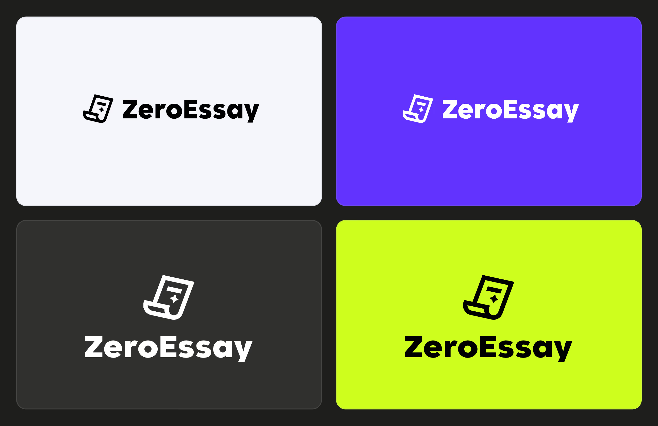
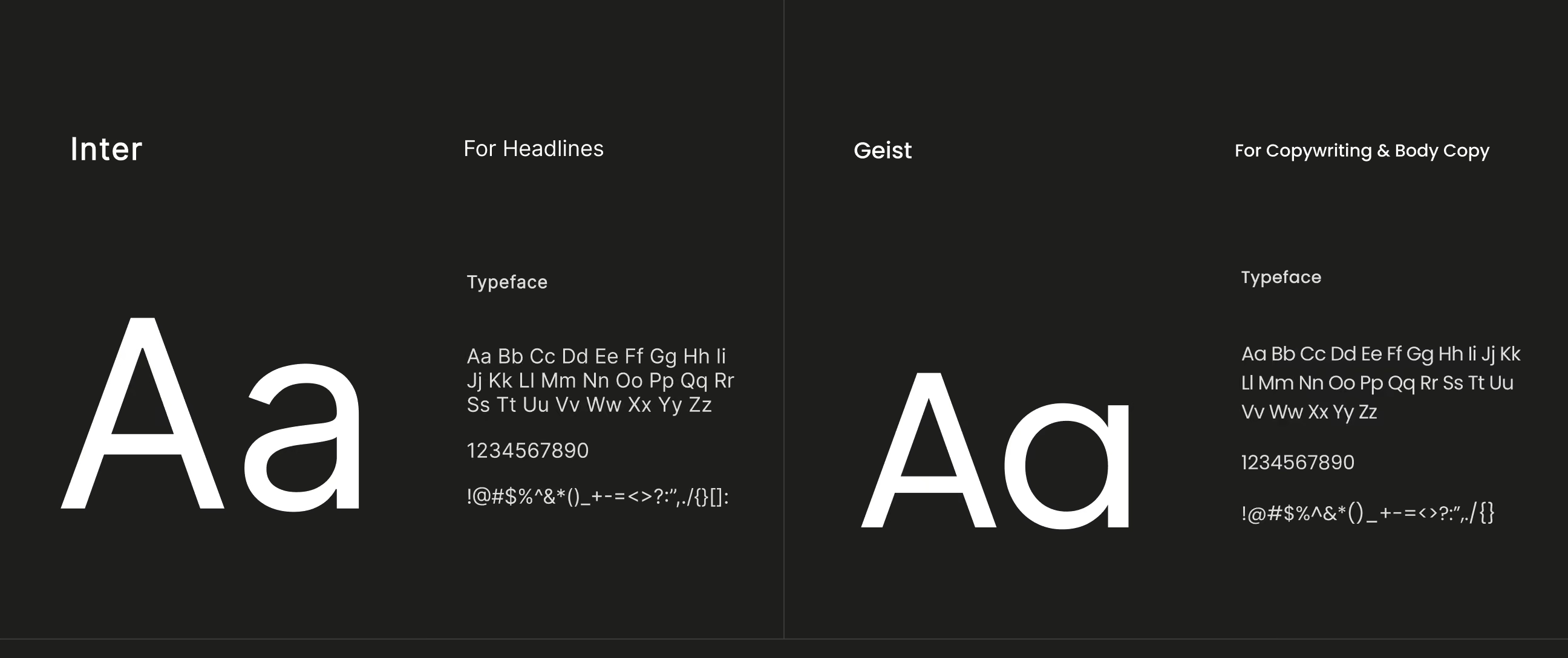
A lime-on-dark palette gives the product energy and focus, while Inter and Geist keep headlines clear and body text easy to read. The signature mark, a document with a spark, captures exactly what ZeroEssay does: turning raw text into something refined.
The result is a brand that feels technical but human, positioning ZeroEssay as an AI writing tool people can rely on with confidence.
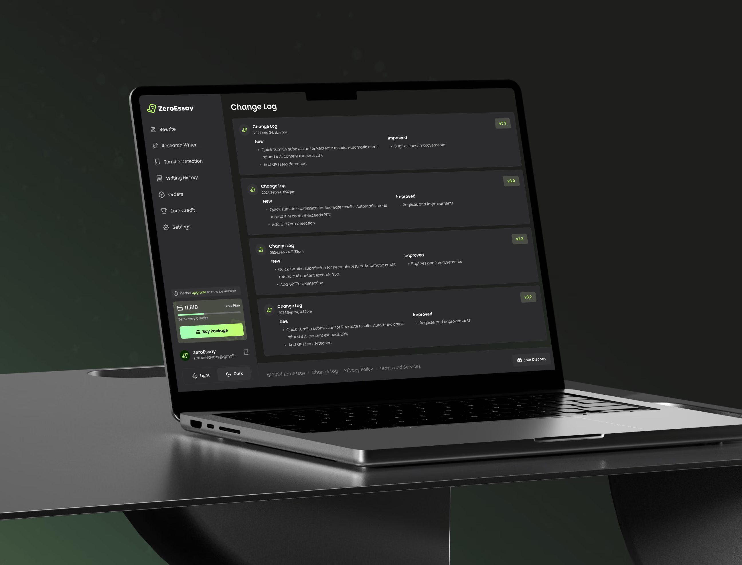
A design system built for clarity and trust
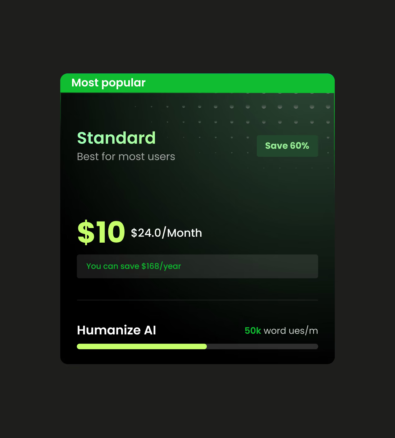
ZeroEssay's design system was built to make a complex AI product feel simple and consistent. We created a modular foundation that adapts across platforms, desktop, tablet, mobile, and light and dark themes. To keep the focus on the work, we paired a lime accent with deep blacks for sharp, intentional contrast and used the document-with-spark mark as the through-line across every surface.
We chose Inter for headlines and Geist for body copy, so titles stay bold and clear while long text stays easy to read on any screen. Every token, color, type style, and spacing rule was documented for a clean developer handoff. The system doesn't just look sharp, it lets ZeroEssay ship new AI features fast without breaking consistency as the product grows.
The UX behind a product users can trust
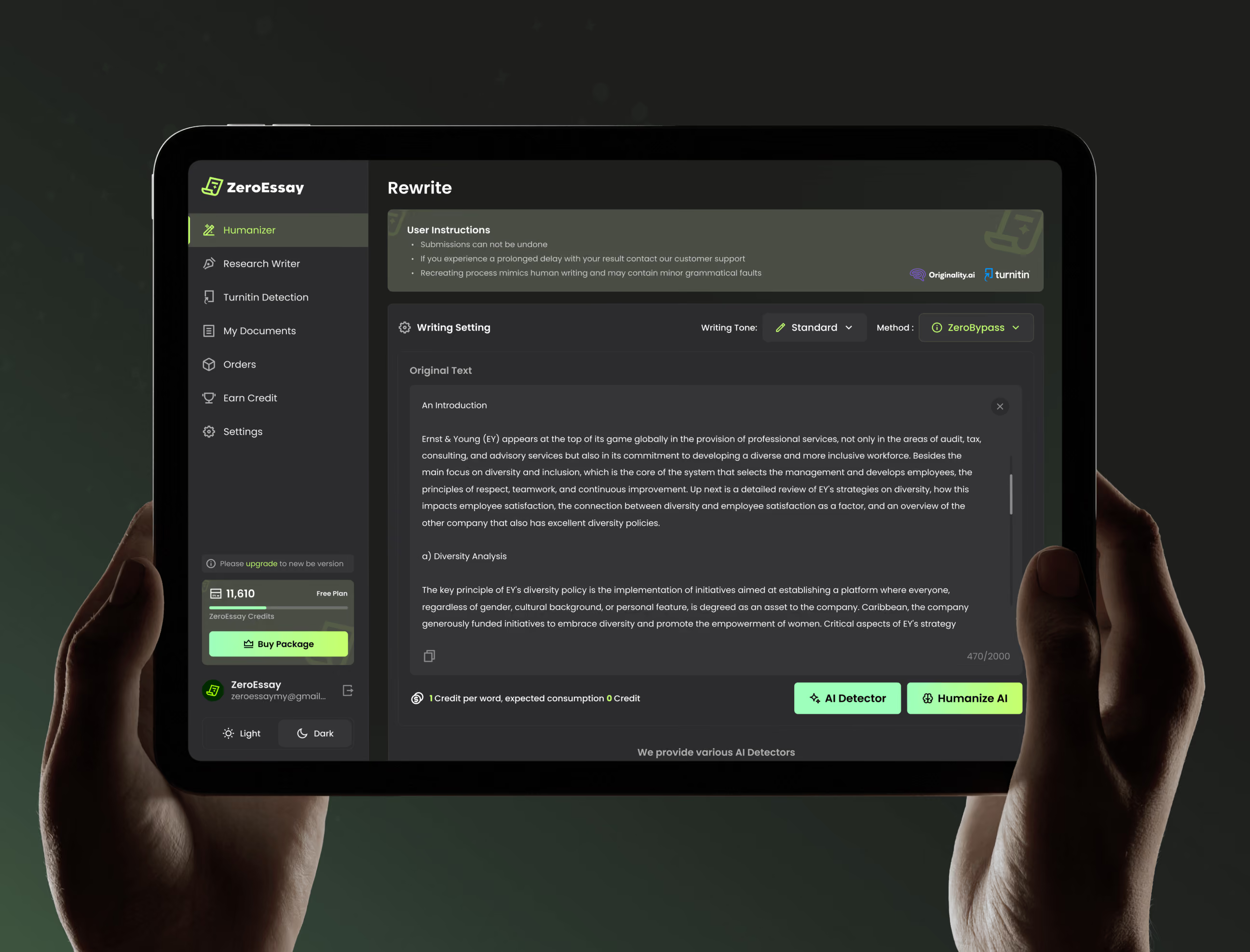
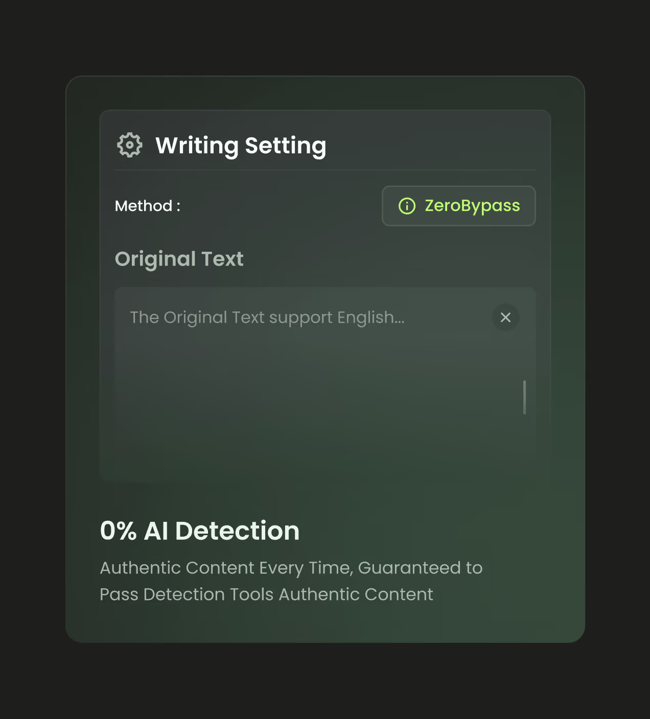
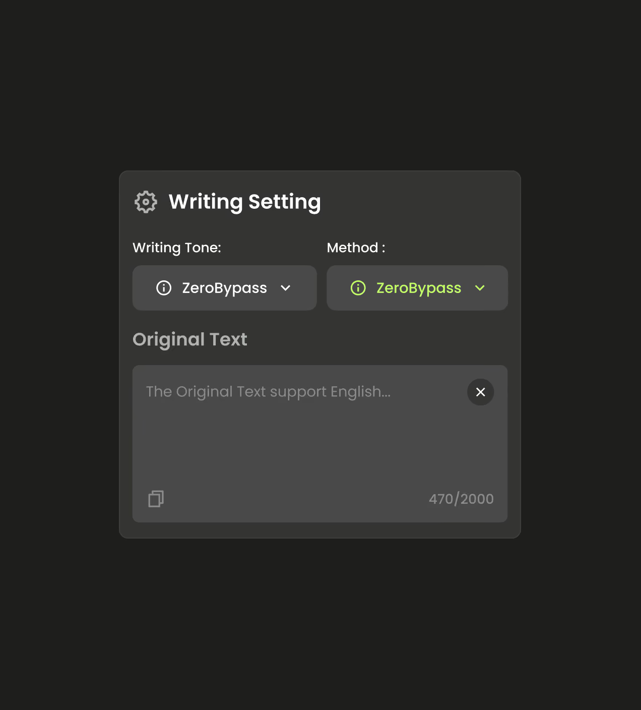
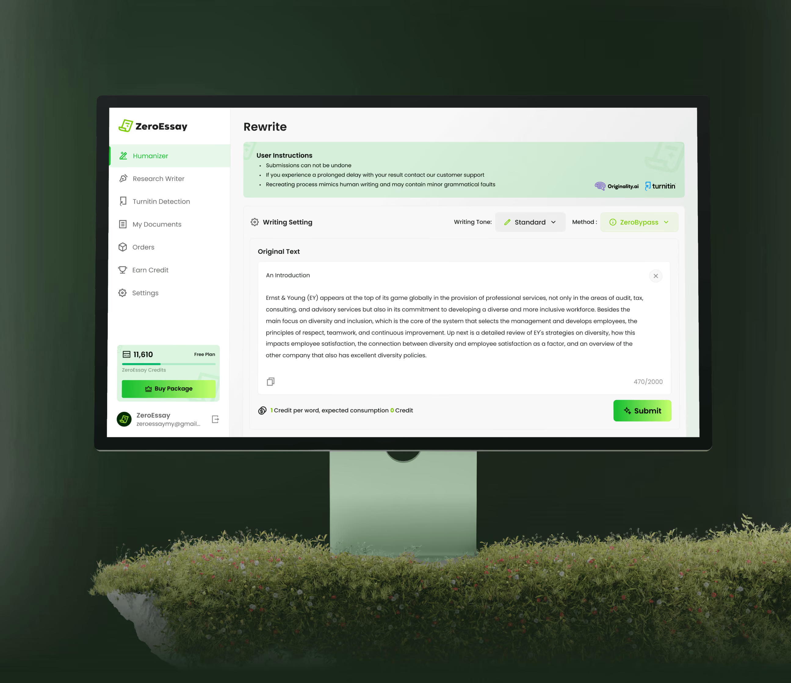
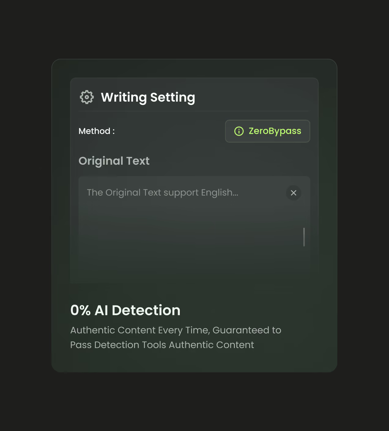
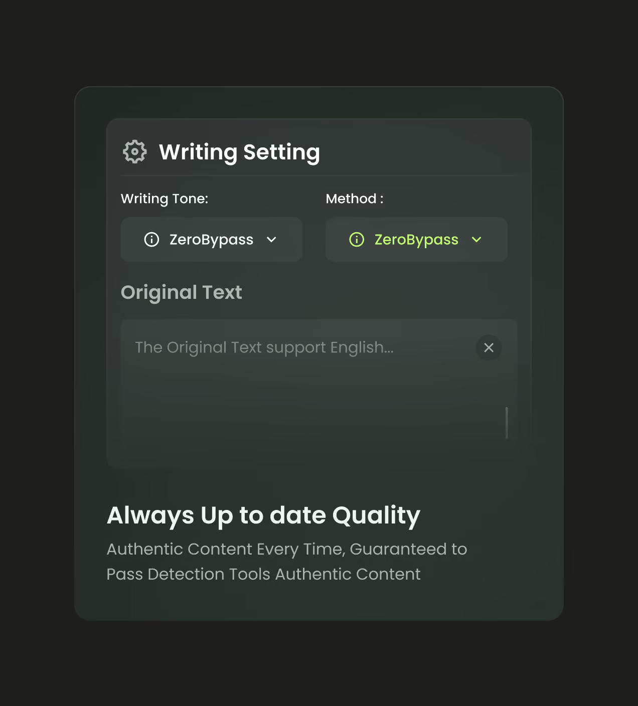
Behind ZeroEssay's calm surface was a hard UX problem: an AI process users couldn't see. We designed the humanizer around live Human, Spelling, Grammar, and Similarity scores, giving an invisible result a visible, readable state users could trust.
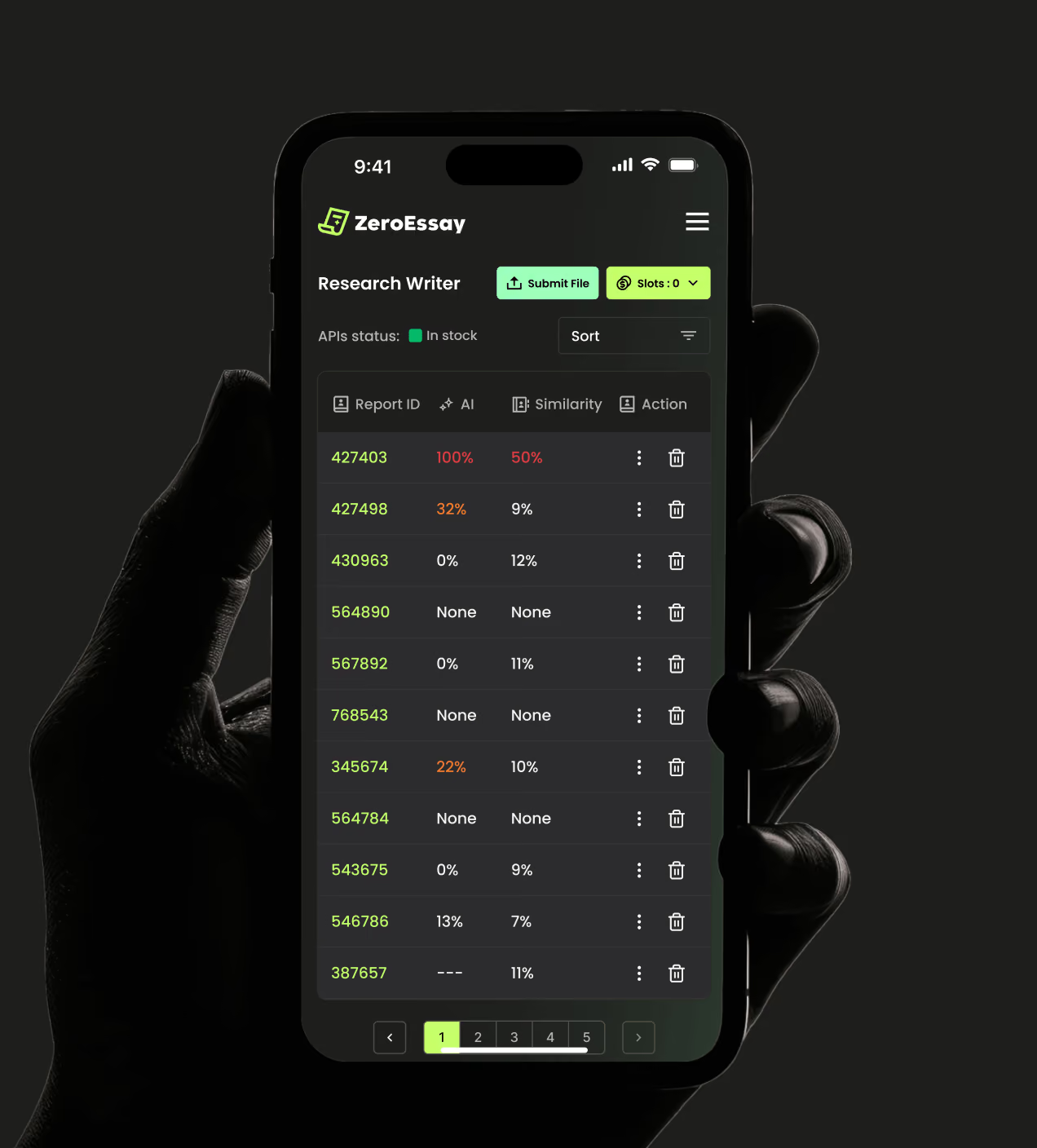
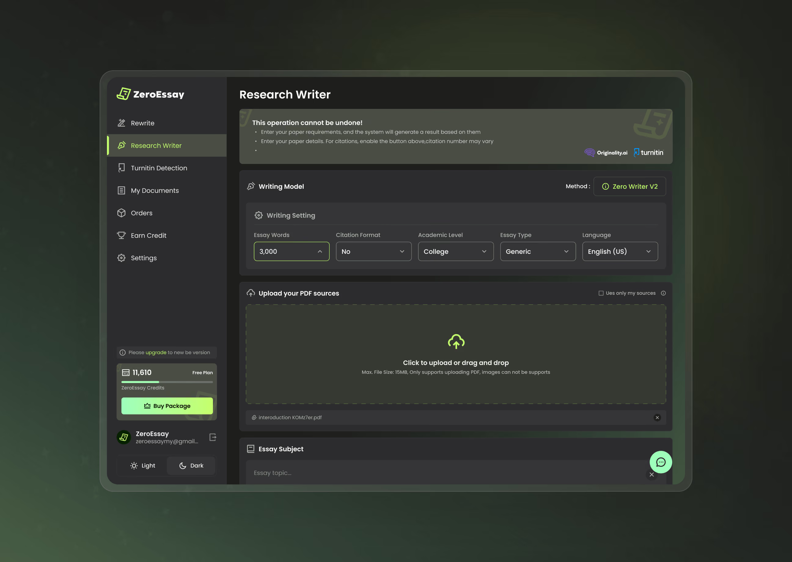
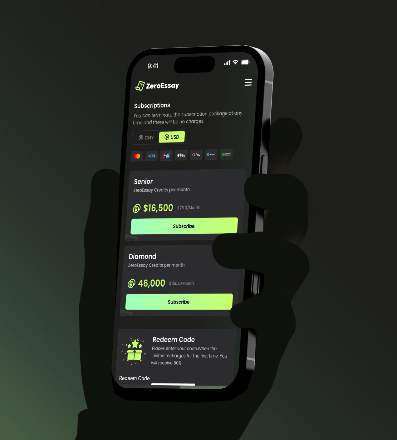
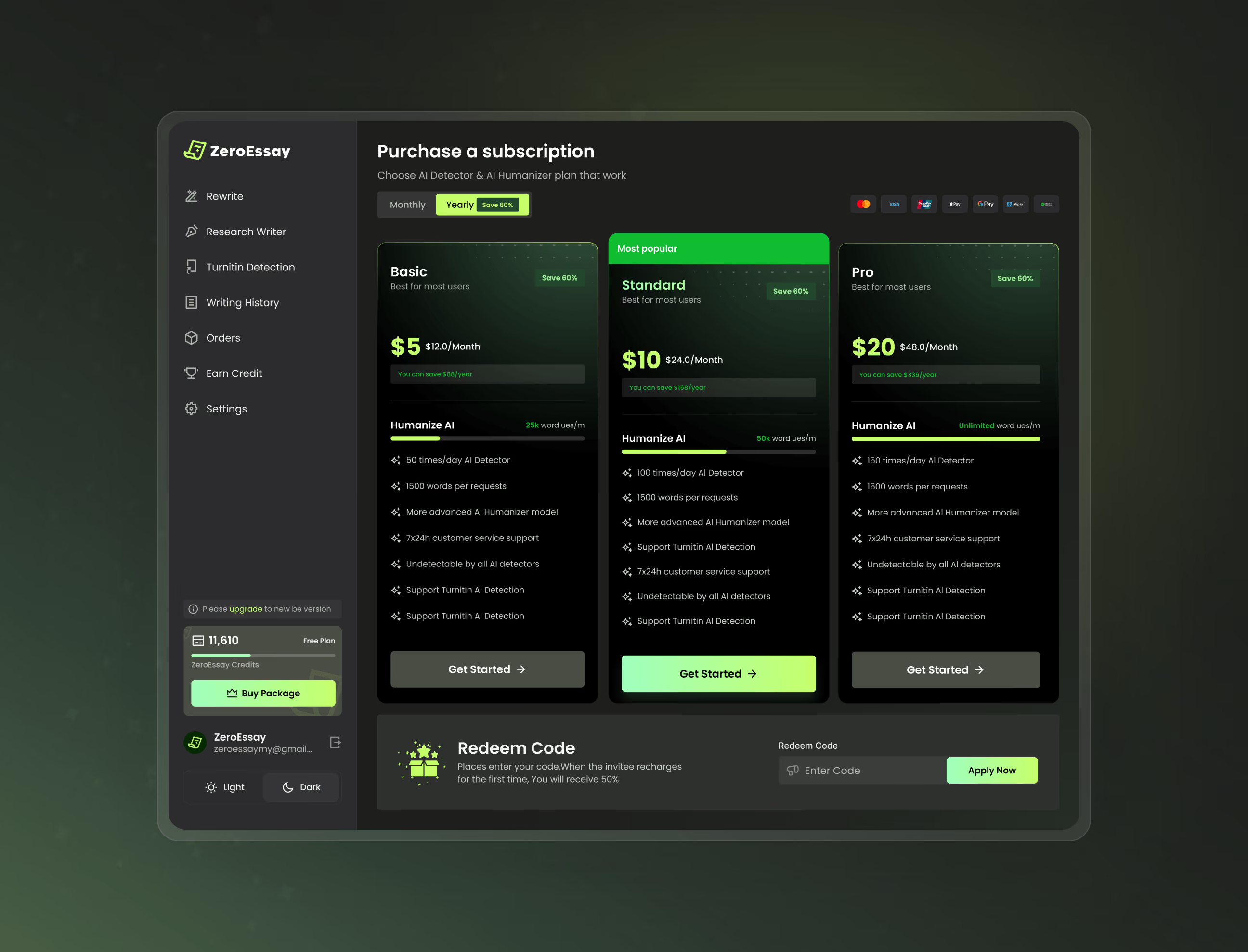
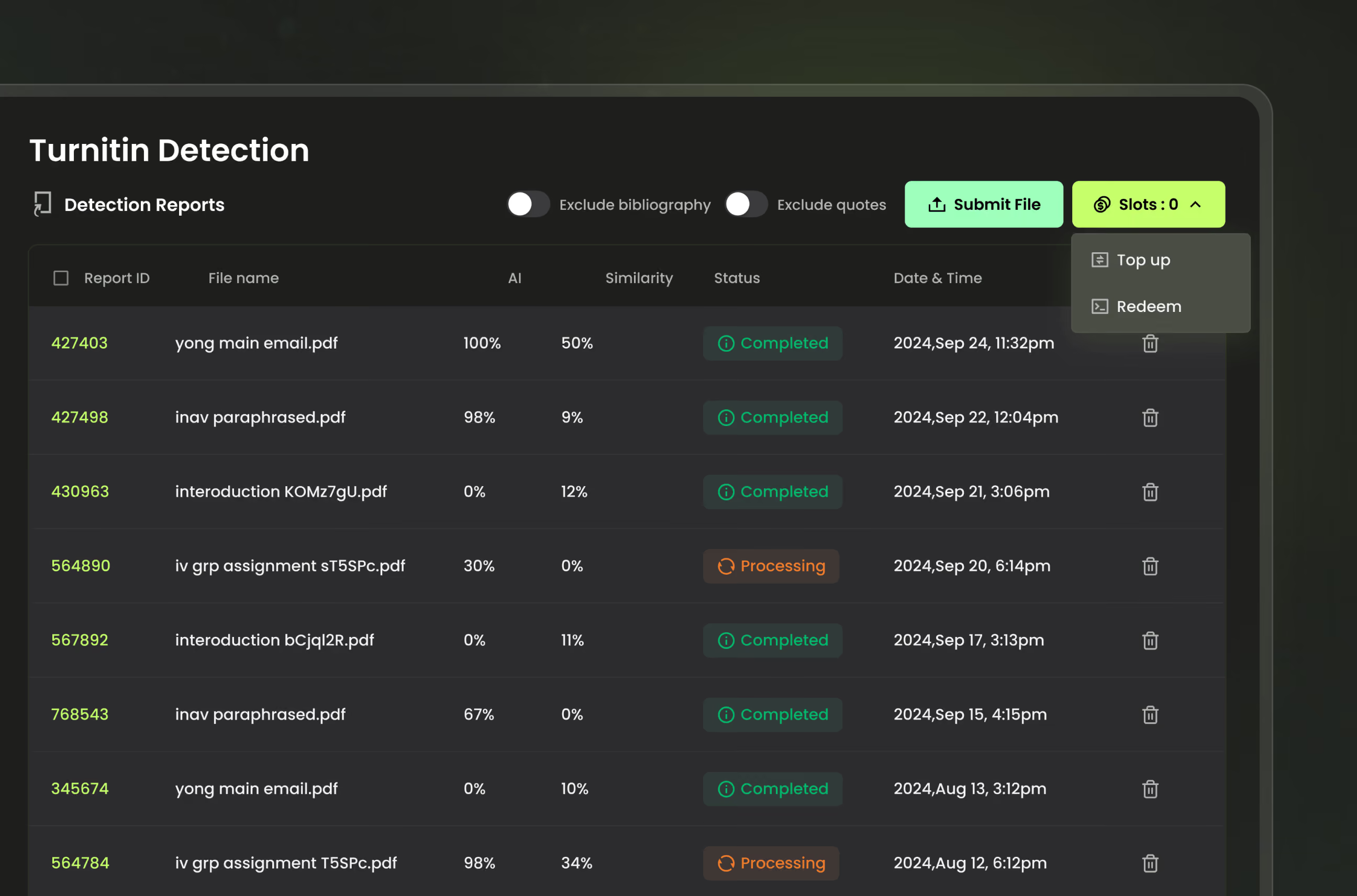
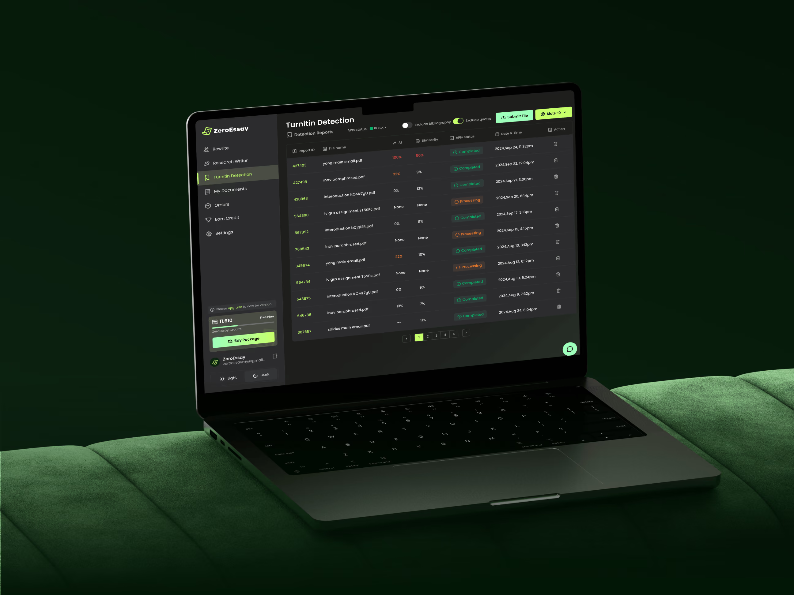
We structured the humanizer, detection, research writer, and billing into one connected system with a single navigation model, so moving between tools never meant relearning the interface. For the detection dashboard, we designed clear status states and hierarchy to keep dense report data readable.
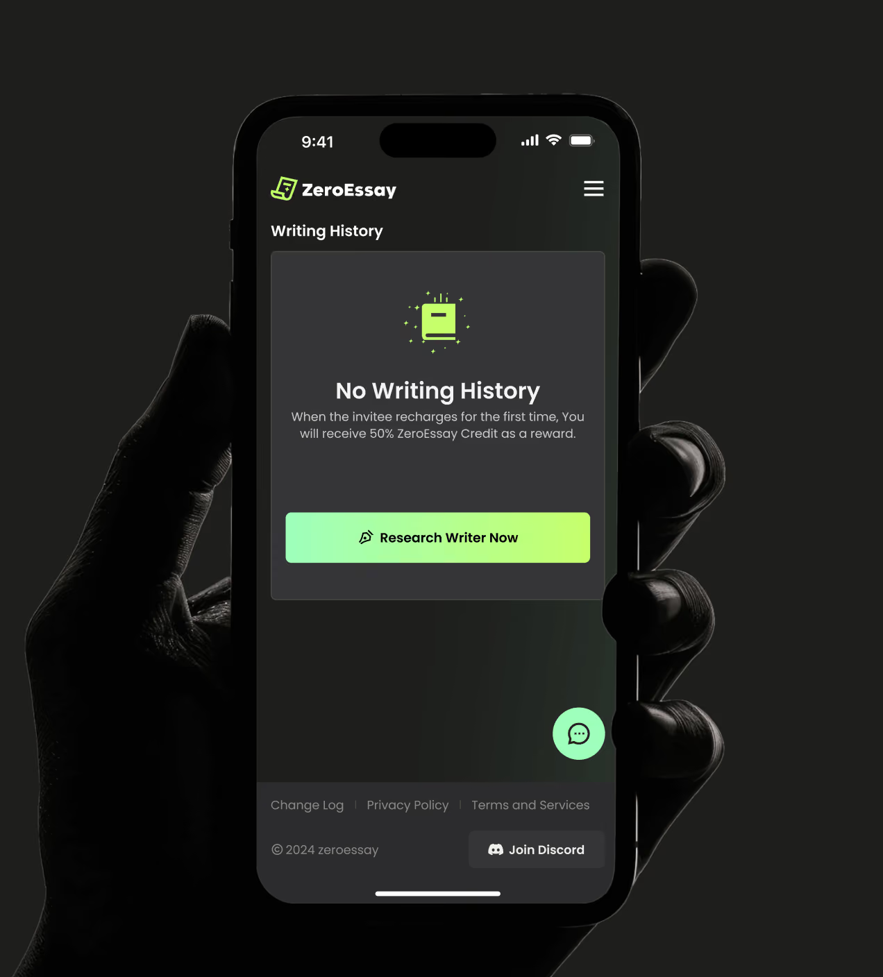
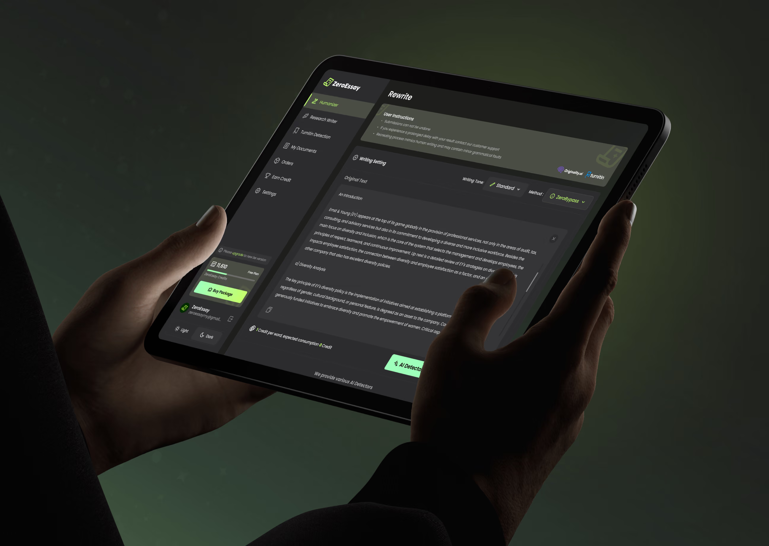
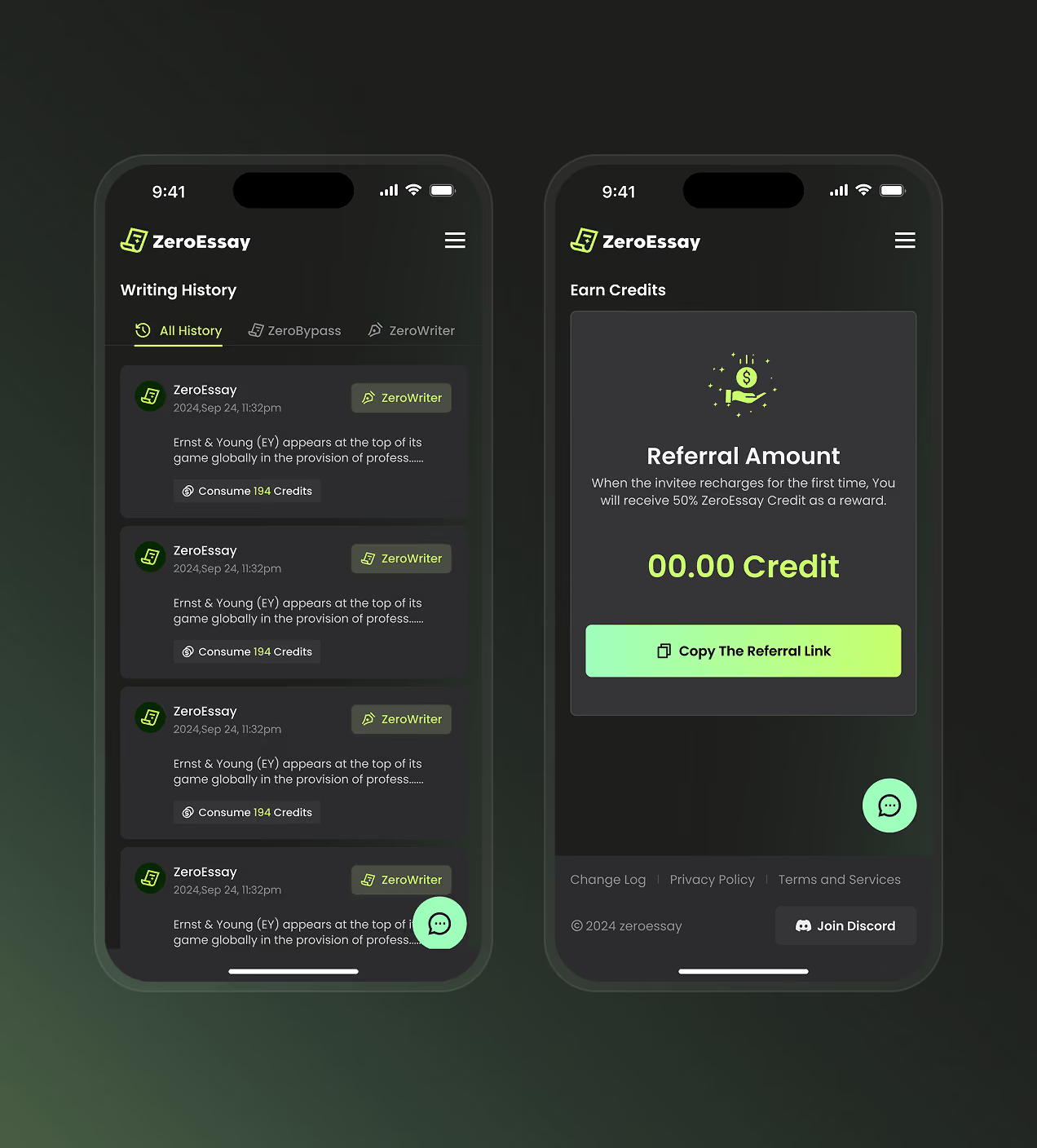
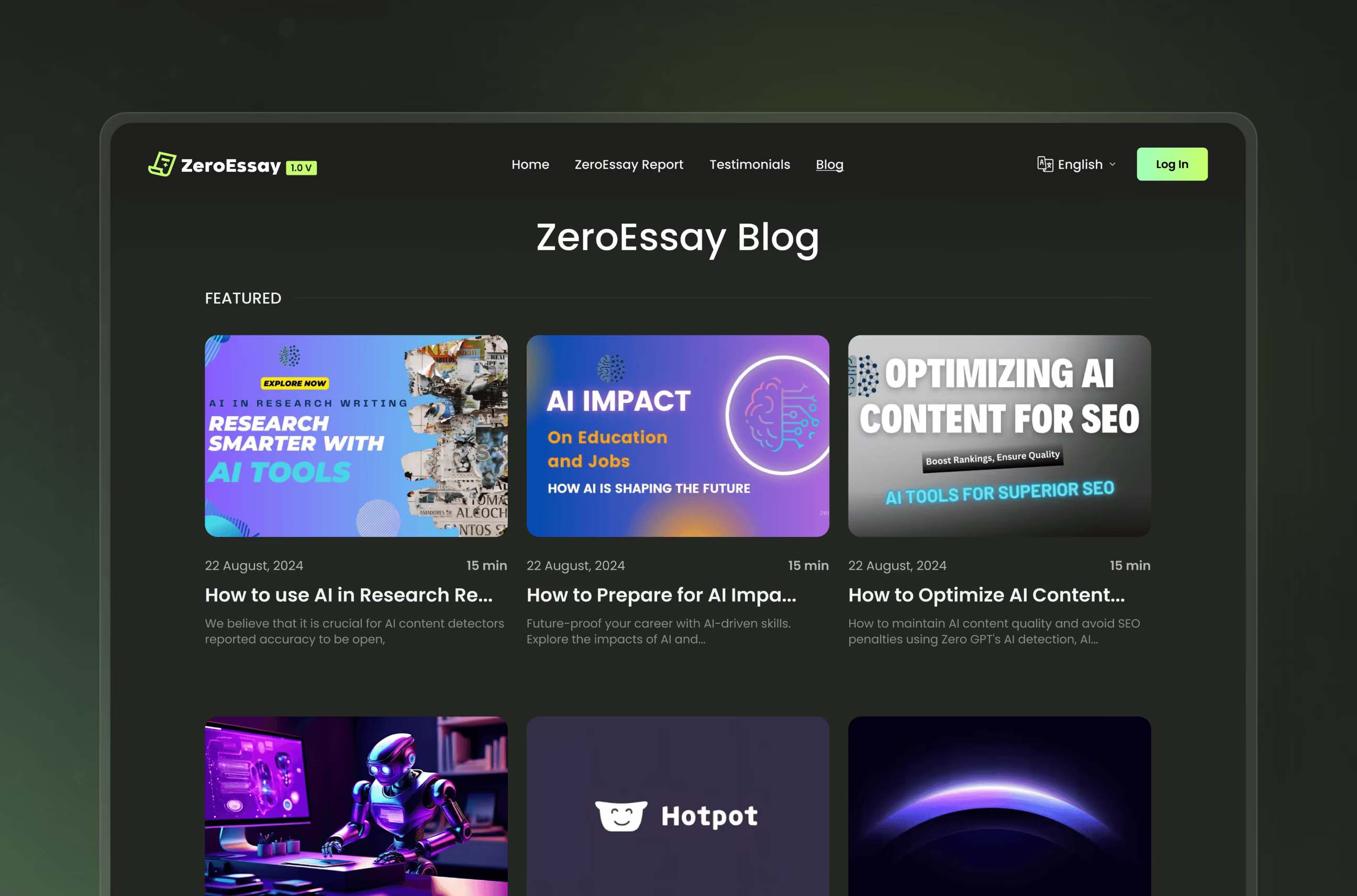
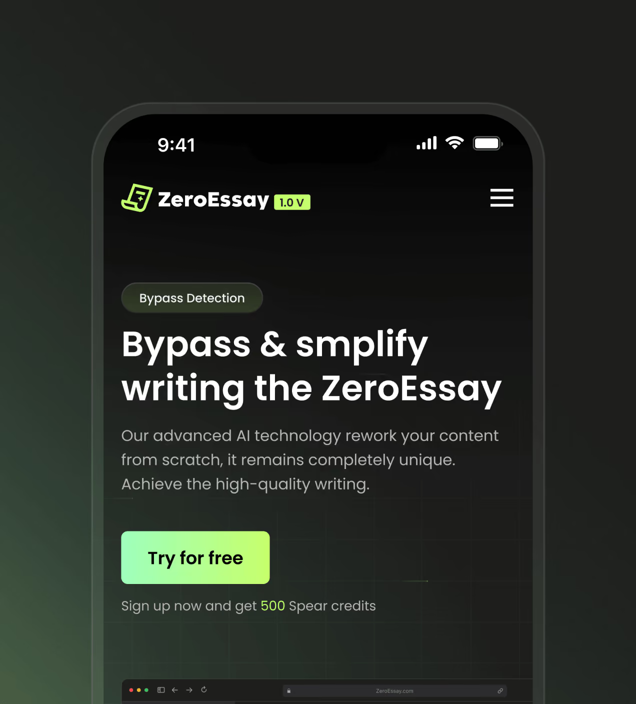
We designed the full system across web, tablet, and mobile in light and dark, holding one visual standard from the landing page through to the app. The marketing site was structured to make ZeroEssay's value clear at a glance, while the product's writing flow was rebuilt to fit a complete AI workflow on a phone screen.
Have a Project? Let’s talk!



















.png)



Francisco, CA 94105, United States




































Your competitors are converting 3x more visitors. Not because they have a better product, but because they have a better design.






.avif)