
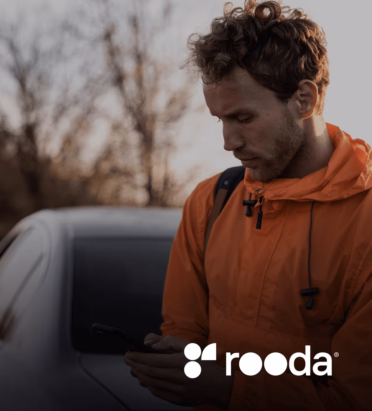
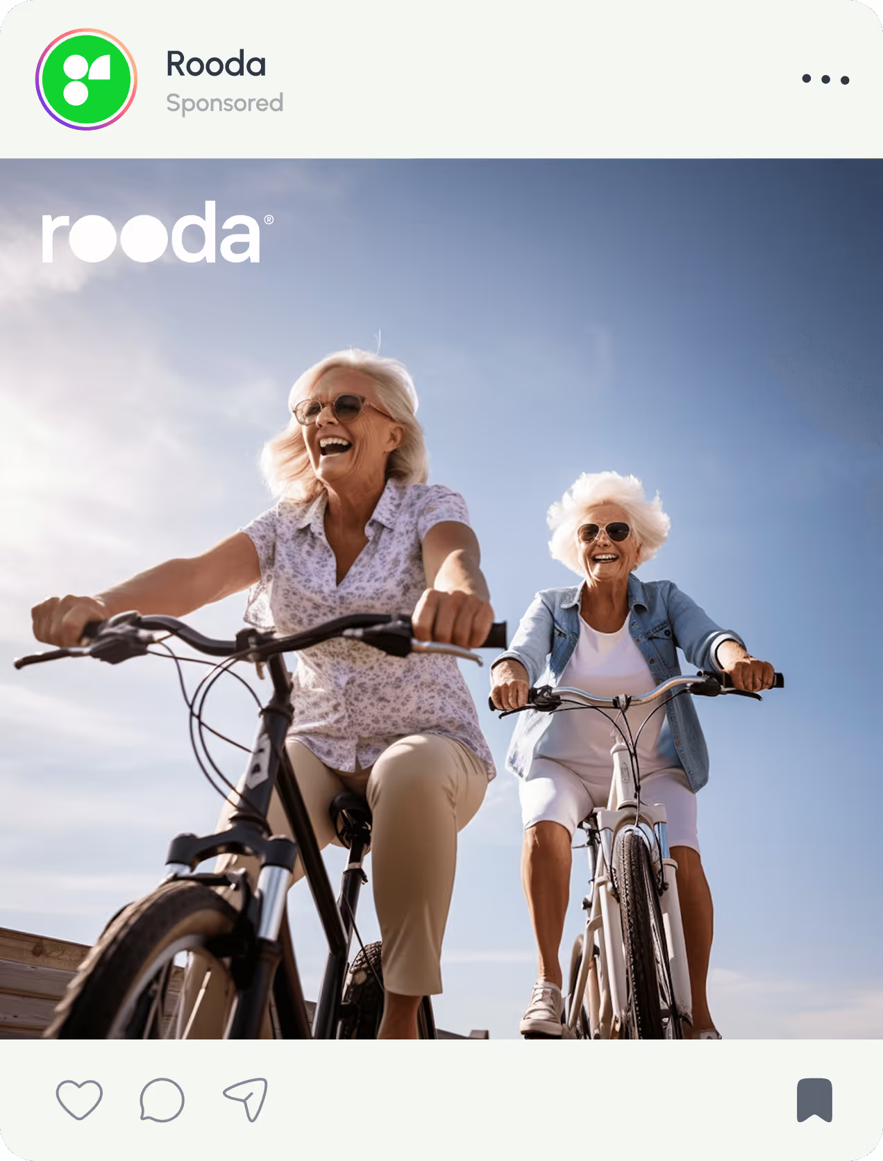
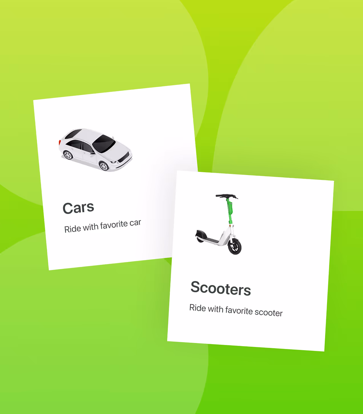
Rooda is a smart mobility platform combining on-demand car rides and electric scooter rentals in one app. Built to make city travel seamless and sustainable, it helps urban commuters find, book, and ride vehicles without switching between multiple apps.
We designed Rooda from scratch to solve fragmented urban transport. Users struggled to choose between scattered ride and scooter services with unclear pricing and availability. Our job was to create a unified platform with real-time maps, clear vehicle info, and simple booking flows that work from the first use.


Challenges that urban user faced
Urban transport felt slow, fragmented, and confusing. Users couldn't find vehicles quickly, didn't trust pricing, and got frustrated switching between apps for different ride options.
- Fragmented options: 68% struggled to choose between cars and scooters without seeing clear pricing or real-time availability upfront.
- No real-time visibility: 72% wanted to see nearby vehicles with battery levels and arrival times on a map before booking, instead of guessing.
- Confusing unlock process : 55% found scooter QR scanning and payment steps unclear during first use, causing them to abandon rides.
- App switching fatigue: Users got tired of juggling multiple apps for rides and scooters, wasting time searching for the best option.
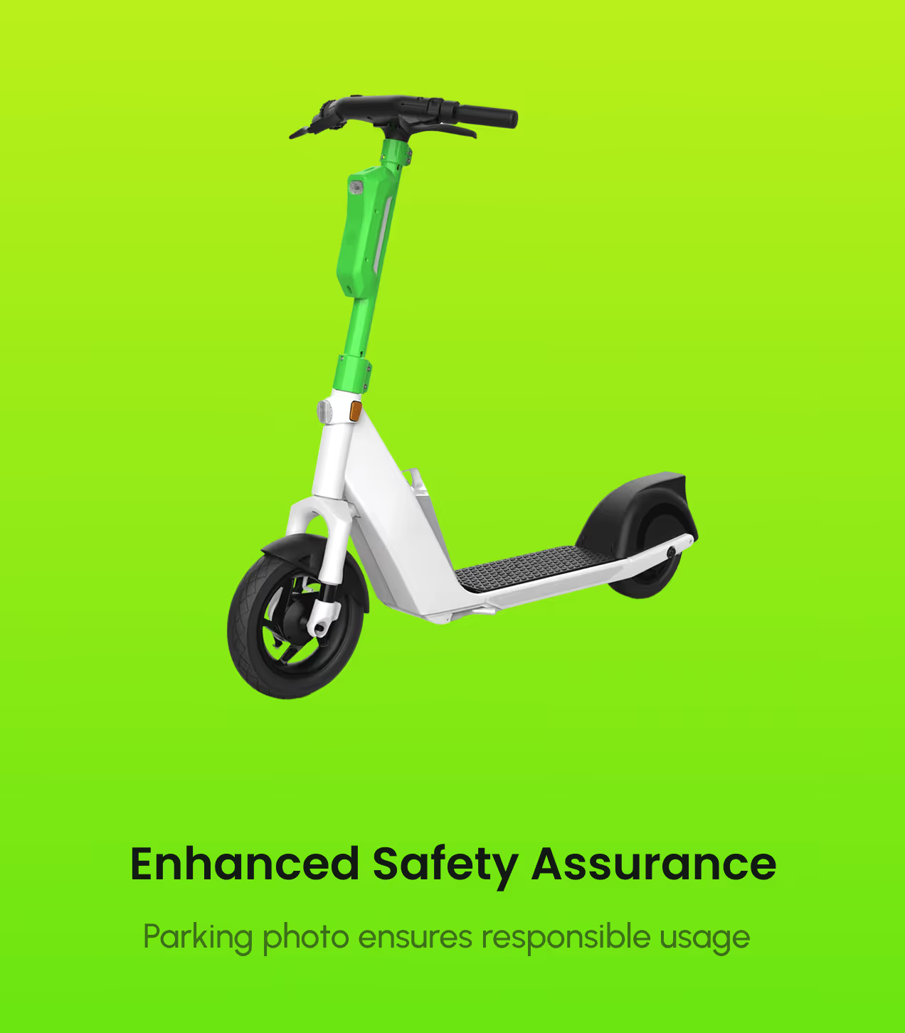
- Unclear ride closure: Users didn't know where to park scooters safely or how to properly end rides, leading to support requests and penalties.
How we fixed fragmented transport
We designed Rooda to unify cars and scooters in one platform with real-time visibility, clear pricing, and simple flows. Every screen was built to help users find vehicles and complete rides without confusion.
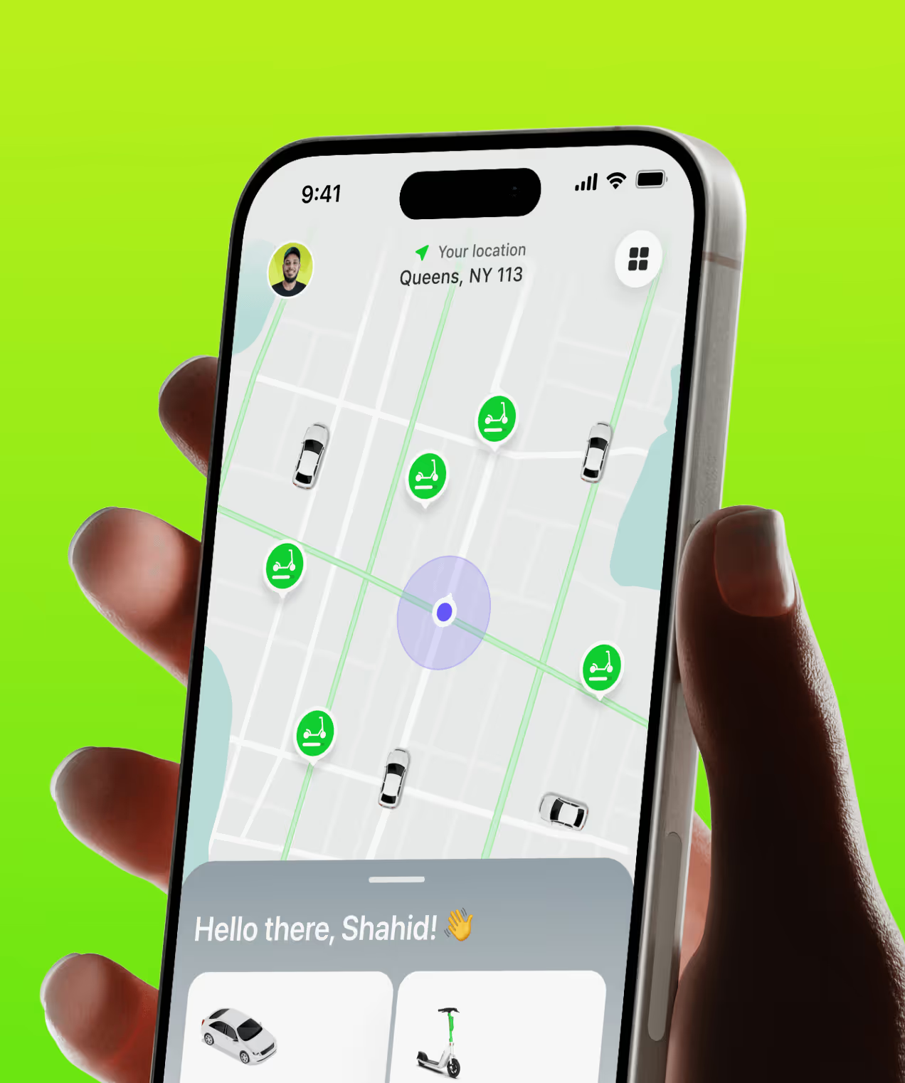
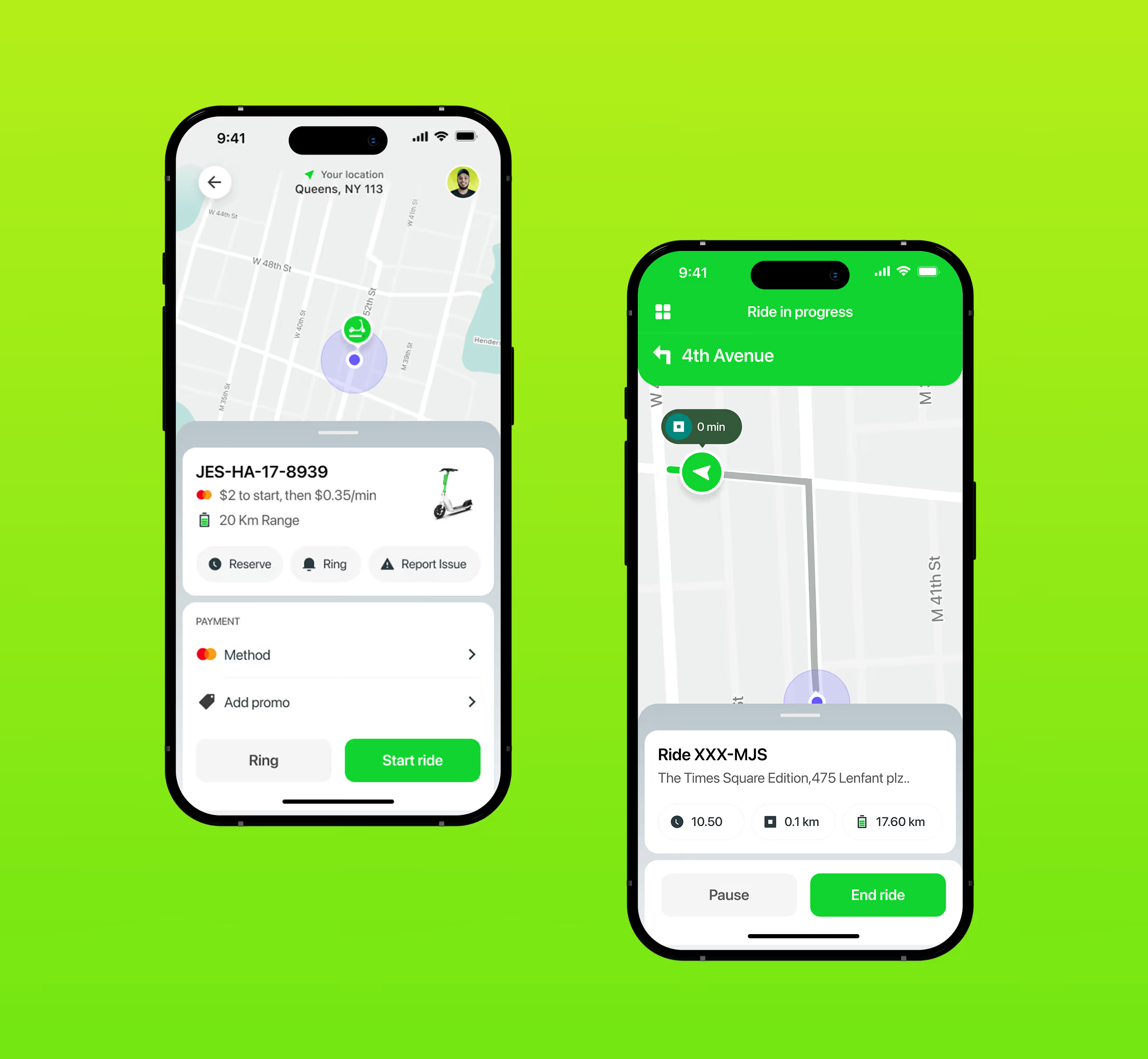
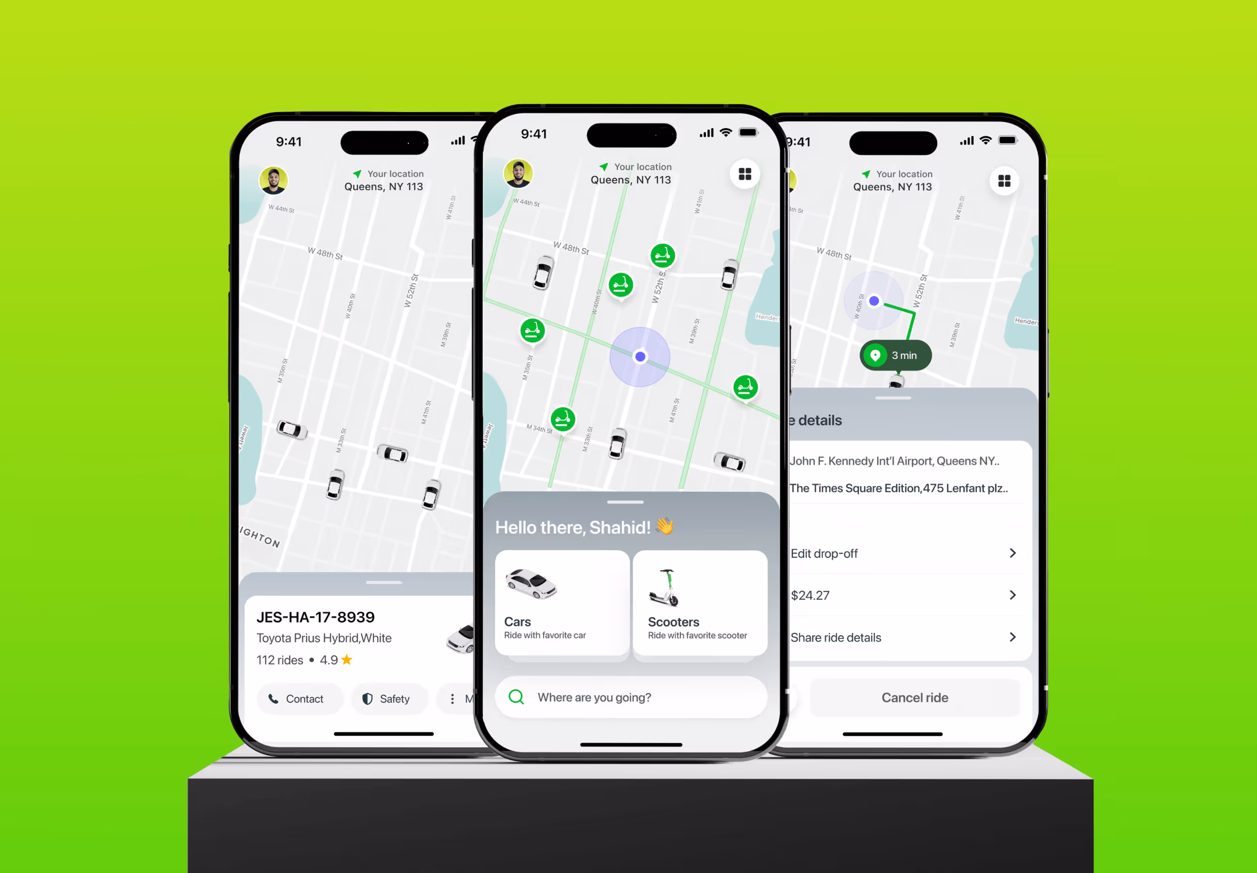
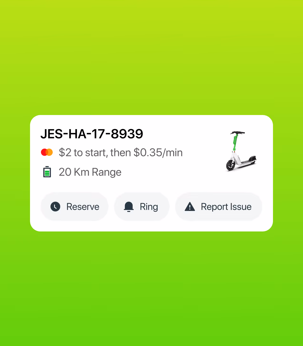
- Real-time map with vehicle details: Built a live map showing nearby cars and scooters with battery levels, pricing, and estimated arrival times so users make informed choices in under 10 seconds.
- Clear vehicle selection: Designed side-by-side car and scooter options with transparent pricing upfront, helping 68% of users decide faster without hidden costs.
- Simple scooter unlock flow: Created step-by-step QR scanning with visual guidance and clear payment confirmation, making first-time users 55% more confident.
- Unified booking experience: Combined cars and scooters in one app, eliminating the need to switch between platforms and encouraging +18% more daily usage.
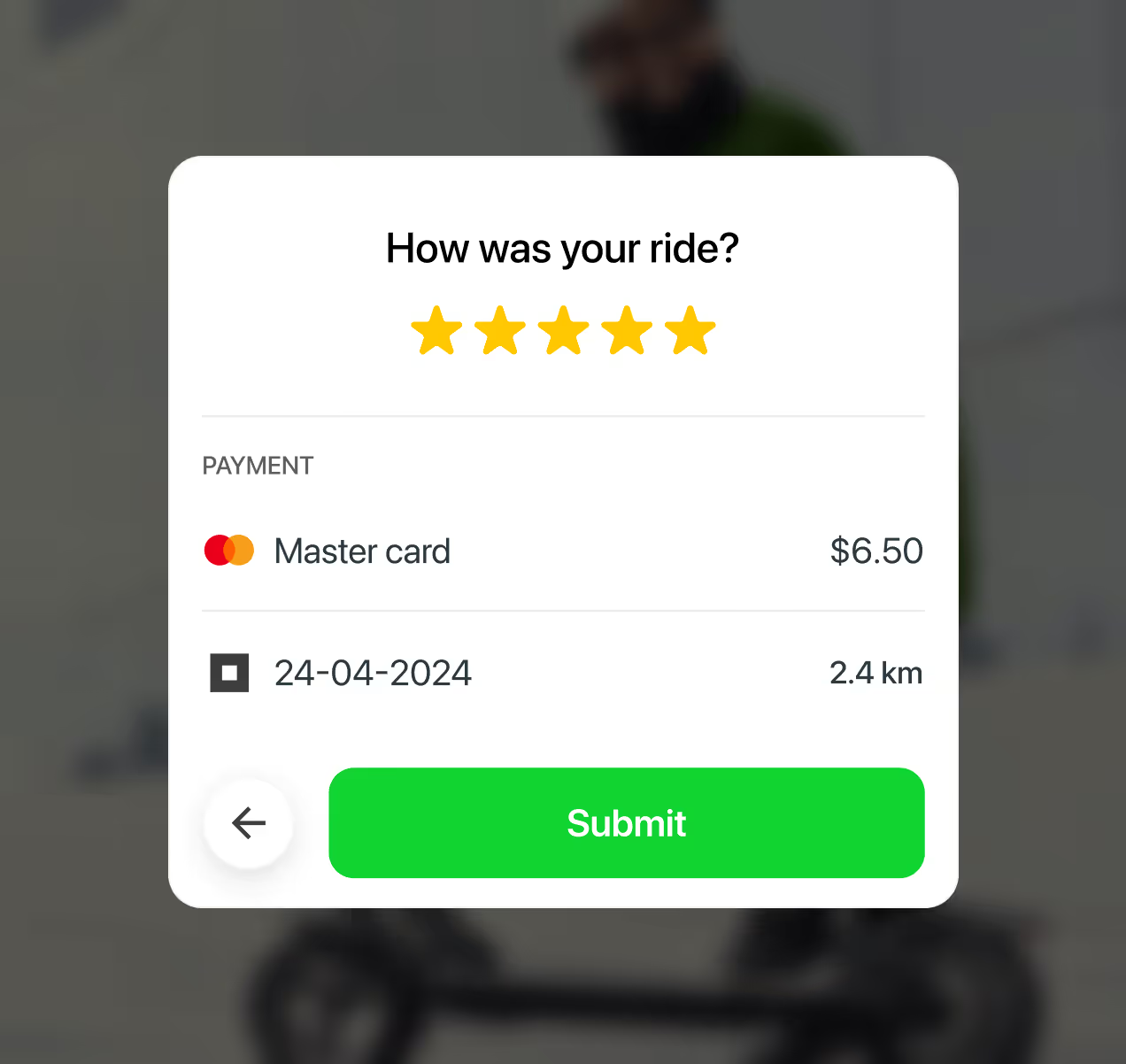
- Guided ride closure: Added parking photo requirements and clear end-ride steps, reducing confusion and cutting support requests by 35%.


Designing Rooda through user-centered design
We worked with urban commuters and mobility users to understand their travel patterns and pain points, then designed Rooda to solve real problems at every step.
We studied how people use ride and scooter apps to find what made them switch apps.
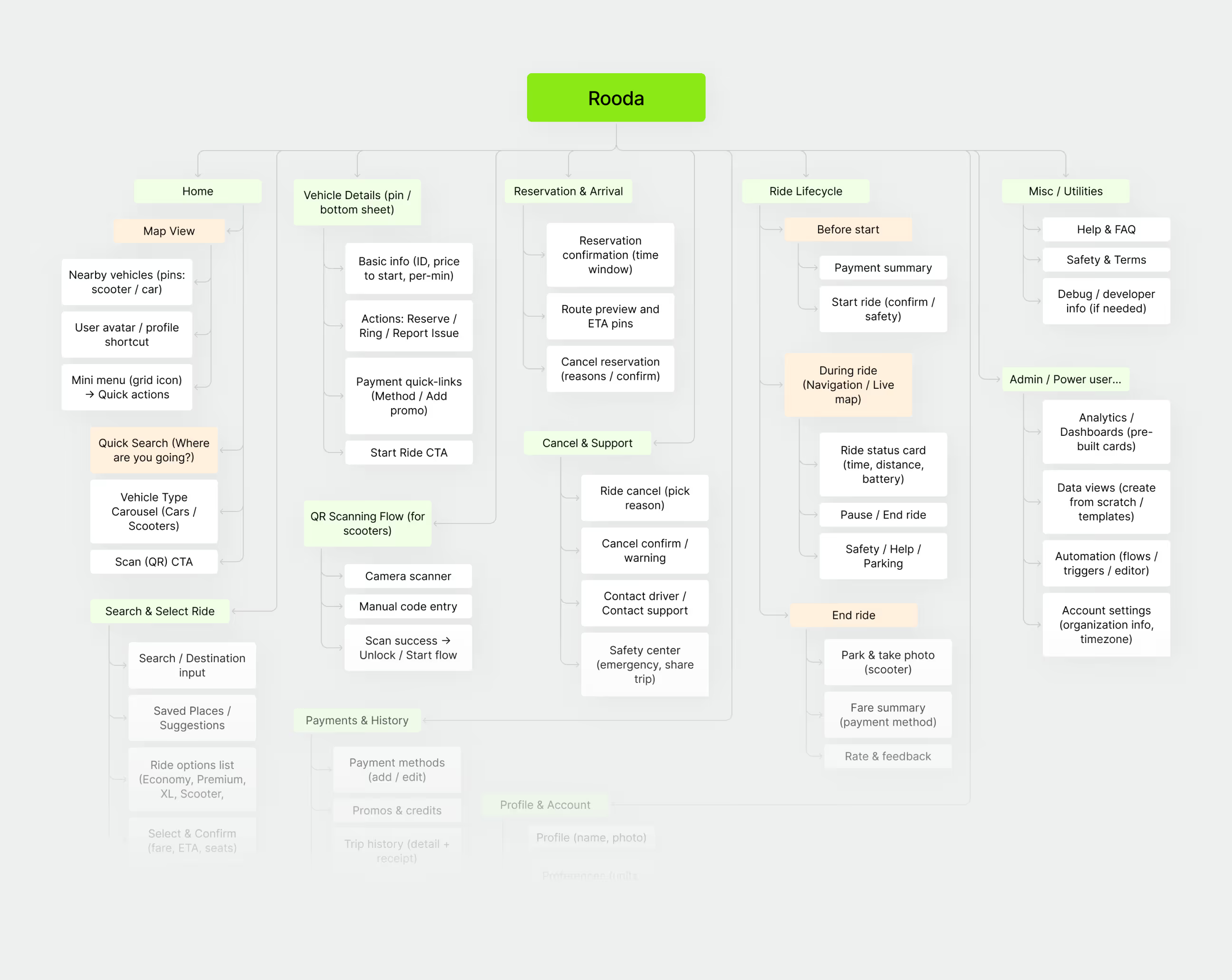
We organized how features connect so users find vehicles, book rides, and complete trips.
We tested low-fidelity screens with real commuters to validate our design direction before final UI.
We created a vibrant green brand system with clear components for both cars and scooters.
UX Research & Design Artifacts
We studied how urban commuters use mobility apps to find what blocks them from completing rides. The findings shaped every design decision we made.
- User interviews with city commuters: Talked to 15+ urban professionals and students. Found 68% struggled to choose between cars and scooters without seeing clear pricing or availability upfront.
- Real-time map testing: Tested map interfaces with 18 users. Discovered 72% wanted to see nearby vehicles with battery levels and arrival times before booking, instead of guessing.
- Scooter unlock usability tests: Watched 20 first-time users try QR scanning. Found 55% got confused by unclear payment steps and unlock instructions during their first ride.
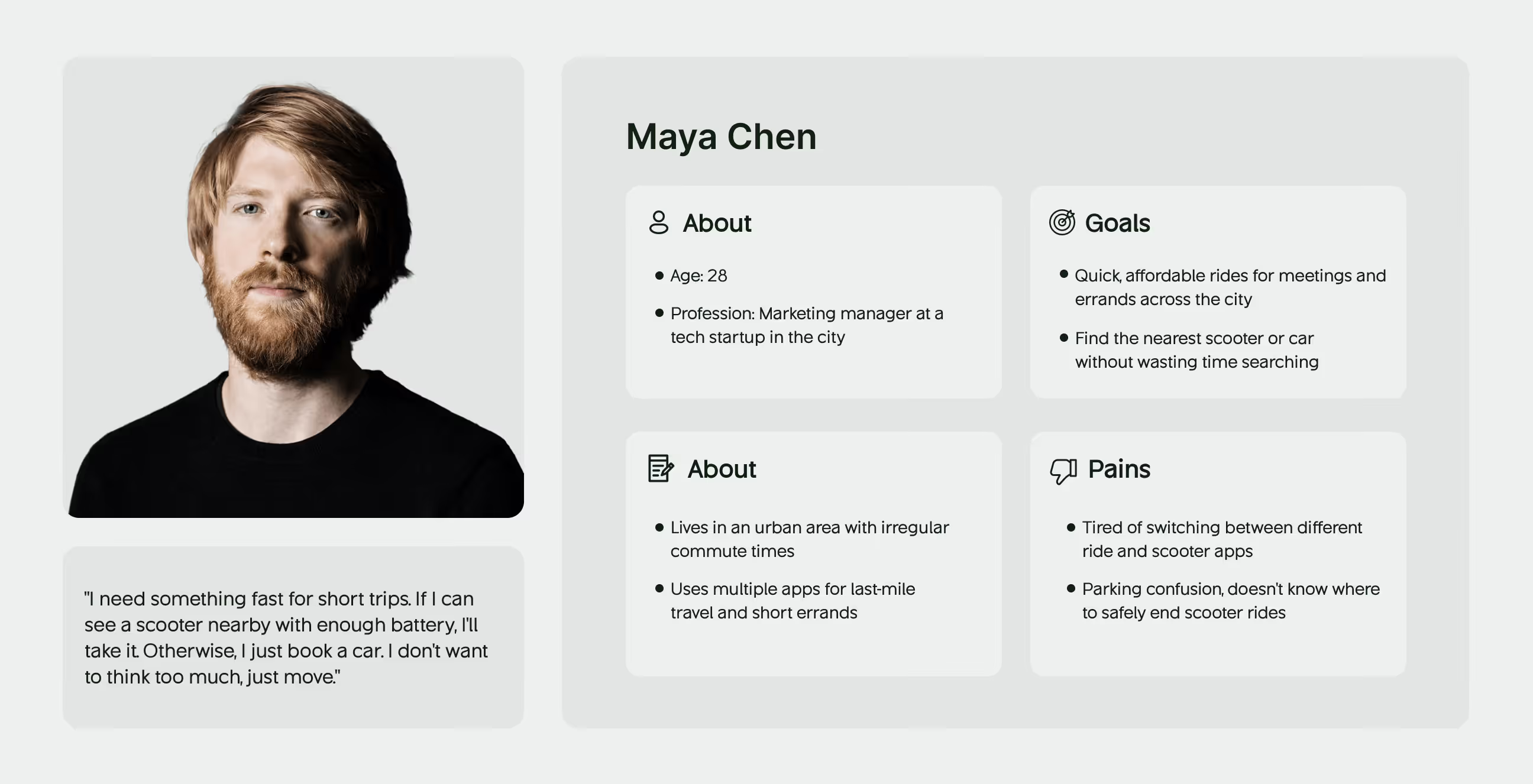
- Design deliverables created: Built user personas (Maya Chen), user journey maps, wireframes for map/booking/ride screens, and high-fidelity prototypes based on real mobility pain points.

Visual Identity and Brand Story
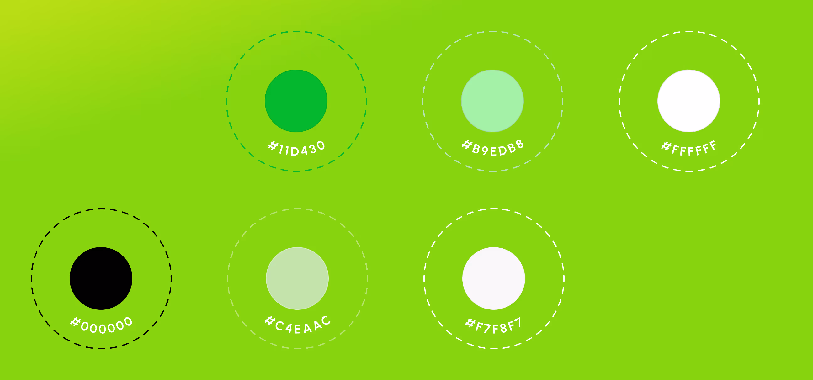
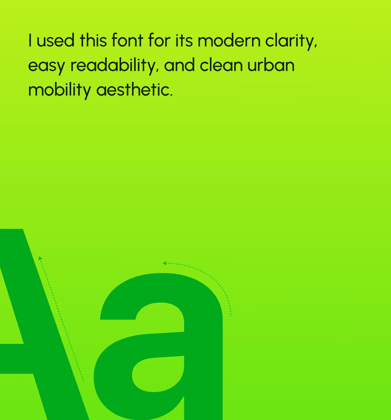
Rooda's brand feels fast, fresh, and sustainable. The logo uses circular dots forming the "oo" in rooda, representing connection and movement. Bright green (#11DA30) brings energy and sustainability while black adds contrast and modernity. Light greens and whites keep the interface clean and easy to scan during quick booking decisions.
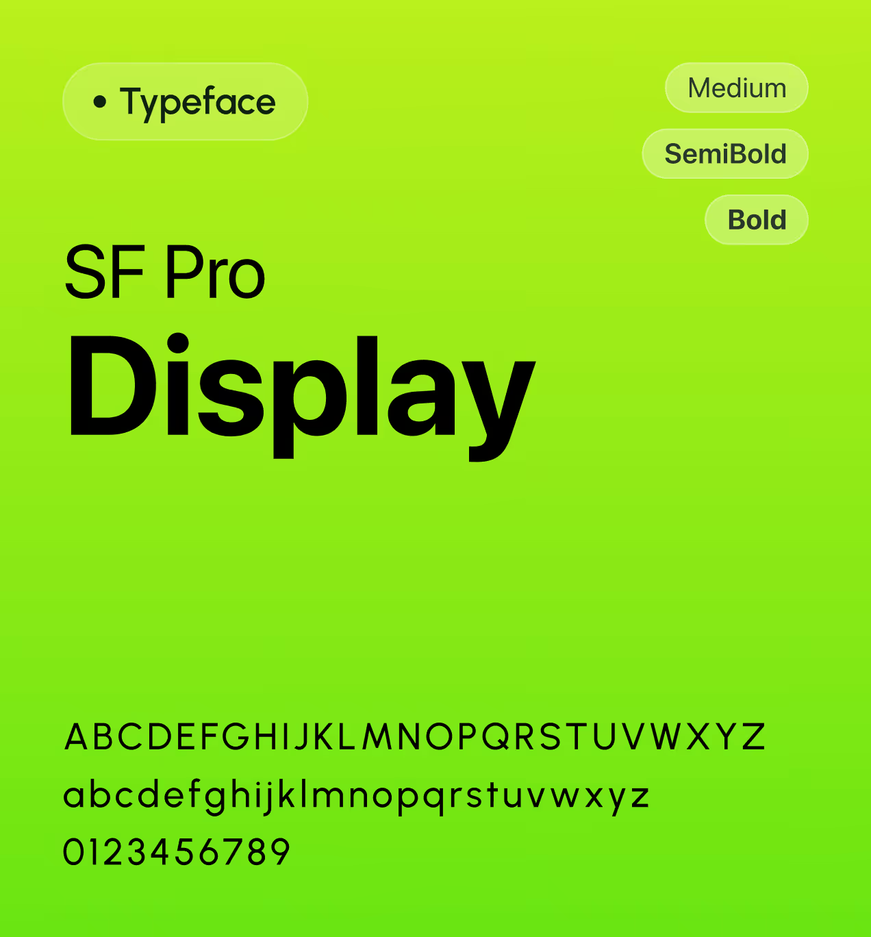
Typography uses SF Pro Display in Medium, Semibold, and Bold weights for modern clarity and easy readability. The brand story is simple: city travel should feel effortless and eco-friendly. Every design element, from the logo to vehicle cards, was made to look approachable, energetic, and built for fast urban movement without confusion.


We made a design system for fast urban design
We built a design system to keep Rooda consistent across mobile and web. The system uses bright green (#11DA30) for primary actions like "Start ride" and "Reserve," light mint (#B9EDB8) and pale green (#C4E4AC) for softer highlights, with black (#000000), white (#FFFFFF), and off-white (#F7F8F7) for backgrounds and contrast. SF Pro Display in Medium, Semibold, and Bold weights keeps text clear during quick booking decisions.
Components like vehicle cards, map markers, booking buttons, and ride status screens follow the same spacing and style rules. Everything scales across devices, making it easy for developers to add new features without starting from scratch. This keeps Rooda looking energetic and professional as the platform grows.

UX design that keeps Rooda consistent
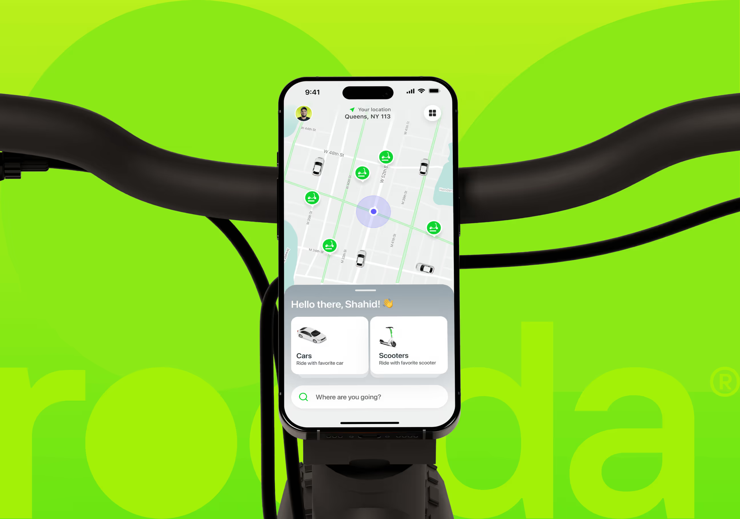
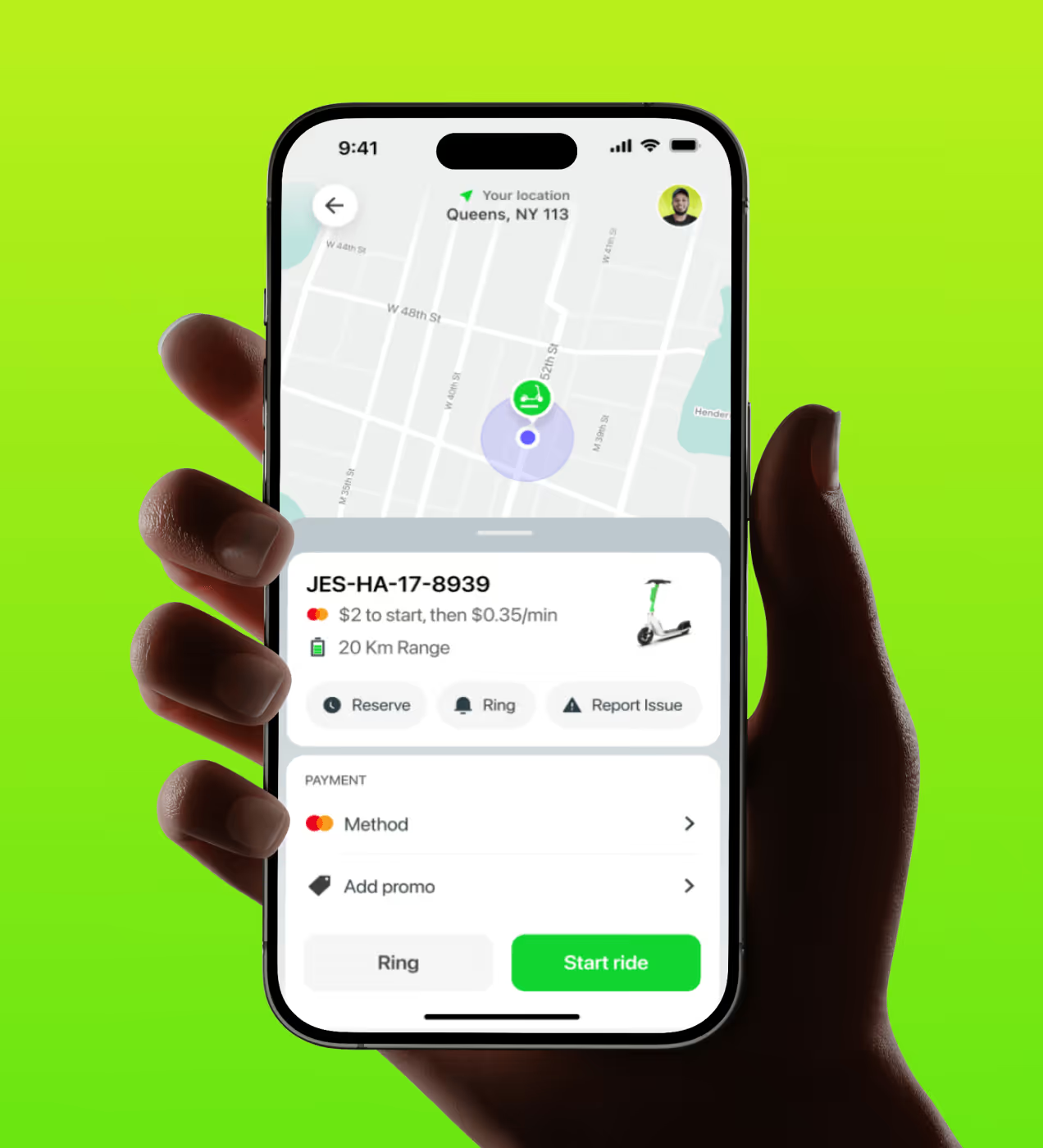
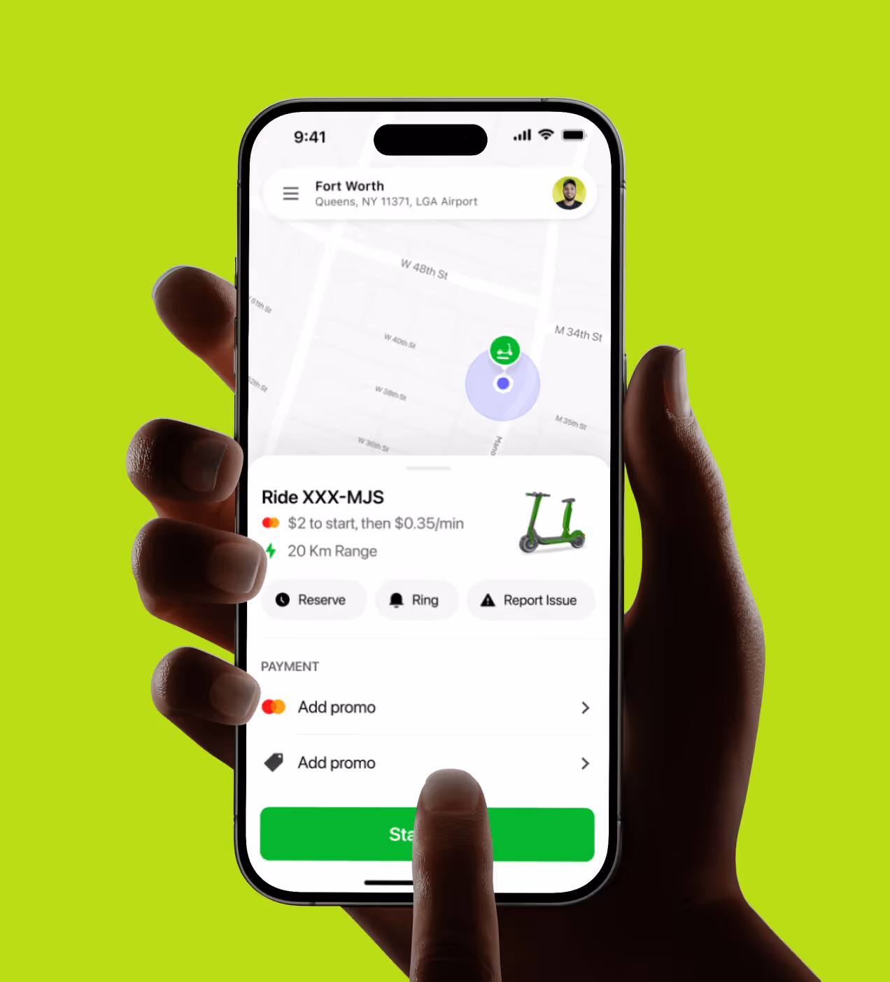
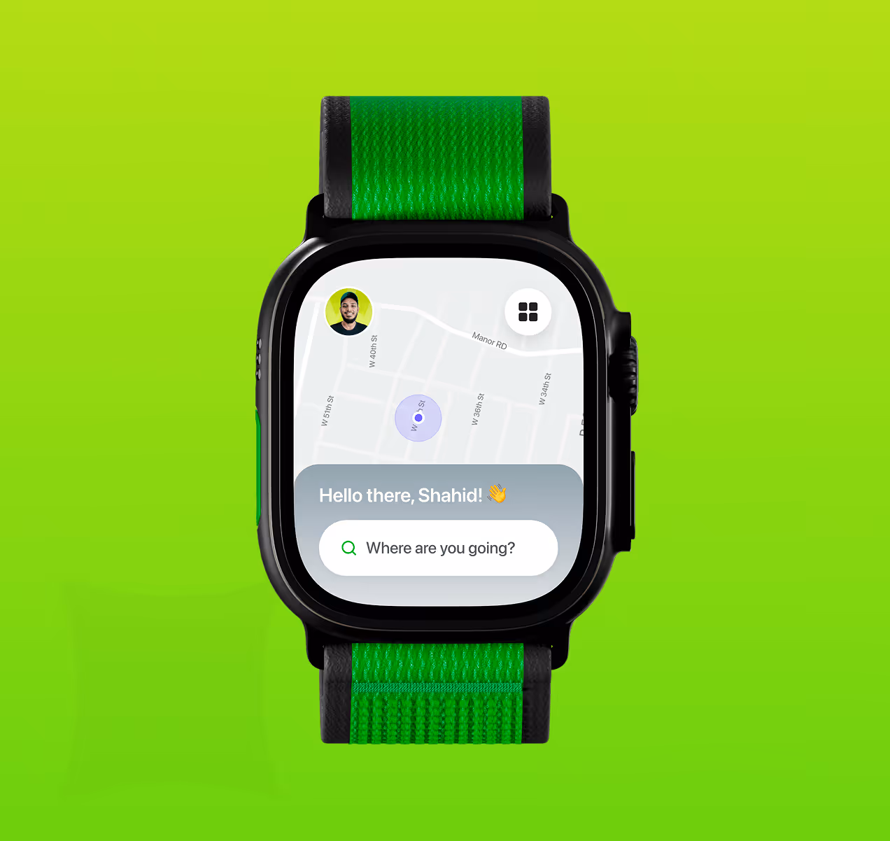
We designed Rooda so users can find vehicles, book rides, and complete trips without switching apps or getting confused. The home screen shows a real-time map with green markers for nearby cars and scooters, each displaying battery level and pricing. Users tap a marker, see vehicle details, and book in two taps. The map stays central, users always know where vehicles are and how far away.
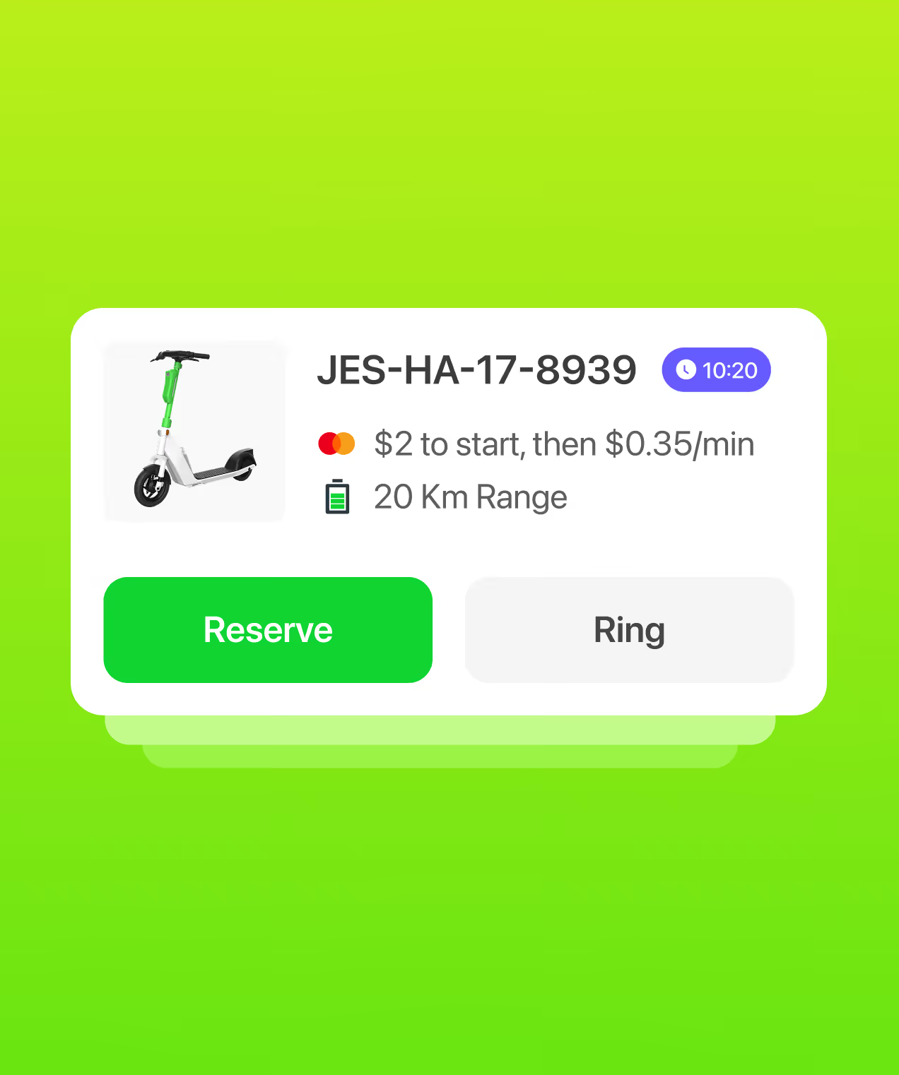
Vehicle cards show clear distinctions between cars and scooters with icons, pricing ($2 to start + per-minute rates), and range (20km battery). QR scanning for scooters uses step-by-step guidance with visual feedback. During rides, users see live navigation, battery status, and can pause or end rides with clear parking instructions and photo requirements. We tested every flow with urban commuters and fixed confusion points before launch.


Measuring Rooda's success
Rooda launched with clear navigation, real-time visibility, and simple flows. Users completed rides confidently, chose vehicles faster, and returned to the app more often.
Key Results:
- Smoother scooter unlock and easier vehicle choice: 55% of first-time users found QR scanning clear with step-by-step guidance, while 68% decided between cars and scooters faster with transparent pricing and battery info shown upfront.
- Ride completion rate increased: 28% more users completed rides after clearer pricing, and vehicle availability reduced booking drop-offs during the selection process.
- Found vehicles faster and daily users grew: 72% of users located nearby cars and scooters with battery info in under 10 seconds using the real-time map, encouraging 18% more daily active users.
- Faster ride closure and reduced support: Streamlined the end-ride process, reducing time from parking to completion by 7.5 seconds, while better UI guidance cut support requests by 35%.
- Feedback engagement boosted: 46% increase in end-of-ride ratings and parking photos helped improve service quality and accountability across the platform.


.avif)
.avif)
Have a Project? Let’s talk!


Your competitors are converting 3x more visitors. Not because they have a better product, but because they have a better design.


.avif)