

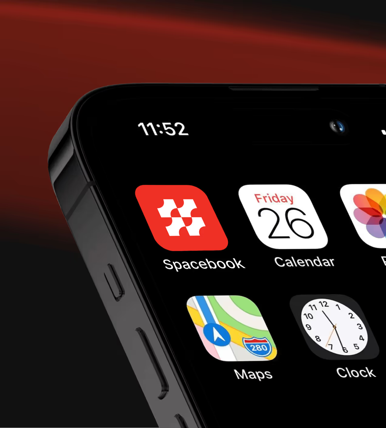
Spacebook is a San Francisco-based SaaS platform providing accounting software for small and mid-sized businesses. It offers invoicing, time tracking, tax summaries, and financial dashboards to simplify financial management.
The problem with everyday accounting tasks
Spacebook had a powerful accounting backend, but the product experience didn’t reflect it. Users struggled to quickly understand their financial status, navigate key actions, or feel confident managing invoices and payments. As a result, many users dropped off after their first session.
- Unclear value at first use: Users struggled to quickly understand their financial status or the core value of the platform, leading to early drop-offs.
- Complex daily workflows: Key actions like invoicing and payments required too many steps, slowing down everyday accounting tasks.
- Poor data scannability: Financial insights were available but not easy to read at a glance, making decision-making harder.
- Low first-session retention: Many users left after their initial visit because the value wasn’t surfaced fast enough.

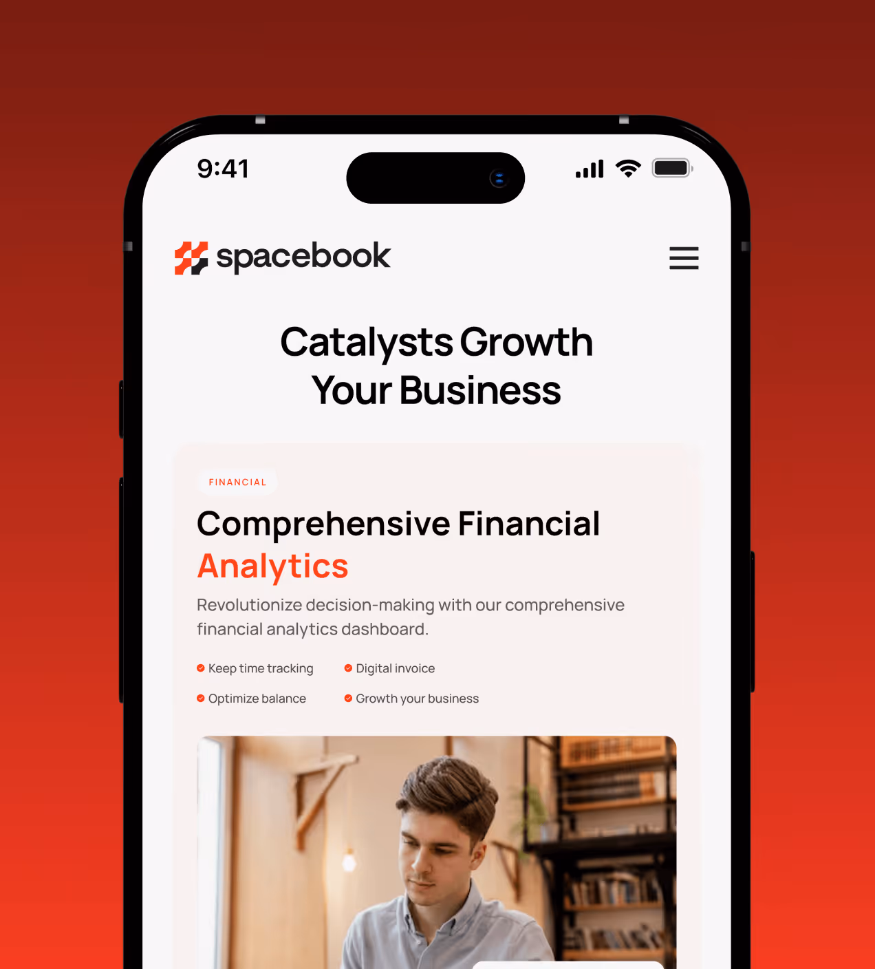
Making everyday accounting easier
We designed Spacebook to make accounting tasks clearer, faster, and easier to complete, helping users understand their finances at a glance and act with confidence.
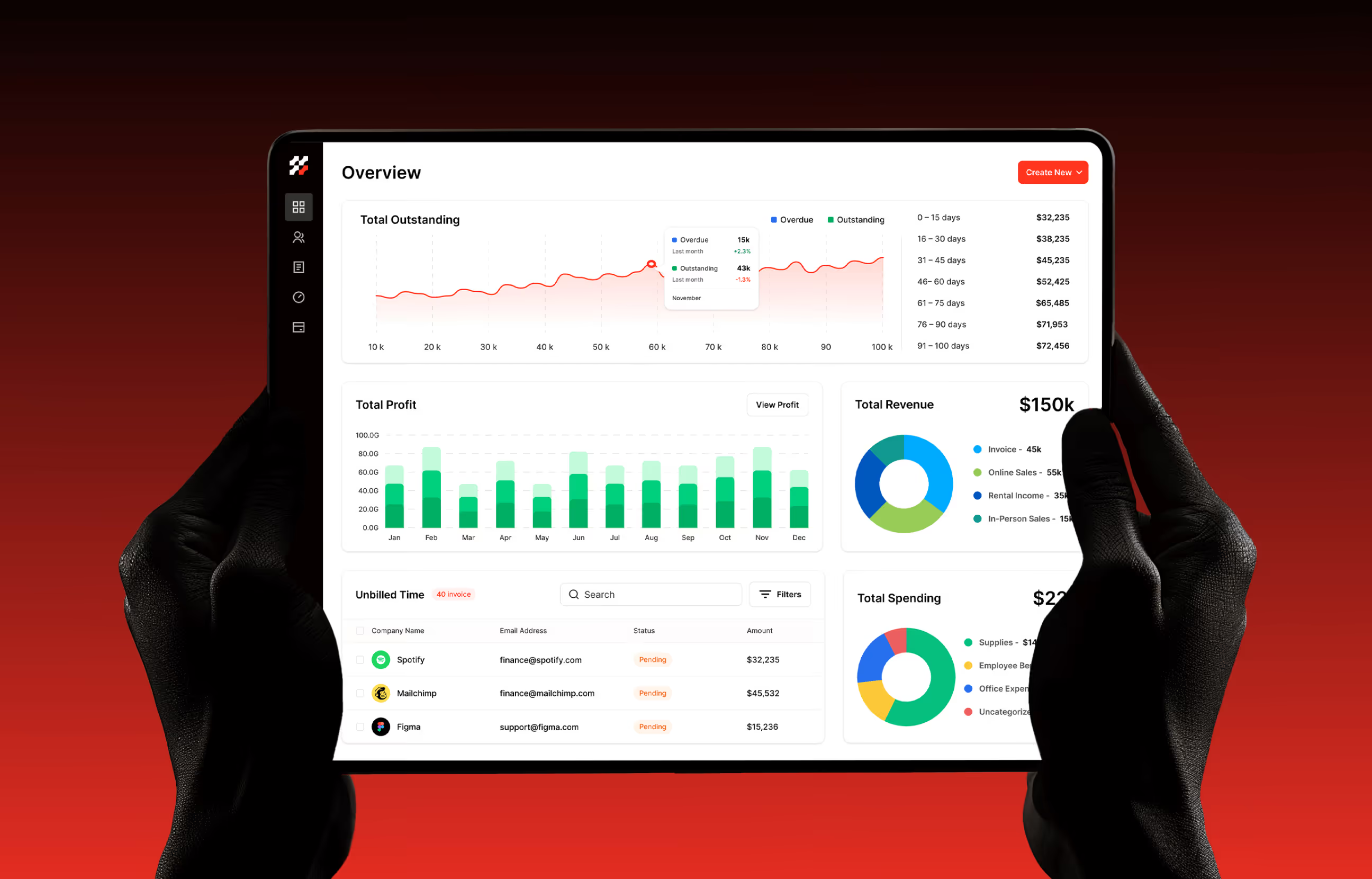
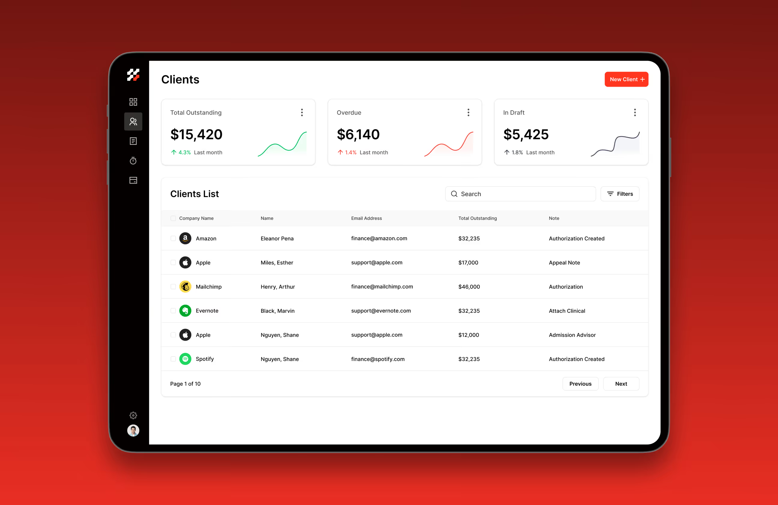
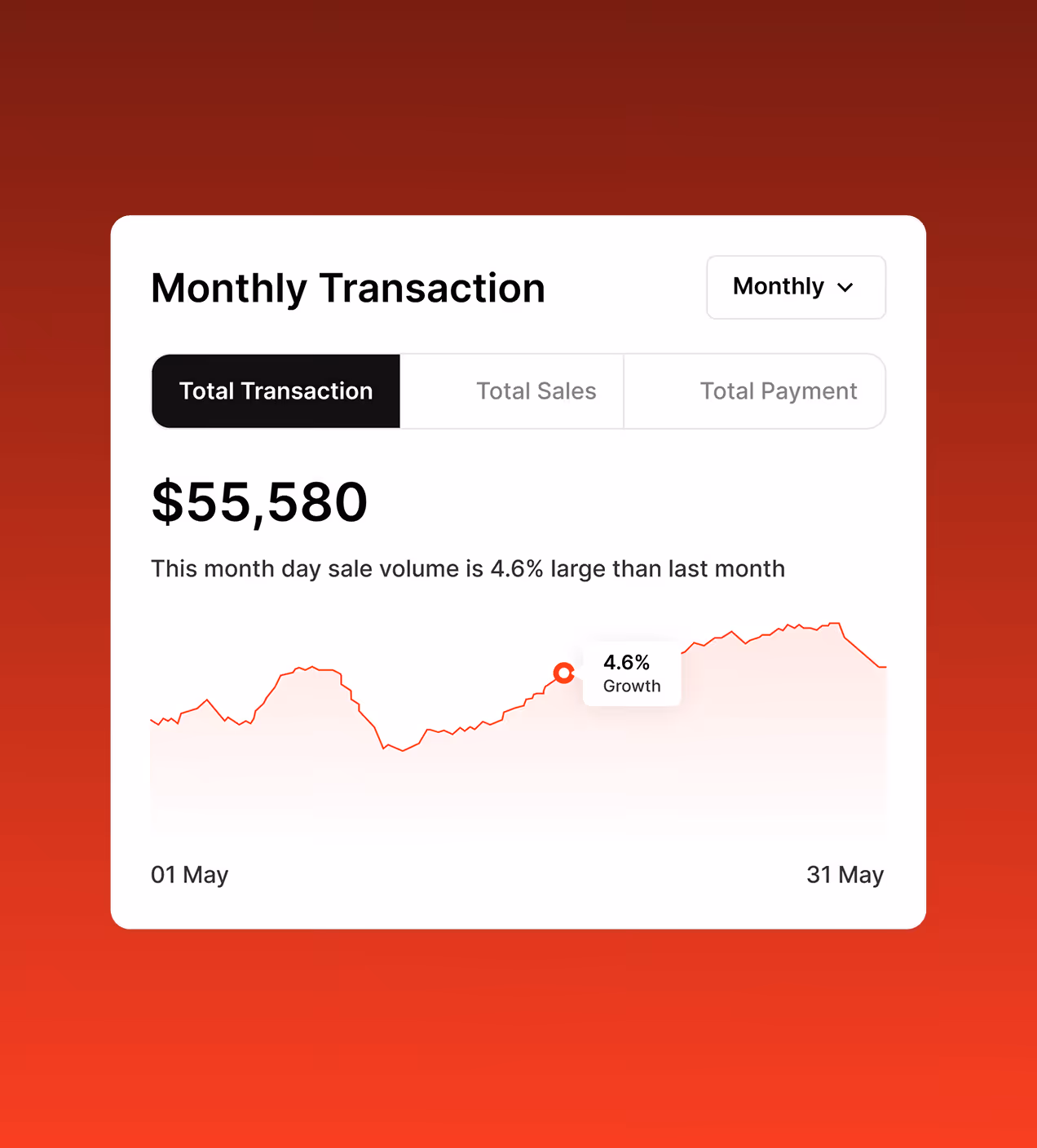
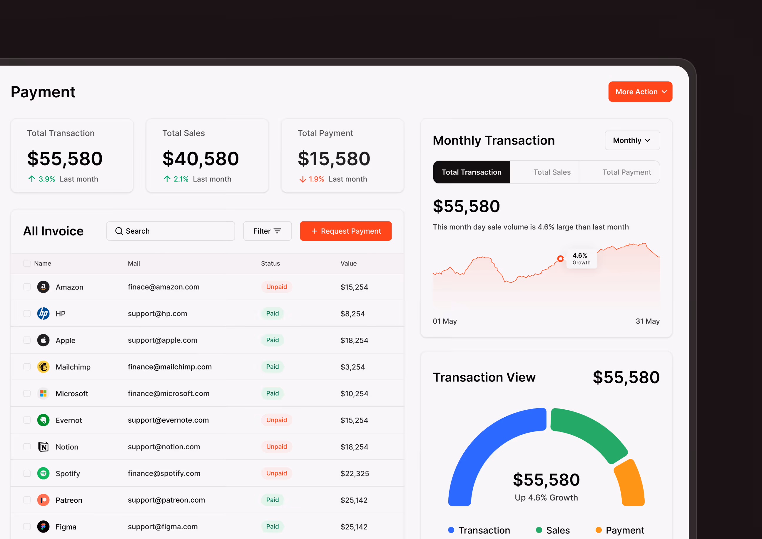
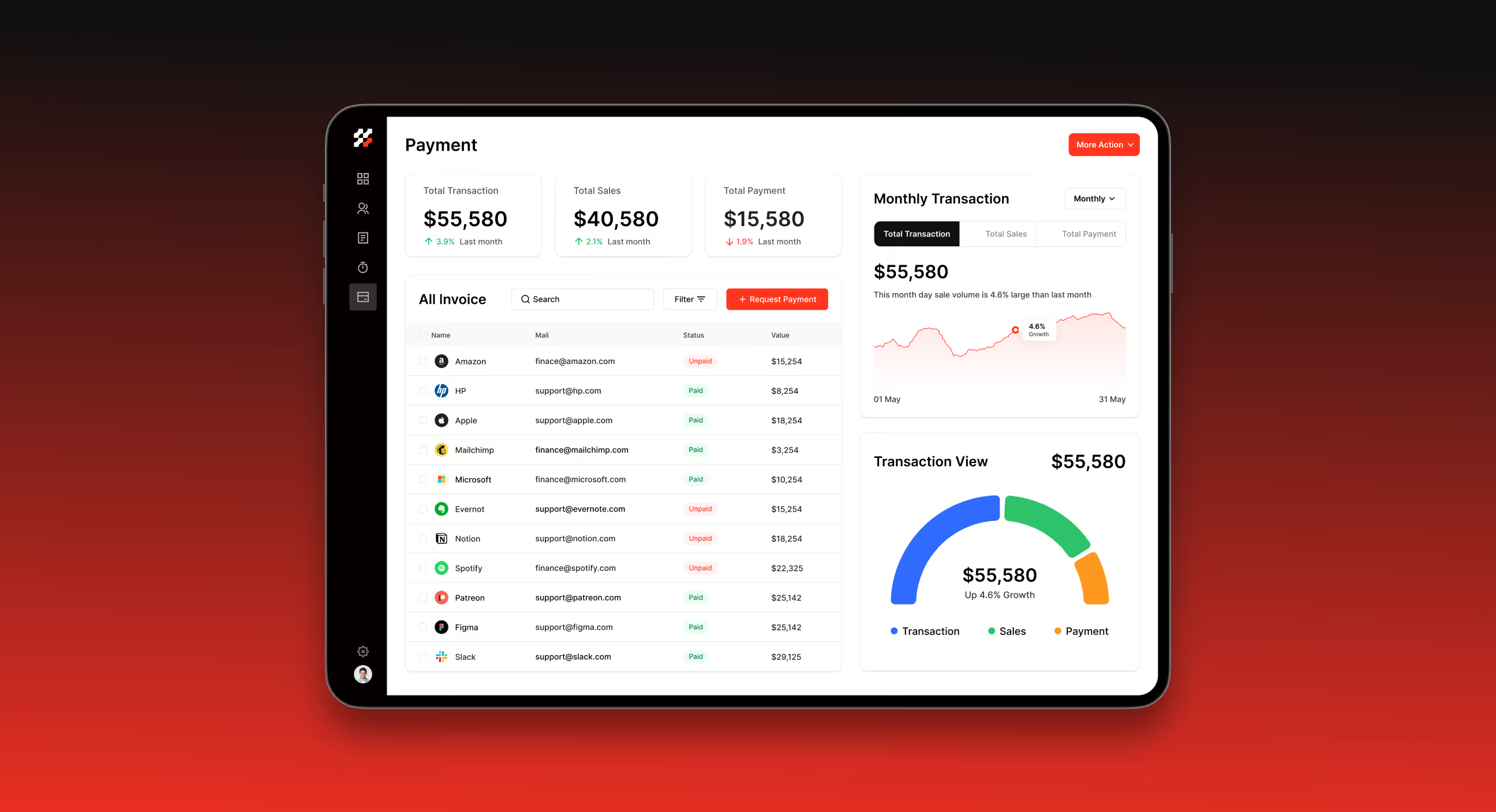
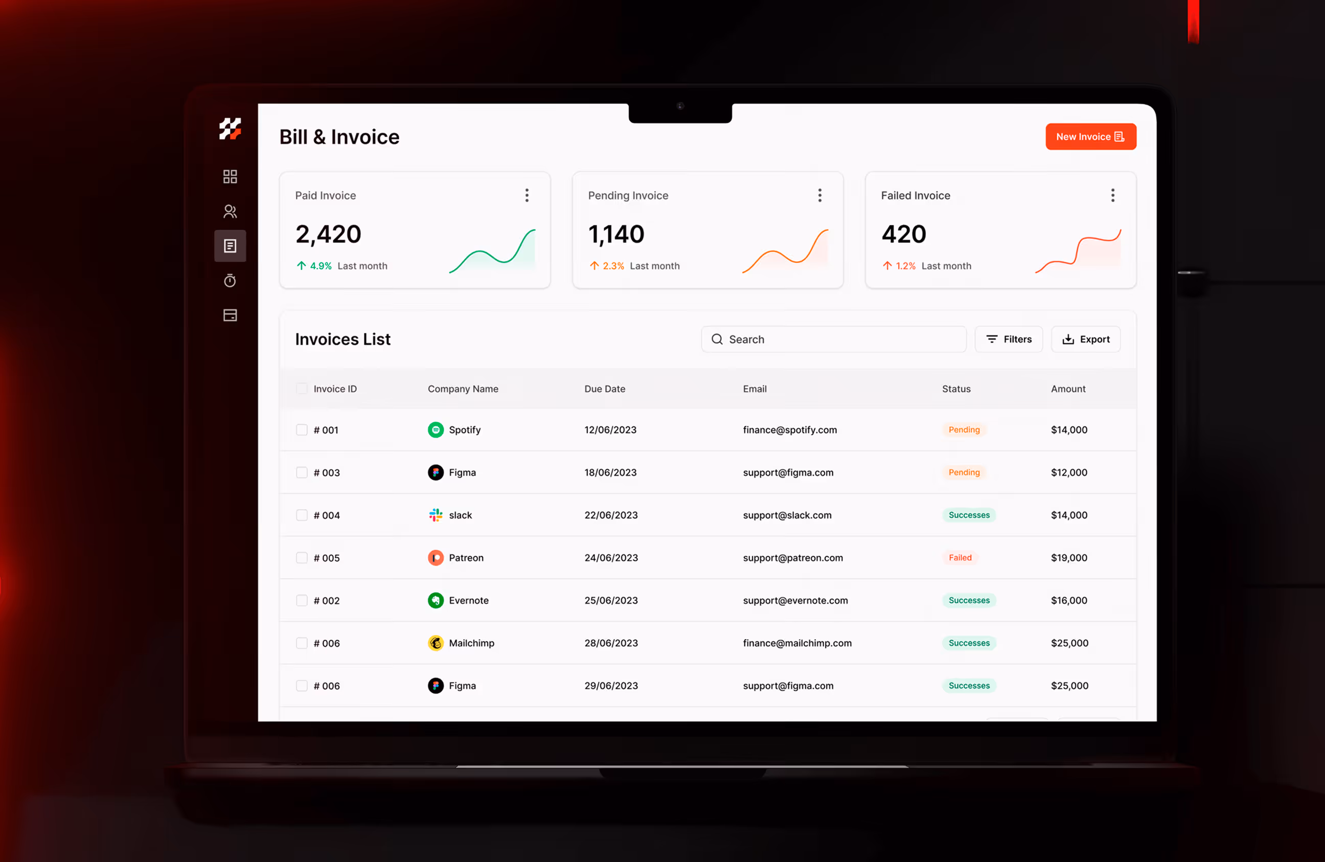
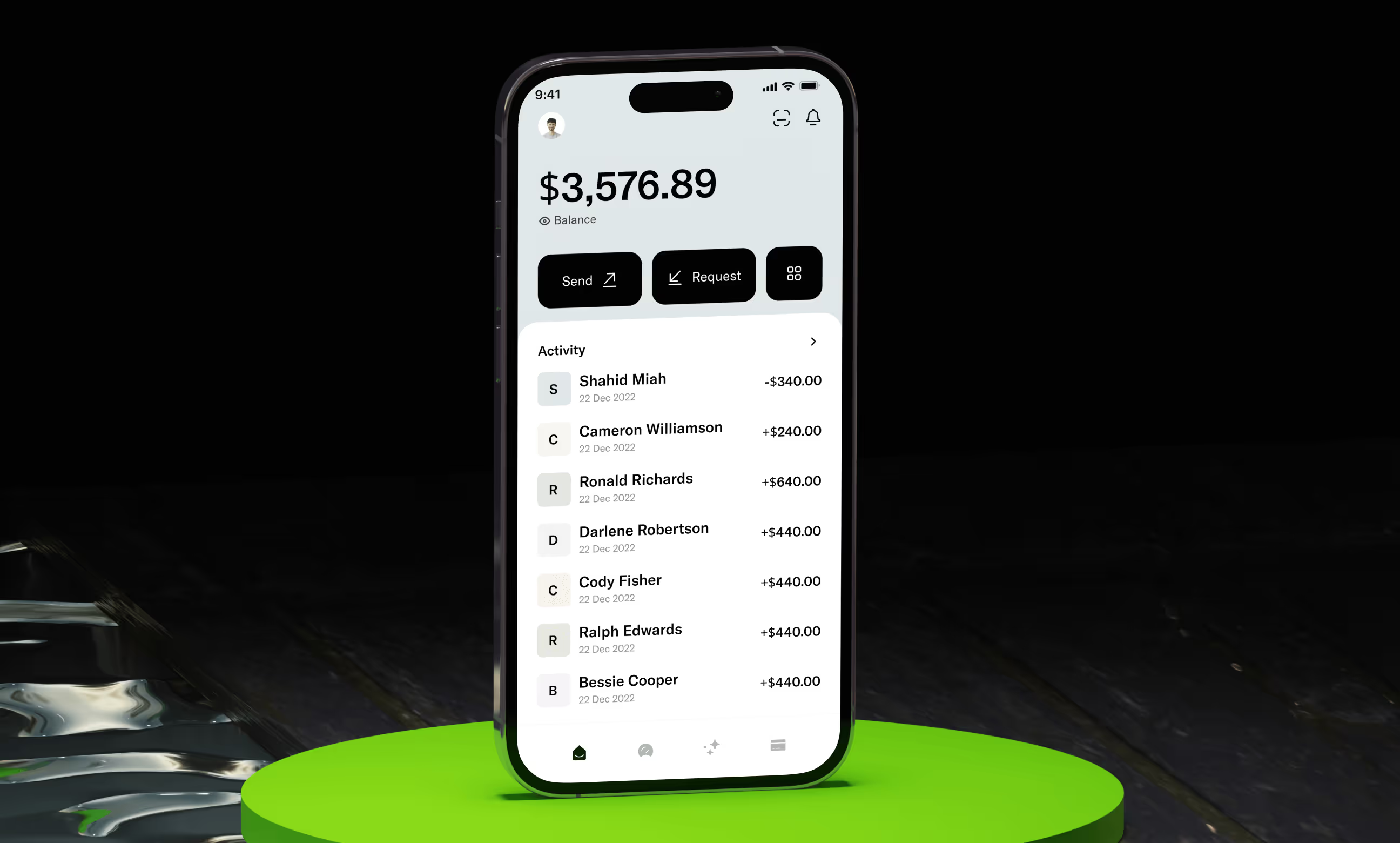
- Clear financial overview: Key metrics like revenue, profit, and outstanding balances are surfaced instantly on the dashboard.
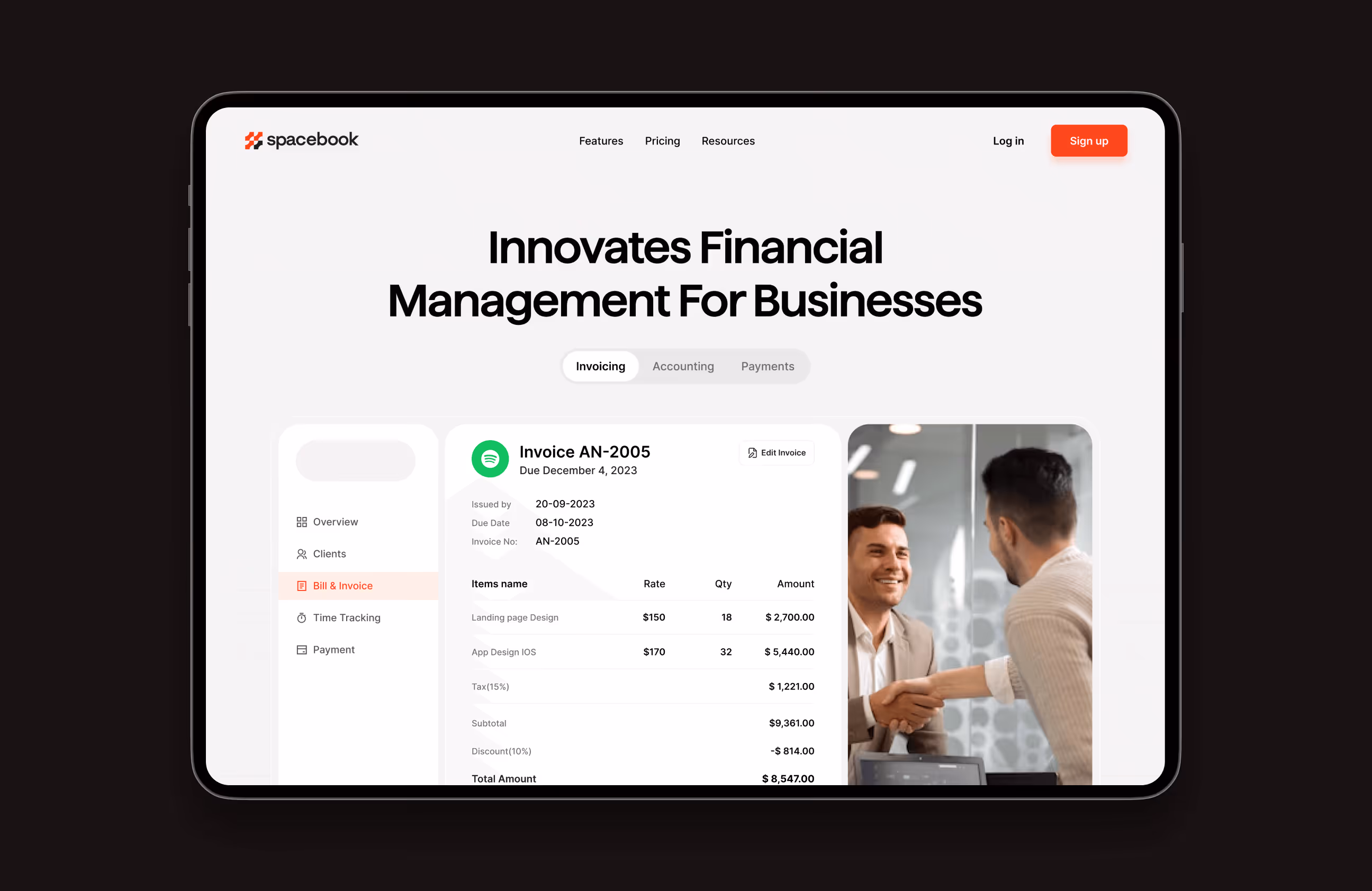
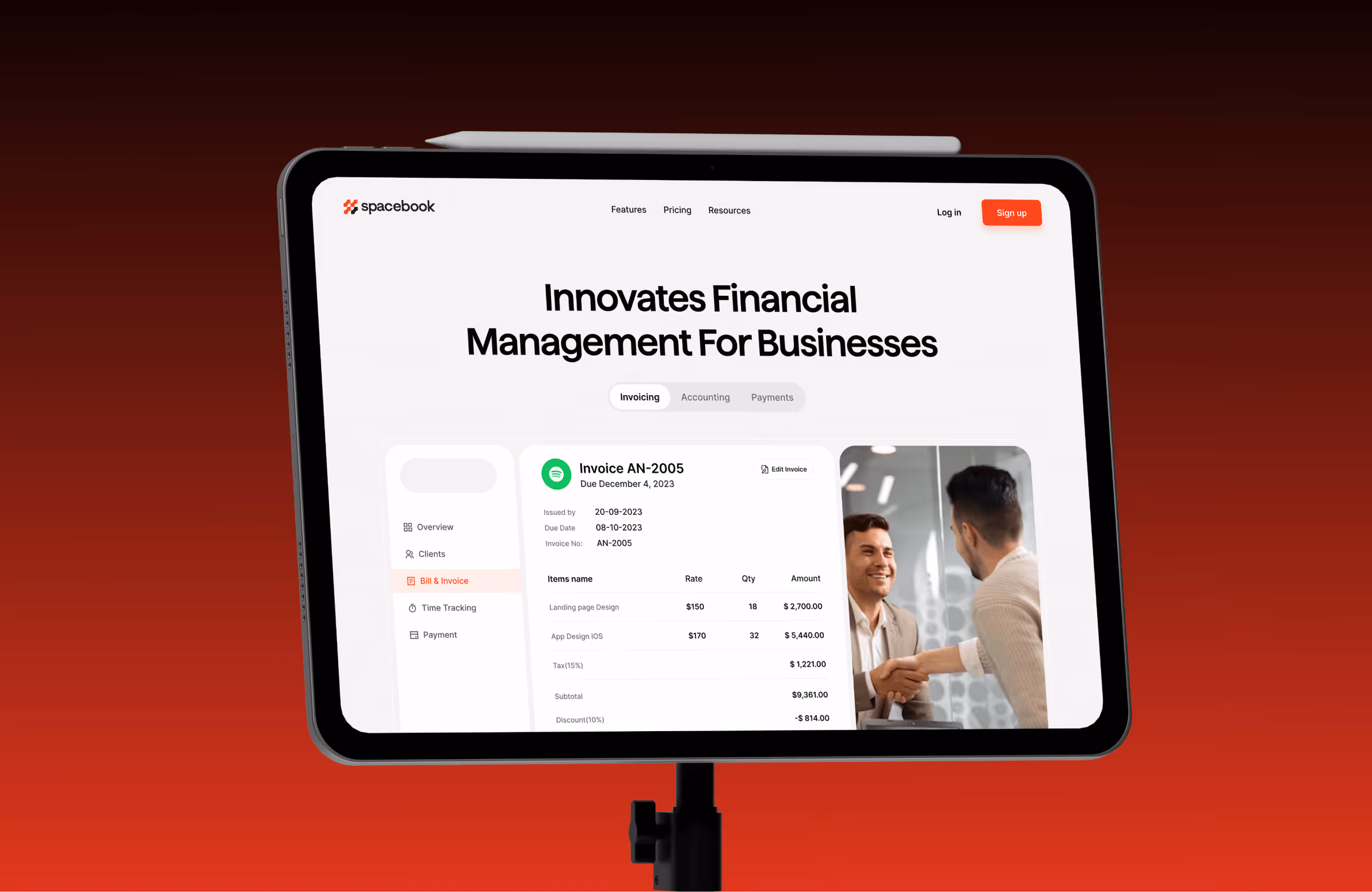
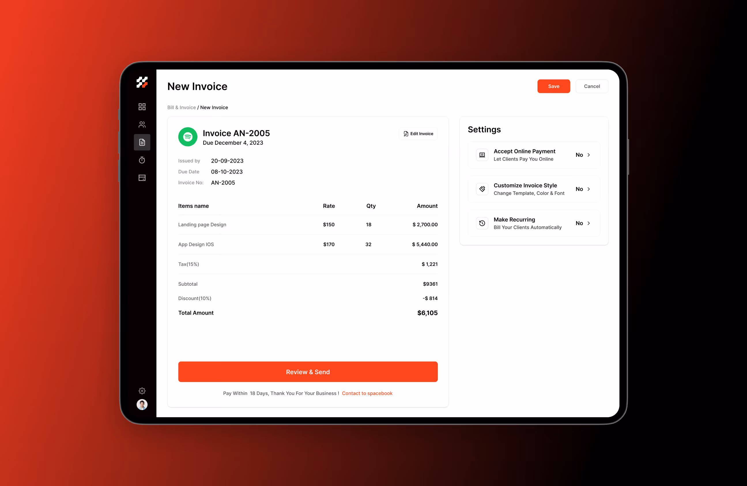
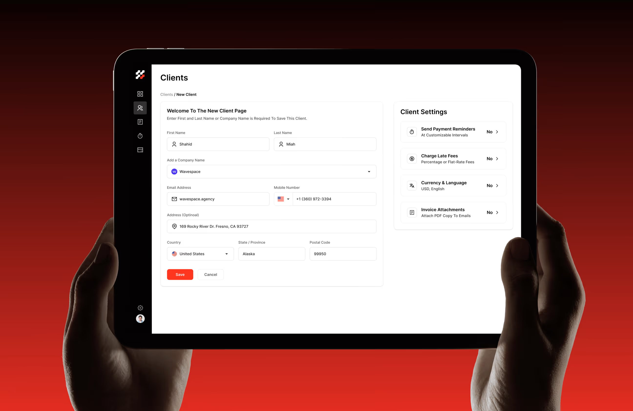
- Simplified invoicing & payments: Reduced steps for creating, reviewing, and managing invoices to speed up daily workflows.
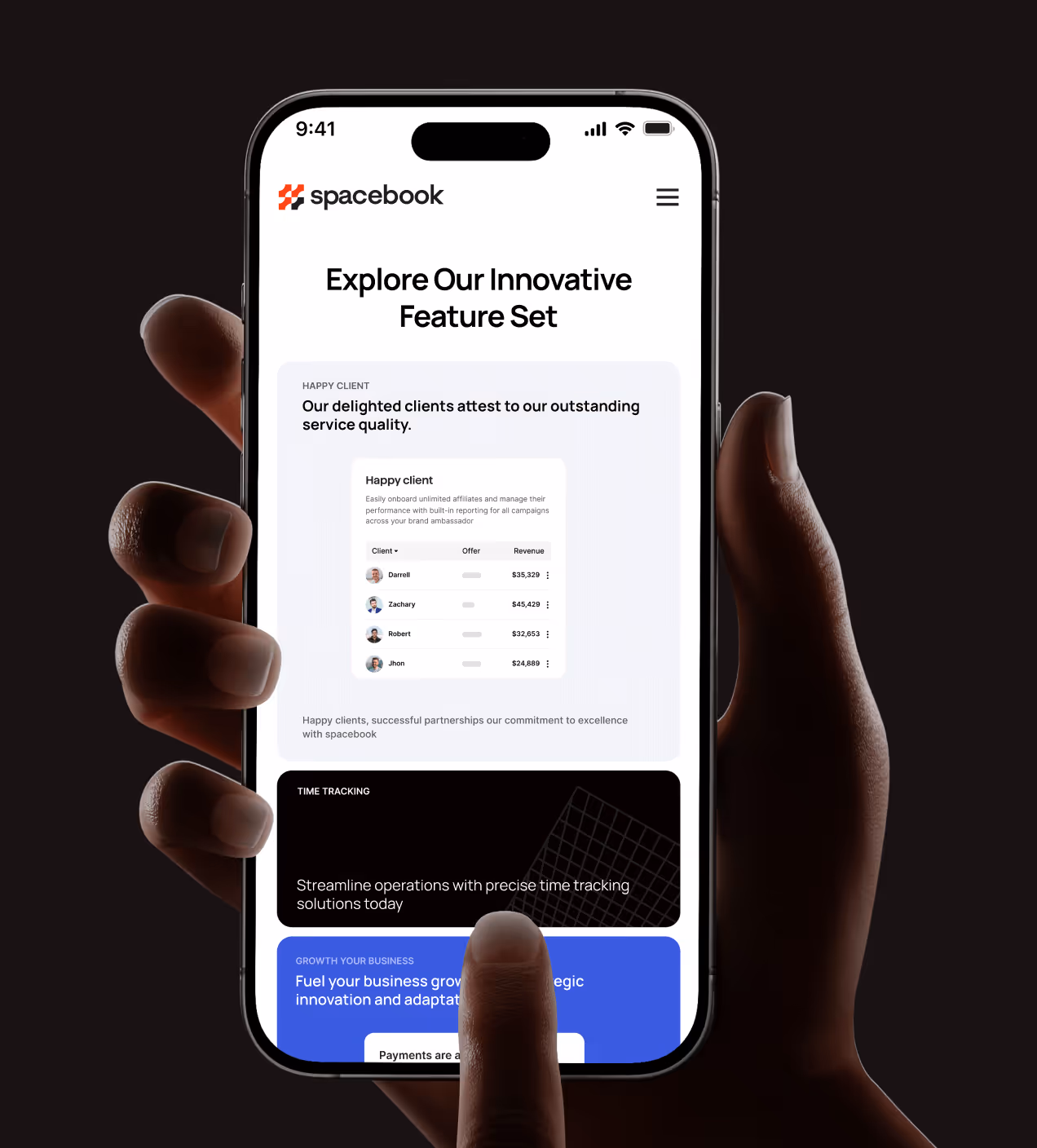
- Improved data hierarchy: Charts, tables, and summaries are structured for quick scanning and better decision-making.
- Guided first-time experience: Clear navigation and prioritised actions help users see value quickly and stay engaged.
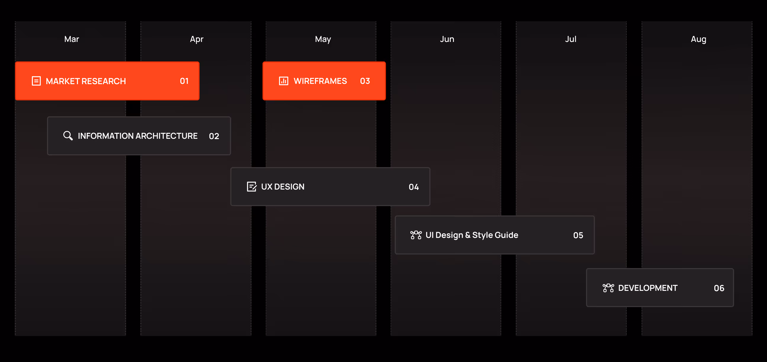
The UX design process behind Spacebook
We followed a clear, design-first process focused on real accounting workflows and everyday use.
Understanding the accounting market, user needs, and product gaps.
Defining information architecture and core product flows.
Designing clear, trustworthy interfaces for financial tasks.
Preparing the product for real usage and implementation.
UX Research & Design Artifacts
We grounded the redesign of Spacebook in real user behavior, focusing on invoicing, expense tracking, and financial visibility to remove friction from everyday accounting tasks.
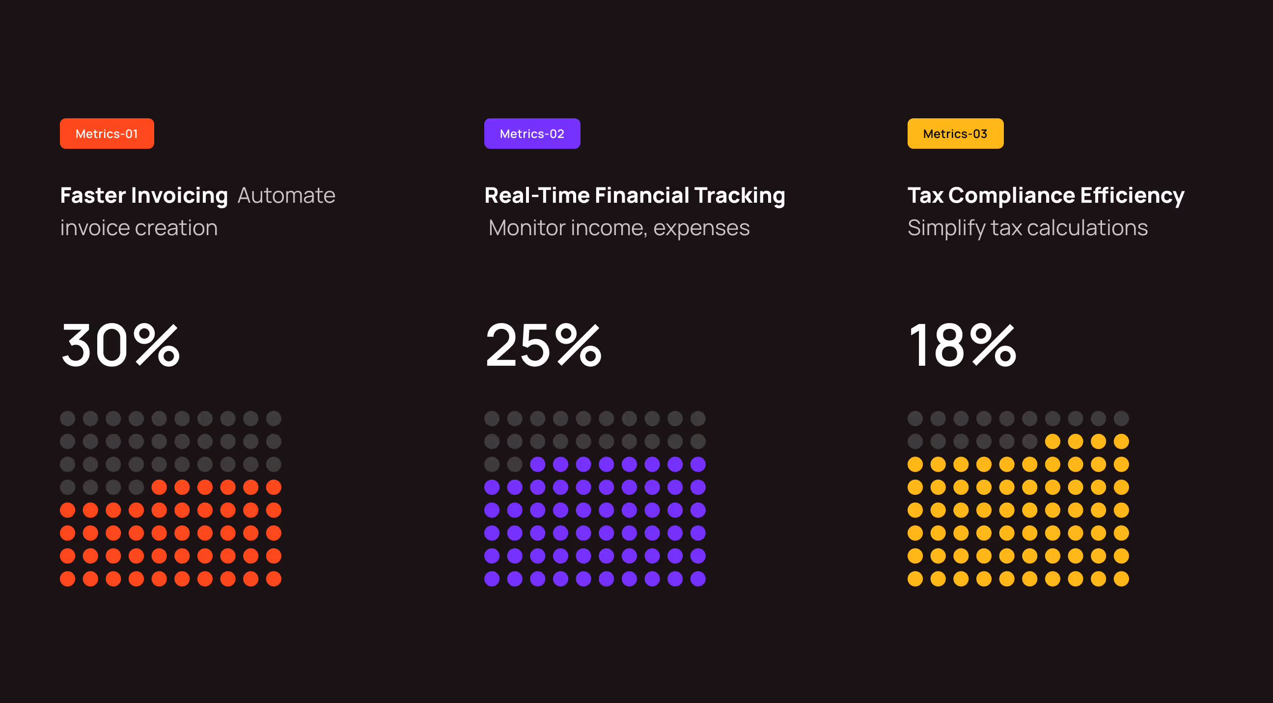
- User acquisition insights: 30% of users prioritize faster invoicing, 25% value real-time financial tracking, and 18% focus on tax compliance efficiency.
- User persona definition: Personas like David Armano represent accountants who need clear financial status, reliable tracking, and time-saving workflows for managing multiple clients.
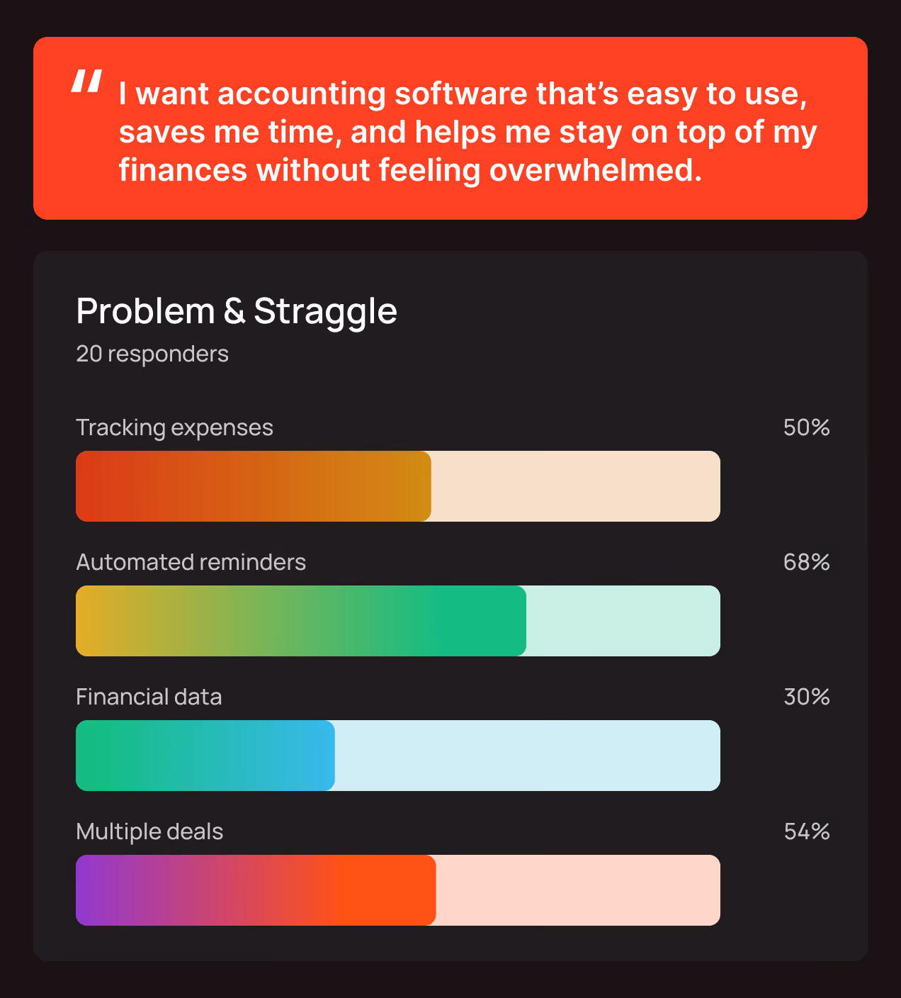
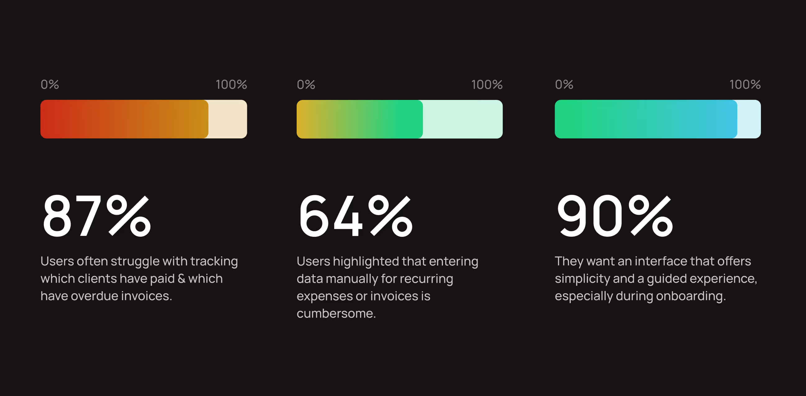
- Invoice and expense challenges: 87% of users struggle to track paid and overdue invoices, while 64% find recurring data entry frustrating.
- Onboarding and guidance needs: 90% of users prefer a simple, guided interface, especially during their first experience with the product.

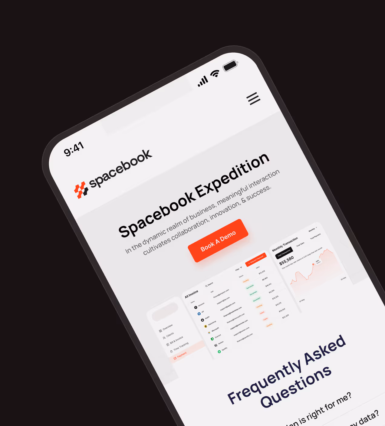
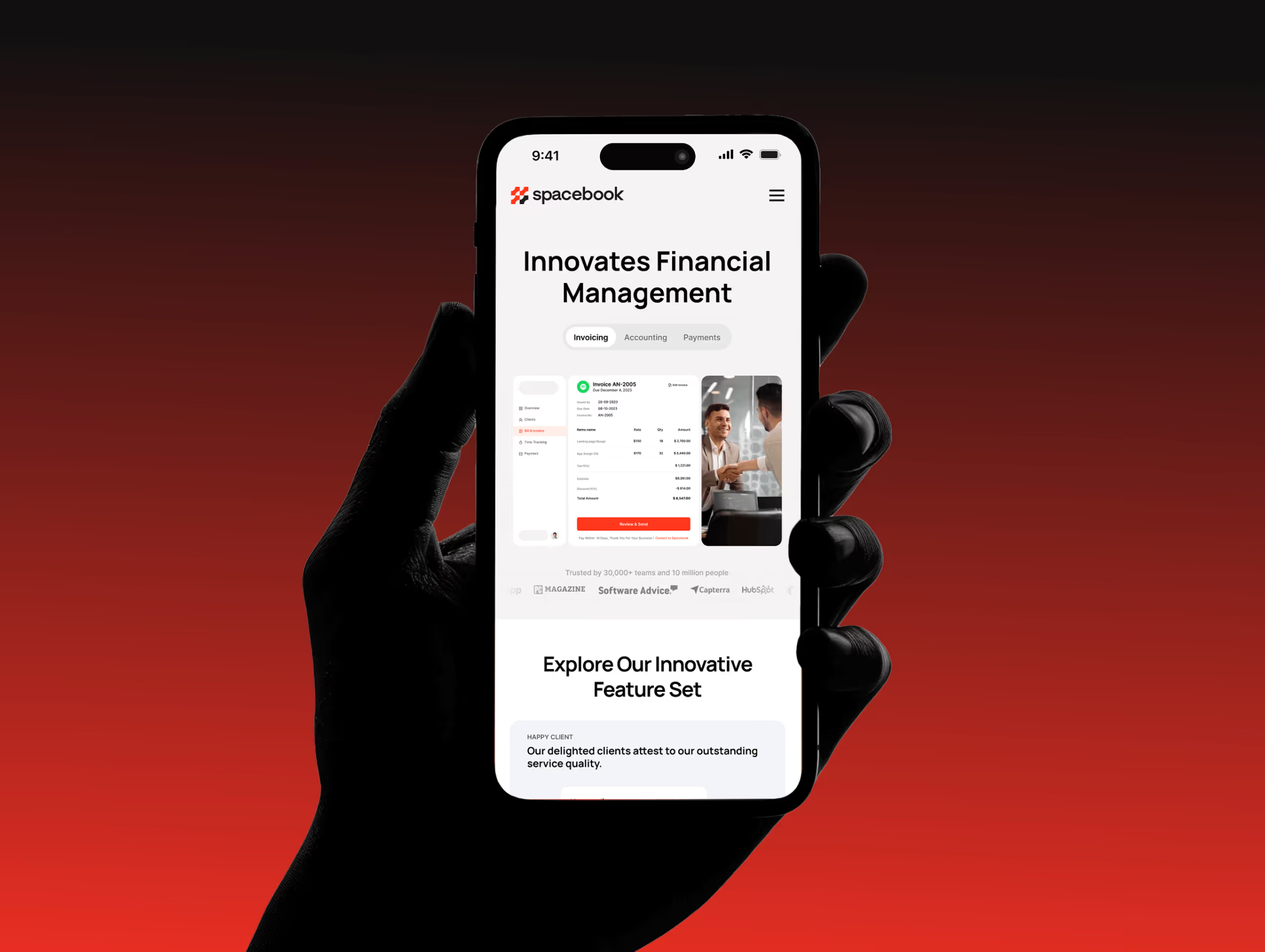
Visual Identity and Brand Story
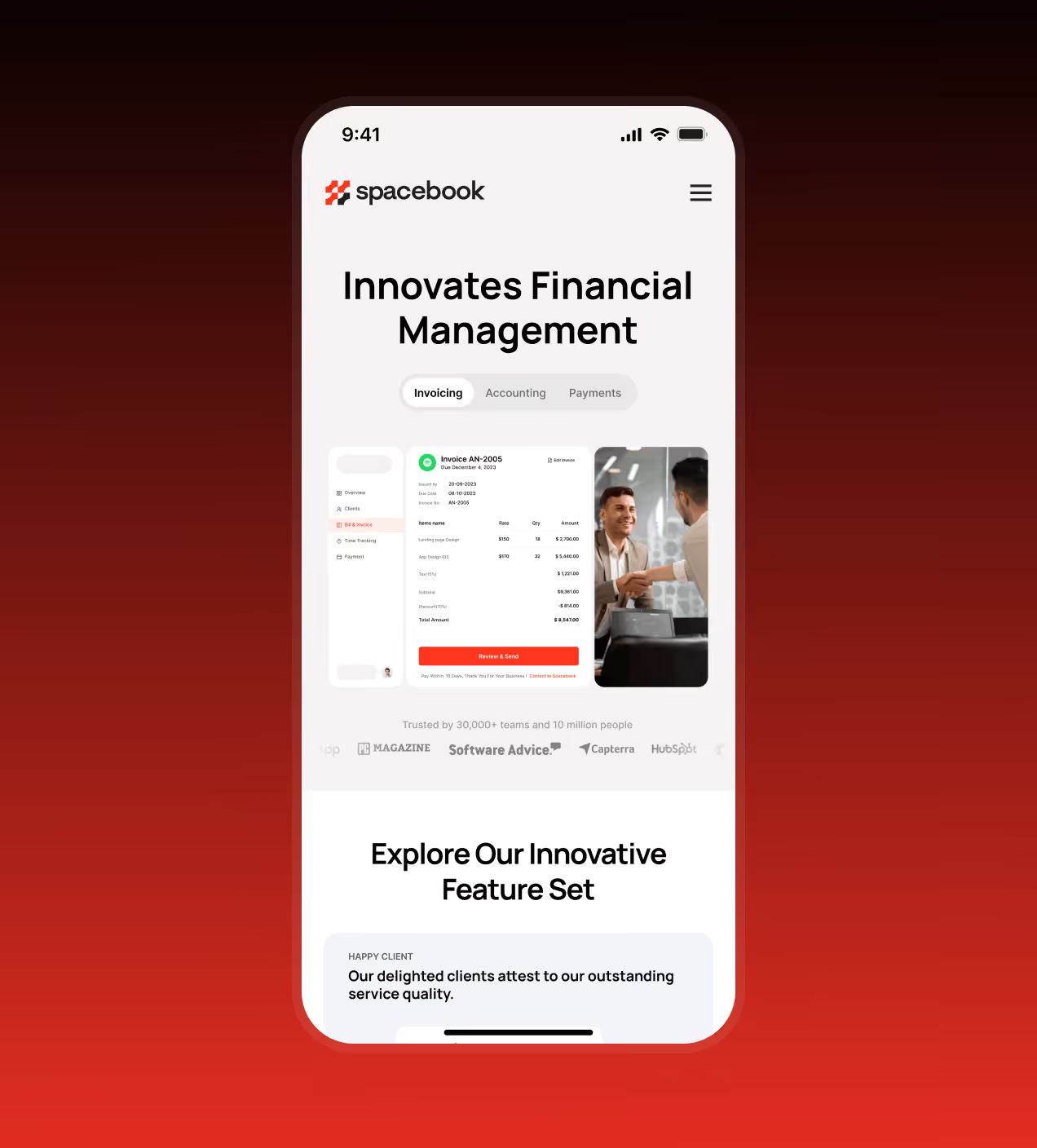
Spacebook’s brand was created to make financial management feel confident, modern, and trustworthy. A bold red-led visual language communicates energy and decisiveness, while dark tones add stability and focus.
The identity is clean and direct, designed to feel professional without being intimidating. Typography and color work together to keep the brand sharp, readable, and memorable across all touchpoints.
Through a consistent and recognizable visual presence, Spacebook moved beyond being just a functional accounting tool and became a brand users can easily recall and trust in their daily financial work.


A design system built for Spacebook
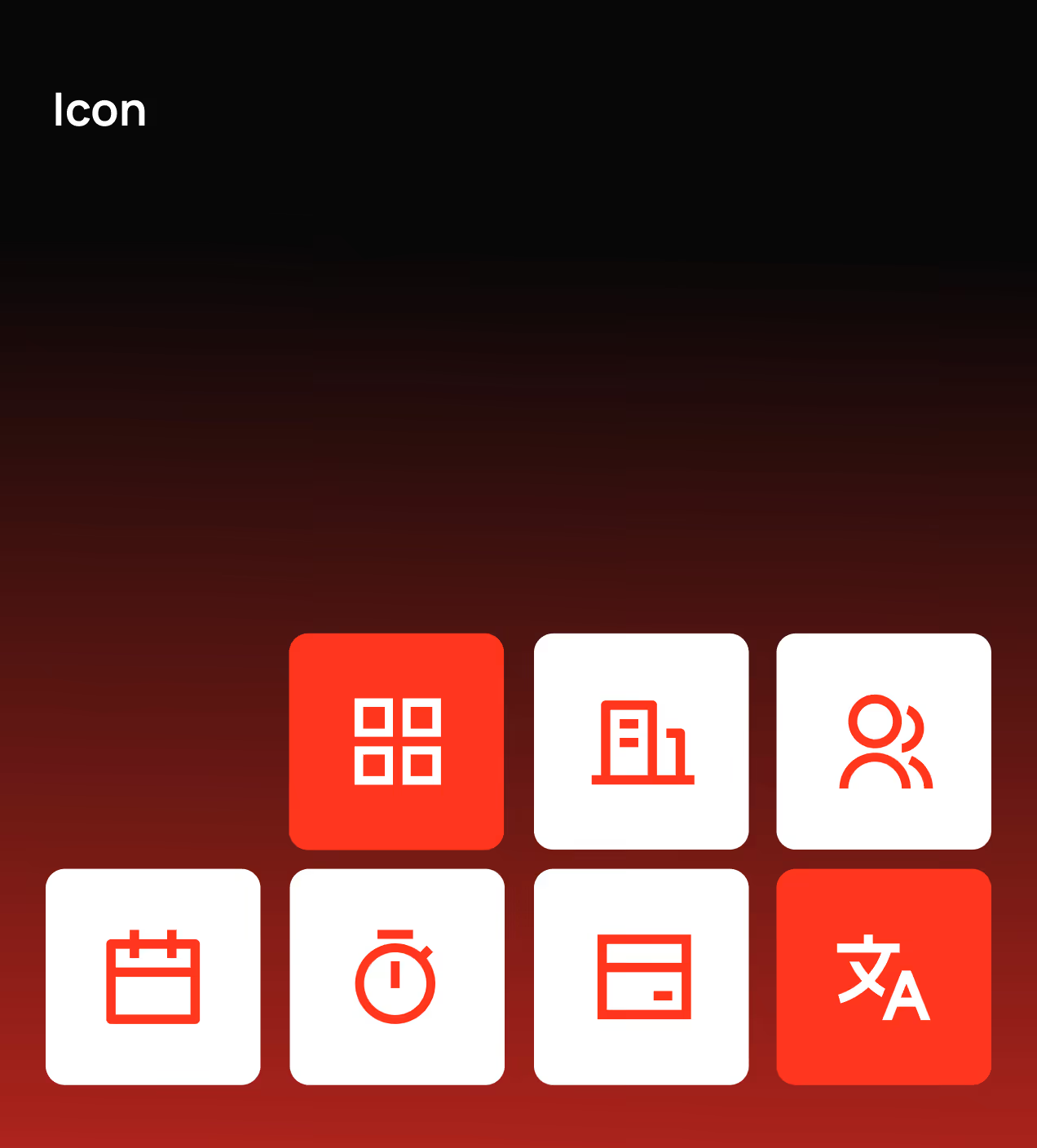
Spacebook’s design system establishes a unified visual foundation across the product by standardizing color, typography, layout, components, and icon usage. It ensures consistency across dashboards, tables, cards, and controls while allowing the product to scale without visual drift.
The system uses a neutral-led color palette (#FFFFFF, #E1E1E1, #323131) for clarity, deeper tones (#060100, #200906) for structure, and bold reds (#FF371E, #A01504) for emphasis and system states. Inter is used as the primary typeface to maintain clear hierarchy and readability in data-heavy views. A modular grid, reusable UI components, and consistent icon rules keep layouts predictable, maintainable, and aligned across web and mobile.


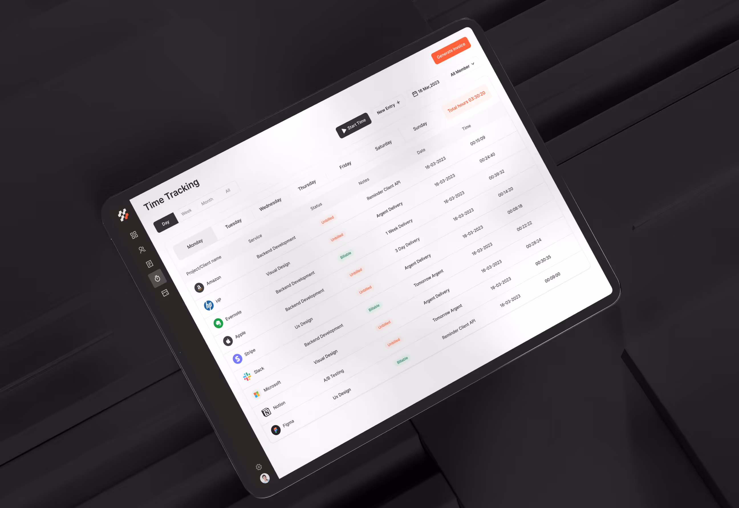
UX design for everyday accounting needs
The UX design of Spacebook focused on helping users understand their finances quickly and act with confidence. We reduced cognitive load by simplifying layouts, prioritizing essential information, and removing unnecessary steps from everyday accounting workflows.
Financial data is organized for quick scanning, with clear hierarchy across dashboards, tables, and summaries. Core actions like invoicing, payments, and tracking appear where users naturally expect them, creating a predictable and efficient experience that supports accuracy, speed, and daily financial management.


Stronger engagement through better UX
The designed Spacebook experience improved how users engage with everyday accounting tasks. By making financial data clearer, workflows faster, and actions more predictable, users can move with confidence and stay engaged longer.
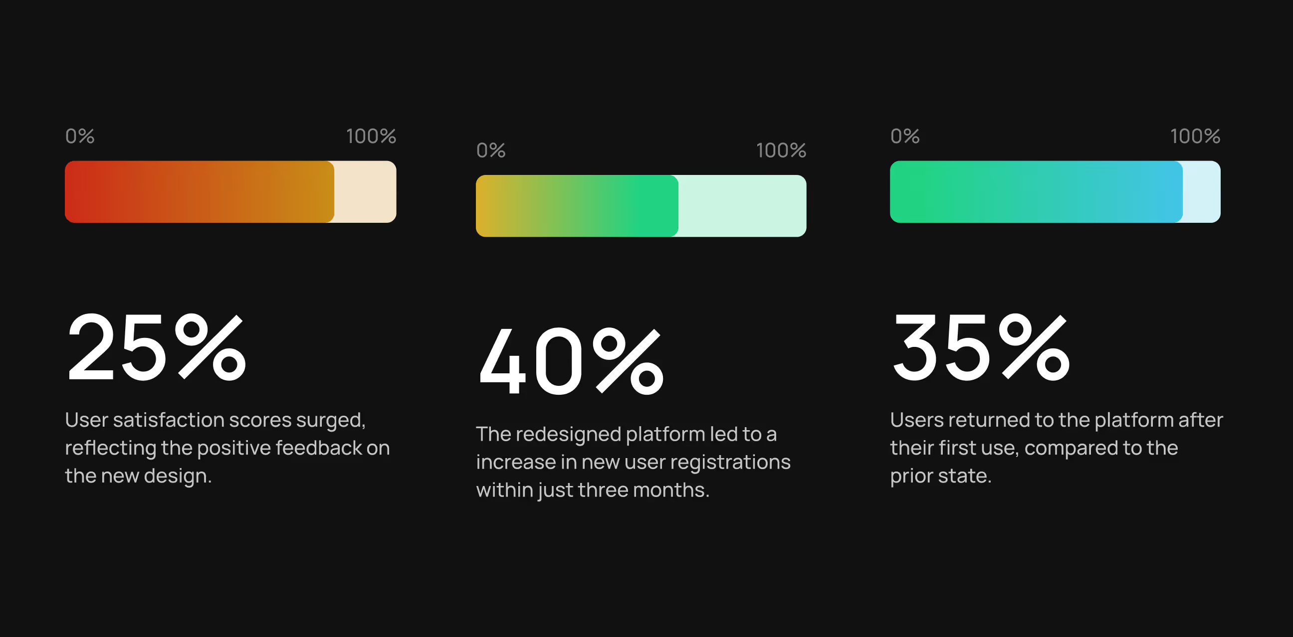
- 25% higher user satisfaction: Clearer layouts and simpler workflows led to more positive user feedback.
- 35% higher user retention: Users were more likely to return after their first session due to improved usability.
- 30% faster invoice and payment actions: Streamlined flows reduced the time spent managing invoices and payments.
- 40% increase in new registrations: A clearer first experience and improved onboarding helped convert more new users.
- Reduced errors in financial tracking: Clear dashboards and structured data views lowered confusion and mistakes.

.avif)
.avif)
Have a Project? Let’s talk!


Your competitors are converting 3x more visitors. Not because they have a better product, but because they have a better design.


.avif)