3.2x
40%
2.4x
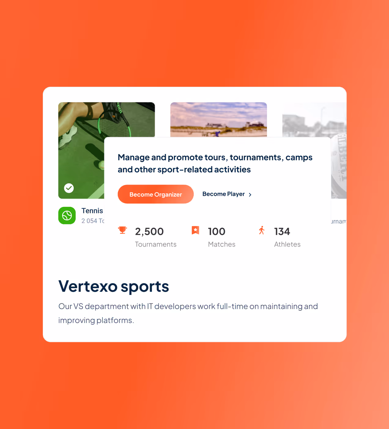
Tournated is a Latvia-based sports SaaS platform that helps federations, clubs, and athletes manage tournaments and data in one place. Founded in 2023 by former athletes, it's known as the "Shopify for Sports Management."
When Tournated came to us, their product was powerful but hard to use. Admins got lost, athletes couldn't find schedules, and the outdated interface slowed their growth. We redesigned their entire dashboard and website to match the platform that later raised $750,000 in strategic funding for global expansion.


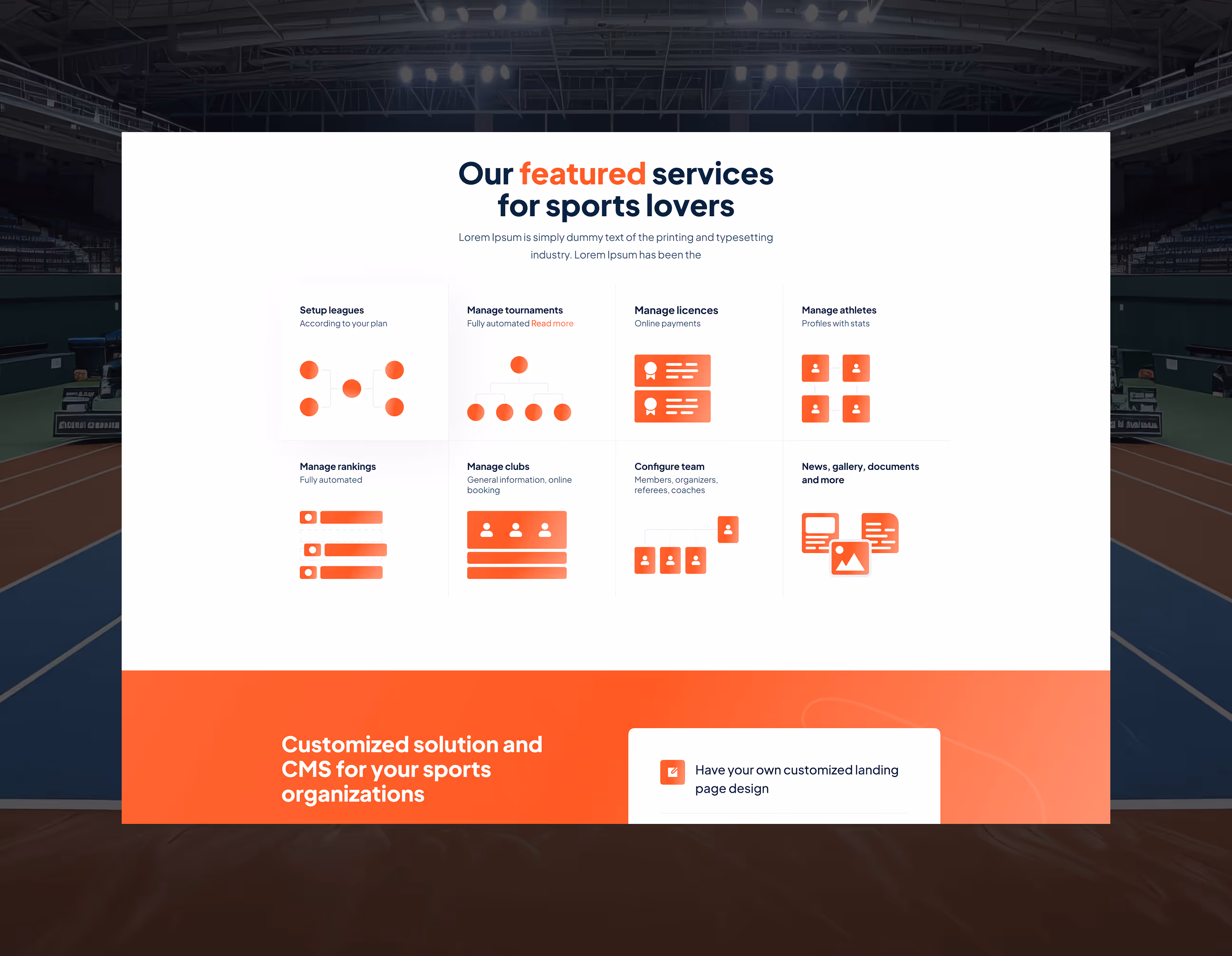
The problems we had to fix
Tournated was growing fast, but the platform couldn't keep up. Admins, club managers, and athletes all struggled with the same core issues: confusing structure, messy workflows, and no guidance to get started.
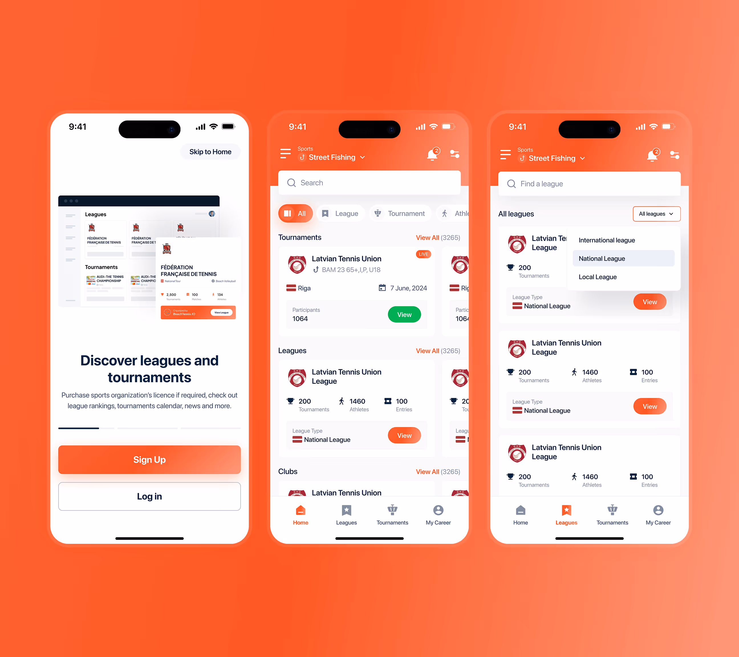
- Unclear federation hierarchy: Admins couldn't see clear links between international, national, and local structures, confusing the platform.
- No onboarding guidance: 70% of new users didn't know how to start a tournament or update entries without help, slowing adoption.
- Complicated club management: Clubs had no single view for managing teams, roles, and tournament participation, leading to manual work and errors.
- Outdated athlete experience: Players struggled to find schedules, results, and rankings because flows were disconnected and hard to follow.
- Cluttered screens: Most users found the interface too messy. Important actions were buried, making simple tasks feel complicated.

How we fixed Tournated
We redesigned Tournated from the ground up, fixing every problem users faced and building a platform that federations, clubs, and athletes actually enjoy using.
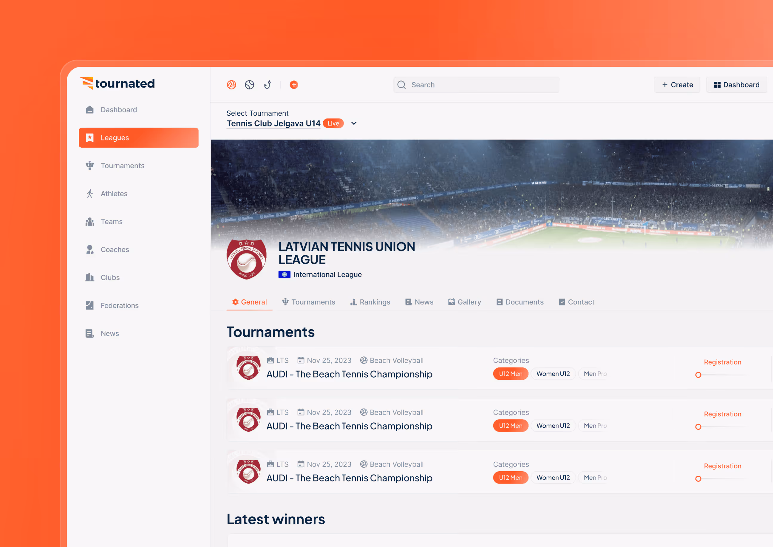
- Unified federation structure: Built a clear hierarchy between international, national, and local levels so admins always know where they are and what they control.
- Simple onboarding flow: Added step-by-step guidance for new users so anyone canstart a tournament or add entries without confusion, cutting support requests by 48%.
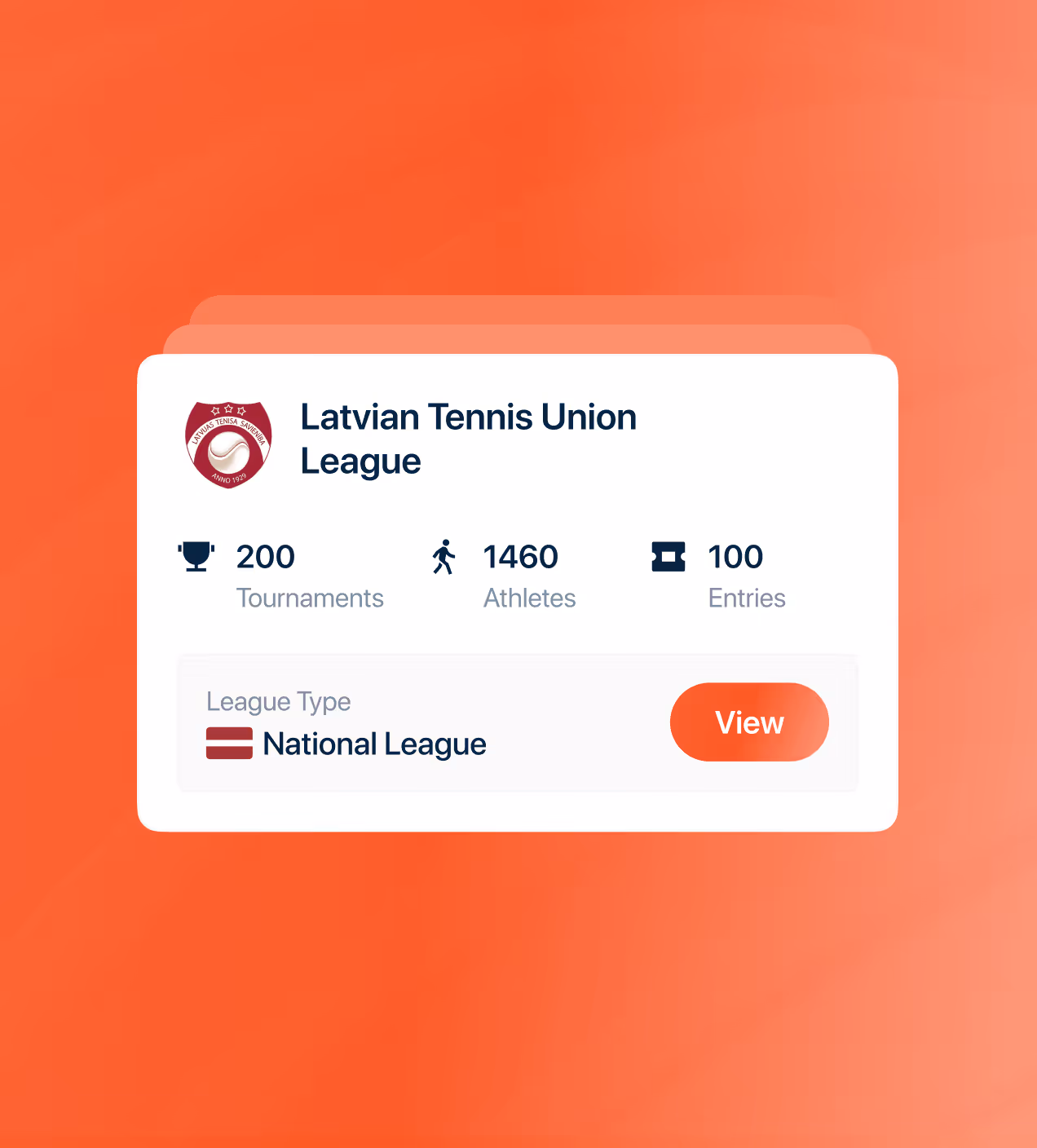
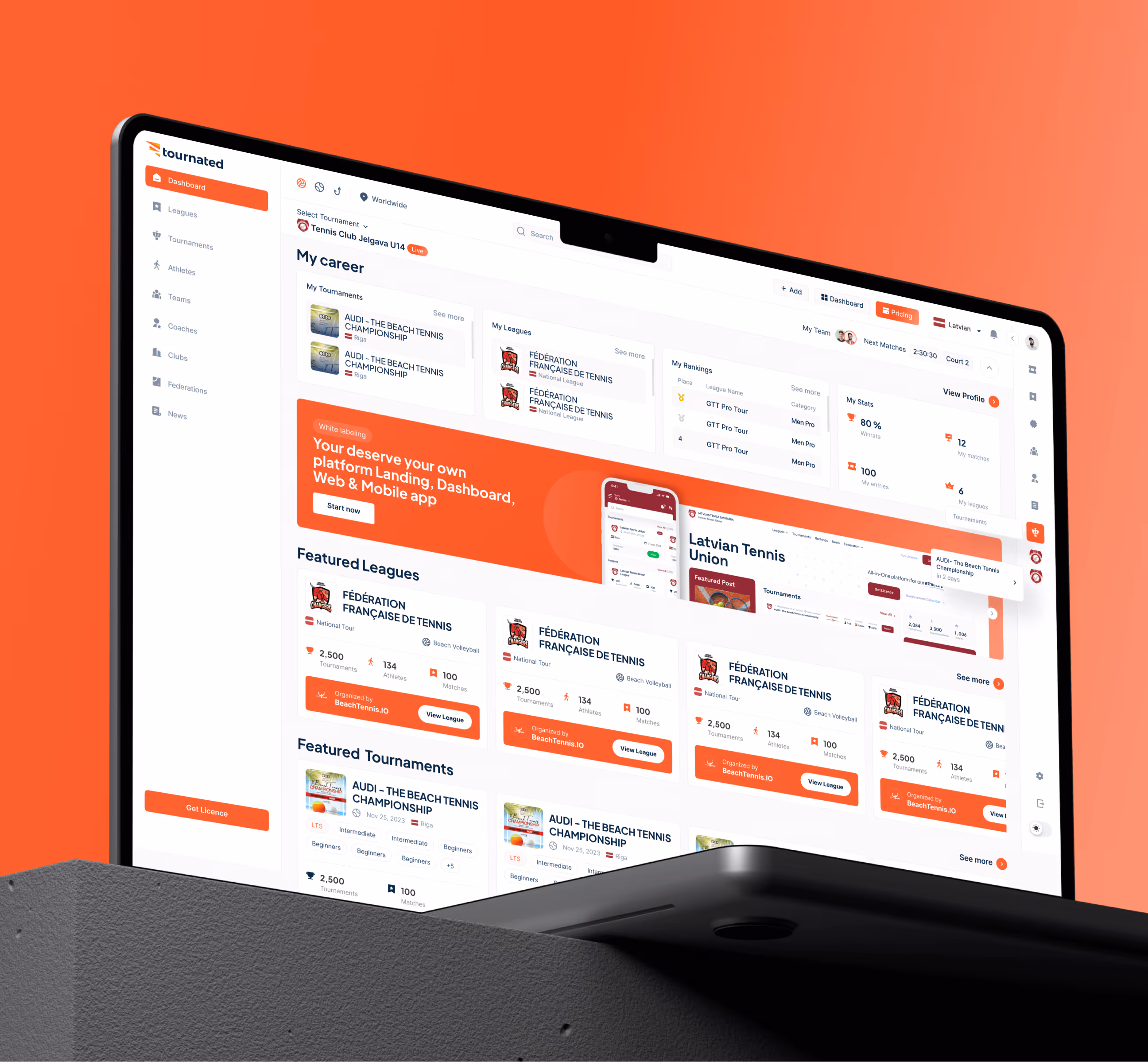
- Smart club dashboard: Gave clubs one clean space to manage members, roles, and tournament participation, removing manual work and miscommunication.
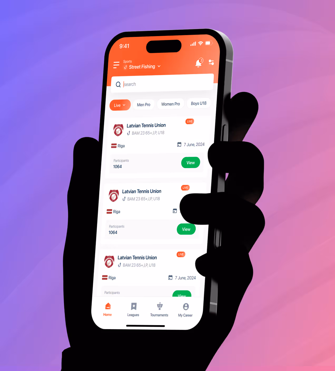
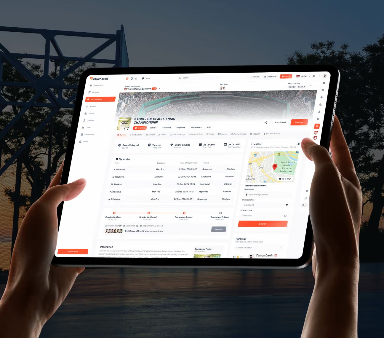
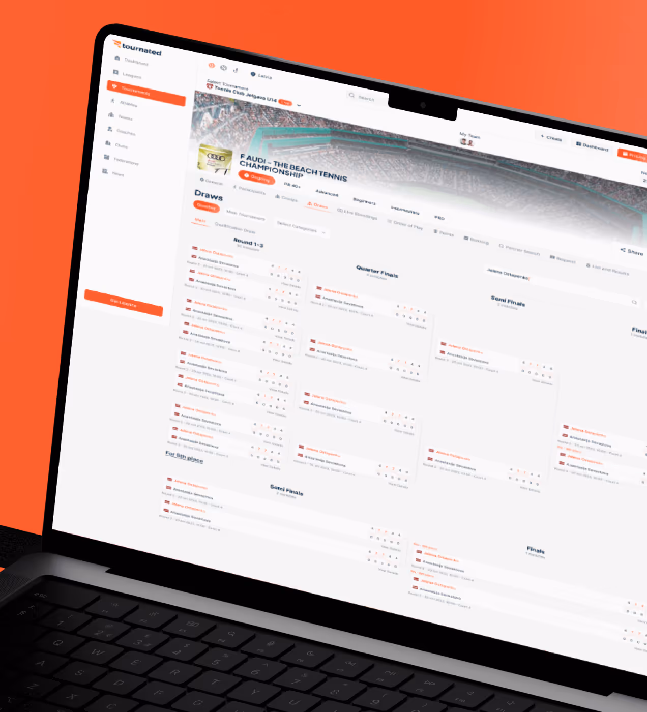
- Focused athlete interface: Players can now find schedules, results, and rankings in a few taps, boosting daily active usage and user confidence by 60%.


From research to launch with Tournated
We worked closely with Tournated's team, from federation admins to athletes, to understand every pain point before designing a single screen.
We talked to league operators, coaches, and athletes to find where the platform broke down.
We reorganized tournament data and athlete profiles so every role finds what they need fast.
We built and tested screens with real users before moving to final designs.
We created a clean design system and delivered everything developers needed.
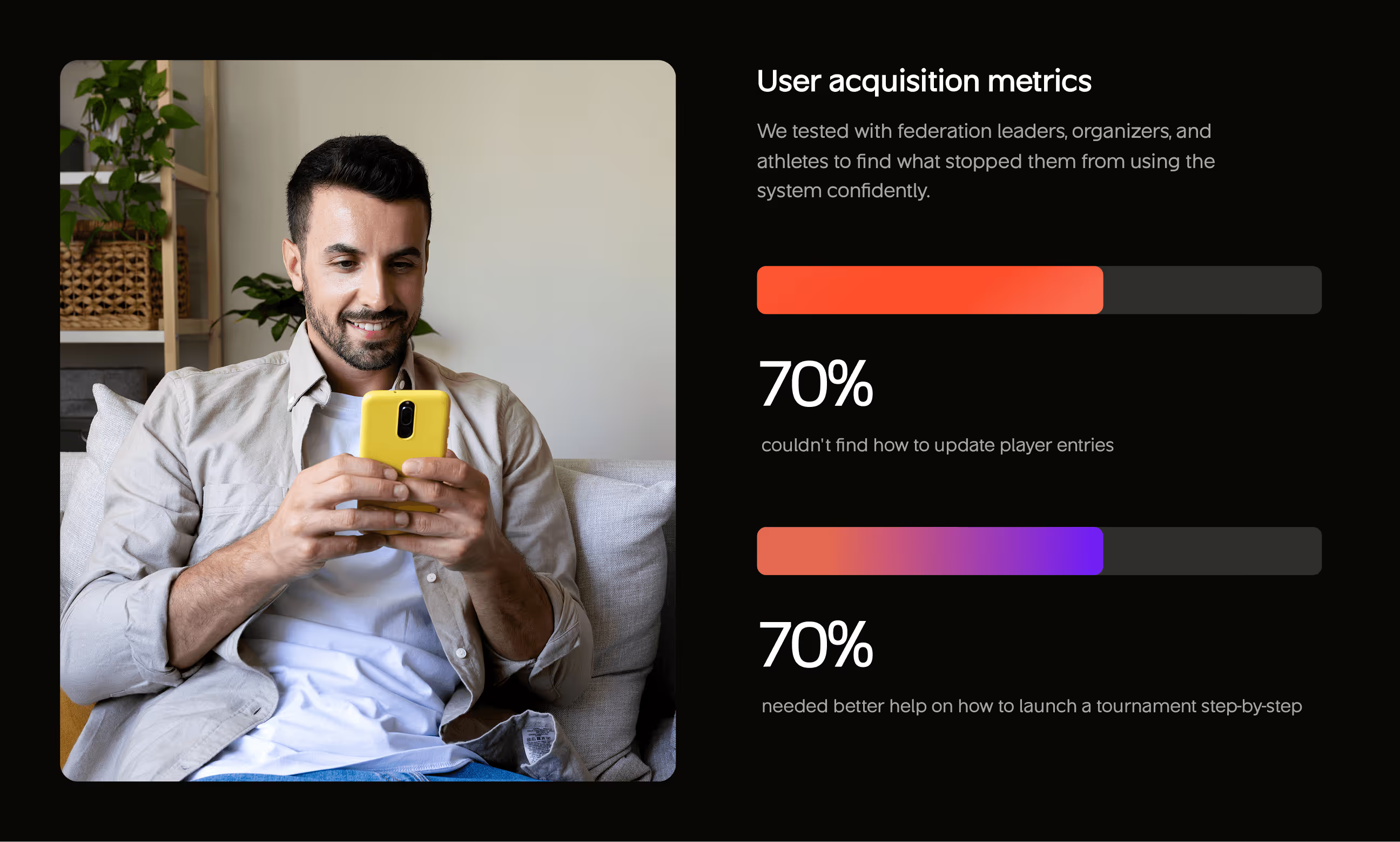
What we learned from real users
We tested with real federation leaders, organizers, and athletes to find what stopped them from using the platform confidently. The findings shaped every design decision we made.
- Crowded dashboard: 72% said the dashboard was too crowded and hard to use without help, showing the need for a cleaner layout with a clear visual hierarchy.
- Missed key actions: 55% didn't notice important tournament updates and actions, telling us critical features needed better placement and visibility.
- Poor first impression: 40% felt the layout looked too complex for new users, confirming we needed a simpler onboarding experience from day one.
- Update and launch confusion: 70% couldn't find how to update player entries, and 70% needed better step-by-step guidance to launch a tournament successfully.


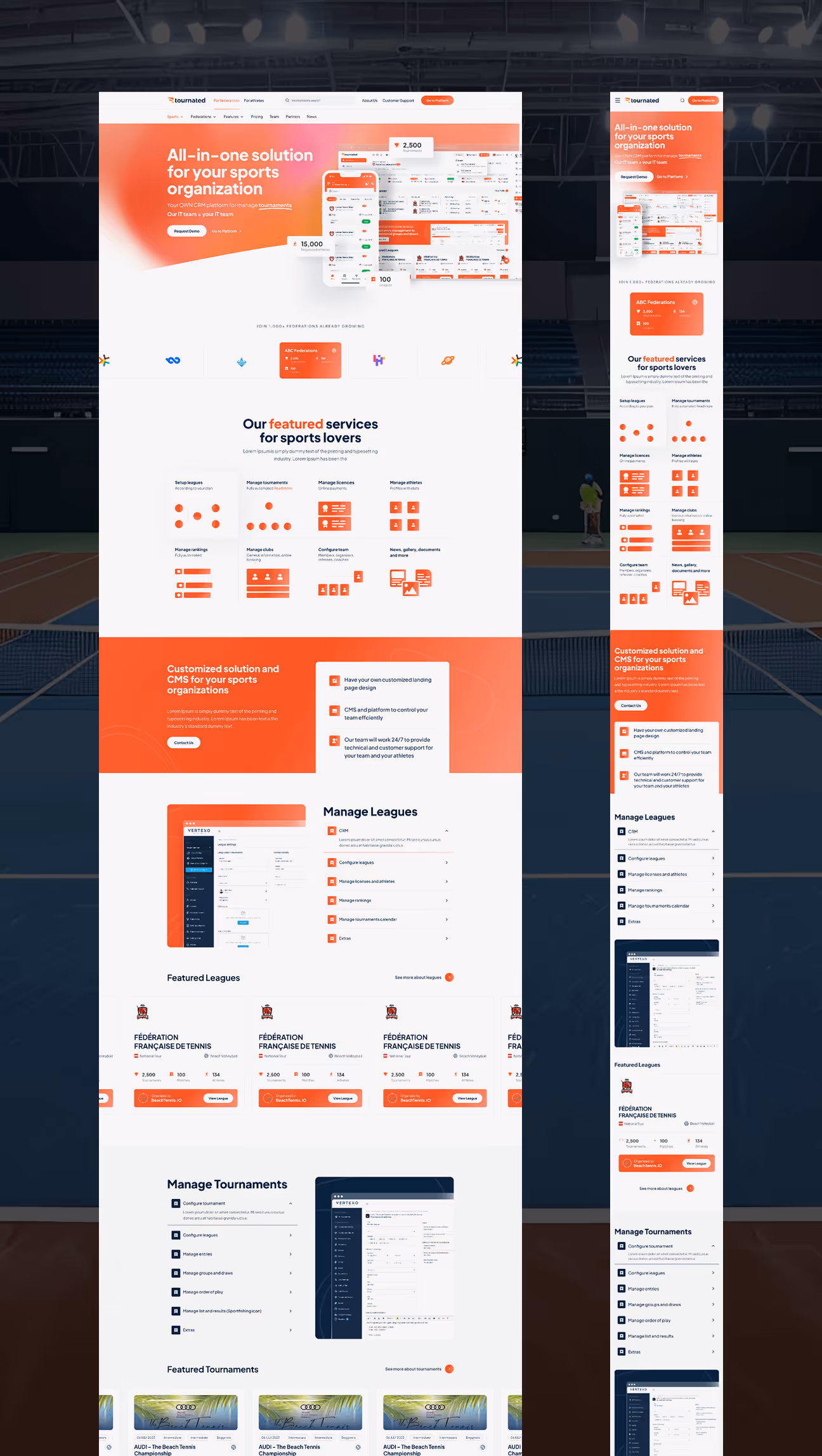
Visual Identity and Brand Story
Tournated's brand feels fast, confident, and trustworthy, just like sports. The logo uses sharp lines that represent speed and forward movement. Portland Orange (#FF5733) brings energy while Prussian Blue (#0A2540) adds balance and trust. Antique Ruby and Eigengrau add depth without making it heavy.
Typography uses Eudoxus Sans, clean and modern, which reads well on desktop and mobile. Every color and icon choice tells the same story: sports management should feel smooth and built for serious use.


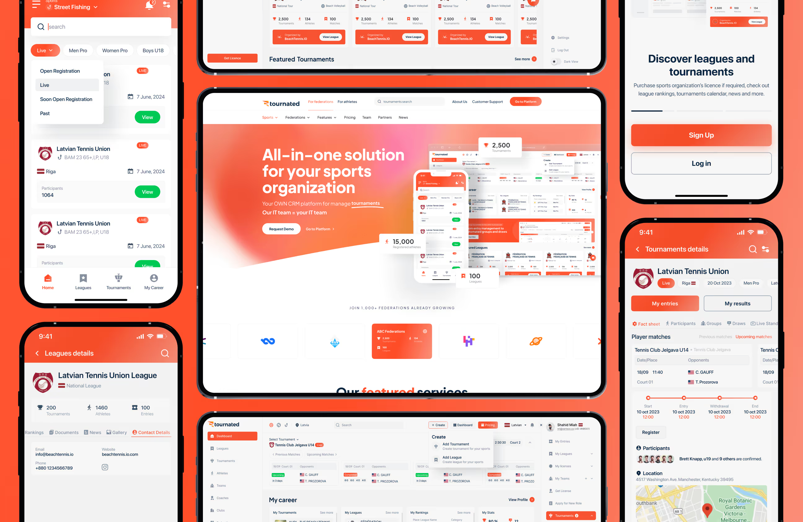
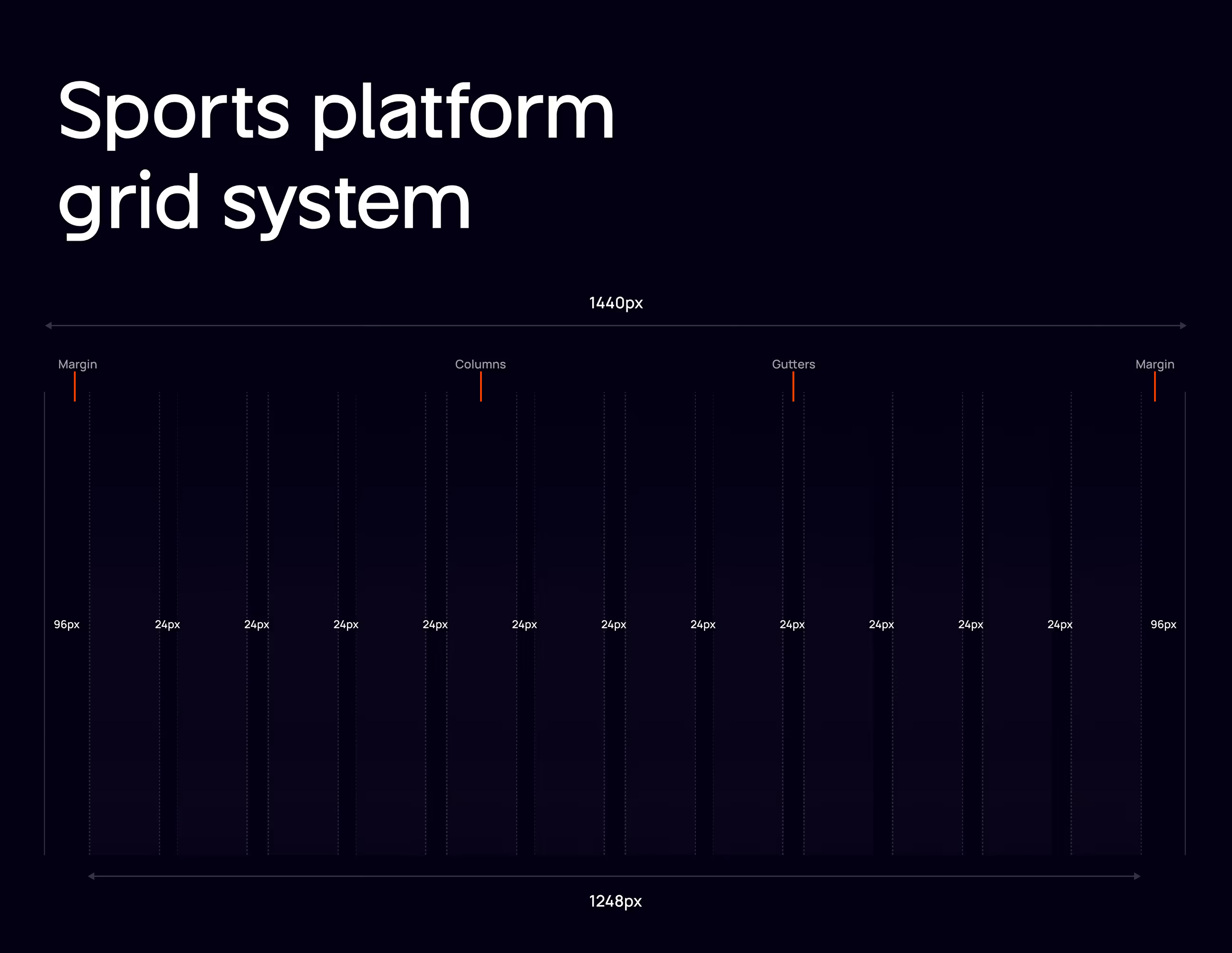
The design system foundation we built
We built a flexible design system for Tournated that works across desktop and mobile. The system uses Portland Orange (#FF5733) for key actions, Prussian Blue (#0A2540) for structure, and Eigengrau (#1F1D2A) for dark backgrounds. A 12-column grid at 1440px with 96px margins keeps every layout clean and balanced across all screen sizes.
Typography uses Eudoxus Sans in five weights, Light to Bold, making content easy to read whether users are checking tournament results or managing athlete data. Reusable components like cards, buttons, and match panels follow the same spacing and style rules, helping developers build faster and keeping every screen consistent as Tournated grows.


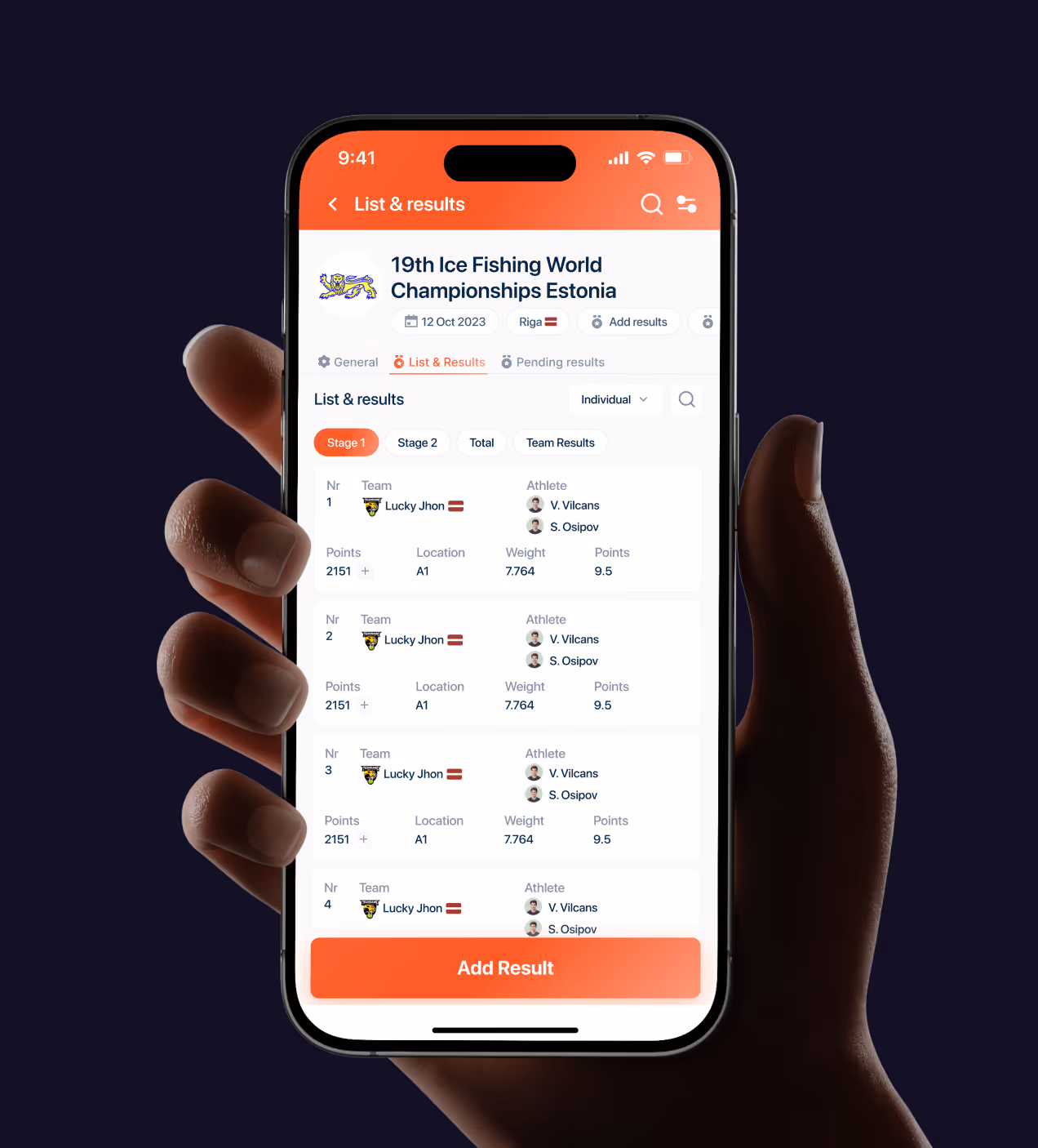
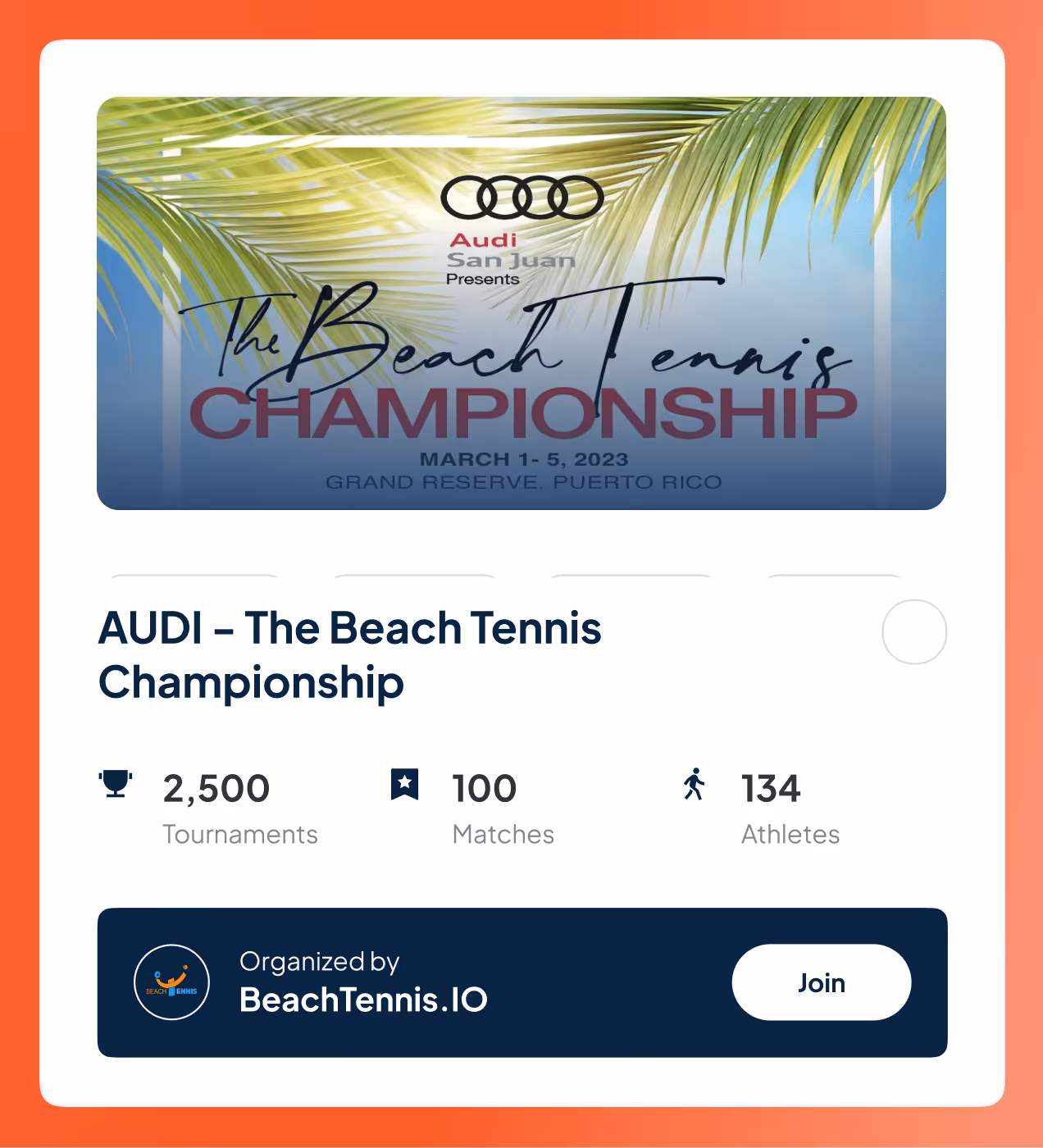
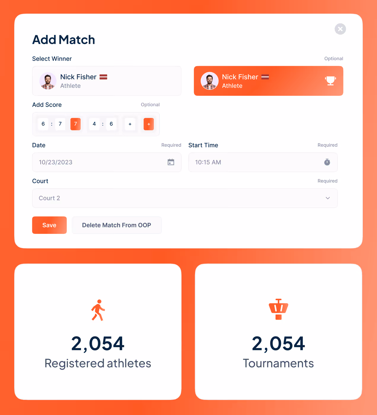

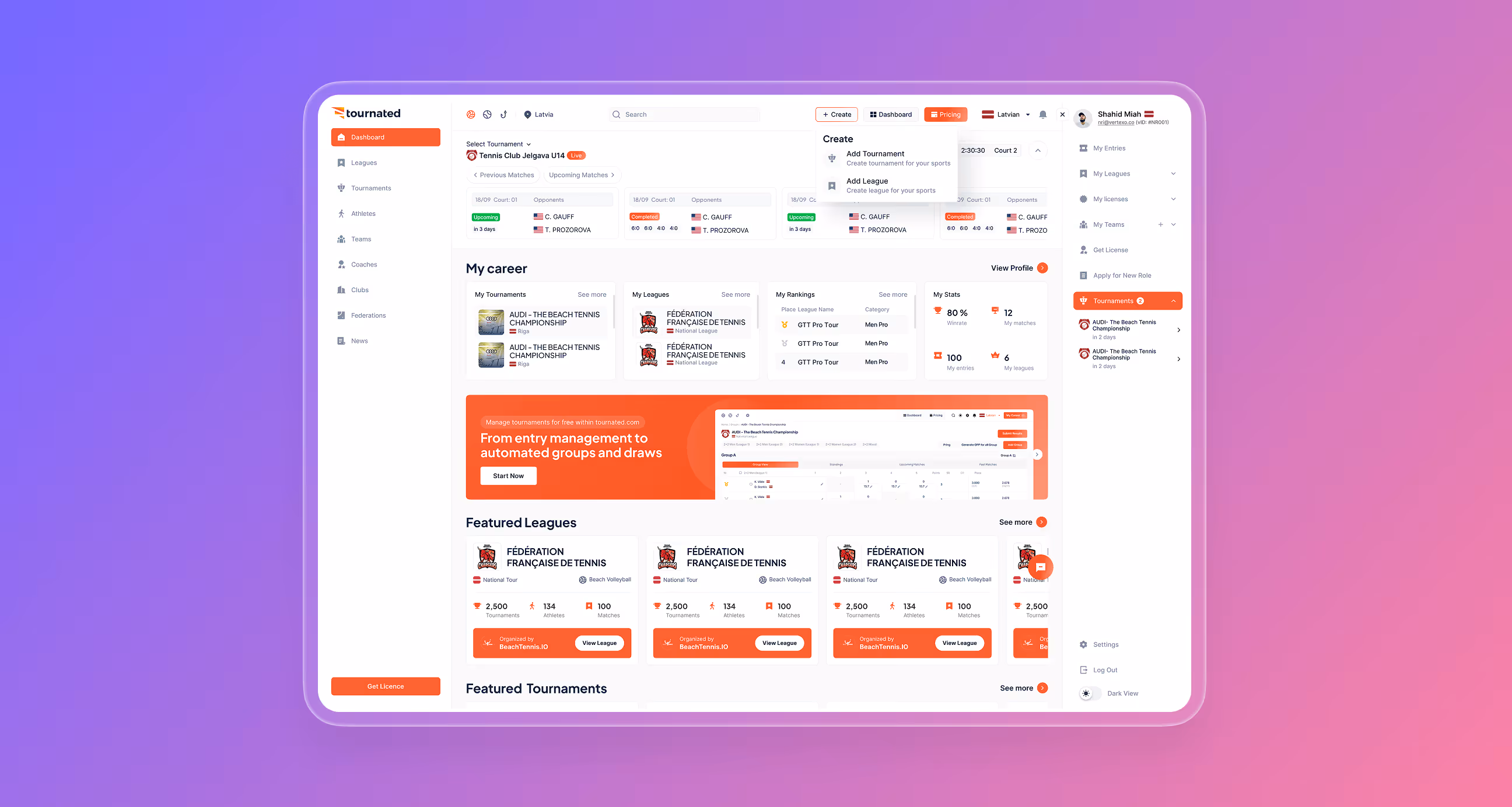
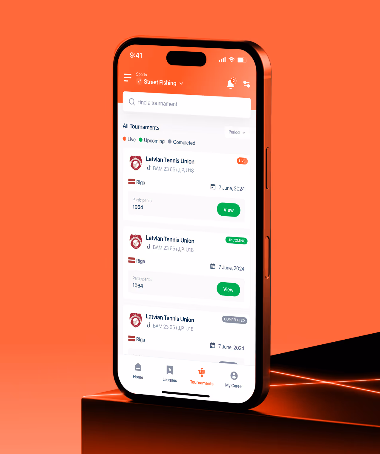
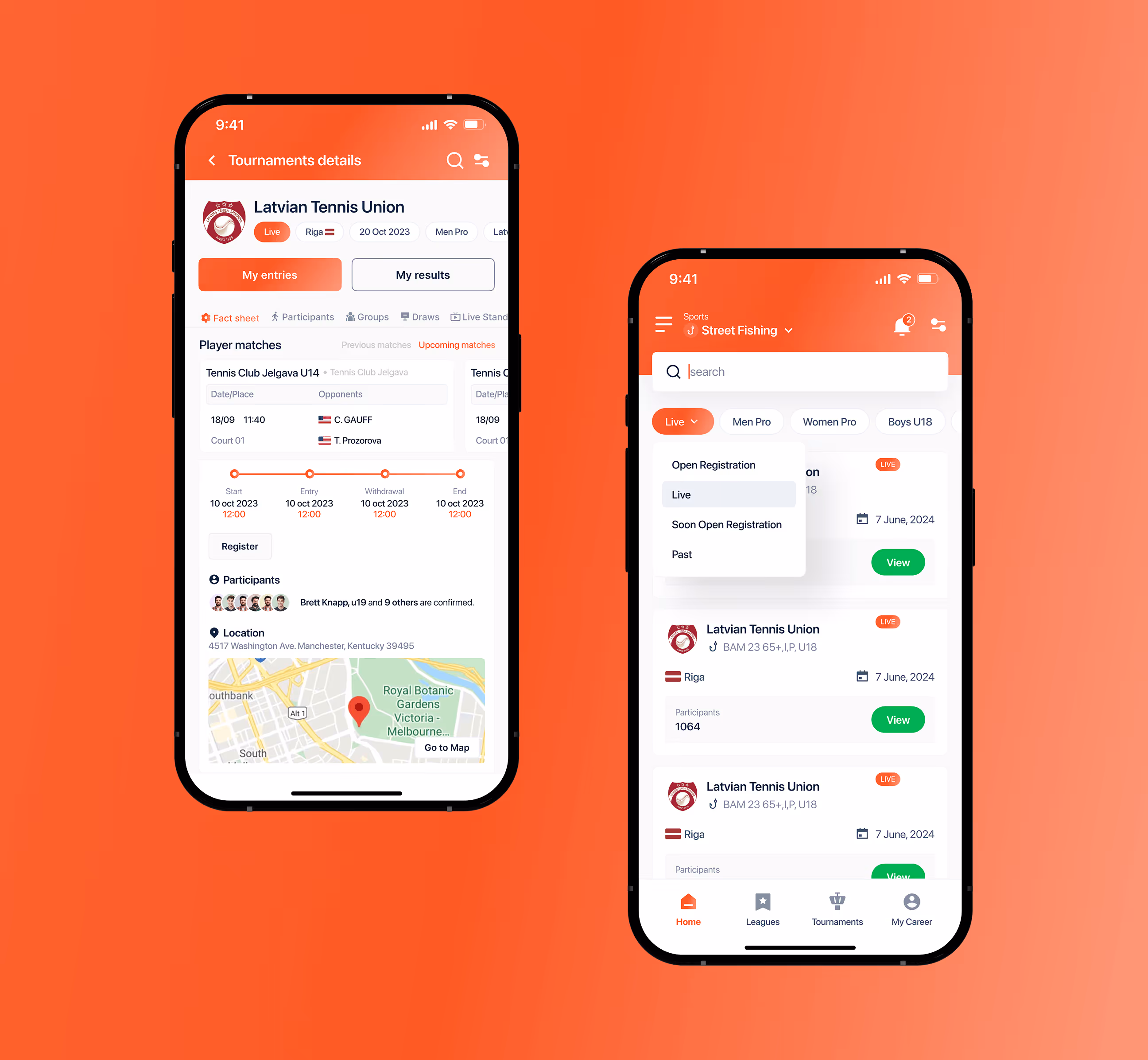
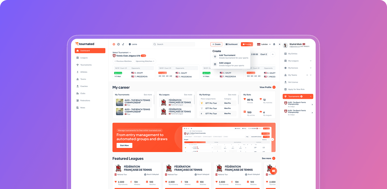
How we made Tournated easy to use
We designed Tournated so federation admins, club managers, and athletes each see exactly what they need. The dashboard gives a full picture at a glance, active tournaments, team stats, athlete data, and quick actions all in one clean view. Admins can launch tournaments, manage entries, and update results in just a few clicks.
Athletes can check schedules, rankings, and match results without getting lost. Every screen follows a clear layout with consistent spacing, orange action buttons, and simple navigation. We kept important actions one or two clicks away and tested every flow with real users before launch. The result works smoothly on both desktop and mobile, fast, simple, and easy for anyone to use from day one.


Real results from the Tournated redesign
The redesigned Tournated platform delivered real results across every user type, from federation admins to athletes. Faster workflows, cleaner screens, and better onboarding made a measurable difference.
Key Results:
- 72% faster task completion: Admins now complete recurring tasks like adding entries and updating results much faster.
- 68% less overwhelmed: Cleaner screens helped users feel less stressed and more in control.
- 3x Satisfaction Score Improved: Overall user satisfaction tripled after the redesign.
- 55% Faster Onboarding: New users got started quickly without confusion thanks to clear step-by-step flows.


Have a Project? Let’s talk!


Your competitors are converting 3x more visitors. Not because they have a better product, but because they have a better design.


.avif)