
3.2x
40%
2.4x
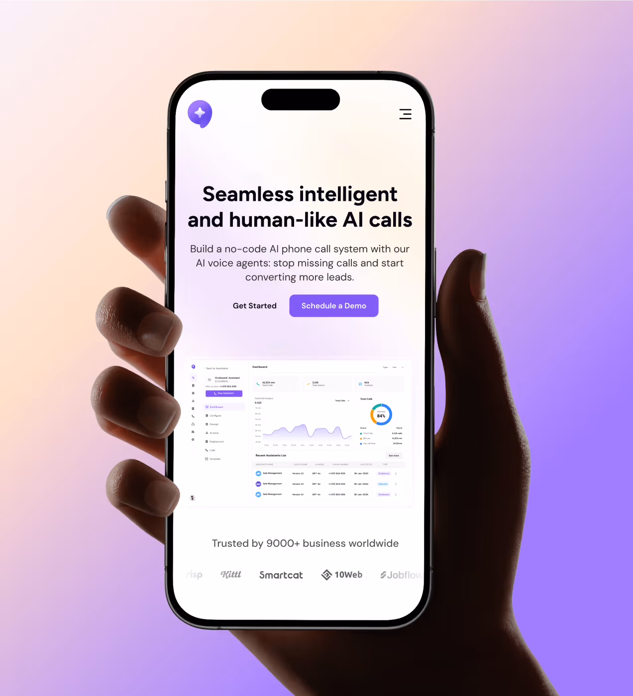
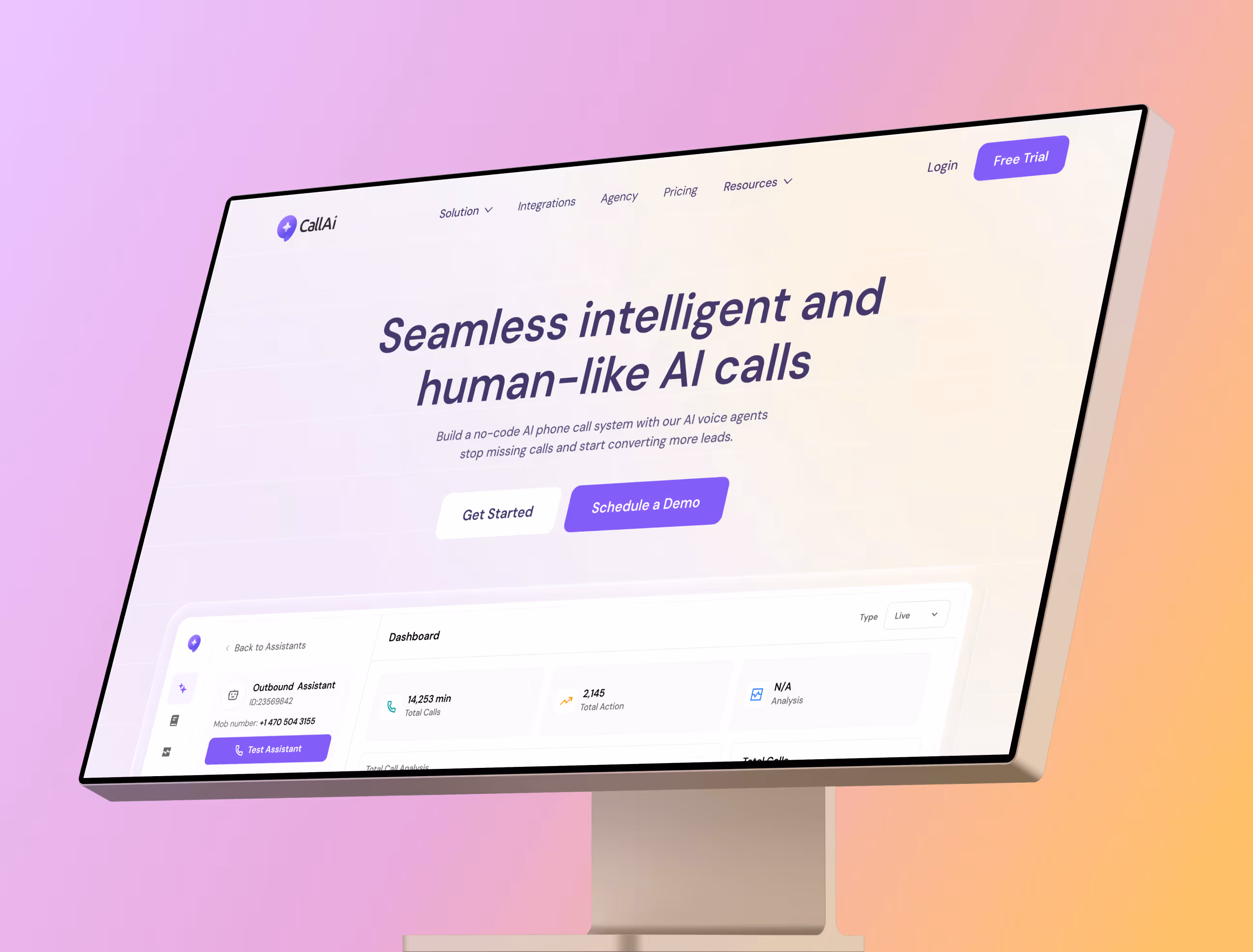
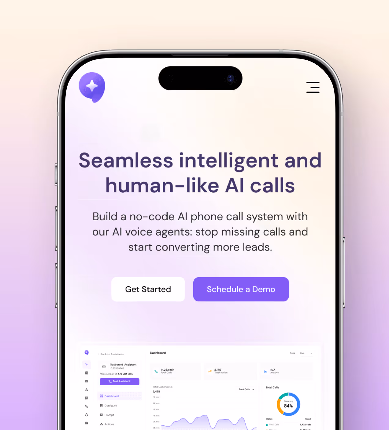
CallAI is a no-code SaaS platform that lets businesses build and deploy AI voice agents, handling inbound and outbound calls, automating workflows, and syncing data across CRM and third-party tools.
Designed for teams who can't afford to miss a lead or lose time to manual communication, it replaces traditional call management with human-like AI that works around the clock.

Challenges every busy business faces with calls
Before CallAI, businesses had no middle ground, either they over-hired, or they kept missing calls and losing deals.
- Missed calls, lost leads: Teams couldn't stay available around the clock. Off-hours and high-volume periods meant leads went cold with no one to pick up
- Setup took too long: Every call automation tool we looked at required a developer. For small and mid-size teams, that meant weeks of waiting before anything went live
- Nothing was connected: Contacts lived in one place, call logs in another, follow-ups in someone's inbox. There was no single system tying it together
- Automation felt risky: Businesses wanted to automate, but robotic-sounding calls scared them off. The trust just wasn't there
How we designed CallAI to work for real teams
We built every screen around one question: can someone with zero technical background set this up and trust it on day one?
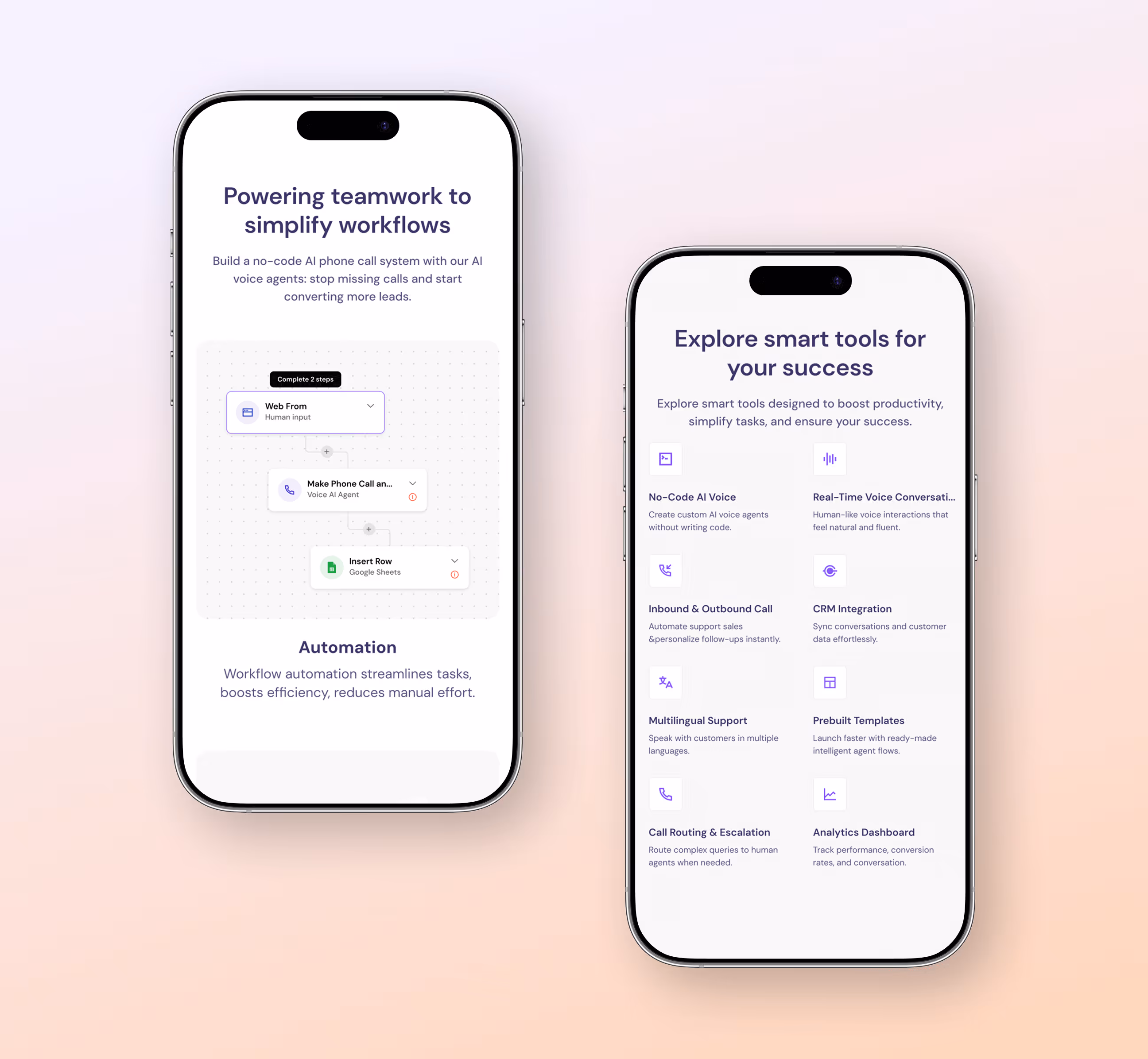
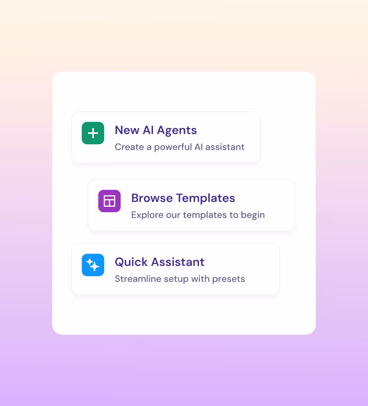
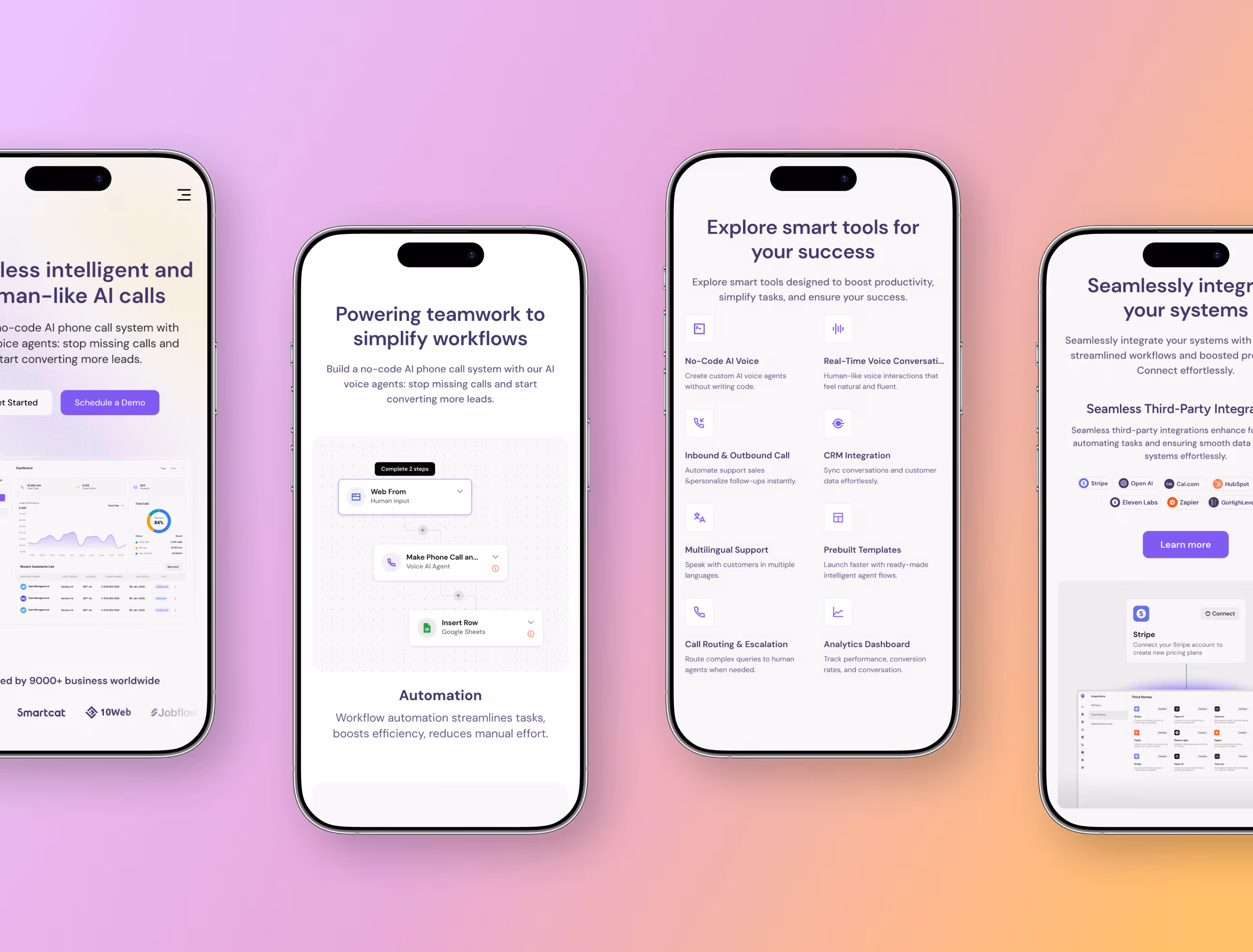
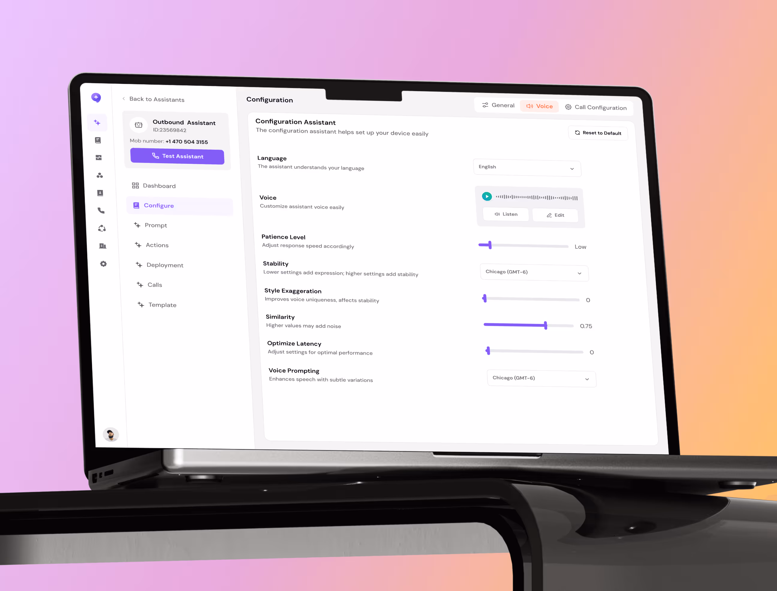
- Guided agent builder: We designed a step-by-step assistant creation flow, voice, prompt, phone number, done. The Quick Assistant preset cuts setup to under 5 minutes.
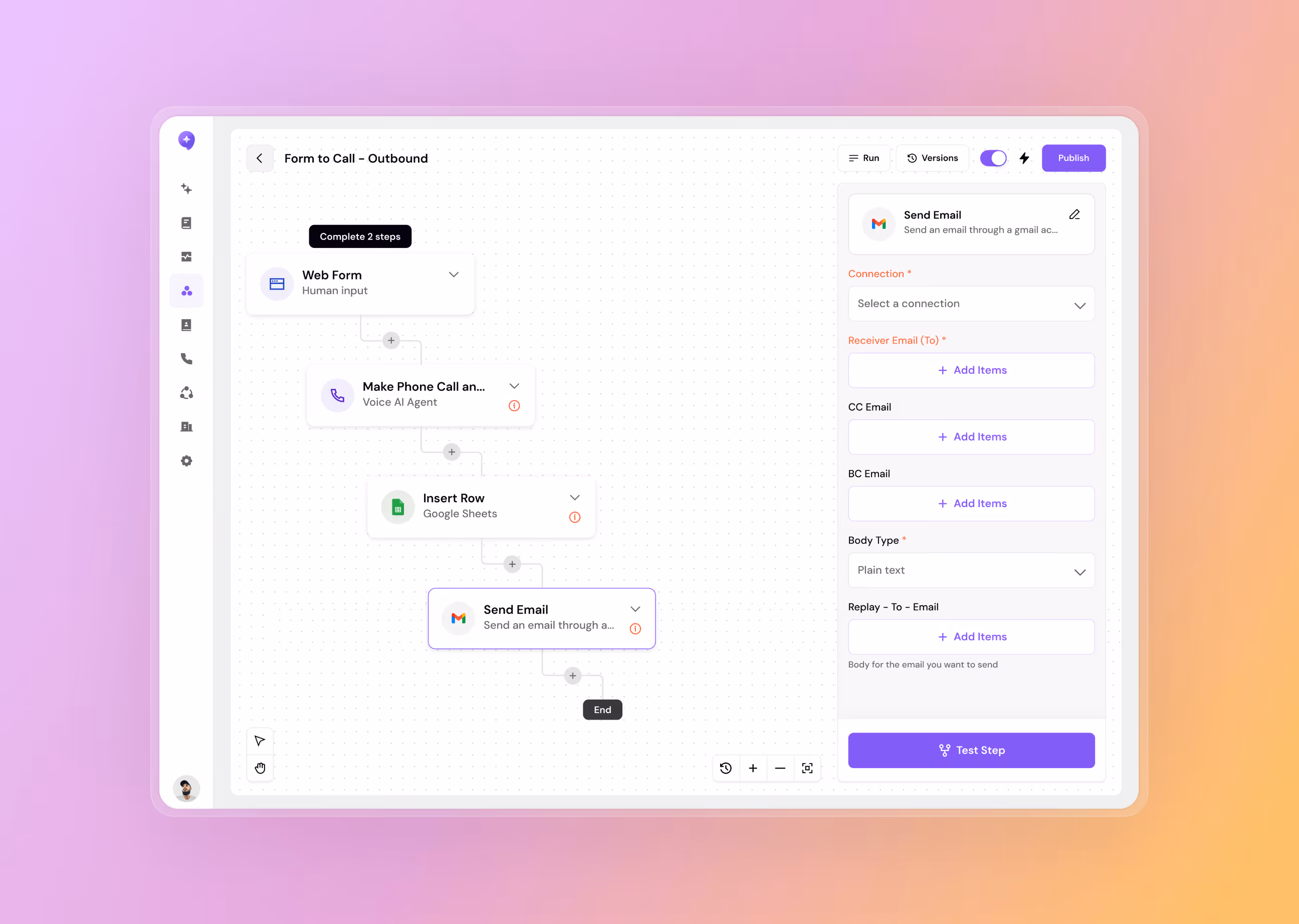
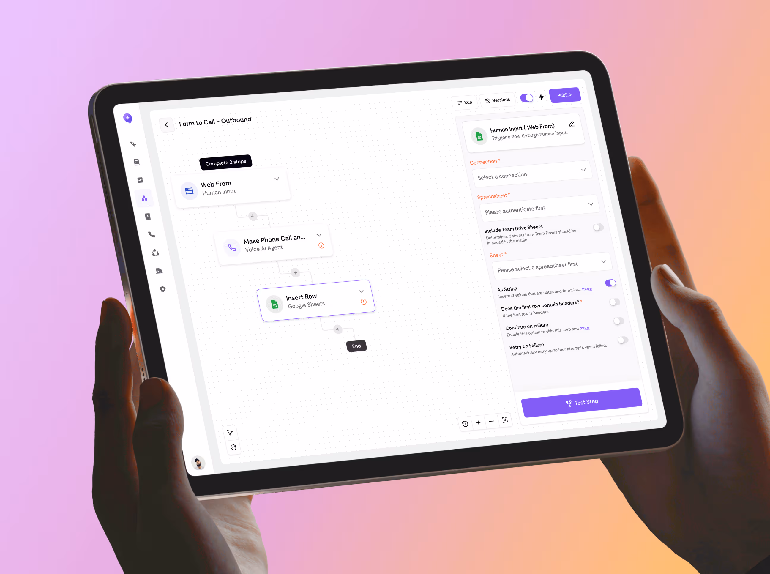
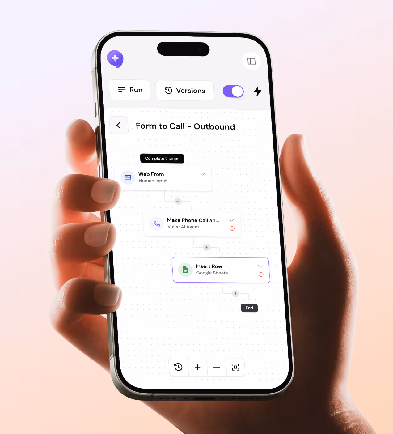
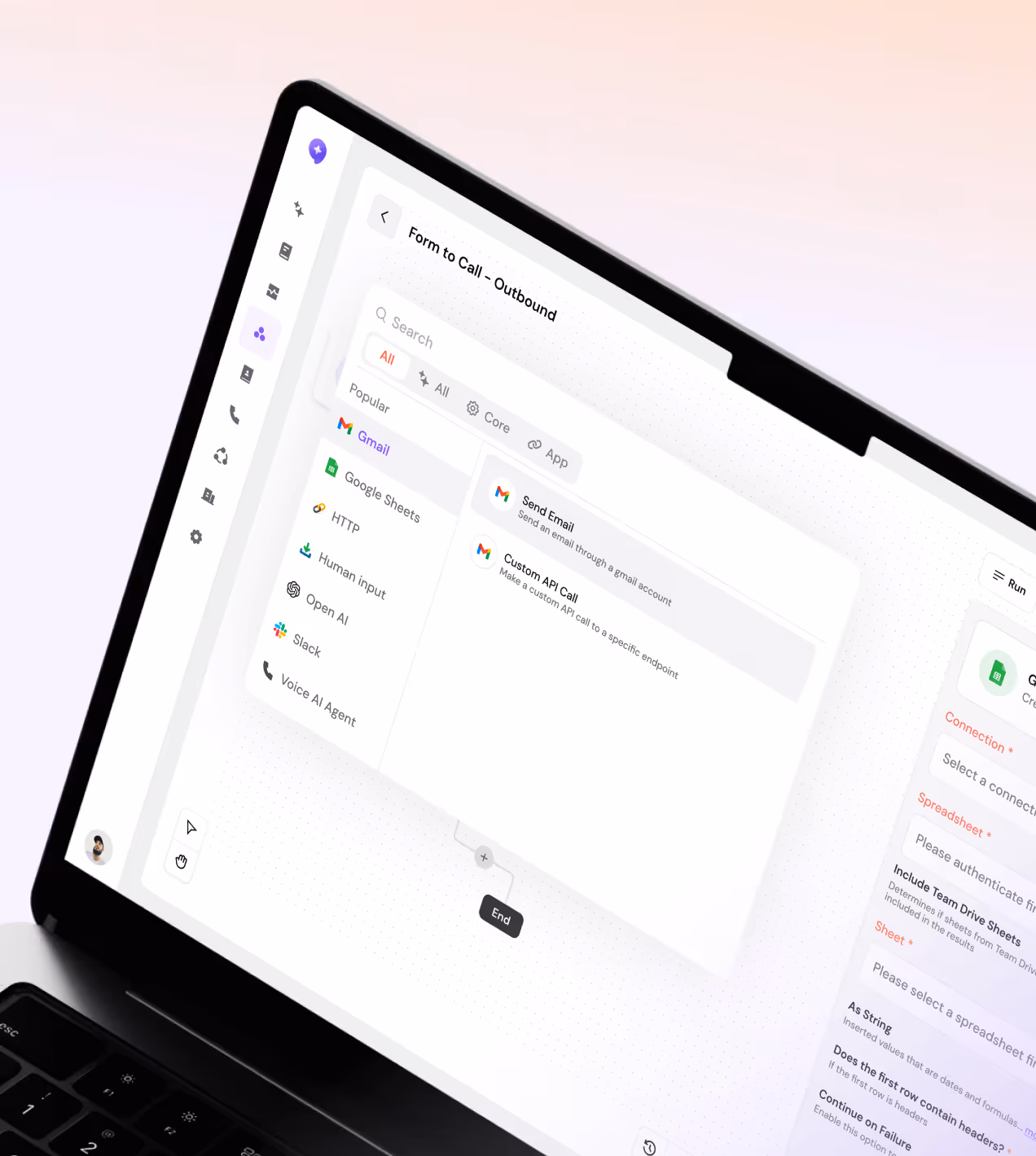
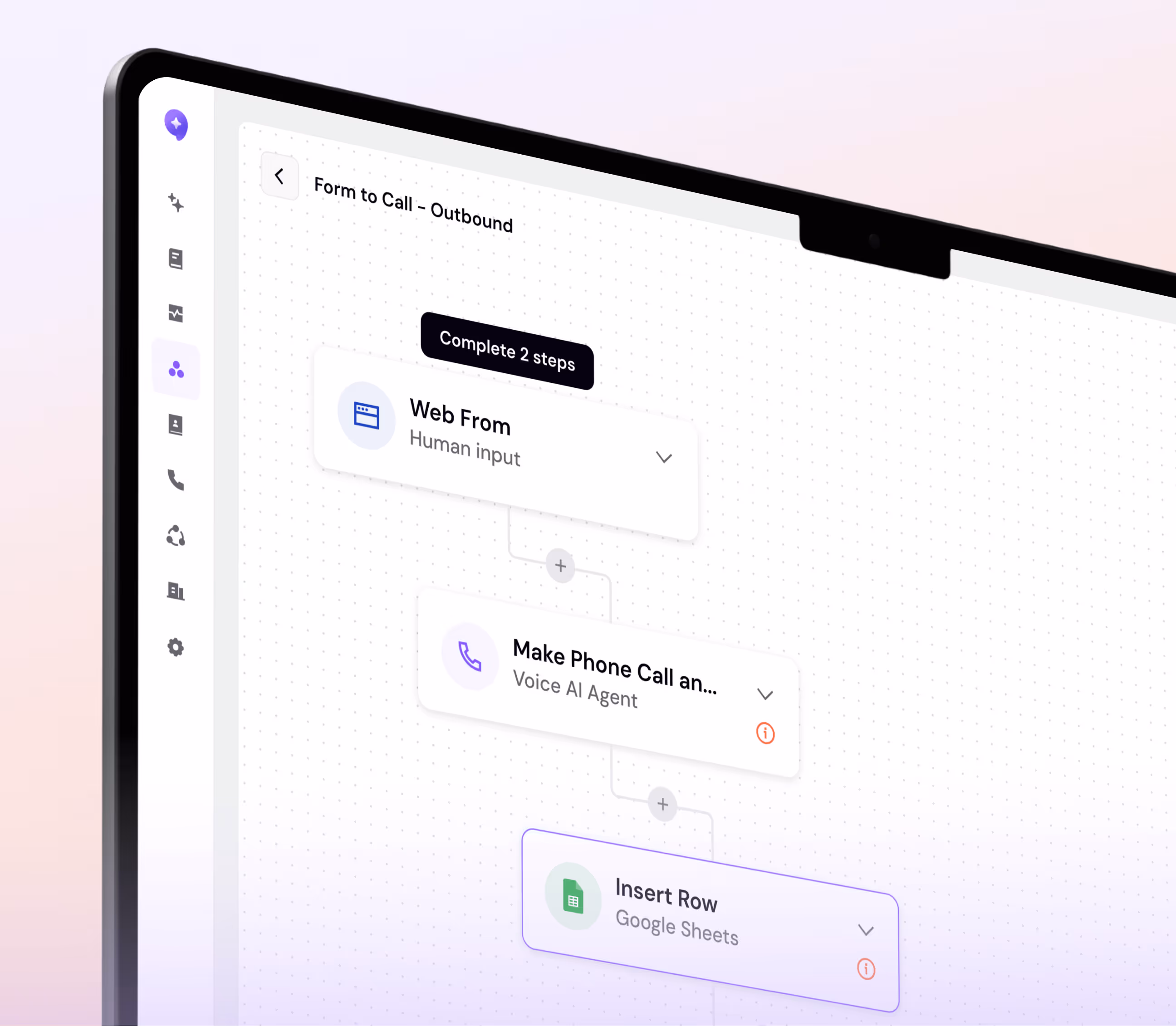
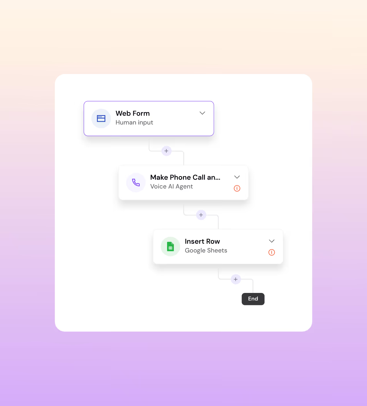
- Visual Workflow Canvas: Instead of forms and dropdowns, we gave users a drag-and-connect canvas. Web Form → Voice AI Agent → Google Sheets, the whole chain visible in one screen.
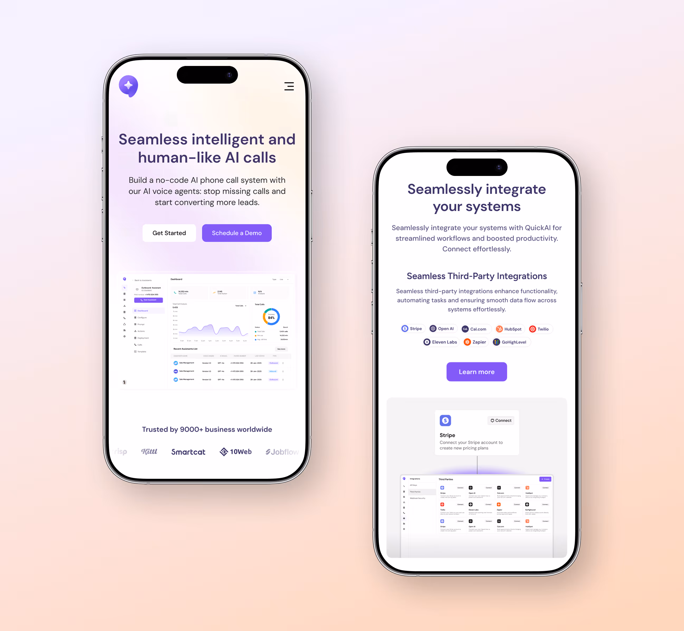
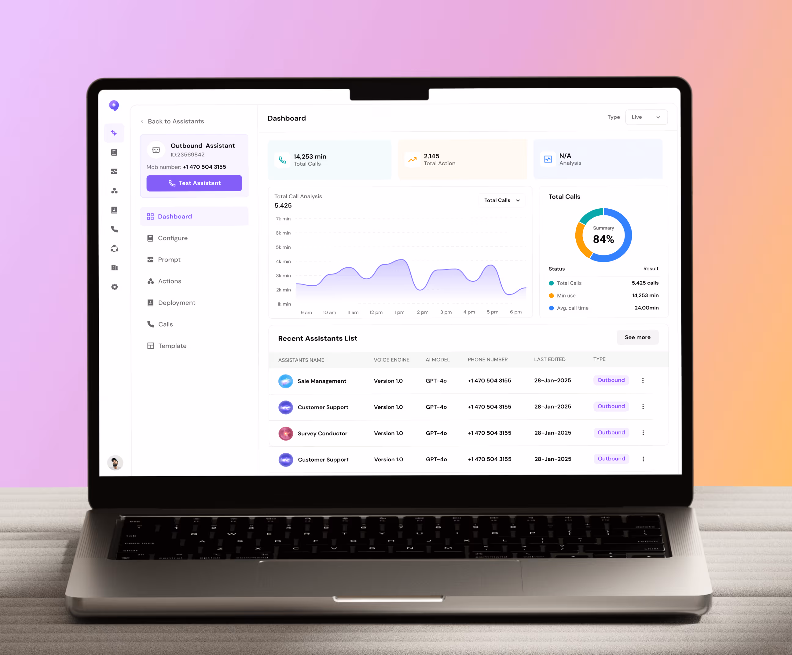
- One dashboard for everything: Total calls, average duration, agent performance, live vs. completed, we pulled every metric into a single analytics view so nothing gets missed.
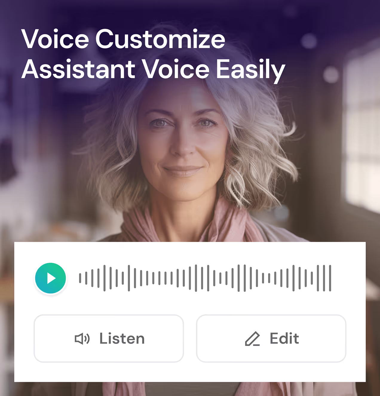
- Voice that sounds human: We built in full voice customization with a live preview ("Listen" before you deploy) so teams could actually trust what their customers would hear.
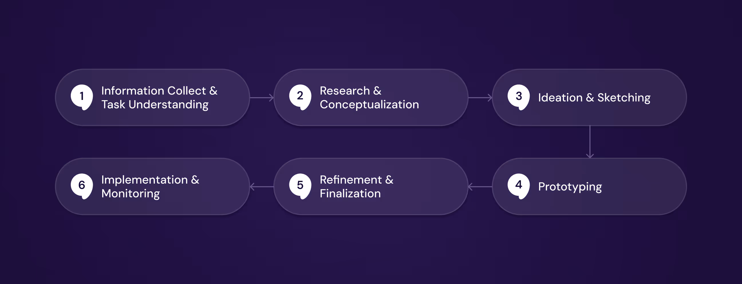
Designed this Call AI agent platform with a clear UX process
Before touching a single screen, we spent time understanding how business teams actually handle calls, where they get stuck, what they avoid, and what they wish existed. That research shaped every decision we made, from the first wireframe to the final handoff.
We mapped real gaps in how businesses manage calls, before touching a single screen.
We studied how sales teams handle calls, then built a strategy around what an AI would need.
From sketches to interactive prototypes,we tested every key flow before moving forward.
We tested, refined, and handed off production-ready files with full design system documentation.
UX Research & Design Artifacts
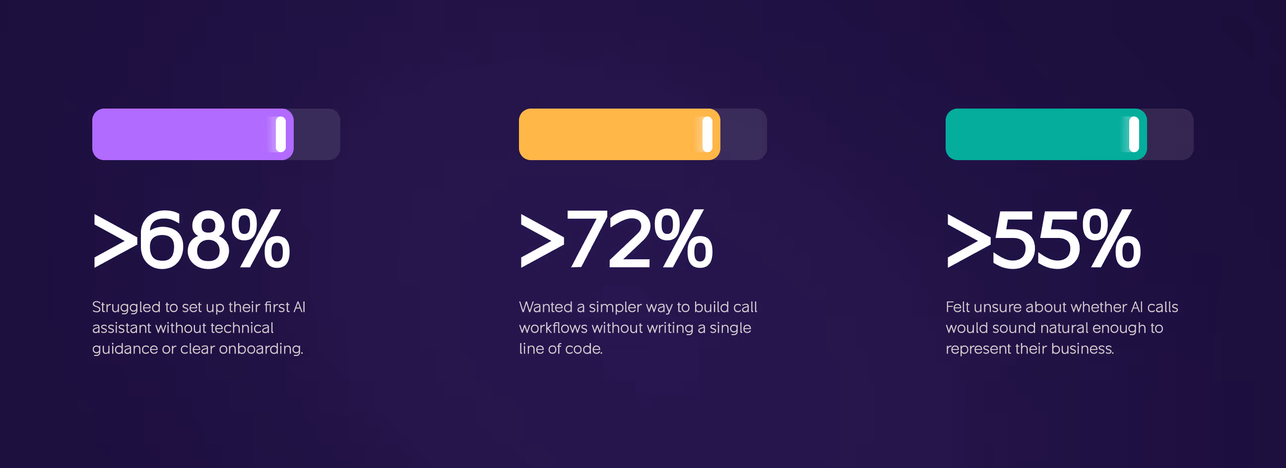
Before wireframes or visual design, we needed to understand where businesses were actually failing, not where we assumed they were. Our research uncovered three patterns that shaped every decision we made in CallAI
- Setup frustration: More than 68% of users struggled to get their first AI assistant running without clearer guidance or a structured onboarding flow.
- Workflow complexity: Over 72% wanted a simpler, visual way to build call workflows, without touching a single line of code.
- User Persona: Travelers like David prefer simplicity and control, managing trips alone and needing streamlined decision-making.
- Preference Data: Many users said they feel more comfortable with & trust an app more when they can customize it.
Visual Identity and Brand Story
CallAI needed to feel intelligent but approachable, not cold and corporate like most enterprise tools. We built the visual identity around a core tension: AI that's powerful enough to run a business, but simple enough that anyone can trust it on day one.
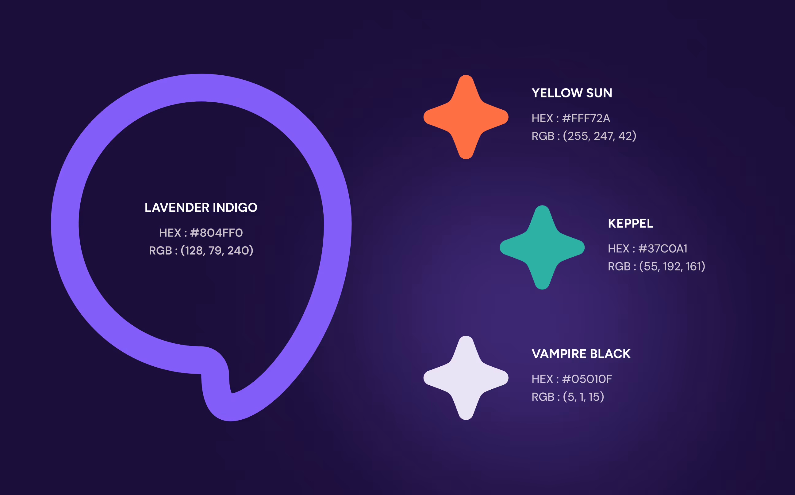
The primary color, Lavender Indigo, was chosen deliberately, it signals innovation and technology without the sterile blue that dominates most SaaS products. Supporting colors like Keppel and Vampire Black add depth and contrast while keeping the interface grounded.
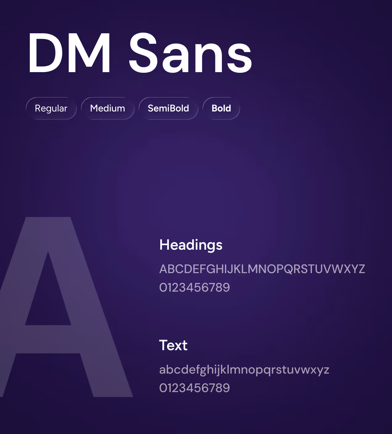
DM Sans ties everything together, clean and modern, legible across dense data tables and minimal landing pages alike. Logo design followed the same logic. The speech bubble mark with a star center communicates two things at once, conversation and intelligence, without needing a single word to explain it.

Every pixel had a purpose
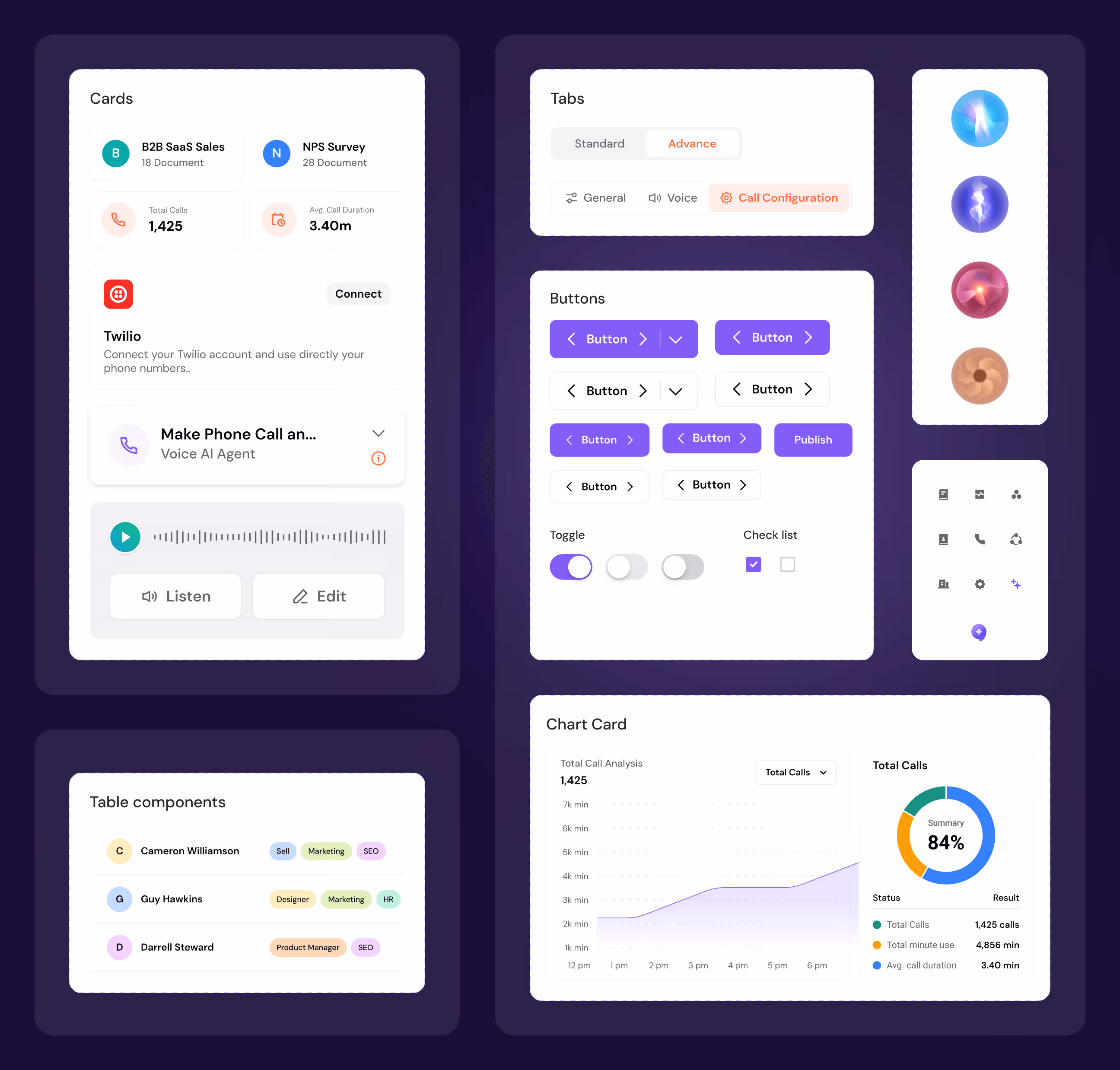
We built a full component library from the ground up. Buttons, inputs, cards, toggles, tabs, every element documented with clear states and spacing rules, designed once and reused everywhere. That way, the interface feels familiar whether a user is creating their first assistant or reading through a week of call data.
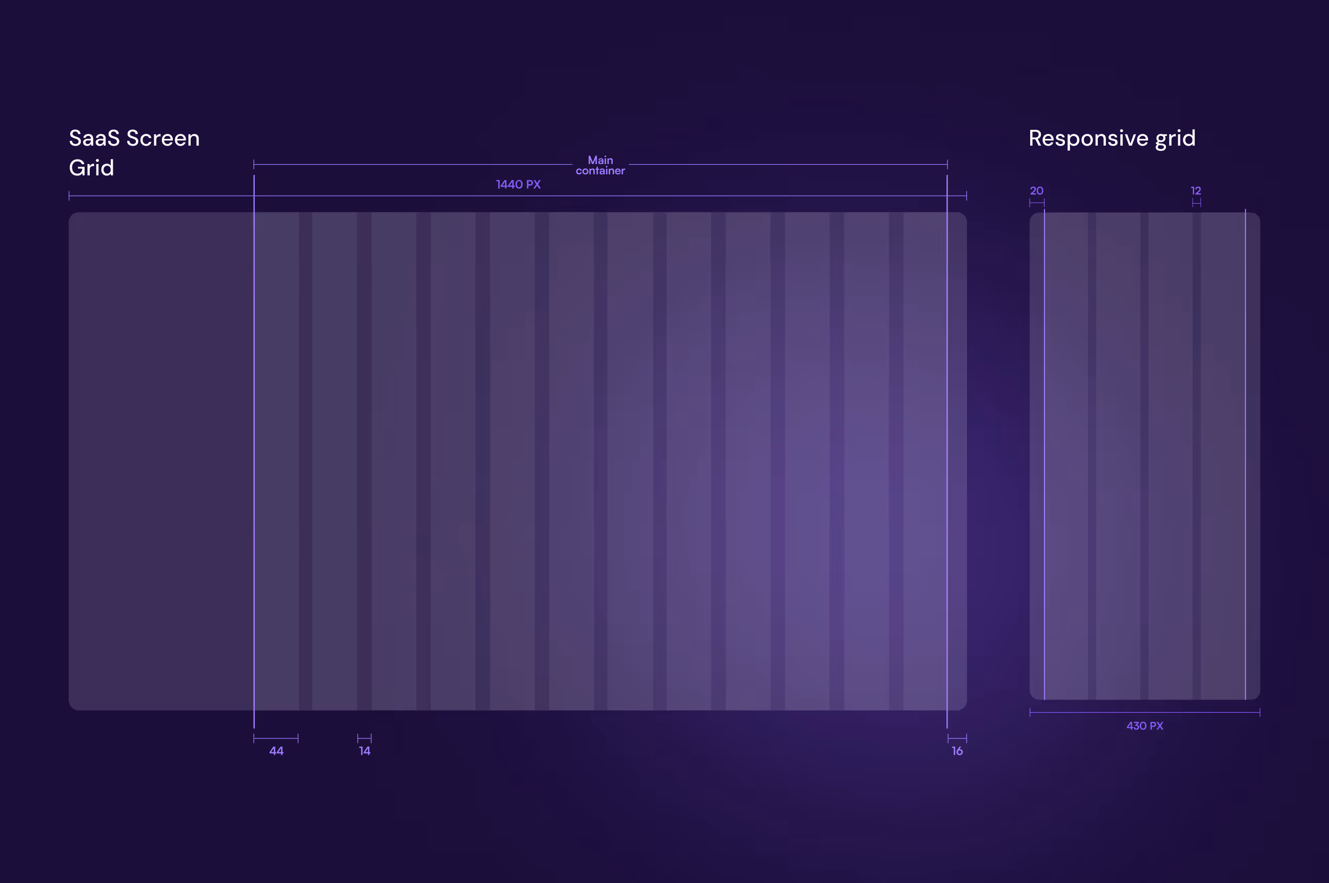
The grid system was locked in early and treated as a foundation, not an afterthought. Desktop at 1440px, mobile at 430px, both structured to keep complex screens from feeling overwhelming. Locking this down from day one meant designers and developers were always speaking the same language, and the handoff process stayed clean from start to finish.
The UX thinking behind every screen we built
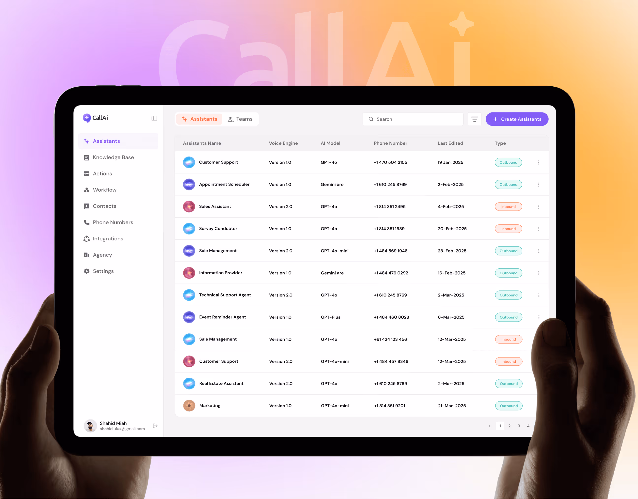
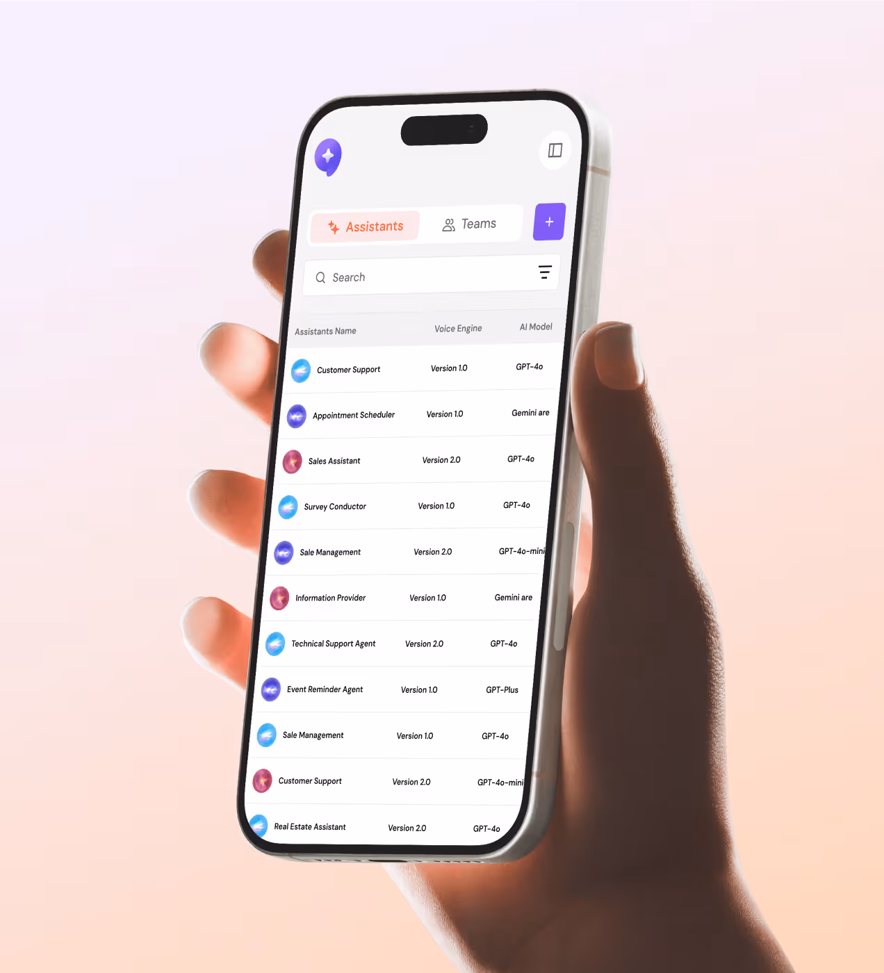
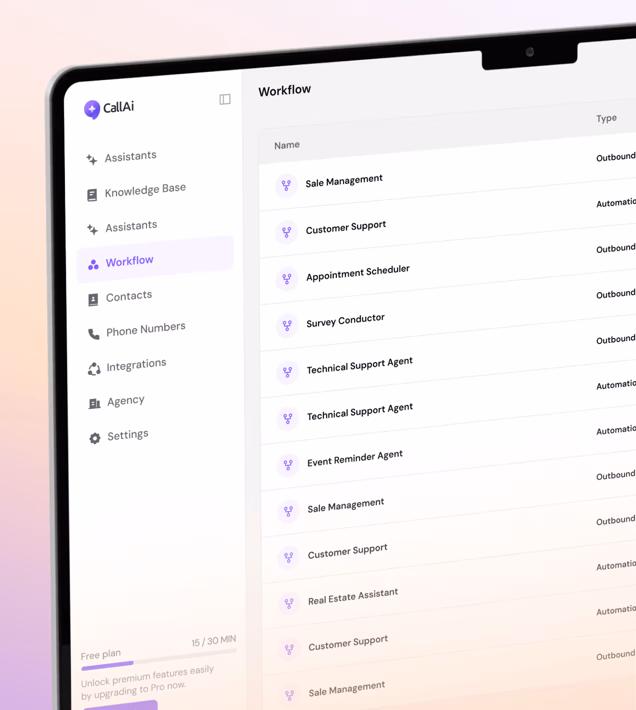
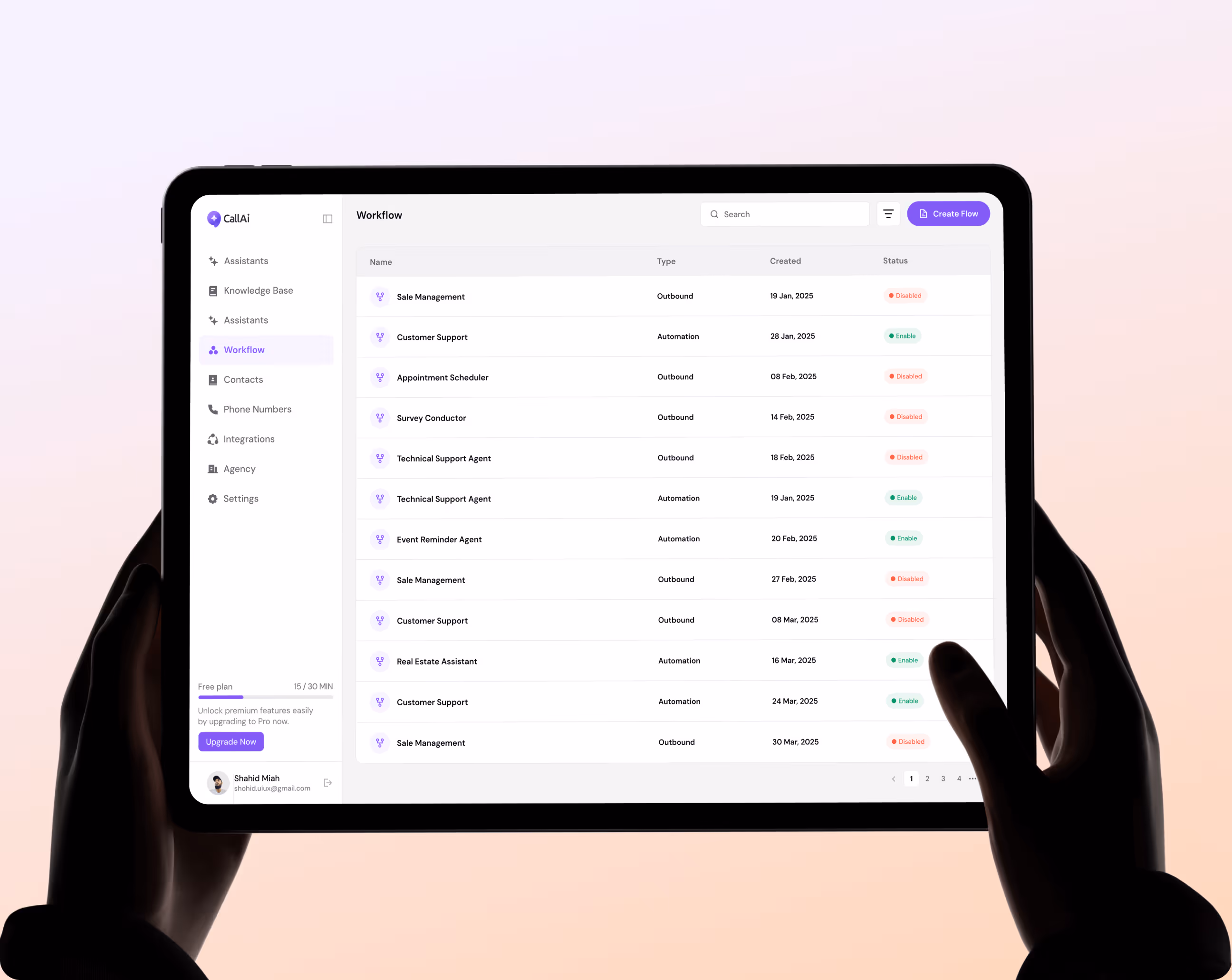
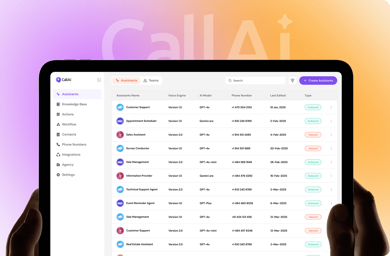
We designed every screen with one goal, make it simple enough that anyone can use it, but powerful enough that real businesses can rely on it every day. The Assistants page lets users create, manage, and deploy AI agents from one clean table view.
The Workflow canvas turns complex automation into a simple connect-the-dots flow. The Dashboard pulls every call metric into one place, no digging around.
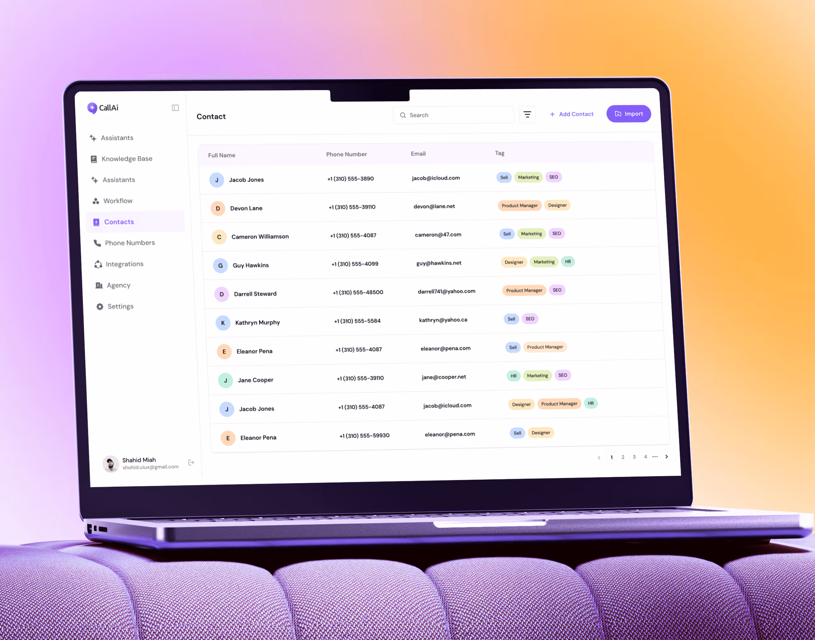
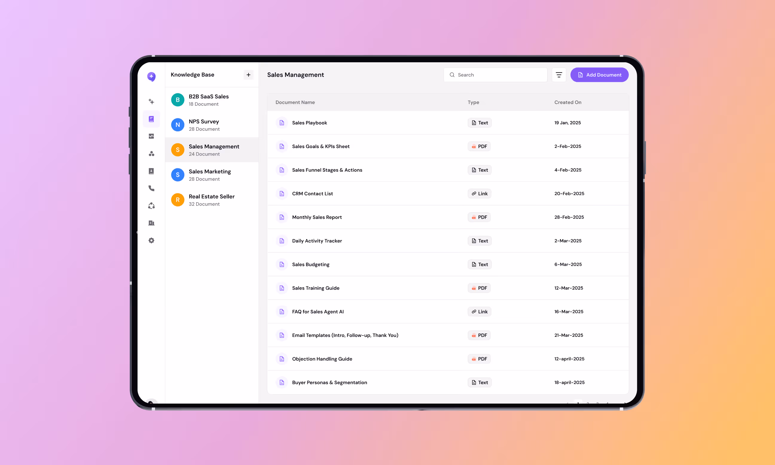
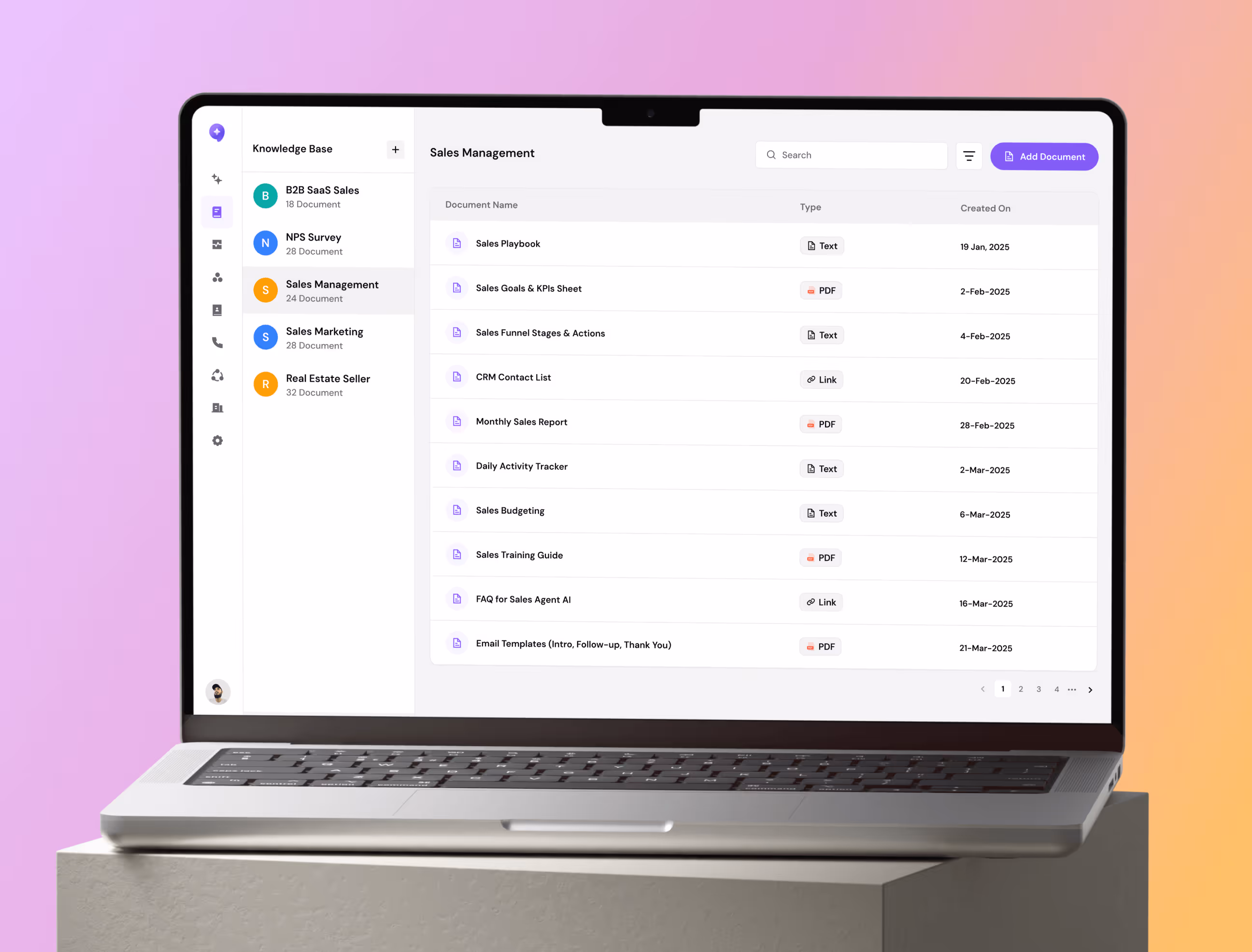
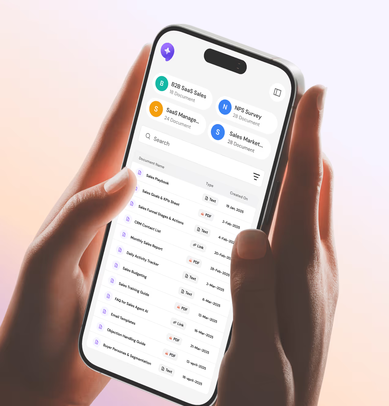
The Knowledge Base keeps documents organized by category so agents always have the right information. And the Contacts page makes managing leads fast and easy with tags, filters, and bulk import.
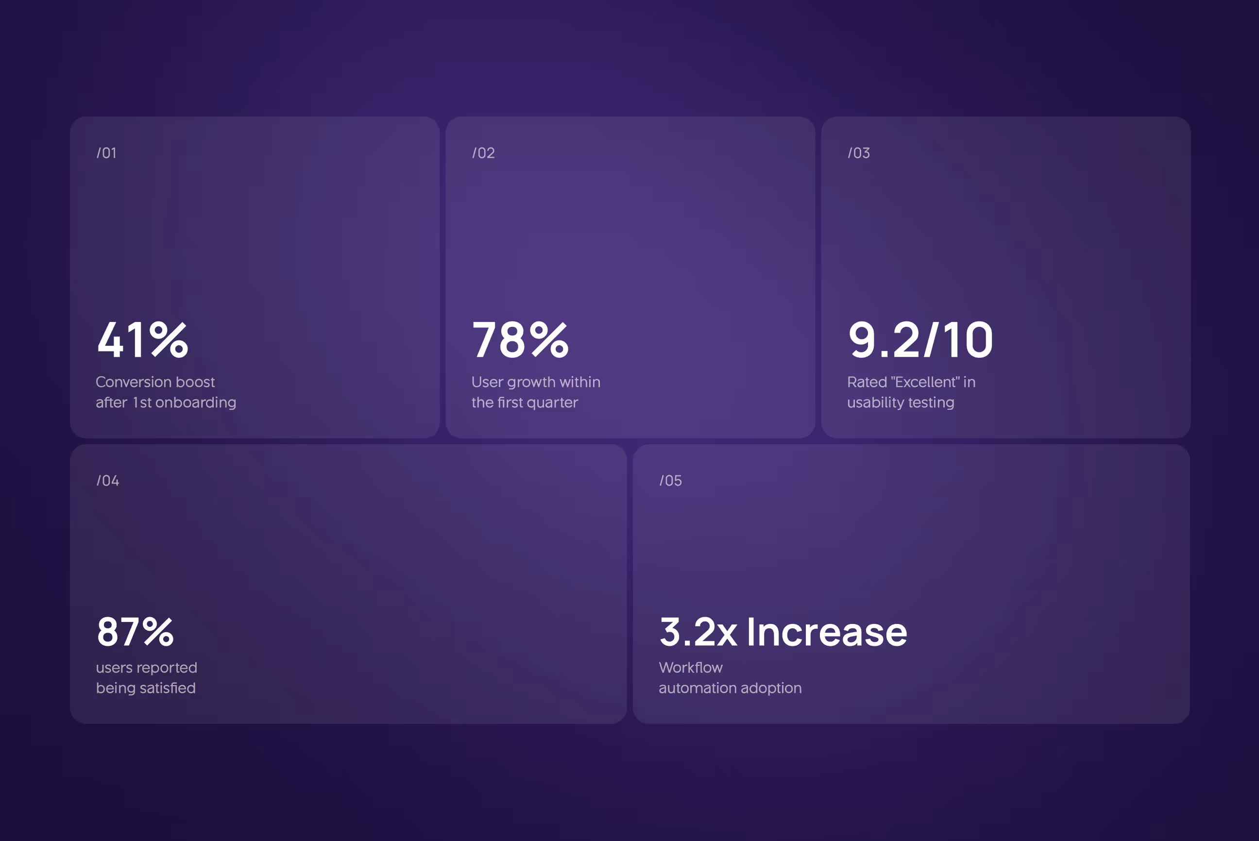
The numbers that prove CallAI's design worked
Four weeks of work. Eight metrics that moved. This is what happens when every design decision is tied to a real user problem.
Key Results:
- Conversion and growth: Free-to-paid conversion jumped 41%, and the platform saw 78% user growth in its first quarter, both driven by a simpler onboarding flow and a faster assistant setup experience.
- Usability and satisfaction: Usability testing returned a 9.2 out of 10 score rated "Excellent", with 87% of users reporting they were satisfied with the overall platform after the redesign.
- NPS Score jumped from 34 to 61: Moving from passive to promoter zone after we redesigned the assistant configuration flow and introduced prebuilt templates.
- Workflow adoption grew: 3.2x after the visual canvas replaced the old form-based setup, making automation feel less like a technical task and more like connecting the dots.
- Dev handoff got 40% faster, and landing page CTAs drove 2.4x more clicks, proving that a clean design system and a focused landing page do more than just look good

Have a Project? Let’s talk!


Your competitors are converting 3x more visitors. Not because they have a better product, but because they have a better design.


.avif)