3-step
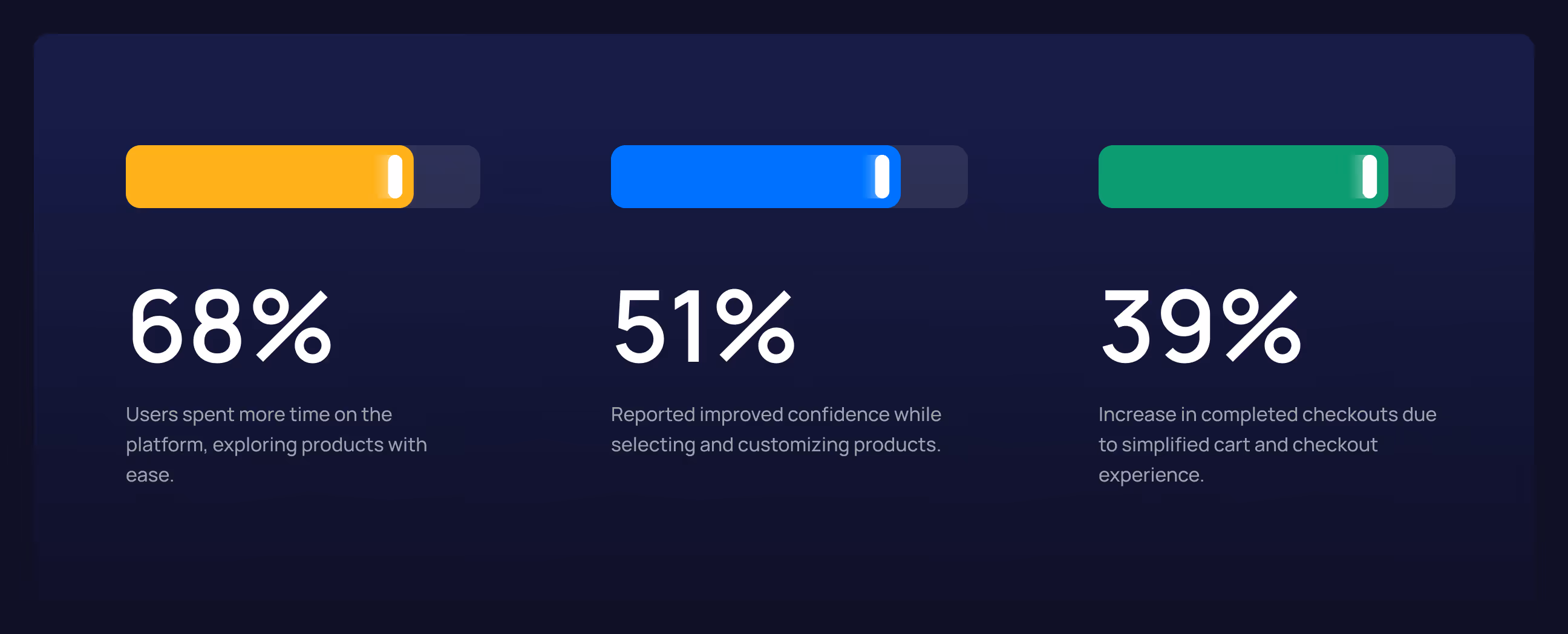
38%
+28% conversion
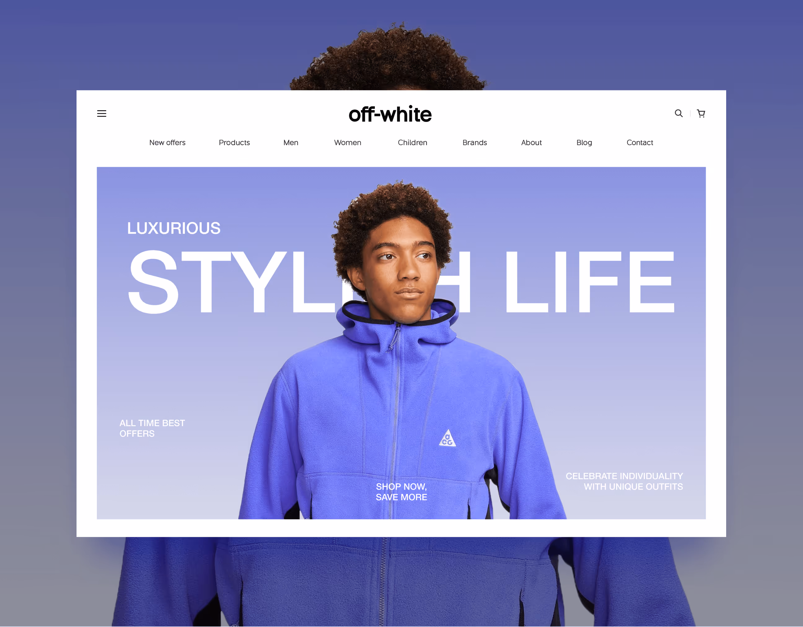


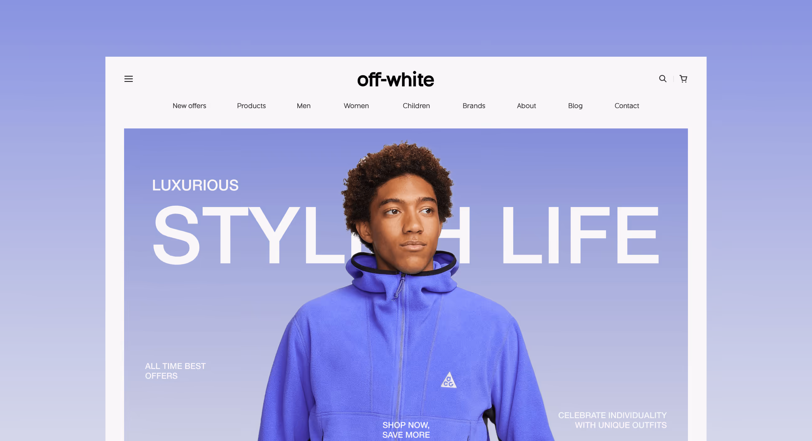
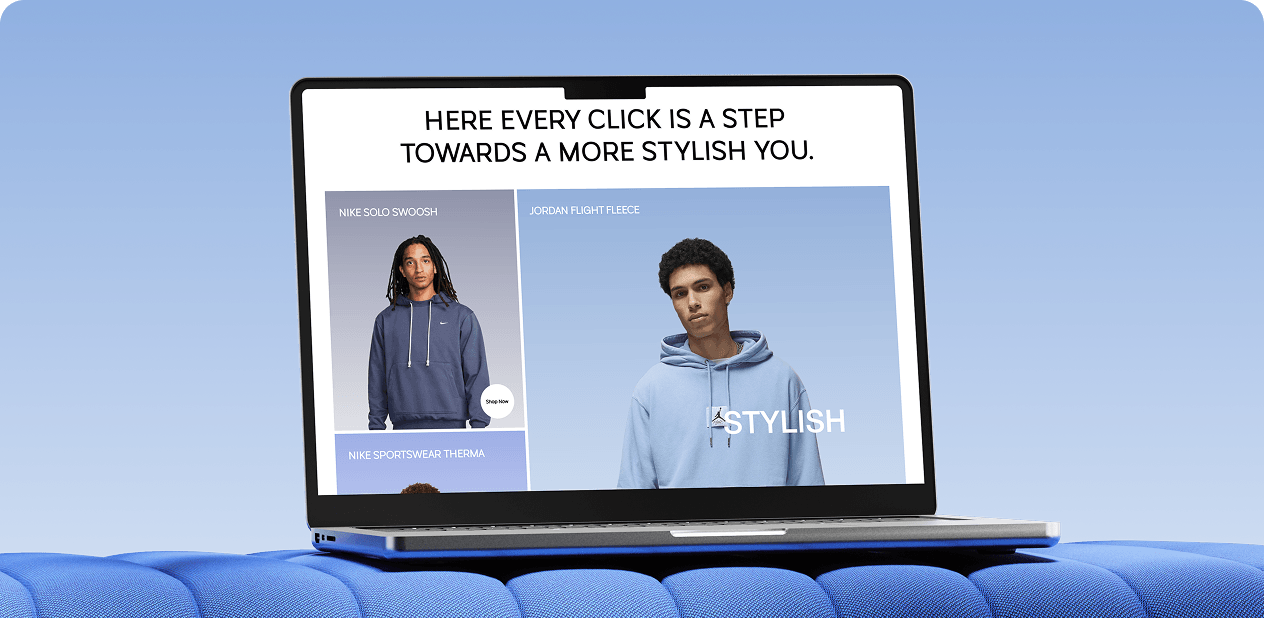
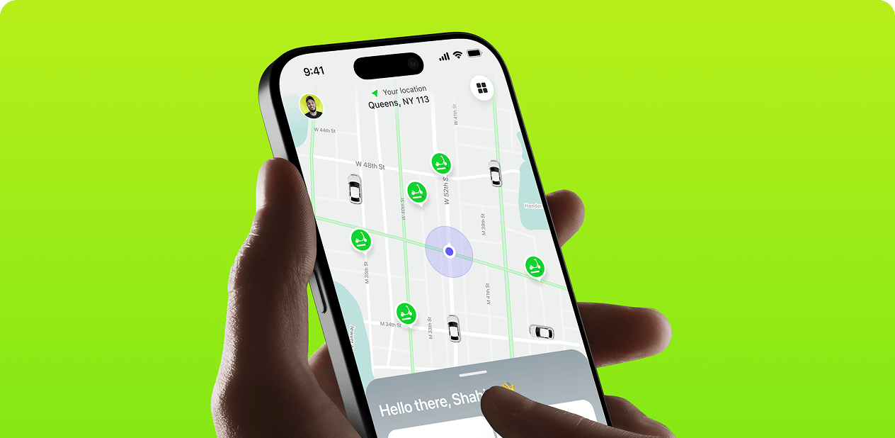
off-white blends urban streetwear with luxury fashion. The e-commerce experience was redesigned to reflect that identity, delivering a premium, fast, and intuitive journey from homepage to checkout, optimized for every device.


Where friction replaced flow
The existing e-commerce experience didn’t support how customers actually shop for premium fashion. While off-white’s products carried a strong identity and value, the digital journey lacked clarity, speed, and consistency, creating friction before users could reach purchase confidence.
- Slow decision-making: Product discovery and comparison felt heavy, making it harder for users to move quickly from interest to intent.
- Friction across key actions: Critical moments like browsing, adding to cart, and checkout introduced hesitation instead of momentum.
- Weak mobile experience: The shopping flow wasn’t optimized for fast, mobile-first behavior, leading to drop-offs before conversion.
- Inconsistent premium feel: Visual and interaction inconsistencies reduced trust and failed to reflect the brand’s high-end positioning.

A Conversion-focused Off-white design
A conversion-focused e-commerce experience designed to help users move faster, feel confident, and stay aligned with off-white’s premium identity.
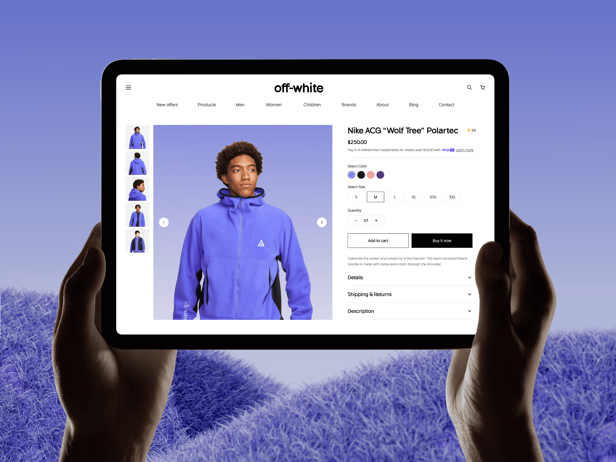
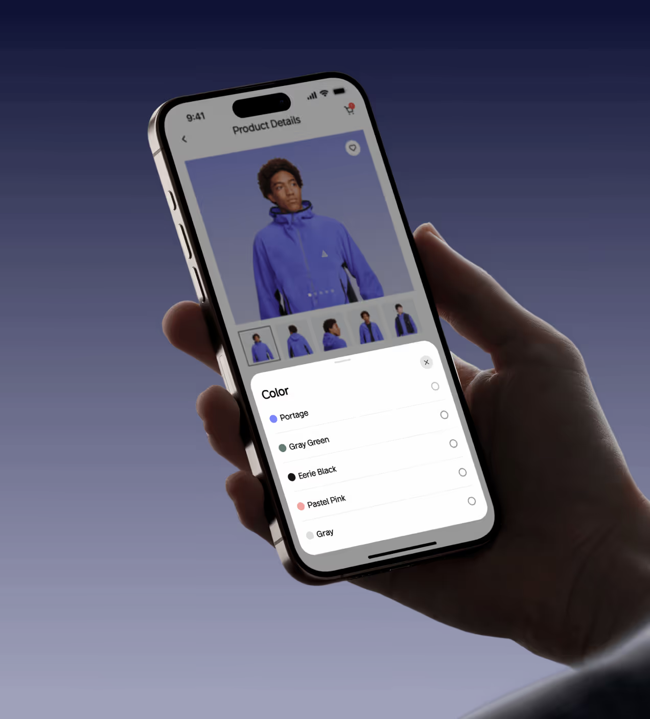
- Faster product discovery: A clearer hierarchy and refined layouts help users scan, compare, and select products with less effort.
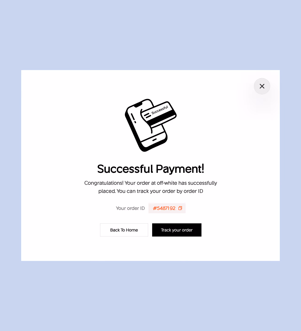
- Reduced friction across the journey: Key interactions were simplified to maintain momentum from browsing to checkout, minimizing hesitation at every step.
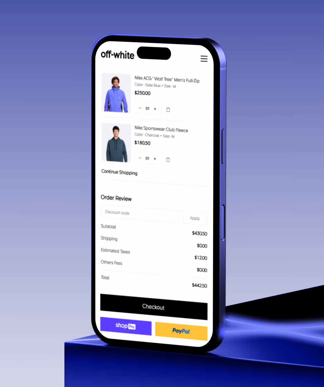
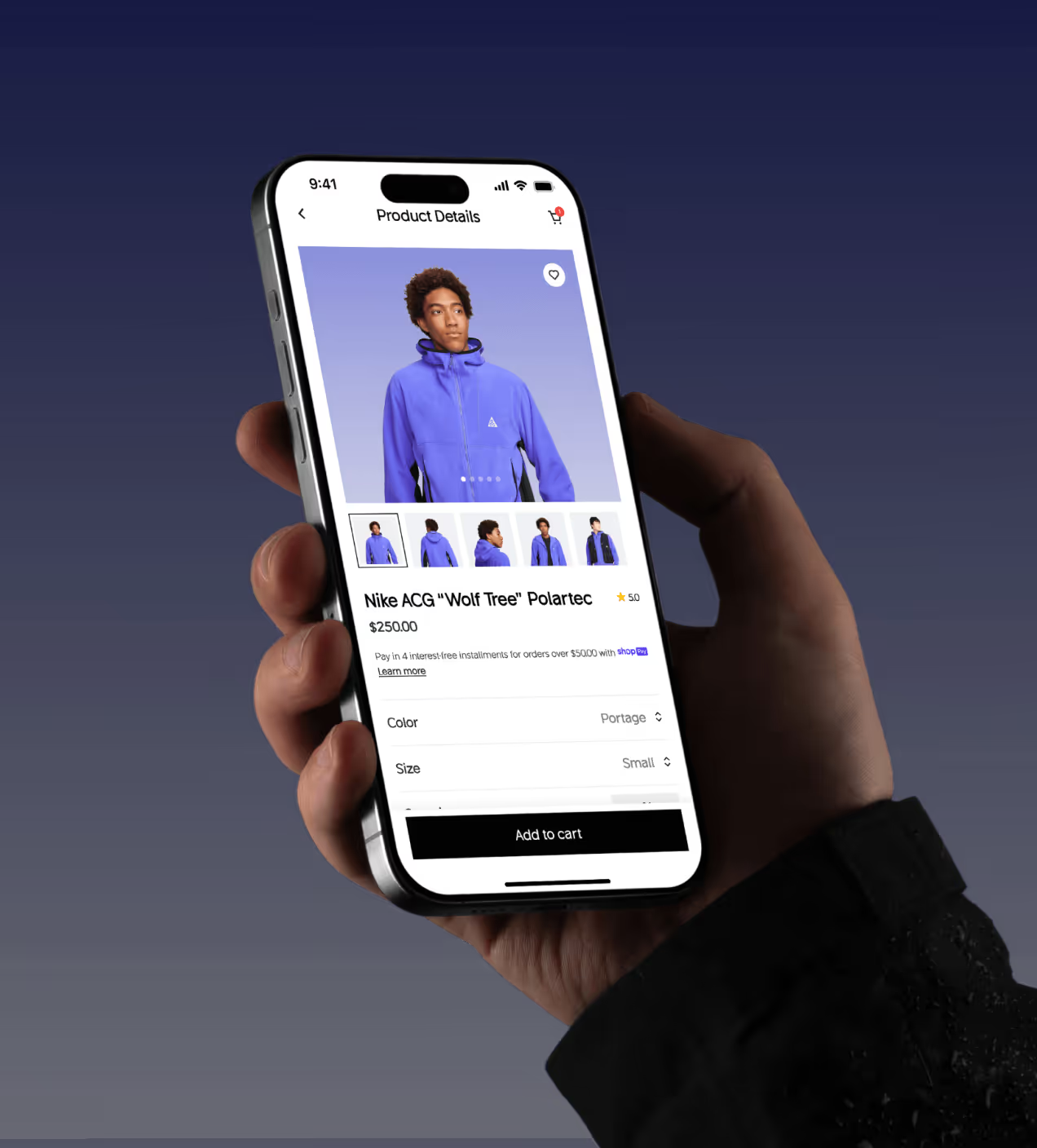
- Mobile-first shopping flow: The experience was optimized for real mobile behavior, ensuring fast, thumb-friendly interactions across the entire journey.
- Stronger premium brand presence: A cohesive visual system reinforced off-white’s luxury positioning, building trust and confidence throughout the experience.

A User-centered design process
Our off-white design process follows a UX-first methodology focused on clarity, usability, and confidence across the shopping journey.
We study user behavior, needs, and expectations to understand how shoppers explore and decide.
We structure content so users can move naturally from discovery to checkout.
We design interfaces that balance usability with a premium fashion aesthetic.
We test, learn, and refine to ensure the experience feels intuitive and friction-free.
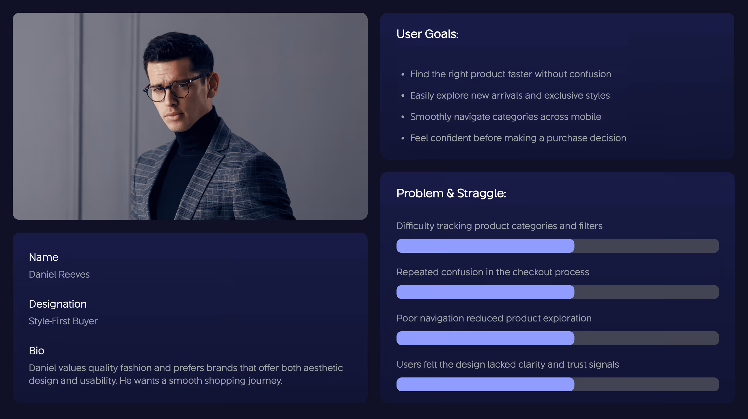
UX Research & Design Artifacts
The insights gathered from early user behavior shaped every design decision that followed. By understanding where users hesitated, felt confused, or lost confidence, we translated those signals into concrete UX artifacts that guided structure, interaction, and visual clarity.
These artifacts helped align the experience with real shopping behavior, informing navigation patterns, interaction feedback, and hierarchy, so the final design reduced friction, supported faster decisions, and reflected off-white’s premium identity throughout the journey.


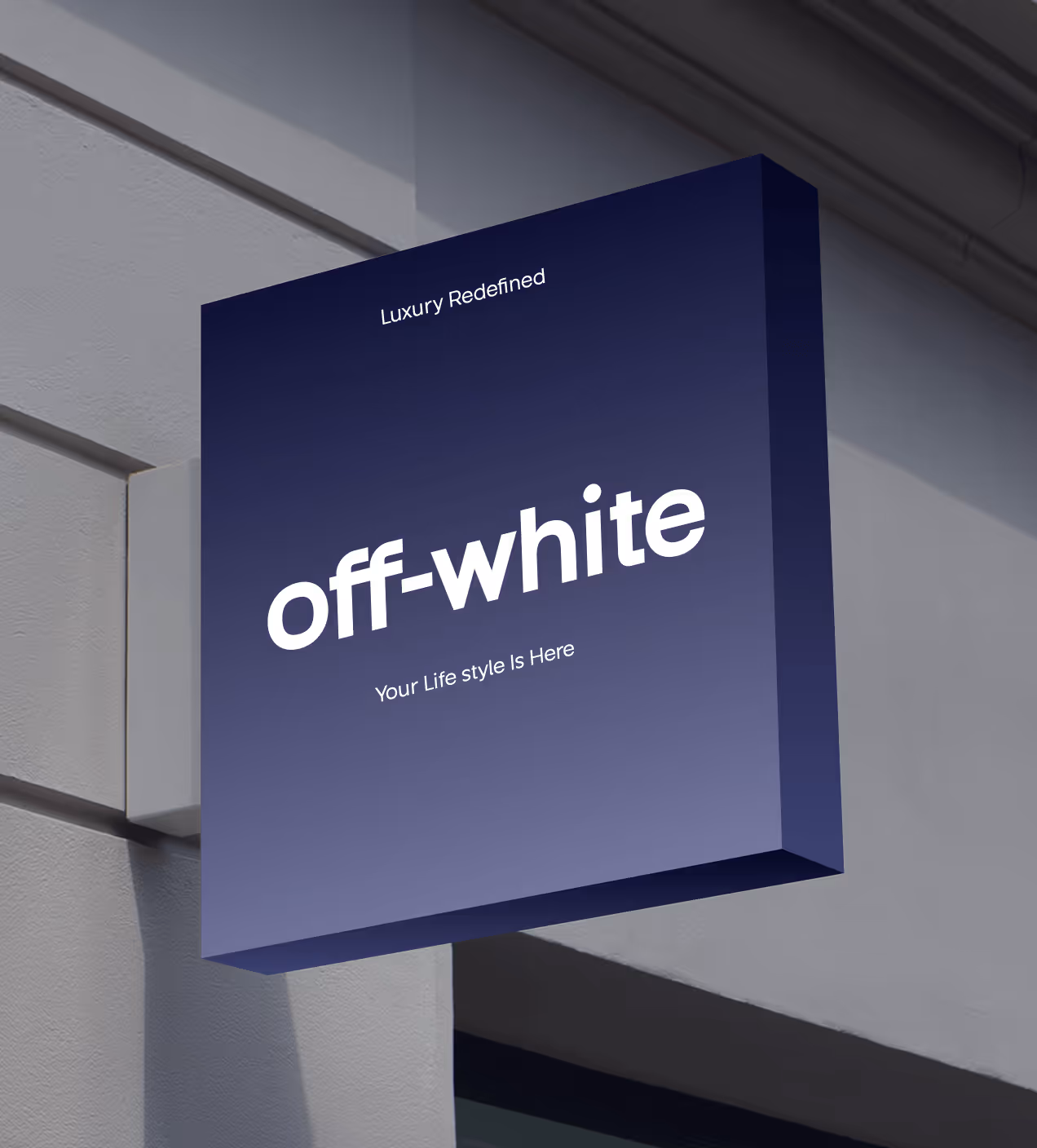
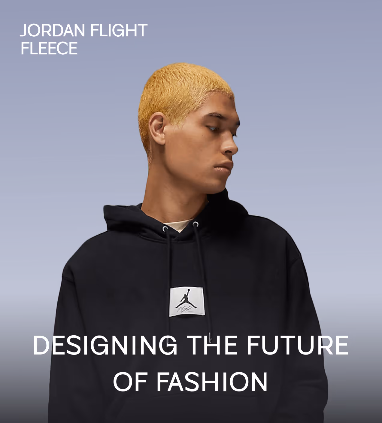
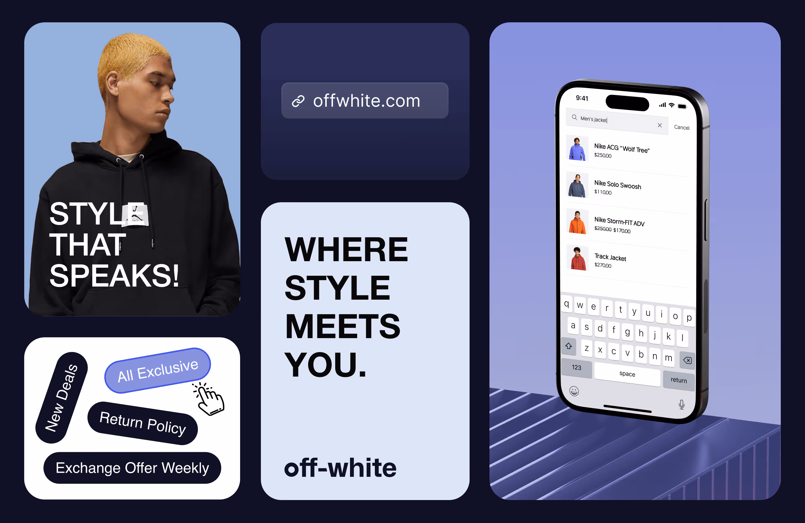
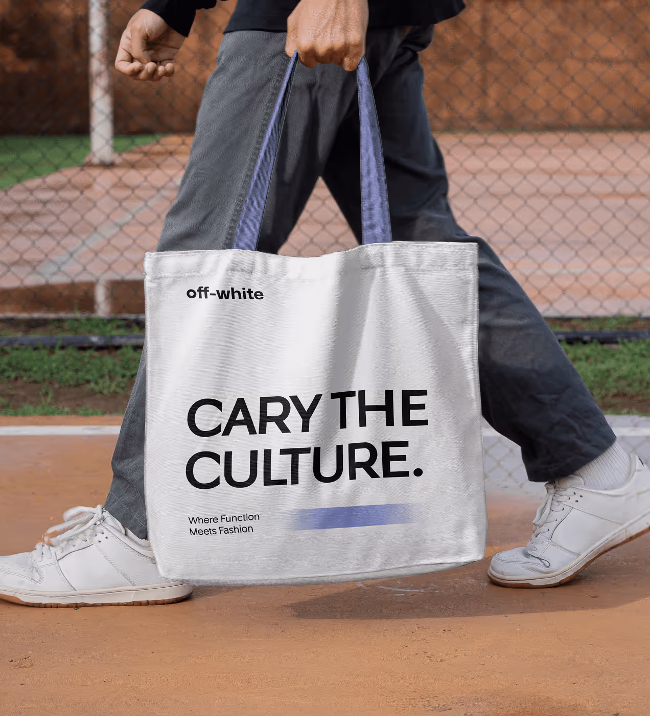
Visual identity and brand story
Off-white’s identity has always been rooted in bold individuality, but its digital presence lacked the same clarity and confidence. Our goal was to translate that attitude into a modern visual language that feels current, minimal, and instantly recognizable.
Through refined typography, signature purple tones, and clear, product-focused imagery, the interface now communicates confidence, transparency, and premium street culture. Every element was designed to feel intentional and easy to remember.
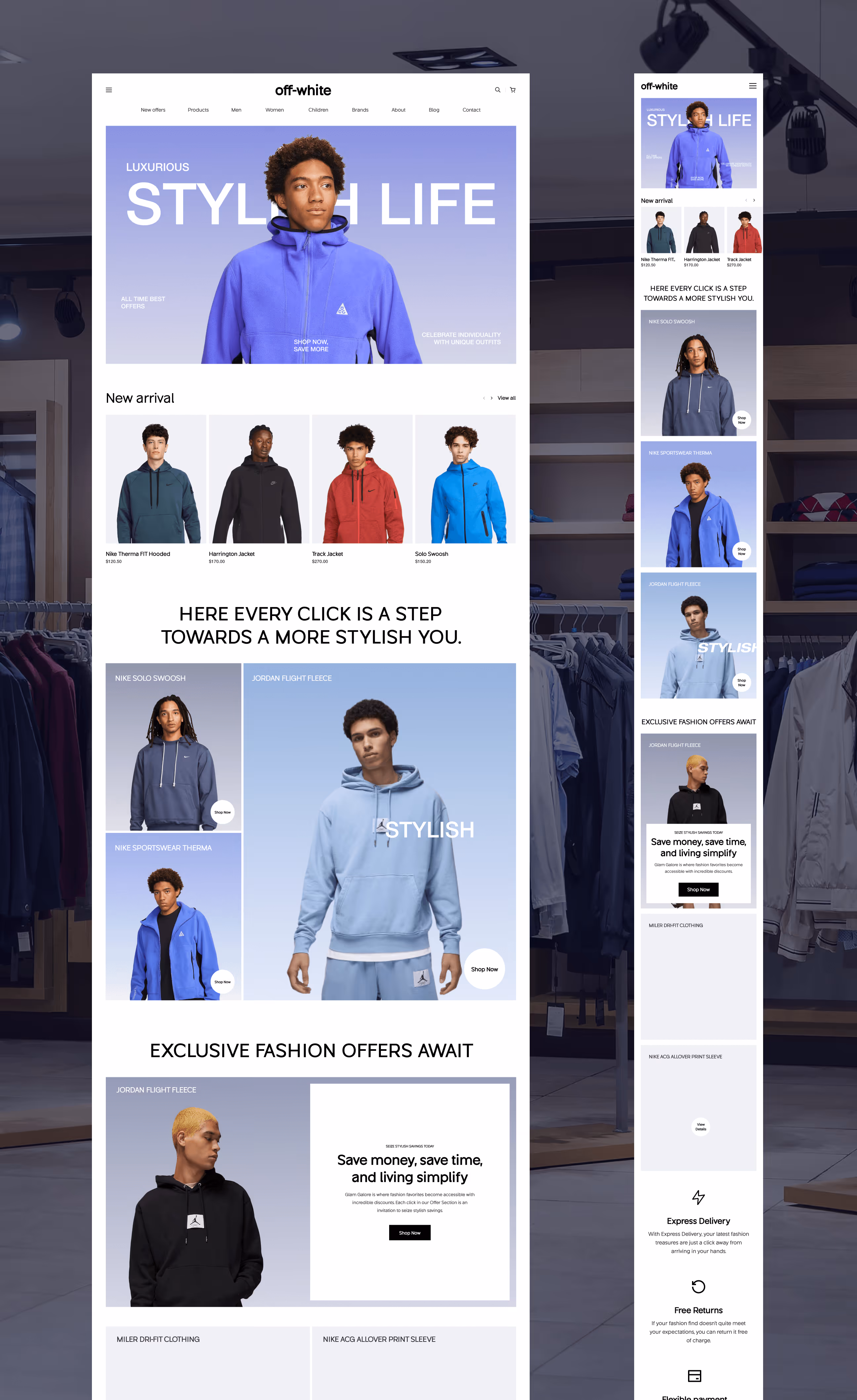
Visual consistency was maintained across all touchpoints, from desktop banners and mobile product cards to branded tote bags, ensuring the experience feels unified wherever users interact with the brand. The tone remains smart, bold, and style-forward, mirroring the mindset of off-white’s audience.


Built for consistency, scale, and brand clarity
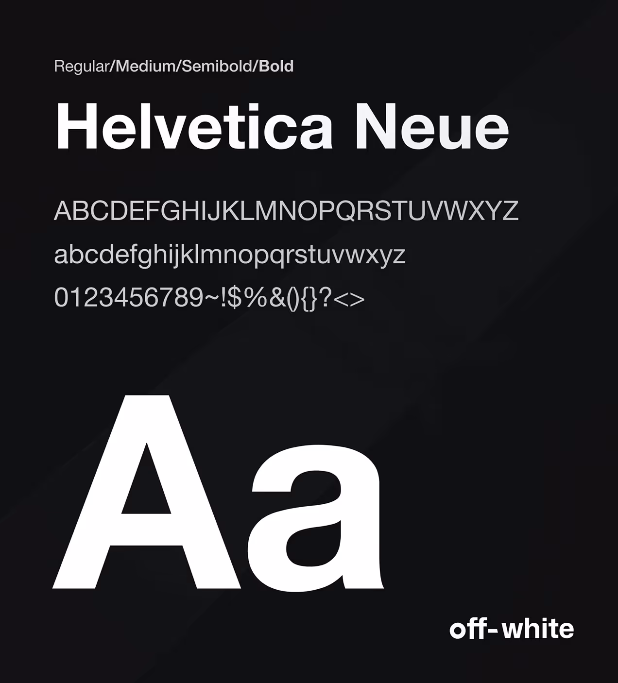
We developed a robust design system aligned with off-white’s premium fashion identity, ensuring visual consistency and long-term scalability across the platform. The color palette, Slate Blue, Errigal White, Cool Gray, and Black, balances expressive style with functional clarity, while Helvetica Neue reinforces the brand’s modern, confident voice.
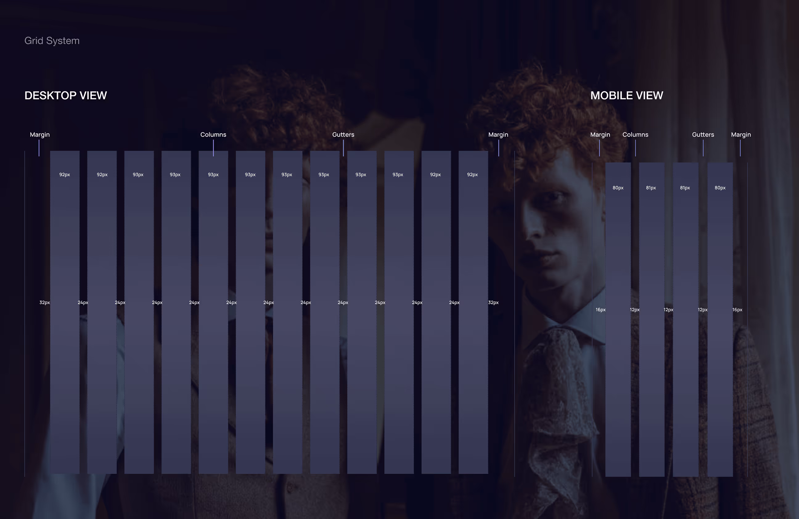
A structured grid system and consistent spacing were applied across product cards, filters, and buttons to maintain usability on all devices. Every UI element, from typography and color to iconography, was designed to support brand consistency, performance, and emotional clarity. The system is built to scale seamlessly as the product grows.

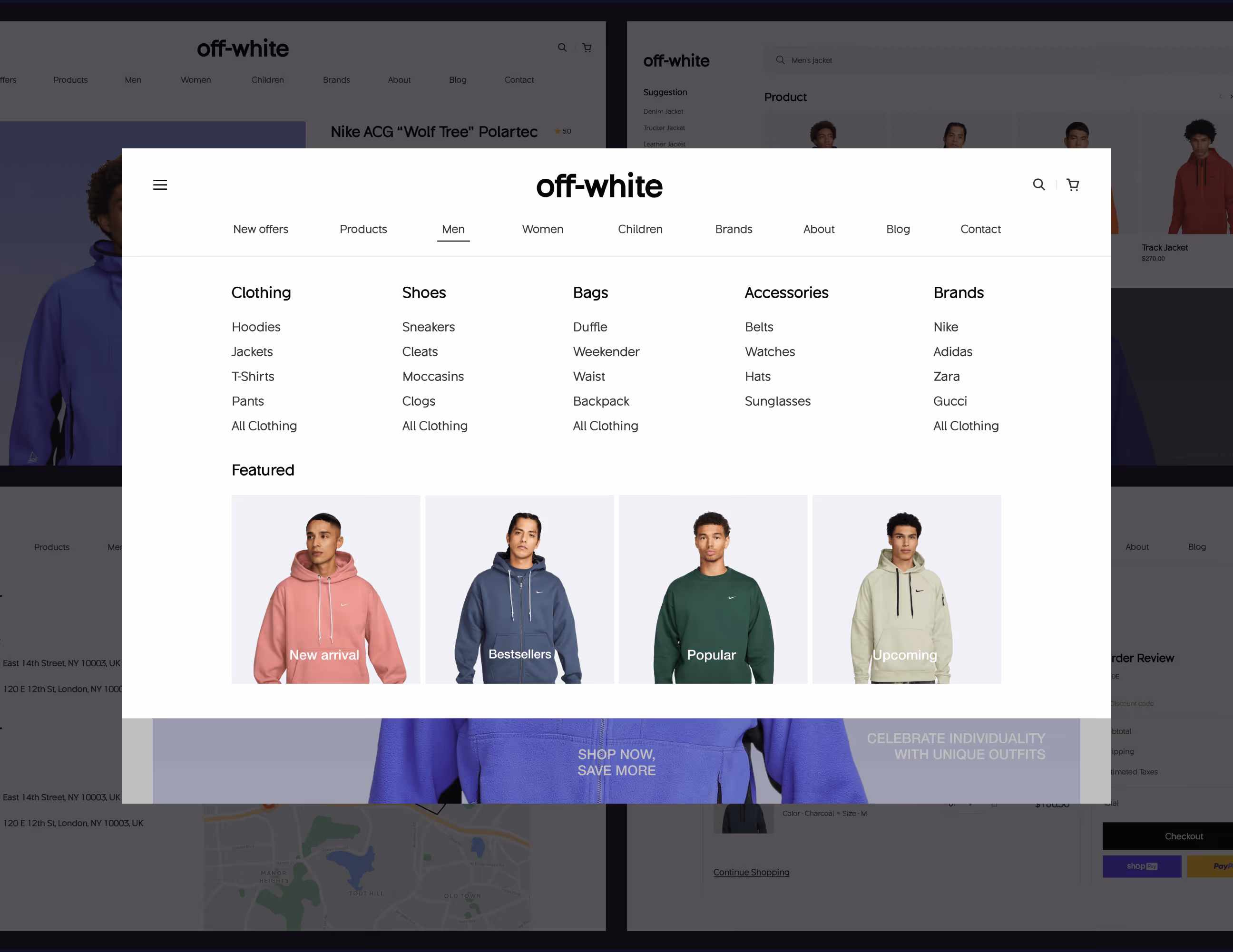
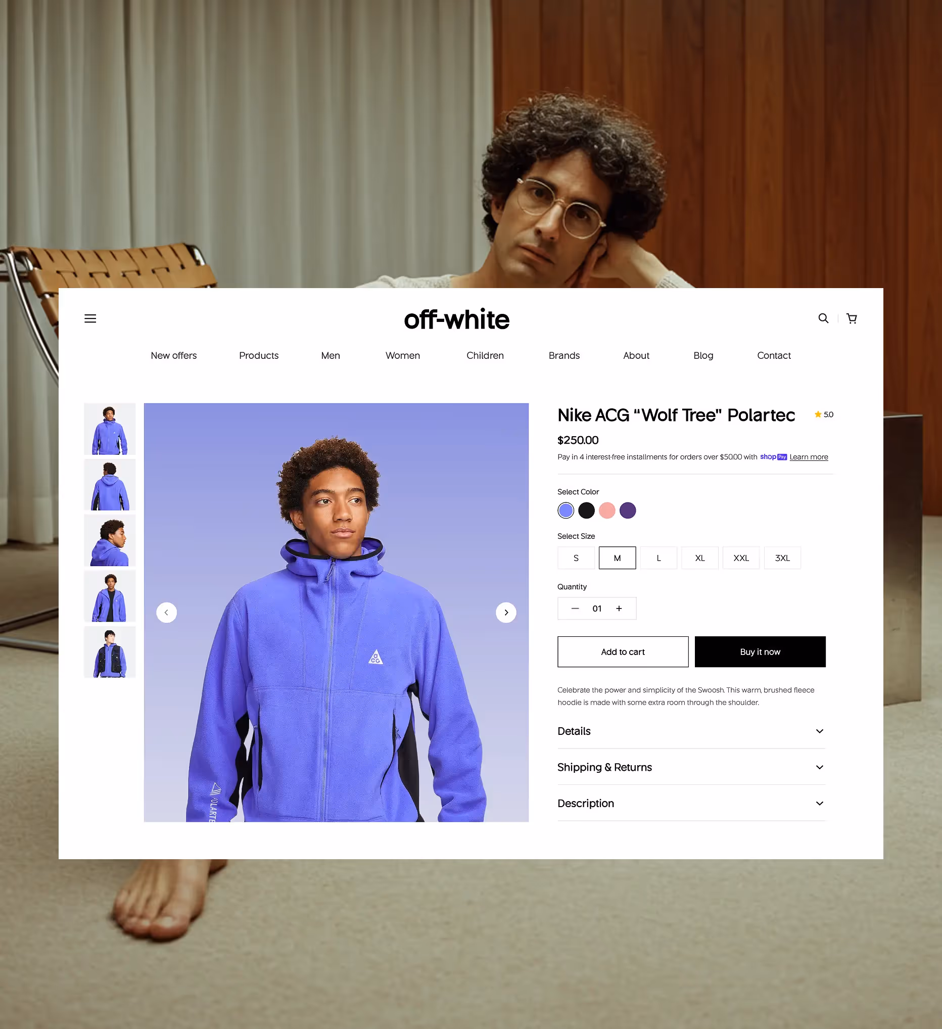
UX design for modern streetwear brands
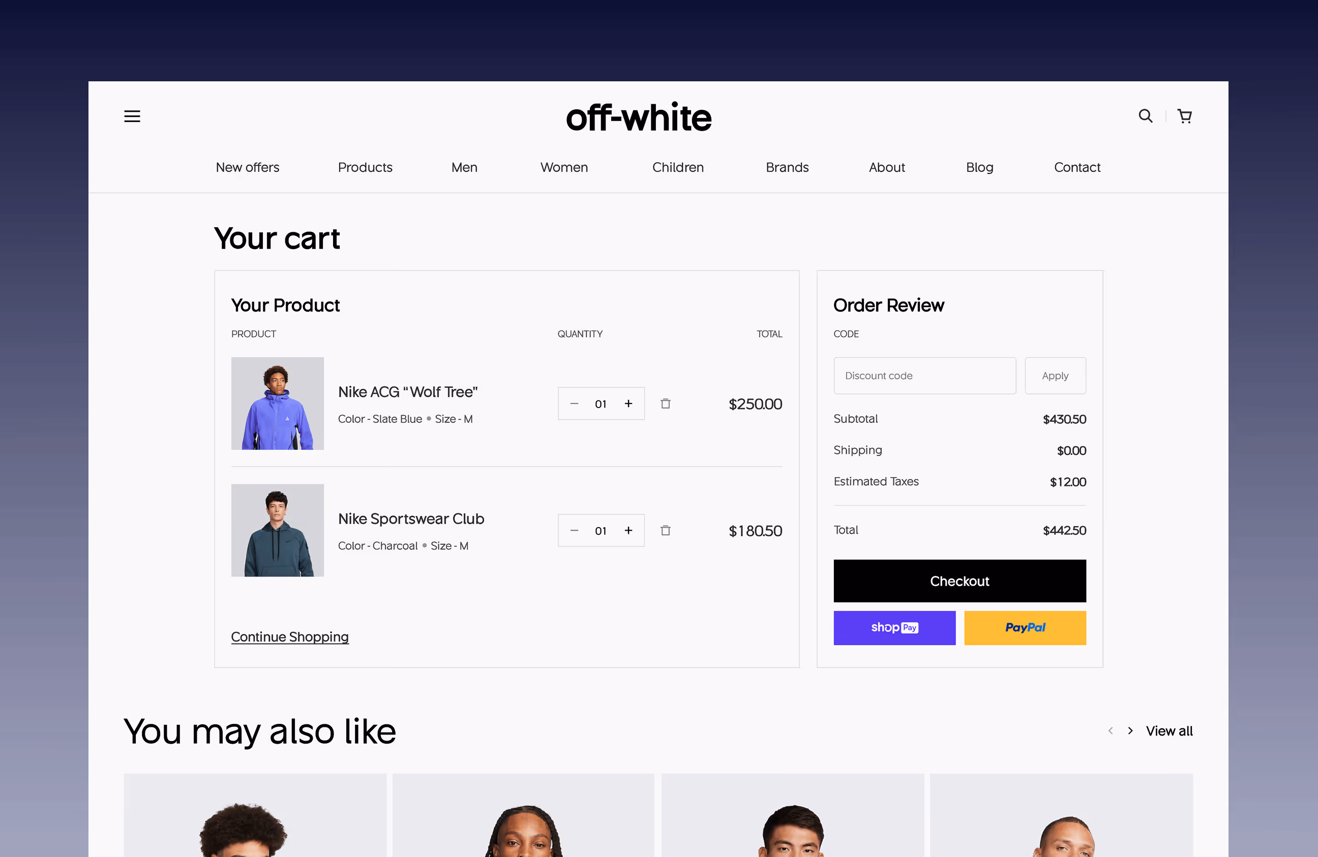
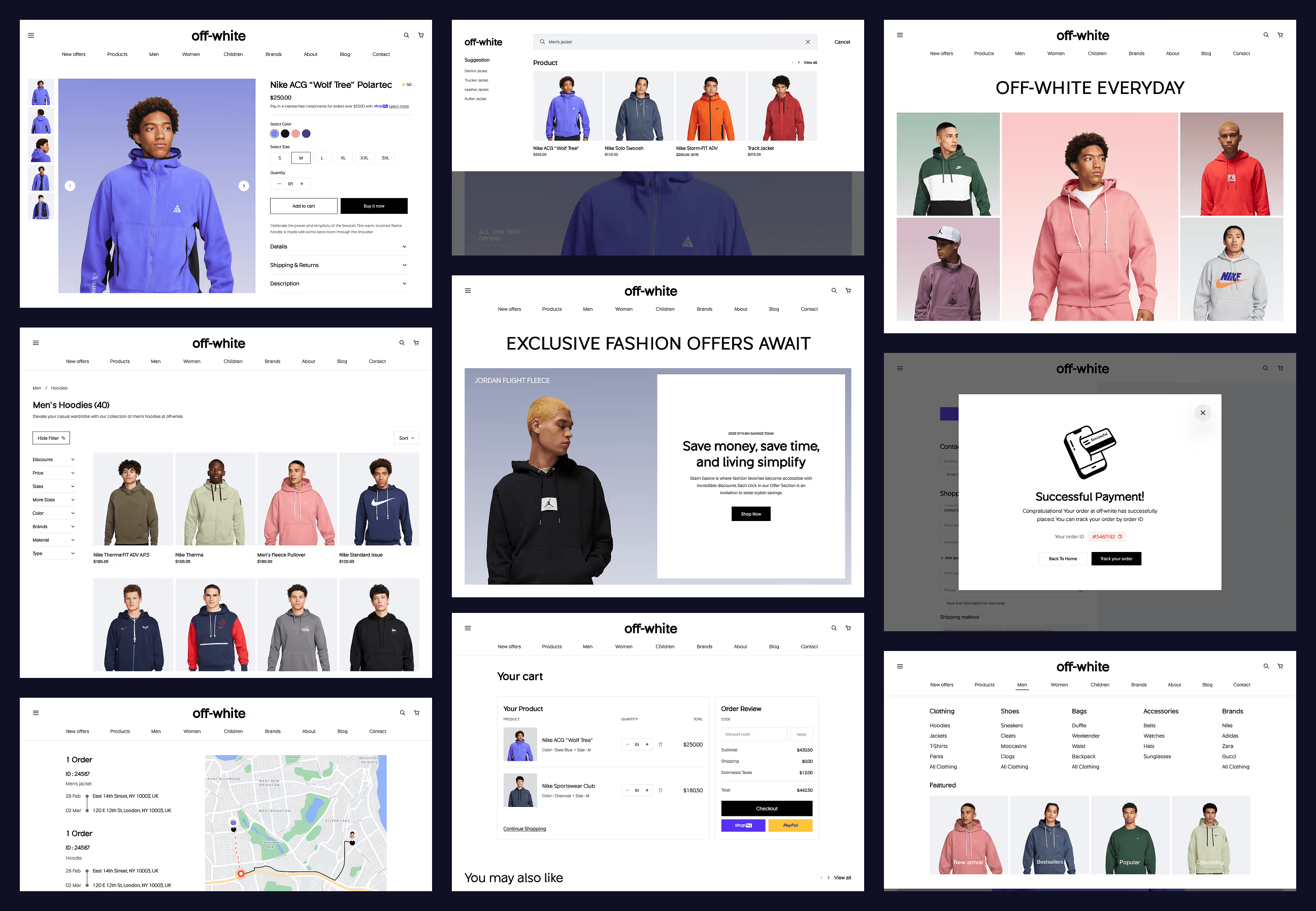
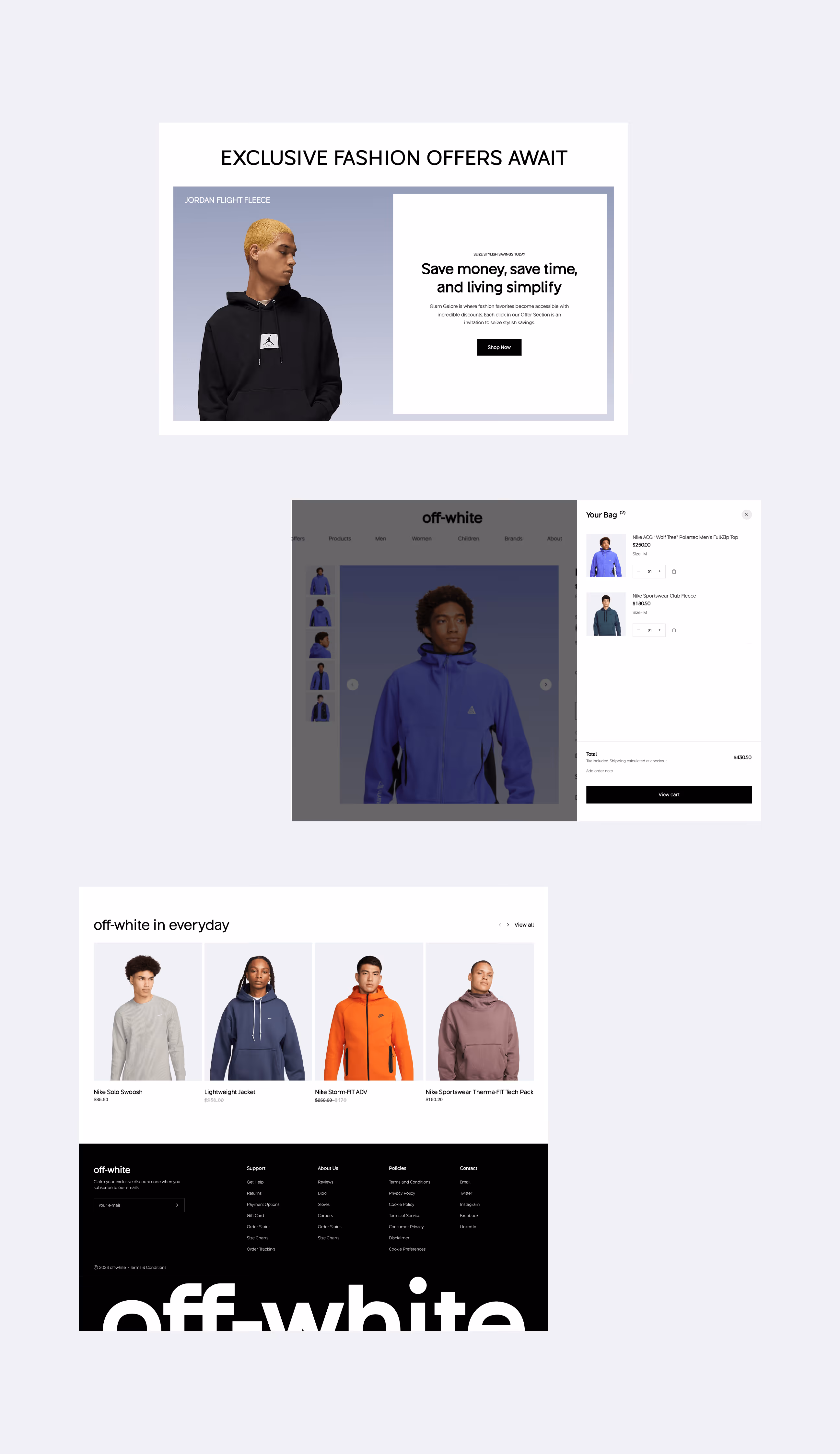
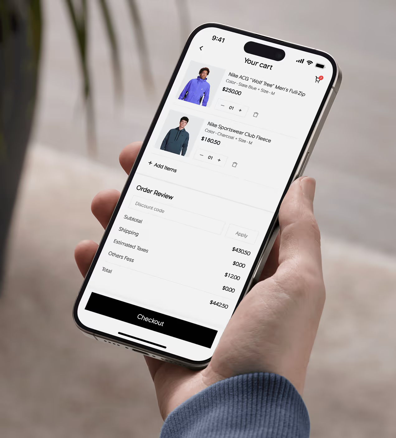
We redesigned off-white’s digital shopping flow to feel smooth, modern, and user-focused. The layout emphasizes clear navigation and prominent CTAs like “Add to cart” and “Buy now”, reducing friction at key moments. Product pages were simplified to highlight essential details such as price, size, and color.
The experience remains consistent across all devices, ensuring familiarity and ease of use. Thoughtful micro-interactions provide immediate feedback during key actions, helping users shop faster, explore more products, and stay engaged with the brand longer.


From better UX to better outcomes
The design balanced usability improvements with measurable business impact. By reducing friction and strengthening confidence across the journey, users were able to make decisions faster while the platform supported stronger engagement and conversion.
Key Results:
- 38% faster product selection through clearer hierarchy and reduced cognitive load.
- 47% stronger premium perception, aligning the interface with off-white’s brand value.
- Up to 28% conversion lift as streamlined flows turned browsing into buying.
- 31% less checkout friction, resulting in faster, more decisive purchases.
- 34% higher mobile engagement driven by thumb-first interactions.
- 38% faster browse-to-cart movement, shortening the path to purchase.

Have a Project? Let’s talk!


Your competitors are converting 3x more visitors. Not because they have a better product, but because they have a better design.


.avif)