
.png)
40%
31M+
2 themes
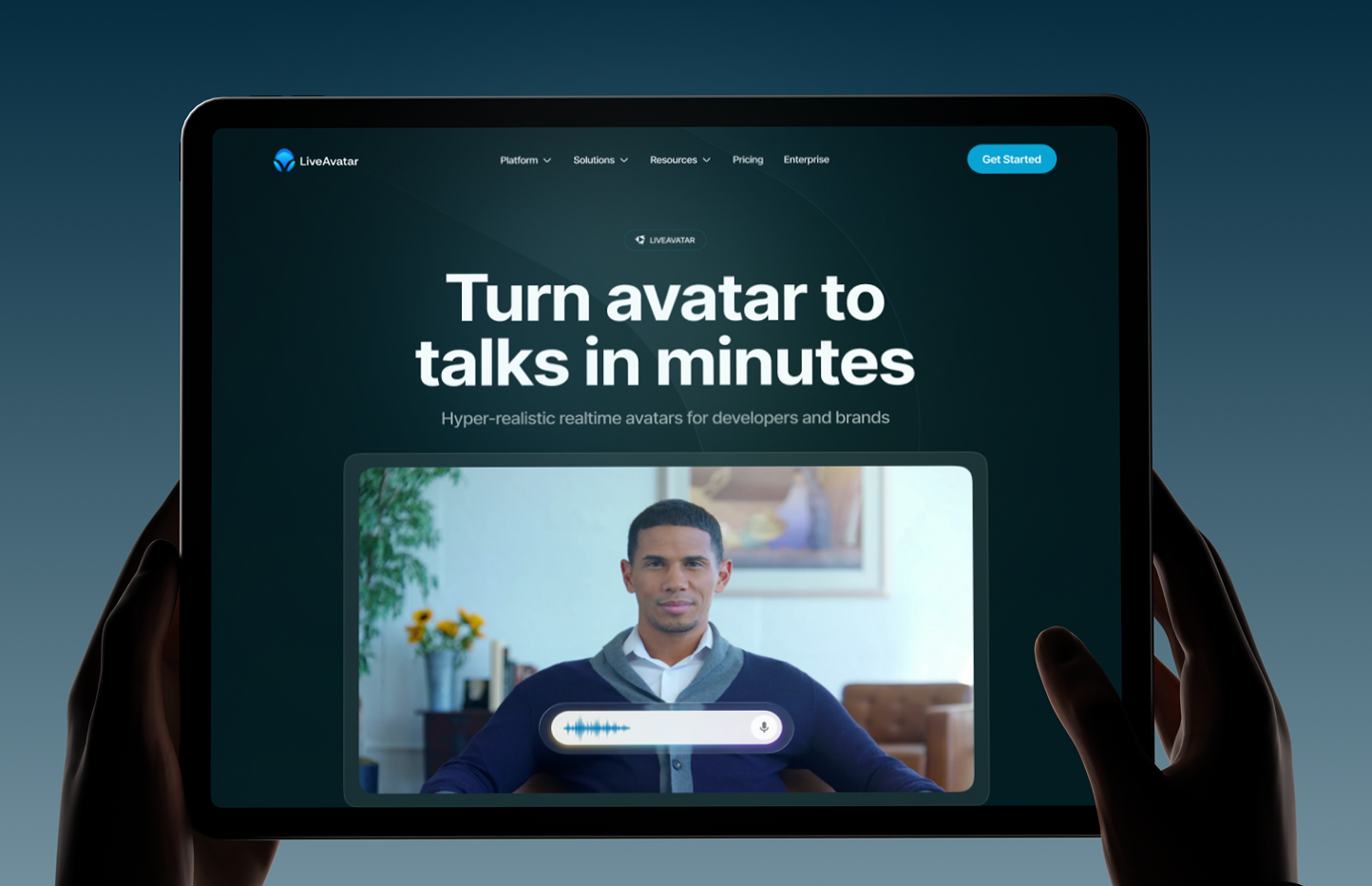
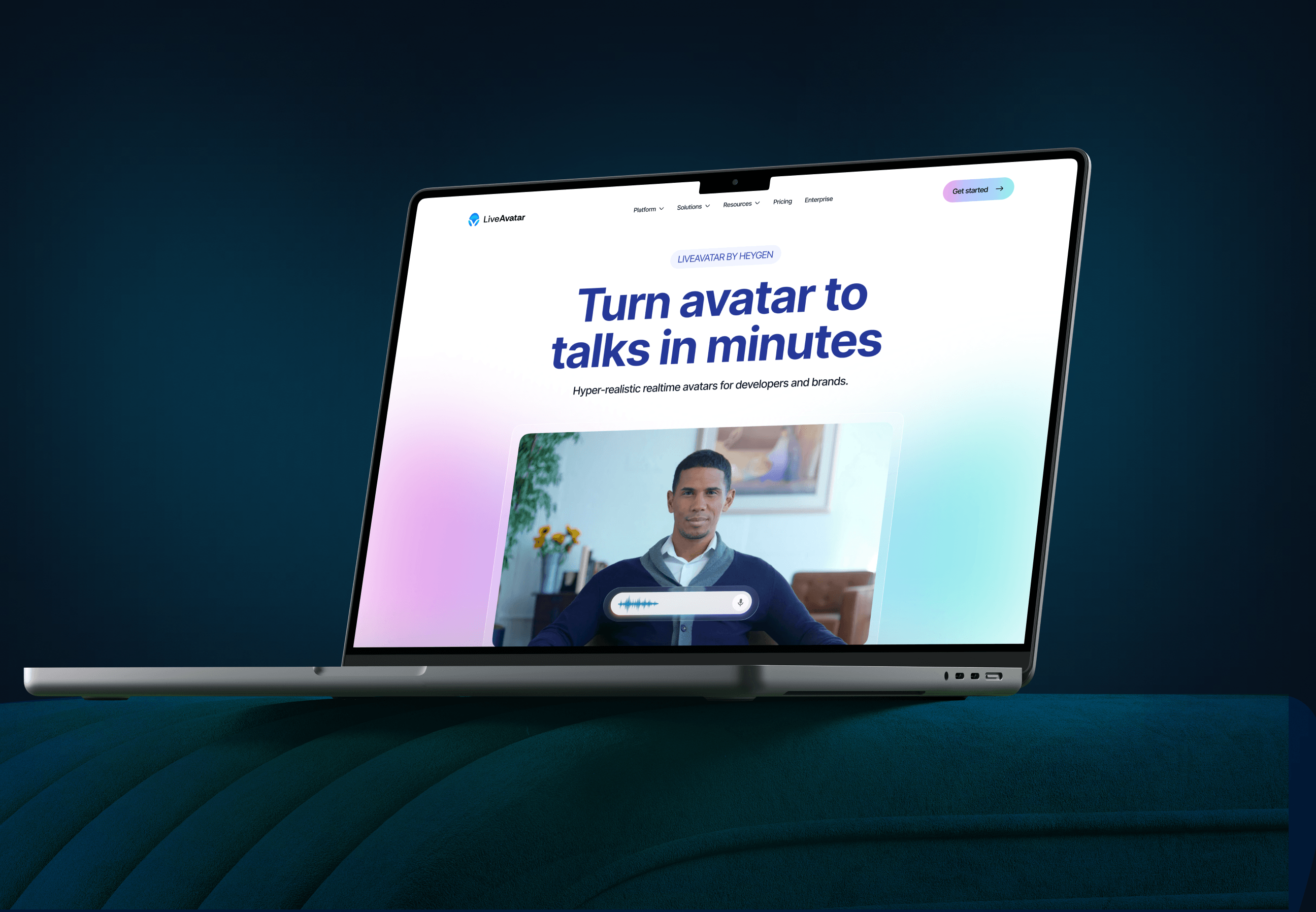

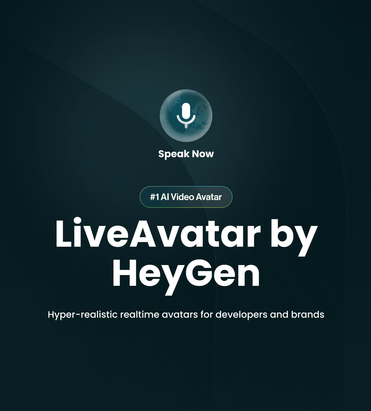
LiveAvatar is HeyGen's real-time avatar product. The avatar listens, answers, and speaks back in the moment, and developers reach it through an API and SDK. HeyGen brought us in to launch it.
But the product arrived with nothing a visitor could see or judge. No mark, no interface language, no page of its own. And that is a design problem before it is anything else. Because a Live Avatar that talks back in real time cannot prove itself through a sentence. People have to watch it happen.
Why did LiveAvatar lose its first visitors
LiveAvatar had powerful real-time avatar technology. But nothing on screen let a visitor confirm it. And a product that promises a human-level conversation cannot survive on a promise, because people judge realism with their eyes, not with a paragraph.
- A claim with no proof: The hero asked visitors to believe in hyper-realistic, real-time avatars. But belief is not a design pattern. Without seeing the avatar speak, people read the words and left unconvinced.
- Two readers, one voice: Developers want the API. Business and enterprise buyers want use cases and a buying path. A single flat page speaks to one of them and loses the other.
- A gated first step: Developers judge an API in minutes. Any interface that pushes them toward a sales call before they see code loses them at the first screen.
- A category that all looks the same: AI product marks blur together in a logo strip. A mark nobody recognises at small size cannot carry a new brand.
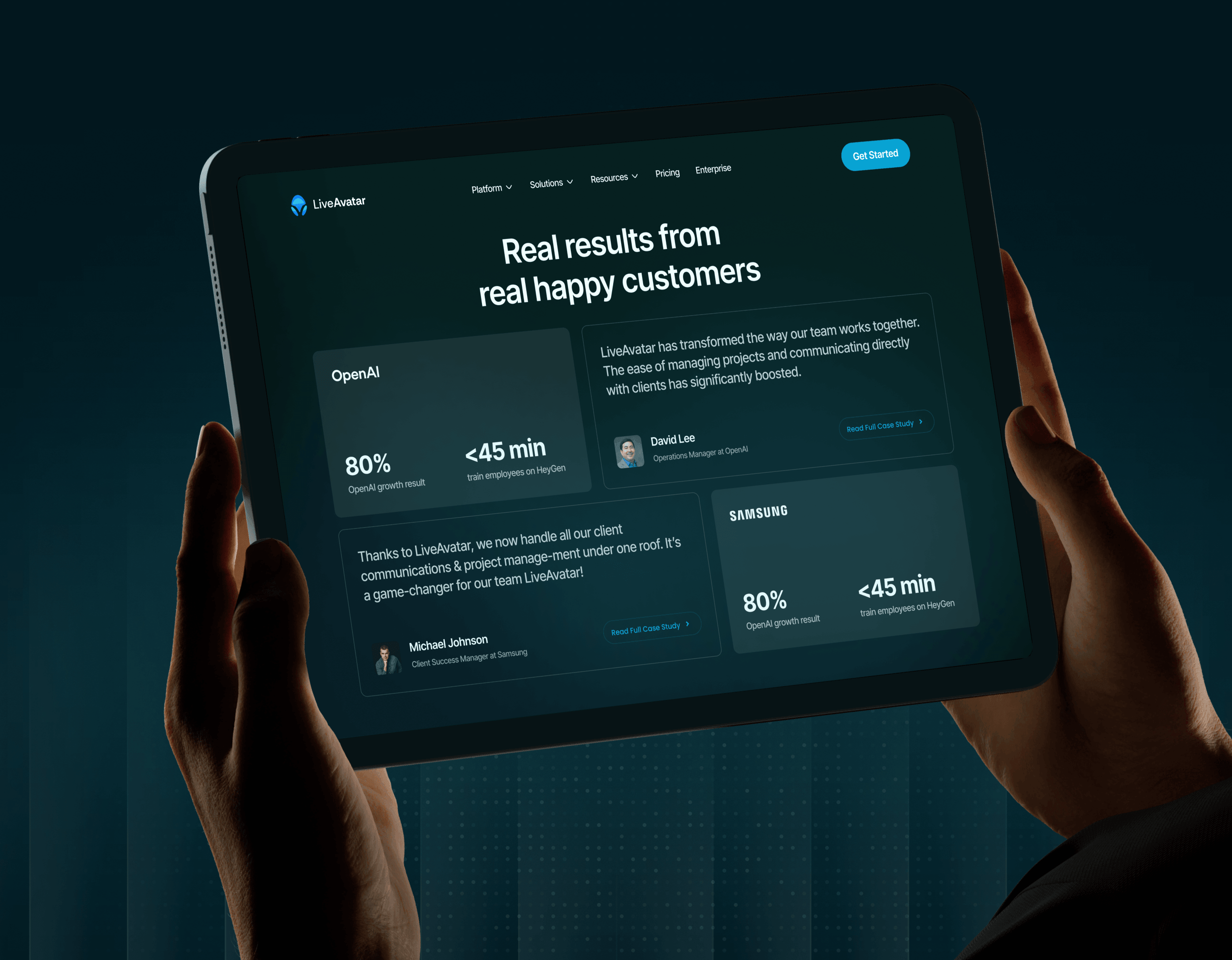
- Nowhere for enterprise to land: A wayfinding failure. A buyer can't find their path. Fixed by the Solutions and Enterprise nav and the trust signals in the footer.
How we designed LiveAvatar to prove itself
We designed LiveAvatar so the product proves itself. Every screen answers one question: can this person see it work, find their own path, and act without asking permission?
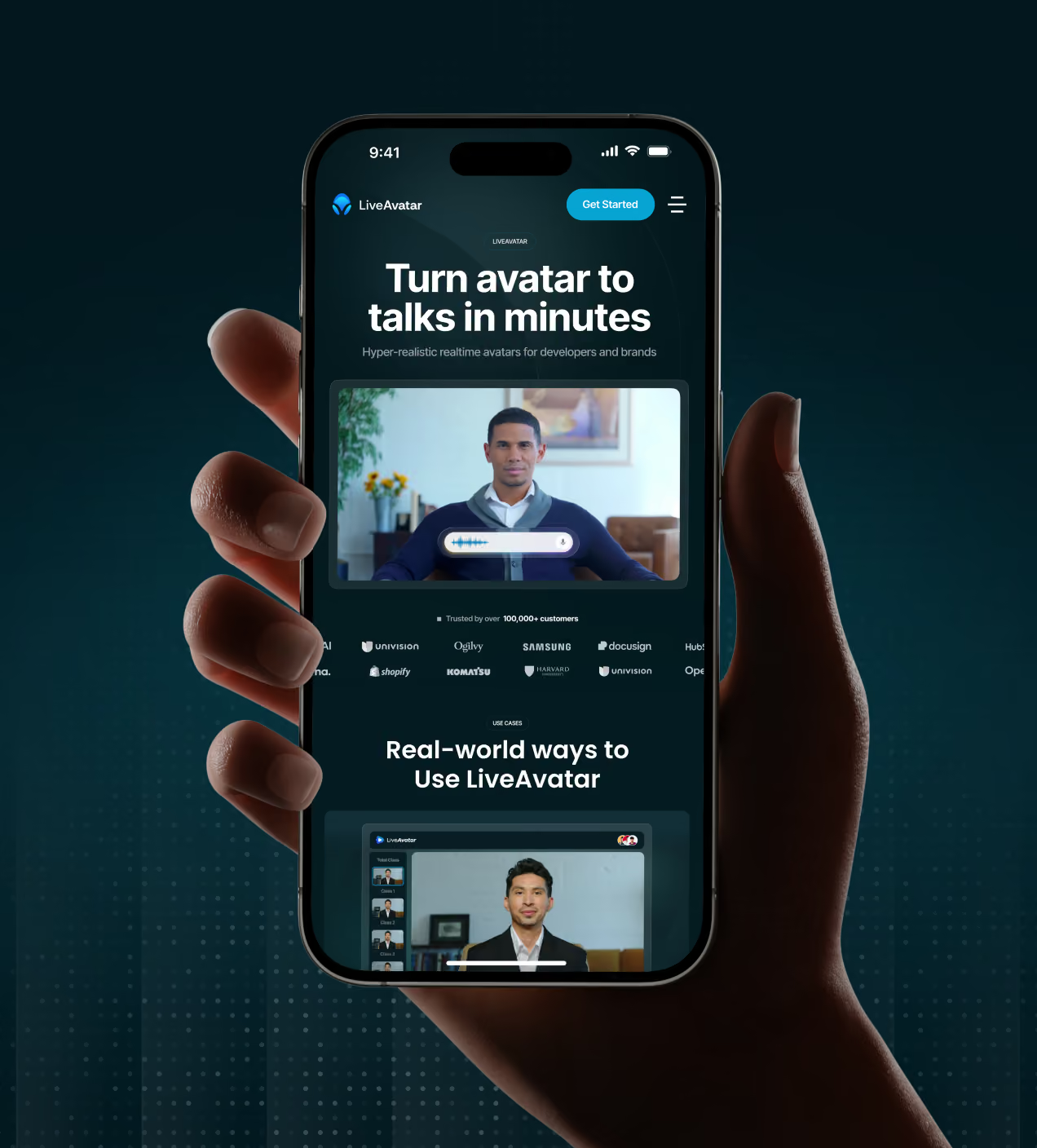
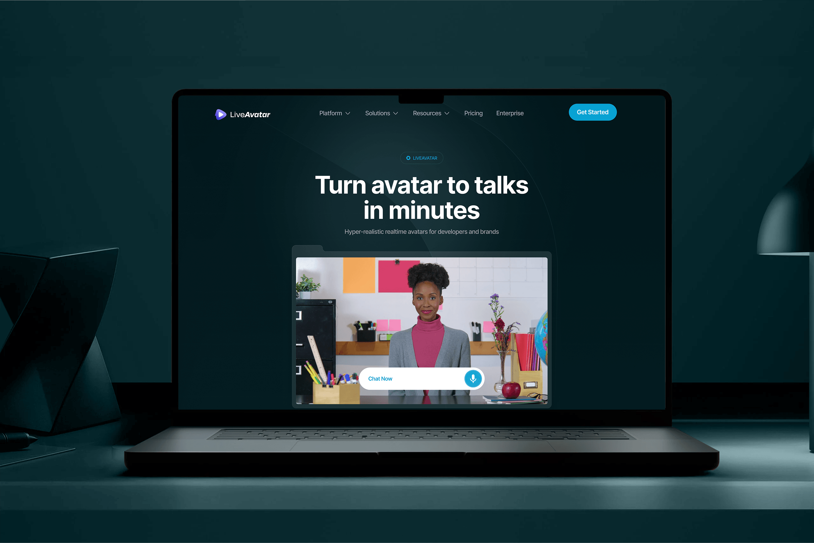
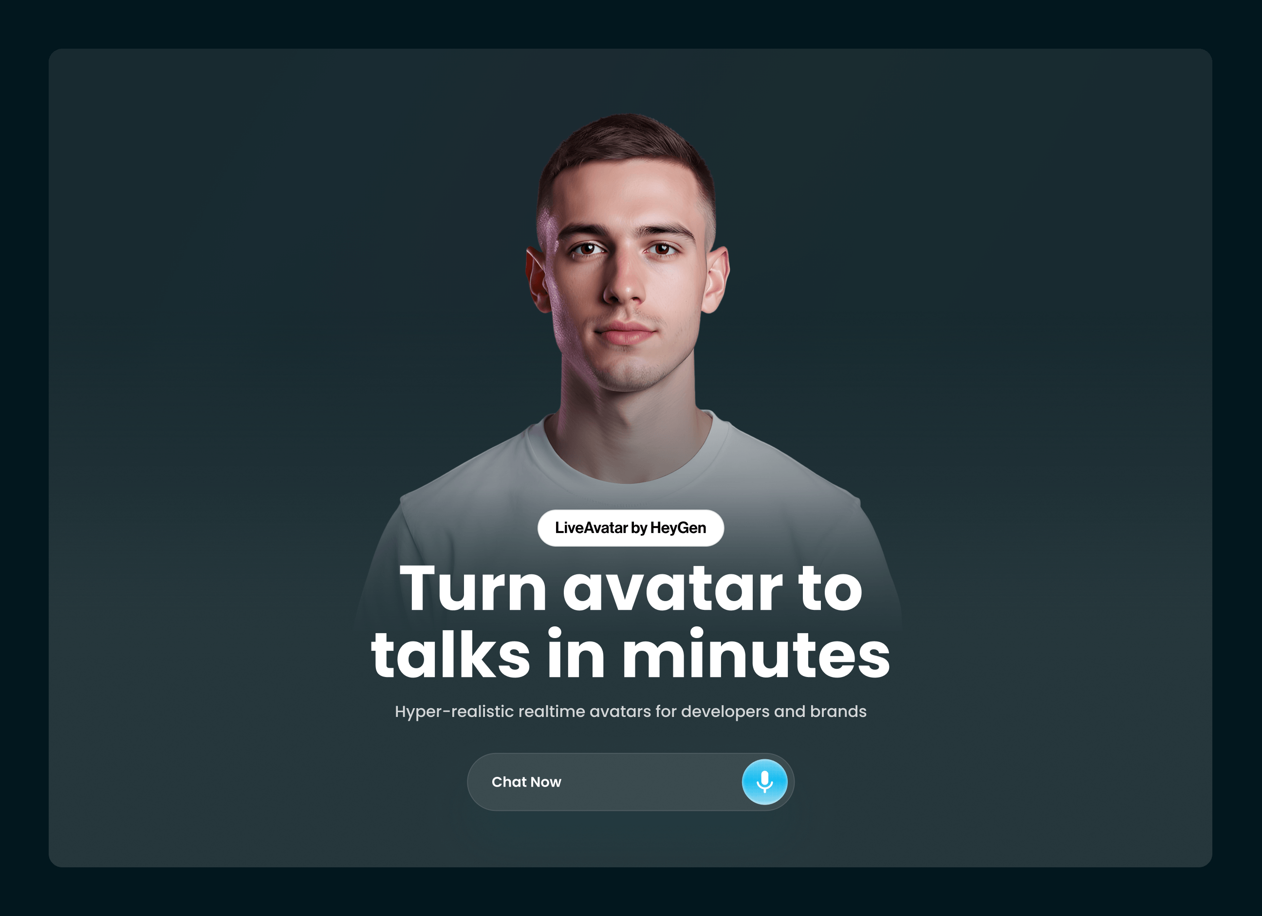
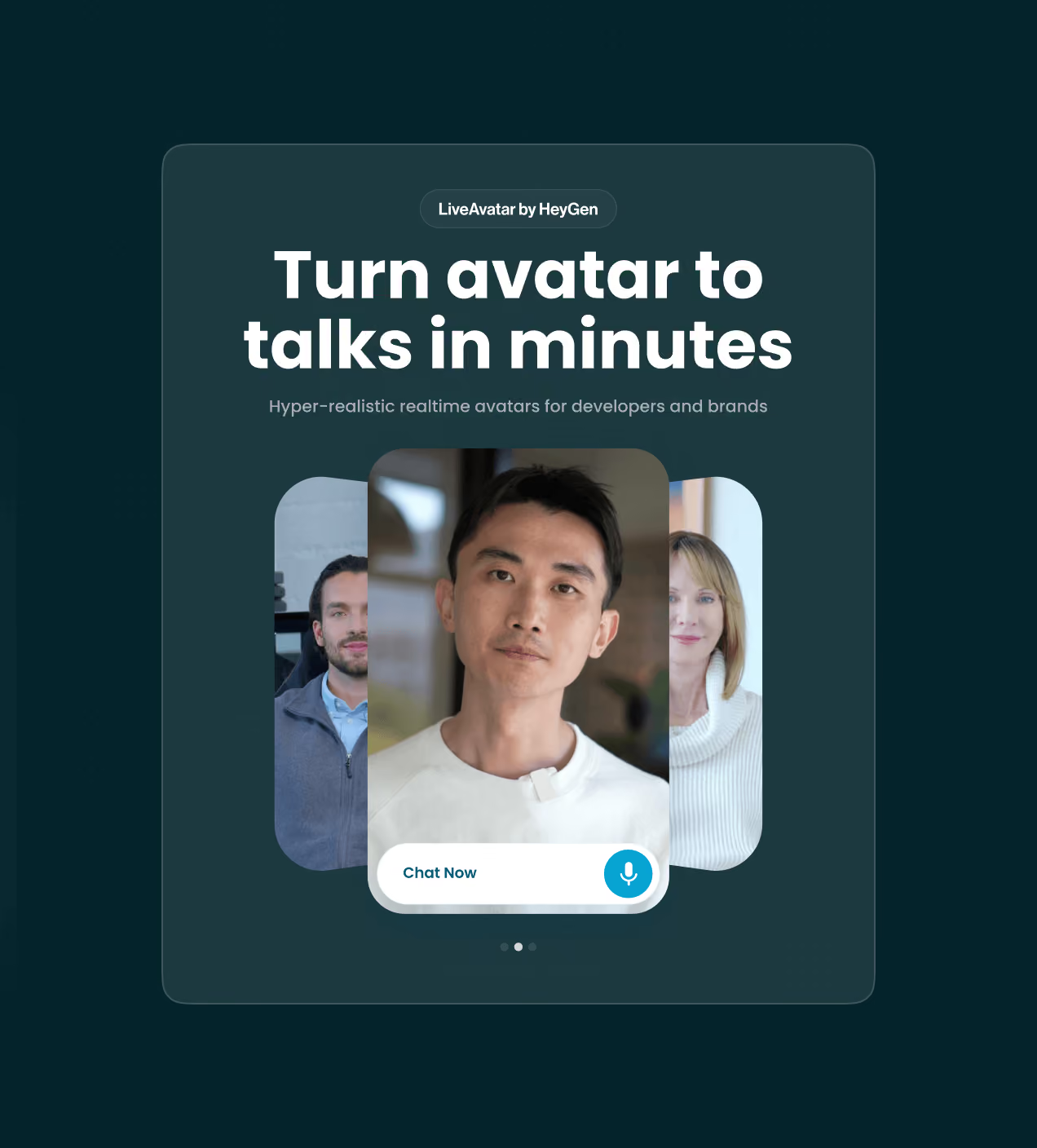
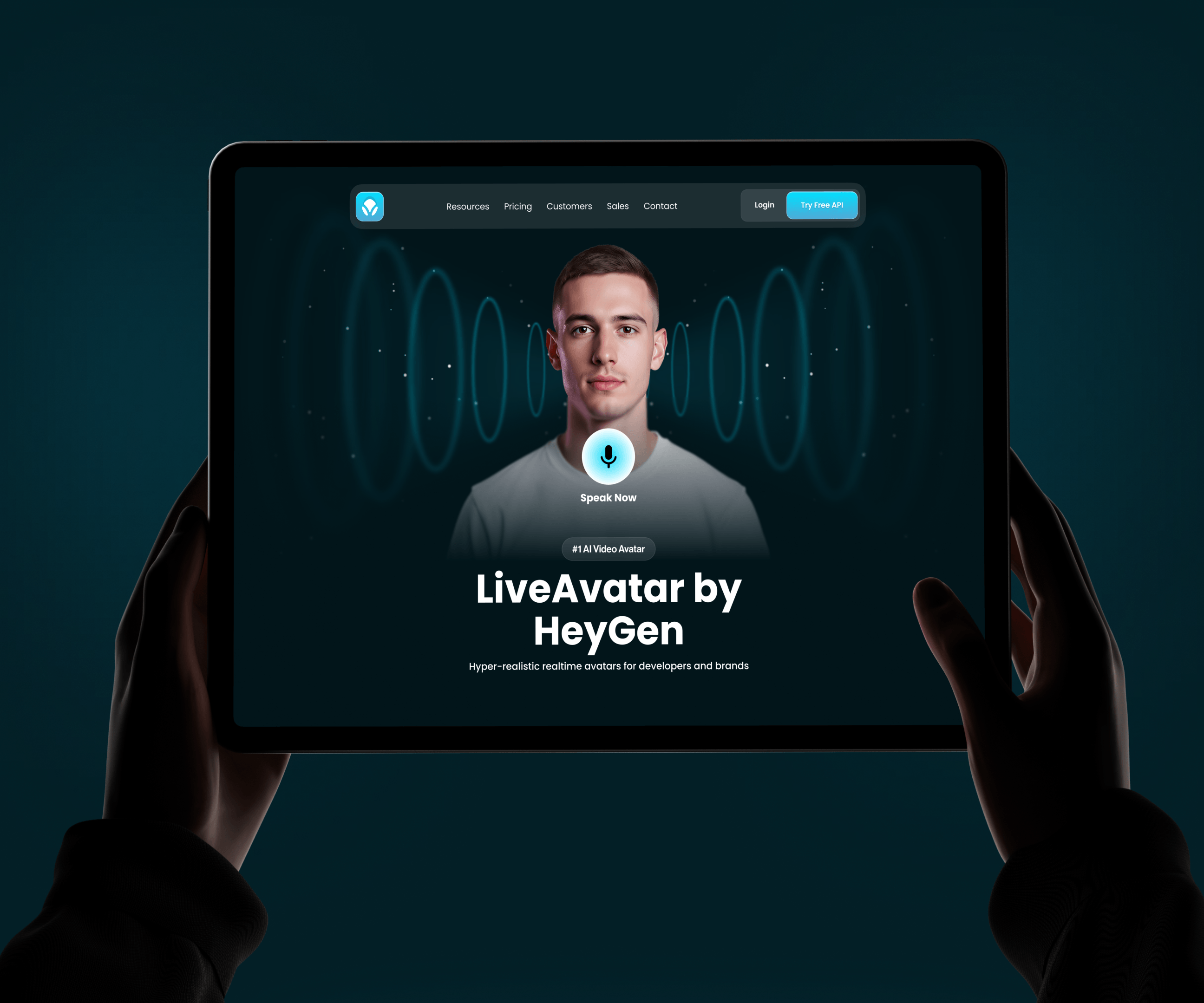
- A hero that plays, not promises: We led with a live avatar and a mic control. Visitors watch it speak before they read a word. The claim proves itself in three seconds.
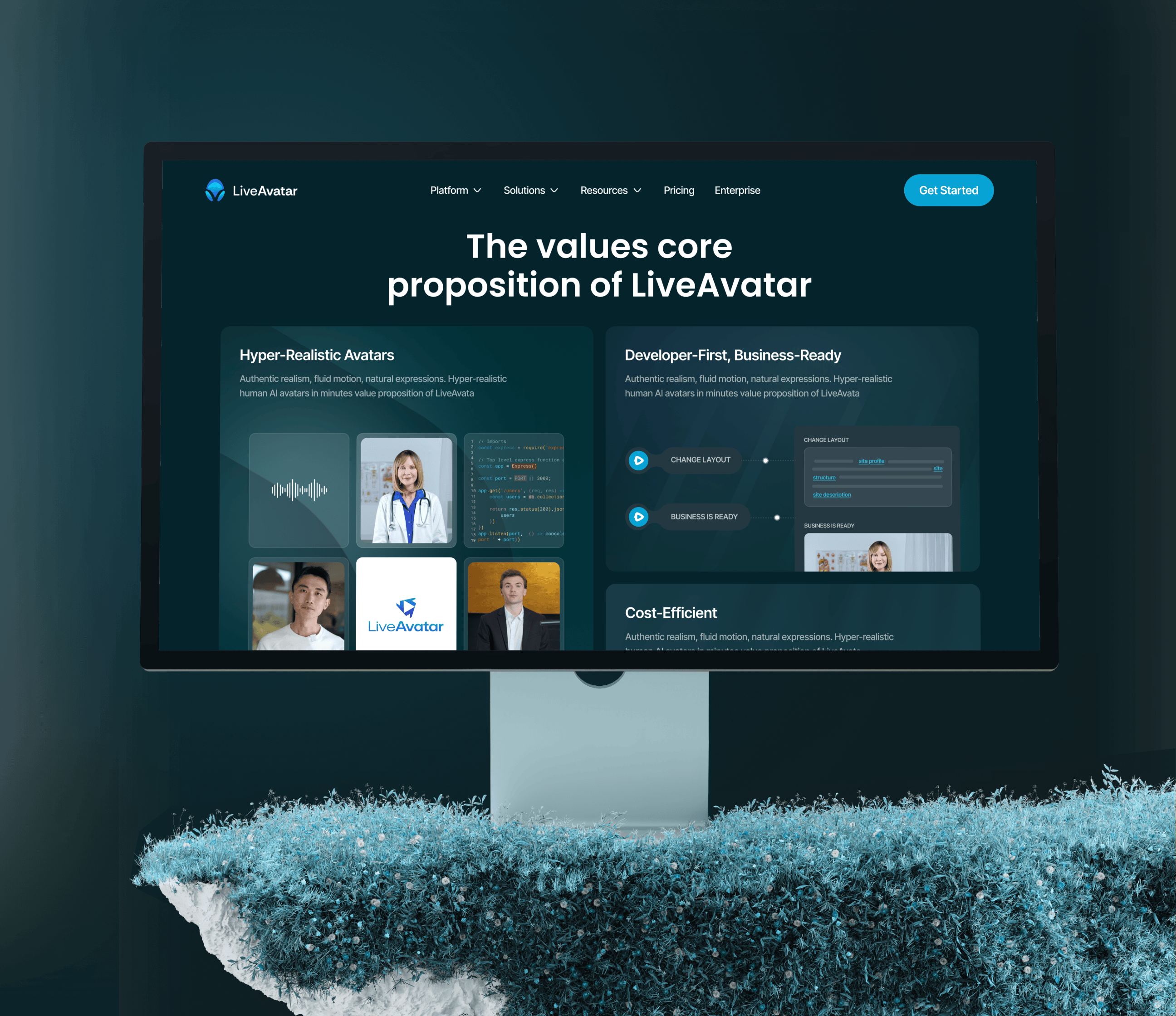
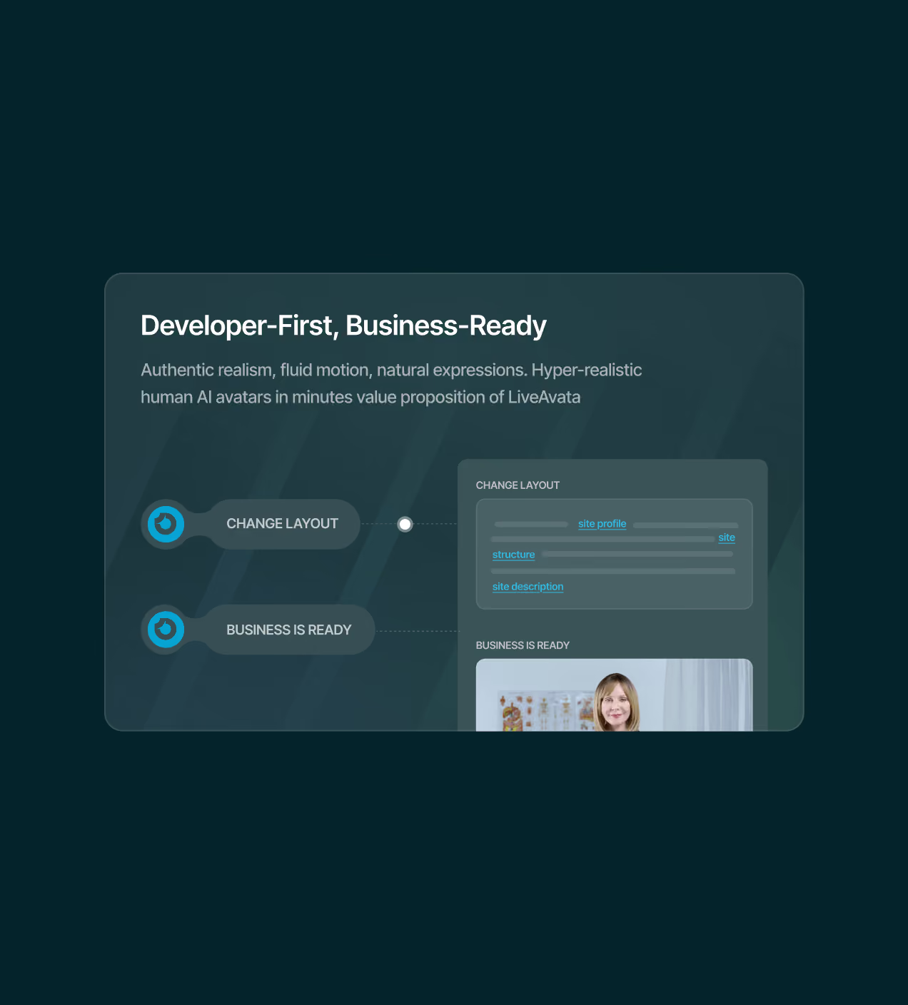
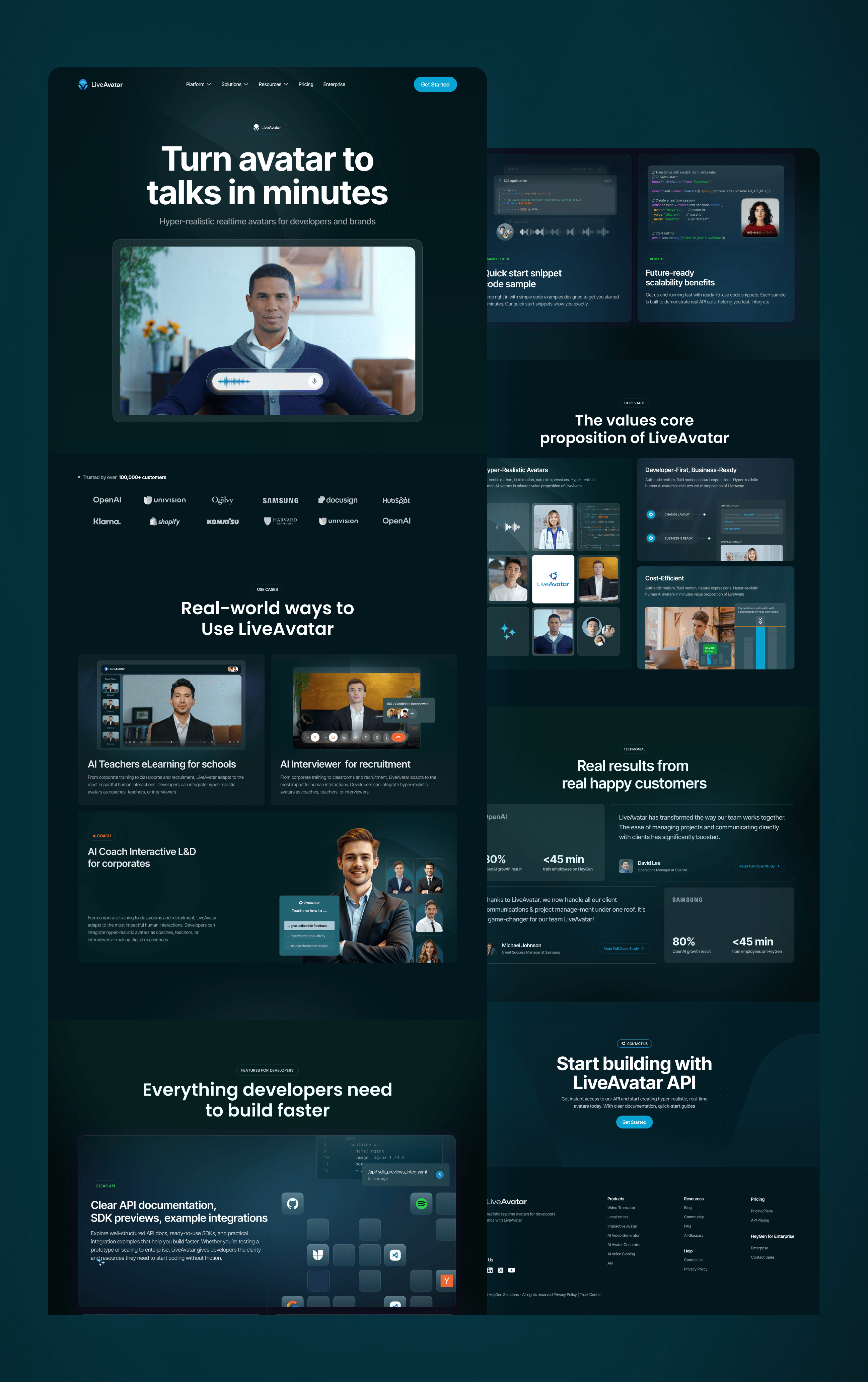
- One page, two readers: Platform for developers. Solutions for business buyers. The page alternates between them, so neither waits through a section meant for someone else.
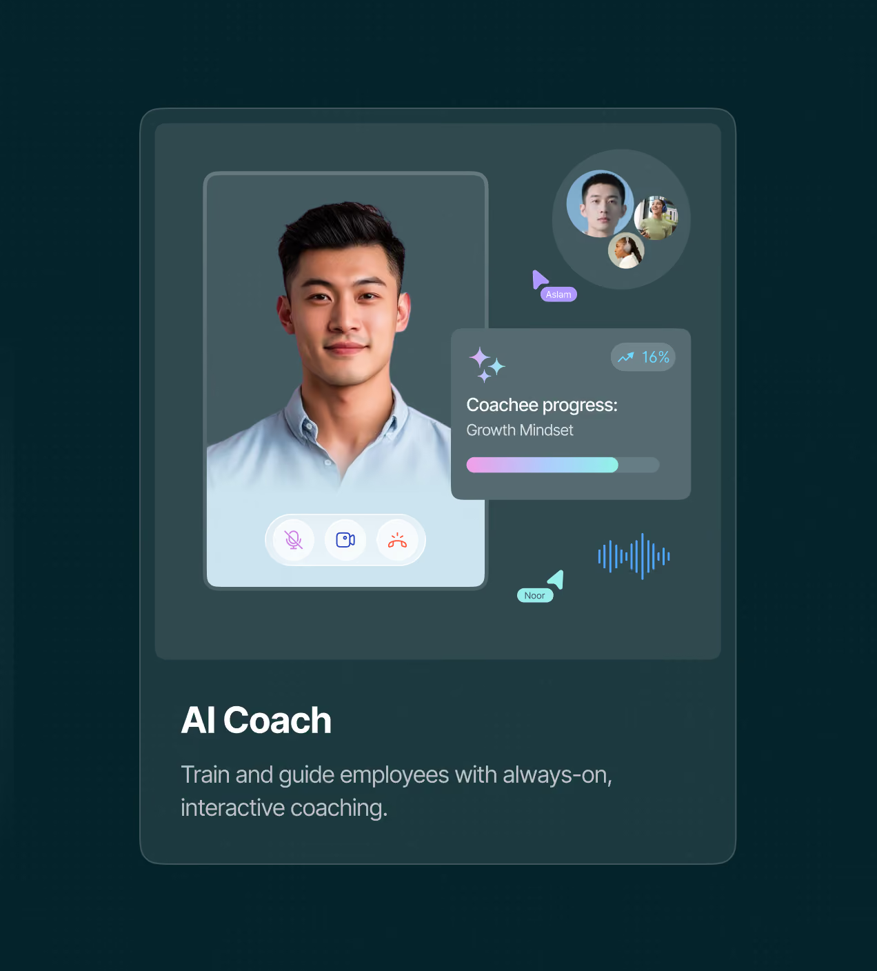
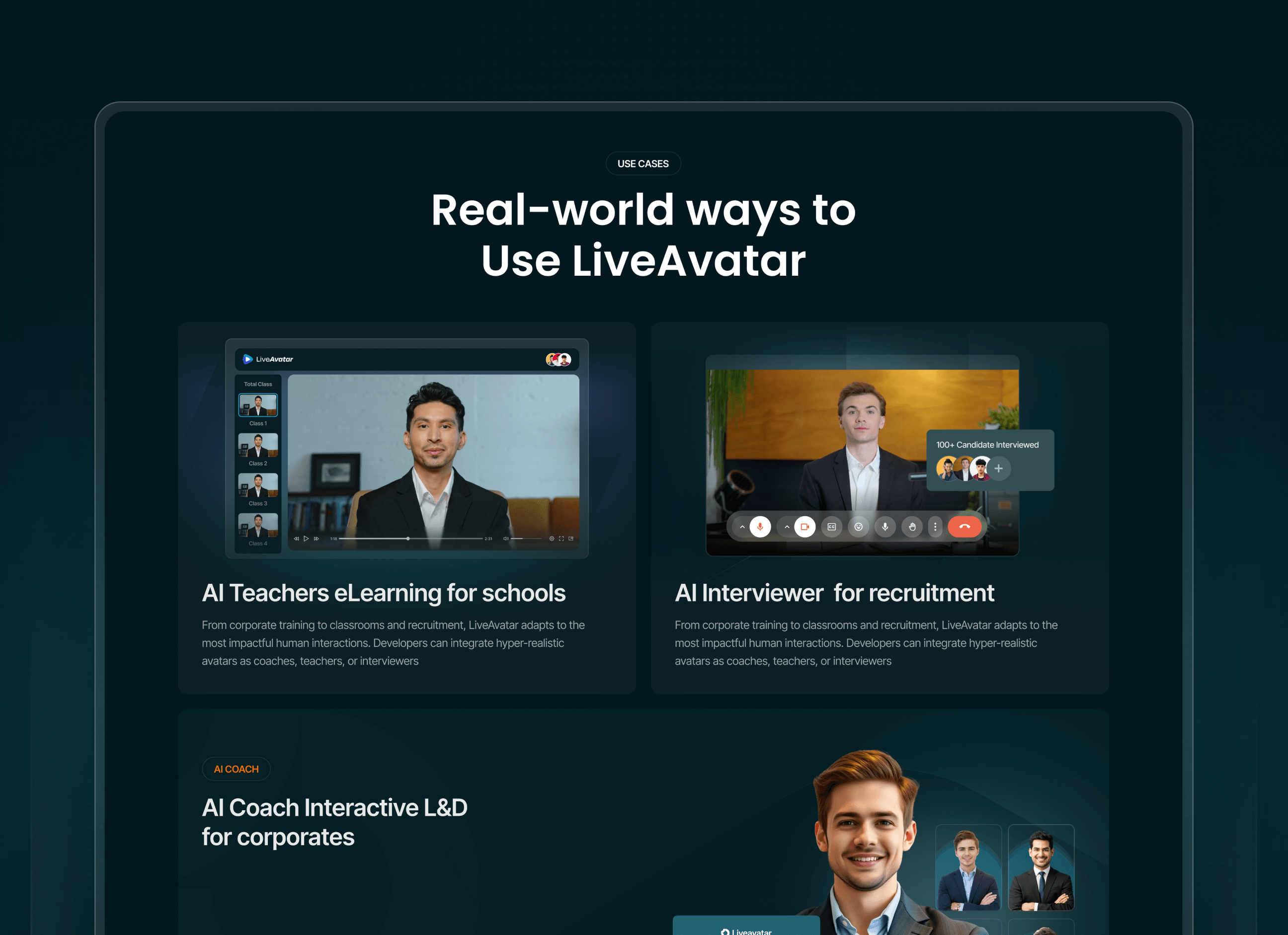
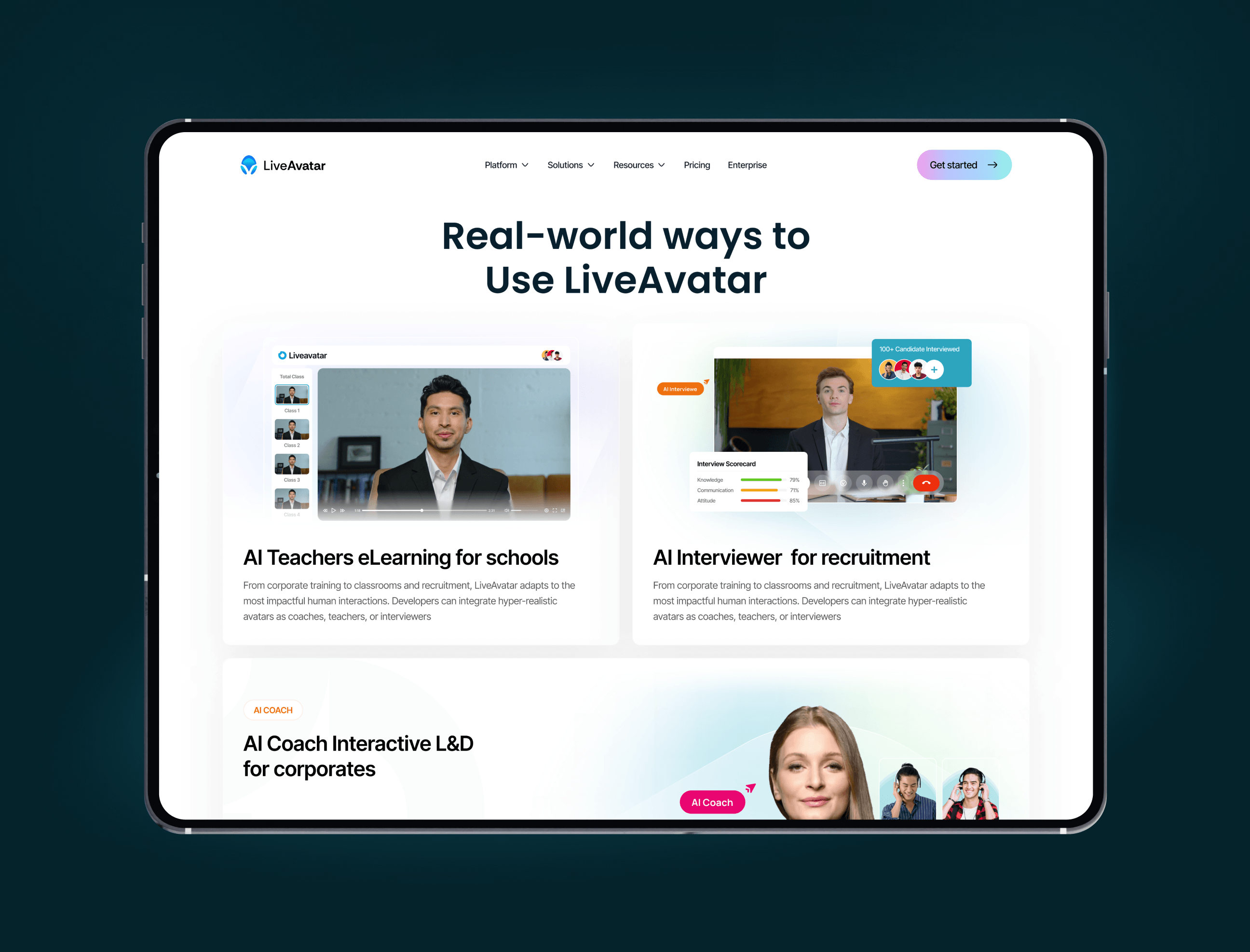
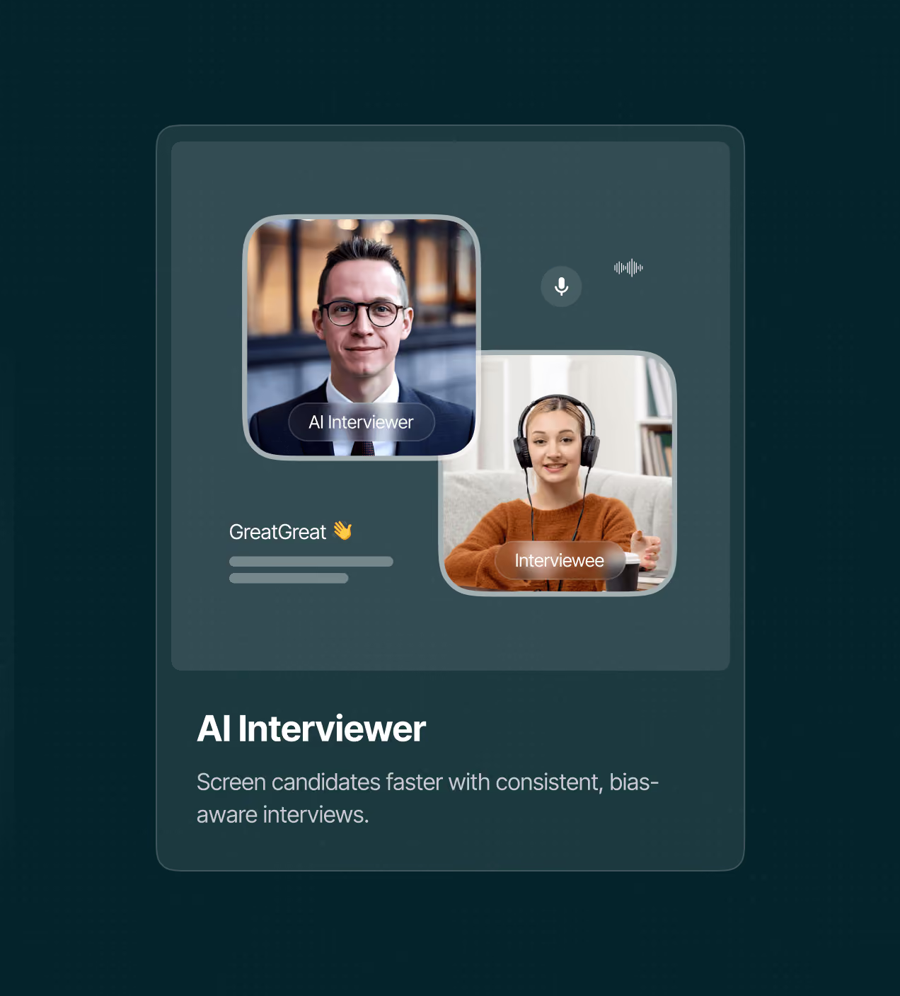
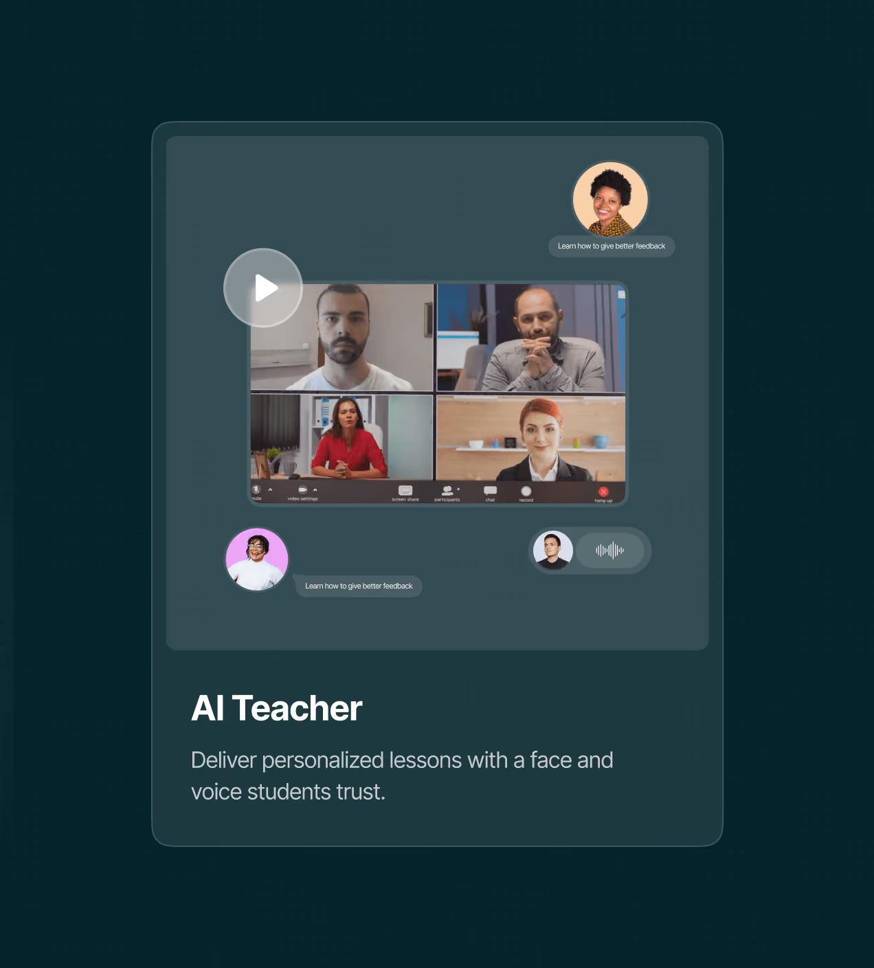
- Real jobs, not features: AI Coach, AI Teacher, AI Interviewer. People recognise their own job faster than a feature list, so they see where LiveAvatar fits.
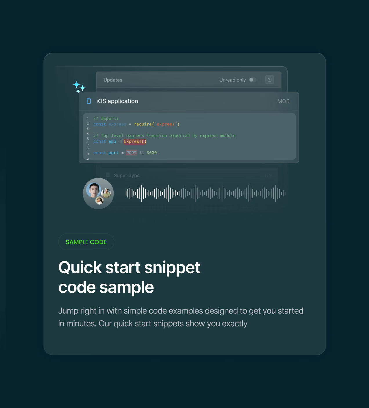
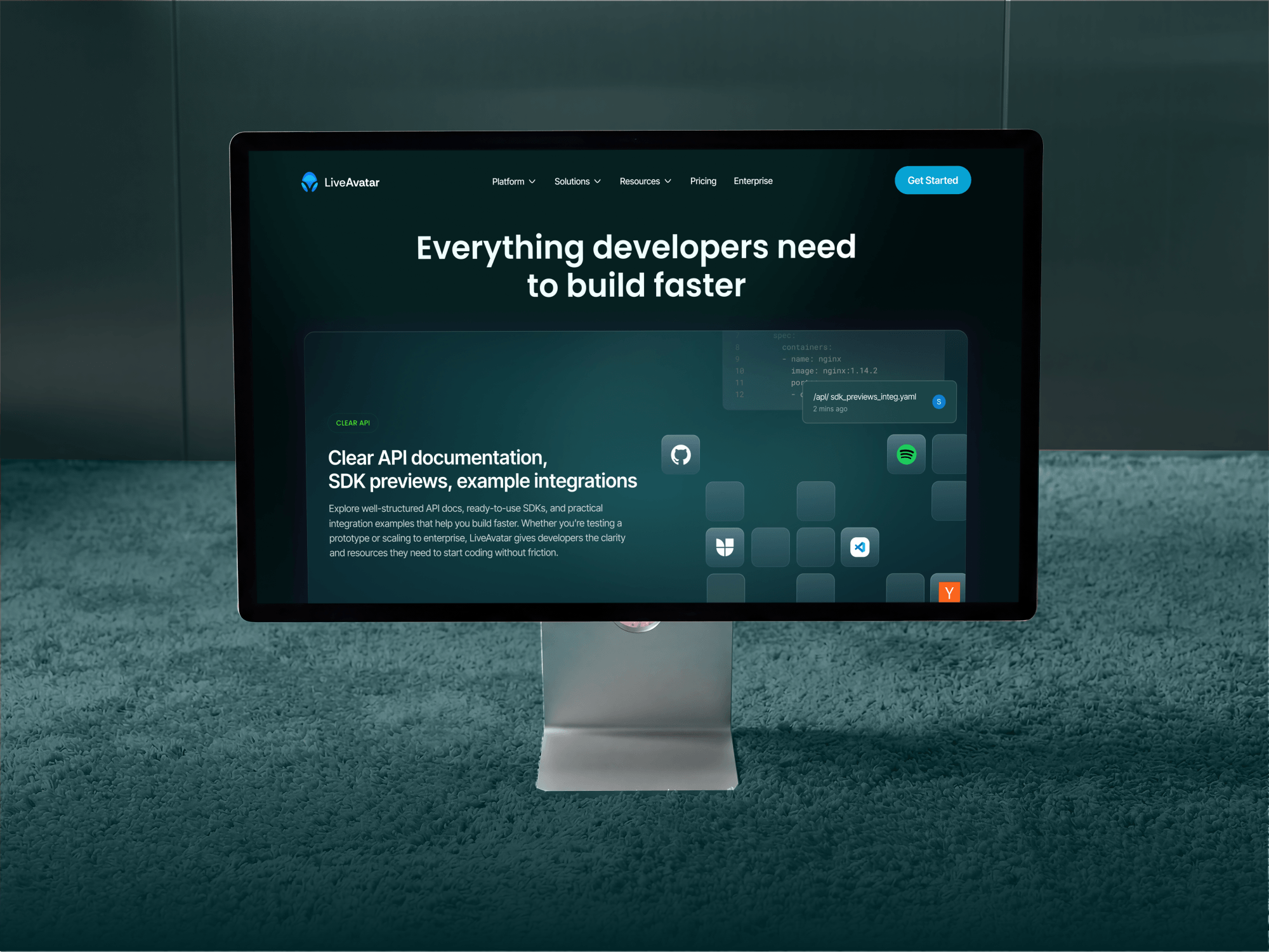
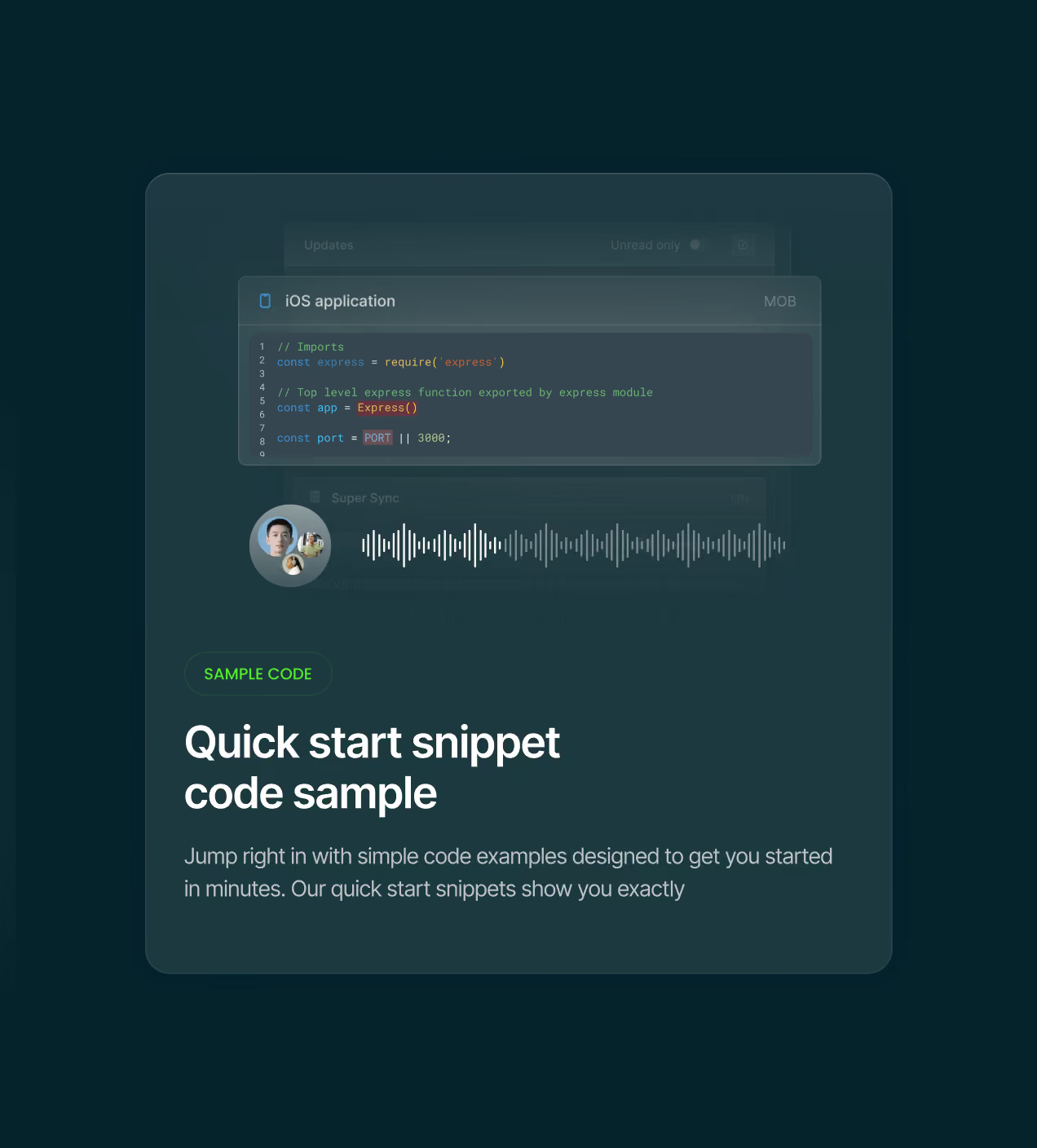
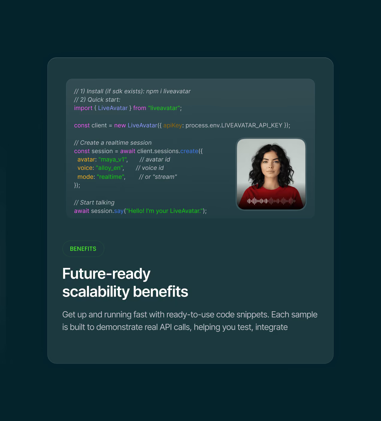
- No gate on the first step: Quick-start code, SDK preview, and docs sit right on the page. Get API Key, no credit card. Developers reach working code in minutes.
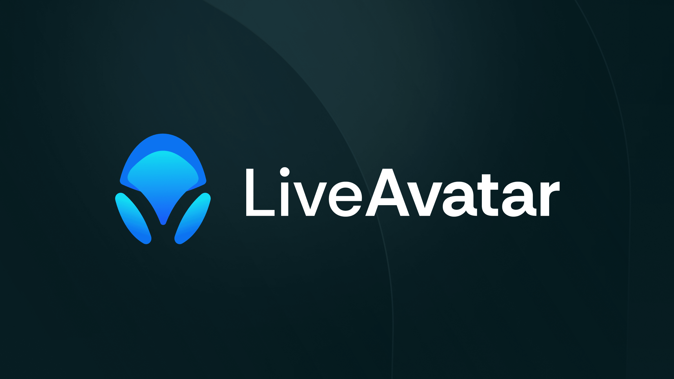
- A mark that survives a logo strip: We tested six concepts against eleven competitor marks at small size. The one we shipped stays sharp beside them.
The UX process behind every Live Avatar screen
We had no brief to work from. So we started with the product itself, tested every assumption on screen, and let each stage settle a decision before the next one began.
We studied the product and the market before drawing a single screen.
We planned how the page should work before deciding how it looks.
We designed the mark and tested it where it would actually live.
We designed every screen and tested the flow end to end.
The system behind every Live Avatar screen
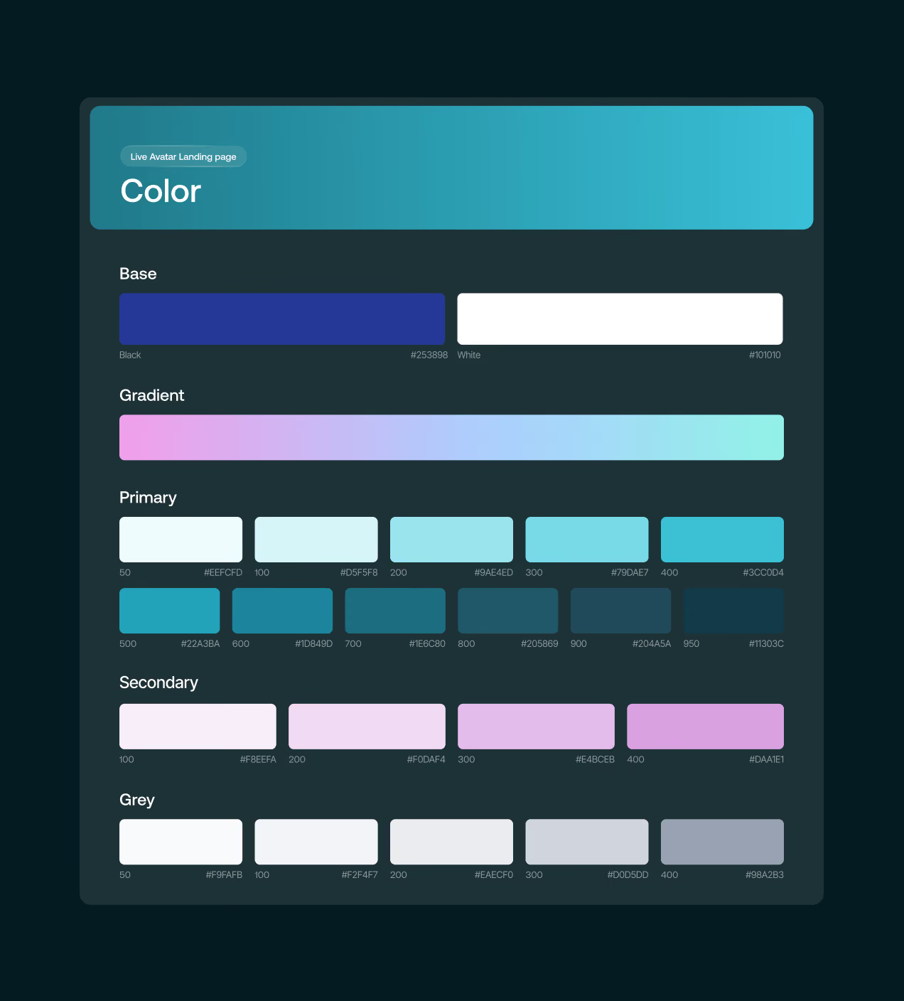
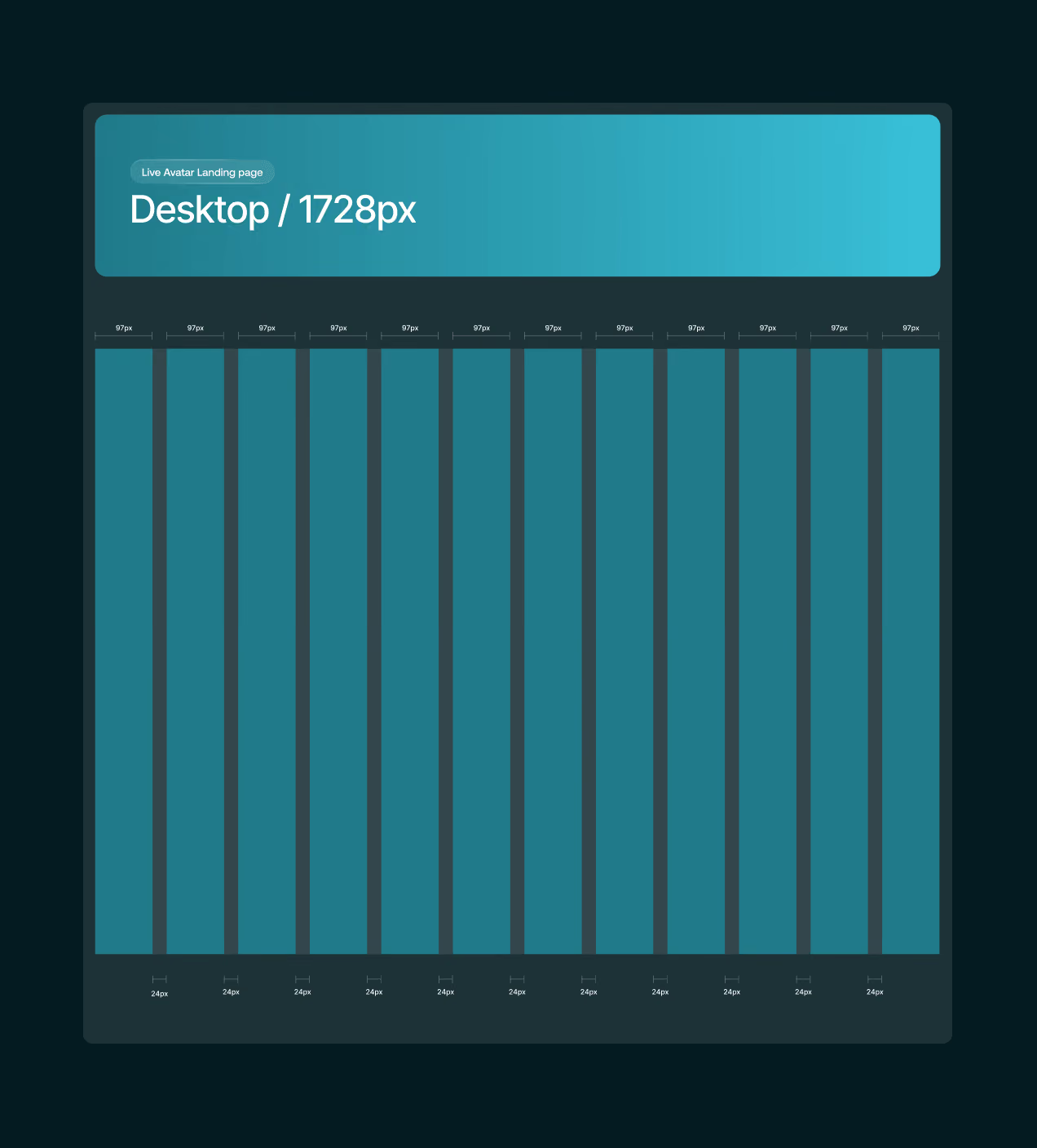
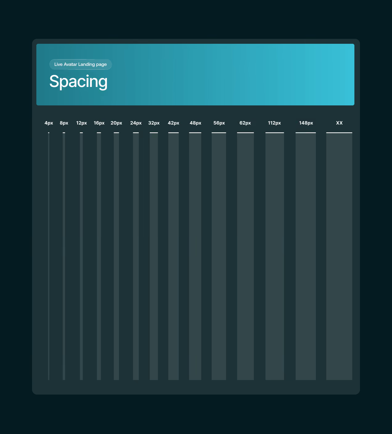
We built the Live Avatar system so nothing has to be decided twice. Colour runs as ramps, not picks, with an eleven-step primary from pale mint to deep teal, a lilac secondary, ten neutrals, and the signature gradient saved as one asset so it never gets mixed by hand.
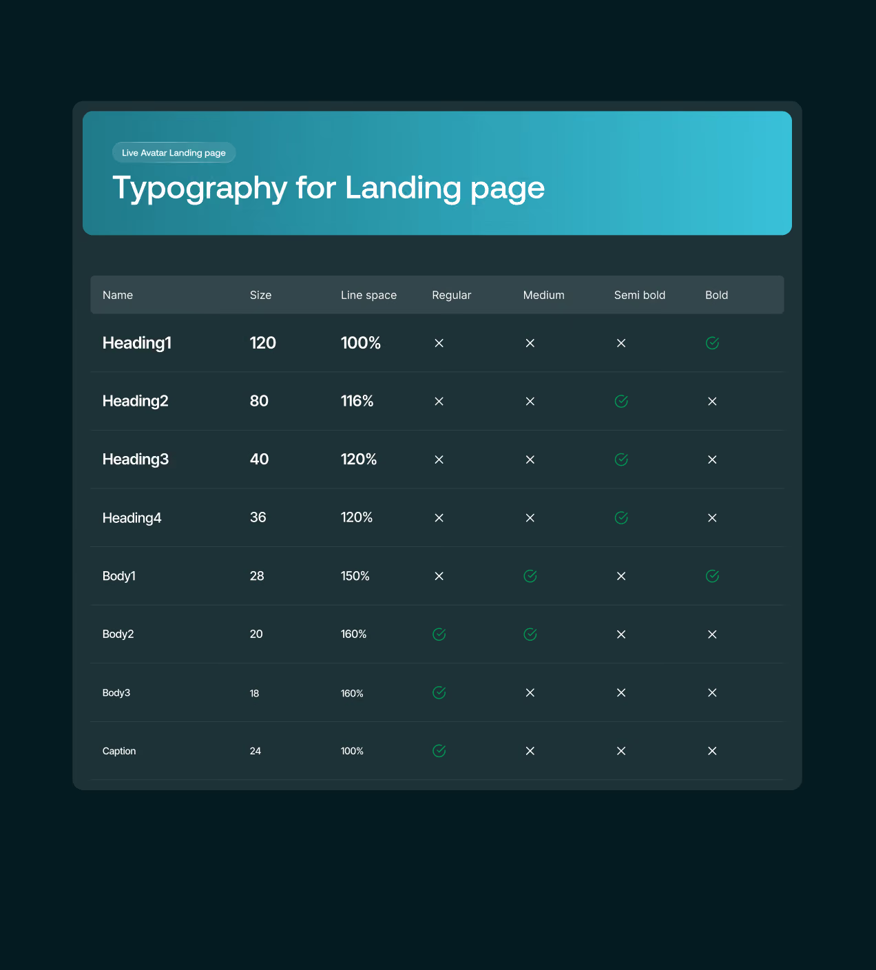
Type is a fixed scale of eight styles, from Heading 1 at 120 down to Body 3 at 18, each with the weights that are allowed and the ones that are not. And that matters because it removes guesswork. A designer opening the file knows which style to use, and a developer reading the spec builds it right the first time.


Brand that feels human, not machine
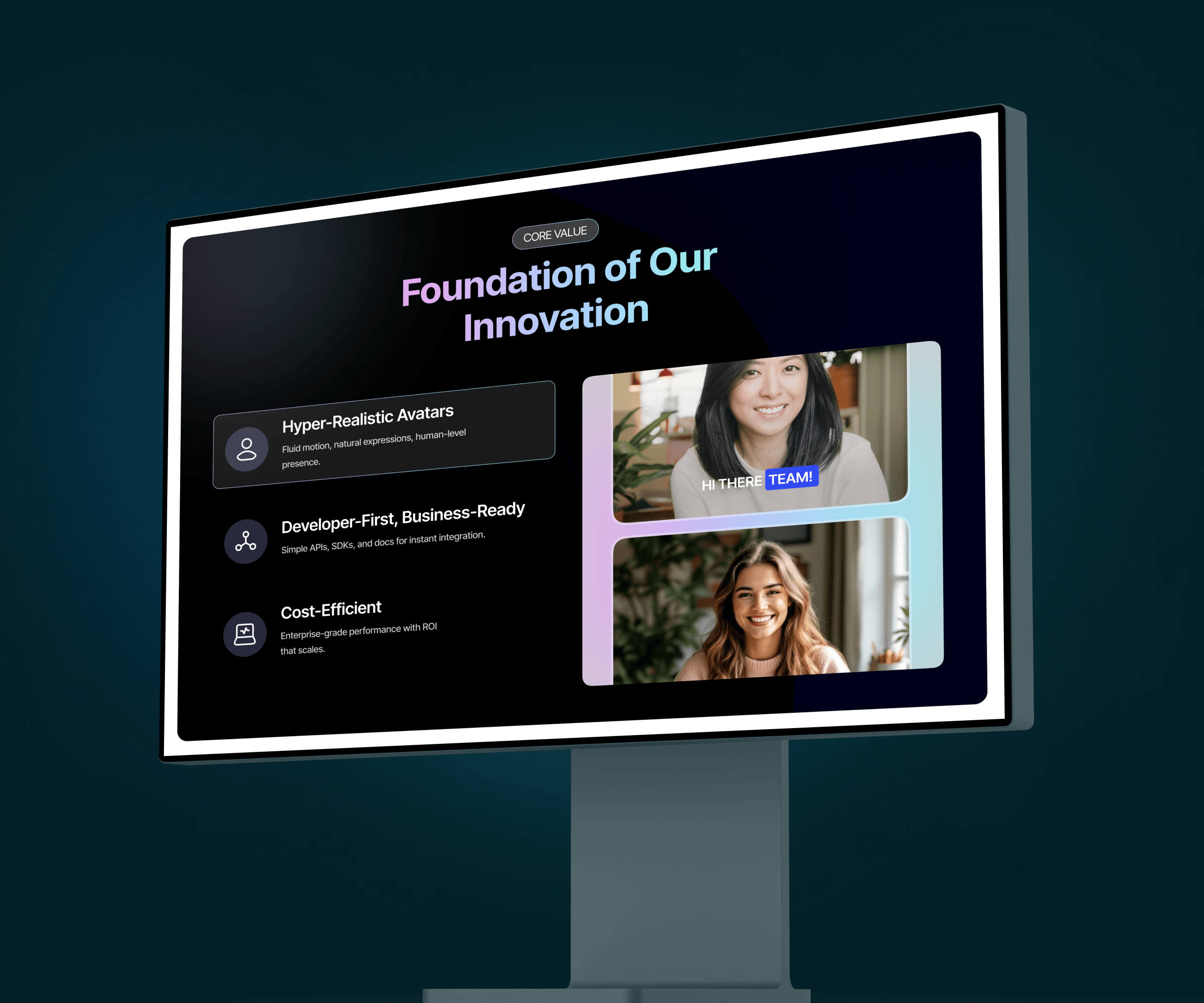
Synthetic humans make people uneasy. So a cold, clinical brand would only have made it worse. We went the other way. The mark is a soft upward form, closer to a face than a logo, and it holds at favicon size where most AI marks blur out. We tested it beside eleven competitor logos before shipping it. Colour follows the same thinking, leading with a gradient of pink, lavender and mint instead of the usual black and blue. It sits behind the avatar frames so faces look warm, not rendered.
The landing page puts it to work. The hero keeps everything quiet around the avatar so the face holds attention. Then the page shifts on purpose, moving to dark surfaces and code windows so developers feel at home. Every section looks different. But nothing looks borrowed.
Have a Project? Let’s talk!







.png)



Francisco, CA 94105, United States

































Your competitors are converting 3x more visitors. Not because they have a better product, but because they have a better design.






.avif)