8 UI Design Trends in 2026 (with real examples)


What is driving UI design in 2026?
The short answer: people got tired of noise.
For years, "modern" meant more. More motion. More gradients. More glow. Interfaces tried to impress you the second they loaded. And for a while, that worked. A flashy screen felt like proof that a company was serious.
But something shifted. Users began to read what was on the screen, but it became a stress, rather than a skill. Error rates increased with the size of homepages. Therefore, designers started to simplify things out, not for the sake of simplicity, but because simplicity just worked.
Meanwhile, Apple and Google were moving in opposite directions, the former with its first iOS gaming update and the latter with its new Android Oreo update. Apple took a deep breath and remained calm and glass. Google went all out with the color and bounce.
It's a tension that defines 2026, and it's found in each of the trends below. These are the eight that matter, with actual products that you can view today.
1. Liquid Glass: Apple's new design language
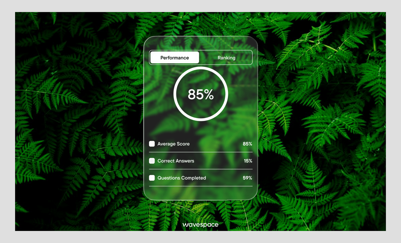
Liquid Glass is Apple's biggest visual change in more than a decade, and it is already live on real devices in iOS 26.
So what is it? Think of a material that acts like glass and water at once. Apple's Human Interface Guidelines say the material bends and shapes light, and it moves like a light liquid that responds to your touch. Buttons, menus, and panels appear above your content and reveal it.
The bigger change is about hierarchy. For a decade, designers showed importance with size and color. The biggest, brightest thing won your eye. Liquid Glass shifts that. Now importance comes through depth, blur, and how much light passes through a layer.
But there is a catch worth naming.
The clear, see-through panels can cause difficulty to read, and that is a real challenge for low vision. Apple is aware of this, and the system allows users to dial the effect down. Good teams plan for a good look for the glass, and a simple high-contrast alternative. A beautiful screen that some people can't read isn't a finished screen.
2. Material 3 Expressive: Google's bold answer
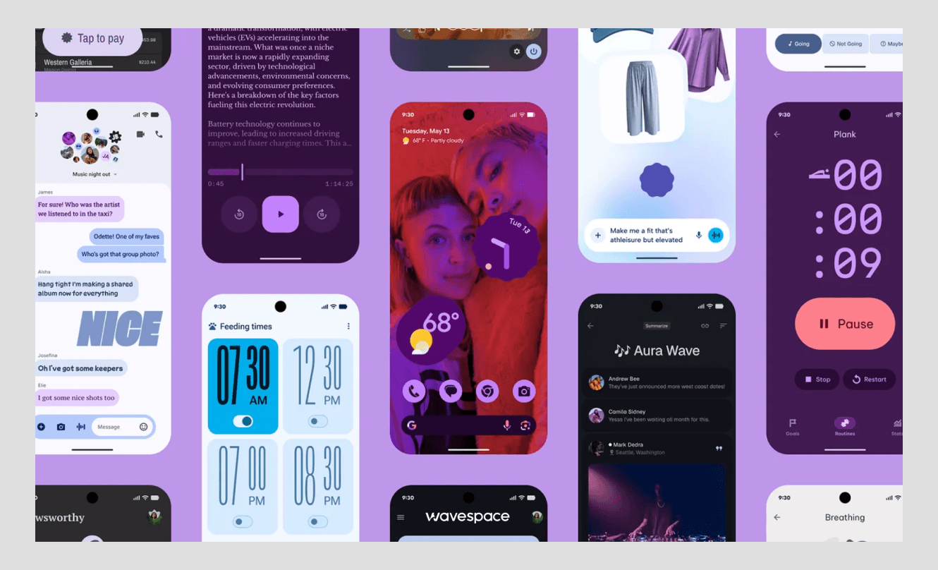
When Apple whispers, Google shouts, and it does, on purpose. Google's newest design language, called Material 3 Expressive, is the clearest opposition to Liquid Glass. According to Google's official blog, the update makes phones and watches feel more fluid, personal, and glanceable.
It's available on Pixel devices and now extends to core apps like Gmail, Chrome, Google Docs, and Keep. When Apple goes down, Google goes personal. Brighter colors. New shapes. A bounce effect that brings life to the screen. If you swipe away a notification, the others respond to the drag, and a little haptic buzz lets you know that you've done it.
And this was not a guess. Google ran the system with over 18,000 people. They discovered that a more expressive and bolder layout was able to help users locate important buttons four times faster than the original design. So the color and bounce are not just for show. They guide the eye and speed people up.
For founders, the lesson is simple. Expression, done with data behind it, can be a real usability win, not just decoration.
3. AI-native interface patterns
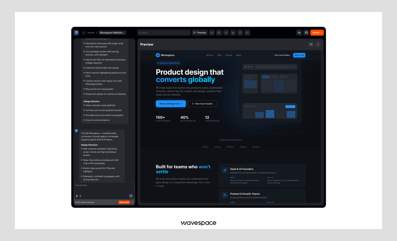
A new rulebook is emerging in 2026, but it is based on many old rules that were broken by AI products.
Traditional screens are fixed. You tap a button, and you know exactly what happens. But AI is different. It thinks, it streams answers word by word, and sometimes it gets things wrong. So the interface has to handle change, doubt, and trust in ways a normal app never did.
That is what "AI-native" design means. It is the set of patterns built for products like Perplexity, Cursor, and v0. You see it in streaming text that appears as the model works.
You see it in prompt-first layouts, where a text box sits at the center instead of a menu. And you see it in trust cues, like citations and confidence signals that tell you where an answer came from.
Because here is the truth about AI tools. People do not trust what they cannot check. So the best AI interfaces show their work. They make it easy to edit, undo, and verify.
That's the secret that makes a first-time user into a daily one, and more than any animation. This is the design work we focus on most at Wavespace, since so many of our clients build AI-first products.
4. Bento grids
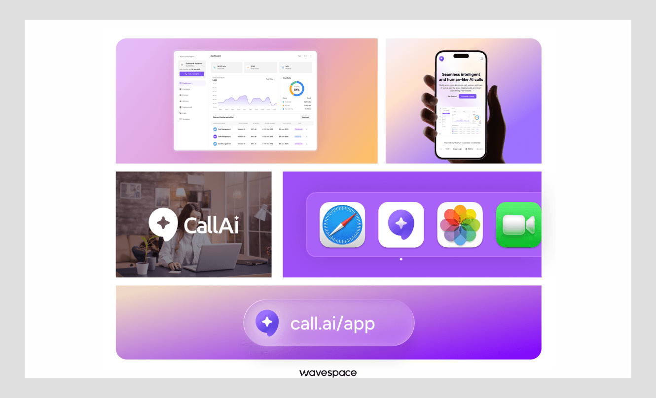
Bento grids get their name from Japanese lunch boxes, and when you start seeing them, you can't stop.
The idea is simple. Instead of one long column, you break a screen into neat blocks of different sizes. A big block for the main point. Smaller blocks around it for supporting details. Everything sits in a tidy, scannable grid.
It was a pattern that Apple introduced on its keynote and product pages, and it took off. You'll find bento layouts on dashboards, pricing pages, and portfolios all over.
And there is a good reason for that. The grid provides an order of nature. Larger cards draw your eye in first; smaller cards complete the story. To fit a lot of information into a single screen without it feeling like too much.
Another reason for the trend was the tools following suit. These layouts can be easily built cleanly with modern CSS, which supports grid and subgrid. No more hacks or messy code!
But a word of caution. A bento grid works when the sizes mean something. If every block is the same weight, you lose the hierarchy, and it just looks like a wall of boxes.
5. Motion-physics animation
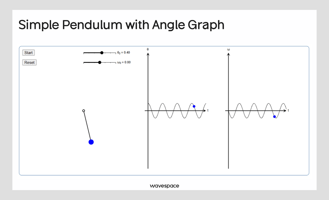
In 2026, people ceased following a stopwatch and began to follow the laws of the real world.
For years, animation ran on fixed timing. An element moved from point A to point B over, say, 300 milliseconds, on a set curve. It looked fine, but it felt a little robotic. Every motion was the same, every time. Physics-based motion changes that.
Now animation behaves like real objects with weight and bounce. Press a button, and it gently squishes, springs back, and settles, just like a real thing would. Google baked this into Material 3 Expressive, and Apple's tools lean the same way.
Designers also follow the shift in the tools they use. Libraries such as Motion and React Spring are based on springs, weight, and momentum, rather than on fixed time intervals. As per LogRocket's 2026 review, Motion has millions of downloads per week; it's quite common these days.
Even with good movement, though, there's still a role for good. It should inform, direct, or ensure an action. There is no point in doing something merely for the sake of movement. The rule is clear: each movement must make its mark.
6. Glassmorphism 2.0
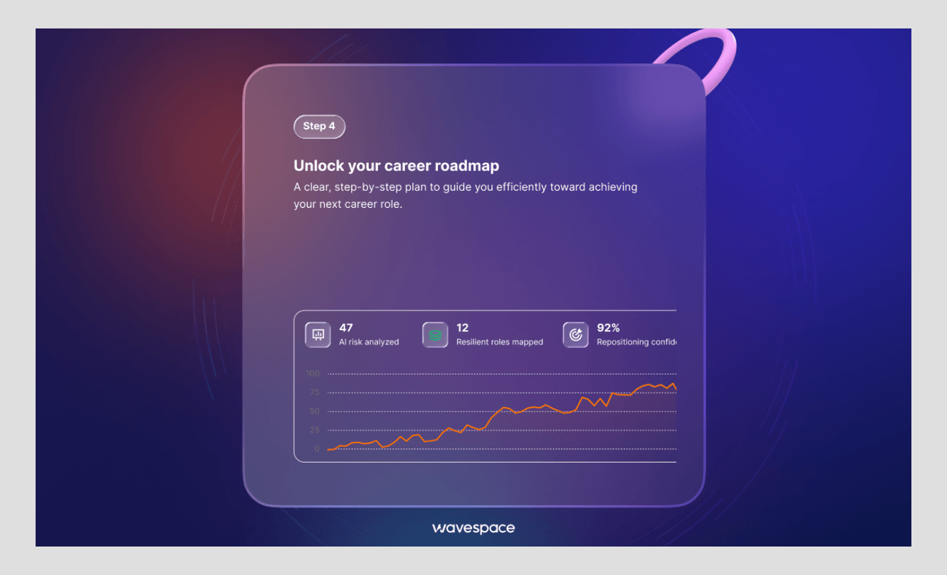
Glassmorphism came back, but it grew up first.
You know the look. Frosted, see-through panels that sit over a background like fogged glass. The first wave, a few years ago, was pretty but often hard to read. Text got lost. Contrast suffered. It was style over function.
The 2026 version is smarter. Designers now use frosted panels with purpose, mostly to create depth and separate layers. A common pattern pairs a dark base screen with a lighter, translucent panel floating on top. The blur does real work here. It shows what sits in front and what sits behind, without adding a hard border or an extra color.
This is also where the "depth as hierarchy" idea lives. A soft shadow and a touch of blur tell you a panel is important and up front. A flatter surface tells you something sits in the background. Your eye reads the order before you think about it.
The key is restraint and contrast. Keep text readable, aim for strong contrast ratios, and use the effect where it helps, like modals, side panels, and AI output areas. Because depth should serve clarity, not fight it.
7. Structural UI: the pushback against sameness
At some point, every software product started to look the same. Same soft pastels. Same friendly rounded font. Same pill-shaped buttons. Structural UI is the rebellion against that.
This look is raw, honest, and confident. It trades soft gradients for hard edges. It swaps the friendly sans-serif for bold serif headlines and clean, ledger-style numbers, the kind you might see in a financial report. The whole feel says "we are serious and we know it," instead of "please like us."
You can see it in real products. Vercel set the tone with its stark black-and-white, developer-first style. Gumroad went bold with heavy borders and loud color. And Are.na wins fans by being proudly dense and plain. Some brands push it even further into ASCII art, like Pencil.dev, which uses text characters to draw a classical figure on its homepage.
But here is the honest limit. A 2026 usability study found that disciplined, clear versions of this style tested fine. The chaotic, anything-goes versions did not. On information-heavy pages, task success dropped as low as 8 to 10 percent. People just gave up. So bold works, but only with a clear grid underneath. Structure first, attitude second.
8. Calm design: the end of visual theatrics
The last trend may be the most significant; it is the feeling that underlies the others.
Call it calm design, or quiet UI. The idea is to respect the user's attention as the scarcest thing they have. That means more white space, fewer choices per screen, and smart defaults that make the easy path obvious. Motion is used to explain, not to dazzle. Color is used to point, not to shout.
Nowhere is this clearer than in AI products. In the first AI wave, screens were loud. Glowing orbs. Sparkles. Constant animation to remind you the machine was "thinking."
By 2026, people found that exhausting. As one design audit put it, the spinning AI sphere became the new flash intro, a dated distraction. Users stopped wanting to watch the AI work. They just wanted the work done.
And there is a practical rule behind the vibe. When it comes to screen design, sometimes a lighter, less cluttered screen is better than a screen that displays more features at the start. Because calm is not empty. Calm is focused. It signals that you value the user's time, and that quiet confidence is what earns trust.
How to actually use these trends
Here is the truth. You do not need all eight. Chasing every trend is how products end up cluttered and confused. The real skill is choosing. So start with your users and your product, not with a trend list.
Ask a few simple questions. Do your users want calm focus or playful energy? Does your product need to feel trustworthy and serious, or warm and friendly? Are you building an AI tool that needs to show its work? The answers point you to the right two or three trends and let you ignore the rest.
That choice is exactly where a good design partner earns their keep. Because knowing which trends fit, and which to skip, takes experience across many products, not just a Dribbble feed.
We have shipped 550+ projects doing this kind of work, and the pattern holds every time: the products that win are not the ones with the most trends. They are the ones that picked the right few and did them well.
If you're considering a redesign and need a straightforward and honest answer to which of these are a good match for your product, schedule a call with us. We will inform you what to use, what to avoid, and why.
Frequently asked questions about UI design trends

The biggest trend is the split between Apple's Liquid Glass, which favors quiet, glass-like restraint, and Google's Material 3 Expressive, which favors bold color and springy motion. Together they set the tone for the whole year.
Glassmorphism is a general frosted-glass style anyone can use. Liquid Glass is Apple's design language for its operating system iOS 26. It brings live behaviours to the table that glassmorphism cannot: light bending, motion.
Yes. Bento grids are now a standard pattern for dashboards, landing pages, and portfolios. They make it easy to present dense information in a clean, easy-to-scan manner, and modern CSS makes them easy to construct.
AI-native design is a set of patterns built for AI products. It features streaming answers, prompt-first layouts, and trust features such as citations. The aim is to make users understand, verify, and believe the AI's output.
No, but it changed. The new version is "calm design. It isn't about showing nothing, it's about making fewer choices, cutting out the clutter, and directing the user gently so that the screens aren't empty.

More related blog

Have a Project? Let’s talk!







.png)



Francisco, CA 94105, United States

















.avif)