Assessing the 8 usability principles for AI interfaces



Usability principles for AI interfaces are the AI UX design rules that decide whether people trust an AI feature or turn it off. They are the classic usability heuristics: visibility, control, and error recovery. Rewritten for systems that guess, change their answers, and hide their reasoning.
Most articles on this topic touch only the surface and stop at describing those principles. I made sure this one does more than the title promises. In this article, I will help you assess your interface against each AI usability principle.
I will show you a self-audit scorecard you can run on your own product in ten minutes. If you only want the principles, scroll down below. If you want to know how your interface scores, you can find that too.
What is an AI interface?
An AI interface is the visual part of an AI product or app that lets people use the AI. The famous ChatGPT chatbot interface is a great example of an AI interface. Simple yet gets the most work done with a few clicks.
An AI interface determines how you use AI: ask questions, get answers, or give tasks to complete.
In a sense, most AI (chatbots, voice assistants, or image/video generation) has almost the same type of interface nowadays. Either you type a prompt, speak to give a command, or click a button to perform a task.
A great AI interface keeps everything simple so that all types of users, from illiterate to PhD holders, can easily understand the interface without a tutorial tour. This is the reason the tech industry has adopted big buttons, easy instructions, and fast responses to make the AI product experience better.

Why AI interfaces need a new usability framework
To understand why AI is a special case in UX design, we need to understand traditional usability. The heuristics of traditional usability were established for software that behaves like an obedient tool. Back then, you had full control: you clicked a button, the same function logic executed, and the same thing happened every time.
How every AI is different. By nature, AI works independently. These three things about AI break that assumption. Each one changes what you need to assess.
AI is non-deterministic: Depending on the model version, context, and data, the same input or prompt can give different results every time. On the other hand, classic usability assumes and wants the system to behave and give the same result every time. Despite that, AI doesn't. Therefore, "consistency" doesn’t mean identical output; for AI, it means consistent behavior and tone.
AI is opaque: AI is still a mystery; all the decisions happen inside a black box. Even the makers don’t have the full picture; they have only reasoning. A normal user can't trace why they got an output; as a result, transparency stops being a nice-to-have and becomes the win factor.
AI shifts cognitive load rather than removing it: the old UX reduced memory demands. AI often adds new ones: users now have to phrase prompts, judge ambiguous output, and decide whether to believe it. Without guardrails, examples, defaults, and previews, you leave people alone with a system they don't fully understand.
So assessing an AI interface isn't about checking whether the layout is polished. It's about checking whether people can see what the AI is doing, use it, and believe it.
AI usability vs. Traditional usability: What’s the difference?
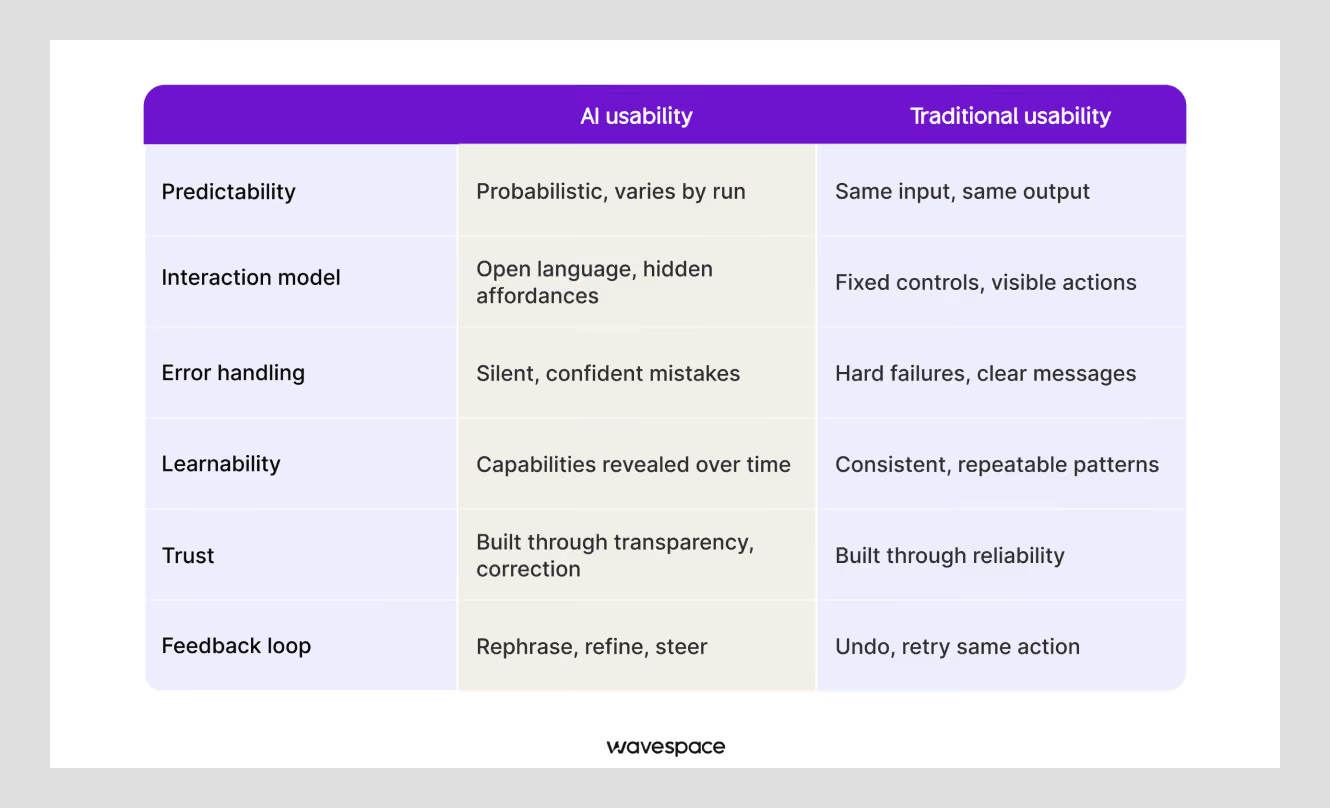
Traditional usability measures whether people can predict and control what a fixed interface will do. AI usability measures whether people can predict, trust in, and correct what a probabilistic system does. Because the same input can now produce a different output every time.
Nielsen's heuristics assumed a stable system: click the same button twice, get the same result.
AI interfaces break that assumption at the root, so the same principles need new definitions, not new rules.
How to assess an AI interface

Before learning the AI usability principles, you should learn the framework. Here's the framework that ties them together.
For each of the eight principles, score it against three lenses:
- Clarity: Can users tell what the AI is doing?
- Control: Can users navigate, undo, or override it?
- Trust: Do users have a reason to believe the output?
Score each lens 0 (absent), 1 (partial), or 2 (done well). Eight principles × three lenses gives a maximum of 48.
We'll come back to what your total means, and there's an interactive scorecard at the end. Keep the three in mind. Most failing AI interfaces are strong on one and empty on the others.
The 8 usability principles for AI interfaces
Each principle below follows the same pattern: what it means, what changes once AI is involved, what good looks like. These are the questions to assess against your AI product, and a red flag equals broken, meaning it needs polishing.
1. Visibility of AI status and confidence
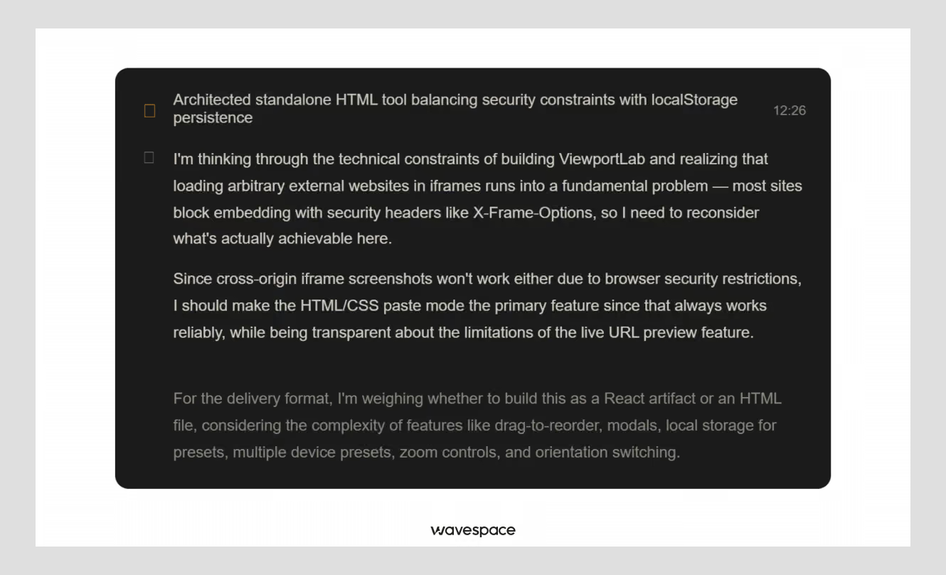
What it means: Users should always know when the AI is working (thinking), what stage it's at (searching, processing), and whether it succeeded.
What changes with AI: A spinner is no longer enough. Because AI output can be wrong and can make mistakes while acting confident, status now includes confidence. Signaling how sure the system is, not just that it finished. This is the piece of information almost every AI startup skips while designing their AI product.
What good looks like: ChatGPT streams its answer token by token so you can see it working and stop it early. Grammarly underlines in real time and color-codes suggestions. Good systems also clarify, "I'm not certain, but…" instead of stating made-up things as fact.
Assess yourself:
- Is the processing state (thinking/done/failed) always visible?
- Can users interrupt or cancel a running action?
- Is the AI's confidence or uncertainty ever shown to the user?
Red flag: The interface presents a low-confidence guess with the same visual certainty as a verified fact.
2. User control and reversibility
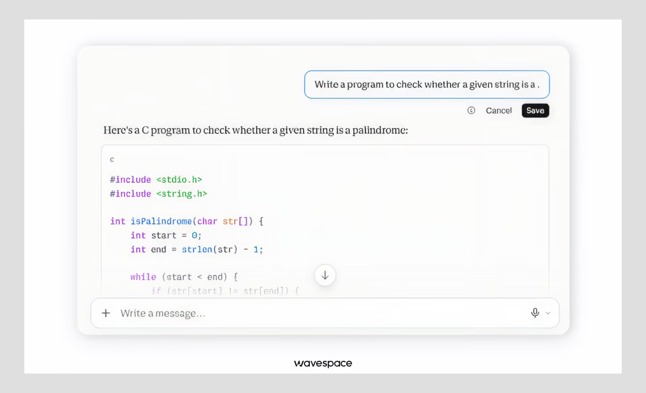
What it means: Users must have the control to edit, undo, override, or opt out of things AI produces.
What changes with AI: Over-automation without control makes users feel powerless. AI acts for the user without any input from them. AI product control has to be designed in at every input and output.
What good looks like: GitHub Copilot and Google Colab suggest code inline and always let the developer accept, modify, or reject it. The human has the final say. Every AI writing tool worth using lets you rewrite or discard what it generated.
Assess yourself:
- Is AI-generated content clearly labeled as AI-generated (suggested)?
- Can users undo, edit, or reject any AI action?
- Can users turn AI assistance off entirely if they like?
Red flag: The AI takes all the action. Sends, saves, or changes it before the user can review it. This can lead to disaster.
3. Match to the user's mental model
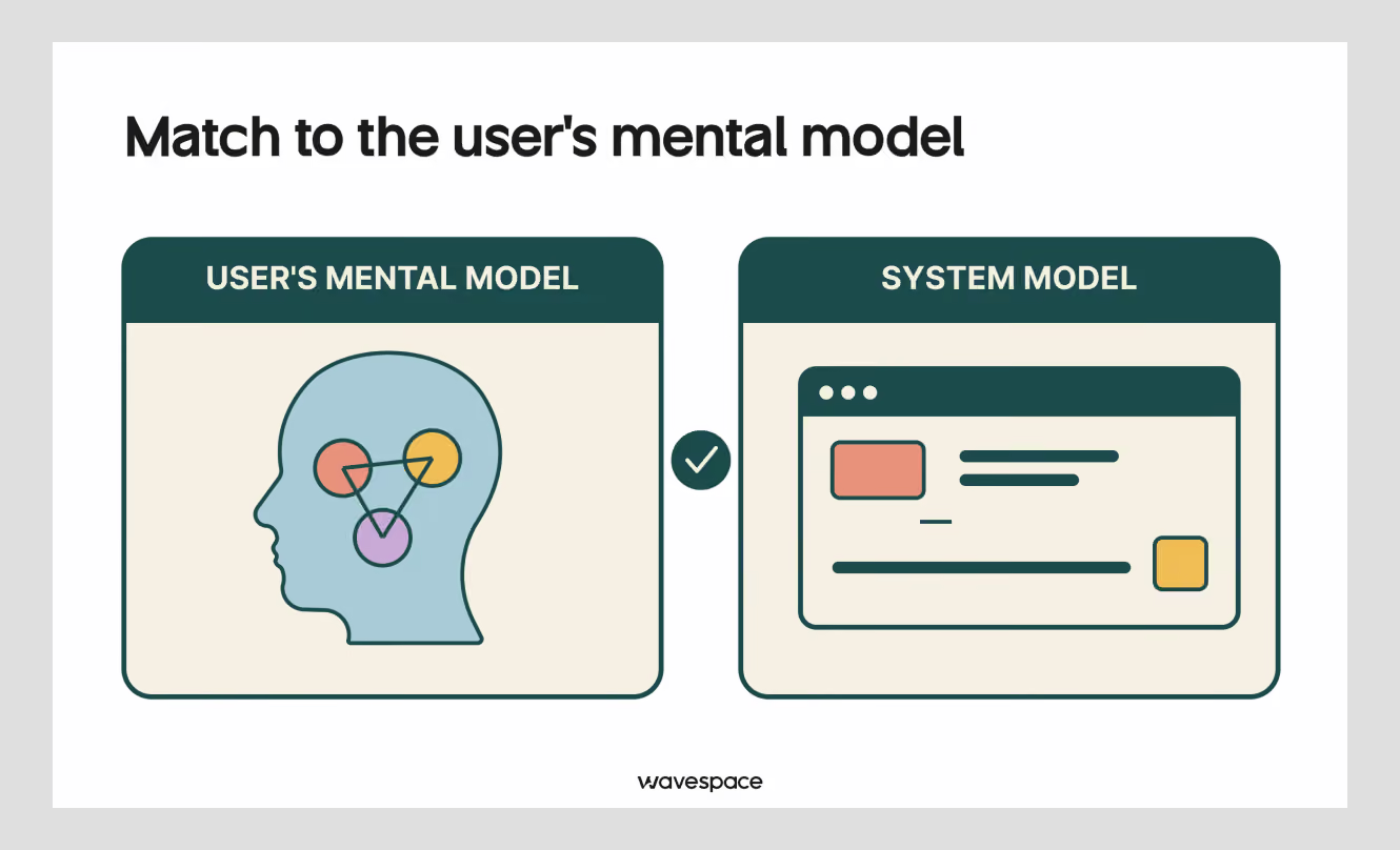
What it means: Speak the user's language. Use familiar words, metaphors, and workflows instead of internal or model jargon.
What changes with AI: AI introduces new CS terms such as "generate," "train," and "prompt" that don't align with about 98% of users. A good UX design trick is to translate those into something recognisable.
What good looks like: A recruitment AI that generates interview questions should present itself as a job-filling-out form. A form that recruiters already know. The AI should be a helpful feature inside that form, not a separate tool that people have to learn. Match the vocabulary to the audience: medical terms for doctors, plain language for patients.
Assess yourself:
- Is model jargon ("generate" and "train") explained in plain terms?
- Do AI flows map to tasks users already understand?
- Does terminology stay consistent across the product?
Red flag: Users have to learn the AI's vocabulary to use your AI product.
4. Explainability and transparency
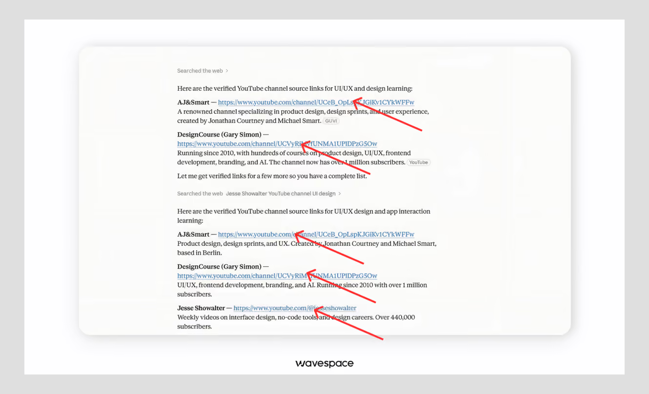
What it means: Show why and how AI is providing the information. Display the sources, their reasoning, and their limits.
What changes with AI: This principle never existed in classic UX. Deterministic systems explained only to themselves. But with AI’s black box, explainability is the biggest driver of trust. If the model was pulled from five sources, show the links between them.
What good looks like: ChatGPT and Perplexity cite sources so users can verify claims. Personalization that explains itself, "recommended because of your recent activity," feels helpful. The same recommendation without the reason feels like getting monitored.
Assess yourself:
- Does the AI show sources or reasoning behind its output?
- Does it explain "why it’s showing that"?
- Does it admit that it can’t perform tasks or doesn't know?
Red flag: Users have no way to check where an answer came from or why it was chosen.
5. Error prevention and graceful failure
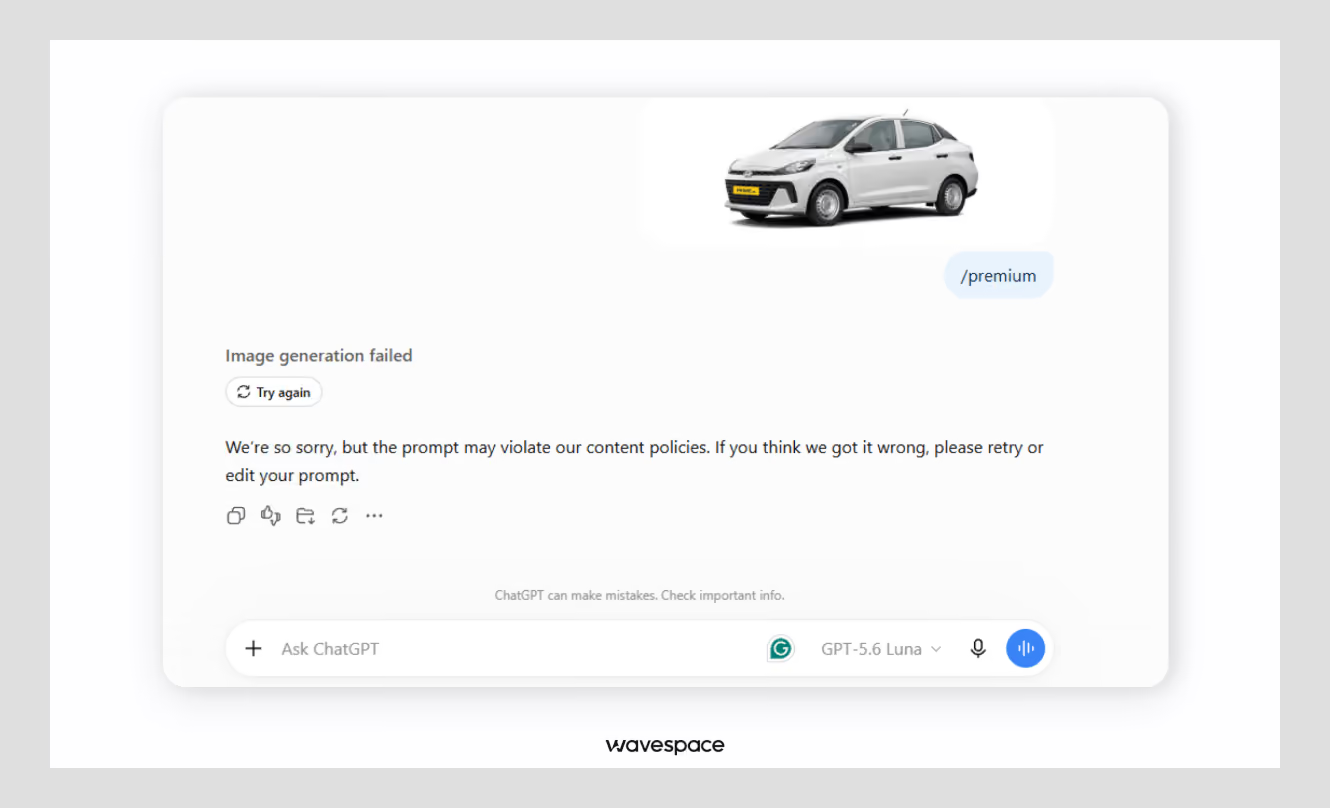
What it means: Stop incorrect inputs before they reach the model and use resources, and when something does fail, fail gracefully. Let the user know so they can recover.
What changes with AI: AI fails in new ways, hallucinates and provides wrong information with confidence, and misreads user intent. Traditional error handling never had to anticipate this. Prevention now includes guiding the input ("Add more detail before generating") and flagging suspect output after.
What good looks like: A generative image tool that disables "Generate" until the prompt has enough detail. AI asks more questions to understand users' full intent. A translation plugin that highlights uncertain passages in color and lets the user walk through each one, correcting some and keeping others.
Assess yourself:
- Are inputs validated or guided before the AI runs?
- Are errors and likely wrong outputs flagged?
- When the AI fails, is there a next step?
Red flag: When the AI gets it wrong, the user hits a dead end with no way forward.
6. Recognition over recall
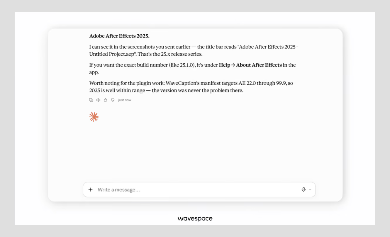
What it means: AI should not make people remember things. Show history, context, options, and examples so the recognition system does the work.
What changes with AI: AI raises the recall burden by expecting users to invent prompts from a blank box. Reducing that workload by implementing placeholder prompts, visible history, and defaults is now core to usability.
What good looks like: Chat interfaces keep visible conversation history so users don't re-explain context. AI that offers quick-request prompt examples next to a free input gives users a starting point instead of a blank page.
Assess yourself:
- Is prior context and history visible?
- Are examples or prompt examples offered?
- Are smart defaults provided instead of empty inputs?
Red flag: Users face a blank prompt box with no hint of what to type or what the system can do.
7. Right level of automation and human touch
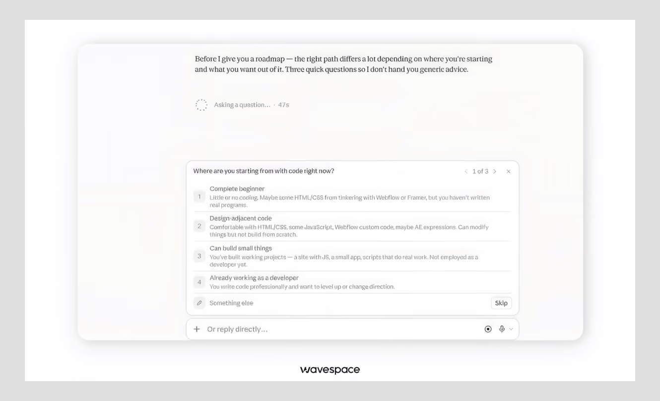
What it means: AI automation with a human in the loop. Let users choose how much the AI works for them in each task, and ask for confirmation before anything consequential.
What changes with AI: This is a new principle. Traditional software didn't act on its own, so there was no automation dial to set. But AI has changed the working principles. Too little automation feels useless, and too much is unnecessary. The sweet spot is adjustable. Let the user decide which task to automate.
What good looks like: A "manual mode" versus "AI assist mode," or a co-pilot that proposes an action but waits for users' confirmation to execute. The pattern that consistently works: AI suggests, humans decide.
Assess yourself:
- Can users choose between manual and assisted modes?
- Is confirmation required before critical actions?
- Does the user keep the final decision?
Red flag: The AI automates a high-stakes action (payment, deletion, send) without asking.
8. Privacy, data control, and ethical guardrails
What it means: Be transparent and upfront about what data the AI uses. Give users real control over their data, keep sensitive data hidden, and use it ethically.
What changes with AI: Some AI features often run on personal data, and users know it. Like their name, age, and weight. If they suspect misuse, they lose trust quickly. This is why privacy is not just a legal matter but also becomes a usability issue.
What good looks like: A clear privacy link at account creation, the ability to delete chat history or opt out of model training, and visible cues ("your data is stored securely") at sensitive moments.
Assess yourself:
- Is it clear what data the AI collects and uses?
- Can users delete their data or opt out of training?
- Are privacy cues shown at the moments that matter?
Red flag: Users can't tell what happens to their data or stop it from being used.
The AI usability scorecard
Now count your total scores. Eight principles, three lenses each, 0–2 per lens, out of 48:
Pattern to watch out:
An asymmetrical score. Many AI products score well on Clarity and near-zero on Control or nail the visible mechanics while offering no reason to trust the output. A 40 that's evenly spread beats a 40 that's all in one lens.
Common AI usability mistakes
- Hidden AI: Users can't tell they're talking to a model. Caught by #1 and #4.
- No undo: AI output is final. Caught by #2.
- Fake confidence: Guesses and hallucinations presented as facts. Caught by #1.
- No sources: Claims with nothing to verify against. Caught by #4.
- Over-automation: AI acts before the user can. Caught by #7.
- AI for the sake of AI: A feature bolted on because it's trendy, solving no real problem. Caught before you build, by asking whether the task needs AI at all.
Every one of these shows up as a zero on the scorecard before it becomes a user complaint. That's the entire point of assessing rather than guessing.

Which principles matter most for your product type
Not every principle carries equal weight. Where your product stands changes which two or three are non-negotiable for your case.
Consumer chats/assistants:
Visibility and confidence (#1) and explainability (#4) are the most crucial. Users are casual and won't forgive an answer they can't verify.
Enterprise copilots:
Automation balance (#7) and control (#2) lead. Professionals need to keep authority over their work and confirm anything that goes to production.
Creative/generative tools:
Recognition over recall (#6) and control (#2) dominate. The whole experience is prompt-then-refine, so starters and easy editing are the product.
High-stakes domains (health, finance, and legal):
Explainability (#4), error handling (#5), and privacy (#8) are mandatory. A wrong answer here has real consequences and can ruin one's life overnight. Every output needs a source, a safety net, and a data guarantee.
Final takeaway
Good AI interfaces don't happen accidentally. What we have learned in Wavespace is that they happen when you predict and solve issues before going public. Check your product against a clear list, then fix what's missing.
That's what these 8 usability principles for AI interfaces are for: visibility, control, matching the user's mental model, explainability, graceful failure, recognition over recall, the right level of automation, and privacy. Each one exists because AI breaks an old rule about how software behaves.
Use the scorecard and measure your product. Try to score your product on Clarity, Control, and Trust. Most products don't fail. They just get strong on one lens and weak on the others. Run your product through the scorecard today and rerun it before every major release.
Frequently asked questions

An in-house design team is a team that is hired for a company's design work. Companies usually hire design agencies to complete their one-off work. However, they choose to build an in-house design team when they have a large volume of design work to finish without any middleman.
They are the classic usability heuristics adapted for AI: visibility of status and confidence, user control and reversibility, match to the user's mental model, explainability, error prevention and graceful failure, recognition over recall, the right level of automation, and privacy and data control.
Score each principle against three lenses. Clarity (can users see what the AI is doing), Control (can they navigate or undo it), and Trust (reason to believe) from 0 to 2, for a total out of 48. A low or skewed score points to which thing to fix first.
Traditional UX assumes a system is consistent, transparent, and passive. AI is non-deterministic, vague, and sometimes acts on its own. Principles like transparency, confidence signaling, and automation balance have more weight than ever before.
Presenting an uncertain, unsourced output with 100% confidence. This fails the trust lens on several principles at once and is the fastest way to cause users to abandon an AI feature.

More related blog



Design & development in one team. Let’s talk!

















.png)



Francisco, CA 94105, United States





































.avif)