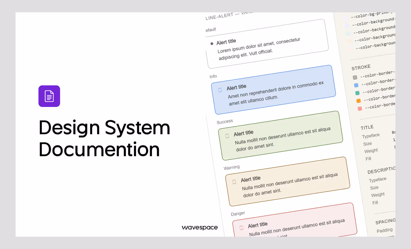
How to build a design system that scales with your SaaS


There is a problem no one in the design industry says out loud. A problem that every growing SaaS company runs into.
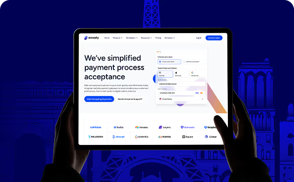
A SaaS product starts shipping fast, the team doubles down on success, and after a few version updates, the UI looks like a product that is stitched by 5 different tailors with 5 types of clothes.
As a result, buttons have three different border radii/radius. Modal backgrounds are three different shades of almost the same color. New developers spend their first two weeks lost, asking, "Which component should I use here?"
Truth is, this isn’t a designer problem; it's a design system problem.
This is where a scalable design system makes the difference. And a good design agency explains this in the onboarding meeting. SaaS products are not just for today; the team and customer base grow with an exceptional product.
The hard part is building a design system that doesn't fall flat when your team goes from 10 to 100.
This article walks you through:
⤷ What a scalable design system actually is
⤷ Why SaaS products specifically need one
⤷ The core principles to design around
⤷ A step-by-step build guide (from audit to documentation)
⤷ Tools, mistakes to avoid, and case studies
⤷ Most common questions teams run into
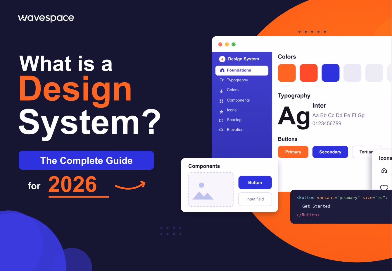
What is a scalable design system (for SaaS)?
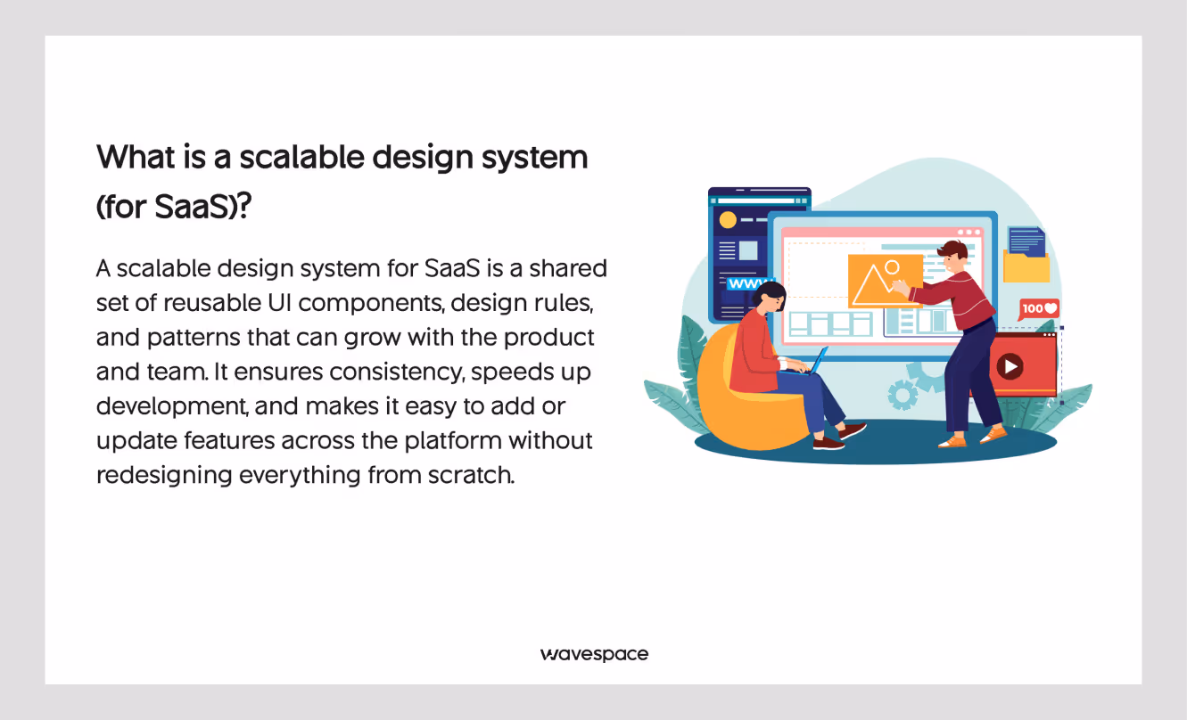
A simple answer is, design system is a collection of reusable components. These design system components are a mix of design decisions and guidelines. Design system helps teams build products consistently without making something look like a foreign object.
Want to learn more about design system? Take a look at our deep dive at our Design System 101 guide.
At the most basic level of a scalable design system, it includes a component library and documentation. At the most in-depth level, it includes design tokens, contribution workflows, versioning, and automated testing.
"Scalable" is the part that most SaaS teams underestimate.
Why a design system that works for a team of five will break for a team of fifty? Because as teams grow:
- More people make design decisions on their own
- More platforms get introduced (mobile, desktop, embedded widgets, and views)
- More edge cases get exposed in components that were built for simpler use
- Design documentation becomes outdated
A scalable design system is built to survive growth. The product UI consistency stays ready for any growth scope. It has clear ownership, structured contribution rules, token-based design decisions, and documentation that stays accurate without too much effort.
For SaaS companies specifically, the stakes are higher. Your product is the service. Users interact with your UI daily. Inconsistency can spiral into disaster. It doesn't just annoy your design team; it confuses your users, makes it look vibe-coded, and breaks trust.
Why SaaS products need a scalable design system
A scalable design system is not just a buzzword or a trend that SaaS products follow. It has become a necessity to survive. It can be compared to building a foundation. Without a solid foundation, you spend more to build a multi-story building.
Three pressures every SaaS UI faces:
1. Continuous shipping
SaaS products ship constantly. Sprints happen every week or two. Massive updates roll out every month. Features get launched, revised, and deprecated. In a sprint environment, the path of saving resources is to copy-paste a reusable component and tweak it according to your feature. Which is exactly how you end up with 14 slightly different button variants.
2. Team growth
Early-stage SaaS teams often have one or two designers who carry the system in their heads. The moment that the team scales or one of those designers leaves, the direct knowledge walks out the door.
3. Multi-product complexity
Many SaaS companies eventually run multiple products, sub-products, or white-label variants. Without a system, each product becomes its own domain.
That's the gap a design system closes.
If you’re evaluating partners, don’t miss our guide to the top enterprise design system agencies in 2026.
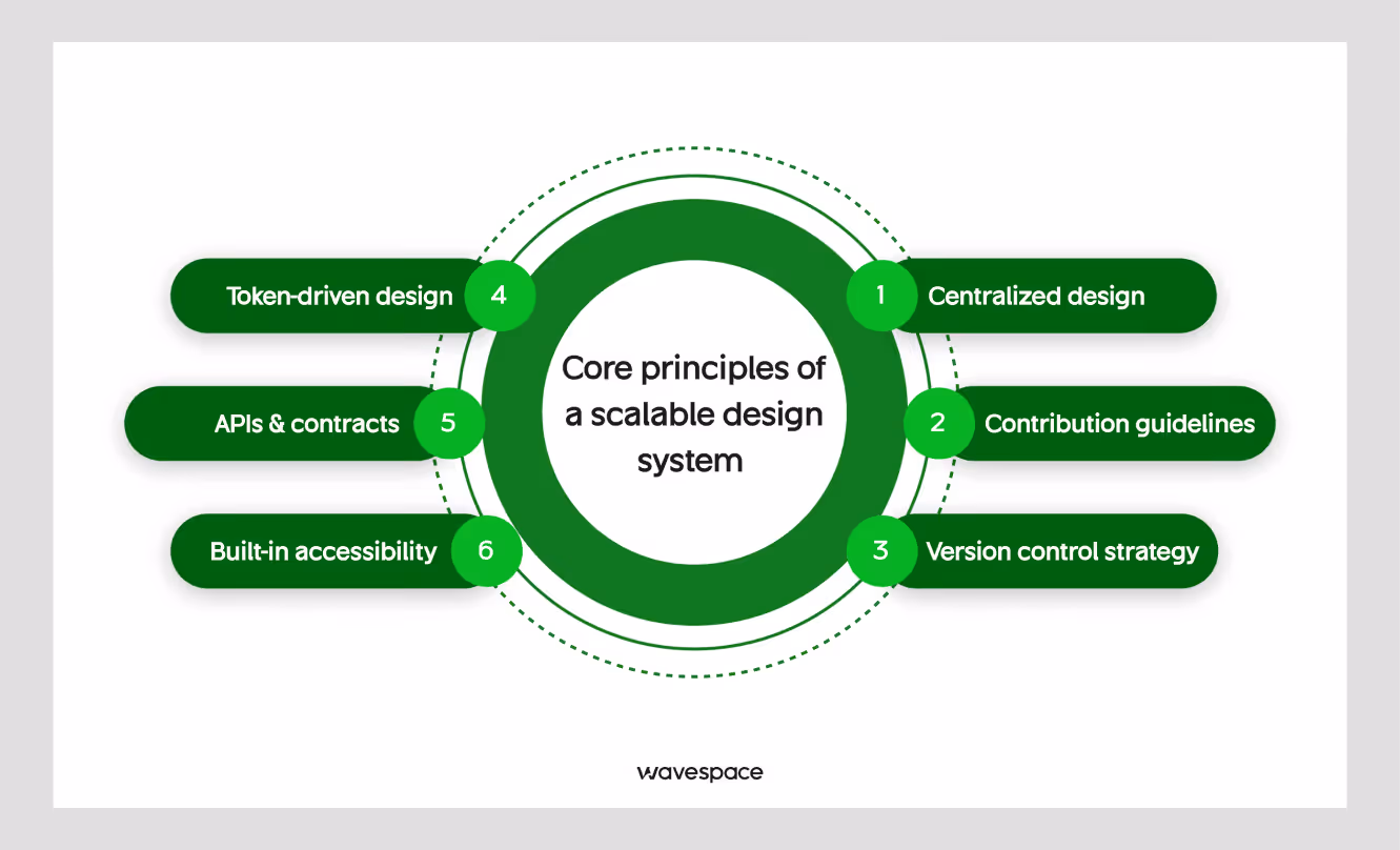
Core principles of a scalable design system
Before touching Figma or writing any line of code, get these principles right.
Centralized design authority
Each of the design decisions of design, from color, spacing, typography, to grid, should stay consistent in the same place. Nothing can be changed. If a designer or developer uses different tools or values that don’t align or sync with each other, you don't have a complete design system.
You have two systems that are pretending to be one.
Token-driven design
Design decisions should be encoded as tokens, not hardcoded values. This is the difference between a system that requires a manual search-and-replace to update a brand color and one that takes less than 30 seconds.
Component APIs & contracts
Each component should have a clear API: props, variants, states, and accessibility requirements. Remember is the value is not a contract here; documentation is.
Contribution guidelines
A design system without a contribution process either stagnates or gets abandoned. Define how new components will be added, reviewed, and approved.
Version control strategy
Breaks will occur, and change will happen. At that time, teams need to know what changed, why, how to fix it, and how to migrate. Semantic versioning (MAJOR.MINOR.PATCH) from software engineering perfectly works here.
Semantic version simply explained:
- MAJOR → Big changes that may break old code (Example: 1.0.0 → 2.0.0)
- MINOR → New features, but old code still works (Example: 1.2.0 → 1.3.0)
- PATCH → Small fixes (bugs), no new features (Example: 1.2.1 → 1.2.2)
Built-in accessibility
WCAG 2.2 compliance isn't a bolt-on that can be done later. It's a bar of quality that should be baked into every component.
Step-by-step guide to building a scalable design system
Step 1: Audit Your Existing UI

Don't start by building. It is a big mistake. Instead, start by looking at what you already have on the plate.
Identify UI Inconsistencies
Start by taking a screenshot of every screen in your product. Print them out, or use Notion, Zeroheight, or Miro to collect them in one place.
What to look for: Mismatch in button styles, misalignment in spacing rather than following a grid, different font sizes (three or four values off without a clear scale).
Build a UI Component Inventory
List them on a spreadsheet for sorting.
List every recurring element:
- Buttons
- Inputs
- Dropdowns
- Modals
- Tooltips
- Tables
- Navigation
Count how many variants exist for each of them and find out whether any of them are actually the same component with slightly different CSS properties or values.
A recent SaaS product that we audited, Wavespace, revealed 47 unique button implementations across a product that should have had maybe 8. That’s not a design failure. That's what happens when there's no system, and everyone's moving and working without thinking.
Assess and Prioritize Design Debt
Identify inconsistent elements that are frustrating users (delayed interactions, confusing interactions, inaccessible elements) with elements that are just aesthetically different. Triage (assess them by their priority).
Remember: Not everything needs to be fixed before launch. The goal here is to fix the major issues and know the minor ones that you're launching with, so you can fix them later.
Step 2: Define Design Foundations
Foundations are the raw materials from which everything else is built. The stronger the foundation, the better the result. Get these wrong, and every component you build inherits the mistake.
Color system
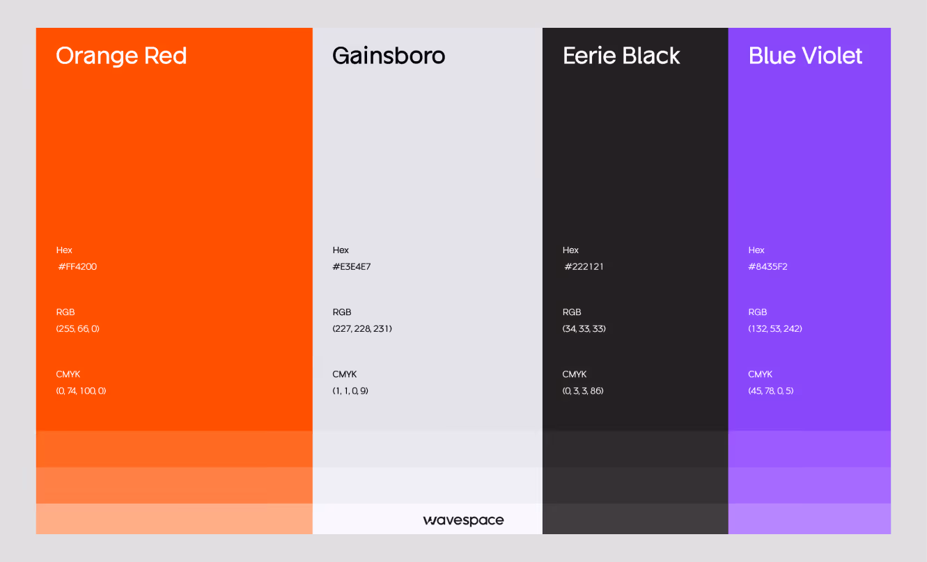
Don't just pick your brand colors. Build a full palette with semantic meaning.
You need:
- Neutral scale (gray-50 through gray-950, or equivalent)
- Primary palette with light, base, and dark variants
- Semantic colors: success, warning, error, info
- Surface colors: background, surface, overlay
Typography scale
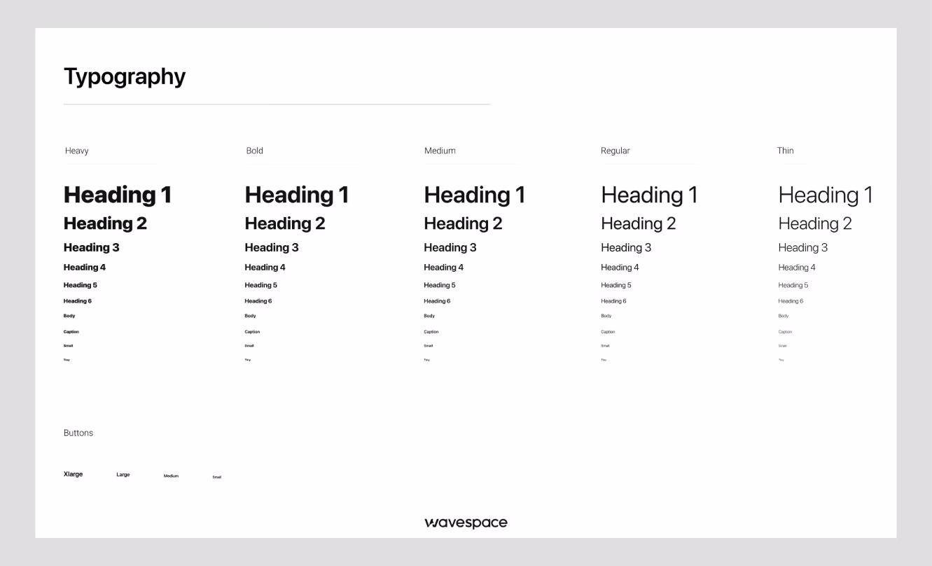
For typography scaling, don’t use a random guess for font sizes. Use a mathematical scale for effortless font sizing.
Use the modular font scale (x1.25 or x1.333 ratios) for Typographic hierarchy to achieve eye-pleasing visual harmony.
Define: font type, font families, font weights, line heights, and letter spacing for the type system (display, heading, body, caption, code).
Spacing and layout grid
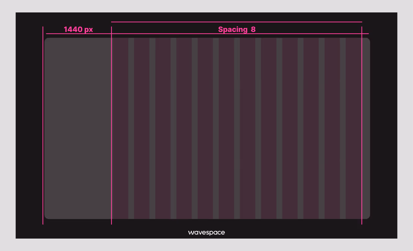
Pick a base grid unit, and ensure the design system follows this grid from thick and thin. 8px is the most common, and another one is 4px. Assign every spacing value from the base unit sequence.
Spacing scale should cover in sequence of: 2, 4, 8, 12, 16, 24, 32, 48, 64, 96px at a minimum.
Define grid:
- Column count
- Gutter width
- Margin width for each component.
Iconography
Choose a single icon library or create custom icons.
Define: Stroke weight, sizing variants, and usage rules.
The worst situation: using a rounded icon library on some screens and a sharp one on others.
Step 3: Create Design Tokens
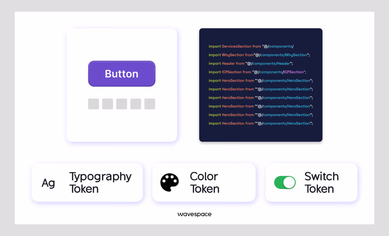
Design tokens are the bridge between design and development. They are the named variables that store design decisions and values. Using design tokens saves a lot of time on developing, fixing, and updating.
Why do design tokens matter
Design tokens eliminate the process of individually hard-coding. It saves time by not hardcoding color Hex codes #6200EE as a button color.
You denote color code into --color-primary.
This --color-primary token maps to #6200EE.
This way, the button component doesn't change. The token value changes. This is how you support theming, dark mode, and brand variants without rewriting components.
Token categories:
- Color tokens: color.brand.primary, color.feedback.error, color.neutral.500
- Spacing tokens: spacing.sm, spacing.md, spacing.xl
- Typography tokens: font.size.body, font.weight.bold, font.line-height.heading
- Motion tokens: motion.duration.fast, motion.easing.standard
- Elevation tokens: shadow.sm, shadow.overlay
Token management tools:
Tokens Studio (Figma plugin): Store tokens in Figma and easily sync them with the code.
Style Dictionary: Transform tokens from JSON into platform-specific outputs (CSS variables, Swift constants, Kotlin values).
Supernova: More structured tool for enterprise teams with Figma-to-code pipelines
One important thing: structure your tokens in two layers.
- Global tokens (Indigo-500: #6200EE)
- Semantic tokens (--color-primary: {Indigo-500})
Semantic tokens reference globals. This way, changing your primary color means changing one global token, not hunting through every semantic reference.
Step 4: Build a Component Library
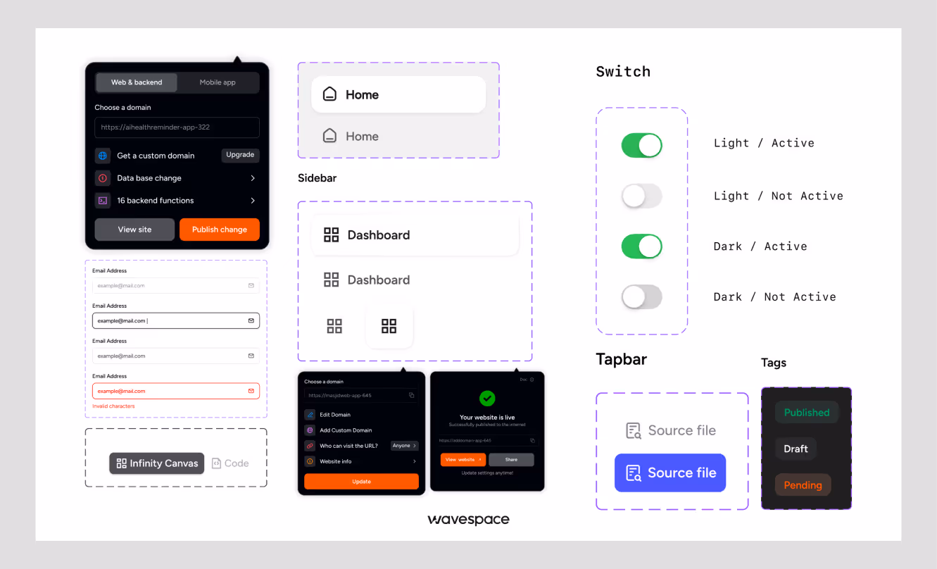
You cannot build a component library without the first three steps. After creating the foundations and tokens, you're ready to build components.
Start with Atomic design
Brad Frost's atomic design methodology divides components into:
- Atoms: The smallest units (buttons, inputs, labels, icons)
- Molecules: Groups of atoms [search bar (input + button), form field (label + input + error text)]
- Organisms: Complex sections (navigation header, data table, card grid)
Start with atoms. Prepare with all necessary specifications for all states (default, hover, focus, disabled, loading, error) before going to the next stage.
Prioritize high-use components
Build in order of frequency. Every SaaS product uses these constantly:
- Buttons (primary, secondary, ghost, destructive)
- Text inputs, textareas, select dropdowns
- Checkboxes and radio buttons
- Modals and drawers
- Data tables
- Toast notifications and alerts
- Navigation (sidebar, top nav, breadcrumbs)
Don't waste time building something that will be used once in a while, before you've nailed these.
Ensure responsiveness
Every component has to be specified and tested across multiple devices (mobile, tablet, and desktop). A button that works on desktop but overflows on mobile is a broken component. You can’t use that even if the desktop version looks great. You need to fix them first.
Step 5: Establish clear guidelines
A component library without guidelines is nothing but a catalog. People (designers, developers) won't be able to understand when to use which part.
Usage rules for every component & document:
- What it's for (primary use case)
- When to use it vs. a similar component (e.g., "Use a modal for actions requiring confirmation. Use a drawer for longer-form content that stays in context.")
- Props, variants, and states with examples
Do's and don'ts
Visual examples work better than text rules and help others understand how to use the elements.
Show a "do" screenshot with the button at an appropriate size.
Show a "don't" screenshot with the button cluttered by surrounding content.
Accessibility standards
Every component should be documented:
- Keyboard interaction pattern
- ARIA roles and labels required
- Color contrast ratios for each variant
- Screen reader behavior
Accessibility in a SaaS product is not optional. In the US, ADA-related digital accessibility lawsuits increased 25% in 2024. In the EU, the European Accessibility Act applies to digital products starting June 2025. SaaS companies with enterprise customers, especially, cannot afford to ignore accessibility.
Need help building a high-performing site? Discover the top agencies for B2B and SaaS web design and development.
Step 6: Develop in parallel
A design system that lives only in Figma is a mood board. A design system that lives only in code is unknown to designers. Both of them need to exist and stay in sync together.
Sync design and development teams
Designers revise components, hand them off to the developers, and then the developers develop them separately. This way, dozens of features get built on the wrong foundation by the time any gap is found.
The fix:
Involve developers from Step 1
Establish a shared vision early. Include a front-end engineer in the design token discussion. Have a designer review the code component as it's being built/developed.
Use component-based frameworks
React, Vue, and Svelte all support component-based architecture. Use Storybook to sandbox UI components and visualize different states/props. This will allow developers to build and test components without needing a full app environment.
Version control and collaboration
Treat your component library as a codebase:
- Use semantic versioning.
- Write changelogs for every release.
- Set up automated visual regression testing (tools like Chromatic or Percy catch unintended UI changes).
- Use a separate package that product teams import, so the system doesn't live directly in one product's repo.
Step 7: Document everything
Documentation is the design system's immune system for a SaaS product. Bad documentation means:
- Developers implement components incorrectly.
- Designers make decisions that the system has already solved.
- New team members spend weeks getting up to speed.
Centralized documentation
Your documentation should be in one place, linked from everywhere.
Design system tools:
- Zeroheight, Backlight, Storybook (for code).
- Notion or Confluence (for guidelines).
The best method is to combine Storybook (live component demos + code) with a documentation layer (Zeroheight or Notion) for design principles and guidelines.
Include examples and use cases
Every component page should show:
- A live interactive example (or screenshot)
- Variant overview
- Real-world usage context ("This is used in the checkout flow, settings sidebar, and onboarding modal")
- Code snippet
Keep it developer-friendly
Developers scan documentation differently from designers. Lead with the code example. Then explain the design thinking. Use clear prop tables + include copy-paste ready snippets.
Want to improve your SaaS funnel conversion rate? Apply these proven tactics now.
Top tools for building and managing design systems
Here are the tools that we are using in 2026:
Design tools:
Figma: Variables (Figma's native token system) are now intelligent enough for production use.
Tokens Studio: Figma plugin for robust token management with JSON export.
Development tools:
Storybook: Component development and documentation. Has a large ecosystem with plugins.
Style Dictionary: Token transformation across platforms (CSS, iOS, Android).
Chromatic: Visual regression testing integrated with Storybook.
Documentation tools:
Zeroheight: Connects to Figma and Storybook to produce unified documentation.
Supernova: More opinionated all-in-one option, especially for teams that want Figma → code handoff automation.
Governance and contribution:
GitHub: For component library versioning, PRs, and changelogs.
Notion: For design decision records and contribution guidelines.
Note that you don't need all of these. A small team (2–8 people) can run an effective system with Figma + Tokens Studio + Storybook + GitHub. Larger teams benefit from adding Zeroheight and Chromatic.
Common design system mistakes to avoid in SaaS
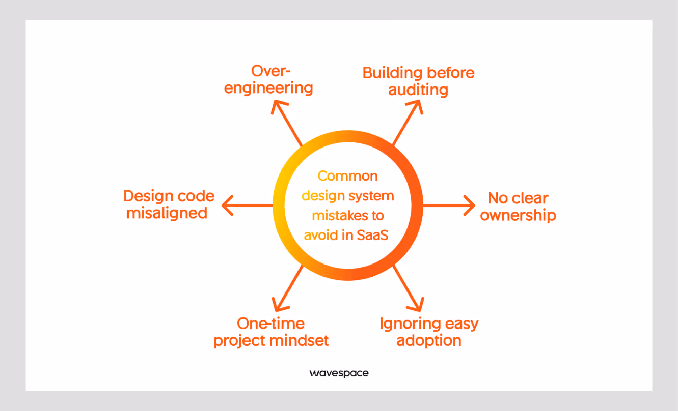
Building before auditing
Jumping into component creation without understanding existing problems and patterns can lead you to rebuild things that already exist. Even worse, build a system that doesn't connect to your actual product.
Over-engineering
A SaaS at Series A does not need the same design system as enterprise-level brands (Shopify or Atlassian). Start with the most used 20 components; it can be 20 or 25. Ship them perfectly. Add more as the product grows.
No clear ownership
A design system without a designated owner falls flat. Assign someone responsible to review contributions, update documentation, and discuss UI breaking changes.
One-time project mindset
A design system is infrastructure, not a deliverable. It needs a budget for ongoing support and maintenance, like your codebase.
Ignoring easy adoption
The best-designed system is worthless if the team doesn't use it in their daily process.
For easy adoption, ensure clear documentation, accessible components, and internal organizational alignment. Make it easier to use the system and avoid shortcuts.
Design code misaligned
When the Figma file and the code library move away from one another, neither of them can be trusted. Establish a regular sync process and conduct monthly reviews to check for drift.
Conclusion
Creating a design system that scales with your SaaS isn't about building the most complete system on day one. It's about building something for the present and preparing for future growth. So that you don’t have to spend resources when scaling your SaaS.
Start with the simple audit. Don’t treat it like a project; it's an infrastructure. Make strong foundations and tokens. Build the 20 components you will actually need in the initial phase. Record everything, document as you go. Assign a person to oversee the entire process.
With the design system, new developers will ship a consistent UI in their first week. Design changes scale without a redesign. The SaaS products look like built by one team, even if multiple teams work behind them.
The goal is not the most comprehensive system but an effective one that grows throughout the SaaS product lifecycle.
Frequently asked questions about design systems
It depends on the scope and team size. A minimal viable design system with 20 core components + tokens and documentation can take most agencies 6-12 weeks. A full-scale enterprise system with governance and multi-platform can take 6-18 months.
Yes, design is great when you scale. You don't need Storybook and a full token pipeline on day one. Defining a minimum of 5 core components, a color palette, and a type scale at the seed stage will save you weeks of rework.
A component library is a collection of reusable UI components. A design system includes a component library, design tokens, usage guidelines, design principles, contribution, and workflows.
A design system works by standardizing UI components, styles, and guidelines for consistent product design.
Product designers, developers, and design teams use design systems to build scalable digital products.
You need a design system to improve consistency, speed up workflows, and reduce design and development errors.
Design and engineering teams are responsible for creating, maintaining, and updating a design system.
The four types of system design are architectural design, logical design, physical design, and interface design.

More related blog

Have a Project? Let’s talk!


.png)


.avif)

