UX design for AI products: A practical guide for 2026


AI products don’t fail because of bad models. They fail because UX fails them.
In 2026, Most UX guides assume the user does. Click a button, get a result. AI products don't work that way. Type a prompt, and you might get something useful, something confusing, or something confidently wrong, or sometimes all three.
That unpredictability is where most AI UX fails. Not because the model is bad. Because the interface never accounted for it.
This guide covers UX design and AI usability from first principles through real case studies. Whether you are a designer working with AI/ML teams. Product managers who are in charge of AI product design, this blog has something for everyone.
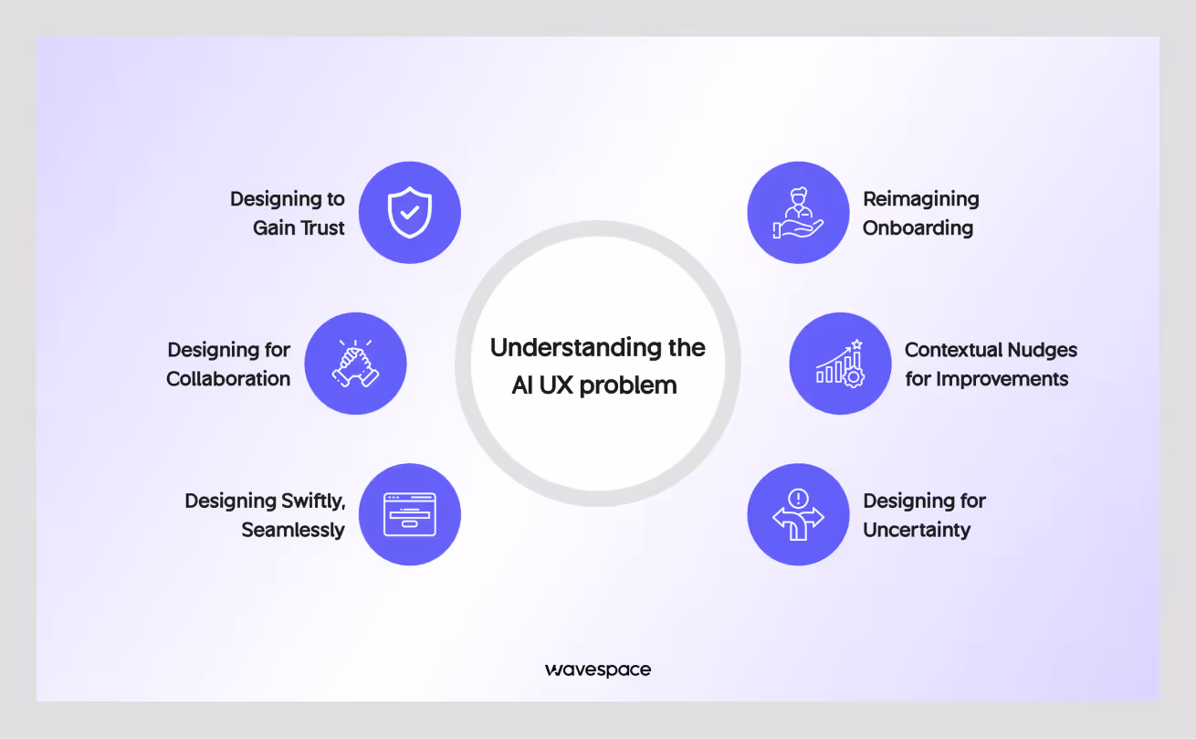
Understanding the AI UX problem
Traditional UX is built around one idea: Deterministic Behavior. Designers control the output. You design an interface from scratch. Users interact with it while the system responds in a predictable and predefined way.
AI products break that model from top to bottom.
The output changes. The confidence level changes. Sometimes the system gives a great answer. Sometimes it hallucinates a fact that sounds completely true. One of the biggest problems is that users do not know what they are getting, and most current AI products do not tell them.
That is the core design challenge of AI user experience design: building interfaces for systems that do not always behave the same way twice.
Check out our curated list of top 10 AI UI UX design and development agencies.
Designing for uncertainty
Traditional UX design assumes that the system knows the right answer and delivers it. AI changes the assumption. The system makes a best guess. Sometimes the guess is right or wrong. The designer's job is to make that right/wrong distinction visible without scaring users away.
Most teams underestimate this. They ship an AI feature with generative text output and call it a day. Then users try to rely on wrong answers. Their trust drops, and the product’s engagement declines. The feature gets lost in the corner.
This uncertainty is not a bug you can fix. This is how AI models work. Good AI user experience design does not hide uncertainty; it designs around it.
What users actually expect from AI
Here is what most first-time AI product users think when they open: It is a search engine that talks. This is a very smart assistant, and it knows everything.
Neither of these two mental models is accurate. But both are real, and design shapes how users interpret AI outputs. How they respond to errors, and how quickly they lose trust.
When users expect a search engine, they get frustrated when AI makes things up from thin air. When users see an all-knowing assistant, they overtrust its outputs and do not cross-check them against anything else.
Your job as a designer is to correct both misconceptions before they cause problems.
The interface itself needs to communicate. This is a useful tool, but it can make mistakes. This helps users think. It does not replace judgment.
It is hard to deliver a transparent message without making the AI product feel weak. But it is far better than overpromising and underdelivering, which permanently destroys user trust.
UX failures unique to AI products

- Confidence trap: The AI presents inaccurate information with the same visual weight as accurate information. Users cannot tell the difference between them. They trust things without verifying.
- Black box problem: Users cannot tell why the AI gave a particular answer. Users don’t have the ability to evaluate, correct it, or know when to ignore it. The interface treats the AI model like a magic crystal ball.
- Latency breaks flow: AI responses take time. Staring at a static screen for five seconds feels like a broken product to most users. Without good loading states, a skeleton screen, and progressive disclosure, users perceive AI as underperforming.
- Edge case cliff: The AI performs well on 50% of queries and falls flat on the remaining 30-50%. There is no graceful fallback; AI fails, often in confusing ways.
All failure modes share a single issue. The interface was designed to make AI appear correct, consistent, and right.
Need help designing an AI product? Explore the Top 10 AI Product Design Agencies.
Foundational principles for designing AI interface
Good UX design principles for AI are not complicated. But they are different from the principles you apply to a form or a dashboard. These four are the most important for designing AI products.
Transparency without complexity
Users do not need to understand how AI transformers work. They do not need to see model weights or confidence scores as plain numbers. But users do need to know:
- Is the output reliable?
- Where did it come from?
- Can they trust it?
Transparency means providing users with the right information they need to make sound decisions in their lives without complicated technical details.
Example: If your AI product must search the internet to find an answer, display a small indicator in the interface that says "Based on recent search results." This one line changes how users evaluate the output. It sets the right expectation. It communicates transparency to users without complexity.
Explainable AI UX does not mean showing users how the model works. It means showing users what the model did and how confident the result is.
Progressive disclosure of intelligence
User don't need every feature on day one. AI products have this problem: not only users but also AI developers are unaware of the AI's full capabilities. Most of the full potential of AI is invisible and discovered by accident or by prompt engineering.
Progressive disclosure means showing the features at the right moment. In this case, surfacing AI capabilities gradually, one at a time.
Dumping all features in the onboarding frustrates the user. Show a user what the AI can do when they are in a situation where a feature can help. If a user is drafting a document, offer to improve it. If they are reviewing data, suggest a pattern they might have missed.
The AI UX goal is to make users feel that the AI is getting smarter over time, even if it was always capable of those things from the get-go.
Human-in-the-loop design
Human-in-the-loop UX means humans control the AI.
The human-in-the-loop process ensures the user has the last say in decision-making. In Layman's terms, AI is the vehicle, and the user is the driver.
This approach can increase users’ trust in AI products. On the contrary, when AI makes all the decisions, users tend to disengage. Feel betrayed when the product feels like it's taking over their life.
Remember, AI outputs are not verdicts; they are just suggestions. Give users easy ways to accept, edit, reject, and regenerate.
Ensure the design gives the user the last shot.
Graceful degradation
AI and AI products fail; their models hallucinate that this is inevitable. APIs will have a timeout. Outputs will have confidence below a useful threshold. These things won’t get fixed overnight. However, great design can work as a remedy in these instances. Your design has to do the heavy lifting and ensure users don’t get lost when AI fails.
The Graceful degradation process can save this problem. On reflection, it means the product stays useful if the AI fails.
If the AI fails to provide a confident answer, it should state the issue and offer an alternative. If the API call fails, show the AI call's text, not a raw error code.
A good AI product design is invisible when things go right and reassuring when things go wrong.
How to use AI for UI UX design (AI product design)
AI as a Co-Pilot
One of the best ways to use AI tools for UX designers in 2026 is to treat them like a co-pilot. Not them as a chatbot to ask questions or an autocomplete tool. A well-integrated AI is a collaborator that helps to think through problems, generate options fast, and stress-test reasoning.
Right prompting with context: "Here is the user flow I am designing. Here are the constraints. What are three edge cases I might have missed?"
Wrong prompting: "How do I design an onboarding flow?"
The main difference is specifying the problem.
AI tools are most useful when they have enough context to give a solution for a specific output. They are least useful when they generate generic output that applies to everyone.
AI co-pilot design is not a feature; it is a mindset. AI won’t do a better job when you want to speed up the boring parts. It is best to build a habit of collaborating with AI tools at every stage of the design process.
AI-assisted research and synthesis
User research and synthesis take a lot of time, and AI can help to reduce them. Specific AI uses that save time for design teams right now:
- Feeding interview transcripts into an AI to find out the recurring themes. (Dovetail)
- Summarizing competitor UX patterns across multiple product reviews. (Perplexity AI)
- Generating first drafts of user personas from raw research data. (UXPressia)
None of these replaces the final human call at the end. The designer still decides what matters and what does not. But with it, you can save time and manual labor by a significant margin.
The risk: AI synthesis can oversimplify complex ideas. If a model pulls ten notes about the same theme, it might miss the one note that contradicts the pattern and has the most important insight.
So, use AI to speed up synthesis and use your brain to find the outliers.
AI to prototype, iterate, and test faster
Prototyping AI behavior used to mean building a real model from scratch. This was not only time-consuming and expensive but also slow and resource-intensive.
In 2026, life is becoming easier. Tools let you simulate AI outputs in a prototype using actual language models connected to design files. You can test how users respond to streaming text, uncertain outputs, and error states before writing a single line of production code.
This changes the design process marginally. You can now run usability tests on AI behavior in the research phase before launch. Discover which specific output tone users find condescending and fix it before the final launch.
Faster iteration is the biggest benefit of AI in the design process: it forces design teams to think about AI behavior early, not just as abstract principles, but in specific responses to specific inputs.
AI in real design workflow
AI is good at expanding the option space fast, but bad at making good decisions.
- Use it to generate ten button copy variations, then pick the best one yourself.
- Use it to identify patterns in usability test notes, then decide which ones matter.
- Use it to draft a design spec, then edit it until it actually reflects your thinking.
Don’t let the AI make the last call.
Bad way: Asking an AI to decide what is good or bad will lead to a generic, robotic response.
Good way: Using AI to do the heavy lifting quickly, but you make the final decisions.

AI UX design patterns

These are the interface patterns that come up in almost every AI product. Some are solved problems. Some are still being figured out.
Input design (How users talk to AI)
The input field is the most underdesigned part of most AI products. It is usually a text box. Sometimes it has a placeholder that says "Ask me anything." That is not enough for AI UX designs.
Good input design tells users what to ask. It sets the right expectation for what kinds of responses they will get. It provides specific examples, not generic ones. It offers structured input options when free-form text is too ambiguous.
Conversational UI design is more than just a single input box.
Not only AI products, but also every type, are experimenting with voice input, structured forms that feed into a model, and multi-step intake flows. This gives AI enough context to get better results that can solve problems rather than a lackluster response.
The pattern that works best reduces the cognitive load of the first input. A designer's duty is to ensure their design doesn’t ask users to figure it out. It is to make it obvious so users are happy when using it for the first time.
Output design (Readable AI responses)
Most of the time, AI responses are long. They contain a mix of accurate and inaccurate information. Also, for this reason, it is difficult to read and hard to act on. Output design is the work of making responses readable, trustworthy, and actionable.
Specific decisions that matter: when to use streaming text (it signals AI is working, hence users wait longer). When to break output into labeled sections. When to use citations or sources. When to show confidence indicators. When to offer regeneration.
Streaming output design is now a standard expectation in AI interfaces. Users who see a static loader wait less patiently than users who see text appearing. But streaming also has failure modes; if the text streams too slowly or the first few words are misleading, users leave before the useful part arrives.
Conversational UI in 2026
The normal chat window is the default UI for AI products. But not everything works better as a conversation. A chat thread is the wrong container if a user needs to do something (edit, share, build) with an output. The output needs to go beyond the conversation to become something useful in its own right.
In 2026, the most interesting conversational UI design is happening in the spaces between turns. Products that let users grab an AI-generated draft and immediately pull it into a document. Products that connect chat outputs to structured data. Products where a conversation is just the entry point, not the whole product.
Generative UI or interfaces that the AI partially constructs based on user input are still early. But it is already showing up in tools that auto-generate forms, dashboards, and data views from natural language requests.
The design challenge is keeping users oriented when the interface itself changes.
Personalization UX
Personalization is one of the most valuable things an AI product can offer. It makes users feel close to the product. It is also one of the fastest ways to break trust when it goes against the user's will.
The line between helpful personalization and a surveillance system is thin. Users are happy to accept AI personalization when it is in their control. On the other hand, they detest it if it feels invisible.
Practical guidance: Let the user know when your AI is adapting to their behavior. Give them a preferences view. Make them easy to change and reset. Never show personal information in a way that makes users feel monitored.
- Personalization is a feature: "The AI learns what you like."
- Personalization is a deal-breaker: "The AI knows you better than you knew we were tracking."
Feedback loops
Liking or disliking a response, editing out, making a favorite, and reporting are part of the feedback mechanism. This is important data to improve your AI. However, the feedback mechanism gives users a sense of agency. If they know their actions can shape the product, they engage more.
The design challenge is making the feedback system frictionless. Feedback that asks for a detailed explanation after a thumbs-down is a bad idea. A single-tap thumbs down with an optional follow-up question is more favorable to users.
Design feedback mechanisms to match the cognitive load of the moment. If a user is frustrated, do not make them work for it.
Design process for building AI products

The AI design process looks just like the regular product design; it includes research, prototype, test, and iterate. But with several important differences.
Research methods for AI products
Standard usability research works fine for AI products. But the questions are different in this picture.
For a traditional product, you are testing whether users can complete tasks.
For an AI product, you also need to test whether users trust the outputs, evaluate uncertainty, and determine what they do when the AI is wrong. Most importantly, whether their mental model of the system matches reality.
Diary studies work well for AI products. Log how users interact with the product in their lives, don’t focus on just a single session. Since AI products fail in a subtle way, that single one-time usability test isn’t effective for AI research.
A diary study helps to close this gap. It catches the issues that are easily missed by single usability testing.
Prototyping AI behavior
Wizard of Oz prototyping is the standard approach for AI products. A designer or researcher sits behind the interface and manually generates the "AI" responses while the test users interact normally. In this method, users do not know a human is in the loop.
It is a good way to test out how users respond to different output styles, confidence levels, error states, and response times. Users respond authentically to Wizard of Oz outputs in most research contexts.
In 2026, you can also use live AI models to power prototypes. Connect a design tool to a language model API, write a system prompt that describes the product behavior you are testing, and run participants through a functioning prototype.
Designing with model limits
Every AI model has limits. It can be the response time, context limit, or low accuracy on a specific task. These limits are not all visible in the documents. Some only appear when you push the model in real use.
Designers who understand AI limits make better decisions. They know when to show a loading indicator if the loading surpasses five seconds. They know when to break a complex query into parts because the model cannot handle all of it at once. They know which tasks the model handles well and which ones produce low-accuracy outputs.
Use this information from your AI/ML team before you design the product flow. Model limits should shape your information architecture, not be retrofitted in.

Work with AI/ML teams as a designer
designer
The relationship between designers and AI/ML engineers is never synchronized. The two disciplines have different assumptions, timelines, and definitions of task completion.
The most useful thing a designer can do is to ask solid questions about AI behavior, not just the abstract questions about a product's capability.
Don’t ask:
- How smart is the model?
- What are the limitations of the model?
Ask:
- What is the realistic accuracy rate for this task?
- What happens when a user inputs something the model cannot handle?
Translate your design questions into testable model questions. That is the language AI/ML teams respond to best.
Metrics that matter for AI product UX
Standard product metrics are retention, activation, and time on task, which also apply to AI products. But they miss important things.
- Track task completion rate on AI-assisted versus unassisted tasks.
- Trust calibration (are users trusting outputs they should verify? Are they distrusting accurate outputs?).
- Error recovery rate (when the AI fails, what percentage of users successfully recover versus abandon the product?).
- Feedback submission rate as a proxy for engagement.
Usability testing AI products also requires specific success metrics.
- Did the user correctly identify which outputs were uncertain?
- Did they know how to regenerate or correct an output?
- Did they understand why the AI said what it said?
AI UX case studies

What Notion got right
Notion AI's UX is loved by users because it did not replace the product. Notion is a writing and organization tool. AI made writing and organization faster. They added AI capabilities to a product that users already understood. The mental model was already there from the beginning.
The integration was contextual. AI suggestions appeared inside documents, not in a separate chat window. Users did not have to leave their workflow to use the AI.
What it got wrong: early outputs were generic. The AI wrote in a flat, corporate voice, which did not match the style of most Notion users. The AI made the response longer, not better. Trust in the outputs decreased because the quality was inconsistent every time.
Lesson: Great AI UX integration is frictionless. Users don’t need workarounds. However, if the output quality does not meet user expectations, low friction won’t matter.
Perplexity's zero-UI search experience
Perplexity UX is interesting because it is built around a single interaction. Ask a question, get a sourced answer, all inside a single page of minimal design.
What they got right: Citations. Every output of a user search includes numbered sources, which helps skeptical users know it's coming from a source, and AI is not making things up.
This single design decision changes the trust dynamic. Users are not taking the AI for granted. Now they also have the option to verify from credible sources.
Ongoing challenge: The design has not fully solved the primary issues for complex or sophisticated topics. A single, summarized answer most of the time flattens nuance in ways that citations alone do not fix.
How Figma integrated AI without going against users
Figma AI had the toughest users to design for. Their users are professional designers, and designers are extremely opinionated about their tool (Figma), which they daily use.
Approach: AI features are add-ons, not replacements. They ensure the AI helps designers do things without tinkering with the core interaction model of a regular user.
What this avoided: The common mistake of redesigning the core product to adapt to AI with existing functions. Heavy users retaliate against AI when it tries to replace loved features. However, heavy users love AI when it makes their lives easier by extending the capabilities of features instead of replacing them.
Remaining challenge: AI is powerful for inexperienced users, although they find it hard to comprehend it. Figma offers more features, but users hardly use them because they are not surfaced to the users.
Responsible AI design
Designing for AI transparency
Designing for AI transparency means ensuring the design tells users what the AI is doing. And it doesn’t stop there. Also, making sure AI design shows what sources AI is using, and how uncertain the output is.
In practice: Cite sources when the AI uses them. Show users when their data is being used to personalize outputs. Explain what the AI cannot do, not just what it can. Use plain language in error states instead of vague apologies.
The EU AI Act, effective from February 2, 2025, is the world’s first law regulating artificial intelligence by risk level, ensuring safety, transparency, and ethical standards across all member states. Designing for transparency is not just an ethical choice. For many products, it is the legal one.
Bias as a UX problem
AI bias UX is often treated as a technical problem. It is not only a problem of the AI model team, but also a design problem.
AI generally has a bias towards something. In this context, when an AI product produces biased outputs, users see those biased outputs through the designed interface. An AI product’s interface shapes how users interpret bias, whether they notice it, or whether to do something with it.
Design responsibility:
- Include diverse users in research.
- Test outputs for patterned failures across different user groups.
- Build reporting mechanisms so users can flag problems.
- Do not design an interface that makes it hard to question or challenge AI outputs.
Bias is not always blatantly visible. Design your product to make it visible when it exists.
Accessibility in AI Products
Accessibility in AI products covers the standard requirements, screen reader compatibility, color contrast, keyboard navigation, plus some issues specific to AI.
- Streaming long text is hard for screen readers.
- Long AI-generated outputs come with cognitive load.
- Voice input assumes clear speech and quiet environments.
Treat accessibility for an AI product as a design requirement from the start. Accessibility is not just a compliance audit at the end. AI products that are not accessible are not usable for a portion of the population. In many countries, they are also not legal.
Conclusion
AI product design in 2026 is not just a feature; it is a must. Most digital products now somehow have AI components. The problem is that most of these components are underdesigned. There is an obvious gap between what the model can achieve and what users actually trust it to do.
The future of UX with AI is not about learning to prompt better or understanding transformer architecture. It is about applying everything designers already know, the mental models, trust, transparency, failure states, and user agency to systems that behave differently than anything that came before.
The fundamentals do not change. Users need to understand what they are using. They need to feel in control. A designer's job is to ensure that products are useful and trustworthy for real people.
Frequently asked questions
User-centered design builds products for real people. This design process focuses on user needs, habits, and problems. Guesswork is a no-go. Designers research, test, and improve based on actual user feedback. The goal of user-centric design is to make things that work for the people using them.
AI speeds up the slow parts of UX work. It helps generate quick wireframe ideas, summarize user research, write microcopy, and even spot usability patterns in collected data. The mindset of tools like Figma AI or ChatGPT won't replace good design thinking, but they surely do cut the labor time.
AI in the UX process takes over the repetitive work. It can analyze user behavior, generate design options, run usability tests, and adjust experiences. The designer still makes the real decisions, AI just makes life easier.
Data collection, model training, inference, and feedback. AI learns from data, builds a model, and uses that model to make decisions. Then it updates based on whether those decisions held up to an acceptable threshold.
Empathize, define, ideate, prototype, and test. You start with users, figure out the actual problem to solve, outline the solutions, build a demo version for the people, and see what sticks and what doesn't. Most projects loop back through prototype and test several times before anything goes live.
- Problem definition
- Data collection
- Data preparation
- Model selection
- Model training
- Evaluation
- Deployment

More related blog


Have a Project? Let’s talk!


.avif)

