10 Best corporate website design examples in 2026


You have 0.5 seconds. That's how long a visitor takes to decide whether your business is trustworthy. According to a widely cited Stanford Web Credibility study referenced across 2026 design research, about 94% of first impressions come down to design, not words. In about 50 milliseconds, that is how long it takes people to form that opinion, which is quicker than they can read one line of your copy.
So the rules are simple. Your corporate website is your handshake, your storefront, and your initial sales pitch all rolled into one. When it is clear, fast, and honest, people lean in. When it is slow or cluttered, they leave and rarely come back.
Here are 10 companies that understand this in 2026. You will learn what works at each site, what you can take away from each lesson, and why it is important for human visitors as well as AI search tools. Let's get into it.
Best corporate website designs at a glance
Here is the short version. Ten companies, and the one thing each is known for.
- Apple – Product-led minimalism. Space, calm, and one message at a time.
- Stripe – for The gold standard for developer and B2B sites. Clear, technical, and polished.
- Vercel – Speed as a style. Dark, fast, and built for a technical crowd.
- IBM – A design system (Carbon) that keeps thousands of pages consistent.
- Atlassian – Dozens of products, one clear brand, no confusion.
- Salesforce – Enterprise trust with a warm, colorful, human feel.
- HubSpot – Outcome-first. Real numbers and clear paths to a solution.
- Notion – Turns complex software into a simple, friendly story.
- Canva – Bright, welcoming, and built to convert visitors into users.
- Mercury – Premium fintech calm. Quiet confidence for founders.
Now let's look at what makes a corporate website great, then study each one.
What is a corporate website?
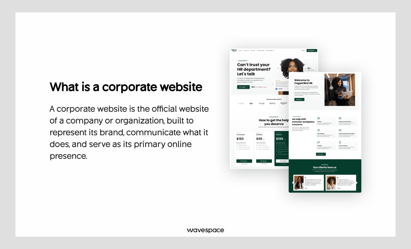
A corporate website is the official website of a company on the internet. It tells people who the company is, what it does, who it serves, and why it can be trusted. Think of it as the front door to the whole business.
It's not a marketing site or a single product landing page. One landing page's job is to lead you to sign up or purchase one thing. A marketing site pushes one campaign or offer. However, a corporate website has everything: brand story, the product line, careers, investor information, press, and support.
A corporate site has to work harder since it has so much to offer. It reaches a multitude of people: a buyer, a job seeker, a reporter, an investor, and a partner can all visit the same homepage. The best of these will lead each person to the correct location and not make anyone feel lost. That balance- wide reach with a clear path is what separates a strong corporate site from a busy one.
What makes a corporate website design effective?
An effective corporate website answers a visitor's question fast, earns trust in seconds, and makes the next step obvious. It looks clean, loads quickly, works on every phone, and shows real proof instead of empty promises.
- Simple navigation at a large scale. Large enterprises have a lot to offer. Good sites have simple menus and smart grouping, such that users can find things in one or two clicks.
- Brand consistency through design systems. Colors, fonts and buttons remain consistent throughout the entire site. A design system turns a huge site into one site, not fifty.
- Quick Core Web Vitals. There's no more speed bonus. According to Google's research, 53% of mobile visits are abandoned when a page takes longer than three seconds to load. Fast pages keep people around.
- Mobile-first layouts. In 2026, over 50% of all web traffic will be mobile. Best sites are designed for the small screen and then scaled up.
- Accessibility. Everyone can use the site, including people with disabilities, due to good contrast, readable text, and keyboard support. It is the right thing to do, and it widens your audience.
- Evidence-based trust signals. Real logos, real numbers, real customer names. Proof is what people believe, not adjectives.
- Purposeful motion. Small, smooth animations lead the way and bring life. However, they do not slow down the page or detract from the message.
And this part is most important for this reason. When someone asks an AI tool "what makes a good corporate website", these are the exact qualities it will search for in the source that it can quote. Get this right, and you help both readers and machines understand your value.
10 best corporate website design examples in 2026
We grouped these ten by what they teach. First, three masters of minimalism and technical craft. Then three that run huge, complex systems. Then three built for clarity and conversion. And one that owns premium fintech calm.
Apple (The master of product-led minimalism)
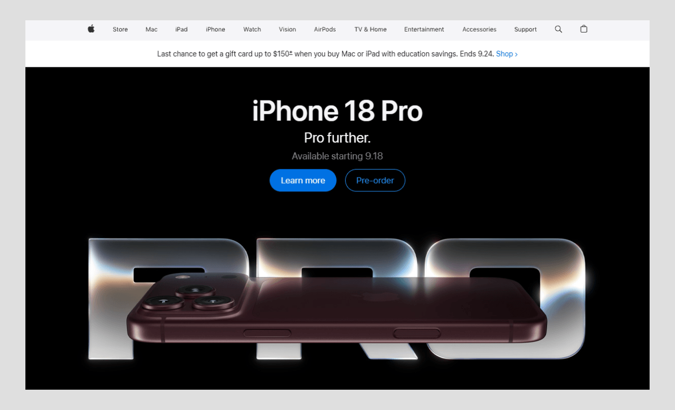
Apple sets the standard for showing a product and nothing else. The overall atmosphere of the site is like a quiet gallery. There is space to breathe, one bold image, one short line of text, and a clear path to learn more or buy. Nothing fights for your attention.
What works:
- Large product images with ample white space, the product is always the star of the show.
- Simple top navigation that hides depth until you need it.
- Smooth, subtle movement that adds elegance without slowing.
The lesson you can learn: One at a time. Most sites cram five messages into one screen and lose the visitor. Focus and space feel premium and premium builds trust, Apple proves.
Stripe (The gold standard for B2B and developer sites)
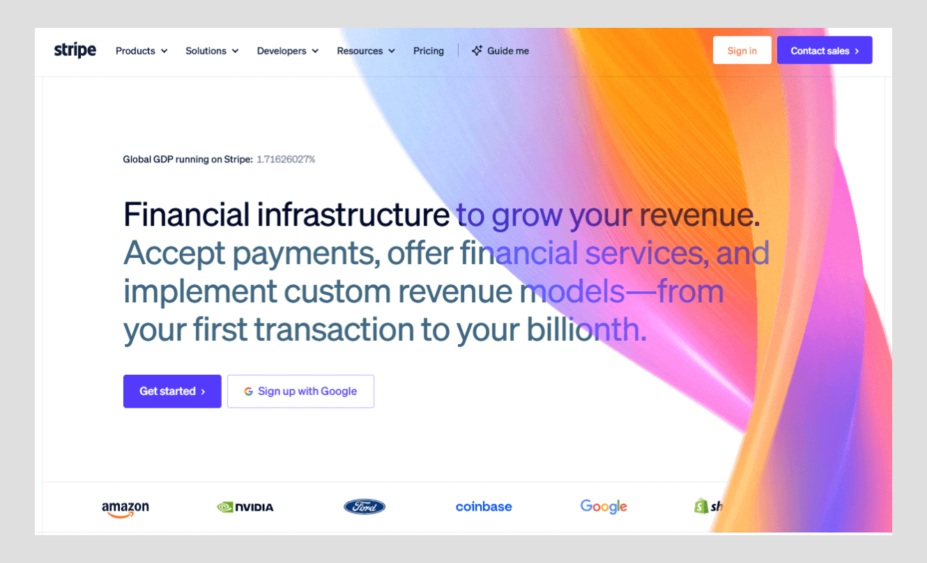
Almost every B2B and tech company is trying to emulate Stripe. Its complex product payments infrastructure is simple and trustworthy. The design is clear, the color gradations are renowned, and the writing is reader-friendly.
What works:
- Beautiful, signature gradient backgrounds that are clean and modern, but not loud.
- Copy with documentation quality clarity for the developer and the CEO to understand.
- Real code and product images that show the tool is effective.
What you can learn: You can make a hard subject feel easy. Do not hide behind jargon. Explain the value in plain words, then show the proof. Stripe rewrites whole sections often to keep them sharp, a reminder that a good site is never truly finished.
IBM (A design system that scales to thousands of pages)
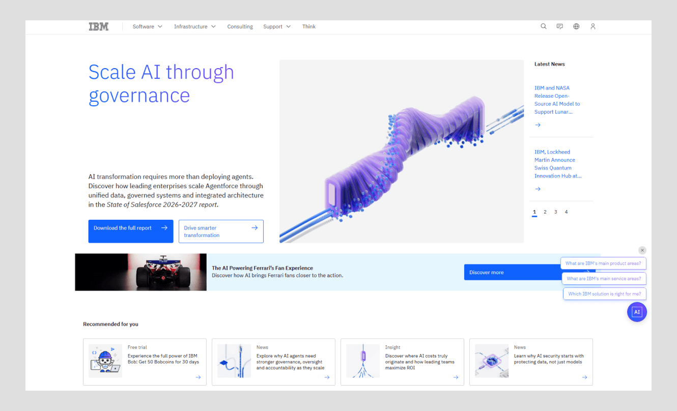
IBM is huge, and its website proves you can be huge and still feel consistent. The secret is Carbon, IBM's open design system. Each button, color, and spacing rule is defined once and used throughout. So, a page on cloud computing is like a page on consulting.
What works:
- Thousands of pages are visually synchronized with one shared design system.
- A professional and calm appearance for a serious business buyer.
- Strong structure that makes dense, technical content easy to scan.
What you can learn: As you develop, create a system, not a single page after another. A design system is saving time, reducing mistakes, and giving your brand a sense of stability. It is the difference between a company that looks organized and one that looks stitched together.
Atlassian (Many products, one clear brand)
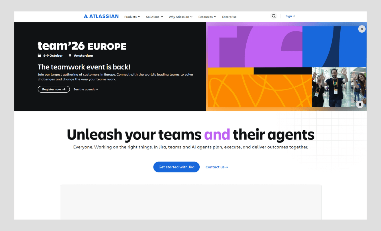
Atlassian develops Jira, Confluence, Trello, and more. That's a lot of planning to do. However, the site is never overcrowded. It will lead you to the correct product with clear paths and a consistent brand voice throughout a very large house.
What works:
- Smart navigation that categorizes dozens of products into easy, human selections.
- Consistent voice and visuals in a large product range.
- Clear entry points, so that a new visitor and a longtime user find their way.
What you can learn: Complexity is not a reason for confusion. If you have a lot of things to offer, organize them in a way that makes sense to your customer, not your organization chart. Good structure turns a maze into a map.
Salesforce (Enterprise trust with a human touch)
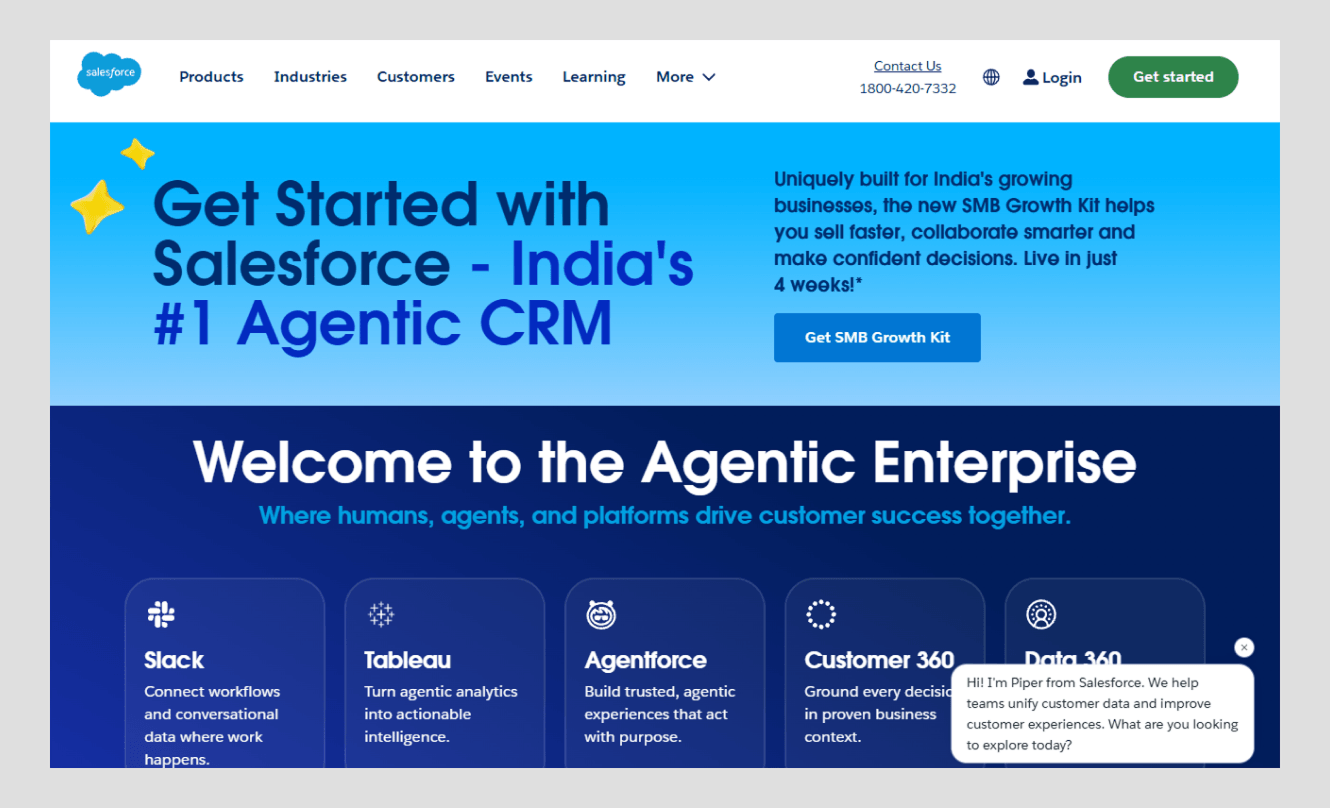
Salesforce may come across as cold and business-like. Rather, it is warm. The website combines serious business credibility with bright colors, friendly characters, and a friendly tone. It is proof that "professional" does not have to mean "boring.”
What works:
- A colorful, welcoming style that softens a heavy enterprise product.
- Clear solution paths by role, industry, and company size.
- Strong trust signals, customer stories, numbers, and recognizable logos.
What you can learn: You can be credible and likable at once. A bit of warmth and personality goes a long way in making a company feel human, and people purchase from human brands. Avoid sanding all rough edges just for the sake of "seriousness.
HubSpot (Outcome-first design)
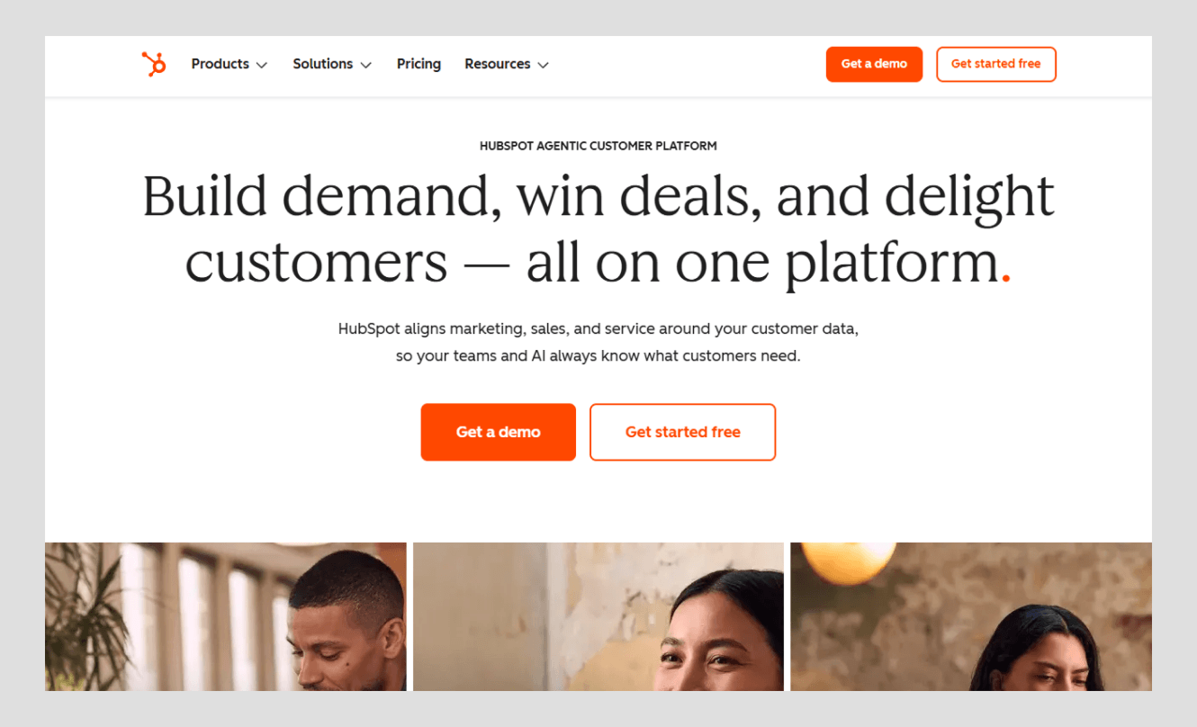
HubSpot's a results-driven company. There is no digging for value on the site. It shows you what you get: transparent numbers, clear tools, and a straight path from problem to solution. Everything points you toward the next helpful step.
What works:
- Clear, outcome-focused headlines that name the benefit up front.
- Solution-first paths that match a visitor's goal, not HubSpot's product list.
- Honest metrics and customer proof in the decision-making process.
What you can learn: Start with the end, don't start with the feature. People do not buy tools; they buy results. Show the win first, then explain how you deliver it. That order respects the reader's time and earns their attention.
Notion (Complex software made simple)
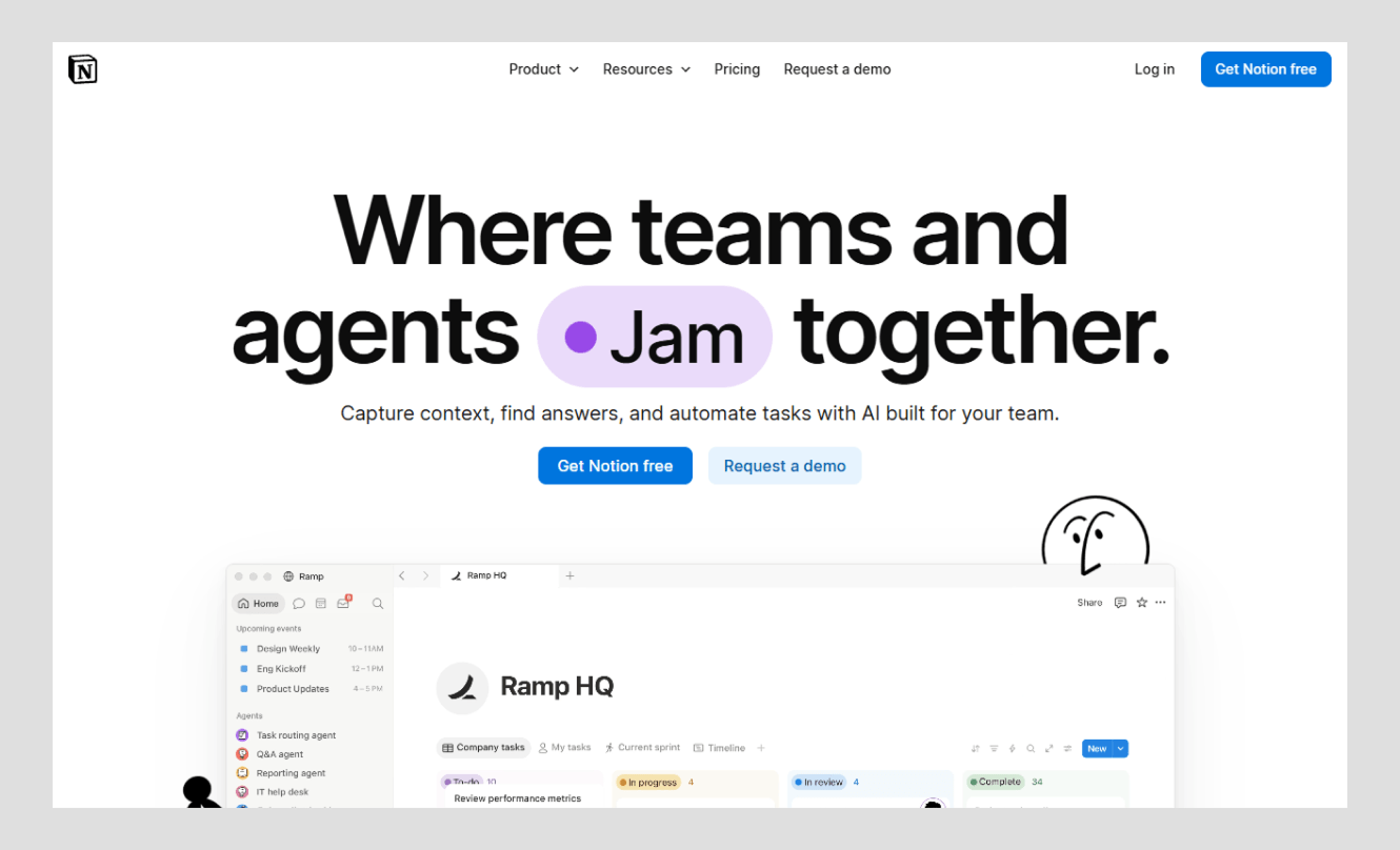
Notion is a very powerful and flexible tool that may be overwhelming to a new user. However, the website is light and friendly. Clean cards, calm layouts, and plain language turn a deep product into a simple, welcoming story.
What works:
- Modular card layouts that divide a large product into smaller, more easily understood cards.
- A relaxed and tidy appearance which reduces the risk of learning a new skill.
- Clear and straightforward language that does not put on a show.
What you can learn: Simple beats clever. When your product is complicated, your task is to make it seem simple, not complicated. Clarity is a gift to your visitor, and they reward it with trust.
Canva (Built to welcome and convert)
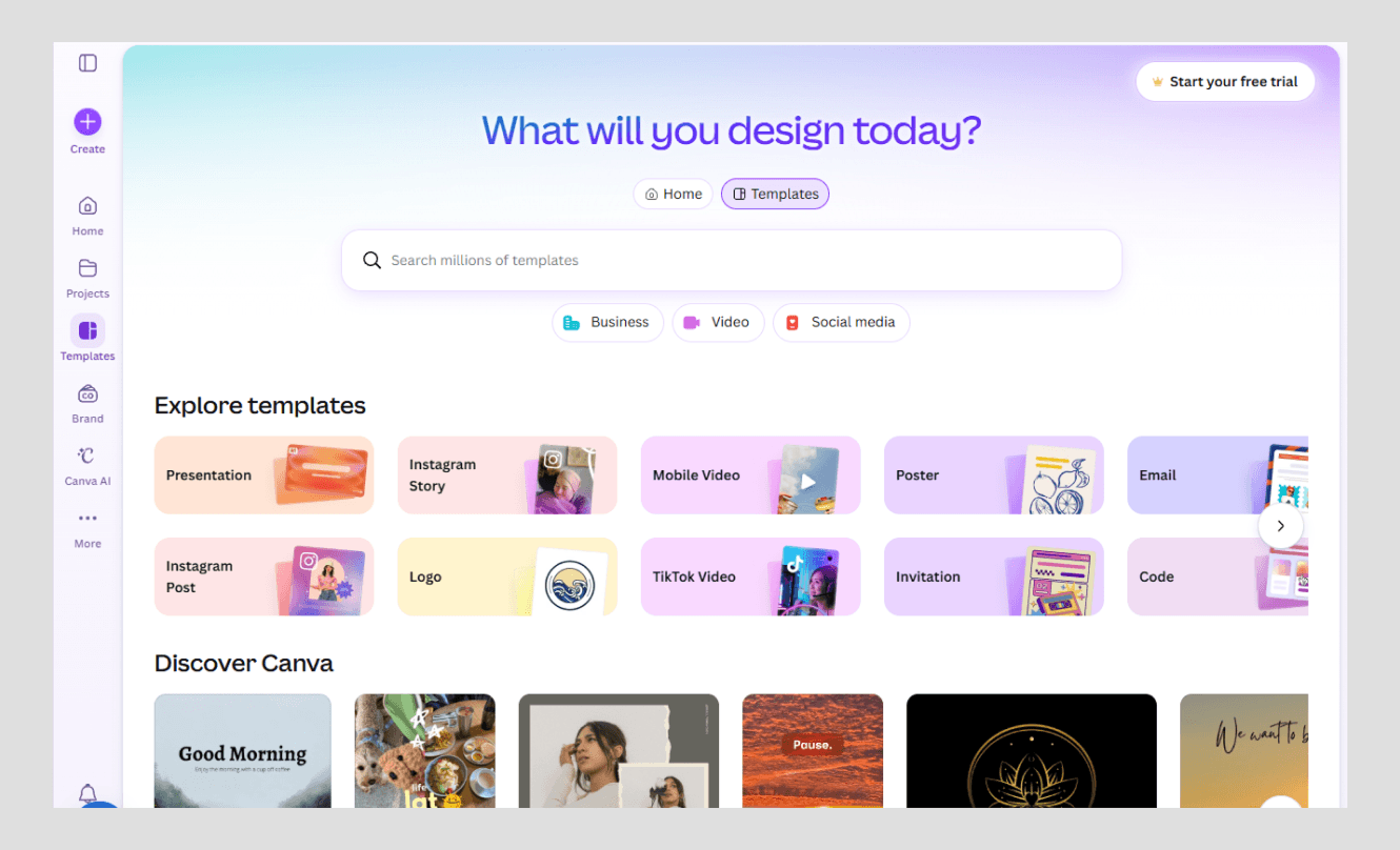
Canva provides design tools for all, and its website is all the welcoming. Colourful gradients and friendly images and happy buttons welcome you to jump in. Each section of the page pushes you towards the free entry.
What works:
- Colorful, inviting graphics; not threatening.
- Conversion buttons that you're ready to use, right where you are.
- An open invitation to sample the product.
What you can learn: Make the first step easy and inviting. A warm design lowers the fear of trying. And a clear, well-placed button turns interest into action. Friendly is not the opposite of effective, it's the combination of both.
Mercury (Premium calm for fintech)
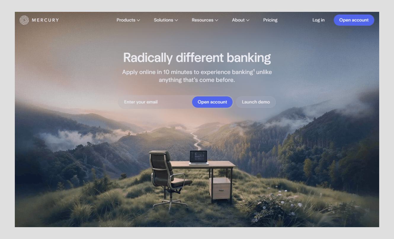
Mercury handles banking for startups, and its website feels like a calm, confident partner. The design is quiet, spare, and premium. There is no shouting, no clutter, just clean space and careful detail aimed at founders who value focus.
What works:
- A restrained, premium look that signals trust in a money-sensitive category.
- Generous space and careful typography that feel modern and grown-up.
- A clear message aimed squarely at its audience: tech-forward founders.
What you can learn: Calm can be a strategy. In a noisy market, quiet confidence stands out. When you handle something sensitive, like money, a composed design tells people you are steady and safe. Restraint is its own kind of proof.
Best corporate website designs for technology firms
If you run a technology company, look hardest at five names from this list: Apple, Stripe, Vercel, Notion, and Mercury. They share a common playbook that fits tech buyers perfectly.
They all lead with real product visuals, not stock photos. They all keep the layout clean so the product stands out. They all write in plain language, even about complex topics. And they all treat speed as part of the design, because a tech buyer notices a slow site instantly.
The lesson for any tech firm is this. Show, do not tell. Let your product and your page speed prove your claim before your words even try. That is how these five earn trust with an audience that is hard to impress.
What makes a corporate website effective for investor relations?
A company's website that is designed for investors is trusted because it is clear, easy to navigate, and provides solid evidence of stability. Investors are busy and careful. They need the vital information quickly, and they need to feel that the company is open and stable.
The best investor sections do a few things well. They put financial reports, leadership bios, and governance details within easy reach, no digging required. They have a clear and honest story on where the company is going. They also employ a clean and calm design which conveys a sense of organization and reliability for the company.
Because for an investor, a messy or confusing site raises a quiet worry. If the website is disorganized, what else is? A clear, well-run investor section answers that worry before it grows. Trust, here, is built through openness and order.
Which corporate websites have won design awards?
Some of the firms in this list are recognized by reputable design organizations. Creative, usable, and technically well done are also the qualities that make a corporate site effective and are rewarded by awards such as Awwwards and the CSS Design Awards (CSSDA).
Designers around the world study and praise Apple and Stripe as examples of design at the reference level. Technical performance and speed are often cited as advantages of Vercel and Linear. As with the awards themselves, the qualities that are recognized are the same ones that we've mentioned before: clean structure, speedy performance, and thoughtful detail.
However, awards are constantly shifting, and certain awards are only awarded in specific years. Therefore, it is always good to review a site's latest recognition on the award body's website before referencing a specific award. The best sign isn't one trophy; it's a reputation built over time that a site can count on.
Where to find more corporate website design inspiration
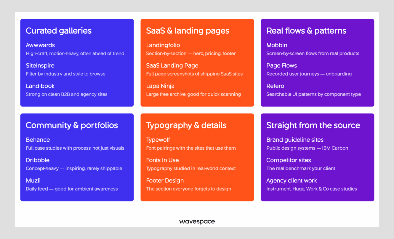
If you want to study great design on your own, a few galleries collect the best work in one place. They are the fastest way to build your eye and spot trends before they spread.
- Awwwards A daily showcase of top sites, judged by design pros. Great for cutting-edge inspiration.
- Landbook – A clean, curated gallery of landing pages and sites, easy to browse by style.
- Behance – Adobe's platform where designers share full projects, including corporate site case studies.
When you browse, do not just look for pretty pages. Look for why a page works: how it guides your eye, how fast it loads, how clear its message is. Copying a look is easy. Understanding the choice behind it is what makes you better.
And if you would rather partner with a team than build it alone, that is a fair choice too. A studio like Wavespace helps startups and growing companies design corporate and SaaS sites that balance clean design with real business results. The point is not who builds it. The point is that your front door deserves the same care as your product.
FAQs about corporate website design examples

The top corporate website design examples in 2026 include Apple, Stripe, Vercel, IBM, Atlassian, Salesforce, HubSpot, Notion, Canva, and Mercury. Each is strong for a different reason, from Apple's minimalism to Stripe's B2B clarity to Mercury's premium fintech calm. Together they cover the full range of what great corporate design looks like today.
Successful corporate websites share a few clear traits: simple navigation, a consistent design system, fast load times, mobile-first layouts, accessibility, real proof like customer logos and numbers, and small, purposeful animations. These features help every visitor find what they need and trust the company faster.
A corporate website is effective when it answers the visitor's question quickly, earns trust in seconds, and makes the next step obvious. Clean design, fast speed, and honest proof matter more than flashy effects. The goal is clarity: help the right person reach the right information without friction.
A corporate website is the official online home of a company. It shares who the company is, what it offers, and why it can be trusted. Unlike a single landing page or a campaign site, it serves many audiences at once, buyers, job seekers, investors, and press, from one central place.
Companies like Apple, Stripe, and Vercel are widely praised in the design community and often referenced for award-level craft from bodies such as Awwwards and CSSDA. Because specific awards change each year, it is best to check the current recognition on the award body's own site before citing a particular prize.
To rank in AI search, answer real questions clearly and early on the page, use simple headings, write in plain language, and show trusted proof. AI tools favor pages that are well structured, fast, and honest. In short, the same things that help human visitors also help you appear in AI answers.

More related blog
Have a Project? Let’s talk!







.png)



Francisco, CA 94105, United States





































.avif)