Problem and solution with long-scroll and single page websites


Long scroll and single page websites have become a trend. A study on the impact of large scrolling pages found a strong first impression (6.36 rated out of 7).
However, many businesses use this page style simply because of its looks. And here's where the page design starts to fail and sometimes performs worse than a simple multi-page structure.
The problem is not long scrolling itself. It starts when your visitors miss your key CTAs or have to scroll through content that they don’t even need.
So, the real question is not, “Is long scrolling good or bad?” It is, “Does long scrolling help your users find what they want?”
Here, I’m going to reveal 7 real-world long scroll and single page websites problems with corresponding solutions. So, you can make a clear decision about when to use long scrolling and when to avoid it.
What is a long-scrolling single-page website?
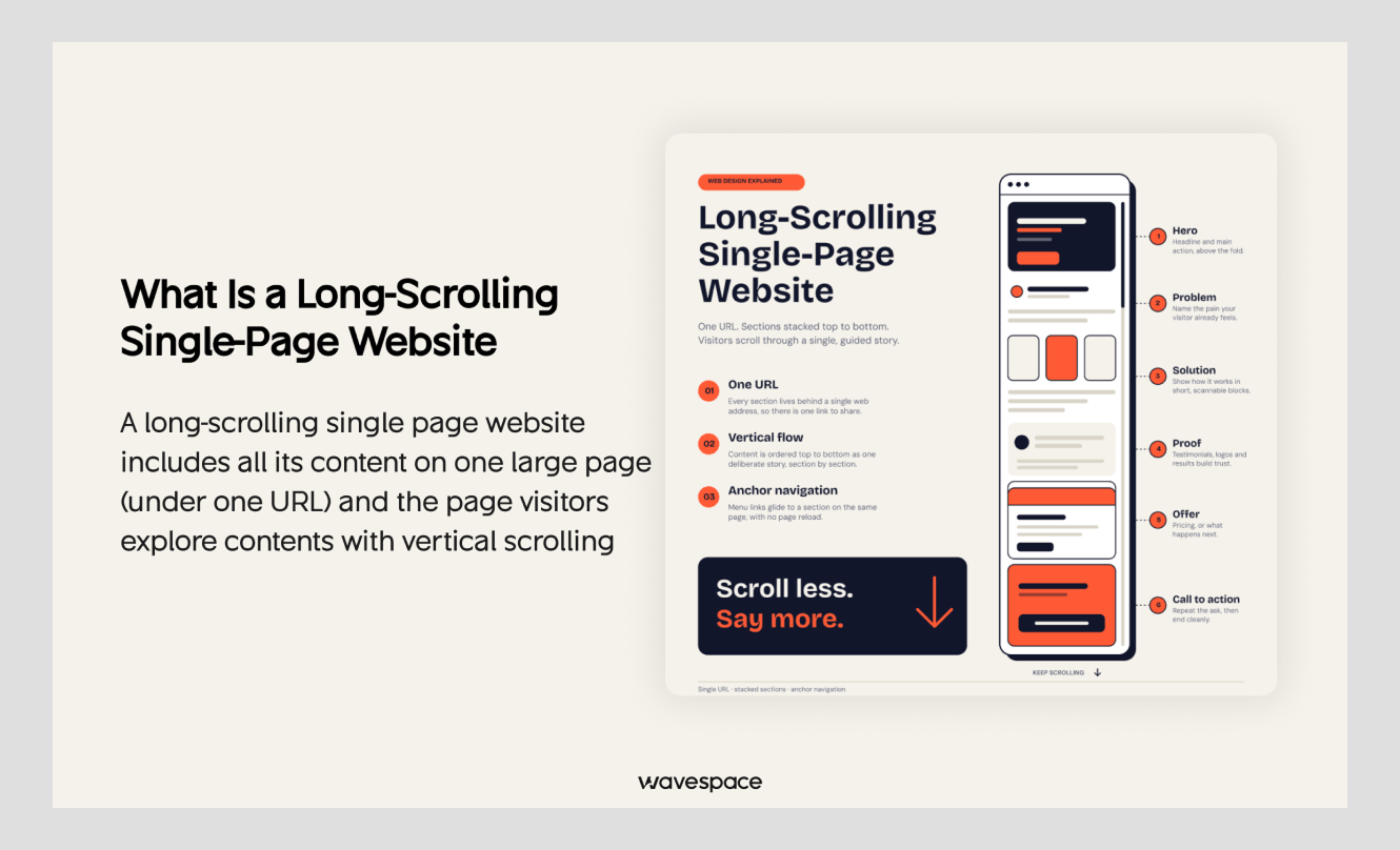
A long-scrolling single page website includes all its content on one large page (under one URL) and the page visitors explore content with vertical scrolling. It mainly includes sections for services, features, pricing, testimonials, FAQs, and contact information.
Unlike infinite scrolling, visitors navigate your content in clear sections. They use pagination, navigation links, or a "Load more" button to move through.
This one page scrolling format is common for:
- Landing pages
- Product launch pages
- Campaign pages
- Portfolios
- Case studies
- Interactive storytelling experiences
There is no fixed maximum length for large scrolling webpages. A scrolling page can work well with 15 sections or struggle with just 10. In real cases, in long scrolling pages, user experience is the real limit rather than page height.
A long page works well when each section provides a clear design hierarchy system with sticky navigation to keep the visitor engaged. So, they can quickly understand where they are and what to do next.
Now, let’s have a quick pros and cons table of long single page scrolling below:
Why long scroll pages become popular?
Long-scroll websites became popular because they can create an immersive, visually engaging experience. Here, you don’t force your users to click through multiple pages. The page designs naturally guide them through one continuous story.
That makes long scrolling useful for brands that want to explain a product, showcase work, or create an emotional experience. But a beautiful first impression does not always mean a good user experience.
Problems with long-scroll pages start when both search engines and your visitors don't understand the core context of the page. Or when there’s no logical content hierarchy with poor navigation.
This makes it harder for Google to index it all and rank, while visitors may leave before finding what they need or taking action.
Long-scroll design is not automatically good or bad. Its success completely depends on your user’s goal.
A long-scroll page should guide users. It should not make them hunt for information.
So, now let’s move on to the main problems of one long page and the specific solutions for each one.
7 Most common long-scroll and single-page website problems | how to fix each
If your one page scrolling is done wrong, you have user page abandon, poor seo signals and page loading issues. So, first you’ll lose your site traffic with higher bounce rate and of course conversions.
Here, we picked the most common yet important 7 long-scrolling site problems. And give you the practical solutions that our expert designers do to fix the issues for our clients site.
1. Your users can’t quickly find what they need
Problem: When you include too many sections in one long-scroll page, your visitors struggle with content discoverability based on their need. And, chances are high, they return back from your page without any engagement.
Why and when it happens: The heavy site browsing issue arises when the page has a weak content hierarchy, no sticky navigation, long text blocks, too many similar sections, poor section labels, or repeated info.
How to fix it:
- Add sticky page navigation with anchor links to key sections.
- Make a logical information architecture with the most important content at the top.
- Use “Back to top” or quick-jump links on very long pages.
- Break long text into short sections, bullets, and visuals.
In this case the rule is simple: after each major section, ask, “What should the user do next?”
Example: A SaaS landing page should quickly explain what the product does, who it is for, and what users can do next. Detailed feature explanations can come later.
2. Visitors lose interest before converting
Problem: If you use too much text based content on a long-scroll page, your users can lose focus before reaching the most important message or CTA. This is common on SaaS landing pages, service pages, and agency homepages.
Why and when it happens: It usually happens when the page section has long paragraphs, repeated points, wordy cluttered layout, or no visual breaks.
How to fix it:
- Keep paragraphs short and use visual breaks
- Use infographic images, hooky yet simple animations
- Use (H1-H6) headings, colored banned or CTAs
- Use action-focused copy, such as “Book a call,” “Start free,” or “Get an estimate.”
Example: In the hero section, place a clear CTA such as “Get a Free UX Audit.” After describing the service section, add another CTA “Book a Call with UX Expert Now”. It will hook your visitors more likely to click.
3. Users lose their place on page with poor anchor navigation
Problem: On long single-page or infinite-scroll websites, users can’t go directly to a specific section or return to the exact place they were viewing. This is very common on long product pages, documentation pages, news feeds, marketplaces, and social-style content pages.
Why and when it happens: It usually happens when your content sections do not have anchor navigation, content loads dynamically without updating the browser history. Or this scroll fatigue changes the page state without saving the user’s position.
How to fix it:
- Add anchor navigation links for different sections
- Update the URL when users move between important sections.
- Preserve scroll position when users return to the page.
- Make key sections shareable through direct links.
Example: A pricing page should include a direct link to share the enterprise plan for visitors. Not force them to explain, “Scroll down until you see the third table.”
4. Important content gets buried below the fold
Problem: When your visitors keep infinite scrolling, first they lose the hook of your content and they can’t track the main CTAs along the way. So, your visitors get blanked to convert before leaving.
Why and when it happens: It mainly happens when your CTAs do not stand out within the boring content section or you use too many CTAs in that one parallax site page.
How to fix it:
- Keep 1-2 primary CTA types across the page.
- Repeat the main CTA at natural decision points.
- Make CTAs visually different from surrounding content.
- Place an important CTA before users need to scroll too far.
Example: For an ecommerce brand, keep essential details like “price”, “Shipping & Returns,” and “Size Guide,” near the product description. For high-intent information, link to dedicated pages instead of burying it in the page.
5. Large one-page limit seo targeting
Problem: Google usually ranks pages better when they have one clear primary context. So, if there are different keyword types, search engines can’t figure out the primary page context. And you lose the potential search visibility for the core intent.
Why and when it happens: This mainly happens when you target different search intents on the same page. If you target info intended for keywords with commercial ended ones, it will clash to rank for an actual search query.
How to fix it:
- Use 1 primary keyword with same intended LSI variations
- Place the primary keyword in the title tag, H1, URL, and main headings.
- Use related entities naturally, without keyword stuffing.
- Make sure important content is available in the initial HTML, not hidden behind scroll-triggered interactions.
Example: If you try to rank one page for both “UX design services” and “UX design examples,” it hurts the page SEO. Because one keyword has service intent and the other is for an informational query.
6. Heavy media can slow down the page speed
Problem: Search browsers can load up to 5 mb content without impacting the loading speed. When your browser finds infinite content coming with every scrolling end, it takes more time to process the data and often stucks loading pages.
Why and when it happens: It happens when you use many heavy content sections like animations, videos, large images on your one page. Still, a visually rich page can still load fast only when performance is part of your design process.
How to fix it:
- Use simple videos or animations 1 or 2 times, use compressed images for other visuals.
- If it focuses on heavy design, keep lazy-load images, videos, below-the-fold sections.
- Avoid autoplaying large background videos.
Example: In our mobile app design service page at Wavespace, we use one animation or video for combining the whole experience of the app. And then add separate images for describing every feature panel. And worth mentioning, the LCP for this page is 2.3s (mobile) and 1.3s (desktop).
7. Scroll-based long content is invisible to the crawler
Problem: In 2026, Googlebot limits its indexing to only the first 2 mb for text-based content of your entire page. So, for your parallax scrolling page, Google literally focuses on the headers panel to decide ranking. And give less weight to the 70% content buried deeper in the rest page or ignored if it isn’t valued enough.
Why and when it happens: This issue doesn't arise for any particular content pattern. It happens to all long-page, heavy-content sites.
How to fix it:
- Keep your most primary things at the top
- Give a short summary of your entire page within the first heading
- Try to include the important CTA in the first section
- Avoid hiding critical information behind tabs, sliders, or scroll animations.
Example: In our UX audit consultancy page, we keep 2 CTA buttons “Call for an audit” and “see our work” with the review rating at the hero image. As it’s important for SEO, users, or conversions, we do not make it dependent on a single interaction.
Well, now you know the areas where long page scrolling hits. Then let’s check out how bad design with such problems can ruin the purpose of the entire page.
Bad long scrolling one page websites examples that fail
Large parallax paging mistakes hurt your page UX badly. The worst long scrolling usually happens in ecommerce shopping pages, official forms, product search pages, etc.
Even some of our industry experts sometimes fail to properly execute “infinite scrolling" on their site. Here are some of the worst examples of continuous scrolling pages:
1. Etsy product search listing
Etsy adapted infinite scrolling for their product-search listings. Though they included it for a testing purpose, turns out, it was a horrible fit for their shopping page.
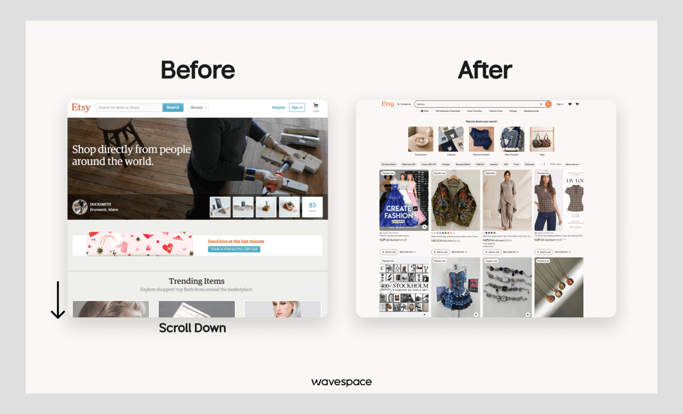
The main reason for the big flop is people can’t compare products, open items. The continuous list makes the “add to cart” and “checkout” hard and mostly confusing.
Etsy further removed the infinite-scroll experiment. They found around 50% fewer clicks on results and overall 22% less product purchases.
2. Apple iPad Air product page
The giant “Apple” also did the long page browsing wrong with scroll control. The page’s scroll animations were visually polished, but they took control away from users to move quickly through the content.
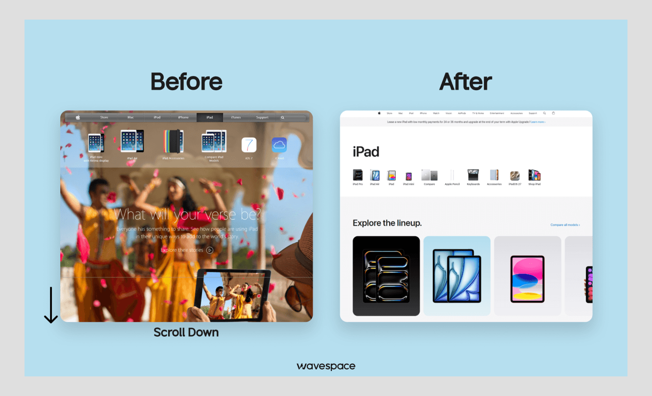
Apple’s product-page design has evolved repeatedly. This example shows why scroll effects should not take away user control. The mistake was not the page being long, it was the page taking control of the scroll input.
3. University of Maryland Health Sciences and Human Services Library
The original library website of Maryland was text-heavy and excessive scrolling. So, the participants get confused with every button, label. Again, the links are often hidden inside dense text.
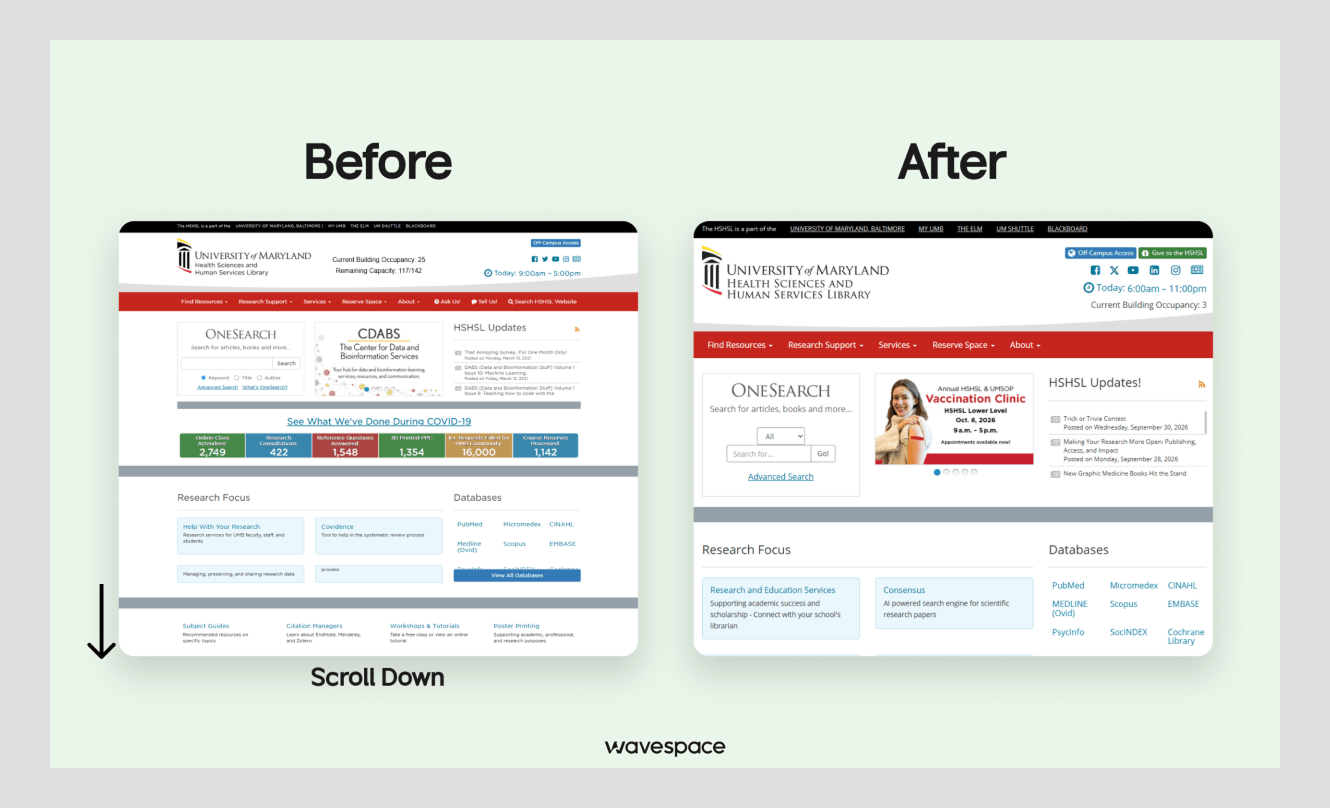
After this poor scrolling experience, it lost 50% less return to the homepage. However, the redesign has clearer categories, quick links to common tasks, a “What’s New” area, a search tool with far less scrolling.
And, in the follow-up testing, users complete all eight assigned tasks in under 10 minutes compared to the earlier average of about 20 minutes.
Well, yes. This is how lengthy scrolling impacts your page’s engagement or can be a serious browsing frustration.
Now, let’s move into where the long page scroll hits its best performance.
Best single page website examples that get long scrolling right
In many scenarios, a large continuous content page engages users to convert without getting lost using the right UX design.
Here are some of the best performing single page website examples that handle long scrolling well with great design and user friendly navigation.
1. Dropbox Dash × McLaren F1 team user guide page
This one-page case study of McLaren’s marketing team manages large volumes of race-related content with Dropbox Dash. Its scrolling sequence includes product UI, campaign context, data, and customer proof into a dense case-study page.
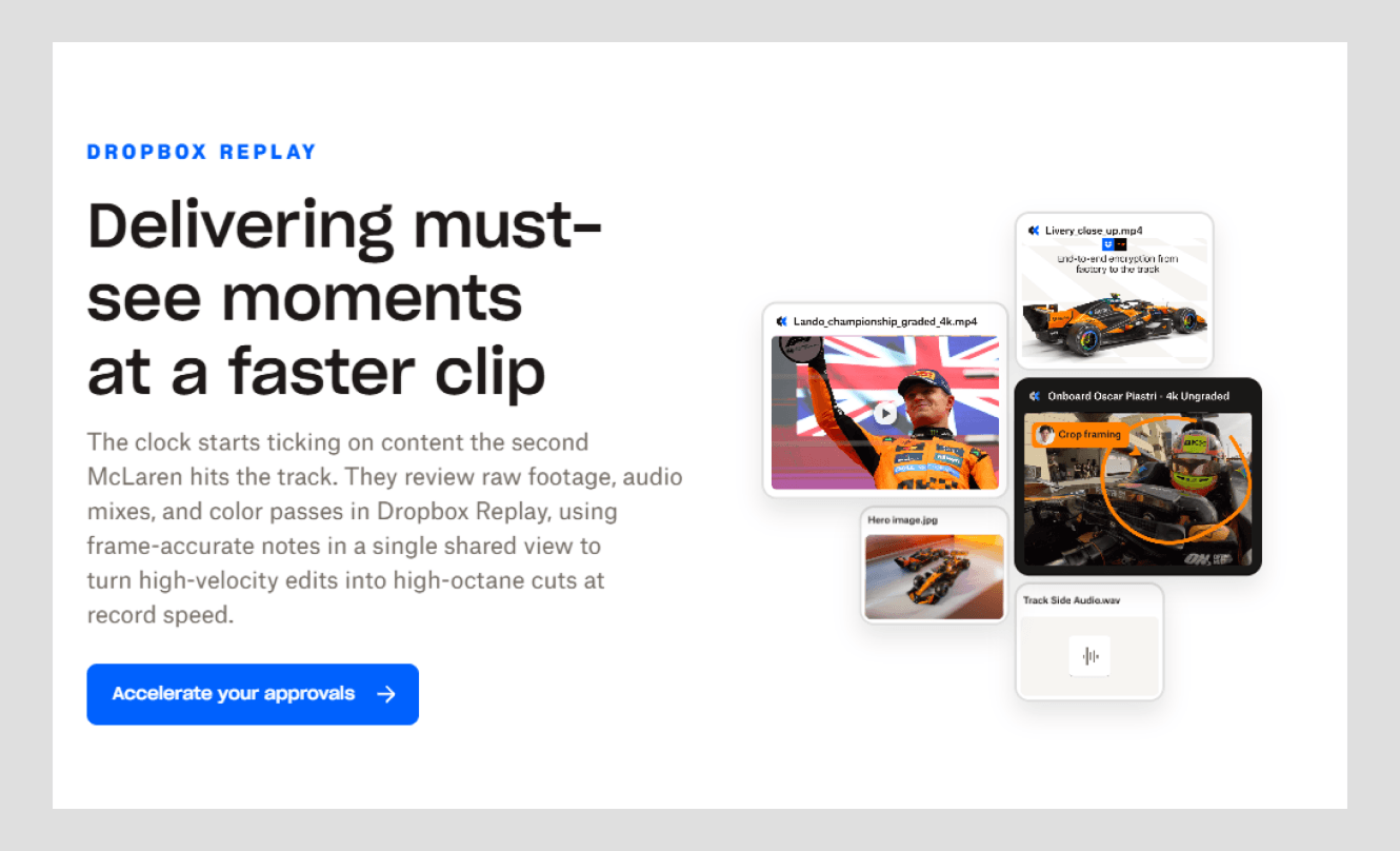
Apple’s iPad Air page used scroll hijacking, they control animation when the visitor’s scrolling. In contrast, the Dropbox Dash × McLaren page uses scrolling guides with direct jumps to specific sections of the information workflow.
It also includes a small “Pixelometer” for scrolling as part of the user experience. They design each content section with visual effects. And that's how they make the one page site perform at its best.
2. Kodezi home page
Kodezi home page is a strong example of a long-scroll single-page website that gets the scrollytelling format right. We redesigned the Kodezi’s long homepage to turn a feature-heavy experience into a clear, guided journey for developers.
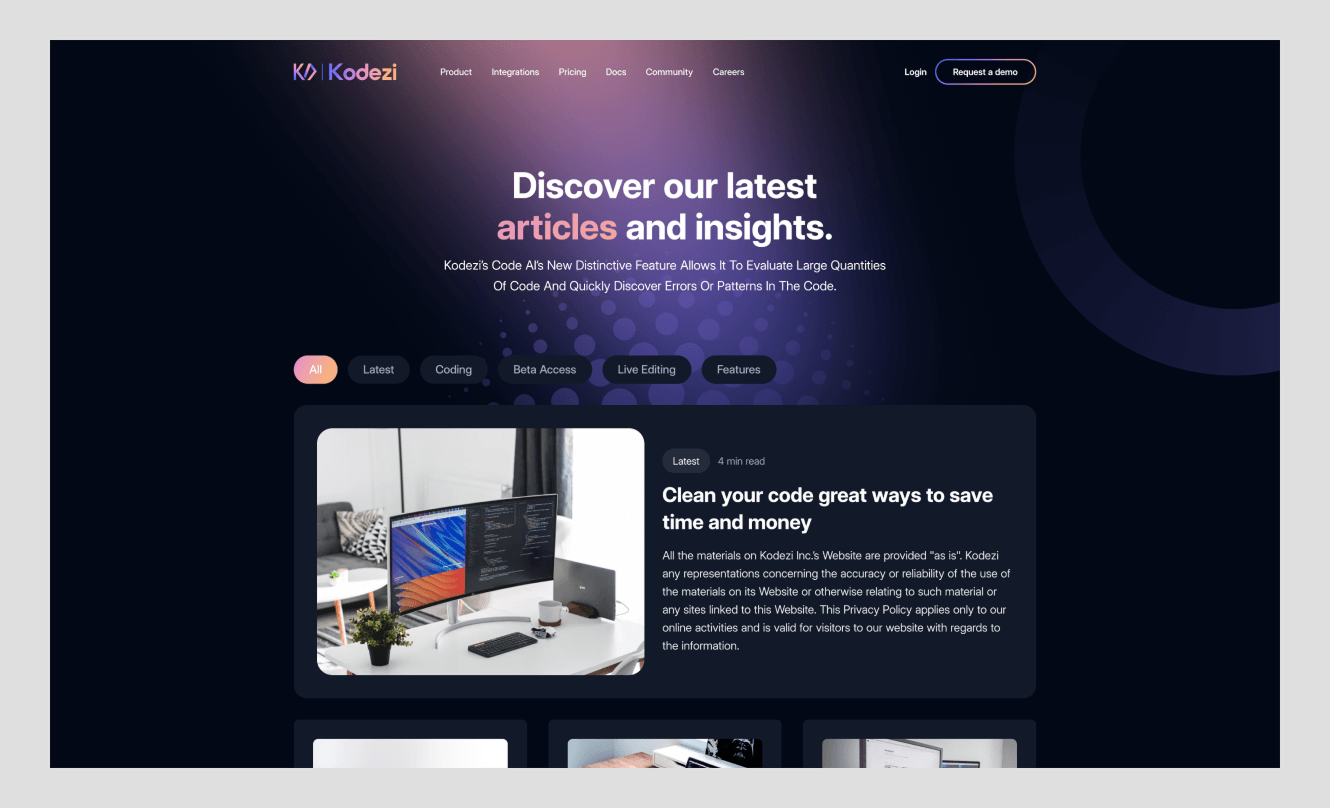
We structured the page around a simple narrative: what Kodezi does, why it matters, and what developers should do next. We also improved the content hierarchy, with clear entry points for users to quickly understand how to use the platform.
It includes illustrations, text, ambient sound, animation, in sequence with interactive scrolling. The result of the redesign stands out with closing $1.8M seed round, developers reaching their first fix 34% sooner, and 41% more AI workflow usage.
3. NU:RO watch landing page
This NU: RO product page uses long scrolling for a simple product story. It introduces the watch, shows the design, explore the strap color, and moves customers toward purchase with clear CTA.
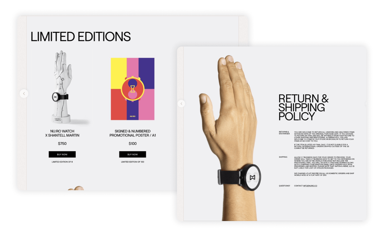
The interactions help explain the product, not just make the page look nice. It focuses every detail and also keeps the purpose narrow.
So, when customers land the page, they can know the product with max details and can confidently purchase without getting distracted.
When to use long scroll design and when to avoid it
We’ve both the worst and best case scenarios of continuous scrolling on one page. Whether you should use or avoid it totally depends on 2 things: page intent and user experience.
If you know the page type and your audience conversion journey, it will be easy to understand where you can use parallax loading and where not.
Let’s have a quick table of the usage of infinite single page loading:
Key Takeaway: You don’t always need to choose between long-scroll and short pages. If some pages need more storytelling while others need quick action, use a hybrid structure. Here, keep long-scroll pages for deeper journeys and shorter pages for faster decisions.
Conclusion
Long-scroll and single-page websites are not good or bad by default. Their success depends on your user’s goal (get detailed information or quick conversion). The best long-scroll pages do not force users to keep scrolling.
So, when you use a long page, you have to make sure the user scrolling behaviors don’t bore them. If your visitors don’t engage them, skip the long page and design multiple or hybrid pages with a faster and clearer experience.
Frequently asked questions

It can. A long-scroll page may struggle to rank for multiple unrelated topics because it has only one URL and one primary context. Again, search engines hardly index content if it loads only after scrolling or interaction.
Not always. A single-page website can rank well for one focused topic or campaign. It becomes a problem when you try to target several unrelated keywords, services, or search intents on the same page.
Use long scrolling for landing pages, product stories, portfolios, case studies, guides, and interactive storytelling. It works best when users need to follow a clear sequence rather than search, compare, or complete a task quickly.
A multi-page or hybrid content page structure is often better for complex websites. So, you use separate pages for services, product categories, guides, and conversion-focused actions. Again, keep long-scroll pages for storytelling or campaign content.

More related blog
Have a Project? Let’s talk!



















.png)



Francisco, CA 94105, United States





































.avif)