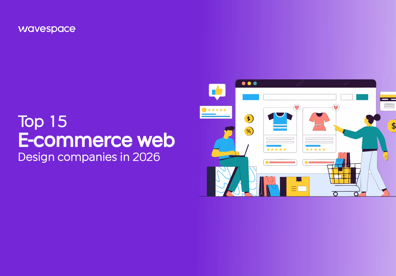
Top 15 Website Design Inspirations for 2026 (With Real Brand Examples)
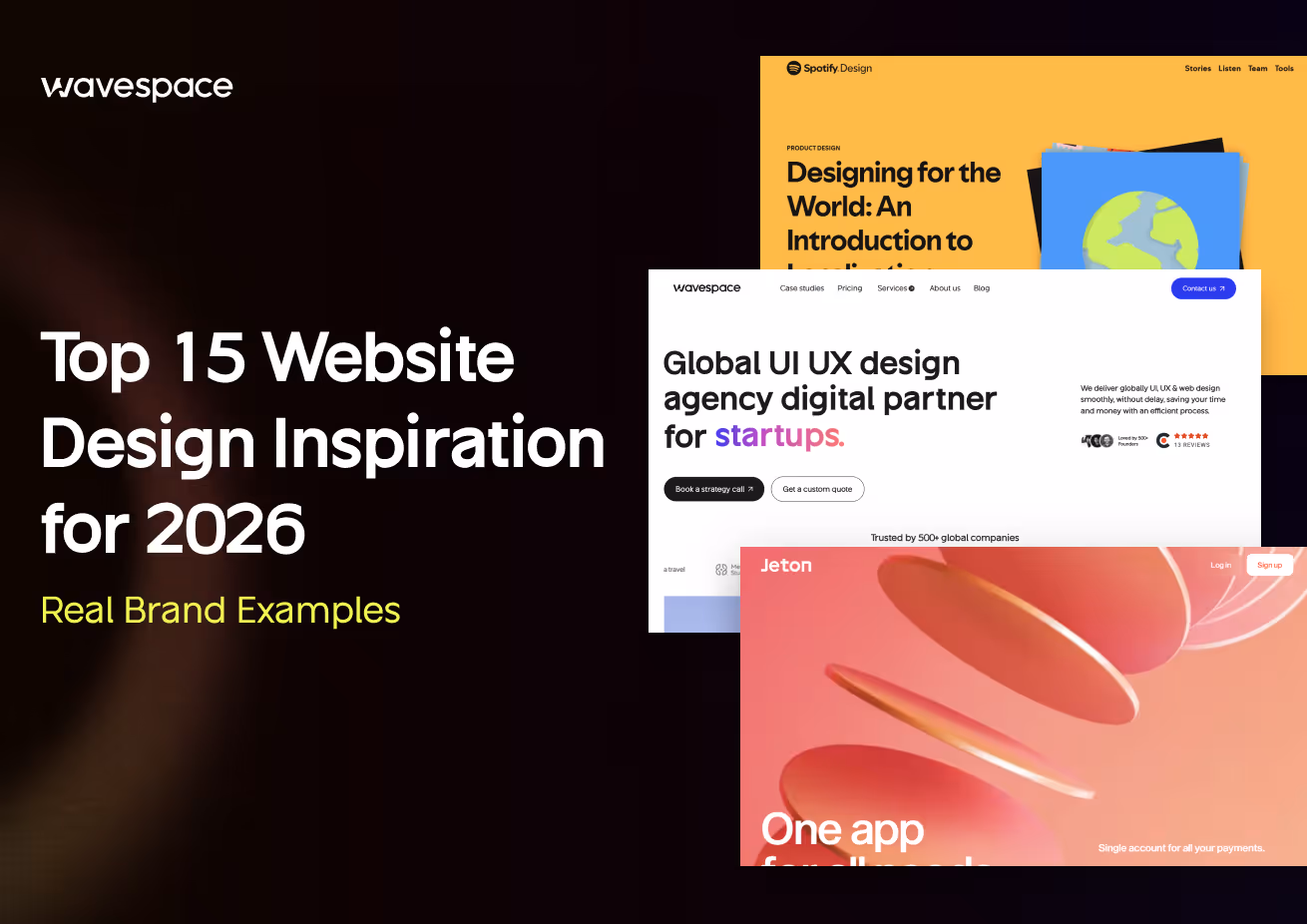


TL;DR This guide showcases 15 of the best website design examples in 2026, from award-winning fintech and pharma platforms to creative agency portfolios and tech giants’ product pages, explaining why each design excels. It features particular UI/UX choices, visual design, and innovation (with Awwwards and Webby awards), highlights the main lessons that designers can learn, describes what makes the web design great, how to create cool websites with the help of grid systems, typography, contrast, and motion, and also provides the frequently asked questions about trends, costs, and best practices that aspiring founders, SaaS team building units, and design specialists should consider.
Need some inspiration on the best website design examples in 2026? You’re in the right place. The following 15 best website design examples, both in technical platforms and in creative brands, exhibit innovation, design beauty, and excellent user experience. Find out why all designs are so good and what designers can learn to make their own cool, innovative websites.

Best Website Designs With Real Brand Examples
In 2026, the company website is much more than an online brochure; it is the initial handshake with customers and investors, it is a living narrative, it is a vision, and credibility. Be it a founder who has a redesign to consider or a UX/UI designer who is in need of creative input, research through award-winning websites can show what actually works.
The 15 examples that have been celebrated in the past in both the fintech and the creative tech industries demonstrate how design can combine storytelling, usability, and emotion in creating real impact. Each of these sections discusses why the design is so great, the visuals used, the flow, and the user experience, and concludes with a point to designers. At the end, you will not only know the current best of web designs, but also be able to know what constitutes long-term excellence in the digital world.
Jeton
Phamily Pharma
Osmo Supply
Gufram
David Langarica
Spinx Digital
Foundry
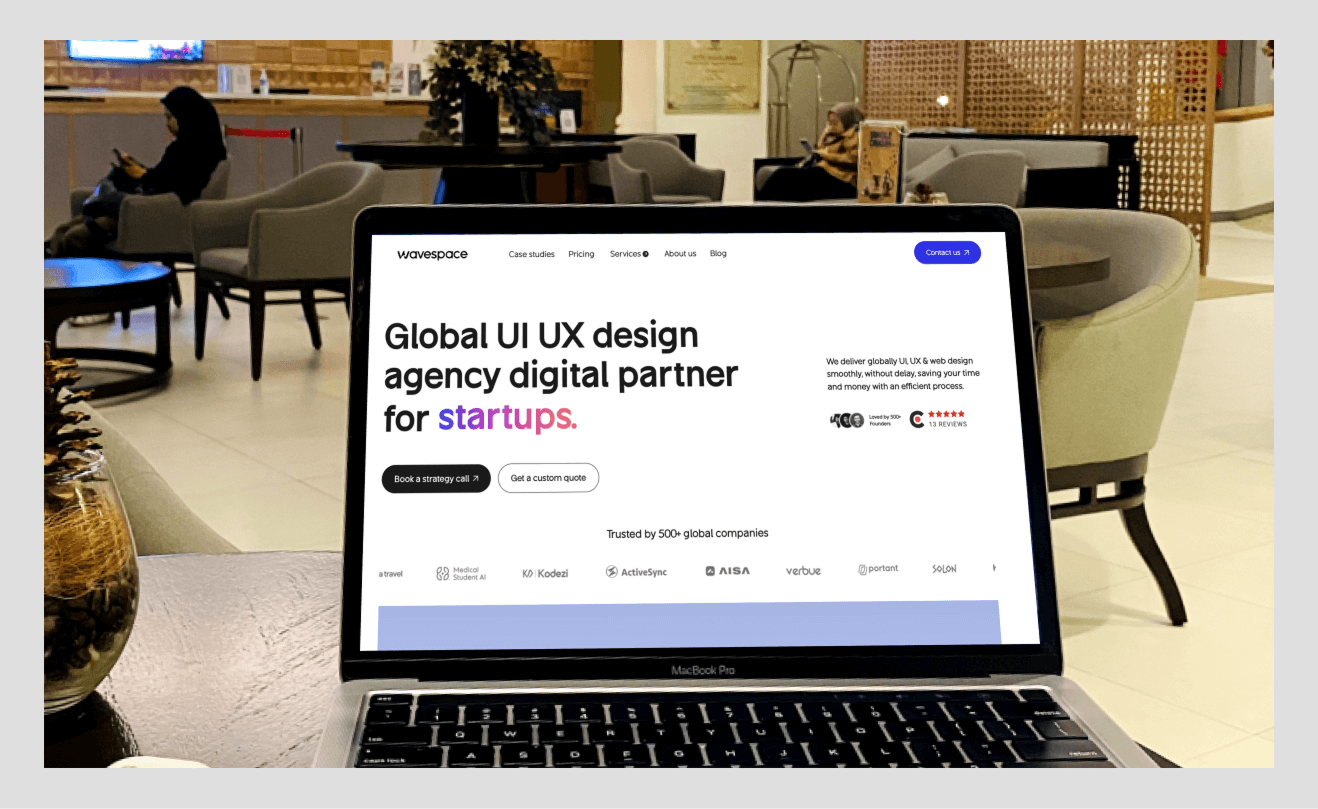
Wavespace
Awwwards
Lusion
Noomy Agency
ClickUp
Spotify Design
B-Egg Farm
Apple Siri
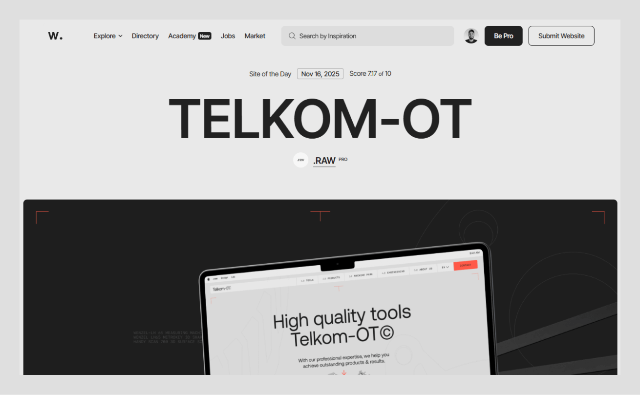
Jeton
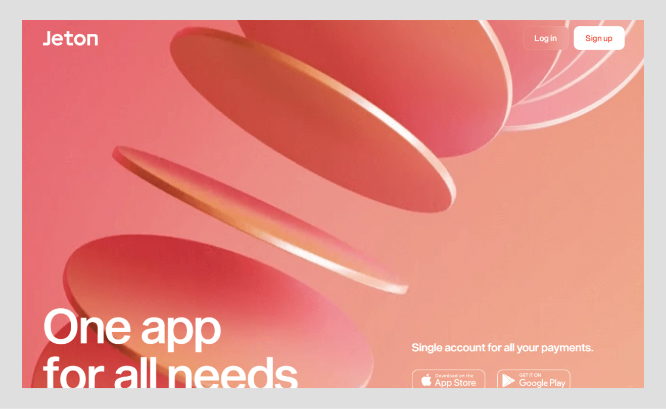
Why this design stands out
Fintech x immersive design: The UX-based redesign at Jeton combines serious finance flow with hands-on scroll-based movement and a morphing desktop-to-mobile experience, winning Awwwards Site of the Day. Creative-grade interactions, which are uncommon in fintech, are intentional.
Award-winning user experience: Two Golds at Clube de Criatividade de Portugal validate intuitive navigation and user-centric flows, crafted with Bürocratik. High scores in design and usability in Awwwards are indicators of performance, readability, and brand implementation.
Dynamic visuals with purpose: A subdued black-and-white platform featuring a signature orange color shade, orange color, marking CTAs, is in place. The corporate trust and creativity are well balanced in cinematic scrolls and interactive footer without making users feel lost.
Seamless multi-device design: Animated transitions adapt hierarchy across breakpoints, reinforcing “your money, your way” while maintaining speed and polish. The build was nominated and won an Awwwards Developer Award in code quality and performance.
Trust through design: The discrete security badges and compliance marks allow credibility, and the UI is smooth and modern, which shows that fintech can be trustworthy, as well as futuristic.
Phamily Pharma
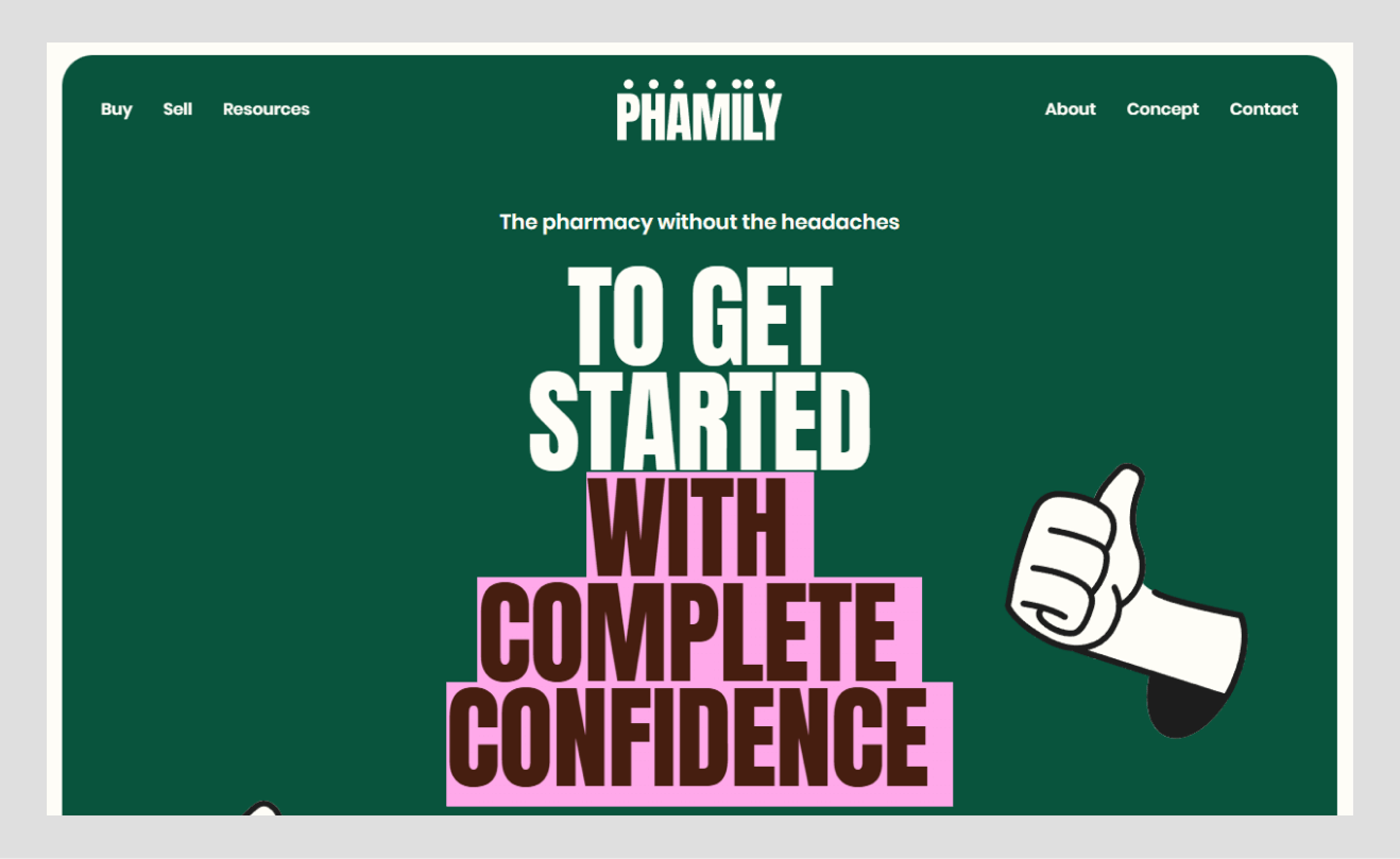
Why this design stands out
Human-focused healthtech: Friendly visual, dark green 09543D, and patient-focused visuals create a compassionate message but also break down complicated stories about the pharma supply chain. The tone is instantaneously contrasted with sterile and clinical conventions.
Creative UI designs: Sticky cards and hand-drawn components follow the scroll, overlaying storytelling and keeping major messages on the screen so that complex information can be understood.
Design-based storytelling: Founding narrative, people illustrations, and even a comfy 404 page help to keep the emotions and focus the way on the community.
Clear layout and simplicity: A professional-level grid, readable fonts, and plenty of white space make it easy to understand; no creativity negatively affects readability, and it serves both clinicians and patients.
Osmo Supply
Why this design stands out
Eco-focus: The eco-friendly images and eco-themes state sustainability in the first screen, positioning the catalog as a trendy movement instead of a generic store.
Visually curated experience: Clean product-oriented designs with large-resolution photos and organized grids look more like a gallery, without the clutter that characterizes e-commerce.
User-centric navigation: There are easy categories of users, intuitive filters, and meaningful content blocks, making extensive assortments easy to navigate and supporting the sustainability narrative.
Innovation and trust blend: This is achieved through quick performance, responsive design, reviews, and transparent pricing that combine creativity and credibility; the use of subtle animations reinforces rather than distracts.
Recognition for purpose-driven design: Unity in visual language is a more authentic reflection of the future of a cleaner world, and this is what earned the top-nominee status and appeal to values-driven consumers.

Gufram
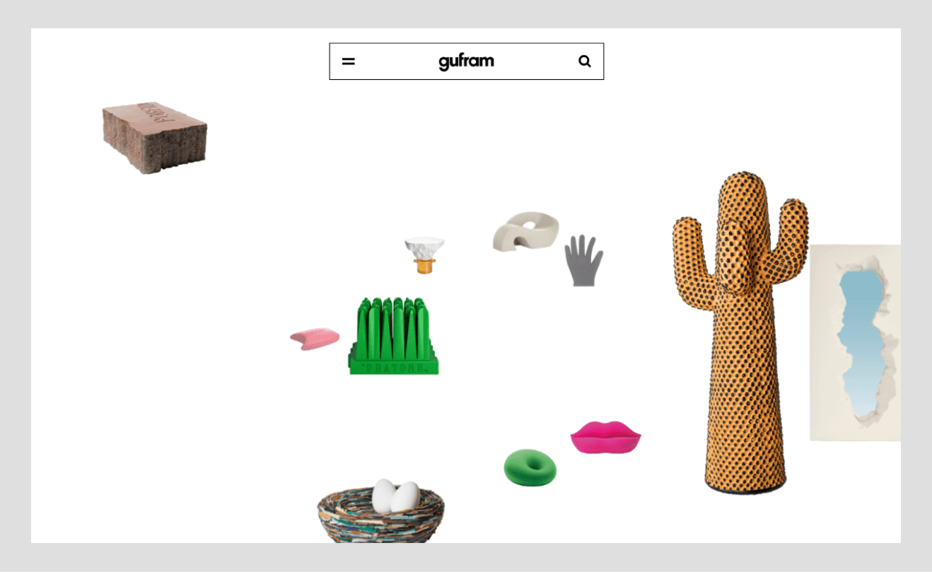
Why this design stands out
Lighthearted brand image: Bold colour, fantasy graphics, and the use of catalogs as exhibits all represent the avant-garde brand persona, which sends the signal of creativity immediately.
Immersive animations: 3D elements animations relying on WebGL blend into the gallery and web, and present products memorably and interactively, amplifying discovery.
Award-winning creativity: Unbeaten-track navigation and premium graphics attract attention; the risks are punished but not lost.
Compositional visual storytelling: Typography is provoked by a retro touch, a lot of negative space, and editorial modules are telling history, collaborations, and craft with curatorial attention.
Balance between art and functionality: There is a clear hierarchy, menus that can be discovered, and clearly visible CTAs make the experience friendly and shoppable, and demonstrate that ultra-creative can still be functional.
David Langarica
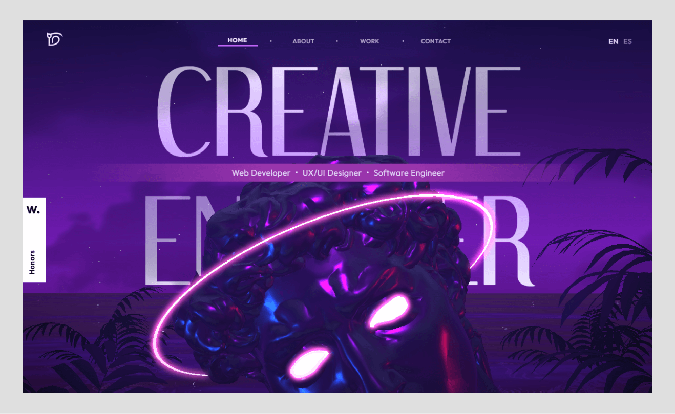
Why this design stands out
Personal portfolio as art: Capturing hero images and sophisticated cursors places a single designer on an agency level.
Simplicity with character: The simplicity of character, the clear differentiation of type, and the slight hover effects allow the work to breathe and still introduce character.
Story-based case studies: Large image, video and considered narrative transition between issue and solution as a magazine spread, and appeal to potential clients.
Awards and community kudos: Inclusion in lists of the best website designs for up coming years is the indication of the polish and perfect mobile responsiveness.
Effective self-branding: The use of colour, mark, and tone is consistent; the portfolio by itself is an asset as a marketing tool in a crowded profession.
SPINX Digital
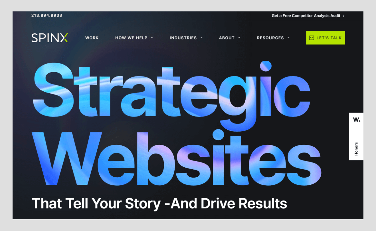
Why this design stands out
Agency showcasing its chops: Sleek, conversion-oriented design doubles as live proof, pairing bold branding with real project integrations.
Authoritative content integration: A prominent, well-designed Insights hub demonstrates thought leadership without breaking visual rhythm.
Interactive portfolio elements: Sliders and animated thumbnails invite exploration; micro-interactions clarify clickability and flow.
Conversion-driven UI: Prominent CTAs such as Let’s Talk are highlighted through contrast and positioning, which make sense and fits the purpose of the business.
Consistency and trust: Stickiness icons, dependable palette, and social proof incorporated in the experience enable the experience to be professional and user-friendly.
Foundry
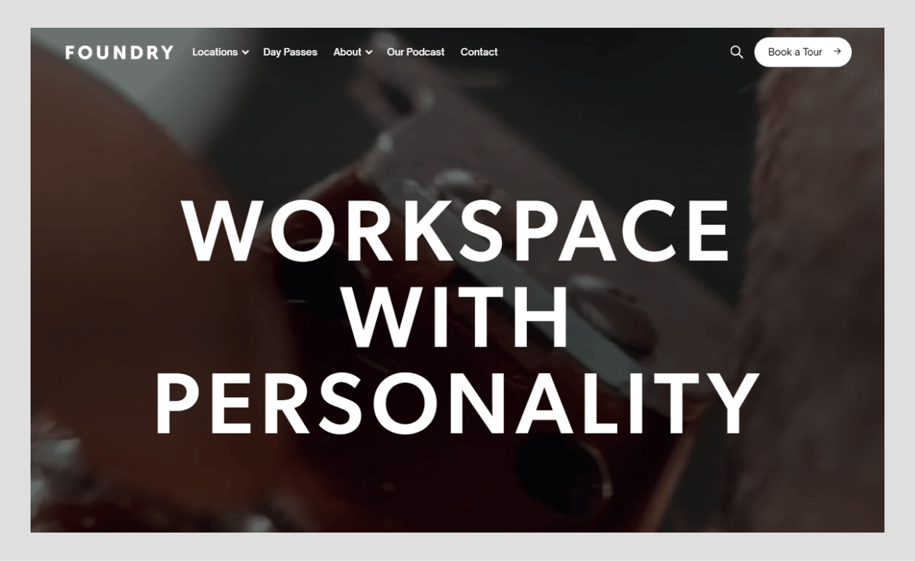
Why this design stands out
Minimalist elegance: The black-white- gray palette combined with a large amount of whitespace gives the gallery an impression and makes the art the center of attention.
Flat design & clarity: Clean lines and non-skeuomorphic UI keep imagery and copy crisp across devices.
Grid-based layout: The layout is a strict grid system and is organized and predictable, with graceful multi-column to single-column collapses.
Fast and user-friendly: Light pages and simple menus provide the best browsing experience; it is mentioned as form-meets-function perfection.
Trust through simplicity: When the type and spacing project will be of consistent quality, simplicity can be used to increase the trustworthiness, since each detail will be purposeful.
Wavespace
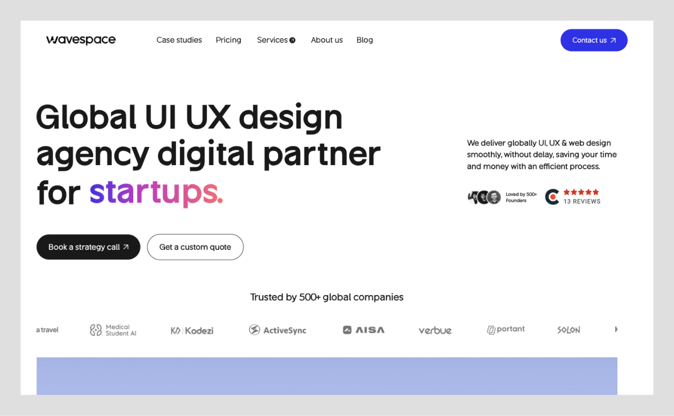
Why this design stands out
Design agency as tech innovator: A smooth, Awwwards-nominated interface packages services and output with certainty.
Dynamic hero messaging: Cycling lines are used to address startups, AI/ML, and SaaS, where the hero is personalized in real-time.
Data and credibility up front: Animated metrics and tier-one logos convey proof at a glance; external signals reinforce trust.
Slick interactive elements: GSAP-smooth transitions, hover previews, and a frictionless “Book a call” flow show craft end-to-end.
Awards and social proof: Recognition and clients are mentioned in the story, but they are not noise, which directs serious buyers to the clear next steps.
Awwwards
Why this design stands out
Curator of the web’s best: Minimal, content-first layout and dark theme spotlight winners and nominees for seamless inspiration.
Focus on content and community: powerful categories, tags, and search can handle huge amounts of content without adding weight to the interface.
The latest trends in the spotlight: Infinite galleries, smooth transitions, and responsive masonry grids will add usability to the site but not distract from the content.
Recognition and trust: The Webby level of credibility and explicit calls to action (voting, comments, submissions, etc.) is how an active community develops.
Educational and inspirational: Blog and Academy have regular styling, heavy content in easily digestible image-based formats.
Lusion
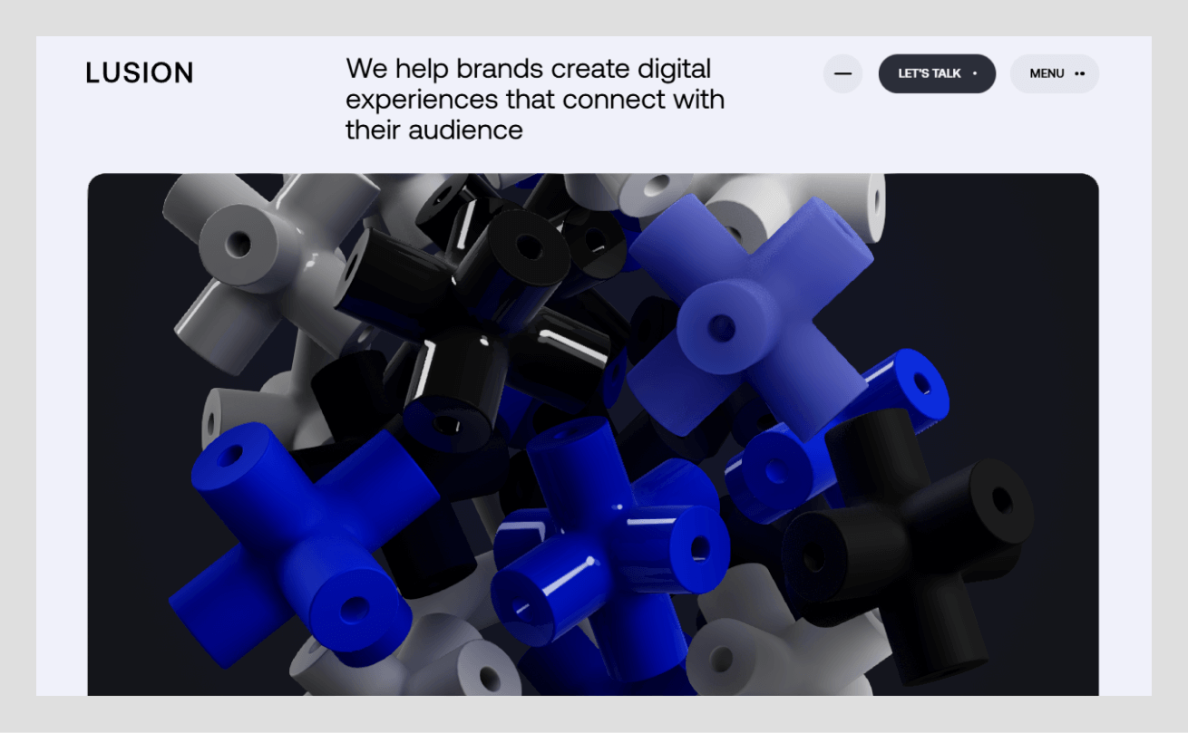
Why this design stands out
Hardcore visual effects: WebGL, 3D, and flowing transitions establish the cinematic immersion of the hero and further.
Interaction Storytelling: The storytelling of a portfolio should be interactive via scroll-based choreography, the use of parallax, and mouse responsiveness; Site of the Month awards follow.
Cohesive aesthetic: Sleek type and a limited palette balance experimentation with unity; jury scores exceed 8/10.
Pushing browser limits: Advanced shaders and GPU effects are tempered by optimization and fallbacks, setting a benchmark.
Lessons in limits: Performance tradeoffs are addressed with streamlined mobile experiences, modeling responsible innovation.
Noomo Agency
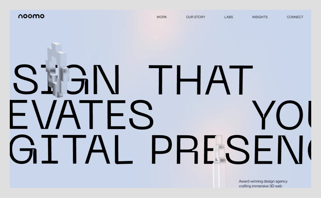
Why this design stands out
Futuristic and immersive: The future, immersive: AI, 3D, AR are integrated as living demonstrations of capacity, and they do not exist as a dead statement to the consumers.
Engaging yet user-friendly: The clear menu and logical structure combine spectacle with simplicity of use and get the best of awards.
Dynamic visuals with purpose: Background video and reactive illustrations are used to emphasize value propositions and not distractions.
Accessible innovation: Considerate toggles, optimizations, or lightweight alternatives welcome slower devices and connections.
Brand impression: A sleek, dark theme with vibrant accents leaves a memorable, tech-forward identity that functions like a live demo.
ClickUp
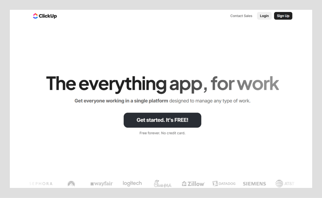
Why this design stands out
Product demo built-in: Built-in drag-and-drop allows the visitor to experience the app as the promise on the homepage.
Strong messaging & CTAs: “The everything app to work with” is accompanied by a clear-cut “Get Started - It is Free” to take action.
Showcasing breadth of features: Animated highlights, comparisons, and concise sections reveal depth without overload; key tools surface early.
Modern yet approachable design: White space, clean type, and pleasant icons make it accessible to both power and novice users.
Performance and responsiveness: Rich media is fast and scales well to mobile, and it serves to build product credibility.
Spotify Design

Why this design stands out
Brand storytelling hub: Brand storytelling is a co-created portal with Stink Studios dedicated to designers, case studies, and culture in an energetic, cohesive system.
Vibrant and animated: Multiple imagery, gentle movement, and the use of depth make energy that has received Awwwards honors.
Content-rich but navigable: Grid systems, tags, and vivid palette remain balanced with the white space and can be scanned easily.
Conversion and community: Light CTAs will direct the reader to teams and professions; the audio playfulness reflects the essence of Spotify.
E-E-A-T and trust: Authority is developed on the basis of behind-the-scenes processes, community ratings on usefulness, and credibility.
B-Egg Farm (B-EGG)
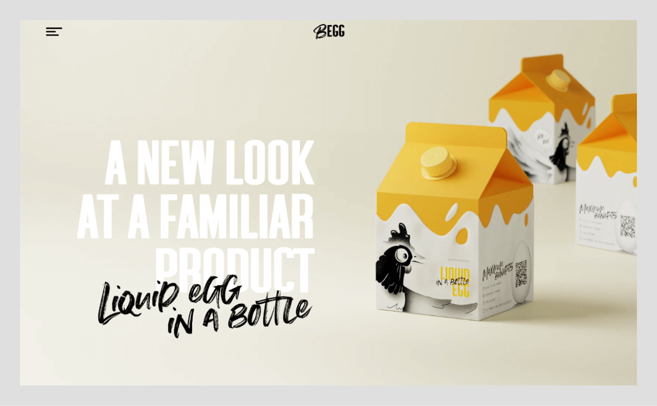
Why this design stands out
Playful narration of a farm brand: Tubik’s “Crazy About Eggs”, makes the biodynamic values real through the lovely illustration and tone.
Interactive and emotional design: Funny 3D and scroll shots make the experience enjoyable, and recipes and facts remain entertaining and practical.
E-commerce meets storytelling: Product and cart flows carry the same crafted personality, uniting packaging and pixels.
Full of awards: Site of the Day, Developer Award, Honorable Mention, and FWA of the Day ensure technical and creative superiority.
Brand differentiation: Uniqueness makes an ordinary product a unique experience and generates brand loyalty and word-of-mouth.
Apple Siri
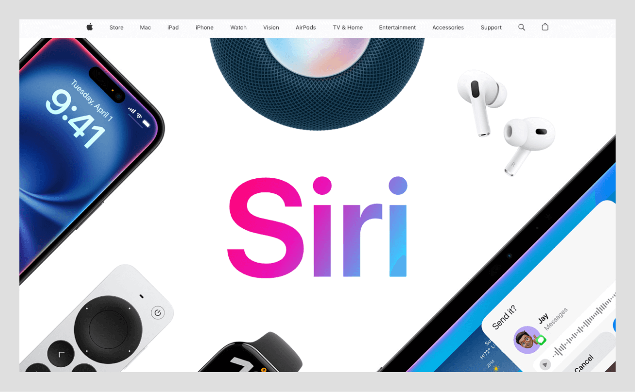
Why this design stands out
Scenario-based presentation: A day in life frame presents features on the go, in the car, working out, in the kitchen, and winding down.
Visual consistency and quality: Premium imagery, elegant type, and neutral palettes let product visuals lead; polish builds trust.
Interactive and informative: Smooth reveals, embedded clips, and animated waveforms guide attention; “Learn more” links extend exploration.
Improving privacy and trust: A special privacy section offers the issues in the story in a bold and clear design.
Considerate and usable: Responsive and tapable elements and contrast create inclusive mobile-first perfection on devices.
How Do You Design Cool Websites?
Design with a grid and visual hierarchy
Start with a grid system to structure your content; it brings alignment, balance, and organization to every page. Many great sites use a 12-column grid on desktop and scale down on mobile for consistency (hostinger.com).
After the grid, build a clear visual hierarchy with font sizes, weights, and placements. The headlines are on the front, the supporting text on the back, and the pictures serve as the center of attention on the top of each square in the grid. This arrangement is similar to how the eye naturally flows through the pages of Apple products or the Awwwards previews, using big headings, pictures, and then text.
Grids and hierarchy keep the creative layouts intuitive and visually appealing, and allow users to navigate content efficiently without any confusion. Cool design is well structured and loose, order and artistry coming together.
Use consistent spacing and typography
Consistency gives design its polish. Set standard paddings, margins, and gutters so layouts breathe evenly, and use a vertical baseline grid for rhythm. Consistent spacing avoids clutter and improves readability across devices.
Use no more than two types, one to use in headings and one in the body, and have a rational scale (e.g, H2 = 24px, body = 16px). This brings a balance and strengthens brand recognition. The site of Noomo Agency strikes the right balance between dynamic visuals and regular type and spacing, as well as keeping the creativity in check.
Repetition is the key: each page is in the same spacing, using the same scales and the same type rhythm, and the user subconsciously believes in the experience. Regular design is trustworthy, classy, and user-friendly, silent, business-like style that leaves visuals and content to shine on their own.
Apply contrast, motion, and feedback effectively
Contrast, motion, and feedback should be carefully used to make a design cool. Contrast draws attention; light text on dark backgrounds or bright buttons on neutral tones improve readability. Make size contrast work as well: big numbers next to smaller words, as with the metrics of Wavespace, quickly attract attention.
Add motion to reinforce content; Jeton’s smooth scroll animations or parallax effects make navigation feel fluid, not flashy. Micro-interactions such as hover color changes or button states provide feedback, making the interface feel alive.
Even minor indicators, a shaking password mistake or morphing menu icon, contribute to the level of engagement and usage. When motion, contrast, and feedback are combined, users are not overwhelmed; rather, they feel directed and amazed. What it achieves is a site that appears fashionable, is naturally behaving, and gives an impression of lasting effects.
Tips for a Creative Website Design
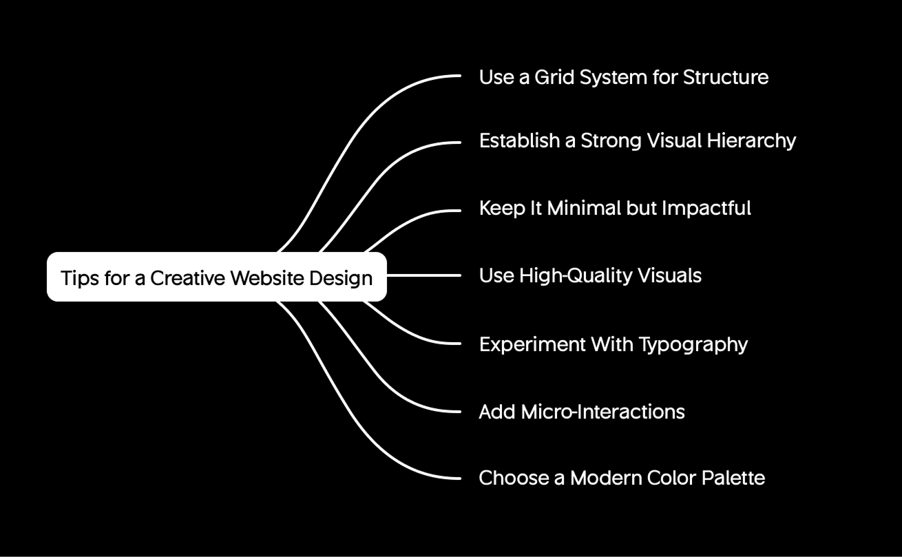
Tell a Story
Think design-narrative, each page must take the user through a journey by the user. It can be a portfolio or product presentation, but either way, you should set up sections in order to create a natural flow and a sense of emotion. Use visuals, transitions, and scroll-based storytelling to add rhythm and flow.
Consider an example of a farm-to-table story by B-EGG Farm; it takes a rather basic product and turns it into a memorable online experience. Storytelling is an emotional experience, which can help breathe life into inanimate layouts: into stories that touch. Users do not simply look at your site; they touch it. With a combination of narrative, images, and interaction, your brand will be memorable, and you will not be just another template.
Experiment with Layouts (Judiciously)
Creativity is successful in pattern breaking, but in a purposive way. Get beyond the standard patterns and see what asymmetrical grids, split screens, or overlaying layers will bring to the picture and provide depth and motion. In the case of Lusion, the site has experimental layering and diagonal framing to focus attention, but remains clear.
These techniques produce curiosity and not confusion. We should always test the usability, and the creative design must improve discovery and not confuse the user. Keep interaction paths predictable even when visuals are bold. A special design is only thrilling when navigation is also intuitive. Think of it as controlled creativity: expressive, structured, and meaningful.
Leverage Custom Illustrations or Media
Personalized images immediately make your brand unique. Replace generic stock images with original illustrations, handcrafted animations, or tailored media that reflect brand tone. Phamily Pharma’s site uses warm, humanizing artwork to transform pharmaceutical content into something approachable and trustworthy.
Customized images generate emotional attachment, build professionalism, and build identity. Not a single stroke, movement, or character must be used to ornament, but to serve the message. Whenever illustration, photography, and motion design are connected to storytelling, your site will be alive, genuine, and recognizable to you.
Use Color and Typography Boldly (but Purposefully)
Color and typography are emotional tools. Use them boldly but thoughtfully; contrast, hierarchy, and readability matter more than volume. The bold color palette can make a mood, and a specific typeface can make a tone.
Spotify Design is a bright example, with its fancy colors and new font reflecting the creative spirit. Select a consistent palette that reflects your brand personality and stick with it across components. Pair expressive headings with simple, legible body fonts to maintain clarity. Being bold does not imply being chaotic, but rather making confident decisions on behalf of your brand.
Incorporate Interactive Surprises
Small, delightful interactions make users stay longer. Add hover effects, micro-animations, or hidden Easter eggs that reward curiosity. Think the dynamic text transitions in Wavespace or the live drag-and-drop demo in ClickUp; both of them seem to be surprising the users, but show that they can do it. It is possible to make subtle animations alive that make buttons, menus, or icons memorable. The feeling of the interactivity must be meaningful, adding to the story, rather than taking away. When properly done, it transforms exploration into interaction and passive browsing into games.
Stay User-Centric with Creativity
Real-world ideas are nailed to imaginary ideas using easy navigation, page design, and quick load speed. Eliminate everything that makes the experience worse by querying, Does this make the experience better or water it down? If it supports clarity, keep it; if not, refine or remove. Creativity is turned to usability with user feedback, accessibility, and performance optimization. Whatever the boldness, the most suitable designs are those that seem easy to work with. Real creativity is creation with a balance between imagination and empathy, making each pixel have a sense.
Final Thoughts
According to research from Stanford, 75% of consumers judge a company’s credibility based on website design alone.
In the case of designers, they emphasize the collaboration of E-E-A-T principles and creativity. Good design is instinctive, reachable, and emotionally appealing. The takeaway? Be user-focused, be better, and make form functional. The most popular places are always updated through feedback mechanisms, and they are constantly better, always inspirational, and guiding digital experiences.

FAQs about Website Design Examples
The examples are Jeton fintech site with seamless UX (Awwwards Site of the Day) and 3D motion (Awwwards Site of the Day), creative studio by Lusion (Awwwards Site of the Month), and eCommerce site by B-EGG Farm (Awwwards SOTD and FWA wins). These show the possibility of creativity and usability to co-exist. Look at Awwwards or CSS Design Awards to have more ideas.
Pay attention to innovation and experience. Apply immersive visuals (3D, micro-animations), should be mobile-first responsive, and be superfast. Represent your tone as a brand, e.g., Spotify Design is boldly colored and has its own personality. Add interactive features like ClickUp’s live demo or narrative scrolling for impact. Create a balance between being creative and easy to understand and use so that your site does not seem all alike.
Approximately 75 percent of users base their credibility on the design of a brand (wix.com). A properly designed site creates trust, increases interactions, and increases conversions. Effective UX, clean layouts, and strong visuals help users navigate to what they want in the shortest time possible. Good design also enhances brand identity and access to broader audiences with the help of mobile and accessibility optimization.
Professional web design costs depend on complexity and range, and cost between a few thousand and more than $10,000 USD. Personalized, animation-based websites such as Lusion’s are more expensive because of research and development time. It is less expensive to use templates or builders (($20–$100/month). Finally, quality design is a cost that leads to ROI in terms of conversions and brand loyalty.
Use a builder (like Wix, Webflow, or Squarespace) for quick, affordable launches. Builders supply concrete templates with restricted customisation. When it comes to high-level, innovative, or brand-specific work, a web design agency will provide tailored output, as Jeton or Noomo Agency did. Agencies bring UX strategy, technical skill, and creative storytelling. Decide according to goals, funds, and the scope of the project.
Major trends are dark mode, Neumorphism, and 3D visuals to create immersion. The slightest navigation, minimal interaction, and cursors are polished. Content personalization via AI and bold fonts, and divided screens improves the storytelling. Inclusivity and sustainability also influence color palettes and imagery. As usual, wear trends that fit your brand; purpose should inform every creative decision.

More related blog
Have a Project? Let’s talk!


.avif)

