
Openhub is a CRM platform that helps businesses manage customers, track deals, and organize sales in one place. It's made for teams who need simple workflows and quick access to customer info without using many different tools.
Openhub had problems. 35% of users got lost in confusing menus and couldn't find key features. People quit using it. Sign-ups stayed low. We redesigned everything to make it simple, clear, and easy to trust.

Why users left Openhub
Users struggled to complete basic CRM tasks because the interface was unclear and hard to navigate. Important features stayed hidden, workflows felt slow, and people lost trust in the platform.
- Confusing navigation: 35% of users couldn't find key features like Deals, Lists, or Activities, wasting time searching through menus.
- Hidden features: Important tools like contact management and deal tracking stayed buried, so users never discovered what the platform could do.
- Complicated workflows: Simple tasks like creating a list or adding a company required too many steps with unclear instructions.
- Low retention: 72% of users stopped coming back because the platform felt frustrating and hard to use daily.
- Weak onboarding: New users got confused during setup and couldn't figure out how to organize their customer data properly.
The solution we created for Openhub
we created a streamlined experience that makes every task feel effortless. BetterAI was built to improve performanceWe redesigned Openhub from the ground up with clear navigation, simple workflows, and better feature discovery. Every design choice focused on helping users complete tasks quickly without confusion. as well as become smarter and more user-friendly.
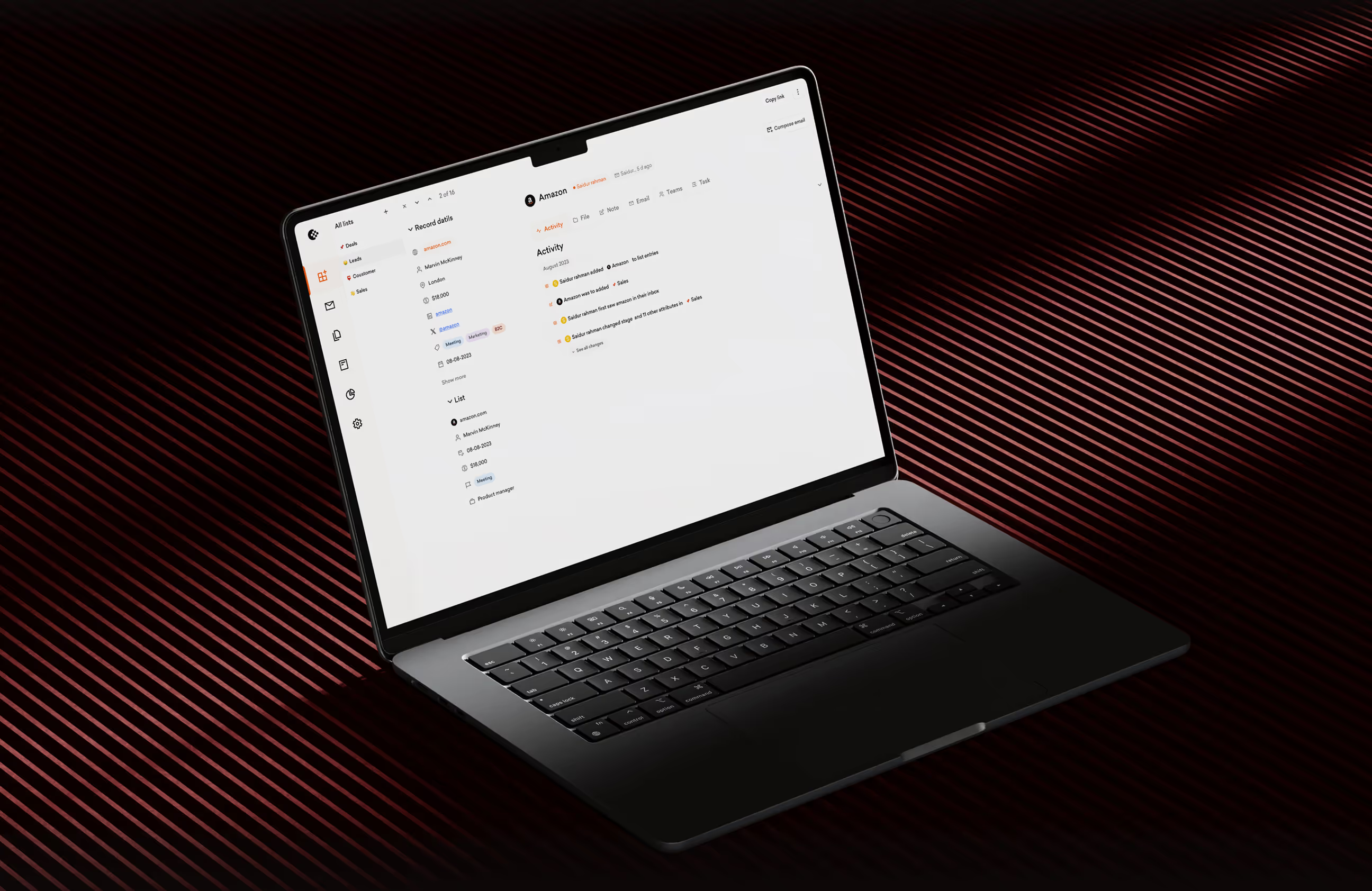
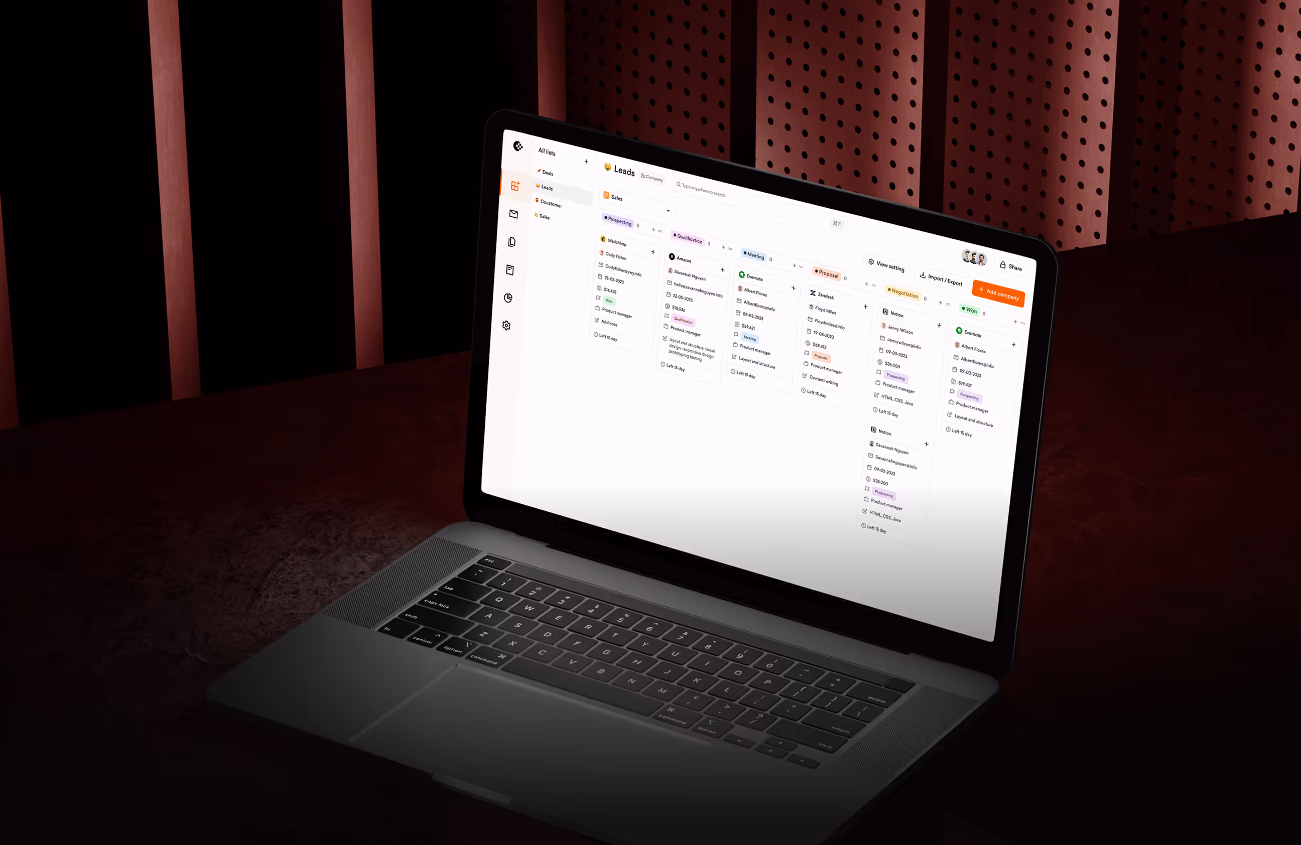
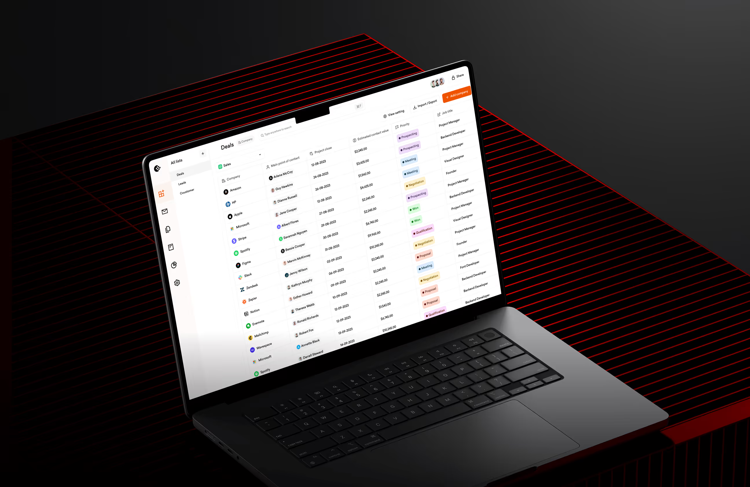
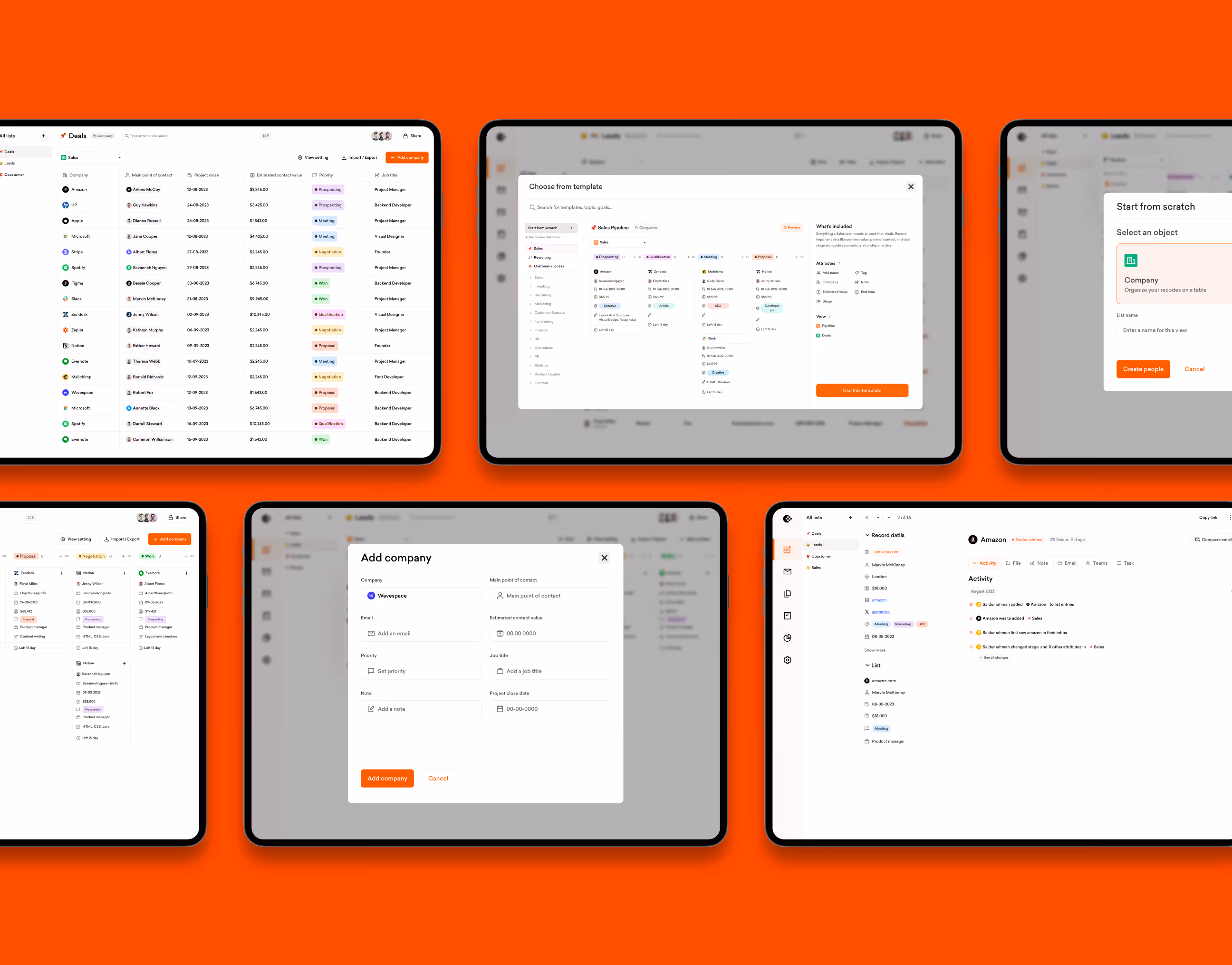
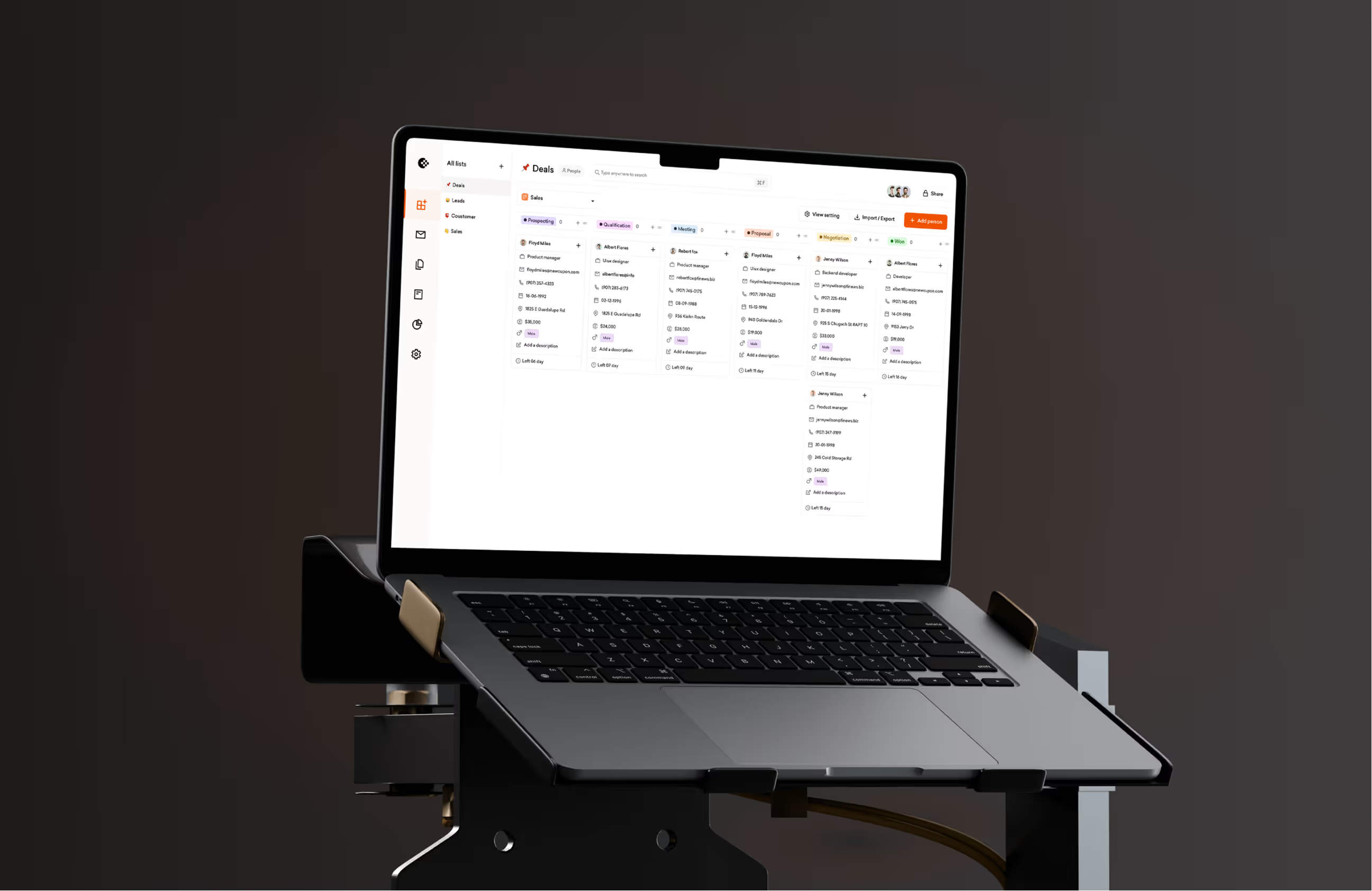
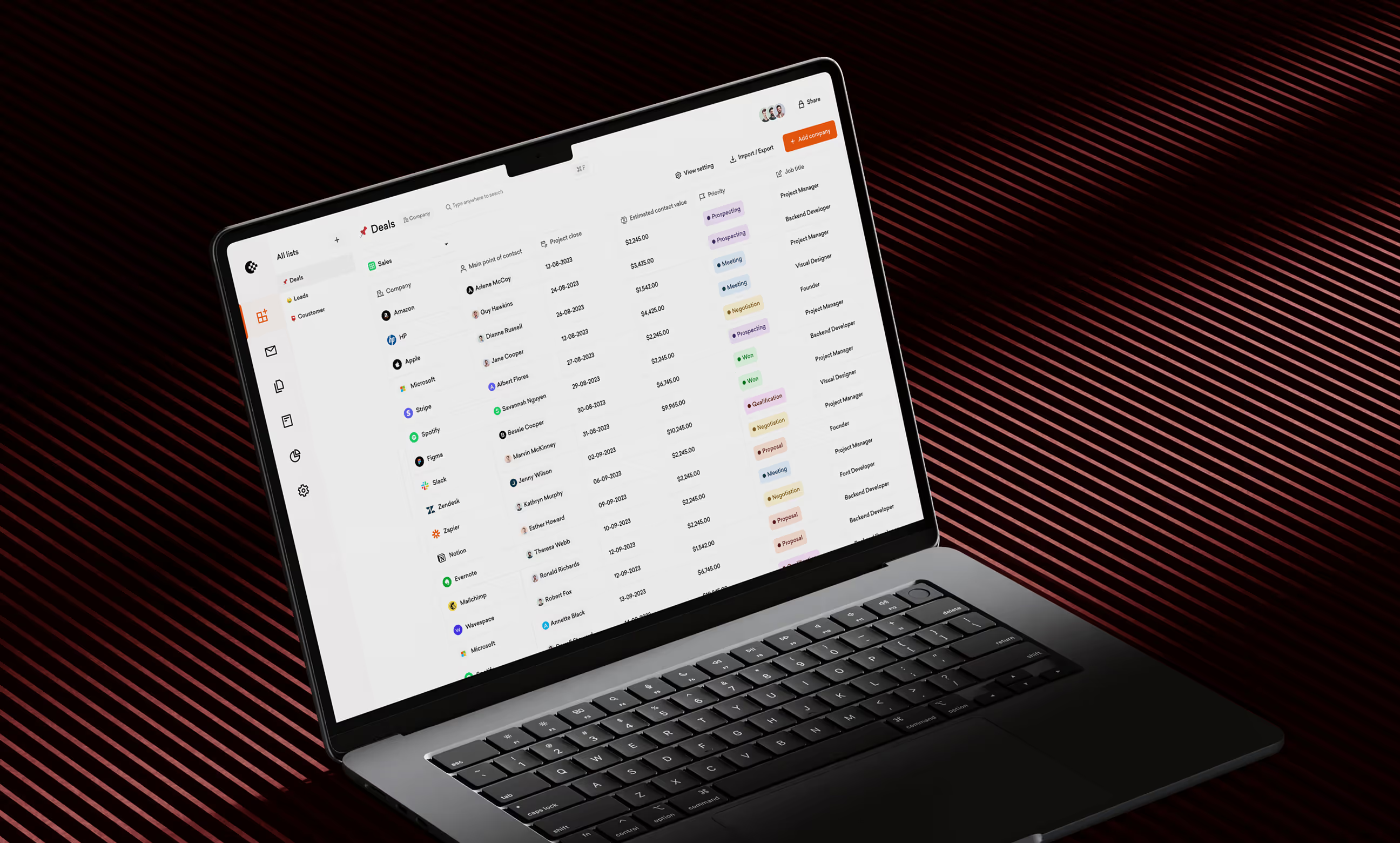
- Clear navigation structure: Reorganized menus so Deals, Activities, Lists, and Contacts are easy to find. Users now see what they need without searching.
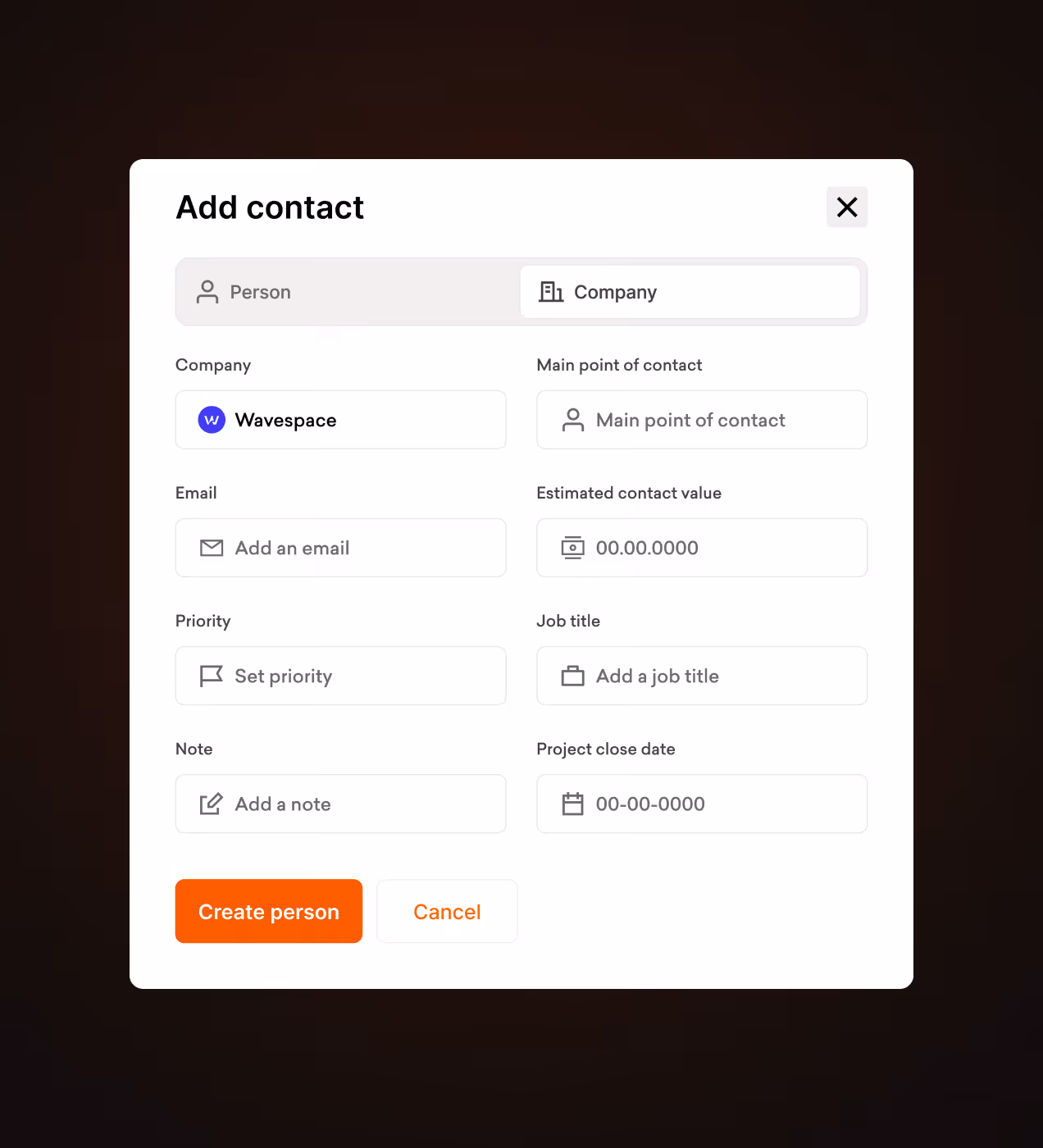
- Simplified workflows: Made common tasks like adding companies, creating lists, and scheduling bookings work in fewer steps with clear button labels.
- Better onboarding: Designed step-by-step guidance for new users to set up their dashboard and understand key features from day one.
- Visible features: Put important tools front and center on the home screen so users discover what the platform can do without digging through settings.
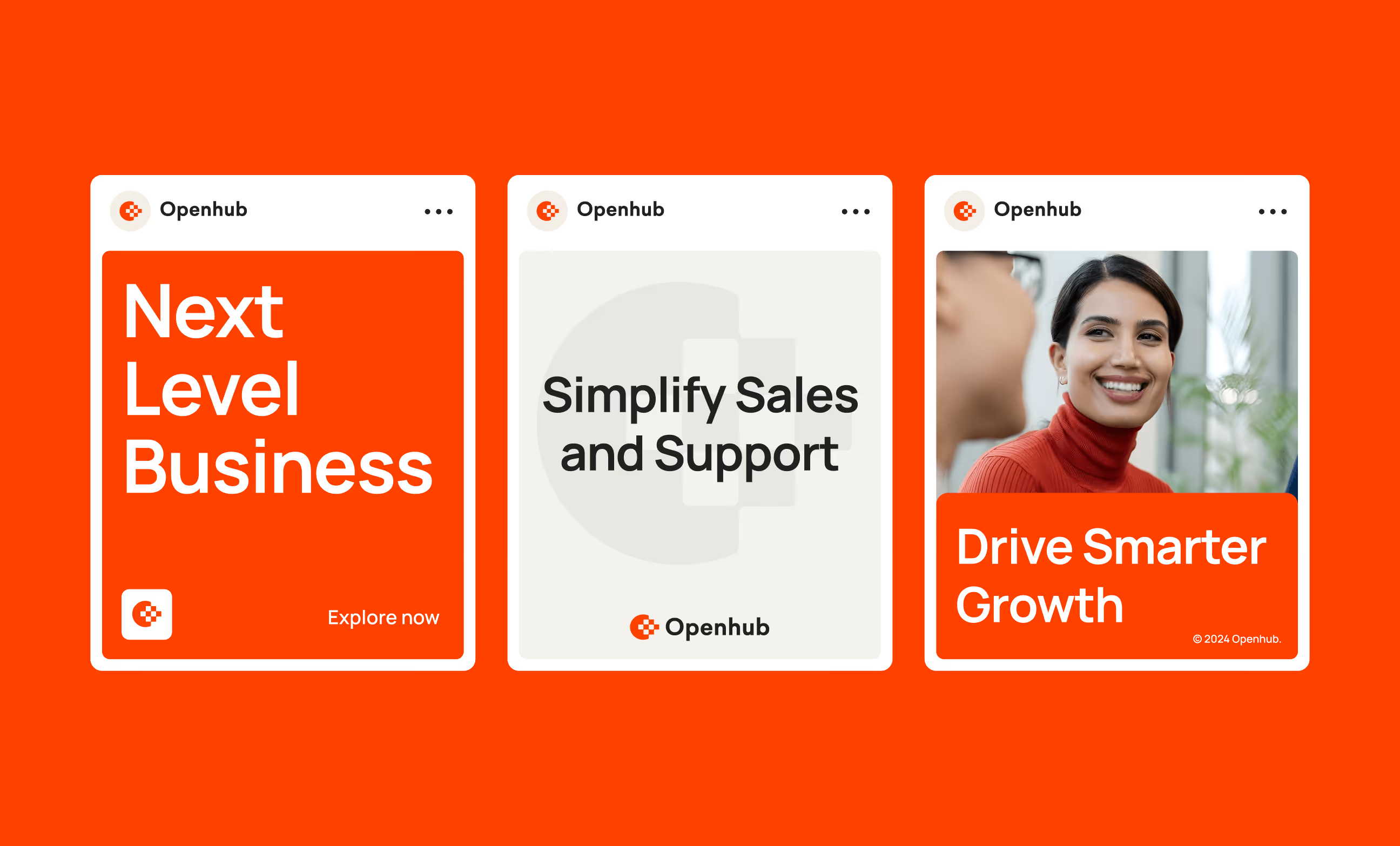
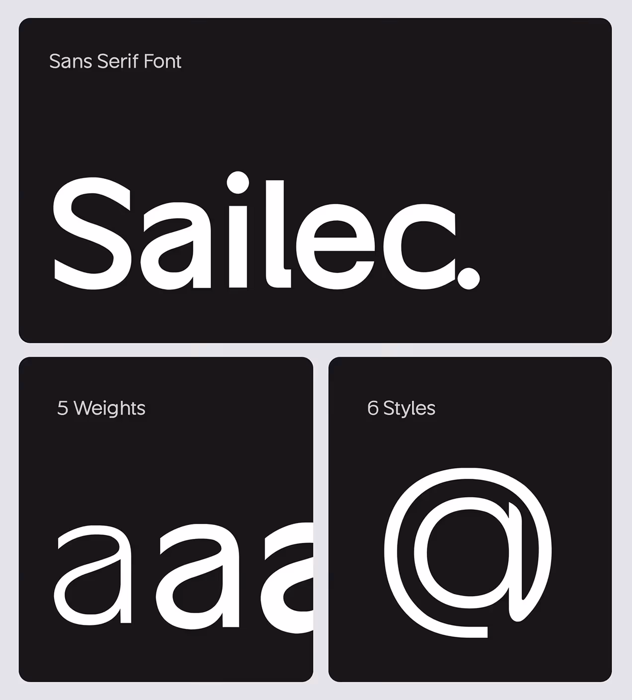
- Consistent design system: Built reusable components with orange accent colors, clean layouts, and Sailec typography so every screen feels connected and professional.
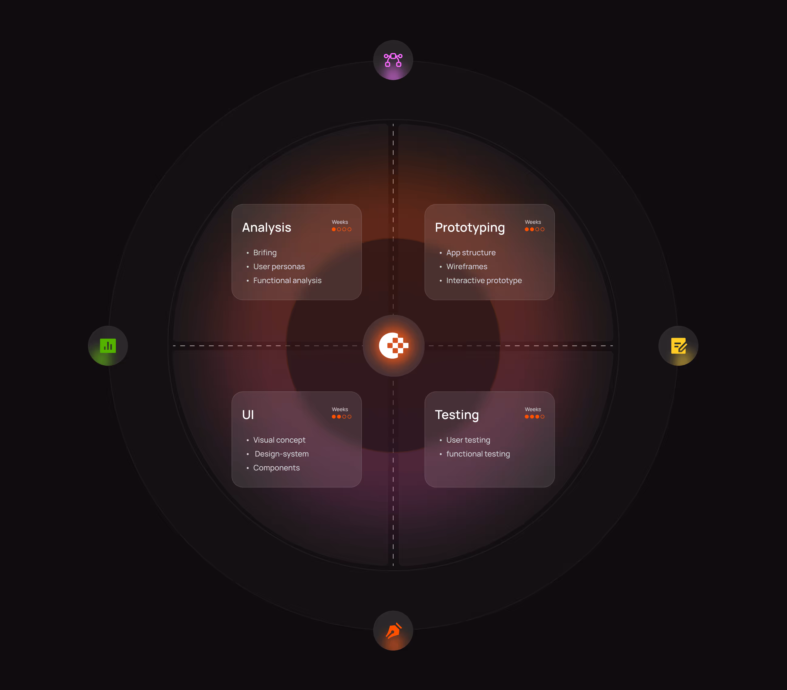
The process behind Openhub
Our Openhub design process focused on understanding CRM user problems and building solutions that actually work. We followed a clear path from research to final product.
We studied how teams use CRM tools and where Openhub users got stuck or gave up.
We reorganized how features connect so users find what they need without hunting via menus.
We designed screens focused on clarity, tested with real users, and refined based on feedback.
We validated designs with users, fixed problems, and delivered everything to developers.
UX Research & Design Artifacts
We studied how CRM users work to find their biggest frustrations and needs. Our research showed clear patterns in where people got stuck and what they wanted most.
- User interviews: Talked to 25+ sales teams and account managers. Found 60% struggled to find the right tools on their first try because the menus felt unclear.
- Usability testing: Tested existing Openhub screens with 15 users. Discovered 75% wanted step-by-step guidance for tasks like creating lists or adding deals.
- Navigation analysis: Tracked how users moved through the platform. Found 40% felt overwhelmed by complex navigation and gave up on key features.
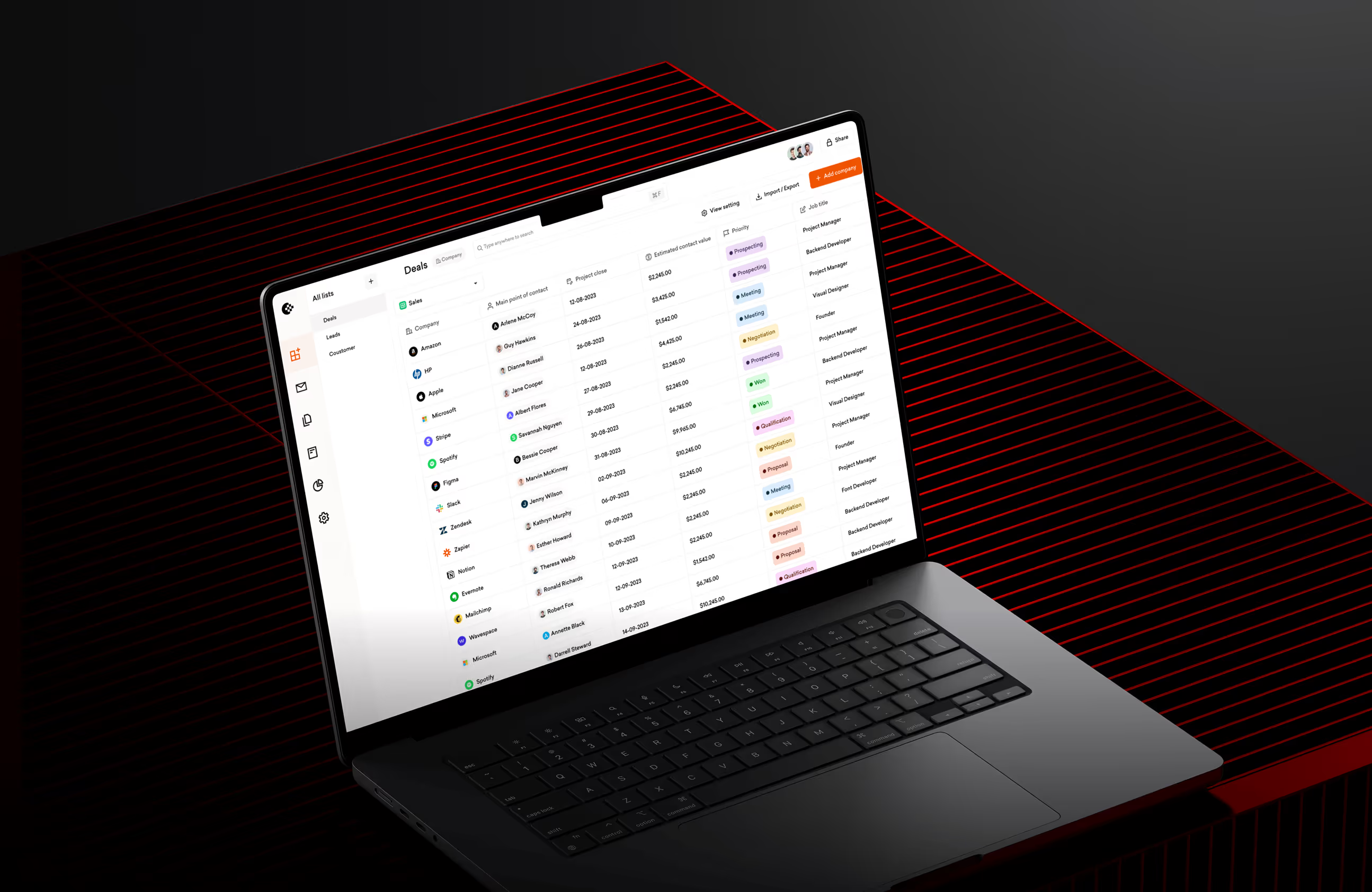
- Design deliverables: Created user personas, journey maps, and wireframes for List View, Company View, and Deals screens based on real user pain points.

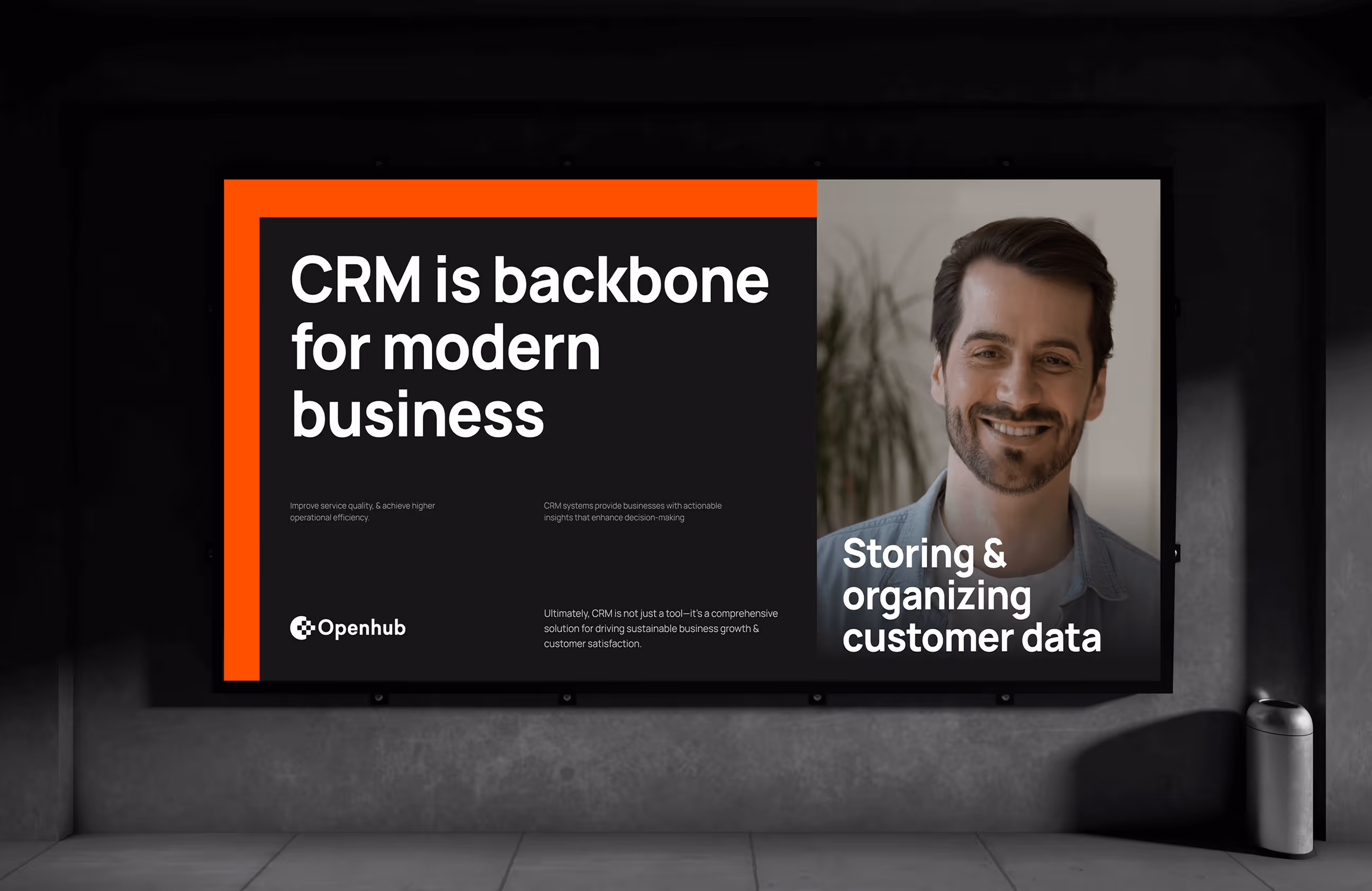
Visual Identity and Brand Story
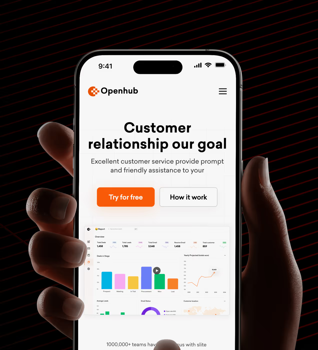
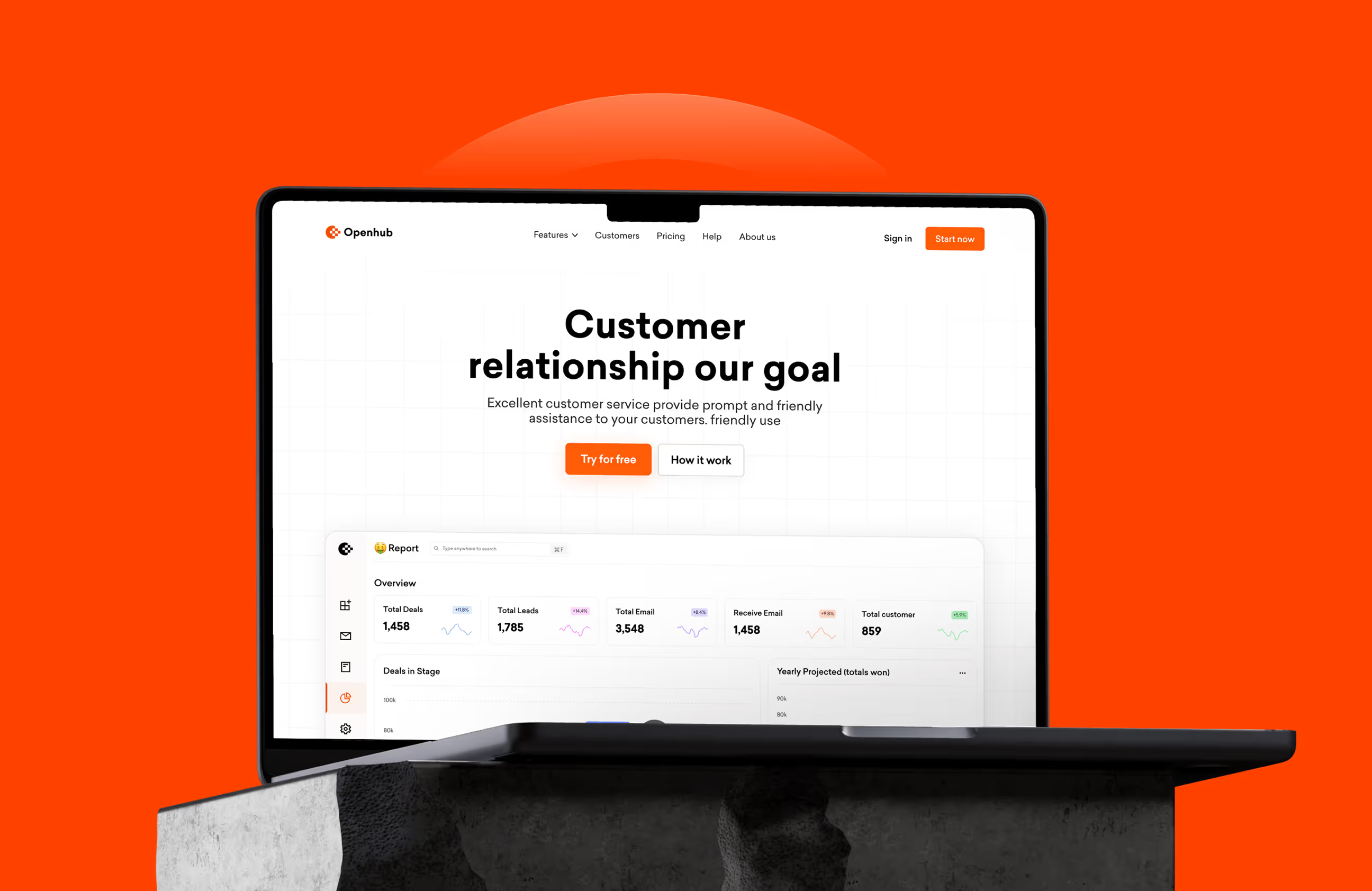
Openhub's brand feels bold, clear, and approachable. The logo uses a checkered circle pattern that represents connection and organized data, core to what CRM does. The main color is bright orange (#FF4200) for energy and action, paired with white for clean layouts, Gainsboro gray (#E3E4E7) for backgrounds, Eerie Black for text, and blue violet for accents. Orange stands out in the CRM market, where most competitors use blue.
Typography uses the Sailec font with different weights, strong enough to feel confident but clean enough to read quickly when managing customer data. The brand works across dashboards, mobile apps, and marketing with the same look, so users recognize Openhub instantly.
The identity helps Openhub stand out in the crowded CRM space with a voice that feels modern and trustworthy. Everything stays connected and consistent as the product grows.


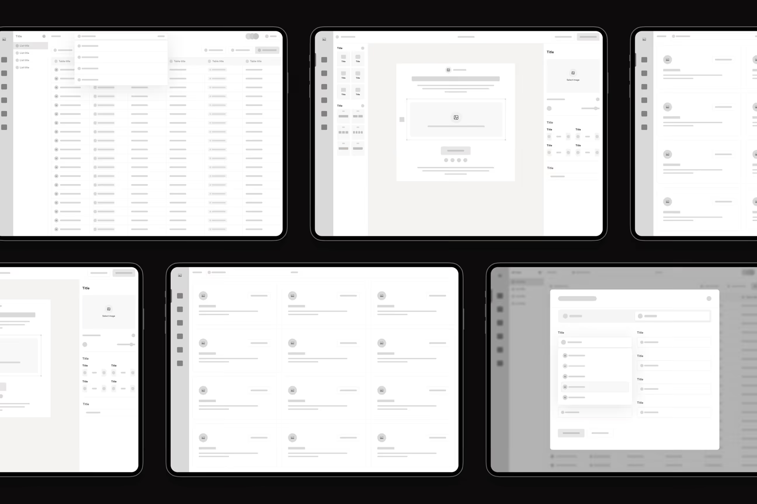
Building Openhub's design system
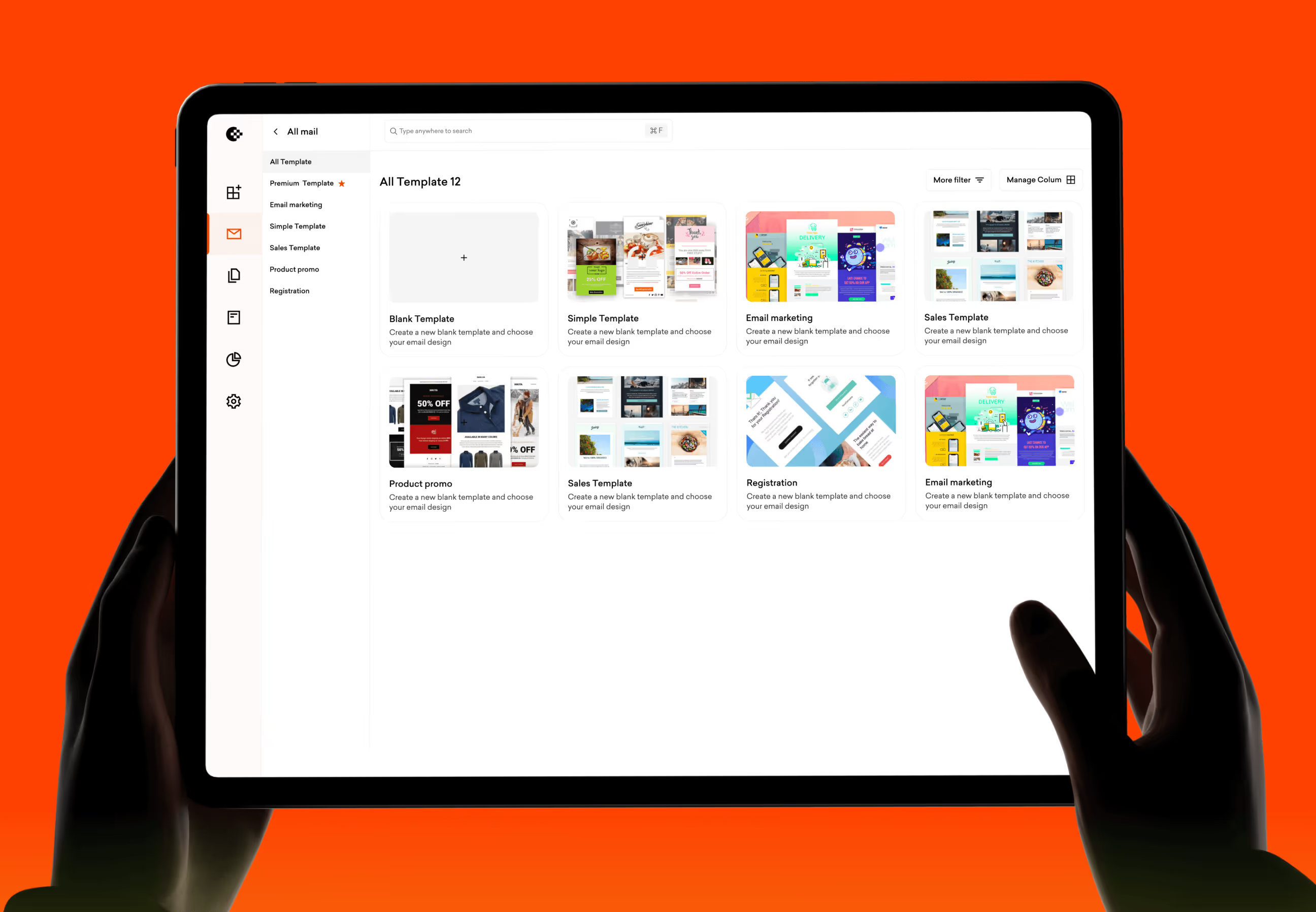
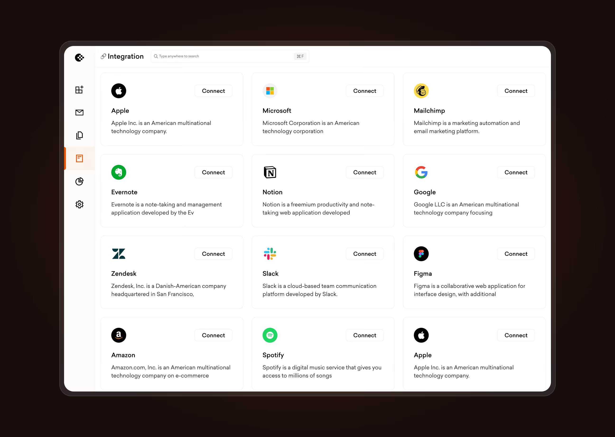
We built a design system with reusable components like buttons, input fields, cards, data tables, and navigation menus. Everything follows the same rules: orange (#FF4200) for primary actions, white backgrounds for content areas, consistent spacing with 8px grid units, and Sailec typography. Buttons have clear states (primary orange, secondary outline, disabled gray). Data tables show customer info with color-coded tags for deal status, making it easy to scan CRM data quickly.
The grid system keeps layouts balanced across all screens, whether users view contact lists, company profiles, or activity feeds. When we add new features, we reuse existing components instead of starting from scratch. This keeps Openhub looking consistent and professional as the product grows.

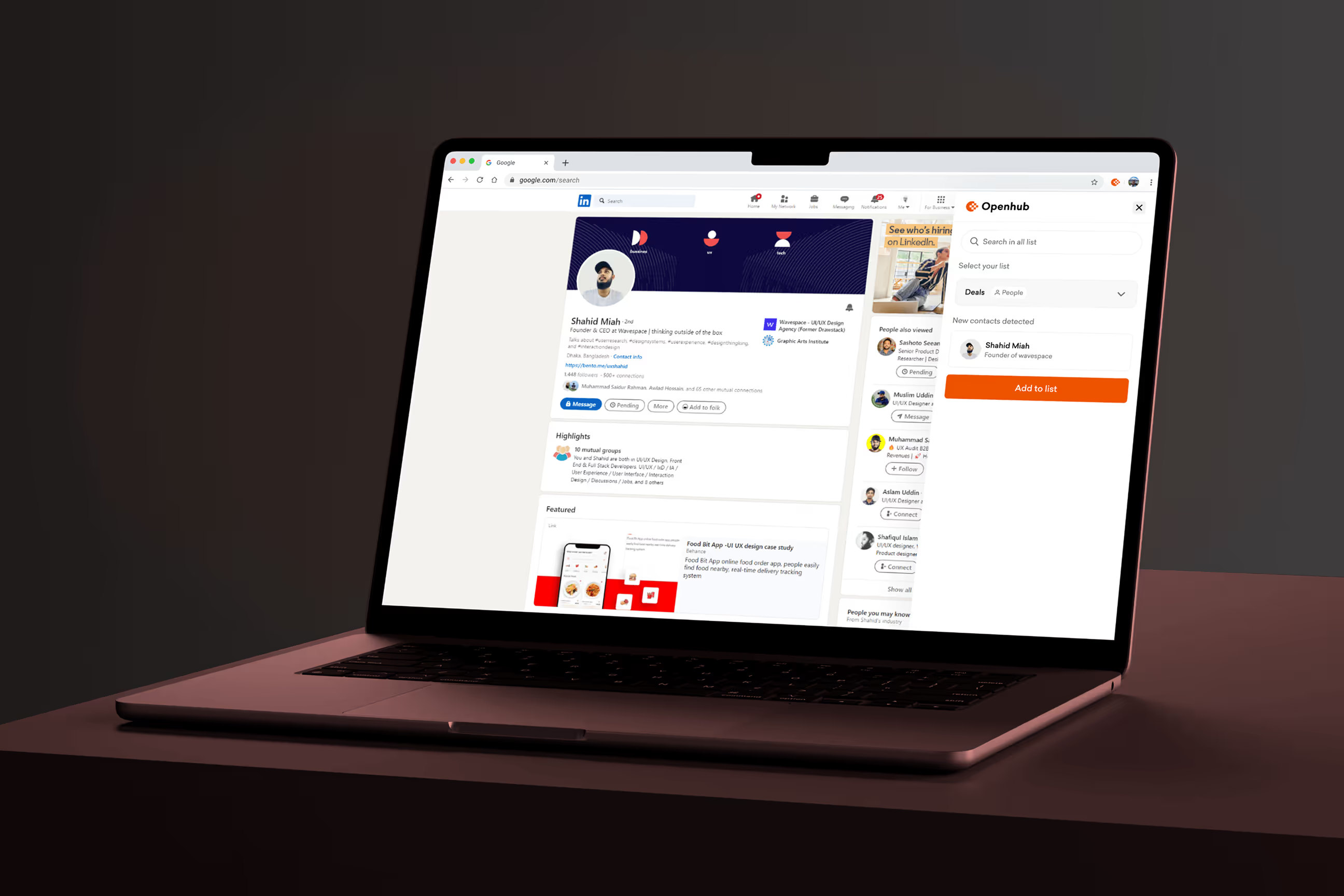
How we made CRM feel simple
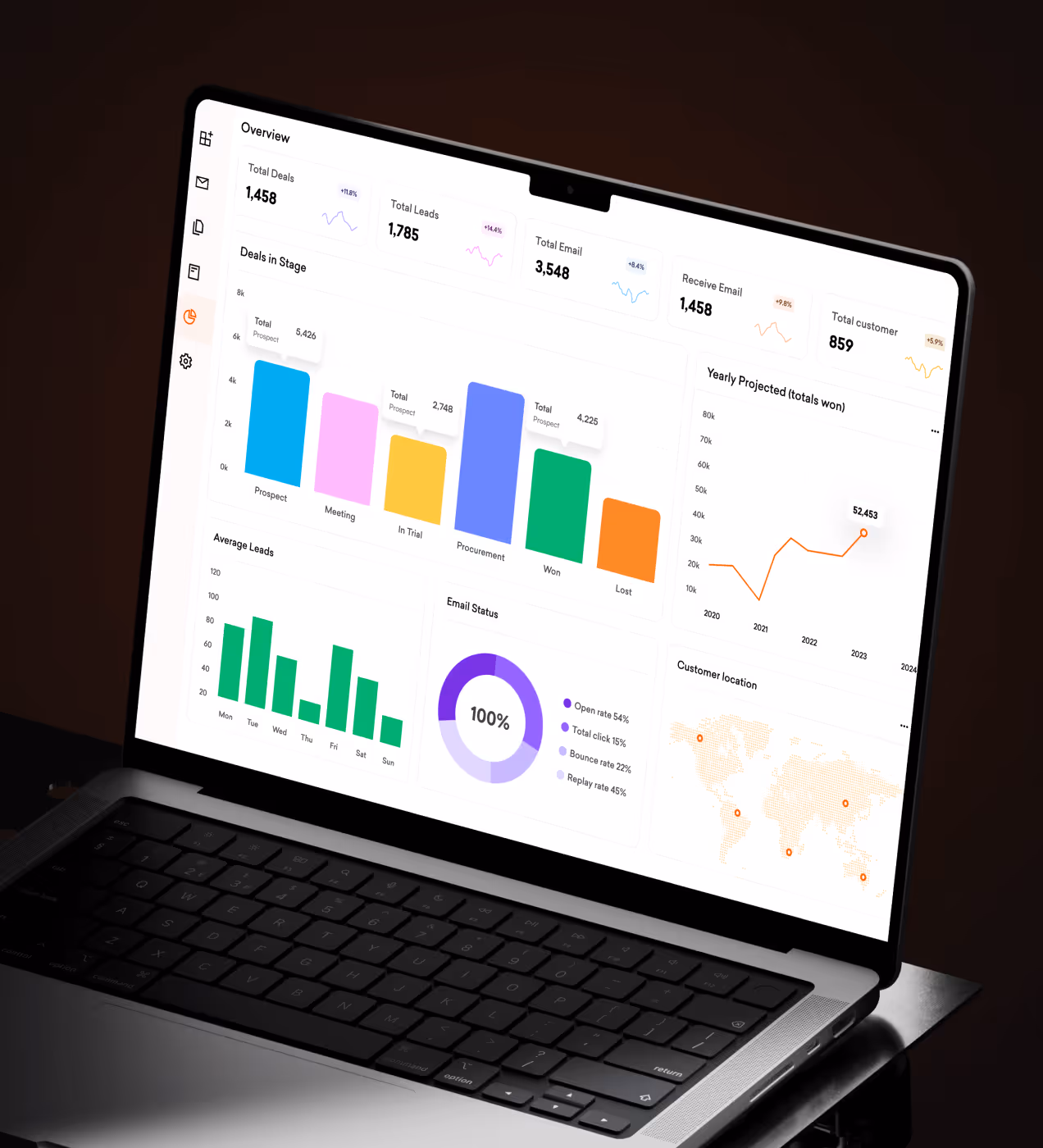
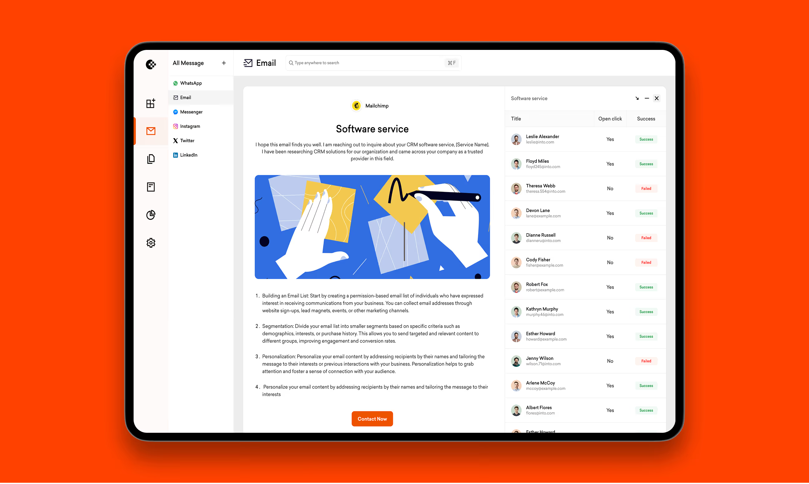
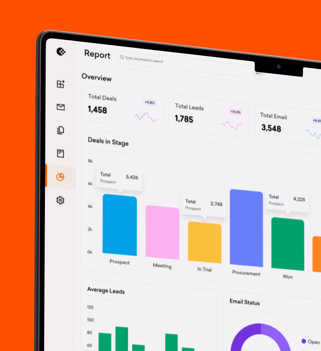
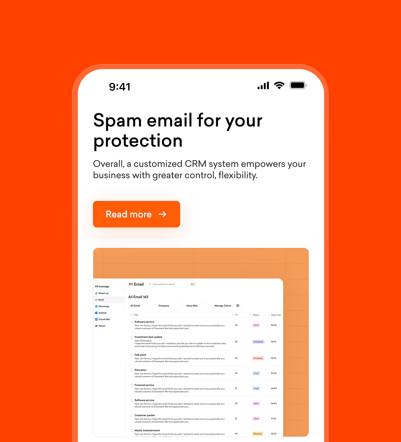
We designed Openhub to solve confusing navigation, hidden features, and slow workflows. The home dashboard shows recent activity, quick actions for adding companies or deals, and a clear contact list. Users create lists, add people, track deals, and schedule bookings in a few clicks. Buttons are clear, so people know what happens when they tap.
Navigation uses a fixed sidebar with Deals, Activities, Companies, and Settings. Dark backgrounds focus attention on data while orange buttons highlight key actions. We tested flows with real CRM users and fixed problems before launch. The result feels simple from day one, no training needed.
Real results from the redesign
The redesign turned Openhub from a confusing tool into a CRM platform users actually want to open daily. Navigation problems dropped, feature usage grew, and teams could manage customers without frustration.
Key Results:
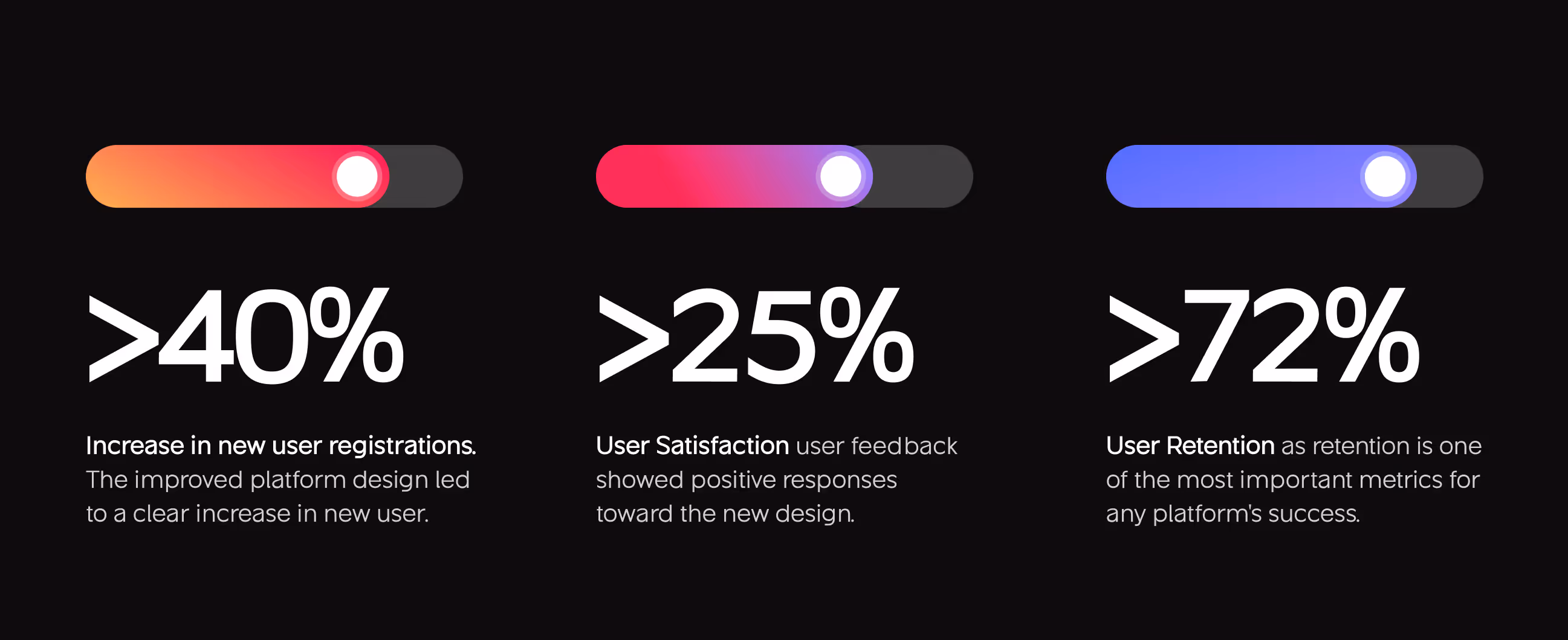
- 40% increase in new registrations: The improved platform design made onboarding clear and simple, leading to more new users signing up.
- 48% feature discovery up: Users now find and use tools like Deals, Lists, and Activities without searching through confusing menus.
- 25% user satisfaction: User feedback showed positive responses toward the new design. People found it easier to use and more trustworthy.
- 72% User Retention: Retention is one of the most important metrics for any platform's success. Users stayed active because the experience worked.

.avif)
.avif)
Have a Project? Let’s talk!


Your competitors are converting 3x more visitors. Not because they have a better product, but because they have a better design.


.avif)