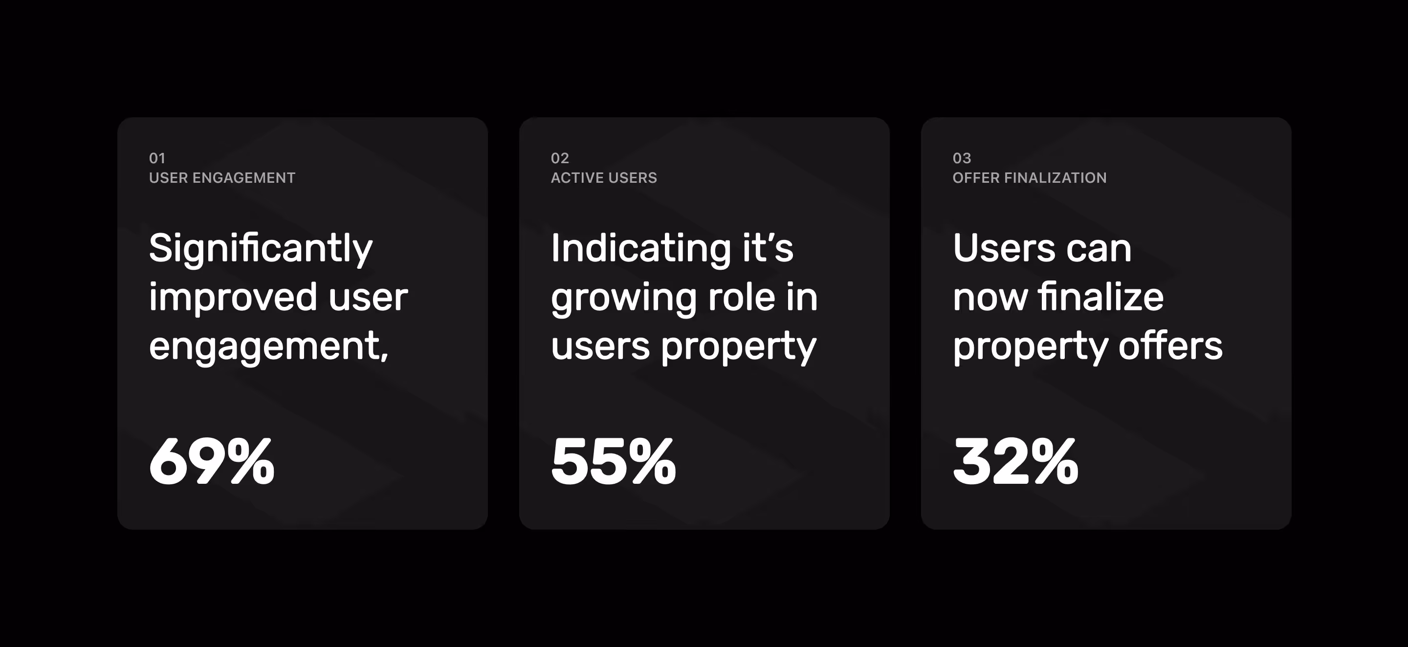
69%+
55%+
32%+
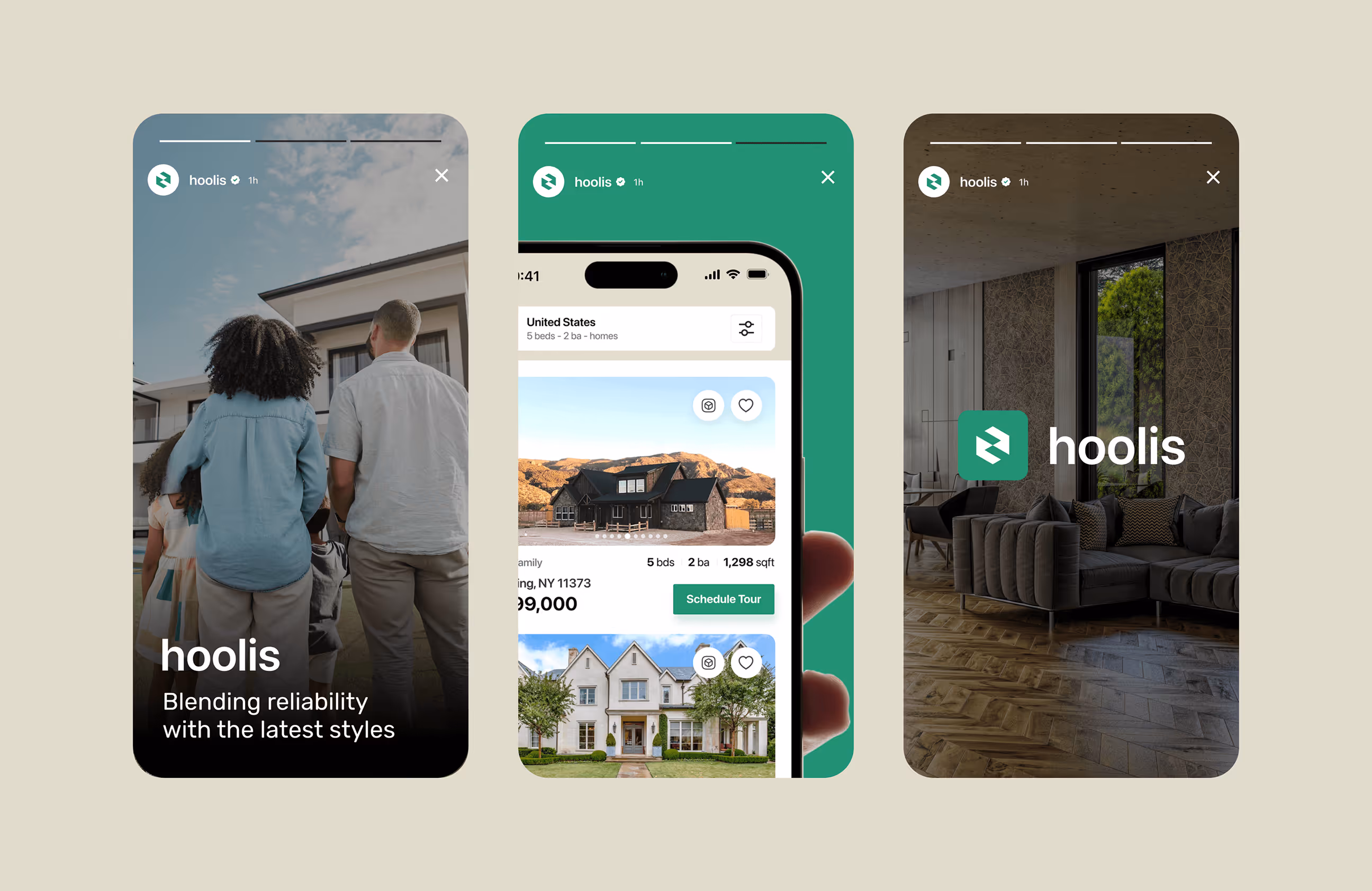
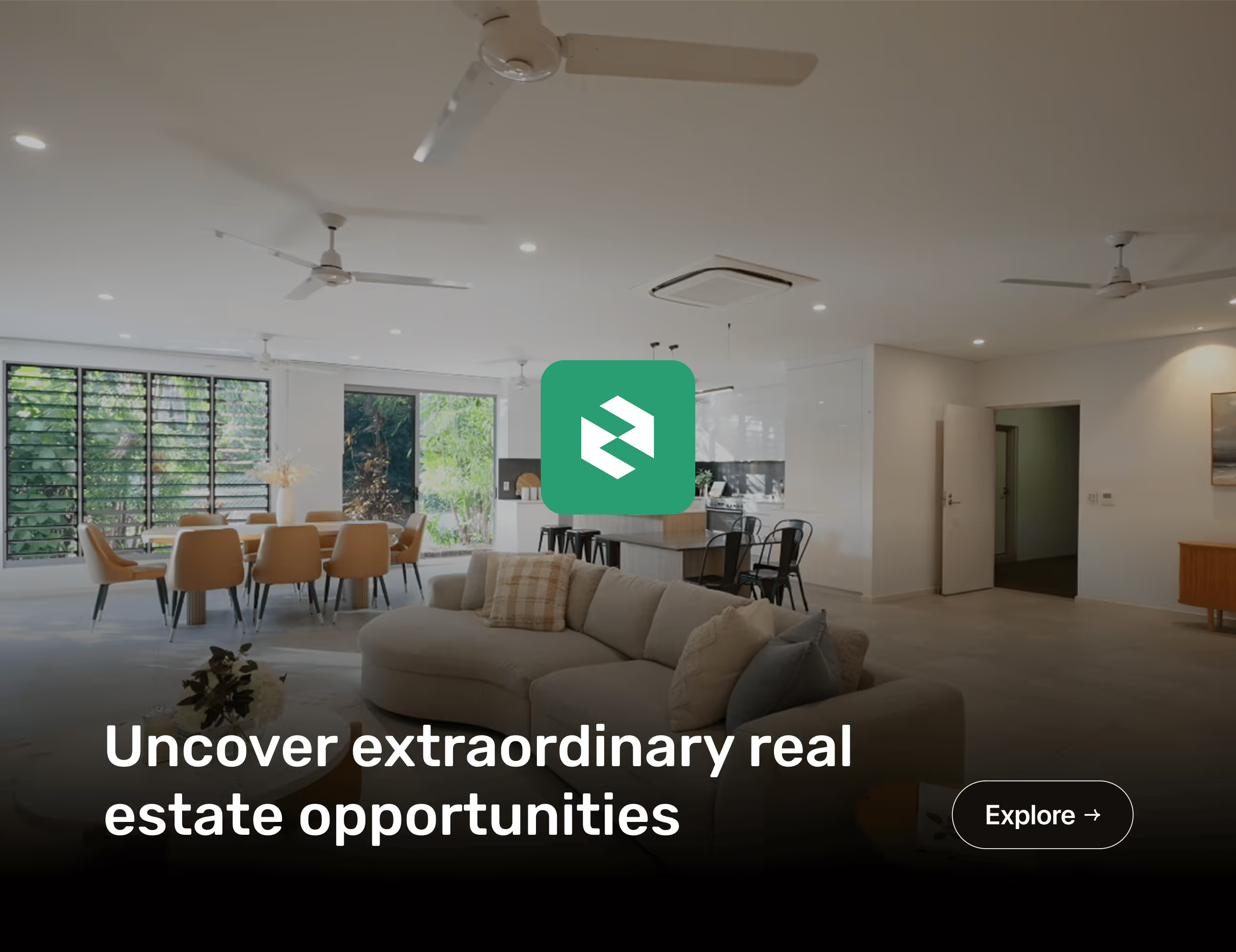
Hoolis is a Berlin-based real estate platform that helps people buy or rent property with less hassle. It connects buyers, renters, and estate agents in one place, with saved listings, direct messaging, and property visit scheduling to move decisions forward faster and with more trust.

A broken discovery experience
Real estate platforms need speed, clarity, and trust. When users struggle to find the right property or feel uncertain, they drop off, and agents lose valuable leads. Hoolis had a strong concept, but the experience lacked flow. Discovery, filtering, and agent visibility didn’t fully support how users and agents work.
- Fragmented and overwhelming property discovery
- Weak filtering and comparison for decisions
- Limited agent insight into lead progress
- Outdated visual identity that reduced trust
A clearer path to property decisions
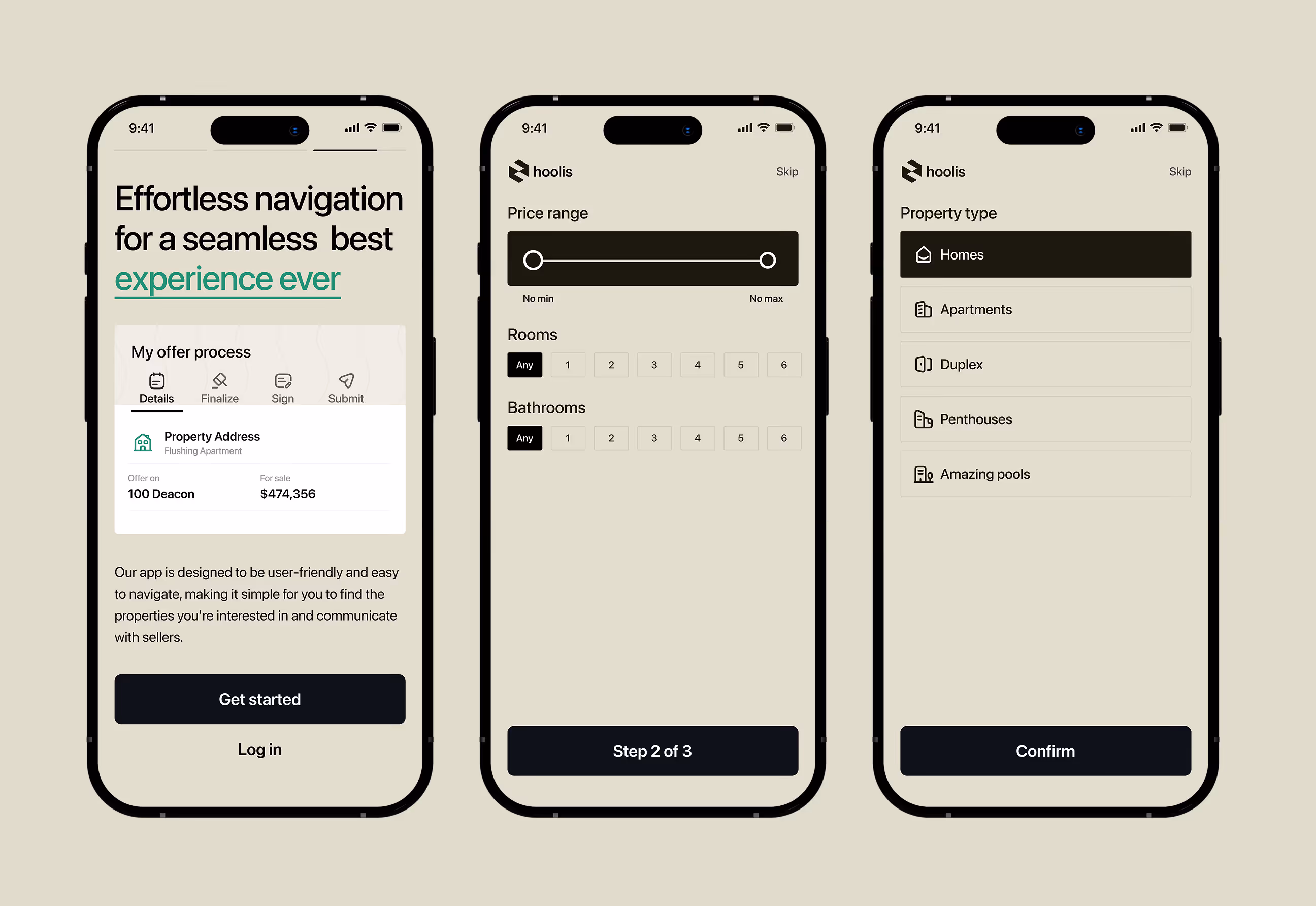
We redesigned Hoolis to support faster, more confident property decisions. The experience was shaped to help users discover, compare, and act with clarity, while giving agents better visibility and control. Each step in the journey was simplified to reduce friction, build trust, and move users closer to real decisions.
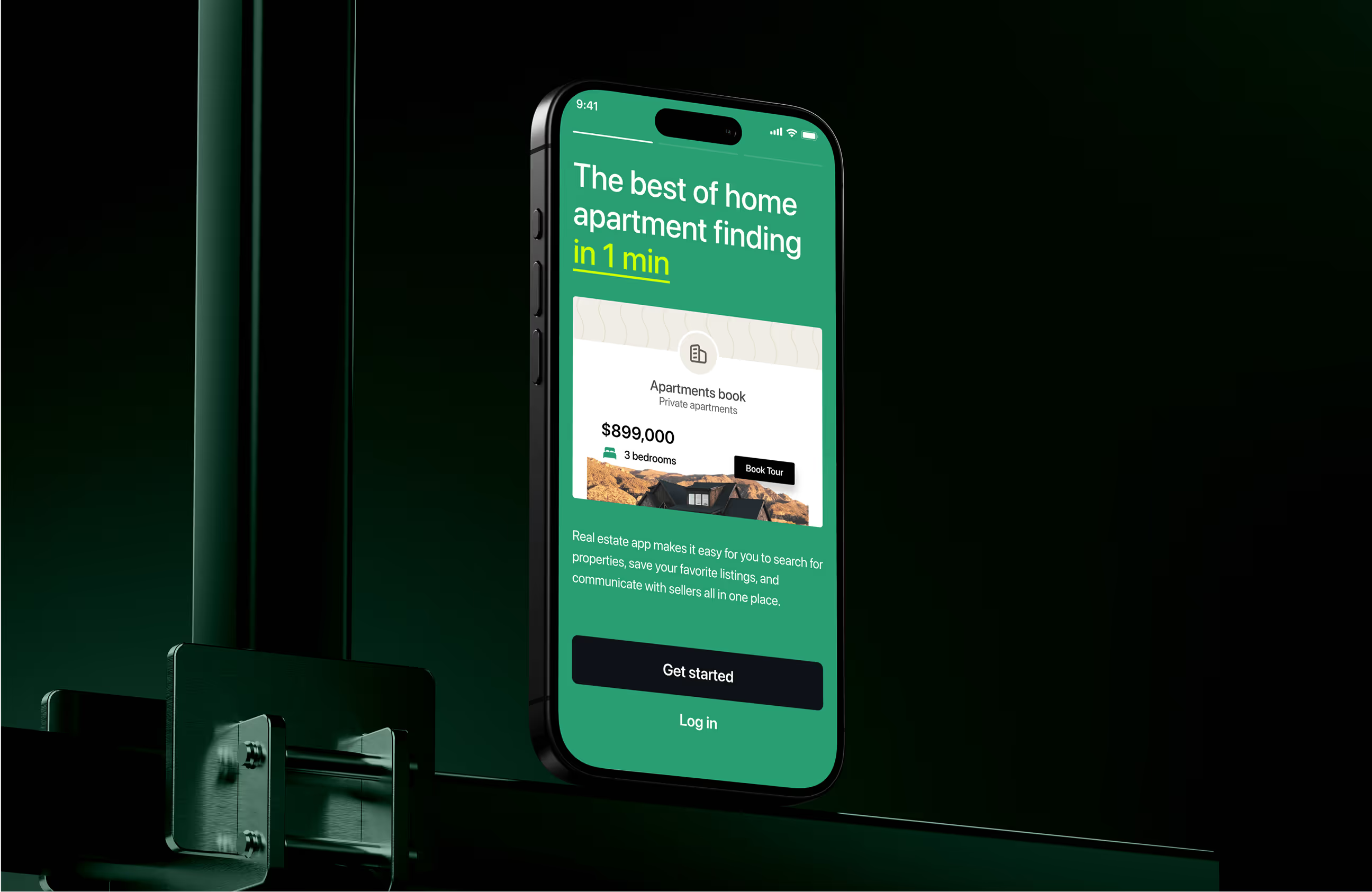
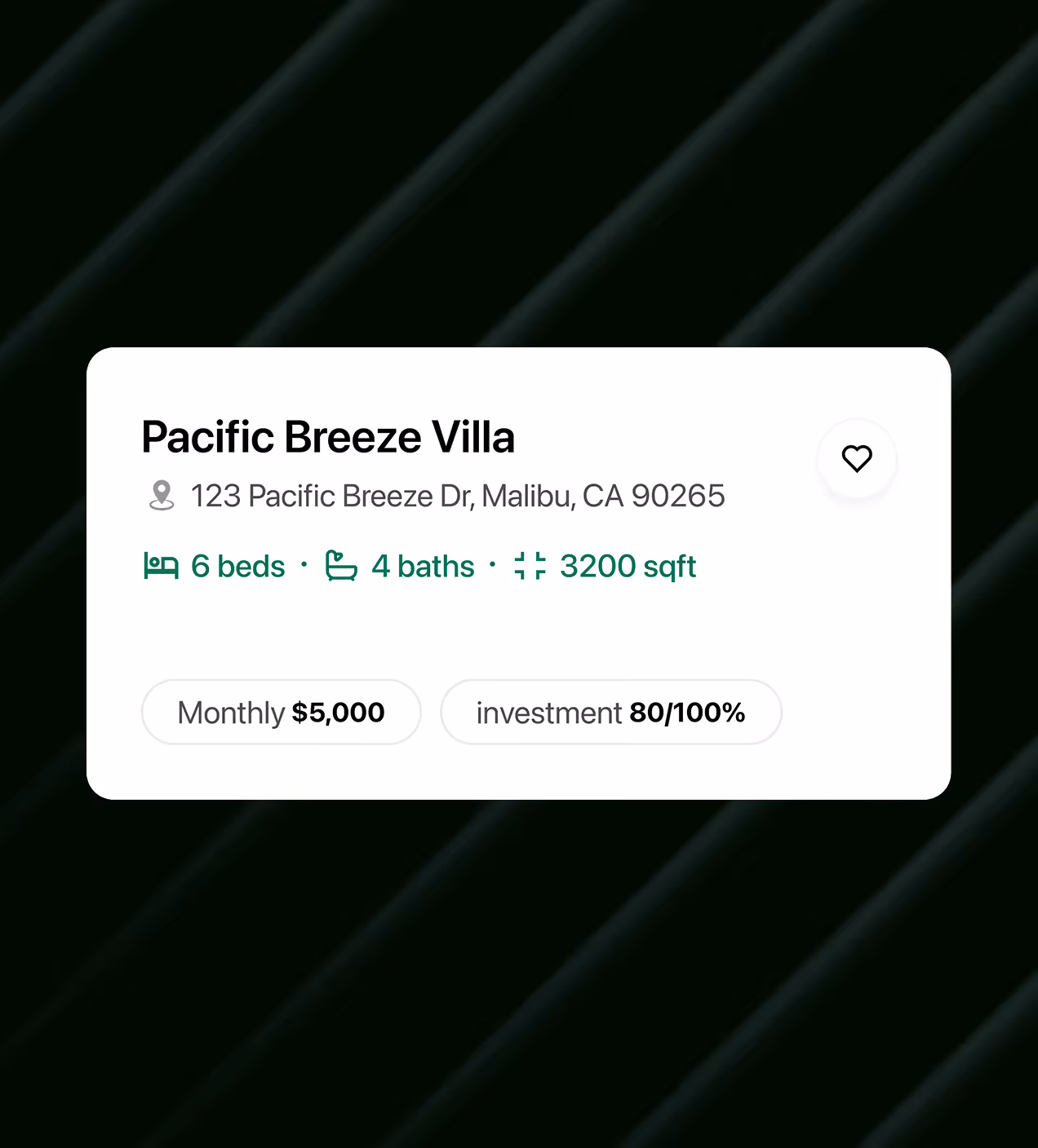
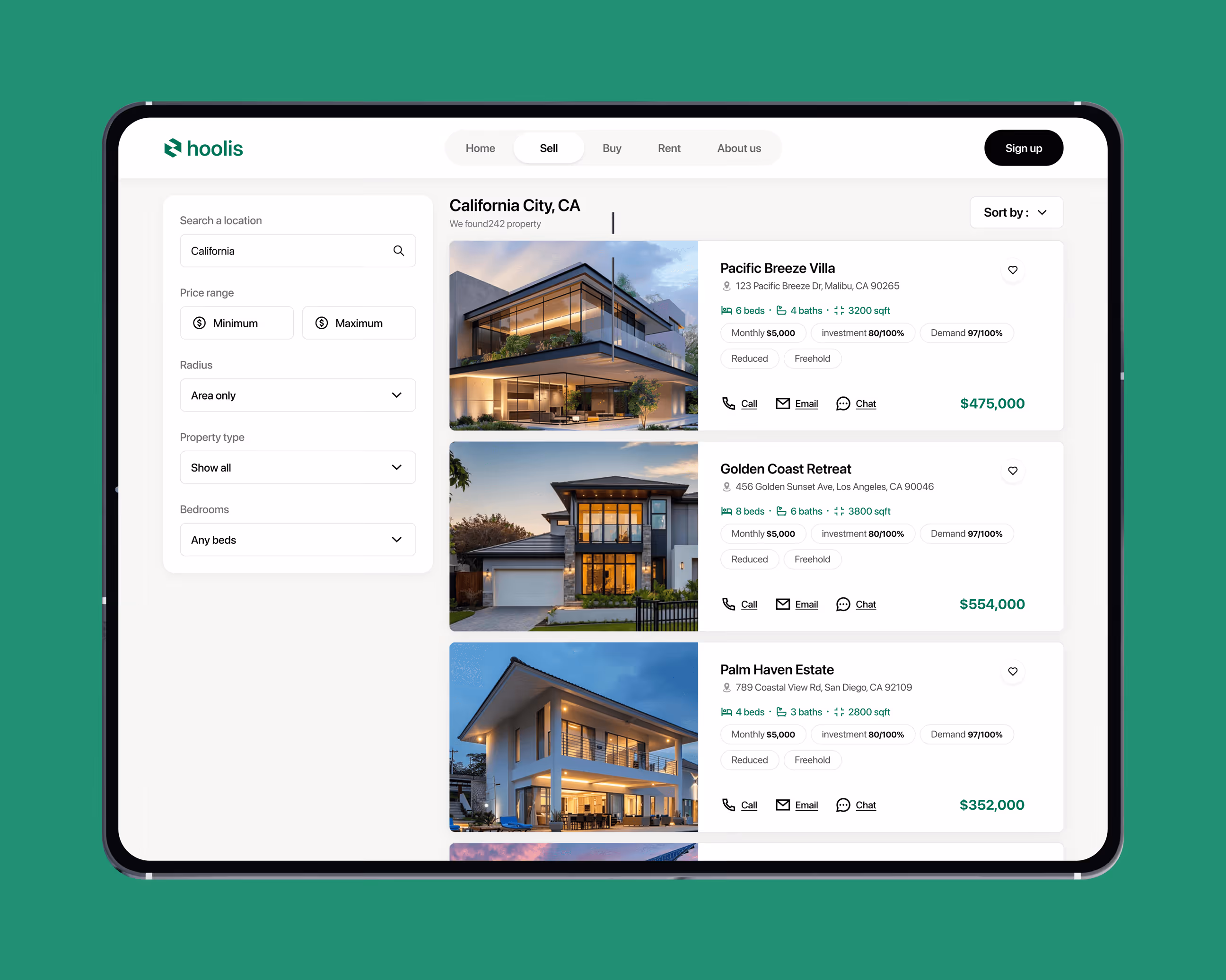
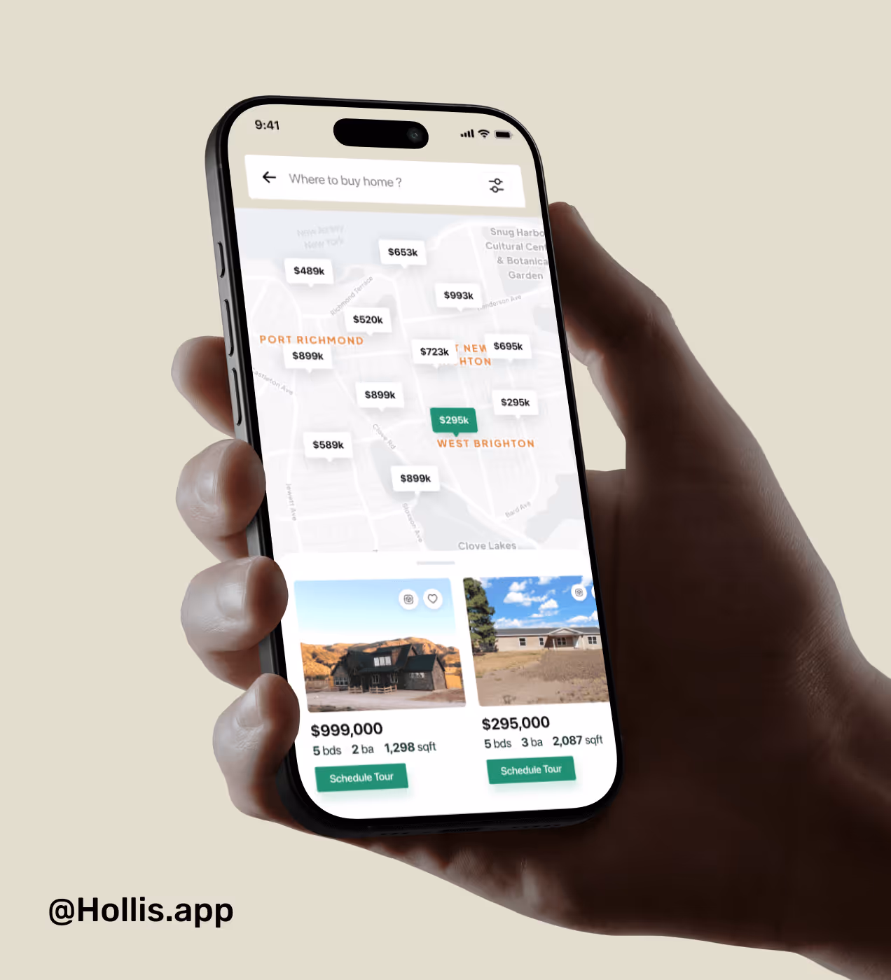
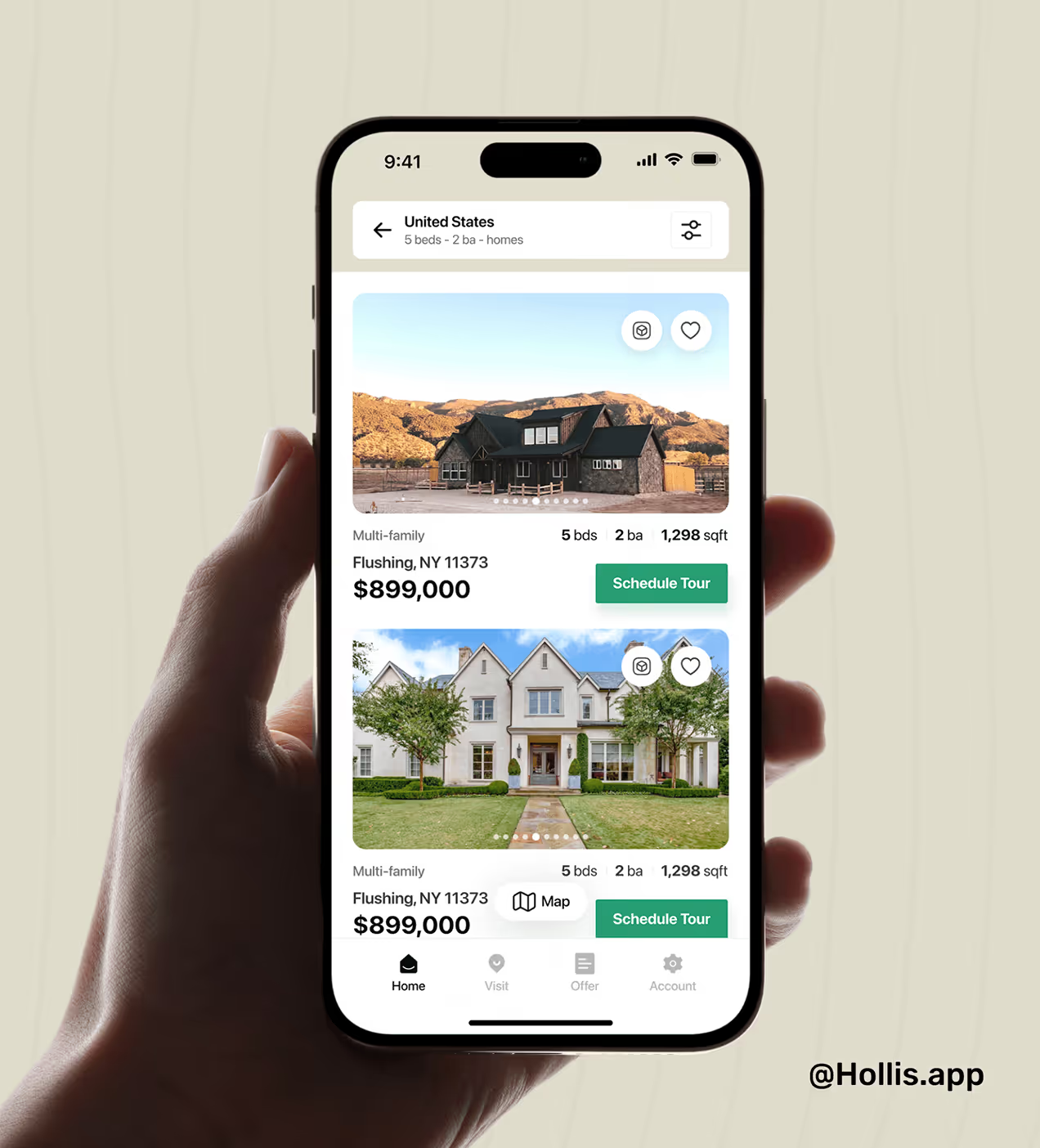
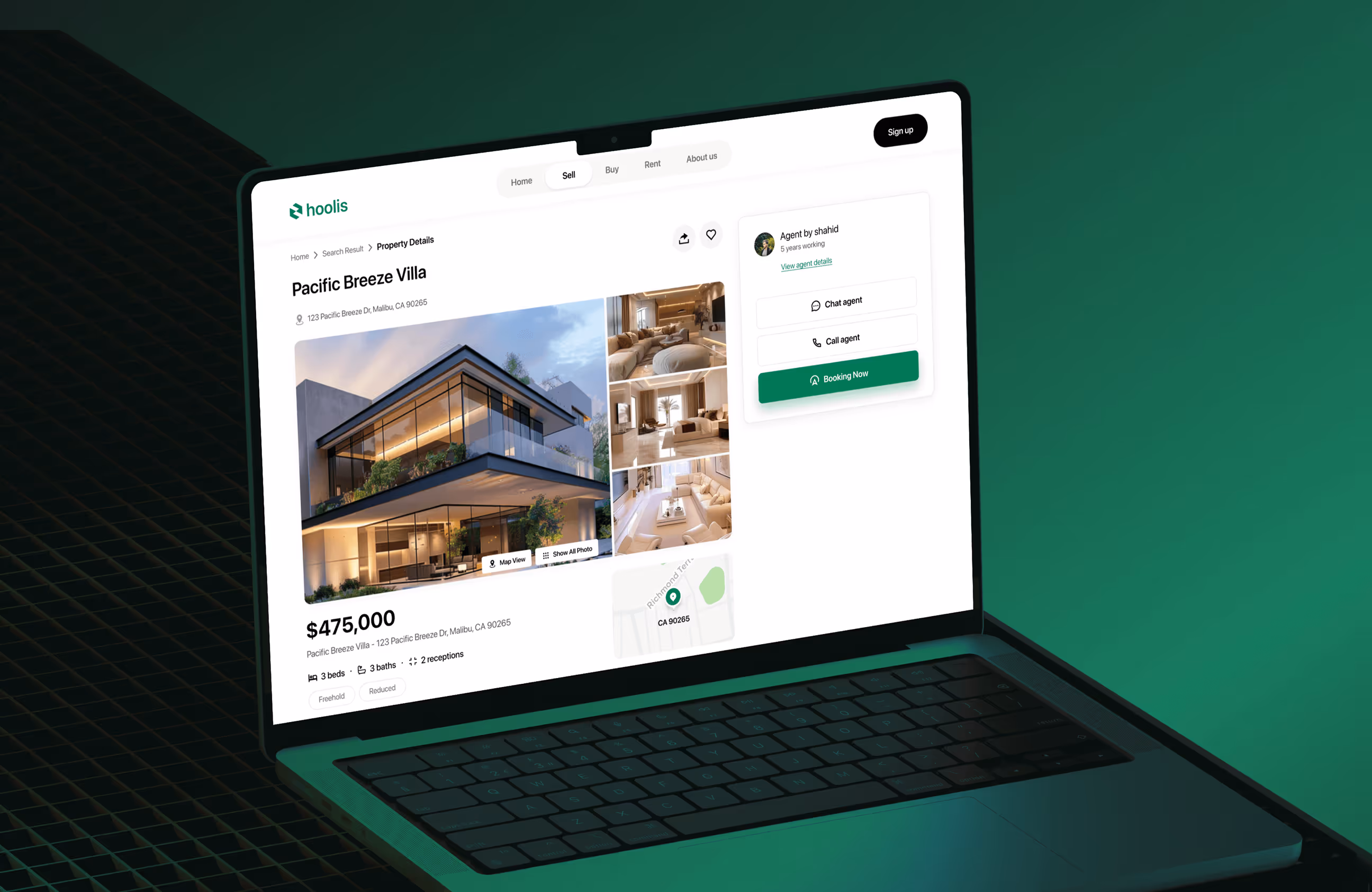
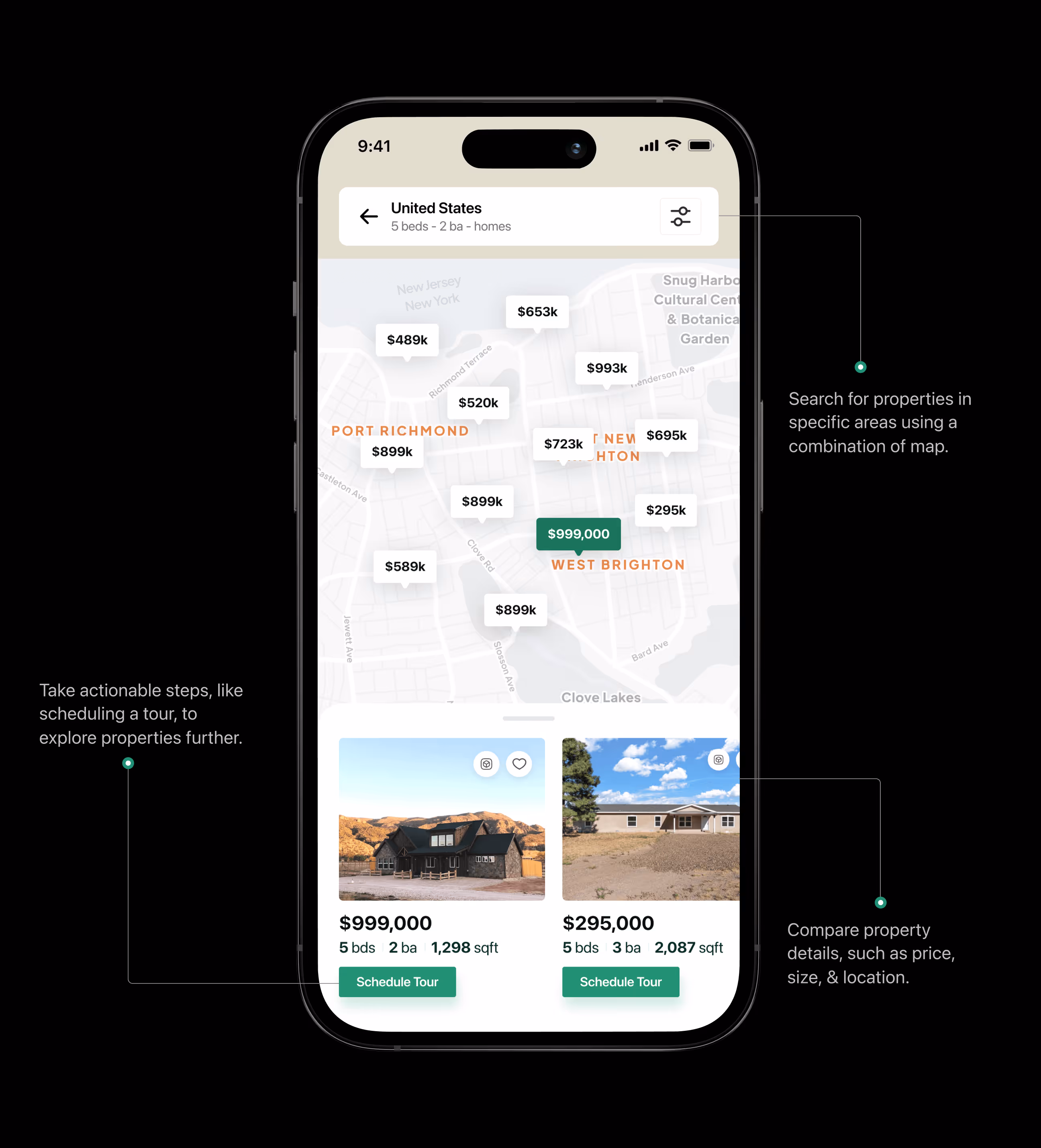
- Clear listing cards: Pricing, bed and bath details, and key property insights are visible at a glance.
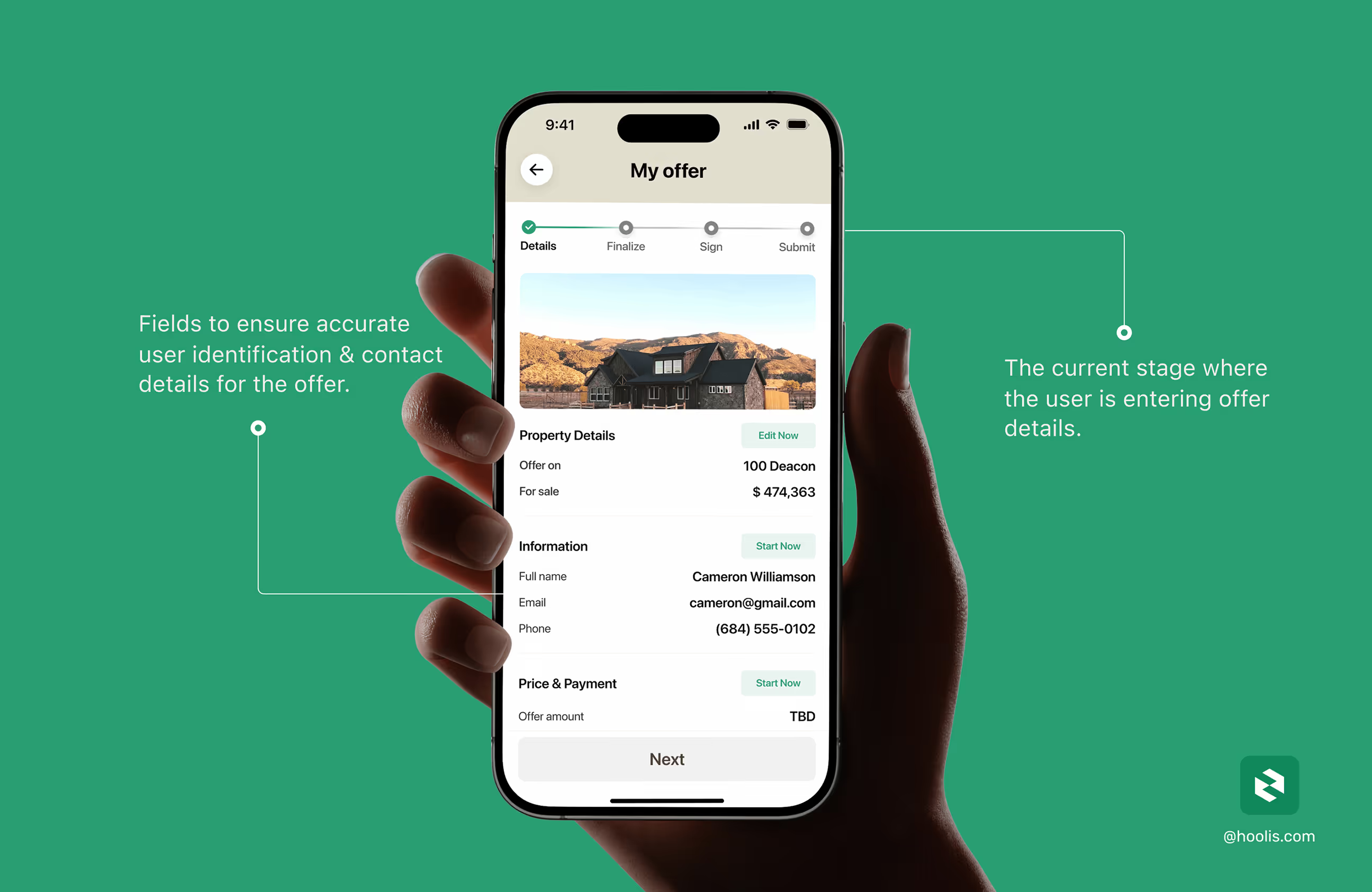
- Guided selection and tour booking: A structured flow helps users move from browsing to booking without hesitation.
- Focused filtering: Clean filters for location, price, and bedrooms support real decision-making.
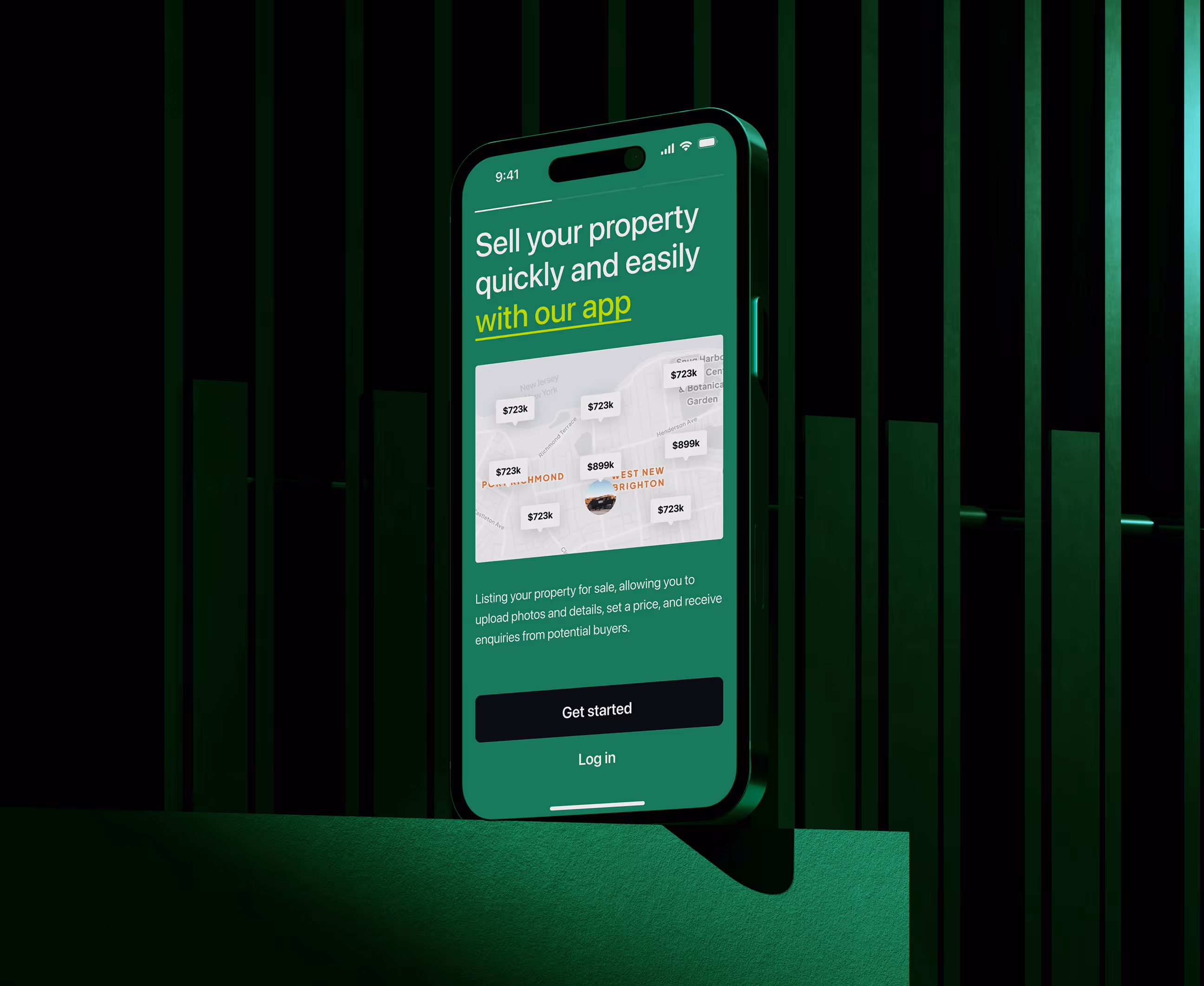
- Agent-ready information sharing: Built-in communication and lead context help agents respond faster and close deals sooner.


A clear and structured UX process for Hoolis
A structured, design-driven approach focused on clarity, trust, and faster decision-making for real estate experiences.
Understanding user goals, real estate behavior, and agent workflows.
We structured clear journeys that help users discover, compare, and act without confusion.
Designing a modern, trustworthy interface and validating flows through prototypes.
We refined usability, prepared dev-ready assets, and optimized the experience for real usage.
UX Research & design artifacts
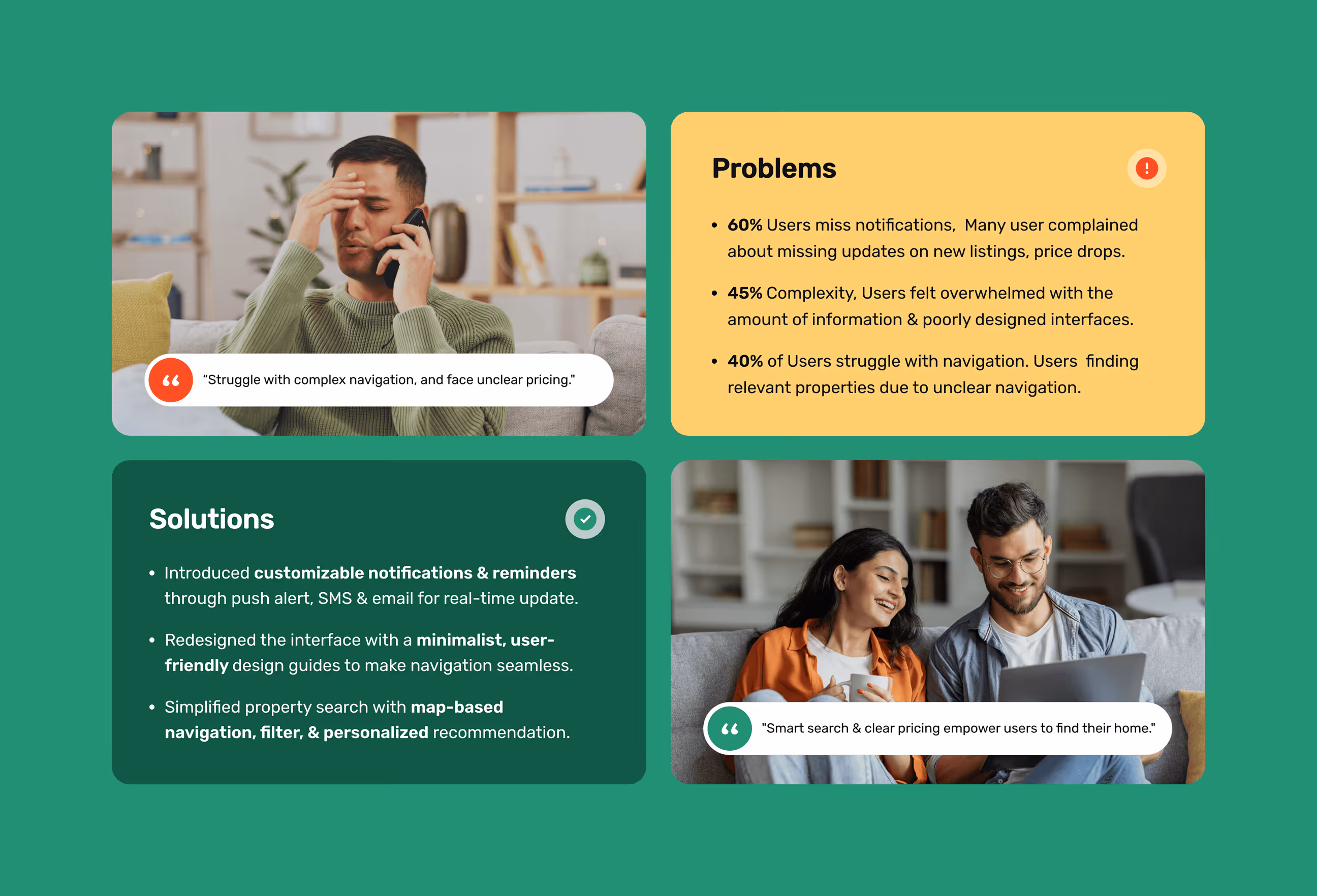
To ensure an easy process for buying homes, we studied what gave users the most difficulty. What we wanted to achieve was effortless access, clear presentation, and reliable confidence in each area.
- 63% of users felt overwhelmed by the number of filters and unclear options.
- 52% couldn’t compare properties easily, missing price and feature visibility.
- 46% dropped off when they couldn’t quickly contact agents or schedule tours
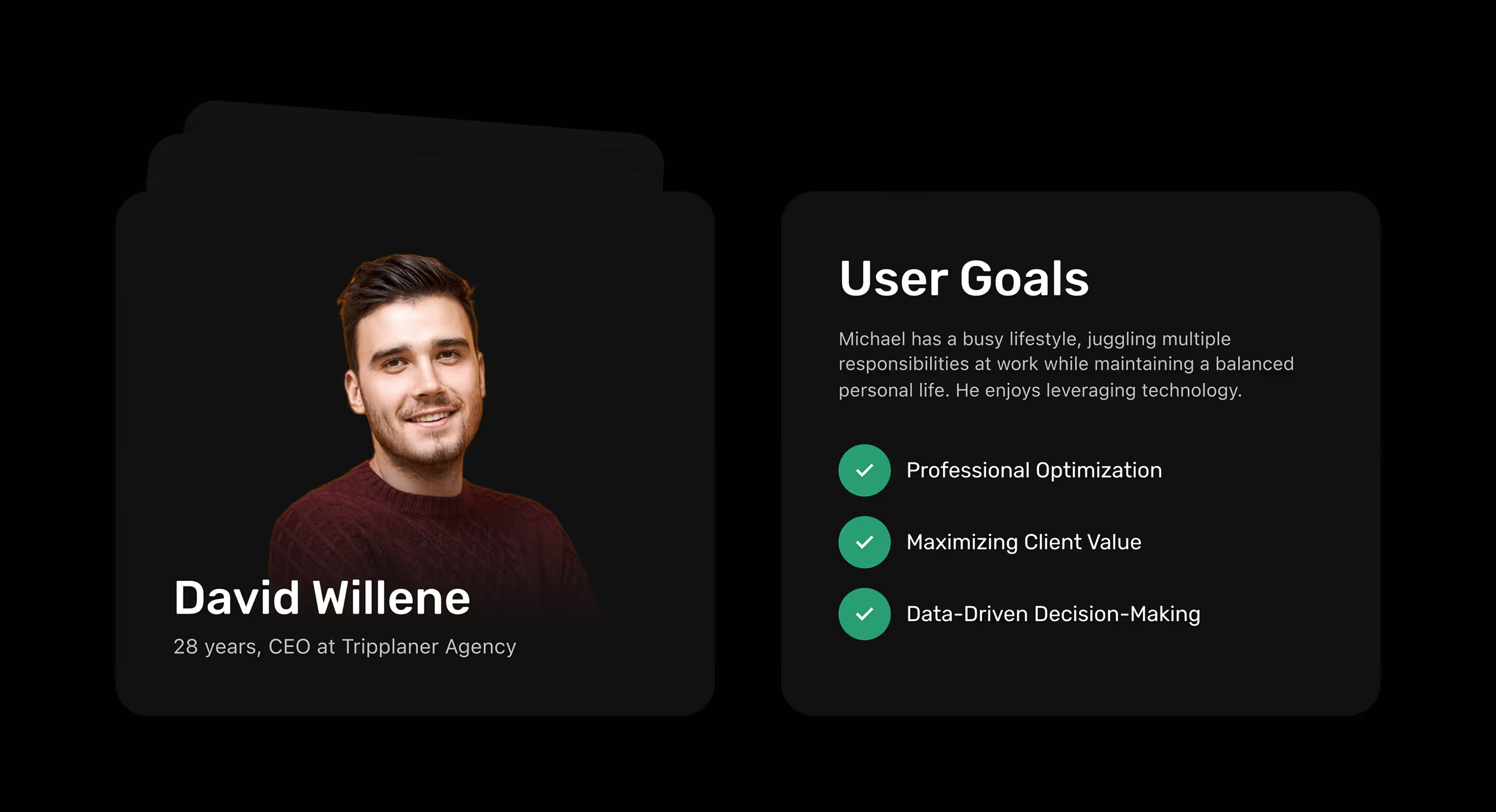
- We designed around David (28, CEO), whose goals reflect speed, clarity, and smart decision-making.

Visual identity and brand story
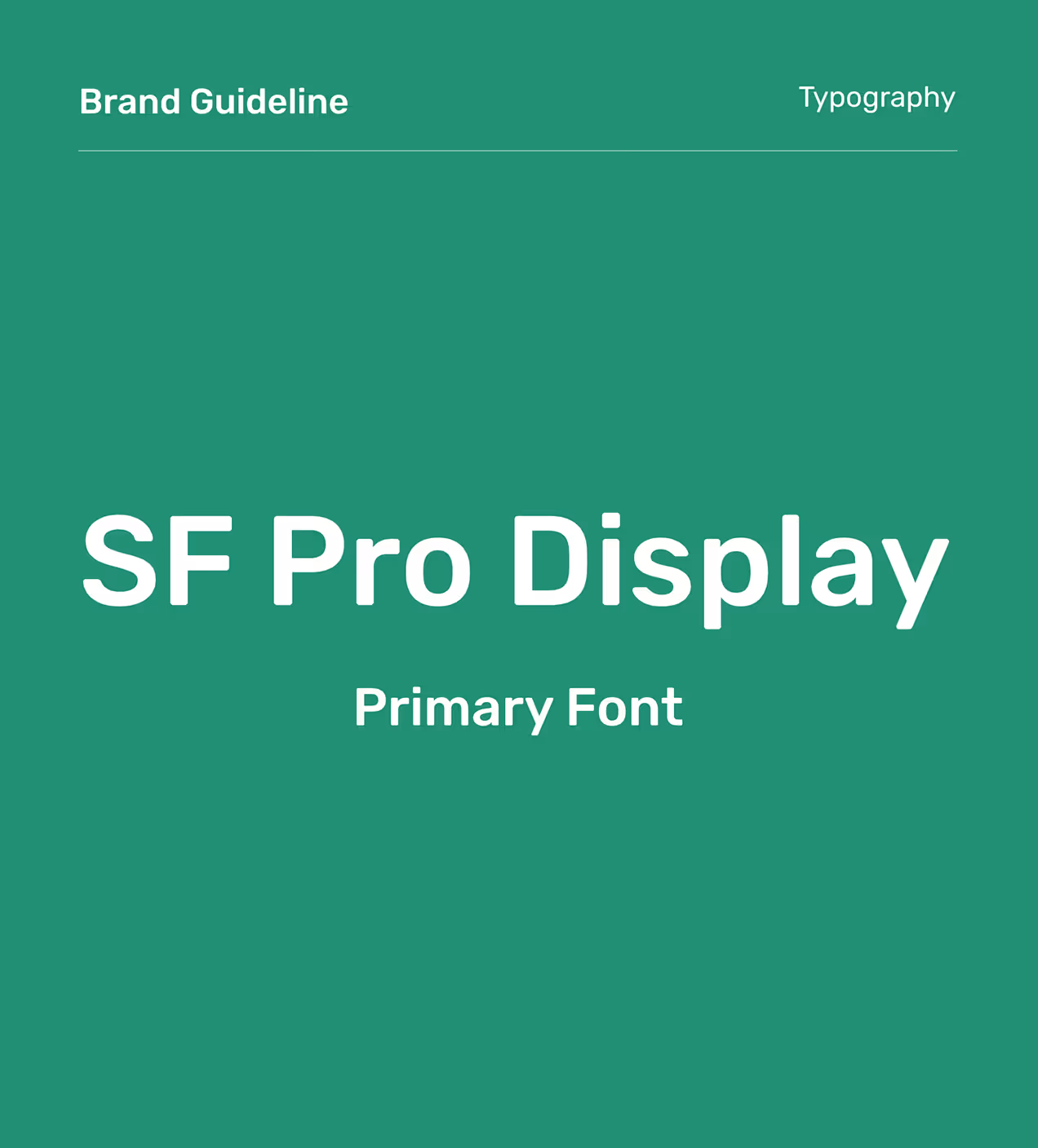
Hoolis’ branding was built to feel trustworthy, simple, and modern for a real estate platform. The logo uses a clean geometric structure to represent direction and stability. A green-led palette communicates growth and security, balanced with soft neutrals for clarity.
SF Pro Display is the primary typeface, chosen for crisp readability and a modern tone across mobile and desktop. Consistent UI elements, icons, and subtle motion reinforce reliability, helping users feel confident when browsing, shortlisting, and contacting agents.


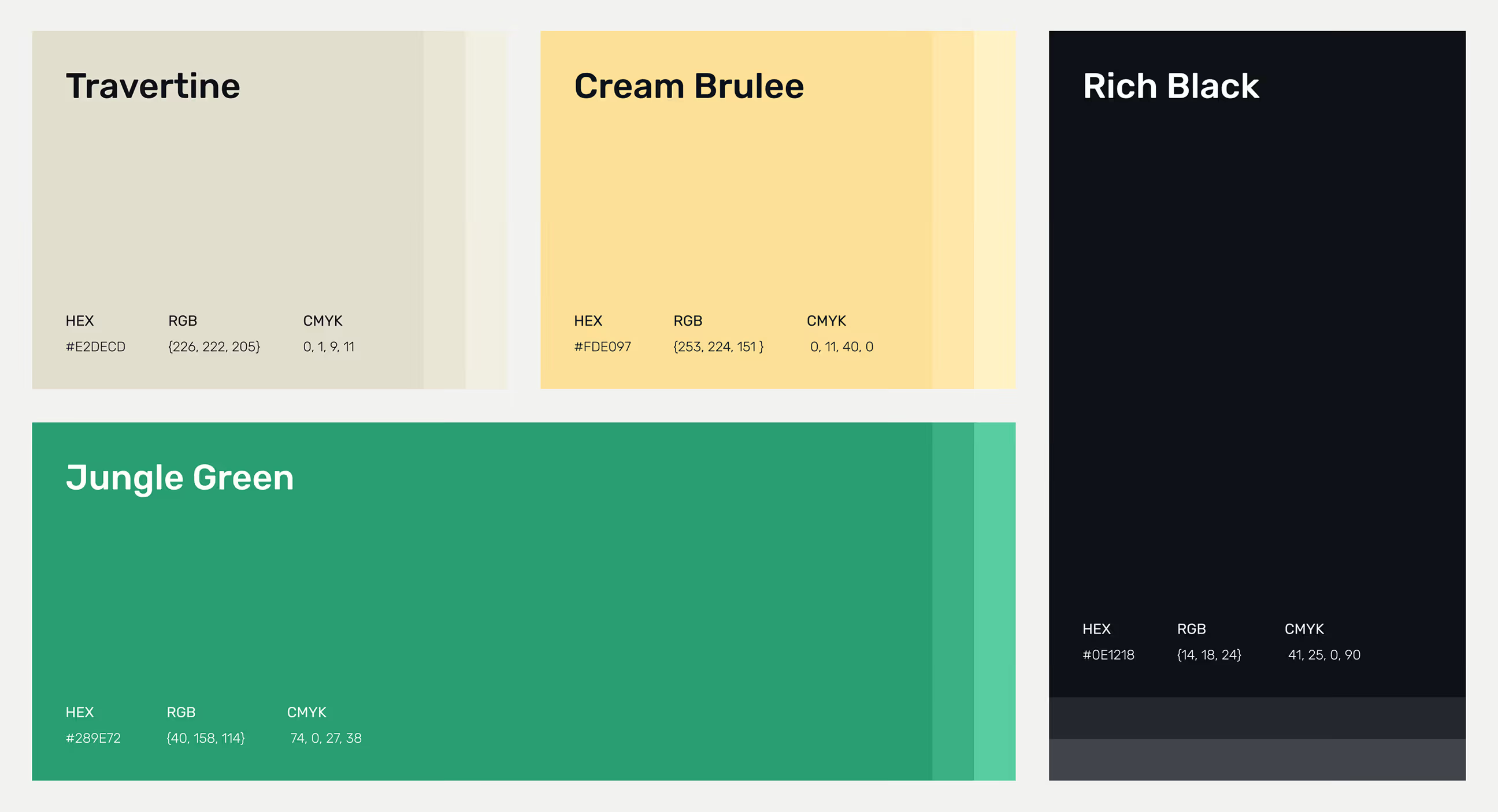
A scalable design system for consistency
We built a scalable design system to keep Hoolis consistent and easy to evolve across screens. The palette uses Travertine and Cream Brulee for warmth, Jungle Green for trust, and Rich Black for contrast. SF Pro Display ensures clear hierarchy and readability, while a geometric icon system and reusable components keep the interface recognizable and fast to update

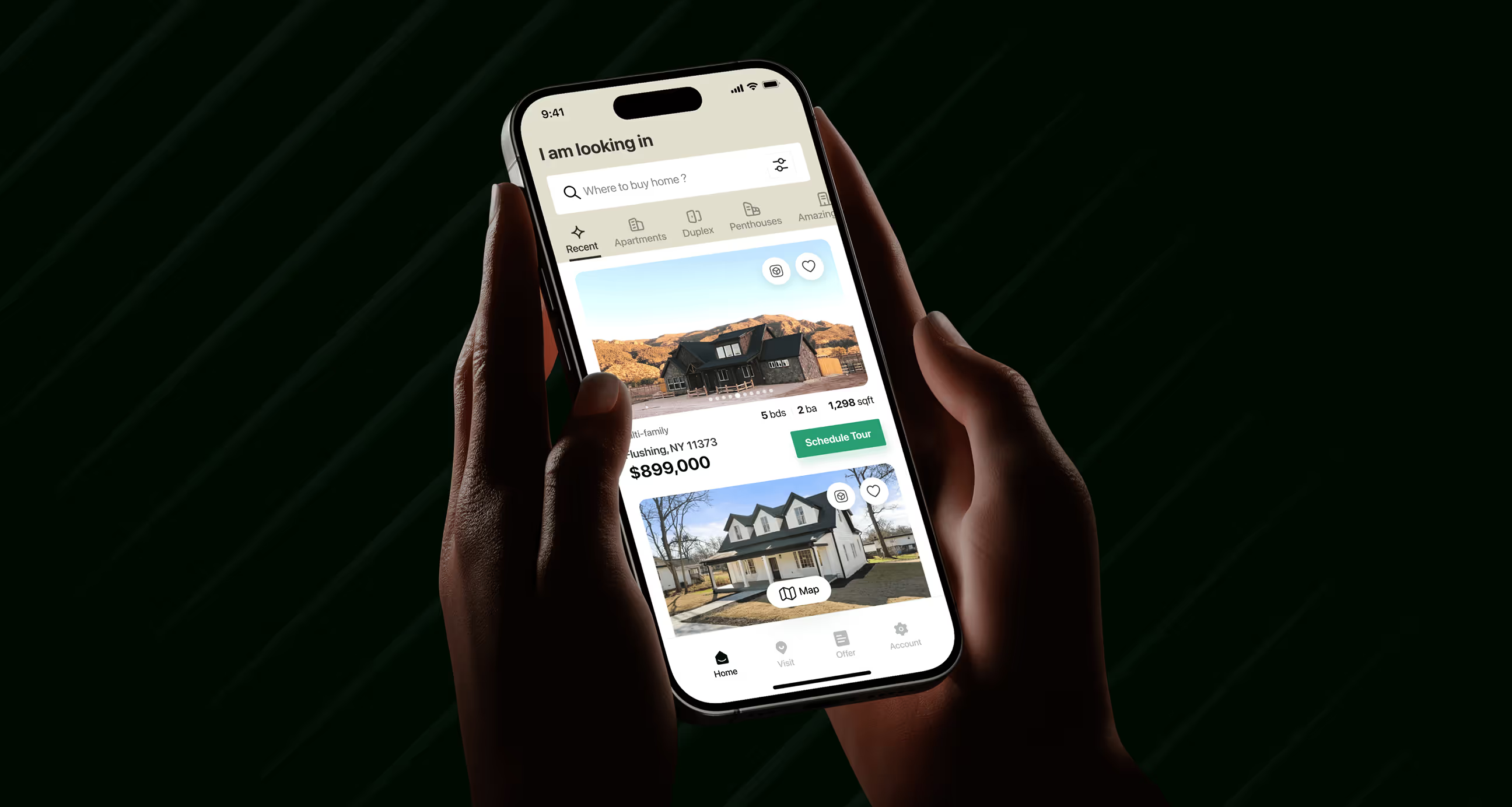
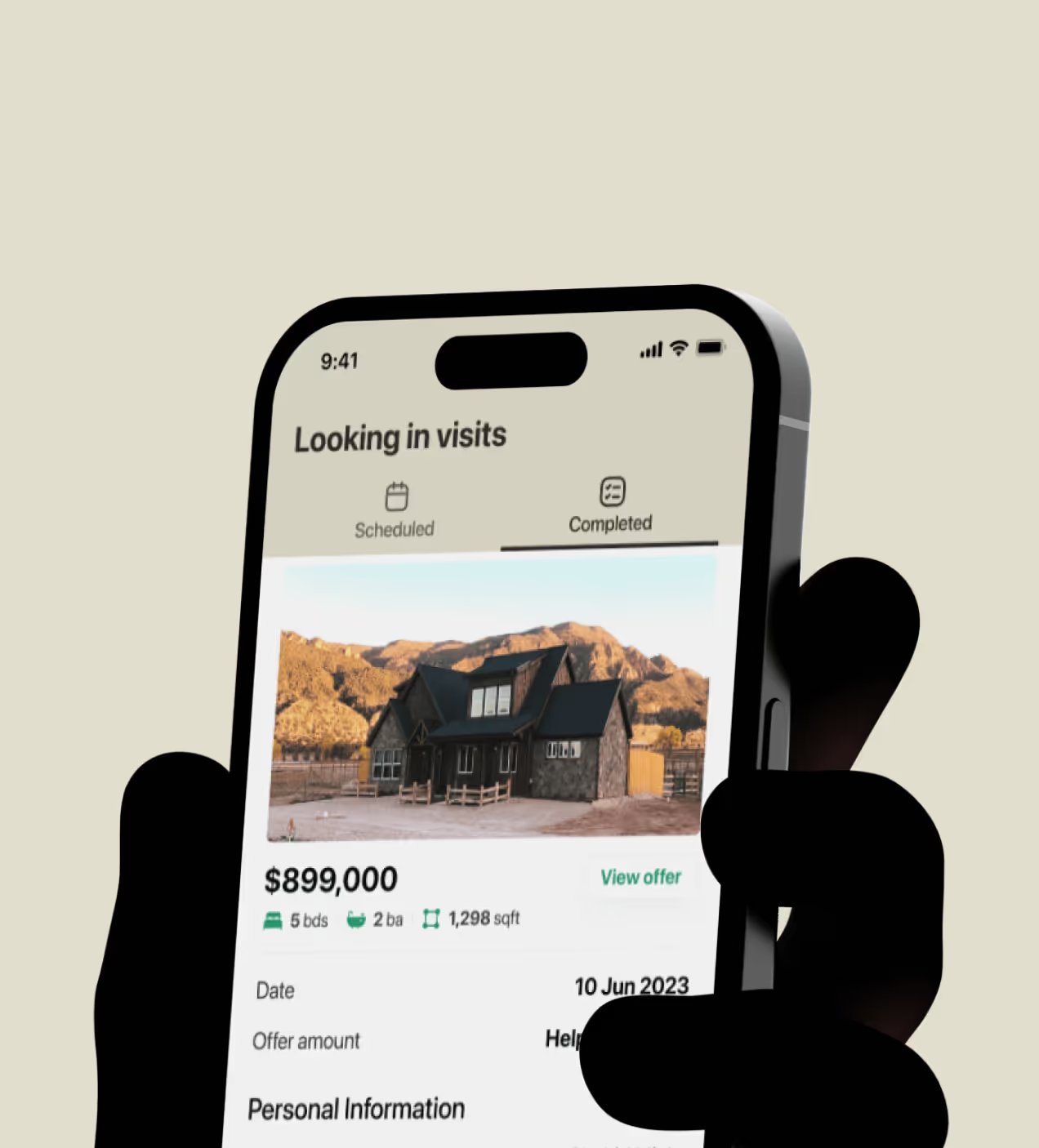
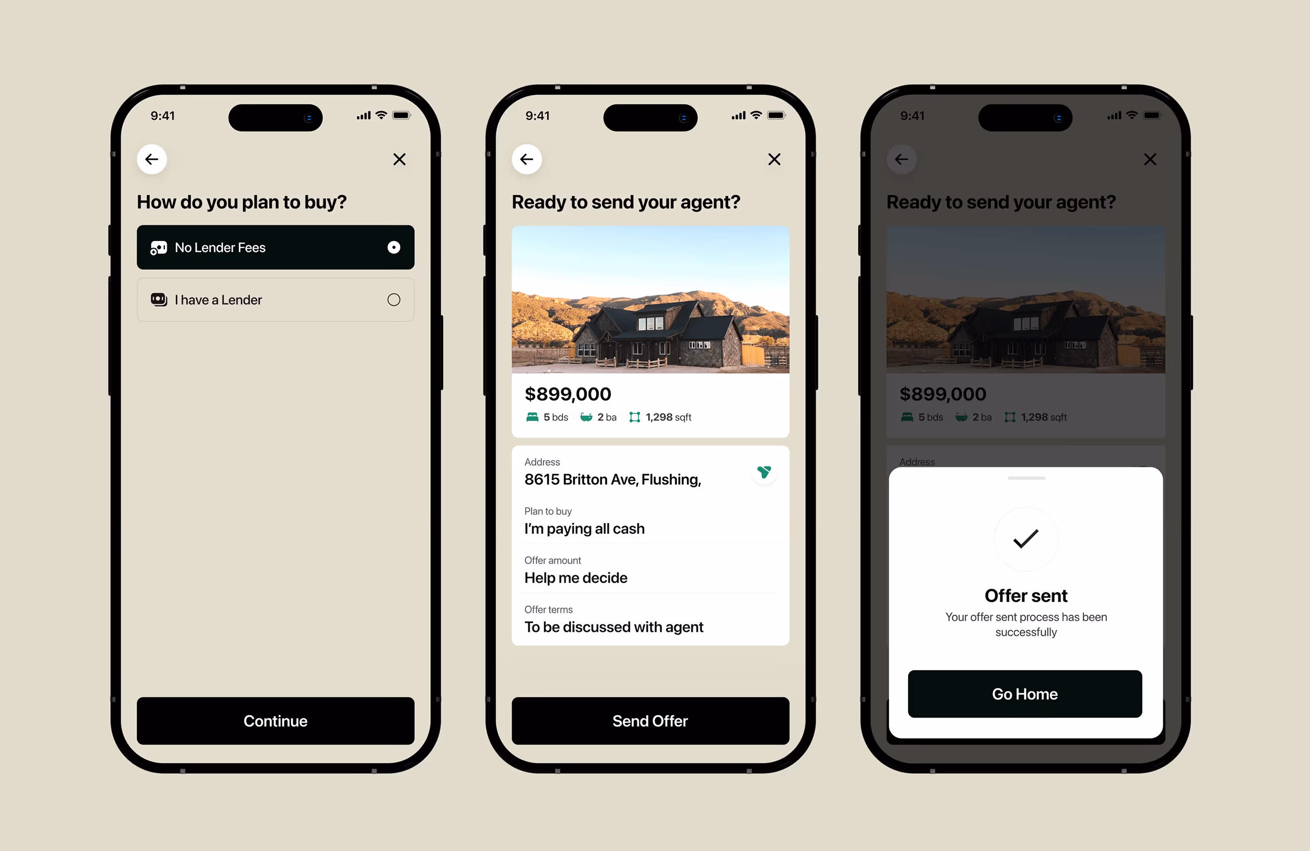
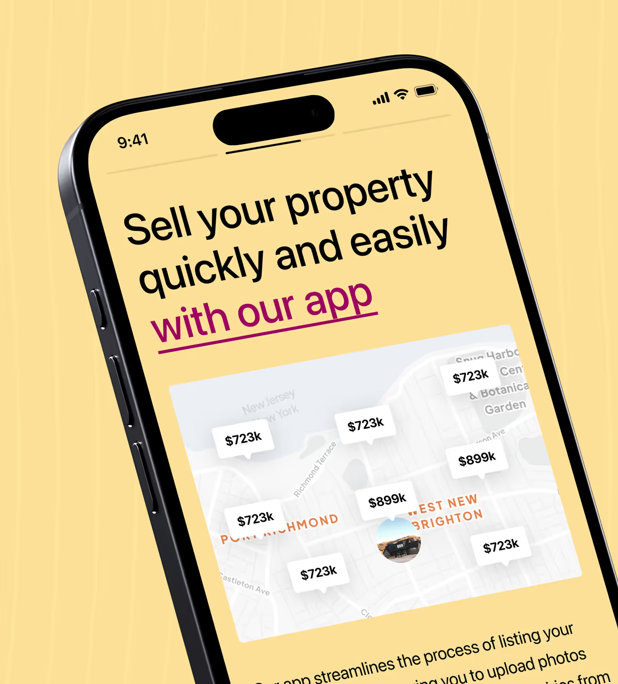
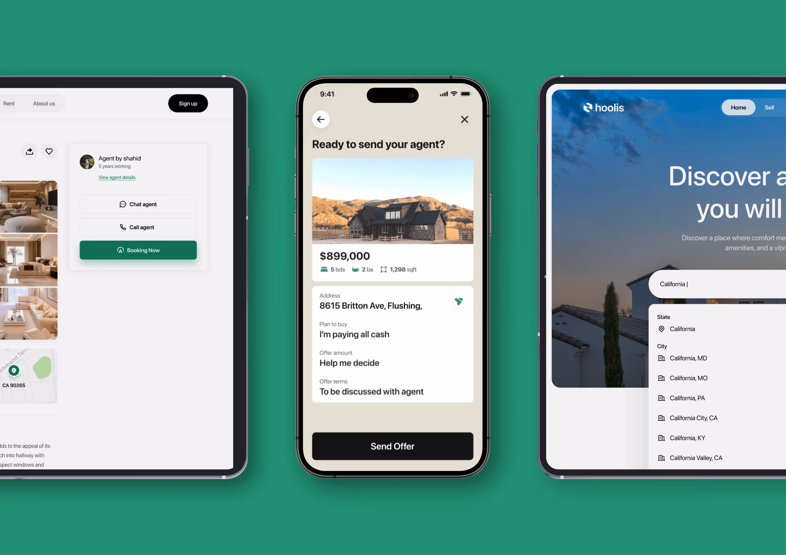
A clear UX design behind every action
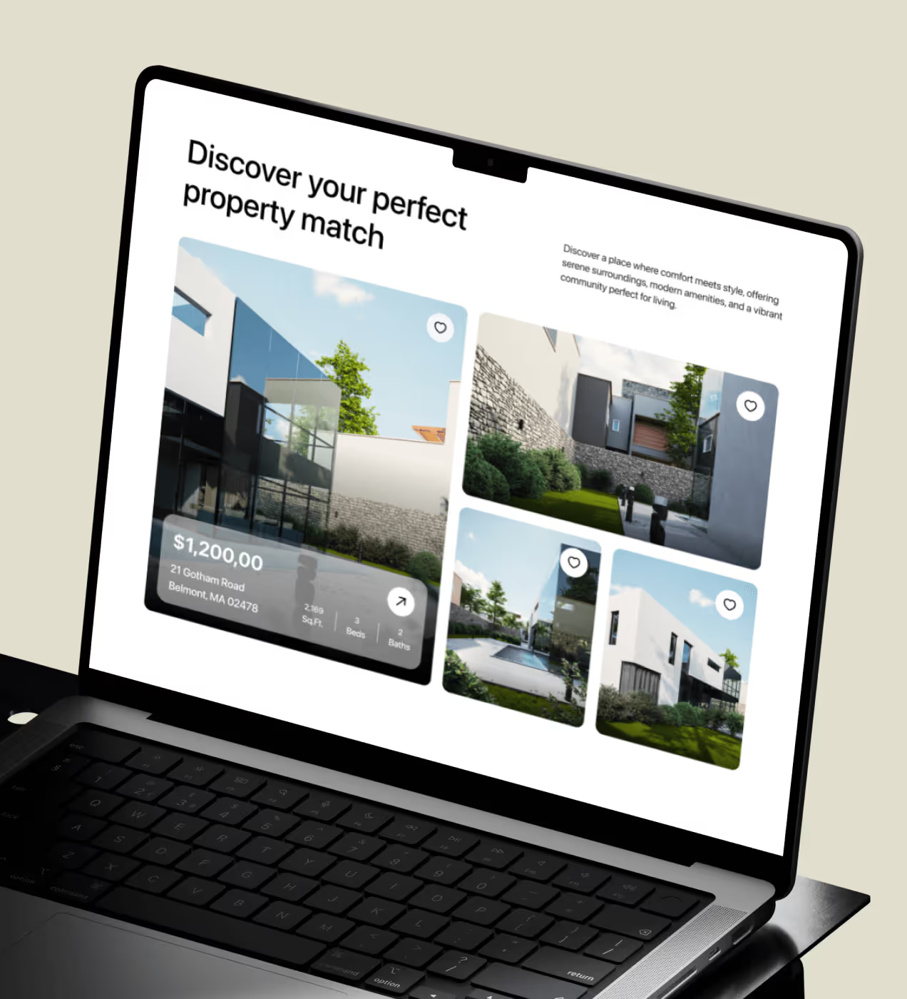
We wanted every moment on Hoolis to feel easy, from browsing to booking. The new design makes it easy to explore, compare, and take action. The important information, like price, number of rooms, and size, is shown immediately on the listing.
Listing a home or making an appointment is now extremely quick and easy for everyone involved. Everything was designed to reduce friction and help users find or sell their dream home with confidence.

Have a Project? Let’s talk!


Your competitors are converting 3x more visitors. Not because they have a better product, but because they have a better design.


.avif)