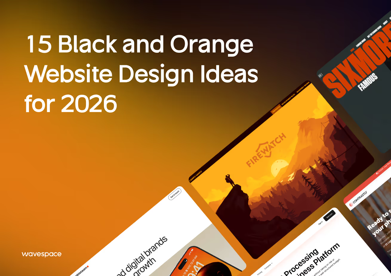
15 Black and Orange Website Design Ideas for 2026


You want to have a new, bold SaaS web design services and black and orange websites provide a dramatic contrast and can express energy, sophistication, and brand confidence. Removing this palette, however, will not be an easy task, particularly regarding accessibility, balance, and the correct design touches.
In this article, I’ll walk you through what black-and-orange sites are, why they matter, when they work (and when they don’t), show you 15 live examples, explain benefits, target-audience fit, how to meet WCAG contrast, and answer common questions.
My goal is to help you feel confident using black and orange while positioning your agency as the expert partner you need.
What Is the Black and Orange Website
When we say “black and orange websites,” we mean sites that use black (or deep dark tones) and orange (or warm, vibrant hues) as their core color scheme. Black typically forms the backdrop, base, or foundation for background, navigation bars, or key containers. Orange is used as the accent: high-converting landing page design (buttons, highlights, hover effects, icons, call-to-actions, or some backgrounds). The difference is deliberate and eye-catching.
In practice, black doesn’t always mean pure #000000—sometimes it’s charcoal, near-black, or a gradient of dark tones. Orange can also be different, either burnt or tangerine, pumpkin, or a custom brand orange. It is only a matter of scalable design systems, and therefore, the orange will not cause dissonance.
As a storytelling frame: imagine walking into a modern, moody gallery. The walls are gloomy, and there is a single daring painting that shines. That’s the essence of a black and orange site: the dark gives calm, mystery, authority; the orange delivers focus, warmth, and energy. It’s a stage for your content, not just decoration.
Designers increasingly favor black and orange because this pairing balances boldness with elegance. With the rise of AI-powered UI/UX design, this palette can stand out in a sea of pastels and muted neutrals. Many creative agencies, tech brands, entertainment sites, and modern startups—including some of the top UX design agencies in USA —adopt this palette to differentiate visually.
Significance of Black and Orange in Web Design
Since color is among the initial emotional appeals a visitor encounters, the black and orange can be very meaningful when used effectively.
High visual contrast: The light and the dark highlights make a visual tension, which is attention-grabbing. Orange fades that are born of black backgrounds will leap more so than the muted tones.
Brand awareness and recognition: This palette is not typical. Once a visitor looks at it, they will have a better chance of remembering the brand as bold, modern, and daring.
Emotional balance: Black conveys authority, elegance, and mystery. Orange brings warmth, optimism, and action. They are all combined to create a balanced yet exciting experience.
Guiding user focus: Since orange contrasts with the black color, it allows concentrating attention, using buttons, links, key values, and user actions, and letting the darker colors fade.
Modern and edgy aesthetic: Black + orange appeals to innovation, especially in design-oriented industries, creative agencies, technology, and entertainment.
Responsibility, though, comes with importance: It is quite simple to overuse orange, overload content so that it becomes difficult to read, or to be so visually aggressive.

Psychology Behind the Palette

The colors affect moods, decisions, and trust, which is why UX research for user behavior plays a crucial role in understanding how users respond to black and orange design choices.
Black: It is a power, luxury, authority, and formal color. In design, black signals seriousness. But dark backgrounds also allow breathing space and contrast. Black backgrounds are usually cinematic in the digital world and bring in drama.
Orange: It is active, cheerful, welcoming, and cozy. It is a mix of the urgency of red and the optimistic yellow. The color orange is creative, enthusiastic, and positive. It can provoke activity without the violence of red.
When used together, a black and orange scheme can balance urgency with composure. You connect with users on an emotional level (orange) and not lose brand authority (black). Think of it like a tech startup that wants to feel both cutting-edge and trustworthy.
Storytelling note: Suppose a founder is selling a new app. You want the site to feel daring (orange) but credible (black). That emotional juxtaposition helps convert curiosity into trust.
Another psychological layer: contrast and focus. Our brains detect contrast strongly. An orange CTA on black is like a beacon. That “look here” effect is psychologically powerful, to guide clicks, scrolls, conversions.
Is It Appropriate for All Businesses, Though?
Black + orange cannot be applied to all brands, and applying without thinking may damage your reputation. This is where it is a fit and where it is not.
Best-fit cases:
- Creative agencies, studios, portfolios
- Software, tech startups, and gaming.
- Recreation, entertainment, amusement experiences.
- Bold fashion, lifestyle, edgy consumer brands
- Niche sectors wanting to stand out vs. blend in
Less ideal cases:
- Conservative industries (legal, healthcare, banking), unless very carefully softened
- Brands targeting older audiences who prefer high-readability, calm palettes
- Sites heavy in long-form reading (blogs, content portals) where the contrast may tire eyes
- Brands with softer, pastel, minimal identities
In the event your brand personality or audience is more warm, soft, or familiar, black and orange can be too aggressive or cold. In such situations, you could employ black and dull warm colors, or simply add some touches of orange into a rather plain palette.
My advice: test a partial pilot (e.g., landing page) before committing site-wide. Gather user feedback, watch heatmap data, and see how people respond emotionally.
Before We Show You What This Might Look Like...
You should remember the following design guidelines and caveats before getting down to the 15 real-life examples (so you know what to look at in any of them):
- Balance is key — Orange should not take over until you get sick of it. Use black as the container, frame, or negative space.
- Shades and tones matter — Darkened orange or charcoal black, slightly, can be better than pure #FF6600 and pitch black.
- Contrast & legibility — Make text readable. Use contrast tools to check ratios (see the later section on WCAG).
- Accent vs base usage — Orange is best as an accent; black (or dark) should remain base.
- Whitespace and breathing room — Bolder designs should be spaced out to prevent a claustrophobic effect.
- Consistent visual language — The palette logic of icons, illustrations, hover states, and transitions should be the same.
- Testing across devices & light modes — It is best to use screens with different brightness; sometimes dark palettes do not play well in sunshine.
- Accessibility sensitivity — Some people perceive orange differently (color blindness). Provide alternatives or failsafes.
With those guardrails, looking at the examples becomes more instructive; you’ll see what works, what pitfalls to avoid.
15 Inspiring Black and Orange Website Designs
Here are 15 live examples of black and orange (or near-black + orange) sites. Each one brings a slightly different twist. Explore them with your design eye.
1. Firewatch
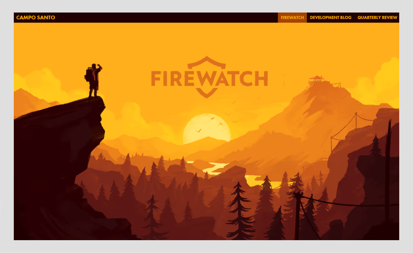
One of the best examples of color storytelling is Firewatch. Deep oranges reflect sunset and firelight, while its dark and mysterious background reflects the forest setting of the game. Such a palette is not the one that is entirely aesthetic; it aids the story.
The website makes customers feel in the same atmosphere as the game does: thrill, coziness, and loneliness. Black provides depth; orange provides emotion. Scroll transitions are cinematic, letting the orange tones lead the eye toward calls-to-action such as “Buy Now.” It’s a masterclass in visual storytelling that shows how even entertainment sites can use color psychology to extend brand emotion.
2. IdeaRocket Animation
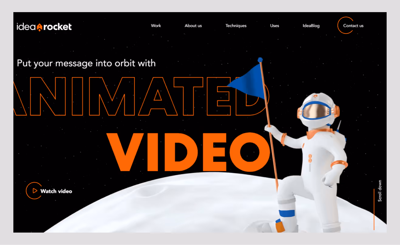
The background color of the IdeaRocket website is dark navy-black with a bright and fun playful orange overlay on all the animations, logo, and text. Being a motion-design agency, it relies on contrast to make its visuals alive; each scroll features little animated effects that combine both warmth and professionalism.
The black base emphasizes the luminous feel of their animated characters, while orange subtly ties back to the “creative spark” narrative. Such a blend will ensure that the brand is assured and creative without losing focus or refinement, which will suit clients with high expectations of animation partners.
3. Humbleteam
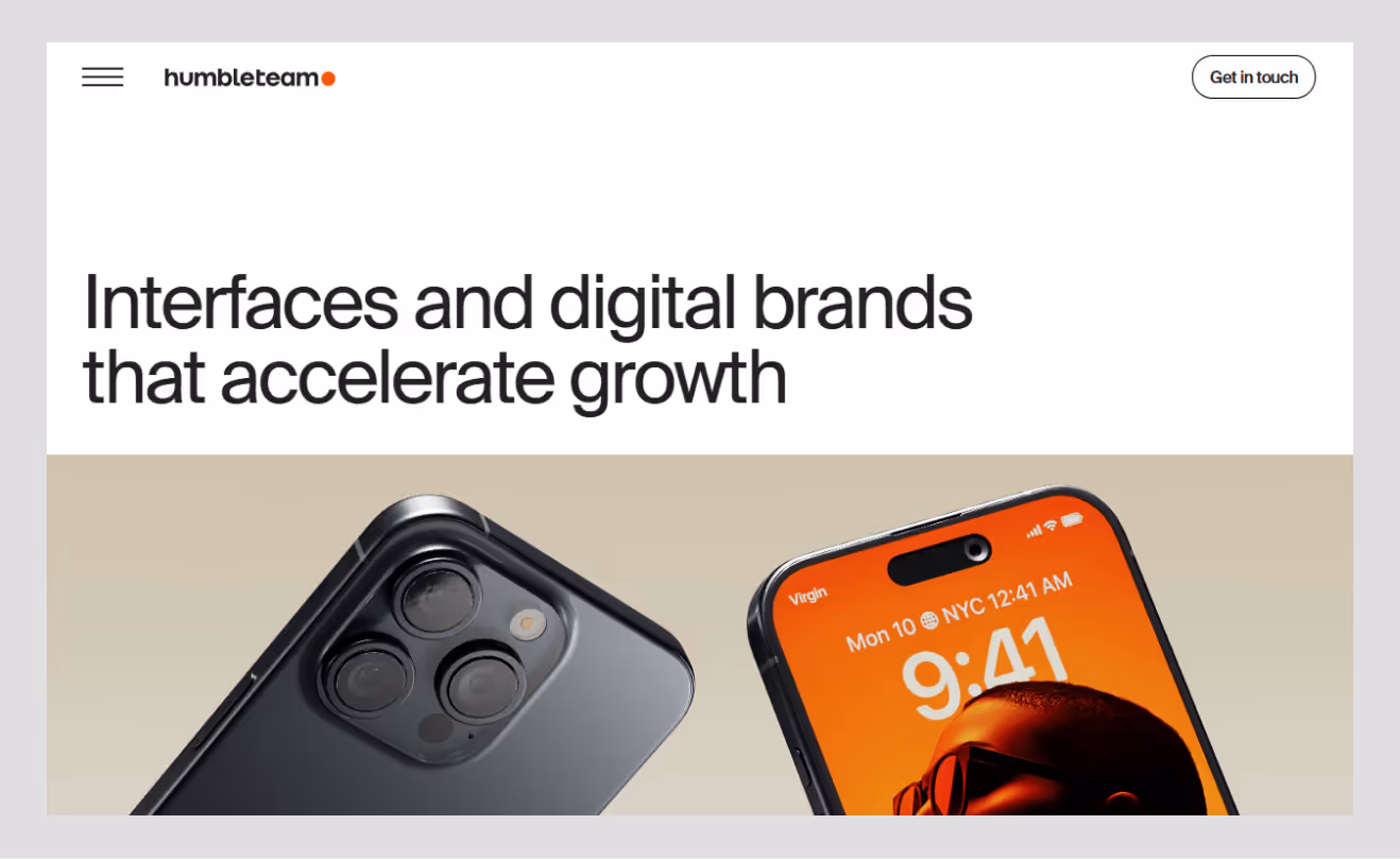
Humbleteam, a world-class product design agency, uses an elegant black interface accented with burnt orange and soft beige tones. The palette supports their positioning: bold but refined. On hover and scroll, subtle orange gradients highlight CTAs and project previews. This restrained color use makes their case studies pop.
Mastery is expressed by black, creativity and energy by orange. They also convey authority together, which is precisely what founders desire from a design partner. Their home page is a perfect example of contrast done correctly: it is minimal, but at the same time, dynamic, balancing both telling the story and conversion design.
4. MicDrop Agency
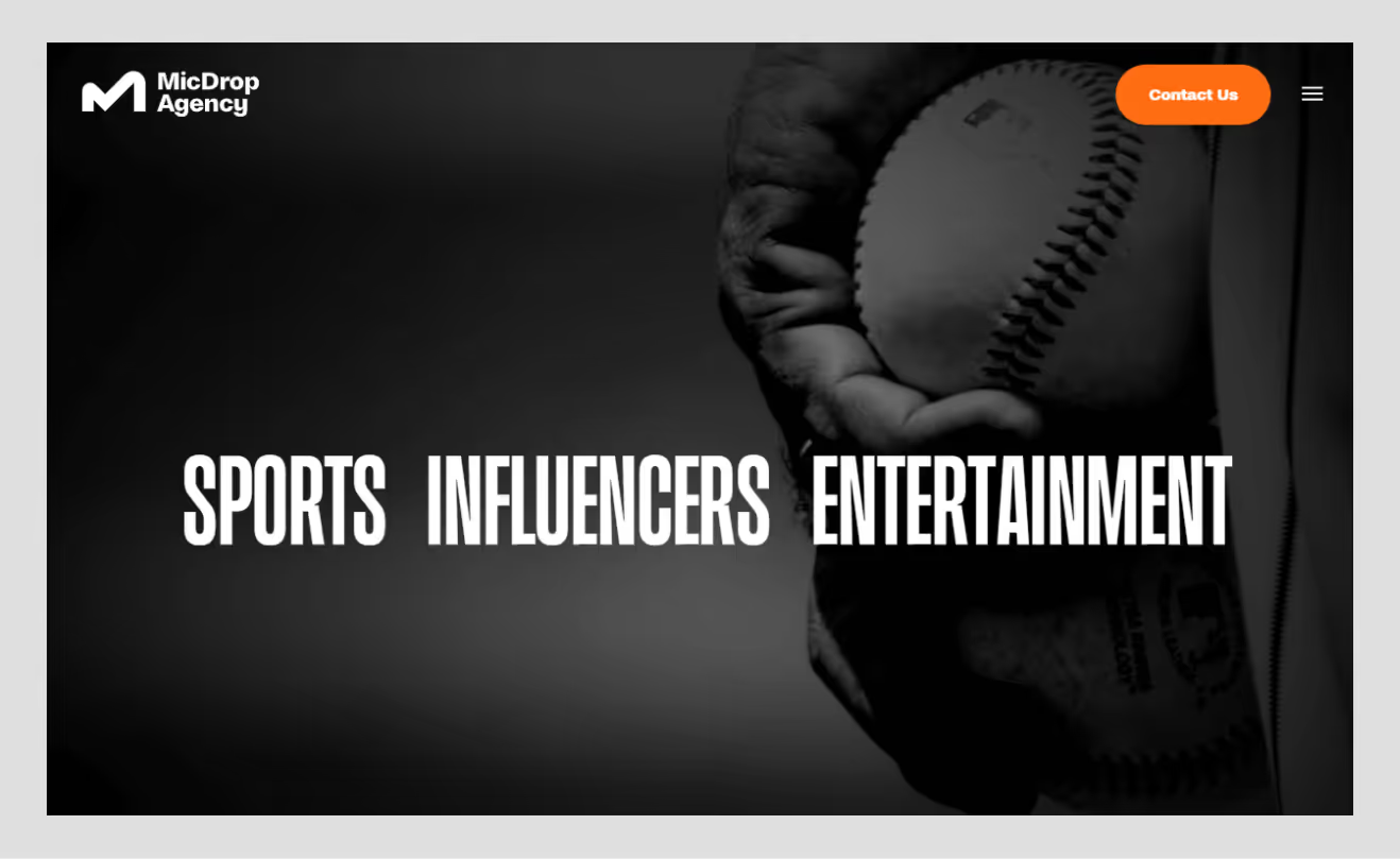
MicDrop’s website lives up to its name; it feels like a performance. The bright orange details, typography and gradient overlays are framed by black backgrounds. Their motion effects amplify that “on-stage” vibe.
Orange is used to highlight bold statements (“Make Noise,” “Be Seen”), translating the agency’s personality into color. The design reveals the way black + orange can be integrated into the brand voice itself: self-confident, expressive, and a bit rebellious. The most important lesson among designers is that color enhances rather than pushes the message.
5. Normand PLLC
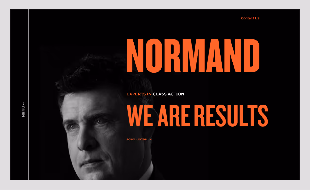
It’s rare to see law firms embracing black and orange, which makes Normand PLLC stand out. Their current law site features deep gray-black with burnt orange headings and CTA accents. This is the expression of trust and modernity without the rigidity that is a hallmark of the legal sector.
It is an excellent example of how conservative sectors can be transformed visually without losing credibility. Black is added to give authority, and orange to give accessibility. The outcome: a professional yet friendly brand, which potential clients will not forget.
6. TekRevol
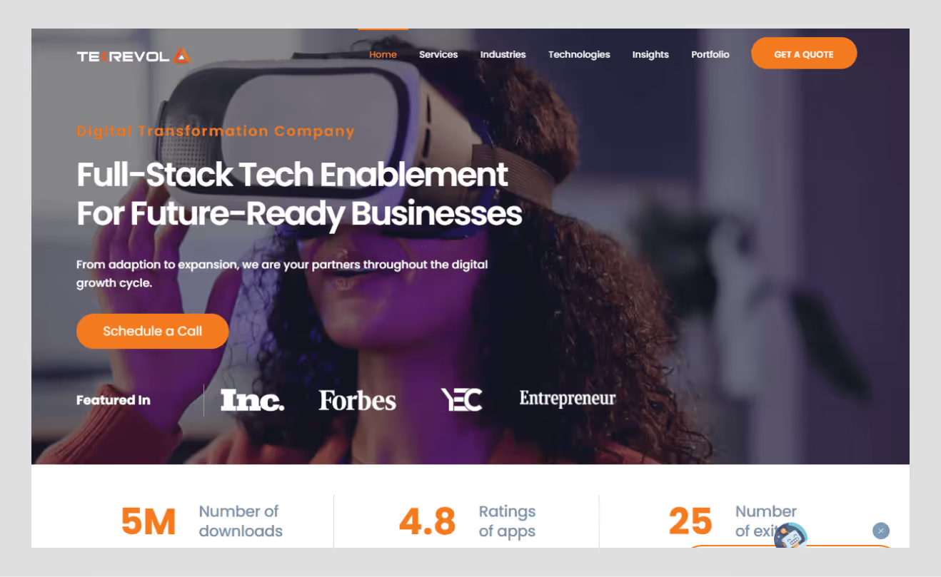
TekRevol is a tech company based in the world and one of the most well-known black-and-orange tech identities. Their site has bold orange gradients on black hero parts with strong typography and interactive features. It is dynamic and innovation-oriented.
The orange emphasizes momentum: “revolution,” “growth,” “movement.” Accessibility awareness is also on display on the site, as the text is spaced out and has sufficient contrast. This makes TekRevol a good source of SaaS or product-based firms in search of energy and confidence in a single palette.
7. Sixmorevodka
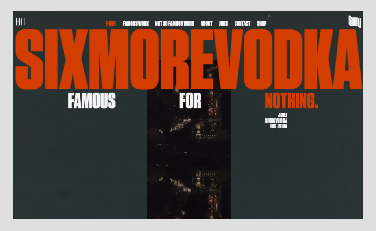
The art studio Sixmorevodka in Berlin employs a black background and controlled warm application of the orange lights on portfolio transitions and thumbnails. Their gritty, artistic color scheme suits their work; they create comic art and illustration for big entertainment brands.
The black background adds depth, whereby the orange light appears on a stage. Combining both creativity and mystery, this combination appeals to the mind. Their location helps in the lesson of a crucial design concept: color can put story framing in the same capacity as the layout or motion.
8. Jason Pontin
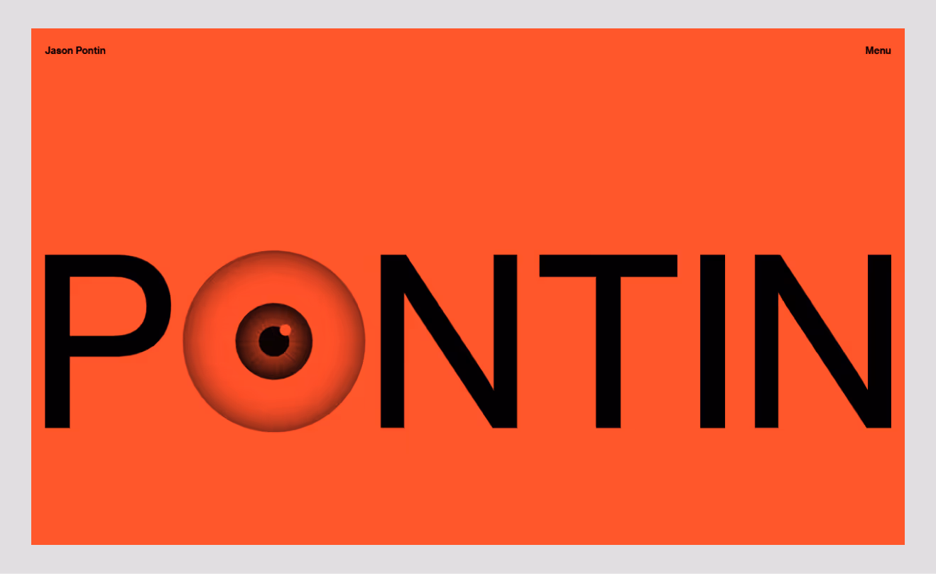
Jason Pontin’s personal website combines minimal typography, editorial layout, and subtle orange highlights for headers and interactive links. It is largely black-and-white, though those orange accents offer warmth to a generally sober, intellectual palette, showing a background in journalism and venture capital by Pontin.
It proves black and orange don’t always need to shout. There are times when restraint is equally effective, and the accent color will intentionally direct attention subtly.
9. A-Andrea

Italian design studio A-Andrea employs black as the hero background and overlays bright orange gradients on imagery and typography. This combination gives the site a distinctly European luxury vibe.
Their scrolling relations are smooth and intentional; each orange transition is attached to the narration instead of ornament. It is one of the examples of how the palette can be artistic and high-end when used with a properly developed motion and hierarchy.
10. Blackorange.nl
As the name suggests, this Dutch B2B outbound agency's entire identity revolves around black and orange. Their site is also versatile in the palette, with matted black graphic elements, to glowing orange logos. They do not make it flat orange, but different shades: amber gradations, neon lights, copper.
This gives a sense of depth and movement in that the color difference can be used to expand a brand experience without introducing new colors. It is actually a study of color by itself and a great example of how an agency can make use of a small palette.
11. Trillest Digital Agency
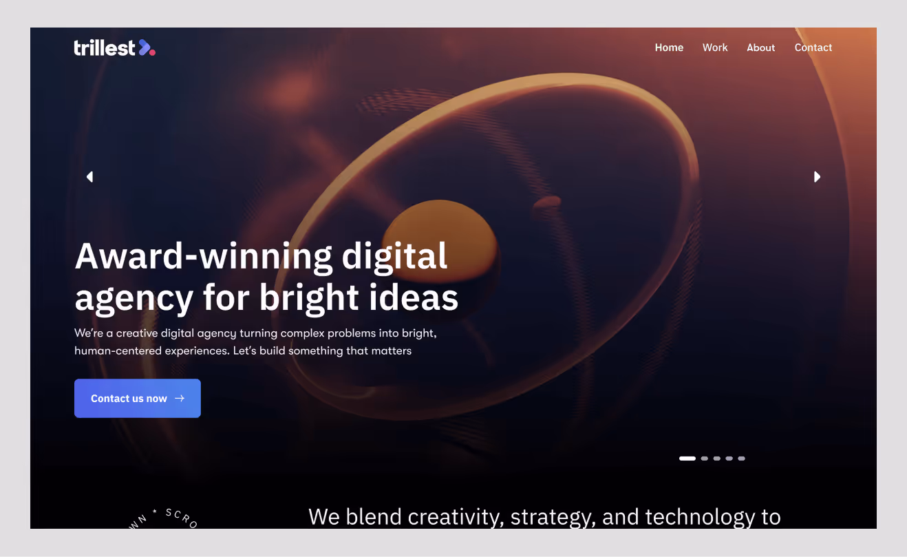
This concept design shows how black and orange can define modern agency aesthetics. The matte black background with the orange typography and the gradient blobs in the hero section are similar to a color leak of the light. The UI feels confident and fast, the kind of design you’d see on a next-gen creative studio. The color relationship builds instant visual hierarchy while staying minimal.

12. OrangeCard Payment Website
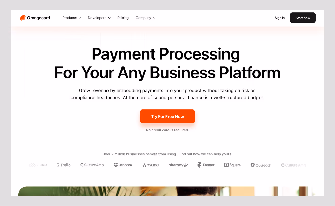
This idea is a redesign of finance. OrangeCard is based on a dark gray foundation with orange buttons of CTA and with faint illustrations. It shows how fintech brands can look energetic without feeling risky. The palette creates credibility without being dull, which is difficult to achieve in financial UI. It is a sensible example of contrast balancing coziness and dependability.
13. Cryptocurrency Landing Page
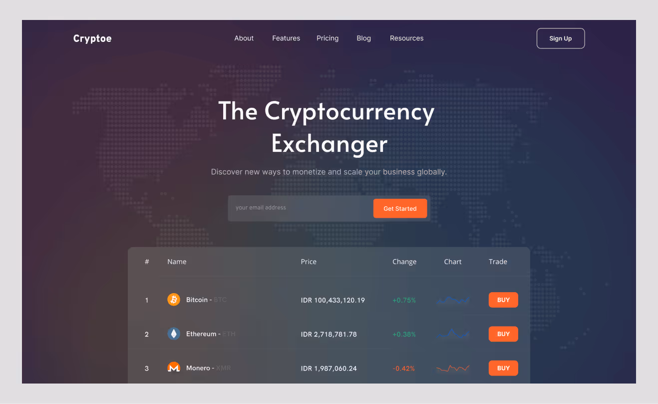
The crypto landing page concept uses jet black and luminous orange gradients to create a futuristic tone. Orange represents energy, innovation, and volatility, exactly the associations crypto audiences expect.
The black background ensures that information is easy to consume, with callouts and motion effects being highlighted. It is smooth, technology-focused, and fully consistent with the mindset of innovation and ambition.
14. Cliquestudios.com
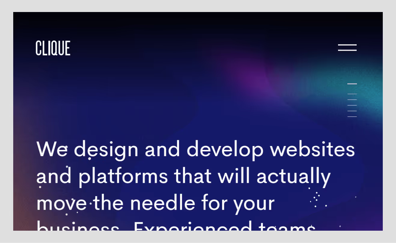
Clique Studios takes the black-and-orange palette and applies it with sharp clarity and strategic restraint. Their site welcomes the audience with dark charcoal backgrounds with bright amber colors on the type, hover states, and micro-interactions.
The orange gives power to the clean grid pattern, and calls to action and project highlights are impossible to overlook. Black, on the other hand, acts as the neutral stage, amplifying focus on the studio’s thought-leadership content and client results. The outcome is secure, natural, and futuristic.
It was a powerful illustration of how a design agency can apply black and orange to create a contrast in appearance but also express authority and friendliness. The combination of functional storytelling with visual confidence makes the pairing; each scroll seems to be organized and vibrant.
15. Contrastly.com

In contrast, photography and editing education platforms leverage brand identity as a core UI/UX color principle. The site contrasts almost black backgrounds with hot and lively orange details throughout the logo, course highlights, and CTAs.
This contrast mirrors the creative process of editing itself, light against shadow, tone against tone. The black foundation creates attention and attention to detail, and the warm and human-oriented touches of the orange resonate perfectly with the platform designed with creatives in mind.
Most educational websites are based on light palettes, whereas the dark mode of Contrastly is cinematic and professional. It asks people to dive in and see the way of entering a digital darkroom. The lesson: black and orange can communicate mastery, creativity, and warmth all at once when executed with intention.
Benefits of Using Black and Orange in Digital Branding
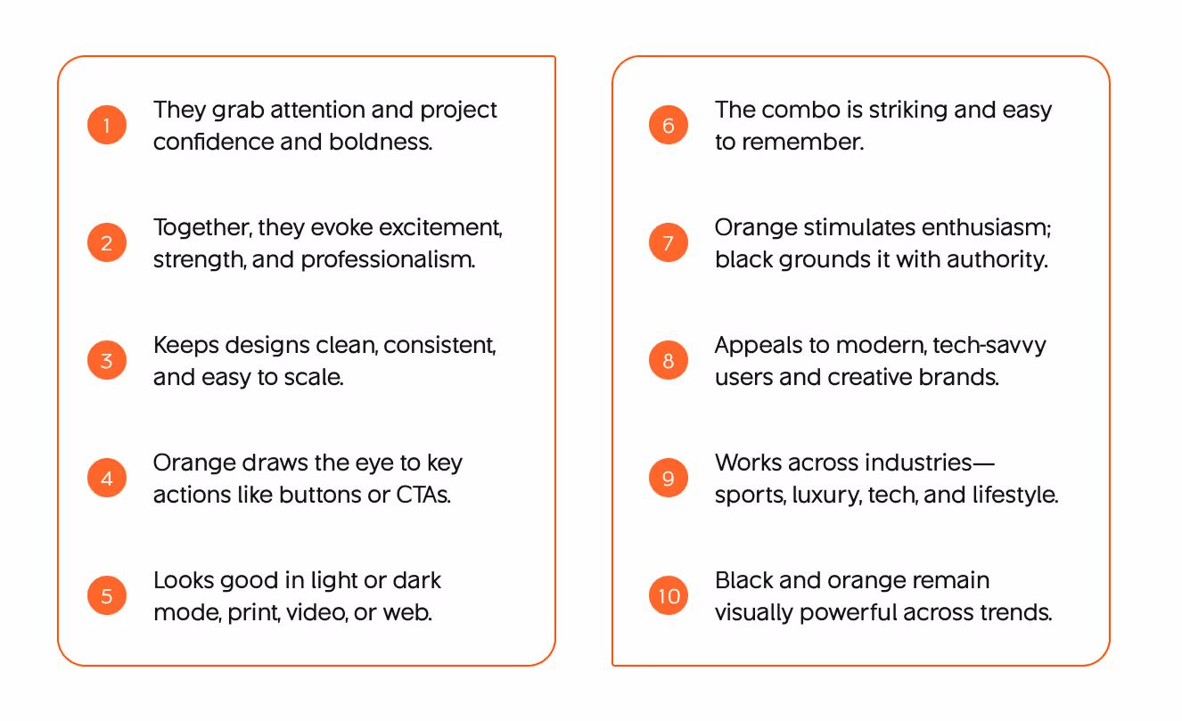
Using this palette carries more than visual flair. Here are key benefits when done right (and how you can tell whether a design agency “gets” them):
Stronger Brand Differentiation
Black + orange is unique among many brands that are moving towards pastel, muted, or flat neutrals. Clients who want attention will tend to be attracted to bolder palettes.
Focused Attention & Hierarchy
Because orange elements demand attention, you can guide users easily; buttons, CTAs, and highlights all become clearer. This drives better conversion flow.
Emotional Resonance
The combination brings heat (orange) and cool reserve (black). It allows you to tell stories: urgency, warmth, professionalism. That emotional appeal can help persuade.
Modern & Premium Perception
Dark designs usually give the impression of high or luxurious quality. Take the power of orange and you sniff of innovation, and not merely of tradition.
Efficient Accent Use
You do not need a broad color palette; less color and more contrast can be effective—an approach often reinforced through strategic branding packages that streamline design systems.
Versatility Across Media
The palette often works well both in light and dark modes, print collateral, motion, and even merchandise, as long as you maintain contrast and adapt shades.
Memorability
Bold colors leave impressions. If someone revisits the site later, the visual identity is more likely to stick.
As a design agency, you can lean into these benefits when pitching: “We’ll give you a brand identity that not only looks modern but feels bold, converts better, and stands out in your industry.” Back that up with the examples above and your own case studies.
Target Audience Appeal of Black and Orange Aesthetic
When you choose a palette, it must align with audience expectations and emotional zones. Black & orange is not just for show; it speaks to certain audiences.
Appeals to:
- Younger, digitally adept audiences who are comfortable with edgier design
- Design-driven clients and startups in search of identity, creative professionals.
- Innovative, risk-taking, entertaining, and technological industries.
- Expecting personality, bold statements.
Risk for:
- The palette should be up to the standard, as audiences are sensitive to readability (elderly, low vision).
- Clients who desire an ultra-trust, peaceful, conservative voice.
- Readers of long-form content who enjoy their black contrast and white comfort.
In the process of pitching to potential clients, you can tell them: “Your target users will be most likely to react to confident, bold visuals. Black + orange gives you personality, but we’ll ensure nothing is sacrificed, legibility, accessibility, strategic focus.”
To prove the fit with the audience, you may mock up a version with a neutral color, and another with a black-orange color, and test the taste among samples or quick A/B tests.
How to Ensure WCAG Contrast for Black and Orange Designs (2026 Update)
Color contrast is not only a compliance point, but it is also a pillar of good design. In the case of the bold palette of black and orange, an accessibility-focused UX audit helps ensure the balance between clarity and visual impact is maintained. A simple slip, however, could turn a beautiful site into an unpleasant one.
Understanding the Standards
According to WCAG 2.2:
- 4.5:1 is the minimum contrast ratio for normal-sized text.
- 3:1 applies to large or bold text (19px bold or 24px regular).
- 3:1 is also required for non-text elements like buttons, icons, and form fields.
This is practical in the sense that all you orange accents on your black background should be readable. As an example, bright orange (#FF6600) on black (#000000) has a ratio of approximately 6.7:1, which is more than the AAA standards.
But white text on orange (#FFFFFF on #FF6600) scores only around 3.2:1, failing for body text and small UI components. The same color combination that feels “high energy” can actually reduce readability if applied carelessly.
Moving Beyond Ratios: The APCA Model
Contrast is not a mathematical concept but is perceptual. The Advanced Perceptual Contrast Algorithm (APCA), which was the focus of WCAG 3, is closer to the human perception of brightness and color on screens. Orange is placed in the middle of the luminance range, which means that it can be even brighter than its technical ratio indicates. APCA helps designers in covering that visual gap.
To apply APCA correctly:
- Target LC 60 or higher for normal body text.
- Target LC 45 or higher for large or bold text.
These benchmarks produce smoother contrast transitions, especially on dark themes, making your black and orange websites easier on the eyes during extended use.
Practical Design Guidelines
- Choose richer, slightly darker oranges—ranging from E15A00 to FF5E1A—to impart warmth without the brightness.
- Select a near-black background color such as 0A0A0A rather than pure black. The result will be a less stark contrast.
- Use orange text only on short statements, buttons, or important words. Do not use orange text in long paragraphs or descriptive text.
- Check contrast with the WebAIM Contrast Checker, Deque Analyzer, or the APCA Calculator.
- Provide visual cues on the links and actions that are not dependent on color, such as underlines, icons, or borders, so that people with color deficiencies can also understand and make their way through the application.
- Try your interface on different screens and with different lighting. At night or on an OLED screen, color behavior will alter.
Use other indicators like underlines, icons, or a change of border to allow those users who are unable to distinguish color to still navigate with ease.
Final Thoughts
Black and orange websites are a compelling visual frontier for 2026. They communicate confidence, energy, and distinction. But executing them well demands discipline, balance, contrast, and empathy.
If you’re a founder or brand leader, choosing black + orange signals that you want more than safe design; you want personality, clarity, and a compelling user journey. When you work with a design firm that knows the emotional and technical ins and outs, you not only will have a site that looks outstanding, but it will work, convert, and gain authority.
If you like, I can audit or mock up your site concept in black + orange, flag contrast problems, and present you with a design pitch. Want me to do that next?


More related blog

Have a Project? Let’s talk!


.avif)

