Top 10 red apps with exceptional UX design (2026)


Have you ever wondered why some apps give you a tingly feeling of excitement after launch? Right after opening them, you automatically tap, scroll, or get drawn to buy something? This feeling and change of behavior come from color, and no color does this better than red.
Red has a special impact on our decision. Red is a symbol of power. This is the reason world leaders wear red ties at summits and conferences.
Red grabs your eyes before anything. Subconsciously tells your brain to pay attention. Which is why many apps use red as their main color. When red is done right, it drives high engagement, creates urgency, and even makes you hungry.
In this blog, we look at the top 10 red apps with the best UX design in 2026. Also, explain what red app UX design means, why it works, and which apps are using it better than anyone else.
What is red UX design?
UX design is a process of designing the user experience. The core purpose of UX design is to make a product not only easier but also useful, fun, and compelling, AKA habit-forming.
Good app UX design ensures new users understand what the app is about and know what to do. Also tackles some issues, such as users not getting confused. They do not get bored. They enjoy it while using it.
Now, Red UX design refers to UX centered on the color red. It is used as a main tool to influence how people feel and behave inside the app. Not to be mentioned, Red UX isn't just about color. It is a statement. It implies, look here with your attention and take action.
While designing, a UX designer meticulously uses the red color. Designing a red app doesn’t mean making everything blood red. Red can be risky. Too much red can feel aggressive or overwhelming. On the other hand, too little and you lose the benefit.
Experienced designers find the perfect sweet spot using red to guide users, spark emotion, and encourage action.
For example, the designers from Wavespace have extensive experience in app design. The UI/UX team delivers data-driven & user centered tailored solutions. Designs from Wavespace drive cumulative results with 67% faster onboarding via clear flows and 35% faster product launches.
Red UX works best when it translates the app's purpose. Red in a food ordering app that will make the food look much tastier. A streaming app will build excitement. A shopping app can create urgency around deals and timers.
Meaning of red in UX and in our lives
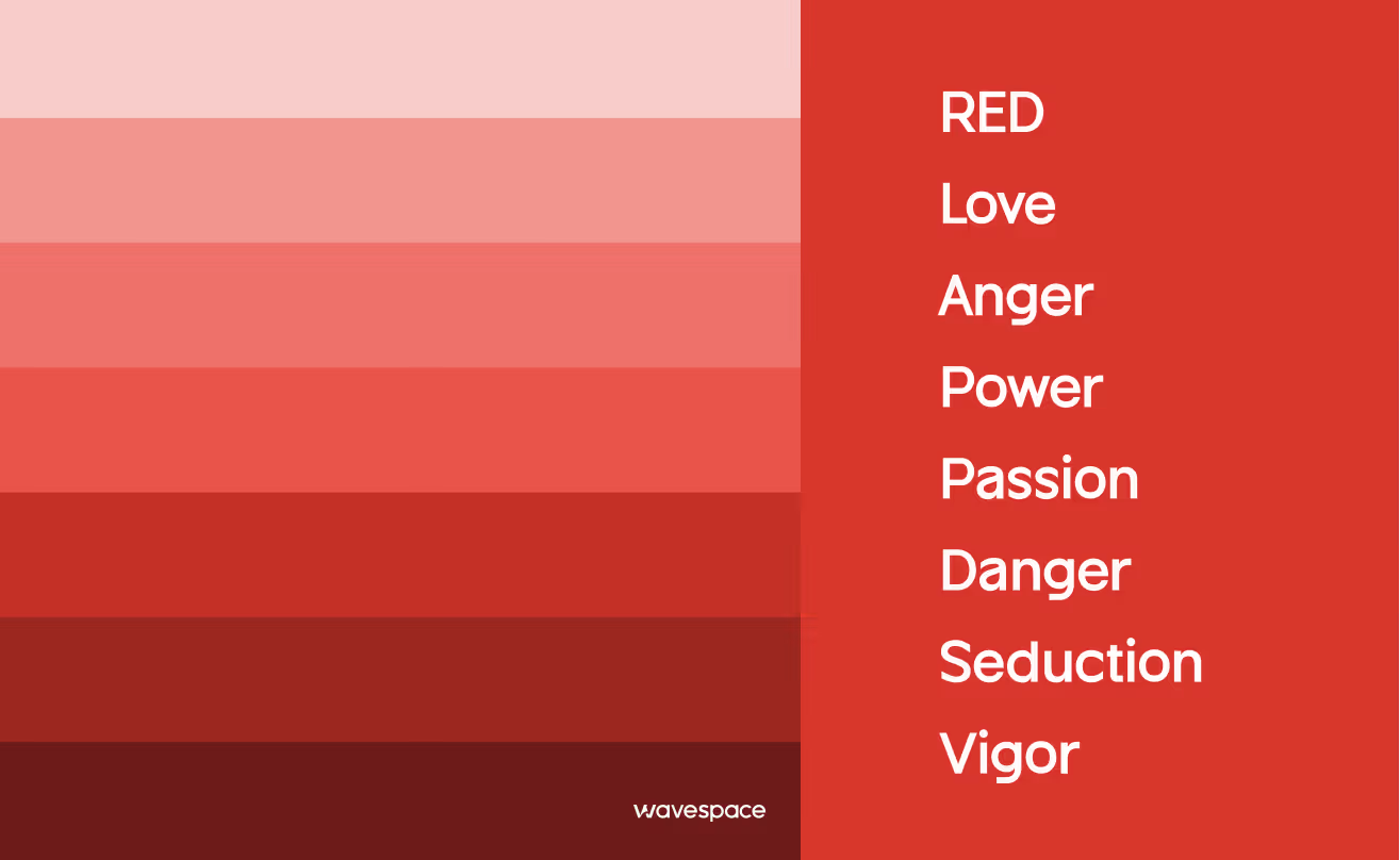
Red is not just a color; it means much more than that.
Before the internet and smartphones, humans were hardwired to respond to red. It doesn’t stop there; in the modern era, red color symbolizes power.
- A red sunset meant danger.
- Red berries might be poisonous or delicious.
- Red meant fire, blood, passion, and power.
- Red is one of the top two favorite colors of humans.
- Approximately 77% of all country flags include red.
That old wiring is still working inside us, even when we are playing a game, browsing the internet, or using an app. In UX design, red carries three key messages that make it incredibly powerful for apps.
- High Engagement: Red’s properties are not only for males. It grabs attention faster than any other color. People notice red elements first, making it ideal for signs, emergency lights, buttons, and badges. When used well, it increases interaction.
- Urgency: Red creates an instant moment feeling. It’s perfect for countdowns, sales, and limited-time offers. When used well, red encourages users to make faster decisions, especially in e-commerce and food apps.
- Appetite Stimulation: Red makes things look more appealing. This is the reason behind brands like McDonald's, KFC, and Pizza Hut using it. When used well, it can literally help sell food.
Red is not only a mere color but also symbolizes love, celebration, and importance, adding strong emotional impact to design choices.
Explore how the color green shapes emotions, influences perception, and impacts the human brain. Read the blog now.
Our selection criteria
How did we make our selection? We didn’t just randomly pick apps with the red color. Instead, we asked our expert designers to cherry-pick the apps that master the craft of Red app UX without causing any form of color fatigue. We provided them with four specific criteria to guide their choices.
- Strategic Balance: How does the app use red color? As an accent or primary theme without hurting the user’s eyes?
- Emotional Impact: Does the color successfully invoke the user’s sense of hunger, speed, or excitement?
- Accessibility: Is the red bright enough to be seen by every type of user? Including users with a lack of vision.
- Modern Features: Does the app use modern trends that live up to 2026?
List of 10 red apps with top UX design

Top 10 red apps with exceptional UX design (2026)
1. Netflix
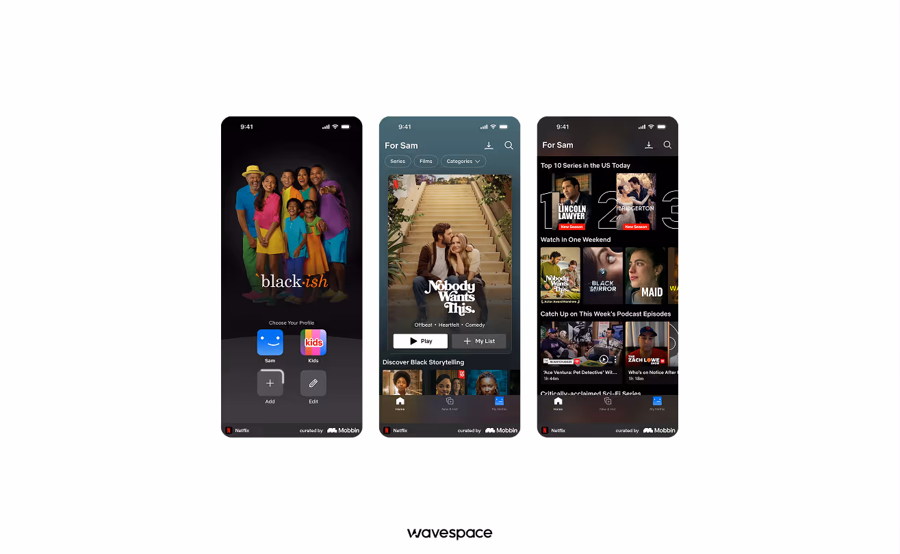
The gold standard for the Red UX app. It utilized red as a high-contrast home entertainment platform.
Why the UX wins:
- Cinema at home: Netflix pairs a deep black background with Netflix Red to create a UI that gives the feeling of a cinema theatre at home. The high contrast immediately grabs the user’s attention on the TV screen.
- Urgency & Live cues: Netflix strategically used red to highlight "Live" event and "Trending Now" sections. These red pops create a psychological sense of the "premiere". Which, in results, makes Netflix content feel more exclusive.
- Navigation: The red in Netflix is also used in the progress bar and the active menu state. It is done so the users can effortlessly see where they are in a movie without being distracted from the visuals.
Key takeaway: Use red with a dark background to create a rich, premium content feeling.
Available on: App Store | Google Play Store
Compare the top 20 mobile app design agencies in the USA and choose the right fit for your brand.
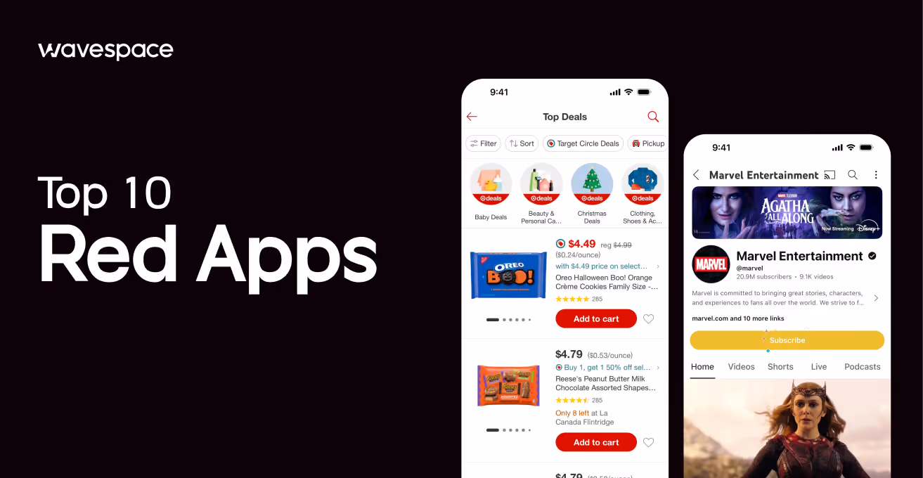
2. DoorDash
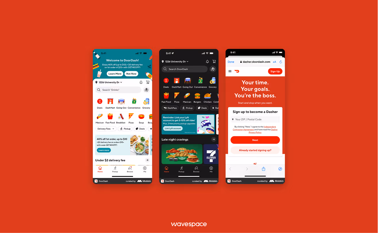
A master of using red to stimulate appetite and create a sense of logistical speed.
Why the UX wins:
- Appetite stimulation: DoorDash meticulously uses a warm red palette. In color psychology, red is known to increase heart rate and invoke the sensation of hunger. Making it a perfect choice for a food ordering platform.
- Visual urgency: Designers used red on the food delivery icon in the map section. Which is deliberately done to create subtle but effective anticipation in users’ mind, “Food is coming”. This is done to keep the user hooked on the app screen.
- Calls to action: Red is used with bold font in primary buttons like "Checkout" or "Place Order." To ensure that users can place an order with one tap without having any decision fatigue.
Key takeaway: Use warm shades of red to invoke biological responses (hunger) and to create a perception of speed.
Available on: App Store | Google Play Store
3. YouTube
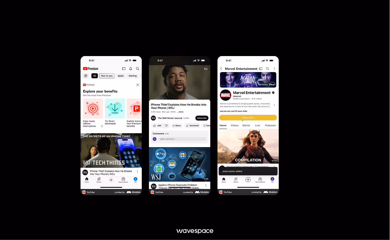
The biggest video platform of the modern era. It actively uses red color to turn casual website viewers into active community participants.
Why the UX wins:
- Micro-Animation: YouTube has perfected the art of micro-animation. YouTube has implemented the color red into everything. From the splash screen to show its presence, to the “Seeking bar” to tell the viewer where they left off in the video.
- Power of Play Button: YouTube’s play button is famous worldwide. The play button is scattered throughout the app, inviting viewers to dive into the ocean of content.
- Subscription Hooks: The "Subscribe" button stays red until it is pressed, at which point it turns grey. This visually tempts the user for “Task completion” action, invoking a sense of satisfaction in supporting a creator.
Key takeaway: Use bright red for micro-animations and interactive buttons to drive users to complete their task, click, and engagement.
Available on: App Store | Google Play Store
4.Target
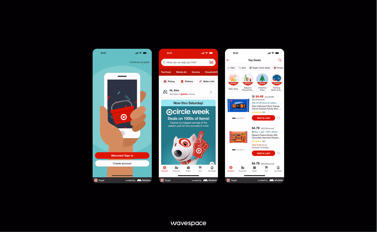
A retail giant that uses the red & white bullseye to turn shopping into a treasure hunt.
Why the UX wins:
- High-energy: The Target masterfully uses red to maintain a high energy level. Unlike green or blue to convey Calm UX or Green UX, Target’s UI UX keeps users' brains active find their necessities. Which influences users to keep browsing and adding items to the cart.
- Guided checkout: Target uses red to effortlessly guide user's eyes to place an order.
- Brand consistency: Target’s"Bullseye" is well integrated into the UX. From loading state to the reward icon, reinforcing brand loyalty every time the screen refreshes.
Key takeaway: Use red color to guide users' eyes through the multi-step checkout funnel.
Available on: App Store | Google Play Store

5. Fly Foundation VPN
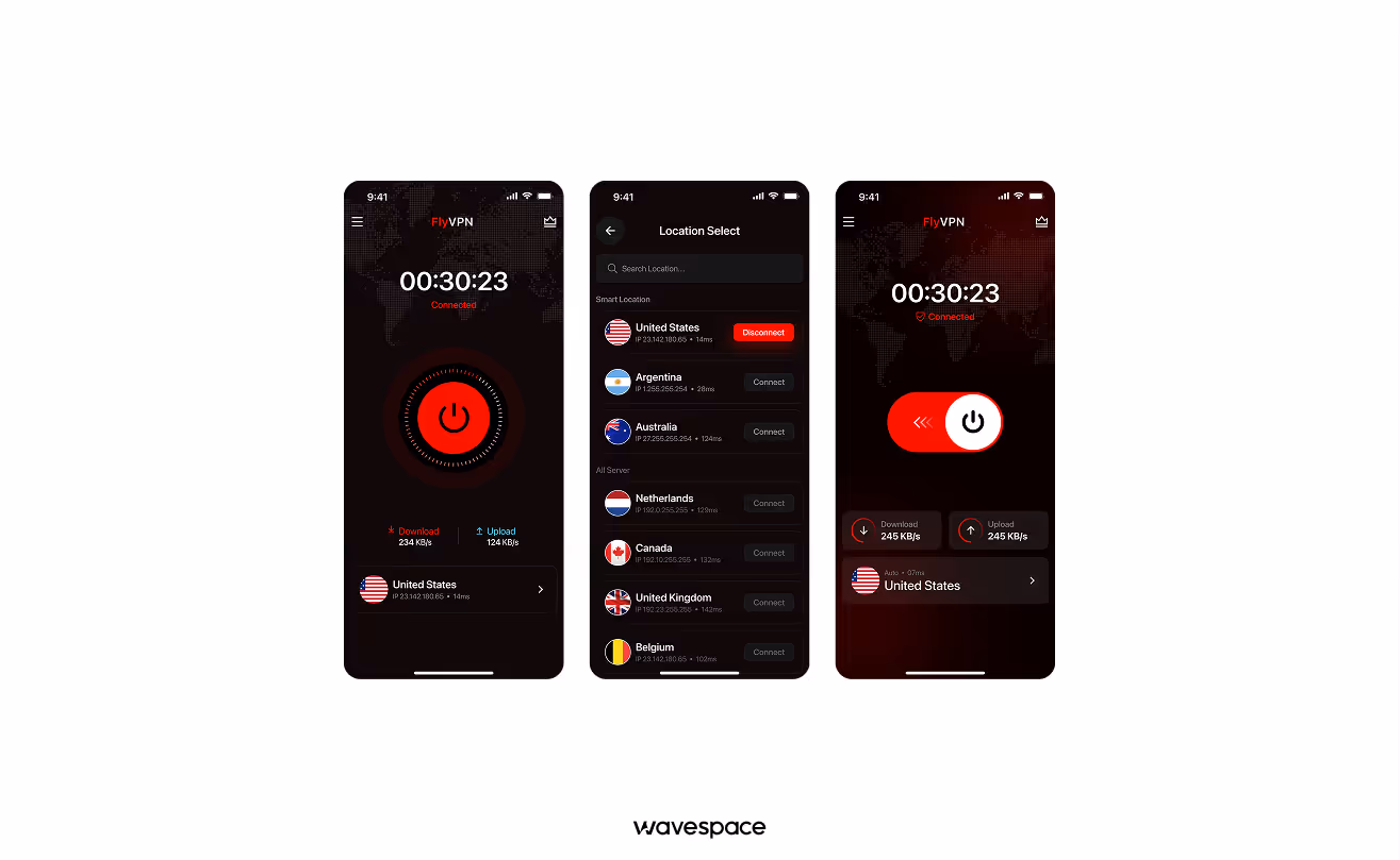
A clean, privacy-first interface that makes complex encryption feel as simple as a single tap.
Why the UX Wins:
- Visual trust: In the high-stakes world of cybersecurity, Fly Foundation uses a Power Red. To signify strength and protection. Unlike the typical "blue for safety" trope, their bold red UI makes users feel they are activating a high-tech shield rather than just a utility.
- Heartbeat connection: When the VPN is active, the app uses a subtle, pulsing red glow around the connect button. This breathing animation provides instant visual confirmation that VPN is connected and data is actively being protected without the user needing to check technical logs.
- High-contrast clarity: The app features a minimalist dashboard where red is used exclusively for the most important data, the Real-time speed, and the kill switch status. Ensuring that in the moment of a connection drop, the user’s eyes are immediately drawn to the critical information.
Key takeaway: Use red to project power and real-time activity, turning a technical background process into a visible, trusted protector.
6. Strava
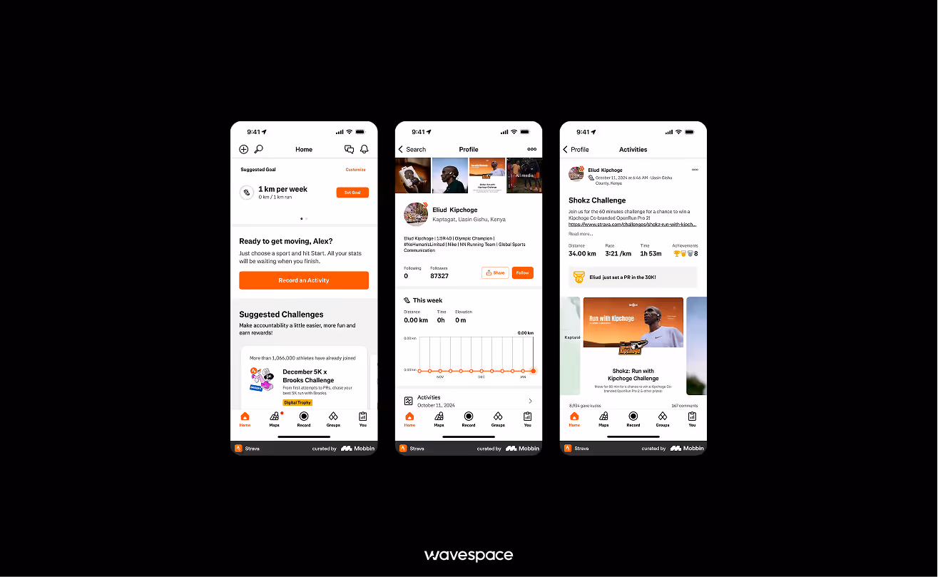
Strava is a social media platform for fitness-focused people. It uses GPS tracking for runners, cyclists, and hikers to encourage others to stay active and healthy.
Why the UX wins:
- Heatmap: Strava uses red color to highlight the "Heatmap" and progression. The more you run or cycle on a route, the redder the map gets. It shows user's physical effort with its red color. Strava turns workout sweat into a digital badge of honor.
- Seamless integration: Personal records and user activities are monitored, achievements and badge unlocks after a user pushes their limit. Strave seamlessly uses red color badges to motivate users to keep going.
- Action-oriented UI: The "Record" button is the most important feature of Strava. It is a bold red circle, mimicking a stopwatch and signaling that it's time to get going.
Key takeaway: Use red to represent brand, its intensity, and achievement in performance-tracking apps.
Available on: App Store | Google Play Store
7. CNN
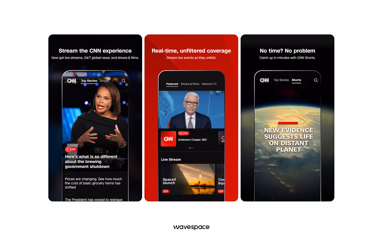
CNN, or Cable News Network, is a global news media that uses subtle, minimalistic red to show importance without causing users panic.
Why the UX wins:
- Selective importance: CNN uses a minimalistic red approach. The app mainly uses white and grey colors for its news. Red comes into play when a breaking news hit. It shows the importance of the news and gets user's attention instantly.
- Hierarchical navigation: CNN uses red neatly. They use red on the top of the header and category markers, allowing users to easily scan the most important headline and go on with their day.
- Global news branding: The specific "CNN Red" has become synonymous with global reporting. CNN has made the red color important. Nowadays, every news networks are using red to show authority and weight to the text on screen.
Key takeaway: Use red thoughtfully to highlight high-priority information. Apply it selectively to ensure impact, consistency, and brand recognition.
Available on: App Store | Google Play Store
8. Pinterest
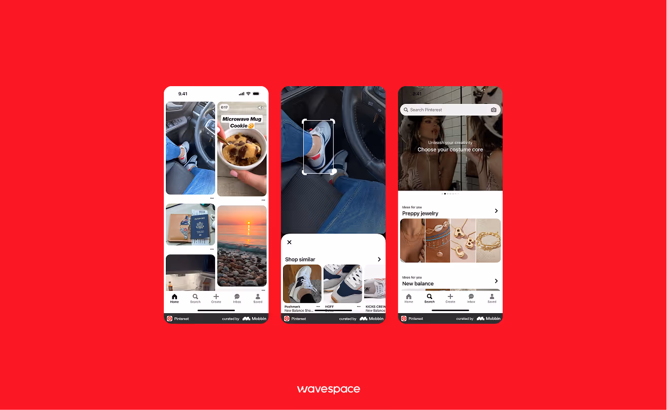
A sophisticated discovery and inspiration idea sharing website that uses red to signify to users keep "saving" what they love.
Why the UX wins:
- Actionable inspiration: The “Save” button is the most actionable component of Pinterest. The red stands out against the bright multi-colored tiles of the feed and background. Makes taking action easy for every user demographic.
- Sophisticated tones: Pinterest uses a different, softer red called Pinterest Red, which is more sophisticated than the news apps. Pinterest Red shifts the danger or rush from the app and grounds itself in more creativity, gentleness, and a passionate feeling.
- Visual organization: The Pinterest Red color accents help users navigate through thousands of boards and pins. It acts as a visual anchor in an app.
Key takeaway: Use softer shades of red to encourage action, "saving" and "favoriting" behaviors.
Available on: App Store | Google Play Store
9.Yelp
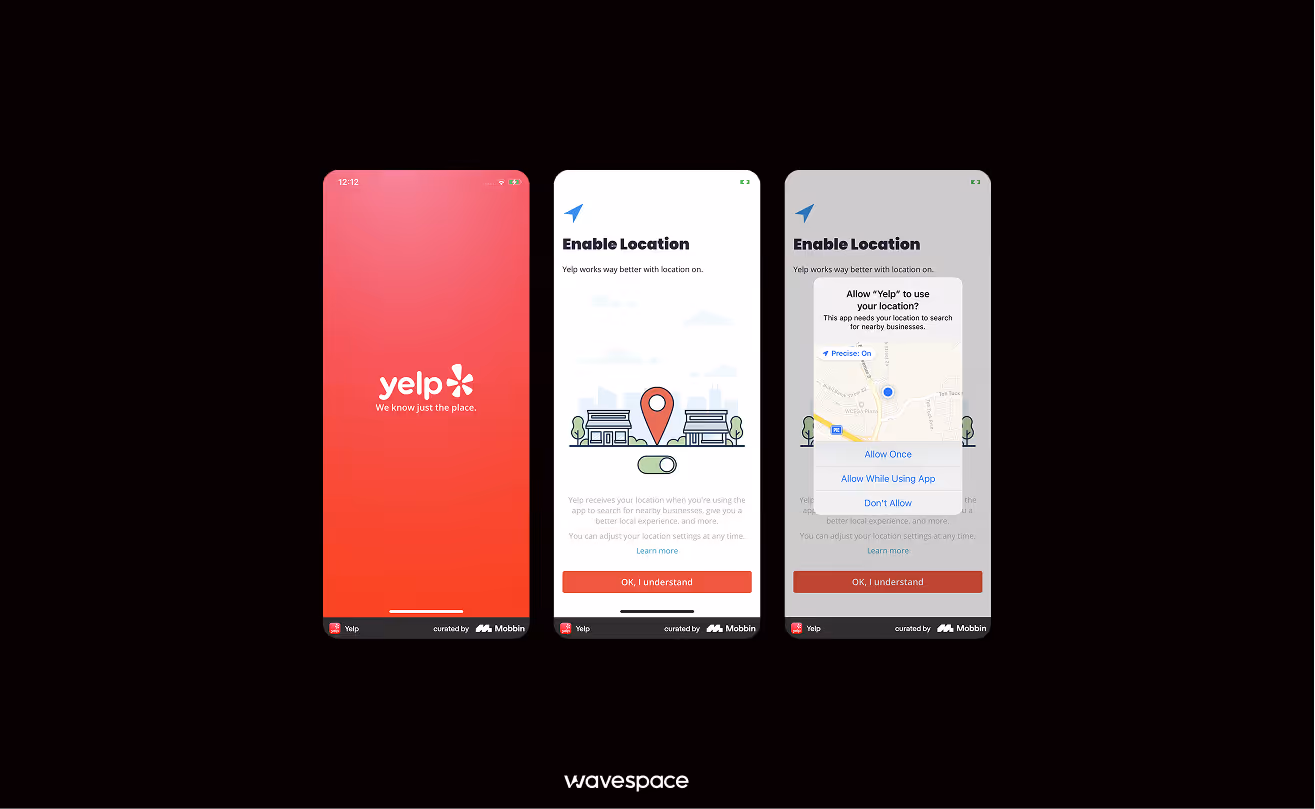
A popular online review platform for local discovering businesses, restaurants, shops, and home services.
Why the UX wins:
- Trust factor: Yelp’s red-white star rating is world famous. Red is used to represent the vibrancy and activity of the business. The five stars mean the business is hot, thriving, and worth a visit.
- Time management: The app uses a red bar to show “Popular Times.” With it, users can make instant and data-driven decisions to avoid crowded businesses.
- Choice urgency: Red “Open Now” tags and “Hot & New” labels help hesitant users to narrow down their choices quickly by highlighting trending places.
Key takeaway: Use red to indicate popularity and help users make quick decisions.
Available on: App Store | Google Play Store
Estimate your FinTech app budget with our complete 2026 cost guide.
10.Reddit
.avif)
Community-driven forum-style social platform for sharing opinions, solutions, and views. Reddit uses bright orange-red for social interaction.
Why the UX wins:
- Dopamine hit: Reddit’s "Orangered" is the hallmark of the Reddit UX. Seeing this red notification icon creates a small hit of dopamine in the user's mind, telling them someone has engaged with their thought or comment.
- Community voting: The "Upvote" arrow turns red (or orangered), and provides instant visual feedback when a user has upvoted a post.
Key takeaway: Use red for social notifications to create a "habit loop" so that users keep returning.
Available on: App Store | Google Play Store
Top red UX trends for 2026
The current internet users are demanding. In 2026, users want more than the service; they are not pleased with the features because they care about the looks. Releasing a feature-packed app won’t cut it in this era.
Top 4 red UX trends of 2026:
Trend 1: Red dark mode
Traditional dark mode used to be grey and blue. However, times have changed as designers are now finding ways to incorporate different colors in dark mode to appeal to every user.
For example, Burgundy Dark Mode is trending, with deep wine or black-cherry backgrounds making it easier on the eyes to spot important, sophisticated, and high-end information.
Trend 2: Haptic red
Building on the trend of visually engaging designs, many apps are also using haptic (vibration) feedback to make user engagement more immersive. This haptic feedback makes the app feel more alive and heavy, reinforcing the action a user just took.

Trend 3: Glow and neon accents
Many applications are going for that Cyberpunk aesthetic. Red elements for the subtle inner glow. This makes any design or flat buttons look 3D, making them more interactive and clickable.
Trend 4: Dynamic red scaling
AI is now adjusting the saturation of a design or an element. Dynamic red scaling works best to present the urgency of information. A Routine reminder starts as soft peach-red, but as a deadline approaches, the AI shifts the tone color to a bright red, making it easier to catch the user's eye.
Final words
In 2026, the most successful red apps prove that red is more than a color aesthetic. It is a psychological ladder for engagement.
From the cinematic theatrical experience of Netflix to the high-stakes personal information security feel of Fly Foundation VPN. These brands meticulously used red to tap into human basic instincts (hunger, urgency, and the drive for achievement).
The secret of mastering the use of red is not just painting it red, but lies in strategic balance. The goal is to use red ux is the same way as other colors, using red color to guide the user, invoke emotions to engage, and complete tasks without cognitive load.
Remember, Red is the color of action. If used with precision, it doesn't just grab attention. It sustains it, turning casual scrollers into lifelong active users.
Frequently asked questions
Many apps use red as their primary color. Here are some popular ones: YouTube, Yelp, Netflix, Reddit, and Pinterest heavily lean on red to signal energy, urgency, or passion.
UX, or User experience, is the entire experience a user has when they are using it. How they feel, how much time it takes to complete a task, and how efficiently the service can be. It covers everything in an app design, from layout, navigation flow, to loading times and error messages.
The seven pillars are: 1. Useful (easy to use). 2. Usable (solves a real problem). 3. Findable (content is easy to locate). 4. Accessible (works for all users). 5. Credible (users trust it). 6. Desirable (feels visually and emotionally appealing). and 7. Valuable (delivers meaningful benefit to both user and business).
There is no single best UX in apps. However, these apps are considered to have the best UX: Duolingo, Notion, TooGoodToGo, and Budgetflow. Duolingo UX is known for gamified engagement, and Notion for its flexible information architecture. Lastly, TooGoodToGo is known for a simple, mature app experience.
The 3 color rules limit color use to a maximum of 3. It makes the design more cohesive without overwhelming the user. The color palette consists of only three colors. A dominant or primary color goes to 60% of the UI (background), a secondary color uses 30% of the surface, and components. And the last 10% used for accent colors for (CTAs and highlights).

More related blog

Have a Project? Let’s talk!


.avif)

