Top 10 green apps with exceptional UX design (2026 edition)


What does the color green mean to you? Does it mean money, nature, or energy? Well, in UX design, it means all of the above (three).
We all want to provide a positive impact on our environment, but modern tech gets in the way. Becoming vegan won’t save on the electricity bill. Many talk about eco-friendly apps. Only to find them confusing or slow to use.
Complex apps make doing good things harder than they should be. This is where great Green App UX comes in.
It’s more than just painting the color green on an app screen. It is a process of designing a user experience. That ensures sustainable choices are easy, but also fast and rewarding. If your app is too complex to comprehend, users won't stay. Even if its goal is to save the world.
In this blog, we’ll dive into the 10 best examples of green ux app design done right. You will see real apps with exceptional designs that you can learn from today.
Two shades of green design
Let’s clear something up before we start. When designers speak about green, they don't just mean a specific color code. In modern app design, the green here is a strategy. It’s a powerful process used to send a message without using words.
We see this happening in two very different ways:
Sustainability: These apps use low-carbon UX design to directly help our planet. The more serious ones use clean, minimal interfaces. Uses simple design that is easier for users to understand, and these apps load faster due to their minimal approach, which actually saves energy.
- Example: Ecosia. It just has a very simple search bar and doesn't clutter your screen by throwing multiple items. Ecosia clearly tells how your searches help to plant trees. This design is green as well as efficient.
Psychology: Other apps use the color green to trigger specific human emotions. Vibrant colors are used to signal success (neon or soft mint), money, health, or energy.
- Example: Robinhood or Duolingo. They utilize green to make you feel at home. A feeling that you are winning or growing as you perform each task. When users see that green color trigger or flash, it creates a sense in their brain, letting them subconsciously believe, "I'm doing well!"

What is green UX design?
Green UX design is a way of developing apps that facilitate easy, eco-friendly choices for users. It ensures that the app design focuses on reducing energy consumption. Also tries to actively minimize data usage and screen brightness.
- Dark Mode: A simple dark mode feature reduces the screen brightness intensity on the display. Which saves phone battery power and energy cost.
- Simple User Flow: App designers focus on a design that gets the work done in fewer clicks. Fewer clicks to finish a task means less data is sent back and forth to the server.
- Positive Feedback: Good apps celebrate small user wins. It motivates users by showing an animation of planting a virtual tree, and it encourages users to keep going.
Confused about hiring designers for your Green App? Wavespace is here to bring your ideas to fruition. Our design solutions have delivered up to 400% conversion uplift (avg. 300%).
Philosophy of green UX (more than just colors)

Green UX is not just style, it's a mindset. It is based on the idea of "Digital Sobriety".
Digital Sobriety thinks about the environment first. It is a lifestyle/choice that acknowledges the impact of technology. And its goal is to reduce the environment & carbon footprint by focusing on efficient digital usage habits.
Here are the three main pillars of Green UX philosophy:
1. Minimalism is sustainability: In modern digital space, electricity is crucial for processing. Furthermore, every excessive image, video, or font ends up requiring servers to work harder. To store, process, and fetch. This process consumes a lot of electricity and creates carbon emissions.
The rule for Green UX is simple: "If it doesn’t help users, then remove it." Fewer images/videos/files equal less energy used. Green UX Philosophy emphasises keeping only the necessary items/components.
2. Respect for user attention: Green design process respects the user's time. It ensures a user doesn’t waste their time just to a button, wasting their battery, time, and personal energy. Good green design is always fast, honest, and easy to navigate.
3. Long-term thinking: Sustainable apps are designed and built to last years. Since it requires less cash to run it smoothly. They do not focus on using trendy, heavy animations that will become “washed” in six months. Instead, Green UX uses classic, minimal, clean structures that stay useful for years.
"The most sustainable pixel is the one that is never rendered. Green UX is the art of solving problems with the least amount of digital waste."
Quick facts:
- Green reduces user anxiety and increases engagement time
- Dark mode + minimal design = faster load times and better battery life
- Apps with clear green CTAs see higher conversion rates
- Natural green tones reduce eye strain by up to 30%

Our selection criteria
As UX design experts, we know when design works. Our design had $10B+raised through UX-led launches. In UX design, an attractive interface or pretty screens are not enough to create an excellent user experience.
For this blog, we did not just pick random apps. We tested each of the apps based on three strict rules of questioning:
Ease of Use: “Can new users figure out the apps and their functionality within 10 seconds?” It is because if an app is confusing, people will give up, delete, and move to an alternative. We only chose apps with simple user flows that make their main features instantly clear and usable.
Visual Design: “Does the app look modern (according to 2026 standards) or outdated?” For this, we checked how the app looks. We analyzed app layouts and other criteria.
- Such as whether the font is readable?
- Does it have dark mode?
- Does it have other accessibility options?
An app in 2026 should look fresh, but it should also implement design tricks that save the phone's battery life.
- Impact: “Does the design actually help the user save the planet?” A sustainable ux app must have real results. We checked if the app's layout gently promotes users to make eco-friendly choices, like reducing food waste or planting trees.
List of 10 green apps with top UX design
Top 10 green apps with exceptional UX design (2026): Design elements behind their success
Let’s take a look at the top 10 Green UX designs that use the color green to hack our brains. These green app designs aren't trying to save polar bears. But they are using green to make us feel calm, rich, safe, or energetic.
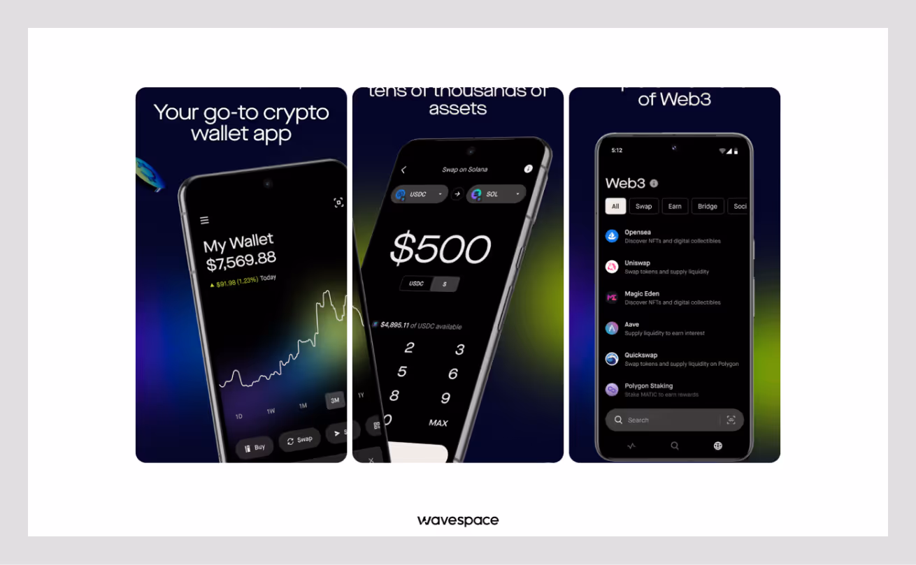
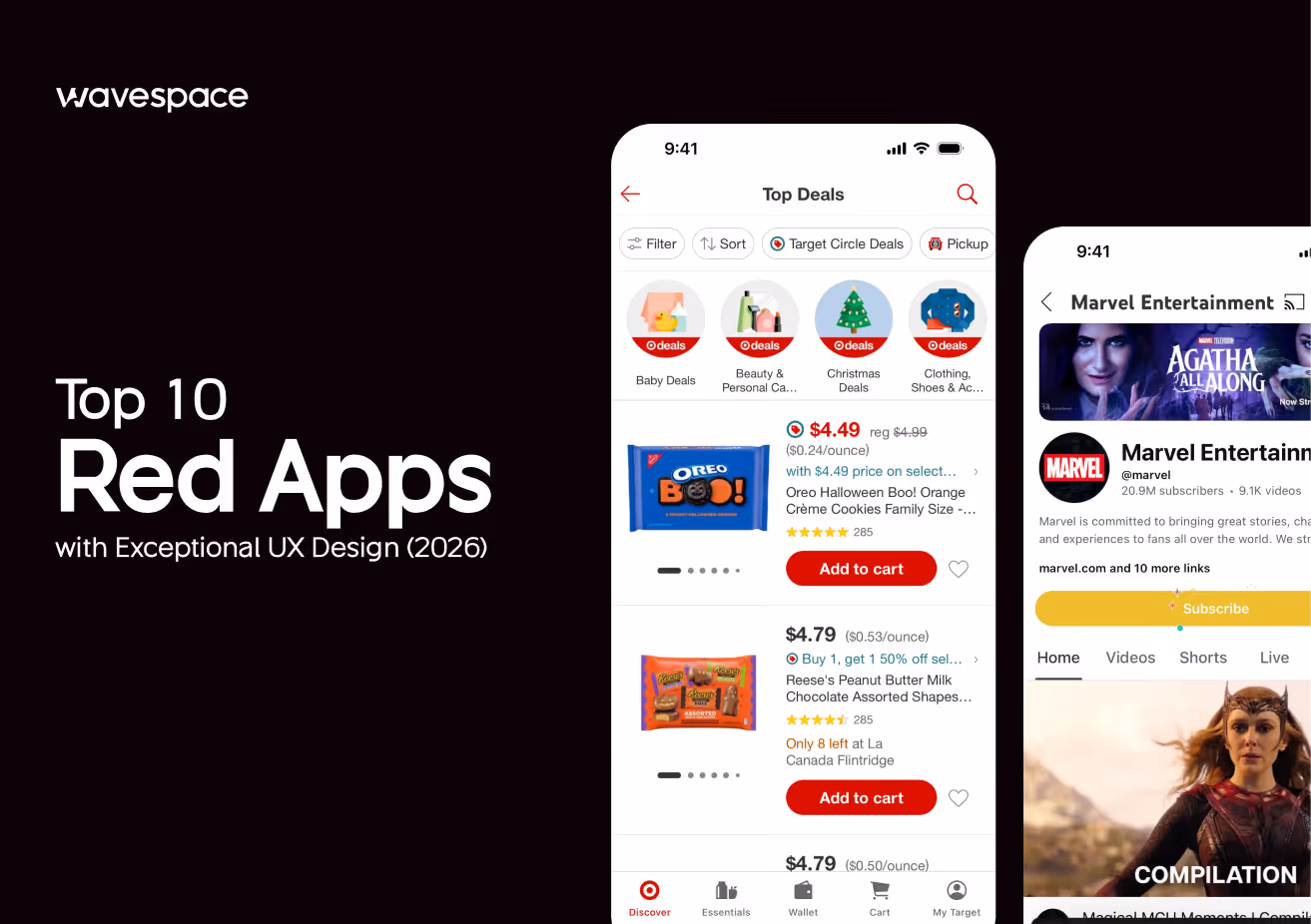
1. WhatsApp
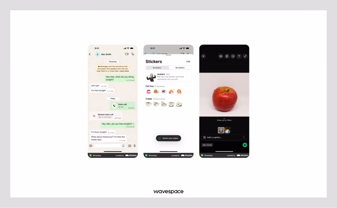
A free messaging and video calling app used by billions globally.
Why the UX Wins:
- Trust and Safety: The soft green color signals safety. It tells the user, "Your message is private and secure".
- Go Signal: Green is universally understood as "Go." The green send button and message bubbles confirm that communication is happening instantly.
- Low Stress: WhatsApp uses this shade of green to be perceived as calm and secure. This green shade allows users to stare at the screen for a long time without eye strain or anxiety.
Key Takeaway: Use soft green color to build user trust and reduce user anxiety.
Available on: App Store | Google Play Store
2. Spotify
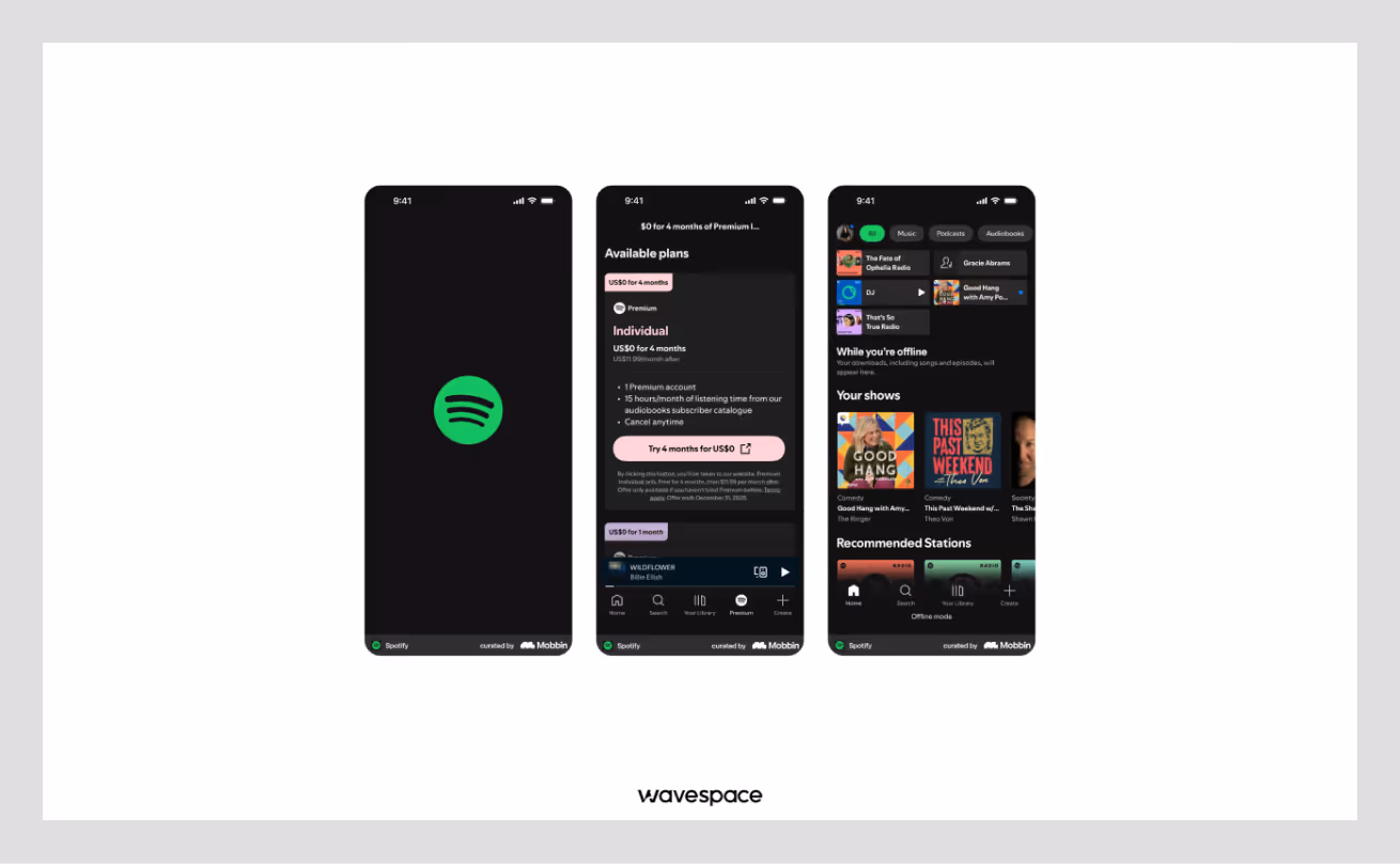
A music+podcast streaming giant that lets you listen to more than 100 million songs.
Why the UX Wins:
- Neon Energy: Spotify uses a specific vibrant yet neon green with a dark background. This high contrast creates a feeling of tranquility and confidence.
- Focus on Action: Spotify’s Play button shows up quickly after launching the app. This instantly tells the user how to use the app and guides user's eye directly to the most important action of the app, which is to play music without any fuss.
- Brand Identity: Spotify’s color & logo are so popular that green is instantly recognizable worldwide. This shade of neon green creates a strong visual habit for users.
Key Takeaway: Use bright neon green to guide attention and create excitement.
Available on: App Store | Google Play Store
3. Robinhood
A stock trading app that makes investing easy for beginners.
Why the UX Wins:
- Up Color: In finance, green means money is being made. Robinhood uses this everywhere. When your numbers are green, you feel a rush of success.
- Gamification: The app celebrates your first trade with bright green confetti. This animation triggers a dopamine hit, making you want to trade again.
- Simple Graphs: The line charts turn green when you are profiting. This gives you instant feedback without needing to do any math.
Key Takeaway: Use green to make users feel successful and wealthy.
Available on: App Store | Google Play Store

4. Hoolis
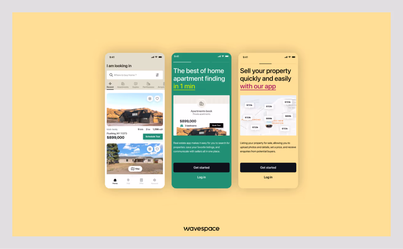
Hoolis is a German real estate platform that makes buying and renting property effortless for users and agents.
Why the UX Wins:
- Growth & Security: Hoolis uses Jungle Green as its primary color to signal both financial growth and trustworthy transactions. In real estate, green conveys that your investment is secure and your future is promising.
- Calm Decision-Making: The soft green color palette, combined with warm neutrals, reduces user anxiety. This helps with major life decisions (buying a house). Also, a well-executed color strategy assists users in browsing properties for an extended period of time. Without feeling fatigue, overwhelmed, or pressured.
- Visual Trust Building: The color green used in Hoolis reinforces the platform's reliability at every touchpoint. Starting from house listing cards to booking confirmations. When house buyers see these consistent green elements, they align with the platform stability, confidence, and essential emotions for making a property decision.
- Action Without Hesitation: The strategic use of green in CTAs (for contact agents, schedule tours, submit offers) subconsciously influences users. and gives them a "green light" to move forward.
Key Takeaway: Use green with a warm neutral color palette. This combination removes decision anxiety and fosters trust in high-stakes commitments.
5. Duolingo
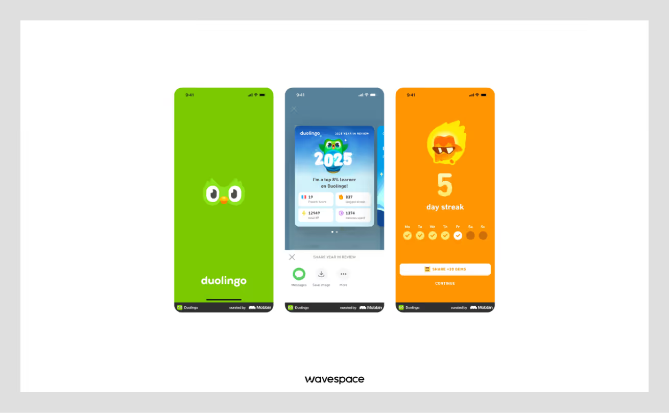
The most popular language learning app that turns learning a language into a game.
Why the UX Wins:
- Positive Reinforcement: When a user answers language questions correctly, Duolingo screen flashes green. Creating a positive loop in users brain. It encourages users to keep learning, aka keep using their app.
- The Green Mascot: Duo - the green owl is a famous, friendly character. The color green here represents growth and learning.
- Progress Tracking: The daily streak counters use green to show consistency. A broken (gray) streak feels bad, while a green streak feels like personal achievement.
Key Takeaway: Use green to validate progress and encourage consistency.
Available on: App Store | Google Play Store
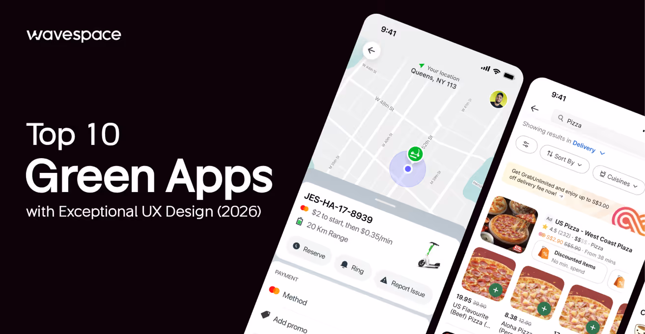
6. Rooda
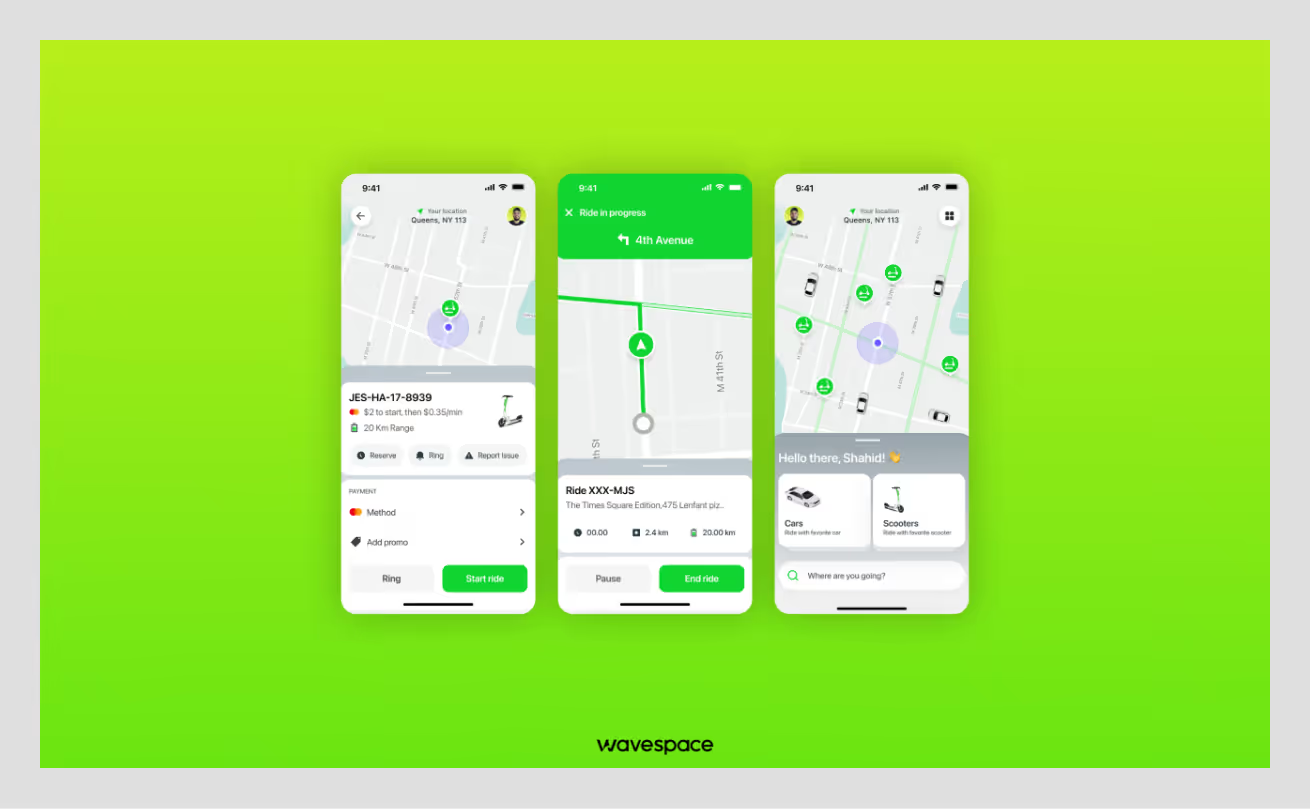
A modern urban mobility app. Primary focused on making eco-friendly choices with easy city travel and on-demand bike & scooter rentals.
Why the UX Wins:
- Eco-Friendly: Rooda's bright green colors speak directly to users. This ride helps the planet. The color helps people believe that their decision to choose the service is morally correct. They’re not just riding with Rooda, with it, they’re helping our planet & environment.
- Easy Spotting: This specific green helps users to see their ride quickly. Makes it easier to spot available bike and scooter rentals. The combination of green with grey streets standouts and no user feels confused.
- Energy and Speed: The neon green makes the user feel active and fast. It creates the feeling of a smart choice when riding. This green is not only calm but also makes users excited and ready to travel.
- Builds Trust: Rooda meticulously uses green for all vehicle types. Including cars, scooters, and bikes. This is an active decision to create a pattern. A pattern for subconsciously influencing users into believing that green means available and reliable.
Key Takeaway: Use bright green to show eco-friendly options and encourage users to take quick action. It makes sustainable choices feel exciting and easy.
7. Grab - Superapp
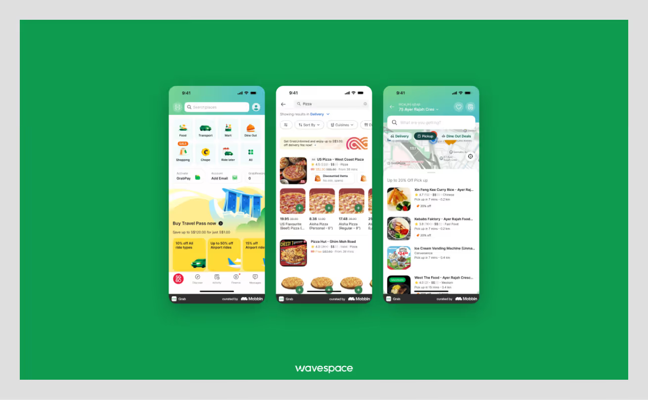
An all-in-one app of Grab that works as a suite for daily services, such as ride-hailing, food delivery, and payments.
Why the UX Wins:
- Uniformity: Grab uses green across all its services (cars, food, pay). This gives a long-lasting impression, making the app feel consistent and reliable.
- Visibility: In daily travel and busy streets, the green logo and UI stand out. It acts as a visual signal for safety and service.
- Clear Status: Green maps and markers clearly display the driver’s location. This strategy reduces uncertainty while giving the user control over the situation.
Key Takeaway: Use a consistent color to tie multiple complex services together.
Available on: App Store | Google Play Store
8. Hulu
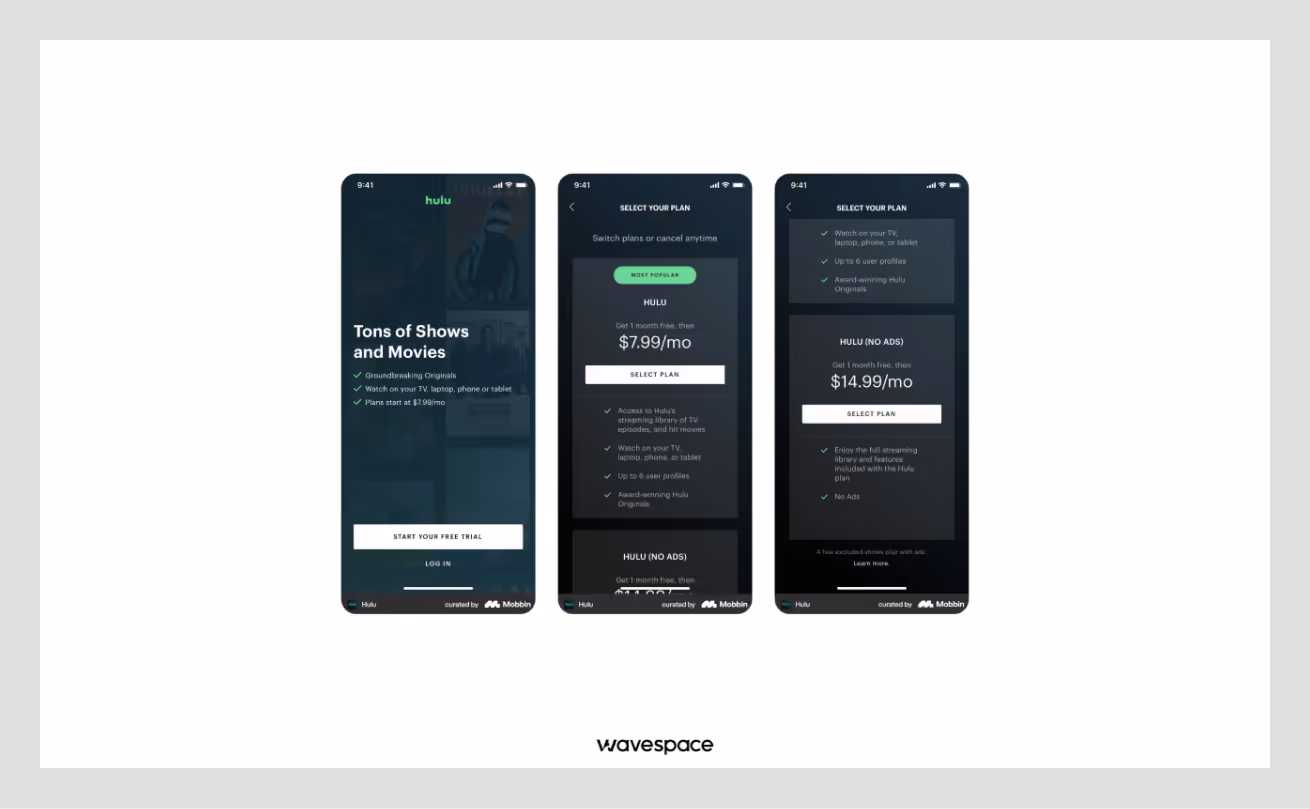
A premium streaming service for TV shows and movies.
Why the UX Wins:
- Differentiation: Most streaming apps are red (Netflix), blue (Disney+), or Black (Apple TV). Or the mixture of these three colors together. Hulu's green stands out as a unique yet comforting alternative.
- Immersive Gradients: Hulu uses deep green gradients, unlike flat colors, like other apps. This makes the interface feel cinematic and premium.
- Mood Setting: Their dark green background sets the mood for perfect relaxation. Since it is easier on the eyes in a dark room than bright white.
Key Takeaway: Use green accents to stand out in a crowded market of competitors.
Available on: App Store | Google Play Store
9. Chime
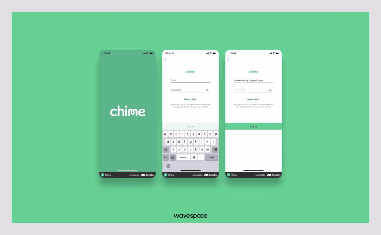
A mobile banking app focused on fee-free financial services.
Why the UX Wins:
- Friendly Finance: Chime uses a minty green instead of the aggressive green like other stock trading apps. This creates an approachable and friendly feeling.
- Instant Gratification: Green notifications pop up the moment you spend money. This provides real-time reassurance that the money transaction is safe and secure.
- Clear Call to Action: Important action buttons are highlighted in green. This makes the primary function of the app clear and easy to locate.
Key Takeaway: Use specific shades of green to change the personality of your finance app (e.g., Mint = Friendly vs. Neon = Aggressive).
Available on: App Store | Google Play Store
10. Forest: Focus for Productivity
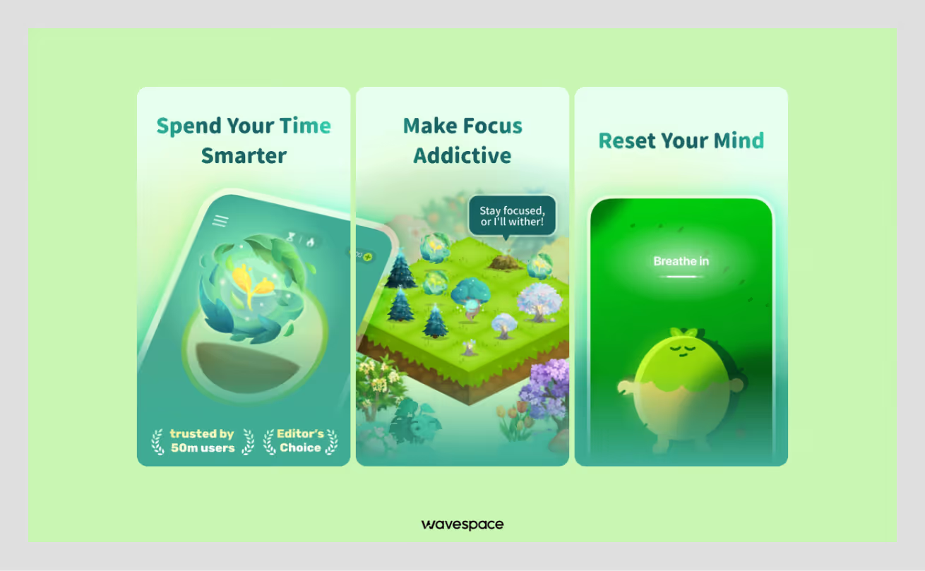
A productivity app that grows virtual trees while you stay focused on your work.
Why the UX Wins:
- Calming Green Palette: Forest uses soft, natural greens to ensure users don’t get eye strain. While creating a peaceful atmosphere for concentration.
- Color-Based Feedback: Growing trees show vibrant green. Breaking focus fades the green to brown. This instant color feedback makes productivity visible without reading numbers.
- Minimalist Design: Forest uses green tree illustrations with a clean background. This prevents other distractions. With it, users can quickly check their progress without overwhelming dashboards.
Key Takeaway: Use natural green tones to create calm focus environments. This makes progress feel organic, not stressful.
Available on: App Store | Google Play Store

Top Green UX trends for 2026
Making apps useful in 2026 is not enough; you need to think about users/society, and our planet. In the current tech boom, designers are coming up with clever ways to make apps look great while using less energy.
Here are three big trends making waves this year:
Trend 1: Eco-mode toggle
Many apps are adopting the Eco-Mode button like electric appliances. After toggling the app switches into a light version. The purpose of this feature is to consume less batter. It can be done in many ways.
Apps like Stellio Player tone down their animation elements to save battery. Other apps stop automatic video play and load lower-quality images to save data. This helps batteries to last longer and saves energy on the huge servers that power the internet.
Trend 2: Calming earth tones
This year, apps are saying goodbye to bright neon colors that tire your eyes and adopting soft earth tones. Why? In 2026, brands are pivoting from traditional marketing and trying to relate to users. This is why you will see
- Neo Mint
- Earthy & Organic Greens
- Green in Gradients & Duotones
- Ocean Blue (cool and peaceful)
These are not just grounded colors. They make people feel more connected to the brand and nature.
Trend 3: Simple carbon charts
Instead of showing the usual scary AQI index and carbon emissions meters. You may see a small bar chart illustrating the amount of CO2 saved by walking. These visuals make it easy to see progress and encourage users for the positive impact they have made on our Mother Earth.
Conclusion
Green UX design doesn't mean only using the color green. It leans more into building apps and websites that are useful, fast, and easy.
App UX should not confuse users or waste their time. It should make users' lives easier through good UX. Green UX ensures every button, image, and feature has a clear purpose. The core purpose of Green UX is that if something (feature, button, or any element) is not useful, it should be removed.
At Wavespace, we believe designers need to think about the future. Ergo, digital products must care about our planet. Simple designs use less energy and work better on all devices. This works as two birds with one stone, it helps both users on the other hand, and the environment.
The key lesson is to focus on what truly matters and needs. Create digital experiences that users can quickly understand, are easy to use, and last long. When we design with care and purpose, everyone benefits.
Frequently asked questions
UI/UX design agencies design websites or apps by following an ideal standard method. They research how people actually use a product and design it around the research data, ensuring the design makes sense.
They check every checklist from research, sketch out ideas, create designs, and test everything. All of this is to confirm users stay hooked on the website or app.
UX strategy is when an agency helps to plan the whole user experience before designers start designing and developers start developing. They analyze the core purpose of the product. Finds out what the business is trying to do, who their users are, and what their competitors are doing.
Afterwards, they map out the best way to move forward. UX strategy services are less about making things look good and more about figuring out the right problems to solve.
UX audit service includes an extended flaw report of a product and solutions to fix them. A UX audit is when a UX researcher or an agency does a deep analytical research on your product. The purpose of this research is to point out minor and major issues that are hindering growth. They conduct a thorough analysis of everything, test user flows, try to complete tasks in multiple roles, and provide an extended report.
UX prototyping consultancy creates a demo version of your product that you can click through and test as users. They build realistic and interactive prototypes that don't require backend service. You can show the prototype to users, get feedback, tweak things out, and repeat until the app feels right.
The cost of UX design services is dependent on the product itself. A simple UX design costs around $3,000 to $15,000. But a full UX design service for website or app design could cost anywhere between $5,000 to $50,000+.
First, review the company's portfolio. Look for their experience and proven results on similar types of products. Also, ensure they have a clear design process, transparent pricing, and strong communication.

More related blog
Have a Project? Let’s talk!


.avif)

