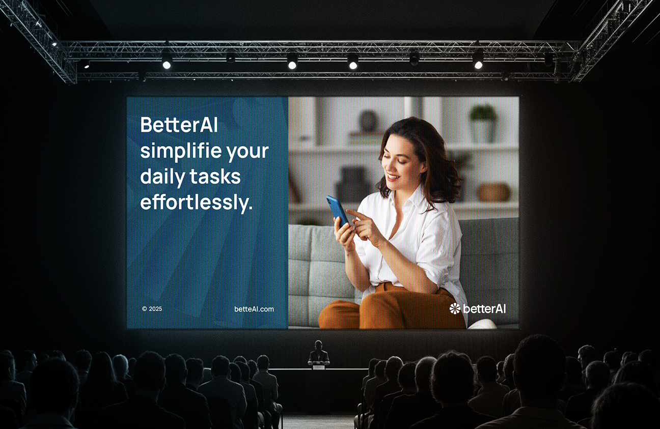
An all-in-one AI app built for everyday life. An all-in-one AI app built for everyday life
BetterAI is an all-in-one mobile platform that helps users manage everyday tasks, such as booking flights, ordering food, or scheduling doctor visits, all in one place. Built with AI at its core, the app reduces the need for juggling multiple services. Our client BetterAI came to us wanting a user experience that was easy and pretty but could still manage complex tasks.
BetterAI aimed to help users lead simpler lives with the help of its AI-driven app.
However, the first version made people hesitate at first. There was no clear direction in the interaction, which left users unsure and uncertain.
- Unclear Value Proposition: BetterAI wasn’t able to explain its value & benefits clearly to users.
- Overwhelming Interface: There were so many choices that people got tired and confused.
- Weak Visual Identity: The layout did not show any innovation or trust, making the app feel like it was not finished.
- Low User Retention: Many users tried the app once but never came back, hurting long-term growth.
- 1. Unclear Value PropositionBetterAI wasn’t able to explain its value and benefits clearly to users. BetterAI wasn’t able to explain its value and benefits clearly to users.BetterAI wasn’t able to explain its value and benefits clearly to users.
- 2. Overwhelming InterfaceBetterAI wasn’t able to explain its value and benefits clearly to users.
- 3. Weak Visual IdentityBetterAI wasn’t able to explain its value and benefits clearly to users. BetterAI wasn’t able to explain its value and benefits clearly to users.
- 4. Low User RetentioBetterAI wasn’t able to explain its value and benefits clearly to users.
To address the scattered flow and lack of clarity
we created a streamlined experience that makes every task feel effortless. BetterAI was built to improve performance as well as become smarter and more user-friendly.
- Unclear Value Proposition: BetterAI wasn’t able to explain its value and benefits clearly to users.
- Overwhelming Interface: There were so many choices that people got tired and confused.
- Overwhelming Interface: The layout did not show any innovation or trust
- Lack of Onboarding: No clear flow helped users get started or complete their first task.
- Low User Retention: Many users tried the app once but never came back, hurting long-term growth.
Our BetterAI design process follows a Lean UX methodology that is comprised of 7 steps
broken down into 4 phases. The methodology provides business-oriented steps supported by the principles of transparency and the requirements for speed and scalability.
To bring to light friction points, we talked to league operators, coaches, and athletes.
We mapped every use case across different roles and broke down flows to their essentials.
We built a clean, flexible design system that’s scalable across regions and device types.
We delivered dev-ready designs and supported beyond launch.
UX Research & Design Artifacts
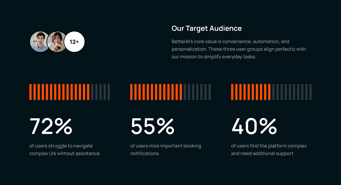
The first step in creating a seamless system was to find out what kinds of problems everyday travelers experience. Using UX research, we were able to create a product that customers find easy, useful, and convenient their own.
- Navigation Issues: 72% of users experienced frustration due to the complex user interface, resulting in dropping out at key stages.
- Missed Alerts: 55% of people missed important messages, so they either missed their flights or were slow to take action.
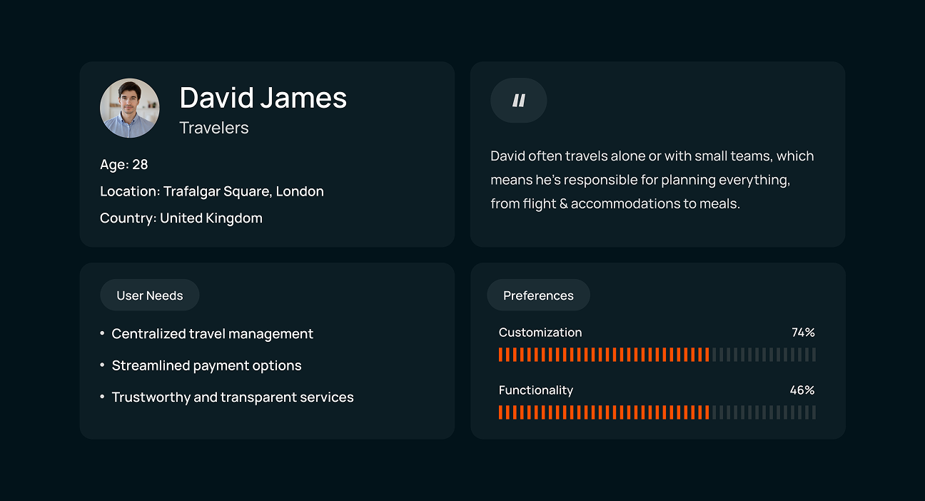
- User Persona: Travelers like David prefer simplicity and control, managing trips alone and needing streamlined decision-making.
- Preference Data: Many users said they feel more comfortable with & trust an app more when they can customize it.

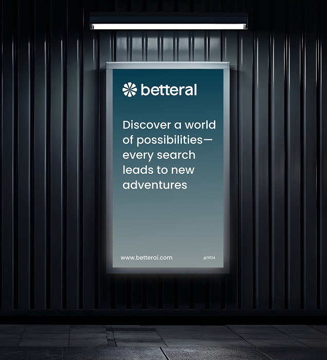
Visual Identity and Brand Story
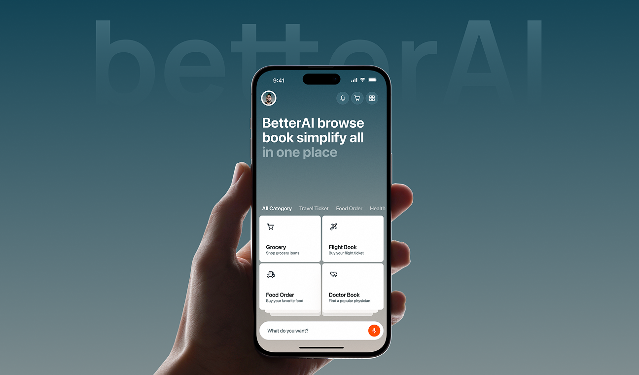
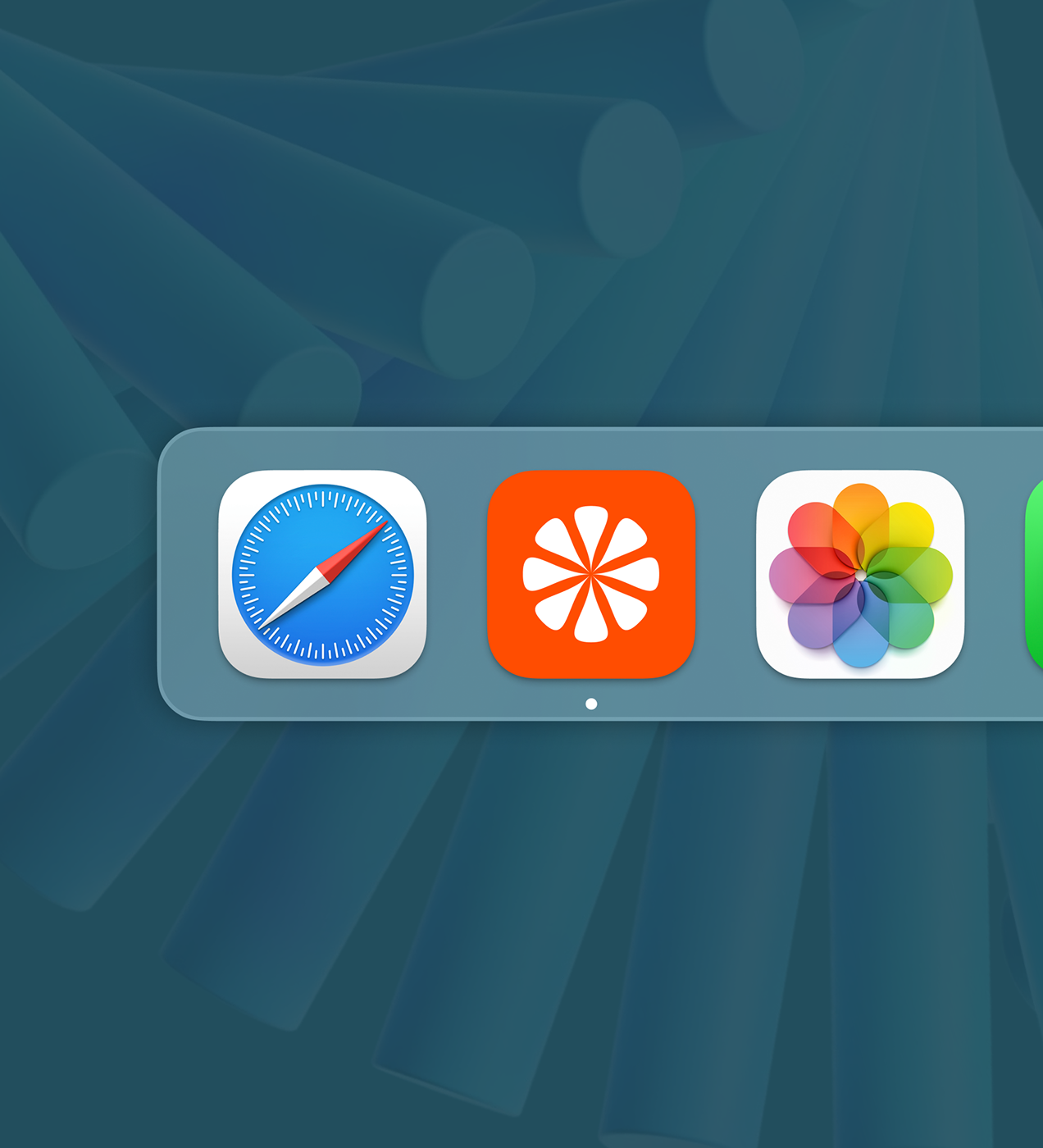
BetterAI’s design uses intelligence and simplicity together. We developed a simple logo that looks like a flower pattern, representing the concept of clarity, control, and different services working together. The typography is bold yet friendly, while the blue-to-grey gradient evokes trust and calmness.
No matter where you see it, the branding is the same and easy to recognise. You can see at a glance what each icon means when you book a doctor or a flight. Visual hierarchy makes it clear and simple for users how to move from one step to another.
The brand tone expresses confidence and relatability, giving users more confidence. All the features, such as plugins and smart search, help build an AI friend that users can depend on daily.
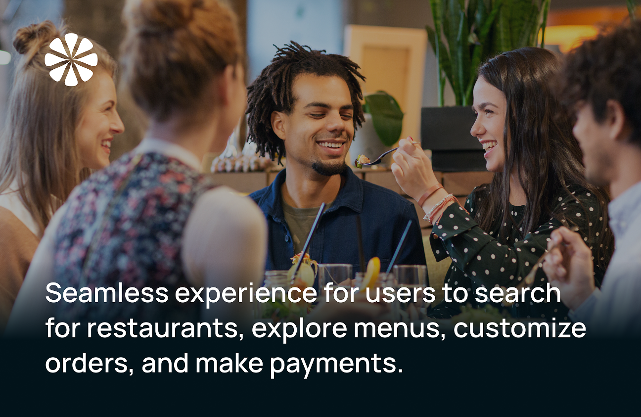
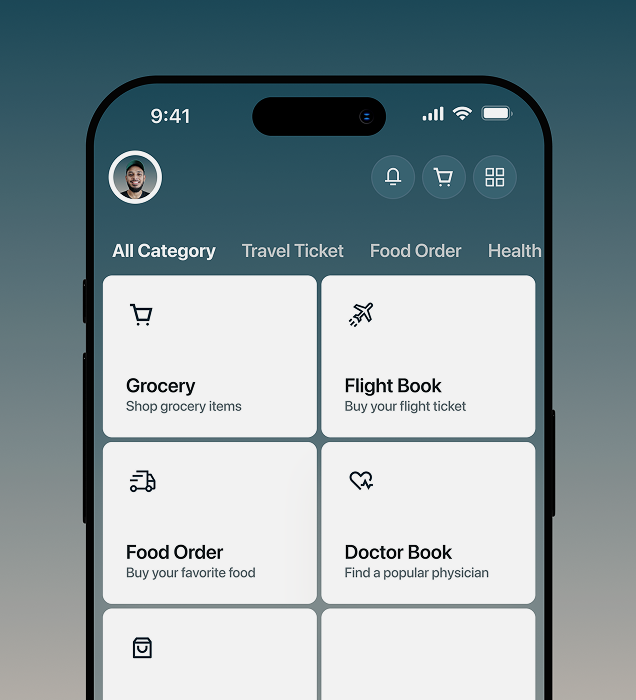
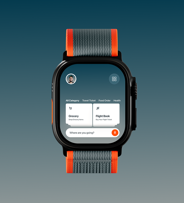
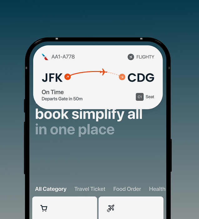
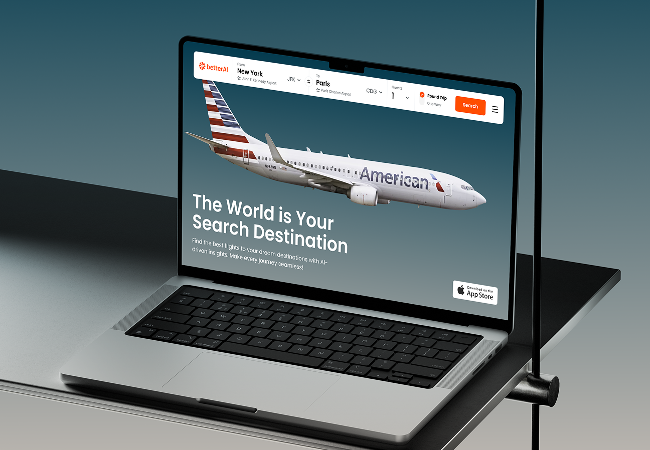
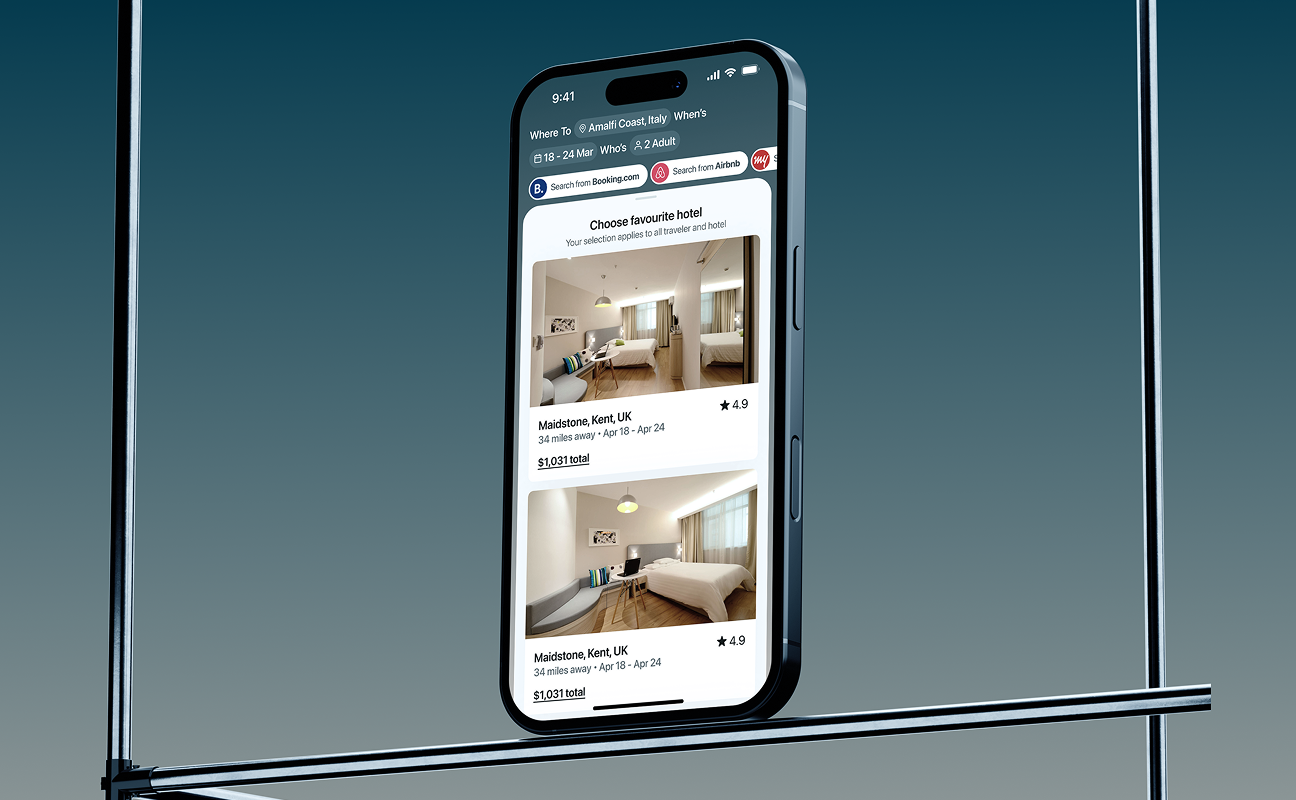
BetterAI was created to allow everyone to complete everyday tasks with less effort
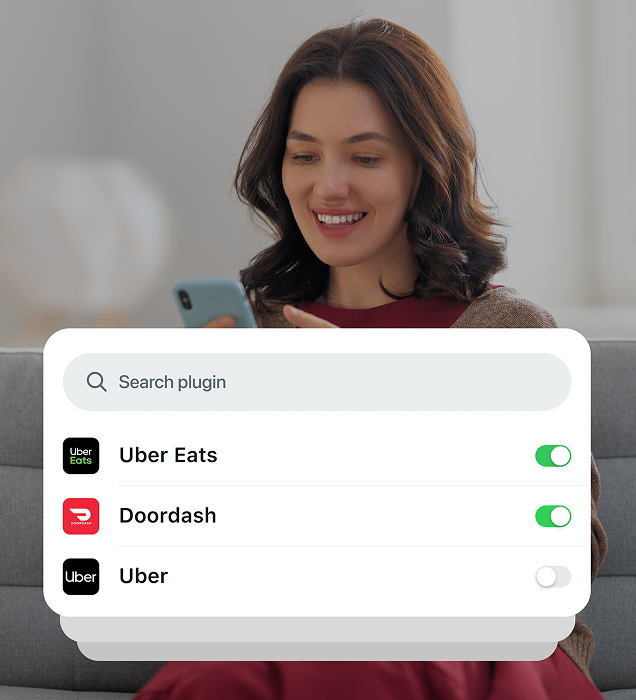
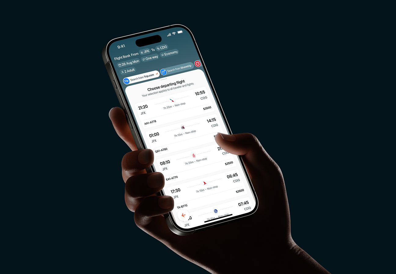
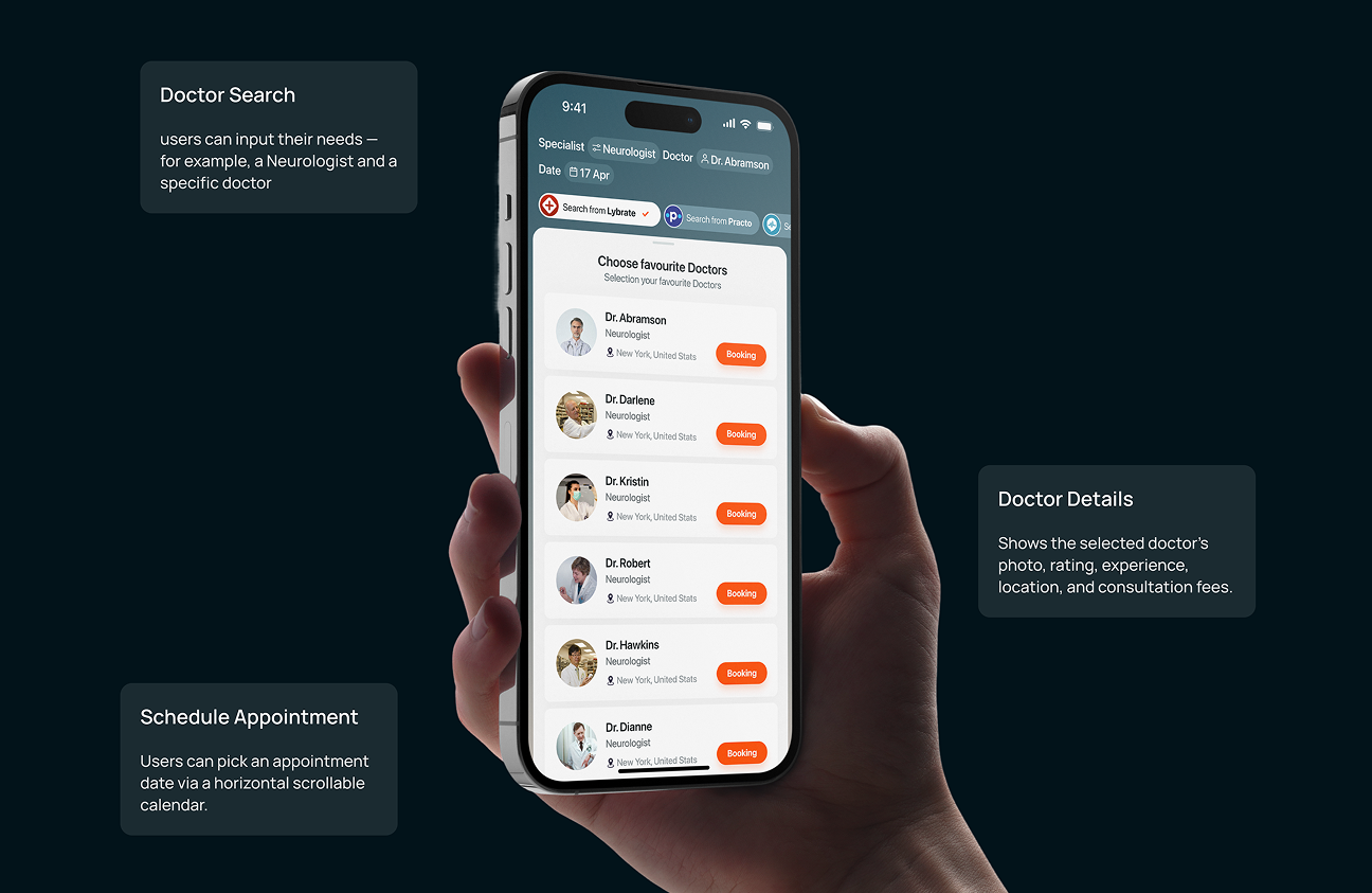
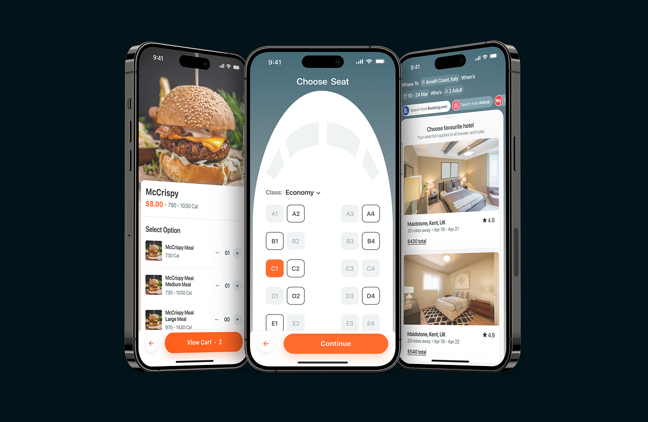
With this layout, people can find pages for food, flights, hotels and doctors easily. With voice commands, live tracking updates and plugins, people can do more and feel better using the app.
All screens are set up to avoid confusing visuals and make actions stand out clearly and fast. By making choose from and scrolling much easier, we helped customers find what they wanted quickly. The result? A service network that is consistent for customers and can be accessed anytime, anywhere.
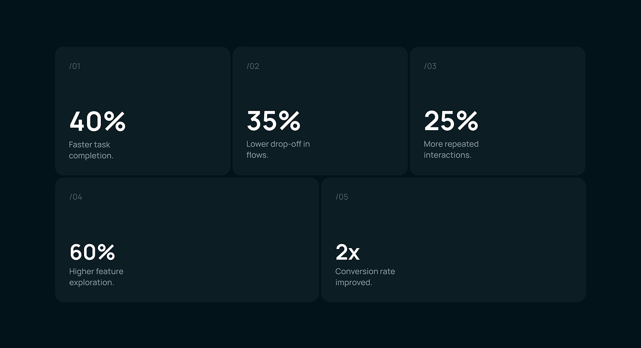
BetterAI's redesign brought real, measurable impact.
BetterAI's redesign brought real, measurable impact. When tasks became easier and the app was intuitive, people spent more time exploring, accessed different areas and came back regularly. Because the app made all work easier, users liked it more and the firm’s profits increased.
Key Results:
- Faster Tasks: Users cut their time on each action by 40% which made daily use much faster.
- Fewer Drop-offs: Better flows resulted in a decrease of user abandonment by 35%.
- More Engagement: There was a 25% rise in returning visitor, proving that people were satisfied.
- Feature Use Up: 60% increase in exploring and using in-app features.
- Higher Conversions: Conversion rate doubled, improving core business performance.

An all-in-one AI app built for everyday life. An all-in-one AI app
Turn your ideas into impactful solutions like them!