Most popular colors in the world & how they influence us


Why do colors influence human emotions, decisions, and behavior?

Colors define our mood even before we are aware of them. This is why color has such influence in our daily choices, whether it is the selection of a product or the belief in a digital platform.
Since the human brain reads color more quickly compared to text, colors generate emotional reactions nearly immediately. A calm interface feels safe. A bold color feels urgent. A soft tone feels reassuring. These responses occur in advance of logic processes. And that is the reason why color shapes the behavior without seeking permission.
Color in branding is a silent message of trust, quality, and intent. It has a meaning in culture that is influenced by tradition and experience. Color in digital products is used to direct focus, minimize confusion, and create confidence during the most important times.
The article discusses the most popular color in the world and how this color is relevant to the world beyond aesthetics. You will know the colors that people like around the world, how psychology and culture influence what they like, and how real-world brands and online products use color to make their choices.
Since the popularity of colors is not a matter of taste. It is about human behavior. And for designers, founders, and product teams, that understanding directly impacts trust, usability, and growth.

What are the most popular colors in the world today?

Blue is a very popular color in the world, and it is always noted as the leading choice in any study and surveys worldwide. This trend is verified by numerous large-scale studies.
Research by YouGov across more than 20 countries shows blue as the top preferred color globally. Similar findings are supported by data shared by Colorlib and international color psychology research.
These findings are universal in terms of geography, culture, and business sector, and blue is the safest and most reliable color.
But blue is not alone. Global preference data repeatedly highlights a small group of dominant colors that shape design, branding, and consumer behavior.
Which colors rank as the most popular globally?
Global color rankings show clear patterns, not random taste.
- Blue is the global leader because it has been linked with confidence, peace, and security.
- Green follows closely, linked to balance, nature, and growth
- Red ranks high for its emotional intensity and visibility
- The reason why purple is used is that it is more creative.
- Yellow is an attention getter and hopes, but is a low-ranking favorite.
One such example is Marrs Green, a colour that was found as a universally attractive shade after a worldwide survey. It was popular as it was neither blue nor green, balancing between coolness and savor. This strengthened the notion that individuals like colors that are safe, balanced, and unafflicting.
These ratings reveal that trendy colors are connected with emotional comfort, rather than visual trends.
How do color preferences differ by gender, age, and culture?
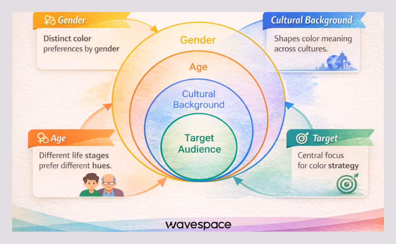
The preference for colors is influenced by identity and experience.
Gender differences
- Men are always fond of blue and green.
- Women are more attracted to purple and lighter colors.
- Orange and brown are the lowest within both groups.
Age-based differences
- Color is more vibrant and expressive to younger audiences.
- Older groups prefer muted, calming shades that reduce visual stress
Regional and cultural variations
- In most Asian cultures, red is a symbol of fortune and feasting.
- White is purity in Western culture and mourning in other cultures.
- Green holds a strong positive meaning in regions focused on nature and sustainability
These trends indicate that color preference is acquired, situational, and very human.
How does color psychology influence human emotions and decisions?

Think about the last time a website felt calm or stressful before you even read a word. That reaction did not come from content. It came from color.
Color psychology influences emotions and decisions because people react to visual signals instantly. The brain processes color faster than text. So before someone understands a message or a feature, they already feel something. That feeling shapes what they do next.
When colors feel balanced and familiar, people move forward without thinking much. When colors feel loud or confusing, they pause or leave. You see this pattern across websites, apps, and brands every day. No onboarding or tutorial can fix a bad first feeling.
Behavioral studies and usability research support this pattern. Color affects perceived trust, clarity, and effort. For founders and designers, this is not theory. It is leverage. Color decisions shape how safe a product feels, how clear it appears, and whether users stay long enough to engage.
“Users don’t think about color when it works. They only feel when something feels wrong.”
How do colors affect human emotion and visual perception?
Color affects emotions and perceptions at the same time. Color affects human feelings. The other affects how clearly they think.
Here is how this shows up consistently in real products and interfaces:
Blue
- Creates calm and trust
- Reduces mental fatigue during long usage
- Common in finance, healthcare, and SaaS dashboards
Red
- Triggers urgency and alertness
- Increases attention but also stress
- Best used for errors, warnings, and critical actions
Green
- Signals balance, safety, and success
- Reinforces positive feedback and progress
- Common in confirmations and completion states
Visual perception is just as important as emotion. Poor contrast increases cognitive load. Overly bright palettes cause fatigue. Soft, balanced systems improve readability and focus.
From real UX work, one truth stands out. A visually calm interface feels easier to use, even if the functionality is complex. Color does not simplify the product. It simplifies how the brain processes it.
How do color preferences shape human behavior and choices?
Color preferences are learned through experience, not personal taste alone. And those learned patterns quietly shape behavior.
People connect colors with outcomes they have experienced repeatedly. Over time, those connections become automatic.
Common behavior patterns seen across products:
- Users trust interfaces that feel visually familiar and emotionally safe
- Users hesitate when colors feel aggressive or unpredictable
- Users complete actions faster when success states feel visually clear
- Users abandon flows when color creates confusion or anxiety
Research in consumer psychology supports this. Color influences confidence, recall, and decision speed. That is why conversion-focused products avoid trendy palettes and rely on predictable emotional signals.
From working with founders and teams, one lesson repeats itself. When color supports behavior, users rarely complain. When color works against behavior, users leave quietly.
“Most users don’t abandon products because of features. They leave because something doesn’t feel right.”
How do cultural differences change the meaning of colors?
Colors have different meanings across different cultures depending on history, religion, and common social experiences. A color does not carry one universal meaning. Culture shows individuals how to read it.
For example:
White
- Represents purity and simplicity in many Western cultures
- Represents mourning and loss in several Asian cultures
Red
- Signals danger or urgency in many Western contexts
- Represents luck, celebration, and prosperity in parts of Asia
Green
- Often linked to nature, growth, and sustainability
- It can also carry religious or political meaning in certain regions
Such differences are significant within international branding and product design. Research from cultural studies and localization experts consistently shows that ignoring color symbolism leads to confusion, mistrust, or emotional disconnect.
Global brands know this, too. They modify the color application by market, not because of the trend shift, but because of a meaning shift. Cultural color awareness is not a luxury for the designers and founders who operate internationally. It is respect. And respect is the quickest way of building trust.
“Good design does not assume meaning. It learns it.”
How do colors influence real-world decisions in brands and digital products?
Colors affect real-life choices since they affect how individuals feel towards a brand even before they consider it. Consumer psychology studies indicate that individuals make judgments within a few seconds, and the color used contributes significantly to this judgment. People become more comfortable when they see something that is familiar and in balance.
Color is not decoration in the case of real products. It is a strategic choice. Reliable brands apply color on websites, apps, and marketing everywhere since this creates recognition and trust over the years. A review of the literature on marketing and UX research shows that the same visual identity makes a brand more trusted and remembered.
Color is silently leading the way, whether it is for global brands or the simplest applications. It determines the level of exploration of people, the confidence level of the same, and the abandonment without any explanation. The majority of users do not know how this reaction is explained, yet the data and real-life cases confirm that color has a strong influence.

How do brands use color to build identity, trust, and recall?
Strong brands rarely change their colors. That is not by accident. Consistent colors create memory, and memory creates trust. When people see the same colors over and over again, they start to feel familiar with the brand. Familiarity reduces doubt.
You can see this clearly in real-world brands. Apple relies on neutral colors like white, black, and gray. These choices signal simplicity and control. They keep attention on the product instead of the design. Over time, this creates a premium and reliable brand image that people instantly recognize.
Airbnb takes a different approach. It uses warm coral and soft tones to feel human and welcoming. The color choice supports the idea of belonging rather than transactions. Users feel invited, not sold to. Netflix uses bold red on dark backgrounds to create emotion and intensity. The red grabs attention, while black adds focus and a cinematic feel.
Across industries, similar patterns appear. Financial brands prefer blue to indicate trust. Health brands prefer green for safety. Entertainment brands use red for emotion. When brands stay consistent with these signals, trust grows quietly. When they change colors without reason, confidence fades just as quietly.
“People don’t remember every feature. They remember how a brand made them feel.”
How does color shape decisions inside web and UI/UX design?
Color inside interfaces guides thinking, not just attention. In real products, every color choice either reduces effort or adds friction.
Why does color choice matter in user interfaces?
In practice, good color systems:
- Reduce cognitive load by separating information clearly
- Create a visual hierarchy so users know where to look first
- Provide emotional safety during complex tasks
For example, Apple’s iOS uses neutral backgrounds with subtle color accents. This reduces mental strain and lets content breathe. The interface feels calm even when tasks are complex.

Why does blue dominate saas and dashboard interfaces?
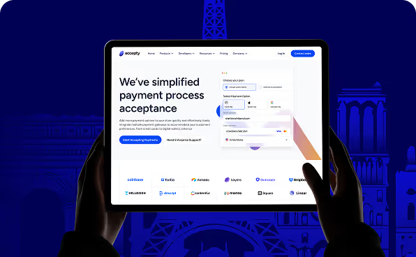
Blue is preferred in SaaS and dashboard interfaces since it makes users remain composed and focused. Designers apply blue when the products involve long sessions and serious decisions. Such tools as Stripe, PayPal, and Google Workspace are based on blue since it is stable and well-known.
Blue does not distract users. It supports thinking. In fintech products, this matters even more. Payments, approvals, and reports already feel stressful. A calm interface reduces hesitation and builds quiet trust.
Users move forward with confidence because nothing feels aggressive or rushed. Blue works in the background. It does not try to impress. It helps users complete tasks without doubt.
- It supports long usage sessions
- It feels stable and predictable
- It lowers anxiety in data-heavy environments
How does green signal success, progress, and safety?
Green is a sign of success as individuals equate it with good things. With time, the digital products have conditioned users to accept green as confirmation. Users can recognize when an action was successful by a green checkmark. A green progress bar will give them the push to move on. Green builds confidence and dispels uncertainty.
Products like Google Forms and many SaaS onboarding flows use green to guide users forward. Clear confirmation helps users move faster because they do not need to double-check their actions. Green supports momentum. It tells users they are safe and on the right path. In good UX, green does not celebrate loudly. It reassures quietly.
- Green checkmarks confirm success
- Green progress bars motivate completion
- Green feedback reassures users instantly
Why is red reserved for errors and critical actions?
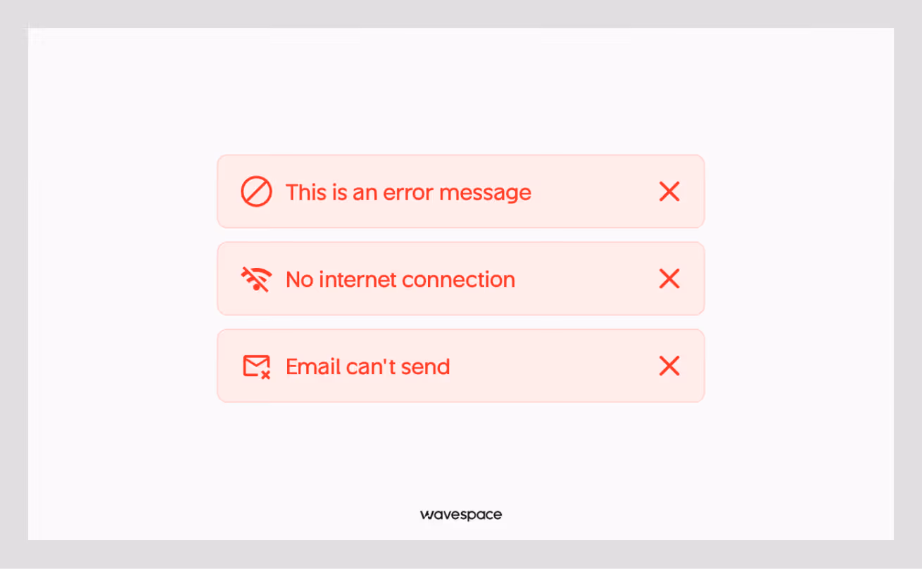
Red demands attention immediately. That is why designers use it with restraint. In digital interfaces, red signals danger, errors, or actions that cannot be undone. It tells users to stop and pay attention before something serious happens.
Most well-designed products avoid using red as a primary interface color. Instead, they reserve it for critical moments. Apple, Google, and Stripe follow this pattern closely. Even though Stripe’s brand relies on purple and neutral tones, red appears only when something goes wrong, such as a failed payment or an invalid action. This clear contrast helps users understand the severity of the situation instantly.
Red increases alertness, but it also raises stress. When designers overuse it, everything feels urgent and exhausting. A good interface maintains emotional balance. Red should interrupt users only when it truly matters, not overwhelm them.
“Red should stop users, not pressure them.”
In real interfaces:
- Red points out mistakes and damaging behavior.
- Red gives warnings before it is too late.
- Red increases alertness, but also stress
How do yellow and orange guide attention without overload?

Yellow and orange guide attention when designers use them with care. These colors attract the eye faster than most others. That makes them useful for highlights, notifications, and primary actions. Amazon uses orange for key actions because it feels energetic but not threatening.
Yellow often highlights warnings or updates without causing panic. These colors are most effective as accents. They do not steal attention as they lead users. The layouts become loud and distracting when designers apply excessive yellow or orange. Balance matters. These colors are used to support action. When inappropriately applied, they disrupt thought.
Real-world examples show:
- Amazon uses orange for primary actions
- Yellow highlights notifications and warnings
- These colors attract attention without triggering fear
How do dark mode and light mode affect user psychology?
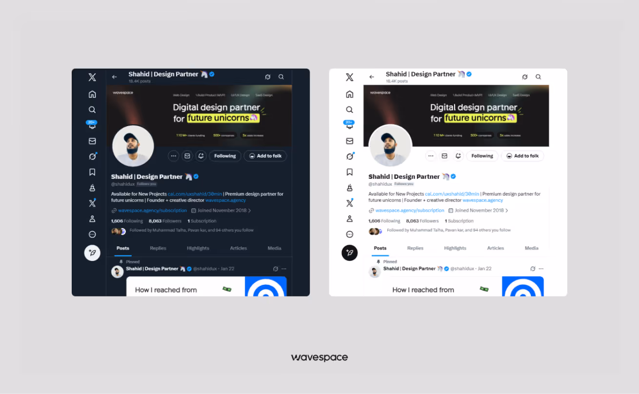
Dark and light modes affect how users feel while using a product. Light mode feels open, familiar, and clean. It works well in bright environments and long reading sessions. Dark mode reduces eye strain and feel calm in low-light conditions. It also feels modern and focused.
Products like Apple, YouTube, and Twitter offer both because context changes. Users work in different environments and at different times. Good design respects those needs. Choice improves comfort. Comfort improves focus. And focused users stay longer.
- Light mode feels open, clean, and familiar
- Dark mode reduces eye strain and feels modern
- Products like Apple, YouTube, and Twitter allow choice because context matters
Why is color accessibility critical in inclusive design?
Color accessibility ensures that everyone can use a product with confidence. Designers must maintain proper contrast so that text remains readable. They must avoid using color alone to explain meaning. Icons, labels, and patterns should support color signals. This helps users with color blindness or visual limitations. Inclusive products consider these needs from the start.
When teams ignore accessibility, users feel excluded without explanation. They leave quietly. Accessible color systems do not limit creativity. They expand reach. And they show responsibility.
Real inclusive systems:
- Maintain proper contrast ratios
- Do not rely on color alone to convey meaning
- Support users with color-blindness
How does color impact conversion and user behavior?
Color affects conversion by shaping confidence. Smooth colors minimize reservations when making forms and checkouts. Consistent color logic builds trust across screens. Users feel guided when they know the meaning of every color.
They stop guessing. Products that change color meaning often confuse users and slow down decisions. Good color systems support behavior naturally. They do not push users. They remove friction. And when friction disappears, action feels easy.
Existing trends between products:
- CTA colors are clear, which enhances the confidence to click.
- Calm palettes minimize the abandonment of forms.
- Consistent color logic builds trust
Color in everyday life
Mood and mental state
Color influences the mood of individuals during the day. Cool and soft colors make the mind relax and remain at peace. Bright and intense colors boost energy but may be stressful once overused. This is why the light and neutral colors are more popular among people in the areas where they work or sleep. Color is the silent creator of emotion that does not beckon to notice.
Interior spaces, clothing, and food
Interior spaces use color to control atmosphere. Light colors make rooms feel open and breathable. Dark tones create warmth and comfort when used carefully. Clothing colors influence confidence and perception. People often choose darker colors to feel strong and lighter colors to appear friendly. Food presentation also depends on color. Warm colors increase appetite, while muted tones feel premium and clean.
Practical color selection tips
Good color choices start with purpose. Choose colors based not on current trends, but on the feeling you want to support. Think about comfort, clarity, and balance. When color matches human emotions, everyday experiences feel easier and more natural.
Future trends in color popularity
Shifts in global preferences
The preferences regarding color are evolving, and people desire emotional balance. Ruddy and violent colors are getting less popular. Cool and soft sounds are becoming trusted as they are so secure and familiar. This transition represents a longing to find something stable in a hectic and chaotic world.
Digital and minimalist palettes
The digital products are shifting towards simpler color systems. Designers also make use of less dominant colors and neutral backgrounds. Light accent takes the place of heavy accent. This will minimize visual noise and allow us to have long periods of use. Users are less distracted and overwhelmed.
Environmentally friendly and natural colors
Futuristic trends are going towards more nature-inspired colors. Earth colors, green and natural colors, are a sign of responsibility and long-term thinking. These are colors that are human and down-to-earth. They are a communication of caring, trusting, and sustaining to brands.

Conclusion
Colors make people feel, think, and even make decisions. They determine trust, behavior, and emotional comfort, whether at cross-cultural, cross-product, or cross-setting levels. Blue creates a perception of calm and confidence. Green reassures progress. Red shields users against errors. Attention is directed by yellow and orange. Culture defines meaning. Inclusion is achieved through accessibility.
Color is not an ornament to designers and founders. It is decision-making. Products become intuitive and trustworthy when color is used to support human emotion. Users avoid or abandon when it fails to do so. Knowing the popularity of colors guides teams to build experiences that people have confidence in, recall, and visit.
FAQs about the most popular colors in the world
Blue, black, white, gray, and red are the most popular colors globally. These colours are popular due to their familiarity, cross-cultural, and emotional application in any industry and in the digital world.
The reason why these colours are still popular is that they generate trust, clarity, and emotional comfort. They are visually and culturally easy to process and are safe options whenever global brands aim to reach a wide range of audiences.
Popular colors make global brands consistent, recognizable, and trustworthy across markets. The familiar colors help to decrease friction, enhance brand recognition, and make visual communication effective in regions and other cultures.
Technology, finance, automotive, fashion, and e-commerce industries use popular colors. Trust, clarity, and scalability are the key concerns in these sectors, and therefore, widely accepted colors are the best options.
Yes, some colors have a different meaning across cultures, but some common colors, such as blue, black, and white, are universally accepted. Their balanced emotional appeal enables them to operate in any region without confusion or unwanted affiliations.
Popular colors reduce uncertainty and create a sense of reliability. When users see familiar colors, they feel more confident, which increases comfort, shortens decision time, and improves the likelihood of completing a purchase.
Core popular colors remain stable, but supporting and accent colors change with trends. Digital products, social media, and technology shifts influence how brands refresh palettes while keeping familiar base colors.
Brands like Apple, Google, Nike, Samsung, and Meta use popular colors effectively. They combine simplicity with strong contrast, allowing their products and messages to feel modern, trustworthy, and globally recognizable.
Familiar colors signal professionalism and stability. When users encounter colors they recognize, they feel safer navigating interfaces, trusting information, and engaging with products or services over longer periods.
Yes, popular colors can improve conversions when paired with strong UX. They guide attention naturally, reduce visual friction, and help users focus on actions like sign-ups, purchases, or form submissions.

More related blog


Have a Project? Let’s talk!


.avif)

