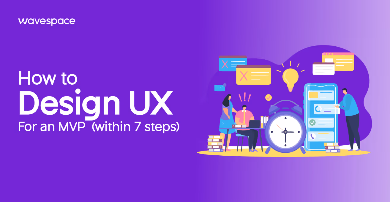
How to design UX for an MVP (within 7 steps)


Most MVPs do not fail because the idea was bad. They fail because users open the product, get confused, and close it often within the first 60 seconds. The founder walks away thinking there is no market. The real problem was a broken user experience.
Poor UX in an MVP does not just frustrate users. It produces misleading data. You cannot tell whether users rejected your idea or your interface. That distinction matters enormously when you are deciding whether to pivot or press forward.
This guide walks through how to design UX for an MVP the right way. You will learn everything from problem definition to usability testing.
Sit back, grab a coffee or popcorn, whatever you like, because we have an answer for everyone. Whether you are a founder, a product manager, or a designer, joining an early-stage team.
What is a minimum viable product?
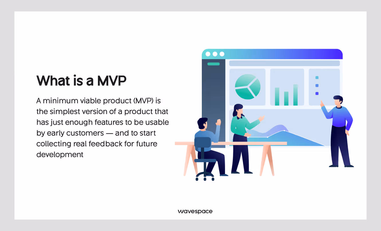
An MVP means Minimum Viable Product. It is the smallest version of a product that can deliver real value.
The purpose of an MVP is to show its capabilities to a specific user and get feedback to keep working on the product.
The keyword for MVP is "viable". It works and meets certain criteria, but is not fully developed yet. It is not a half-built product. It is a deliberately scoped product.
With an MVP, founders can collect genuine feedback. Which problem do users want to solve? What does the shortest path to a solution look like? And decide which problem to solve first.
MVP is not a full-scale product; the difference between an MVP and a full product comes down to scope. Not the number of features or functions. A complete product serves a diverse range of users across multiple use cases.
On the other hand, an MVP serves one type of user, solving one core problem.
Looking for an MVP development agency? Check out our curated top MVP development agency list.
What is UX MVP?
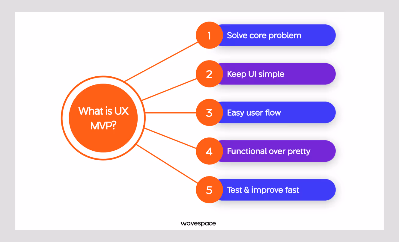
A UX MVP is the user experience layer of a minimum viable product. It contains MVP screens, flows, and the interactions a user will encounter while using your MVP. A better MVP UX ensures your users are not facing a clunky experience.
However, it is not a full UX system. MVP UX only covers the core components needed for a target user to complete the core task.
The contrast between MVP UX and full UX systems matters because UX MVP design is about scope control.
In an MVP, you are not building something that needs a full design system, a full component library, or a well-defined, polished interface.
Instead, you are designing the shortest, clearest path from user arrival to product value. With it, you can test whether a path works or not.
In practice, a UX MVP includes three things:
- A defined user journey
- Wireframes or a prototype of the core flow
- One round of usability testing before or shortly after launch
Everything beyond that is future work.
Treating UX as part of the MVP rather than something layered on after is what separates products that generate clean validation data from products that generate headaches after launch.

Role of UX for MVP development
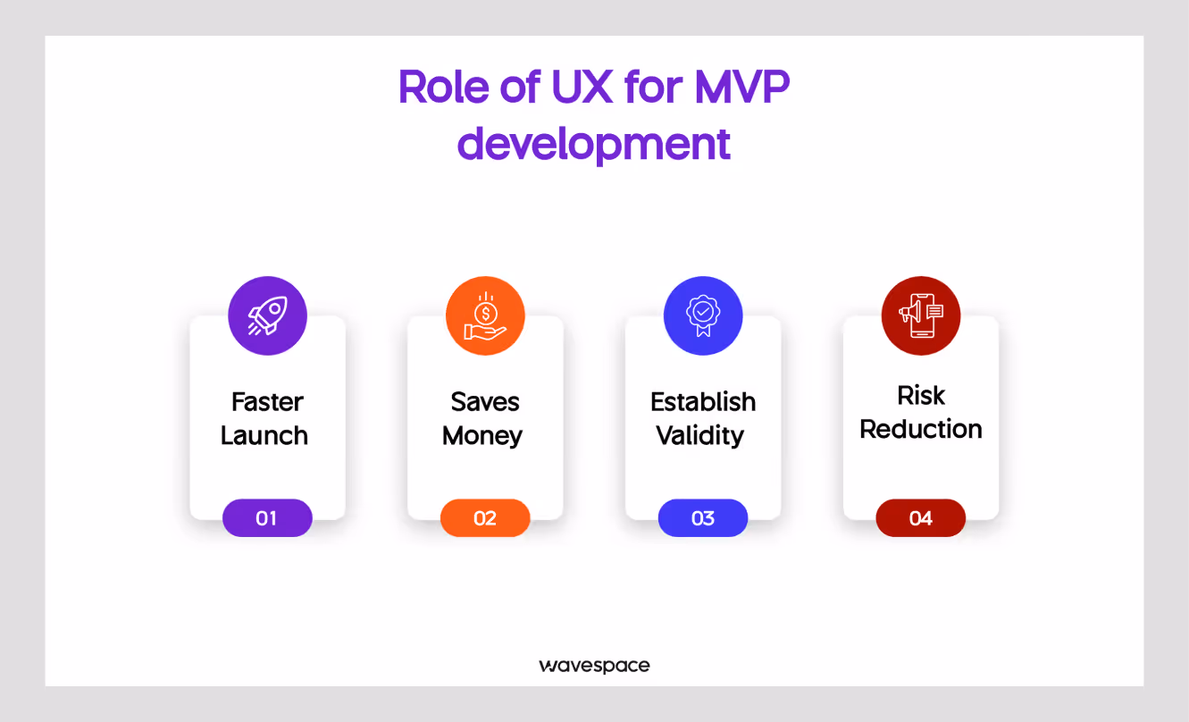
MVP development plays an important role in a product's life. It helps to determine if the product will be successful even before the first release.
Building a full product before you have validated demand is one of the most expensive mistakes a startup can make. One wrong decision can lead you to spending more on fixing issues than building.
An MVP lets you avoid that.
Faster Launch:
An MVP gets a real product in front of real users faster. Weeks instead of months. This speed gives a competitive advantage, especially in crowded markets.
Saves Money:
You build less. That means lower development costs, fewer design revisions, and more importantly, a smaller team needed at launch.
Establish Validity:
You learn whether people will actually use what you built, before you build everything. This is the core purpose of an MVP. The data you gather shapes every decision that follows.
Risk Reduction:
Every feature you do not build in the first MVP version is a bet you did not have to make yet. MVPs are, in fact, MVP risk management tools as much as they are product tools.
MVP development is critical for startups. But speed without the right design partner can slow you down.
At Wavespace, we help startups and enterprises by providing MVP services and AI MVP development that looks and feels fast, scalable, and investor-ready. Since 2019, we’ve partnered with companies from early-stage founders to Fortune 500 teams and Y Combinator-backed startups. We’re helping to turn ideas into validated products.
Why is UX design important for MVP success?
UX is an integral part of digital products and digital product design (SaaS MVP, AI MVP, or web app MVP). A great product is always backed by UX design and UX research. But alas! There is a common misconception that UX is something you polish later. After the product is working.
That thinking is backwards. At the first tide of the tech industry, many implemented UX later. Meaning after suffering from substantial churn or revenue loss.
A well-planned founder creates the foundation structure with UX design. Simply, if the product is a car, UX is the motor oil that keeps everything running smoothly.
Don Norman, father of User Experience (UX) stated “It is not enough that we build products that function, that are understandable and usable, we also need to build products that bring joy and excitement, pleasure and fun, and, yes, beauty to people’s lives.”
First impressions are permanent. A good impression hooks the user. A good impression can gain permanent users. Whereas a user who gets lost during onboarding will not come back to give you a second chance.
Bad UX creates false-negative validation. This is the hidden cost. That ambiguity poisons your learning.
They will not email you to explain what confused them. They will just leave. You will be confused with questions like, " What were the problems? Did the product fail? Did the idea fail? Or something else?
Usability drives retention. The early users you need most are the ones willing to try something new, who still expect to complete basic tasks without friction. If they cannot, they leave and they tell others.
Good MVP UX design does not mean a beautiful product. It means a clear product. A functional product and a navigable product.
How to design UX for an MVP in 7 simple steps
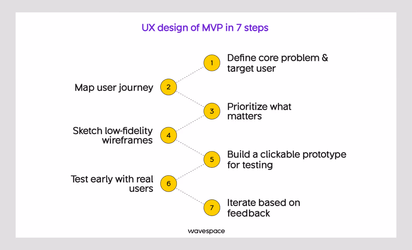
1. Define your core problem & target user
Whether you design UX for B2B, SaaS UX, or Enterprise UX. Every UX decision in your MVP should connect back to one clearly stated problem and one specific user. Not two users. Not three problems. One of each.
You get zero results when you design UX for everyone; you end up achieving nothing. When you try to think about everyone. The interface becomes cluttered with options that different user types might want. The product becomes Frankenstein's monster. No single user can find what they need.
How to do this well:
- Write a single problem statement:
"Users who [description] struggle to [problem] because [root cause]."
- Build one lightweight persona. Include role, goals, frustrations, and technical comfort level. Do not spend more than two hours on this. It is a tool for alignment, not a research deliverable.
- Validate each problem before starting to design anything. Having conversations with potential users (five to ten) will secure more information as well as results than three weeks of assumption-based design.
The output of the first step should always be in a single sentence that your team agrees on. If you cannot write it, you are not ready to design yet.
2. Map user journey
Creating a user journey map can help find answers to many issues before even starting the UX design process. A user journey helps UX designers to better understand. It shows the steps a user takes from first contact to completing the core task of an MVP. Note that, for an MVP, this user map needs to be short.
The purpose of the MVP design is to deliver a functional product in a quick time.
Mainly, the user journey map is looking for the shortest path to value. What is the minimum number of steps a user needs to take before they experience the thing your product is supposed to do for them?
What to focus on:
- Identify the single "aha moment". The point where users understand why the product is useful. The point where users feel the dopamine hit. Every step before that moment is friction; your target is to reduce those steps.
- Look for decision points where users might get confused or stall. These are your highest-risk design areas.
- Remove extra steps that only benefit you and don’t serve users. Lengthy sign-up flows with multiple 5-10 input fields, mandatory profile setup, and forced long tooltip tutorials often reflect product assumptions, not user needs.
A useful exercise: time yourself completing the core task in your prototype. If it takes more than two minutes to reach the main value, the journey needs pruning.
3. Prioritize what matters
Feature creep is the most common reason many MVPs get delayed and over-complicated before releasing the final product.
Feature creep, in simple terms, is bloating an app with extra features that the user actually doesn't need in the first place.
A great example is the calculator in the Banking app. In theory, it might sound nice, but no one wants a calculator in their fintech app.
MVP research helps to prevent scope creep and over-engineering. Because deciding to add "just one more thing" ends up needing an extra 10 steps. UI designers and app developers make changes across dozens of changes to add one feature.
And fast-forward to six months later, the product becomes complex with extra bloated features. MVP becomes harder to test and too expensive to make changes.
How to avoid MVP scope creep:
A good hack to shun MVP scope creep is following the principle of the greedy algorithm. Choosing the most important thing. Split every feature into two nodes.
- Must-have: Without it, the product cannot fulfill its core promise. If missing, users cannot complete the primary task.
- Nice-to-have: With it, it would improve the overall experience of the product. But the absence of it does not compromise the core value.
Remove the Nice-to-have features for version 1.0.
When in doubt, ask: "If we remove this feature, does it stop working for our target user or lose the core function?" If the answer is no, remove it from the MVP scope.
A tool like a simple prioritization matrix. Plotting features by user impact versus development effort can help teams make this decision in a structured way rather than arguing it in meetings.
4. Sketch low-fidelity wireframes
Wireframes are structural blueprints. Skipping wireframing is like shooting yourself in the foot. Without wireframing, a normal product can have chaotic development, cost more, and miss the mark on user experience in the final product.
At the low-fidelity stage, they are rough sketches showing where which elements reside on a page and how screens connect with each other.
However, do not just start the wireframing in Figma yet. The best approach is wireframing is to start with pen and paper or a whiteboard.
The goal of wireframing is speed and iteration, not precision or good-looking lines.
What makes a good low-fidelity wireframe:
- Shows layout and hierarchy, not colors or typography
- Labels interactive elements clearly (buttons, links, inputs)
- Covers every screen in the core user journey
- Takes minutes per screen, not hours
Using pen and paper is a great technique that brings out the best of creative decisions. Sketching by hand forces you to think through logic rather than spend time on aesthetics.
It helps and makes it easy to discard bloated feature ideas without emotional attachment. That makes the entire MVP project harder than the polished work.
Once you have a rough sketch, move it into a tool like Figma or Balsamiq to create a slightly cleaner version for prototyping.
5. Build a clickable prototype for testing
A clickable prototype turns your wireframes into something that feel real product but without functionality. Clickable prototypes are helpful because of a real user to interact with.
It does not need to be connected to a real backend. It just needs to simulate/replicate the experience convincingly enough that users can behave and use it as they would with the final product.
Figma is the standard tool for this. You can link screens together, simulate button clicks, and create simple flows without writing a single line of code.
What your prototype needs for MVP testing (Complete checklist):
- The complete core user journey, clickable from start to finish
- Enough visual clarity that users are not confused by placeholder content
- Error states for the most likely failure points (wrong input, empty states)
- A realistic enough feel that users engage with it the same way they would with a live product
Animations, transitions, or polished visual design should not be considered at this stage. What you need is a working flow so that a stranger can navigate without your guidance.
Leverage our MVP services, which launches 35% faster products. We helped Mediqo to save 420+ dev hours, and our experts helped them improve their overall user experience, moving to full development.
6. Test early with real users
Usability testing is where assumptions get answered with hard evidence. It is also the step most teams skip or find a shortcut. Which is why so many MVPs launch with preventable problems.
You do not need a lab for user testing, nor a research team, nor a large sample of testers. MVP user testing with only five users will surface the majority of your most significant usability issues. Not only that, you will start seeing the same problems repeat.
How to run an MVP usability test:
- Recruit five users who match your target persona. This is usually easier than it sounds. LinkedIn, Reddit, Twitter, Slack communities (Avoid the UX designer on the project).
- Give them a task, not instructions. "Try to complete [core task]" Avoid instructions "Click here, then here." You want to observe natural user behavior on MVP.
- Watch without intervening. Take note when users struggle, resist the urge to help. That struggle is the data to improve the UX design flow.
- Take notes on where users pause, backtrack, misclick, or ask questions. These moments indicate friction in your UX.
The most important thing you are looking for is not whether users liked the product. It is whether they could use it with ease or not.
7. Iterate based on feedback
Testing without iterating is just futile observation. The value comes from what you do next and what you do with the testing data.
After each round of testing, identify the two or three highest-impact problems. The ones that stopped multiple users from completing the core task.
Fix those first. Do not try to fix everything at once.
A practical MVP iteration process:
- Identify the top friction points from your test sessions
- Redesign only those parts of the flow
- Test again with a new set of users
- Repeat until users can complete the core journey without help
This loop continues after launch. The MVP UX design process is not something you complete before shipping. It is a practice that continues as long as you have users.
Common UX mistakes to avoid in MVPs
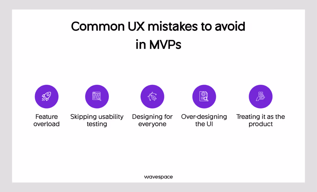
Many exciting MVPs fail because they refuse to understand the basics. In the ever-growing tech industry, founders need to be smart just to survive.
Here are the common UX mistakes that can kill an MVP:
Feature overload
Adding features in MVP to just please stakeholders, not because users need them. Every extra feature is a new opportunity for confusion.
Skipping usability testing
"We already know our users" is the most expensive assumption in product development. You do not know until you watch someone use what you’ve built.
Designing for everyone
An MVP that tries to serve multiple user types with different needs will serve all of them poorly. Pick one and design for them specifically.
Over-designing the UI
Spending weeks on visual polish before you have validated the flow is a misuse of time. Users will tolerate an ugly product that works. They will not tolerate a beautiful product that confuses them.
Treating it as the product
An MVP prototype tests assumptions. A product serves users. Do not let the MVP prototype constrain your thinking about what the product could be.
Tools for MVP UX Design
You do not need an expensive tech stack and tools to do the UX design for your MVP. Top-level designers don’t chase expensive tools; they use tools that make things easy.
These tools cover the full MVP UX design process:
Wireframing
- Pen and paper - Underrated; faster for early ideation.
- Figma - Relume Figma Kit.
- Balsamiq - Good for teams that want low-fidelity output without the temptation to over-design.
Prototyping
- Figma - Industry standard, handles low to high fidelity.
- Marvel - Simpler learning curve than Figma for non-designers.
- Framer - For teams that want more interactive prototypes.
Usability testing
- Maze - Unmoderated testing at scale.
- Lookback - Moderated remote sessions.
- UserTesting - Fast access to a panel of participants.
- Loom - For async testing, where you watch session recordings.

Collaboration and documentation
- Notion - User journey maps, personas, research notes.
- FigJam - Visual brainstorming and journey mapping directly in Figma's ecosystem.
- Miro - Whiteboarding and workshop facilitation.
Pick one tool from each category. Do not spend a week trying different options. Any of these will do the job.
Real-world example of MVP UX done right
Airbnb
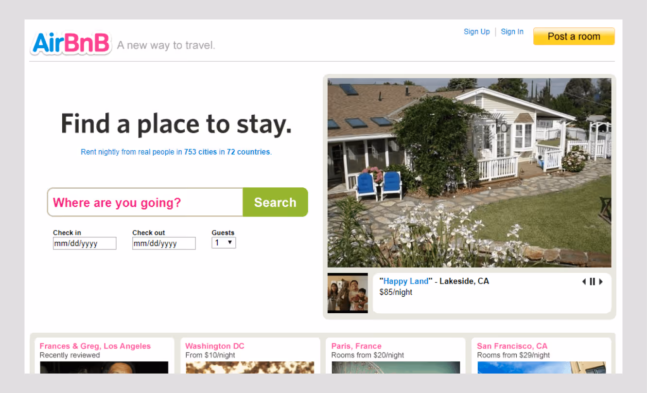
Airbnb's first version was not a polished travel platform. It was a simple website that let the founders rent out air mattresses in their own apartment. The photos were taken on a consumer camera. The booking process was manual. There were no reviews, no map search, and no instant booking.
What the MVP had was a clear, functional user journey: browse a space, contact the host, pay, and show up. That was it.
The UX was simple because the product was simple. But it was also clear. A new visitor could easily understand what the service was and what they would get from Airbnb. That clarity was what validated the idea, not the visual design, not the feature set.
Dropbox
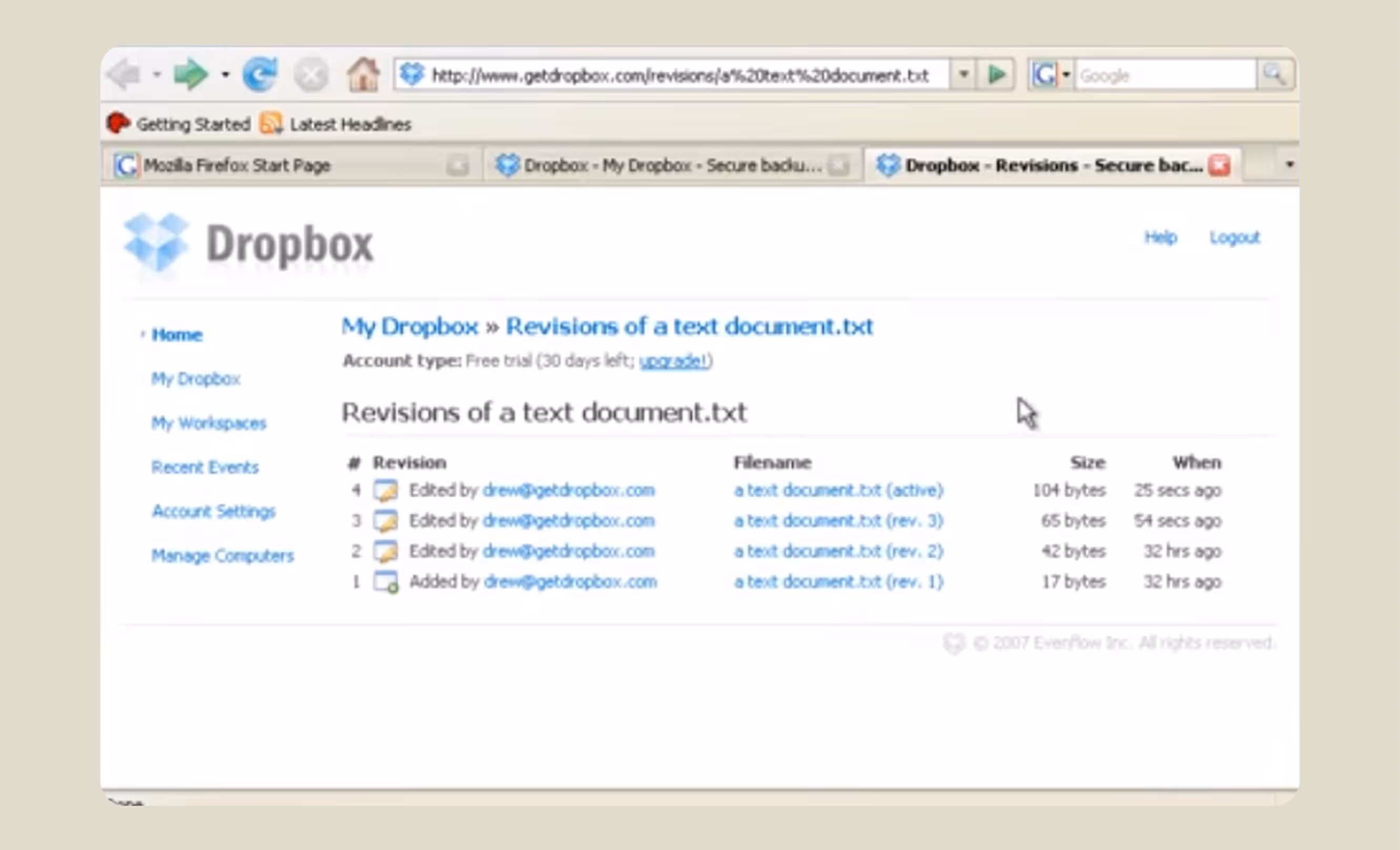
Dropbox took a similar approach. Before building the product, founder Drew Houston created a short demo video showing what Dropbox would do. That video was the MVP. It tested user interest before a single line of product code was written for the final product.
Both examples point to the same principle: validate the idea with the minimum amount of design necessary to communicate it clearly. That is what a minimum viable product UX design is.
Conclusion
Designing UX for an MVP is not about building something beautiful. At this stage, the idea matters more than the looks. It is about building something clear enough to test. Simple enough to navigate. Service focused enough to tell you whether your core belief is right or not.
In this guide, we covered the 7-step process to design UX for MVP. From problem definition to iterative testing.
You do not need to reinvent it each time. This industry-grade process helps build MVPs faster. You need to execute it with discipline and without skipping the parts that feel slow.
The most successful early-stage products are not the ones with the best visual design. They are the ones whose teams learned faster. Good MVP UX design is how you learn faster.
Frequently asked questions about UX design in MVP
A Minimum Viable Product is the smallest thing you can ship that tests whether your core idea sticks with the users or the market. For example, Facebook launched only to Harvard students with limited functionality.
A Minimum Marketable Product is an idea after it's been polished enough to actually market and acquire users. For example, Spotify launched with a stable desktop app for a smooth listening experience.
A Minimum Marketable Feature is even smaller. It is a single feature, shipped alone, that delivers value it without needing the rest of the product around it. For example, “Stories” feature on Instagram.
In an MVP, UX isn't about aesthetics. It's the difference between users getting it in 10 seconds and users closing the tab. It's about removing every reason someone might give up before they understand what you built.
User Experience. How someone interacts with a product and how they feel while doing it.
No, a demo shows the product. An MVP tests the product. With MVP, a real user can actually use it and give you real feedback. But demos are created to show off a product. For example, Apple Intelligence. On the other hand, Bard with LaMDA/PaLM 2 was the MVP for Gemini.
Yes, but it will cost you more than developing. You can skip polished UX, but you cannot skip usability. Confusing early users can lead to losing them before learning anything, which defeats the whole point of building an MVP. Not skipping UX design for MVP is the safest way.
Realistically speaking, somewhere between one and four weeks. A small project with narrow complexity takes closer to 1-2 weeks, and a project with a large scope is closer to 4 weeks (if you're still figuring out who you're designing for).
Wrong comparison. UX is how users experience the product itself. CX (Customer Experience) is everything around it. Onboarding emails, support, and the sales call. One doesn't replace the other.

More related blog

Have a Project? Let’s talk!


.avif)

