8 Common Mistakes in UX User Flows to Avoid
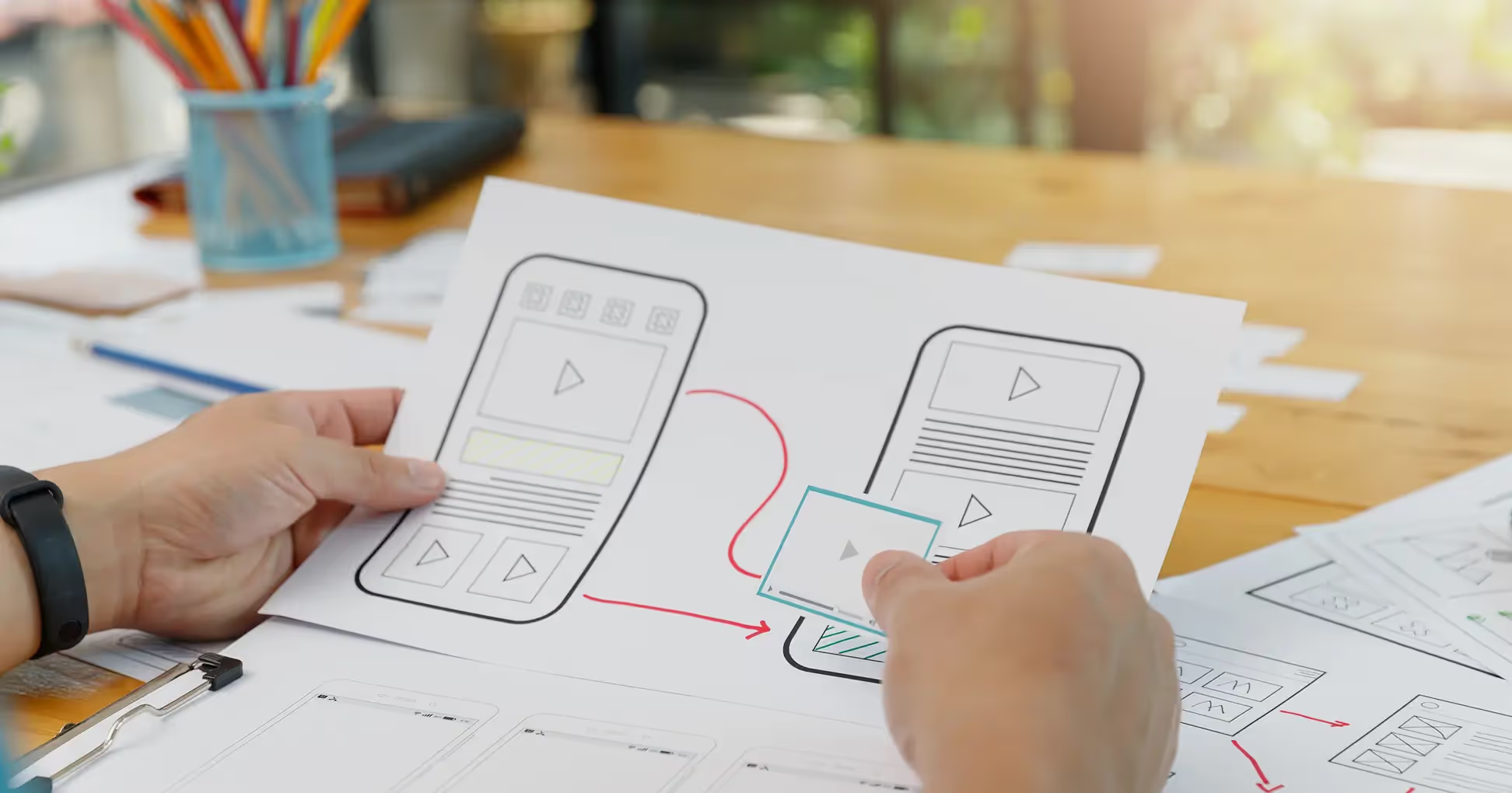
At Wavespace, we’ve worked with hundreds of digital products, SaaS tools, mobile apps, AI startups, and enterprise dashboards.
One thing we keep seeing over and over again? Founders and product teams underestimate the impact of their UX user flow. Not just the screens, but the invisible journey that connects them.
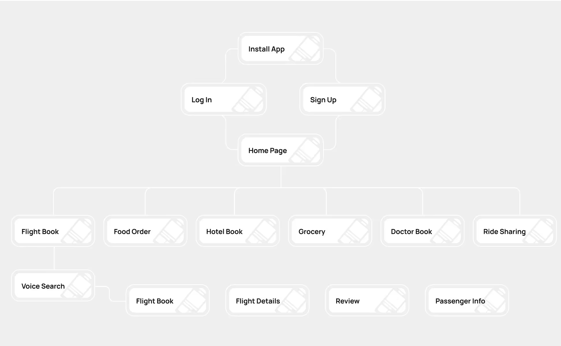
A user flow isn’t just a step-by-step diagram. It’s a story. A conversation between your product and the person using it. When this conversation is smooth, people trust your product. When it breaks, so does your business. And in a competitive landscape, even a small disruption in the flow can push users to look elsewhere.
In this article, we’re going to break down 8 of the most common mistakes teams make when designing UX user flows, and how to fix them. This isn’t just a guide for designers.
If you're a founder, product manager, or anyone building a digital product, this guide will help you think differently about the journey you’re creating for your users.
The Most Costly Mistakes in UX User Flows
1. Designing Without Understanding User Intent
The most damaging mistake in the process is to start user flow design without understanding what users want to achieve. The terms of features rather than user goals become the basis of the team design initiative. Instead of simply asking the user's end goal, designers should ask users what activities their screens will address.
When you don’t understand user intent, you risk building flows that make sense internally but feel clunky or disconnected to users. They have to stop and think, click around, or worse, leave your product entirely.
The best user flows anticipate the user’s next move and meet them there. Before you build anything, map out real-life use cases. Interview potential users. Watch how they behave with similar tools. Then align your flow with their mental model. It’s not about guessing, it’s about listening.
2. Forcing Too Many Decisions at Once

Users face technical challenges when they are presented with multiple options on the same screen. Their cognitive functions must pause and process the options, which can lead to delays or abandonment. Decision fatigue occurs when users experience cognitive fatigue due to the additional demands of making decisions, which results in communication failures between users.
Numerous apps have too many options available, which we have seen many times. Users are faced with a single screen that contains multiple tasks, including account setup as well as preferences and profile settings and notification configuration.
It can feel overwhelming. The implementation of steps should be managed through multiple short and easy-to-use segments. Users should focus on performing a single task at each point.
Good UX is often about removing things. It’s not about hiding functionality, it’s about showing the right thing at the right time. A clean, focused flow builds confidence and keeps users moving forward.
3. Ignoring Edge Cases and Empty States
Most teams design flows for the ideal scenario, when everything works perfectly. But real-world users don’t always follow the ideal path. Sometimes there’s no data. Sometimes they make mistakes. Sometimes they get disconnected. Ignoring these edge cases creates brittle experiences.
Users hit empty states and don’t know what to do. Or they get an error with no explanation and feel stuck.
Design for reality. Design for empty states should be guided by providing both help and guidance to users. All error states should give users two pieces of information: exactly what went wrong and clear instructions about possible solutions. Emotional trust is built between users and designers when designers spend time creating small details that reveal careful planning.
4. Lack of Visual Hierarchy

Even if your user flow is logically sound, it can fail visually. When every element on the screen competes for attention, the user doesn’t know where to look. And if they don’t know where to look, they don’t know what to do next.
Users can use the visual hierarchy in any interface as their directional guide to understand what to do next. The design indicates which elements should be prioritized and which ones users can handle later. Users move seamlessly through the product without paying attention to the visual hierarchy because it is designed effectively.
Visual priorities become clear by using typography, spacing, color, and size to visually organize screens. Your primary command should be noticeably prominent. Visual contrast will help viewers follow a specific path. Space plays an important role because it reduces visual clutter, which increases readability.
5. Overcomplicating Onboarding
You understand our point about the powerful nature of your product. You want to show every functionality of your product. New users just want to know if your tool can solve their problem. The primary question on their mind is whether this tool solves their problem.
Onboarding is not a feature tour. It’s not the place to throw in pop-ups, walkthroughs, and checklists. Instead, it's your chance to help users get quick wins. To get them from sign-up to “aha moment” as fast as possible.
Start by removing everything that’s not essential. Can you simplify onboarding to one or two steps? Can your product explain itself through use? Use progressive onboarding to reveal features as users need them. That’s how you reduce friction and keep people coming back.
6. Not Providing Feedback Between Actions
The button click results in no visible response. Did it work? Should you click again? Did something break?
That’s the problem with poor feedback. When users take an action, they expect a response, visual, auditory, or textual. It doesn’t have to be loud. Even subtle animations, microcopy, or confirmation messages can make all the difference.
Feedback builds confidence. Through this type of feedback, users gain confidence in their position. Without the right feedback, users become hesitant and then express doubts, which can lead to abandoning the current task altogether. A computer conversation occurs whenever users engage with the system. Don't leave them silent.
7. Skipping Flow Testing with Real Users
No matter how experienced your team is, you cannot fully predict how real users will interact with your product. The only way to truly validate your user flow is to test it with actual people.
Yet many teams skip this step. They build, launch, and wait for feedback. But by then, it’s too late. You’re already losing users.
Testing doesn’t require a big budget or a research lab. Just five users can reveal most of the flow issues. Watch how they move through the product. Where do they hesitate? Where do they get stuck? These insights are gold.
And testing isn’t a one-time thing. Your product will evolve. So should your user flows.
8. Building UX Flows in Isolation From the Brand
Design isn’t just function. It’s also emotion. And that emotion is often shaped by your brand.
A lot of user flows feel cold and mechanical because they were built without considering tone, voice, and identity. The buttons work. The layout is clean. But there’s no warmth, no connection.
Your brand should be present in every part of the experience, not just the marketing site. Infuse your values, your personality, and your voice into the flow.
Use copy that speaks like a human. Use a design that reflects your identity. When users feel aligned with your brand, they don’t just use your product; they trust it.
Finally, UX User Flow Is Business Strategy
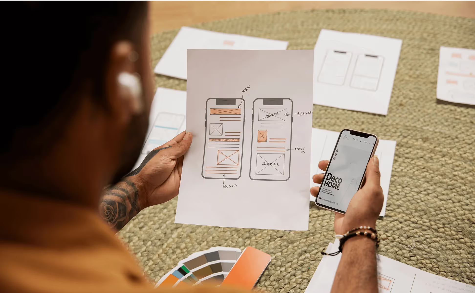
UX user flow isn’t a nice-to-have. It’s not something you fix later. It’s the foundation of how your product works. How people experience it. How do they move through it? And how they feel while doing it.
If your user flow is broken, everything else breaks too, conversion, retention, brand perception, support tickets. But when it’s done right? Everything improves. Users get value faster. They feel smarter. They trust your product. And they come back.
At Wavespace, we help startups and SaaS teams build experiences that feel invisible, smooth, fast, and intuitive. If you’re building something great, we’d love to help make sure your user flow is just as great.
FAQs About UX User Flows
A user needs to follow a specific sequence of screens while using your product to complete an activity. The visual path shows the user's movement between screens, which helps design teams create a better experience.
Because it reduces friction. This process guides users towards achieving their goals. A great user flow path results in higher customer satisfaction and improved trust levels, which leads to higher conversion rates.
Begin by defining actual goals that users want to achieve. Test your flow with users. Remove unnecessary steps. Provide clear feedback. And align it with your brand personality.
Yes. Creating a user-friendly flow prevents users from churning, while improving the initial process steps and creating a clear understanding of instructions. Implemented methods increase user retention and directly contribute to business expansion.
It’s a team effort. UX designers, product managers, developers, and marketers should collaborate to create a user journey that makes sense both functionally and emotionally.
Have a Project? Let’s talk!







.png)
.png)
.png)
.png)

.png)


